• 🏆 Texturing Contest #33 is OPEN! Contestants must re-texture a SD unit model found in-game (Warcraft 3 Classic), recreating the unit into a peaceful NPC version. 🔗Click here to enter!
  • It's time for the first HD Modeling Contest of 2024. Join the theme discussion for Hive's HD Modeling Contest #6! Click here to post your idea!

Icon Contest #12 - Spells on Different Units

Status
Not open for further replies.

Kyrbi0

Arena Moderator
Level 45
Joined
Jul 29, 2008
Messages
9,502
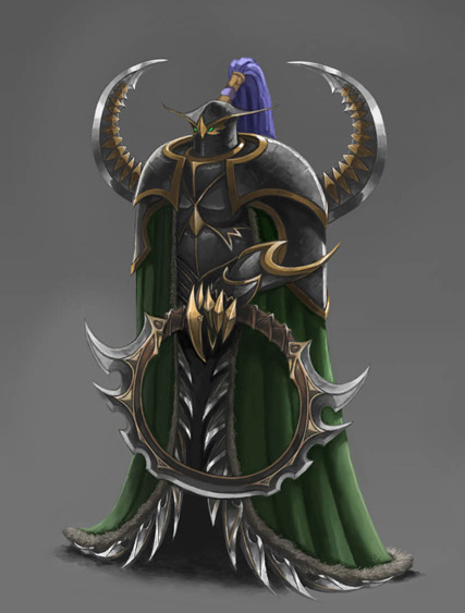
I'm not sure if i'm even gonna join the contest, but here's a quick WIP i made.

174300-albums4636-picture87273.png


There's something off about it, but y'know, for a first try (heck, a first foray; have you done any artwork on this site before?...), that's really good.
 
Your last chance to give suggestions, I'm moving on to Grom Avatar.

Your style is less-detailed and more outlined. You should focus on a single character in an icon rather than multiple. Warcraft III icons are 64x64, multiple objects tend to mold into one shape in such a resolution. It is best to focus only a single character, use more detail, smaller brush and try not to outline it.
 
Presenting...

As of now, My Final Submission
attachment.php
Provided by Heinvers

attachment.php
attachment.php
attachment.php
attachment.php

attachment.php


In this pack:
BTN for Taunt, Impale, Berserk, and Reincarnation
DISBTN for Taunt, Impale, Berserk, and Reincarnation
PAS for Taunt, Impale, Berserk, and Reincarnation
DISPAS for Taunt, Impale, Berserk, and Reincarnation
 

Attachments

  • Abomination Icons.zip
    65.8 KB · Views: 56
  • Yes.png
    Yes.png
    518.4 KB · Views: 439
Last edited:
They don't really fit. I gave you a good example- Just_Spectating. Then you just got offended that I edited in order to show you your mistakes. :/

The fact that you made them yourself denies me of using the same icon for this contest.
It would be as if we entered the contest together if my final submission happened to be all of the icons you made of mine.

I took some of your input, don't get me wrong, but I don't necessarily have to agree with your decisions either.
 
Level 25
Joined
Mar 23, 2008
Messages
1,813
@morb

Now that you say that, it is not really warcraft3ish. I was just blown away. It would fit perfect for lich's dark ritual in dota 2 though.

Anyway, point still remain, you shouldn't be doing icons for this contest. Your art is too good for this game. Just go work for some triple A company with your icons already.
 
Level 7
Joined
Feb 16, 2014
Messages
322
@Morbent, Your new immolation icon is so icy. I liked the the color selection and it really matched War3 TFT. For name it can be even called blue fire, frozen seal, freezing curse and many others. I liked the 1st once since it gave be more War3 feel.
 
Level 7
Joined
Feb 16, 2014
Messages
322
Thank you lokharke! I'd appreciate some negative comments though :X Like what you think I should edit so I can do better on the rework!

Back to icon making, Mana Burn for Maiev (One of the best chars ever :!!, damn maiev is awesome.)

209078-albums5714-picture87319.png


209078-albums5714-picture87317.png

OMG. i didn't kow u were such an artist before. Perfect claws and that light but i think it might suit some other unit more than maiev.
 
Hey Morbent, the contest requires
Exactly 4 icons.
which ones are for this contest?
icon.jpg


First wip - Breath of Fire (Neutral Hostile) for Red Dragon.

Untitled-3.jpg
Mind Rot for Lich.

209078-albums5714-picture86875.png


209078-albums5714-picture86874.png

Critical Strike for Illidan

This one took a lot of time but it was pretty fun. Besides, Illidan is the best character ever ^^

209078-albums5714-picture87024.png


209078-albums5714-picture87025.png
To be honest, I actually (until looking into the critical strike to realize what it is) thought it was a crab's leg.

Now I KNOW there are 100 hammers in Warcraft 3, especially in the same position but I just couldn't resist :X HAMMERS!

Endurance Aura for Paladin:

209078-albums5714-picture87075.png


209078-albums5714-picture87076.png


(I should also make a sword version, come to think of it. For Arthas.)

I'm not happy with these two, so I'll rework them soon I think. No filters used this time! Just round and blurry brush (is the blurry brush a custom brush btw?).

209078-albums5714-picture87308.png


209078-albums5714-picture87309.png


209078-albums5714-picture87311.png


209078-albums5714-picture87310.png


Happily, https://www.youtube.com/watch?v=KjsSvjA5TuE so I've got 1 more icon to make ^^

edit: ah fuck I forgot the borders. I'll add them in the remake.
Thank you lokharke! I'd appreciate some negative comments though :X Like what you think I should edit so I can do better on the rework!

Back to icon making, Mana Burn for Maiev (One of the best chars ever :!!, damn maiev is awesome.)

209078-albums5714-picture87319.png


209078-albums5714-picture87317.png
 
Level 28
Joined
Aug 7, 2011
Messages
1,638
There. I deleted most of my spam. I suggest we stop flooding the Icon Contest discussing Blizzard's icons now.

In regard to making icons of that sort (Chen) I believe that altering the idea of the weird ones wouldn't hurt. Like for Windwalk you can do whatever you want. Or mirror image doesn't necessarily have to be DoubleFace icon. I know earlier we discussed how you should maintain the idea of the old icon, but with some it's just impossible. Like Windwalk :p
 
Status
Not open for further replies.
Top