- Joined
- Dec 30, 2005
- Messages
- 1,383


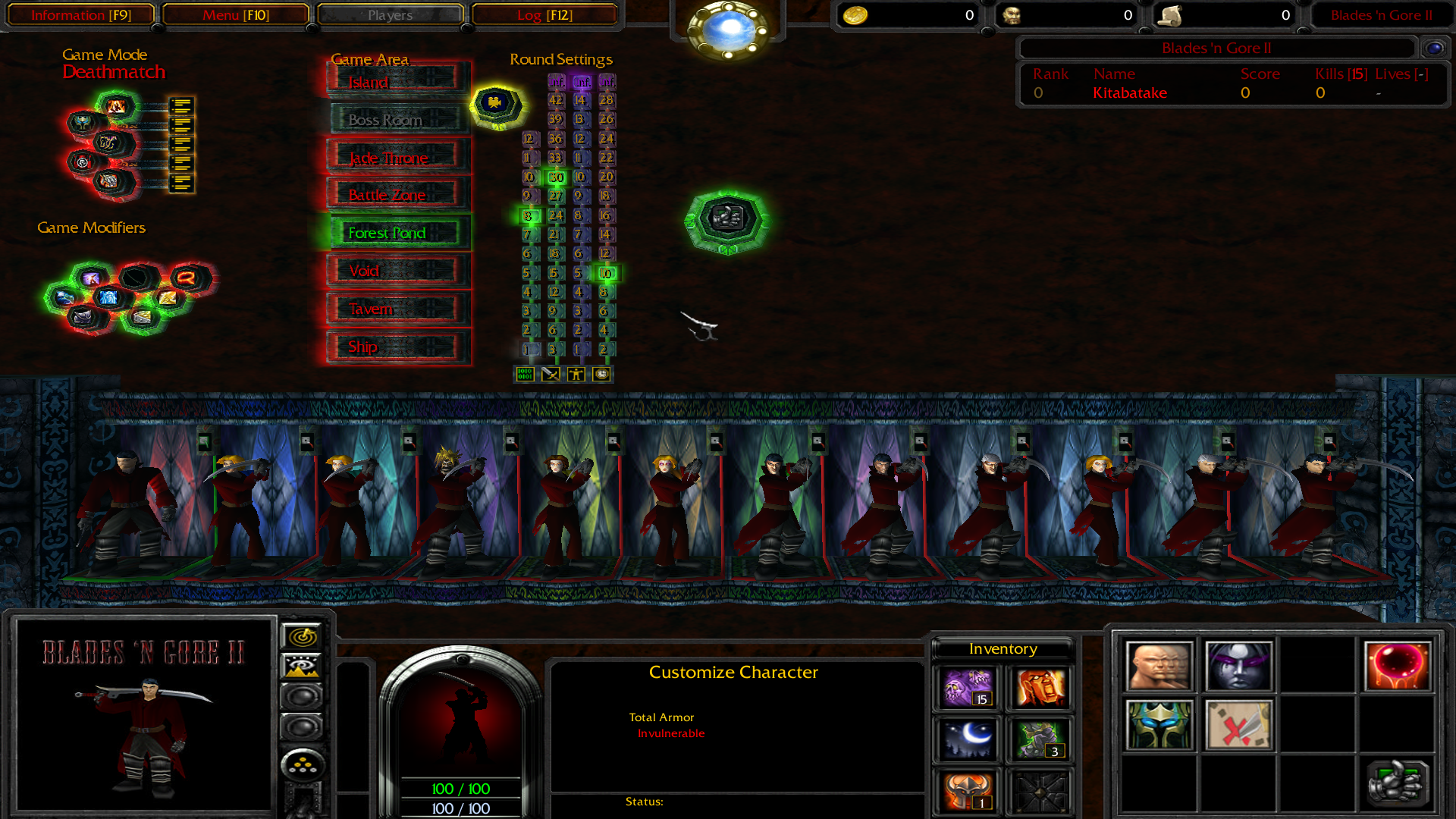
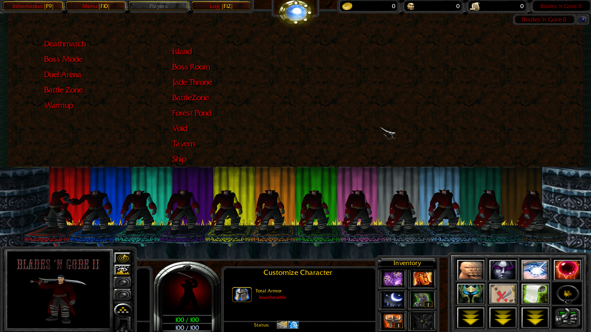
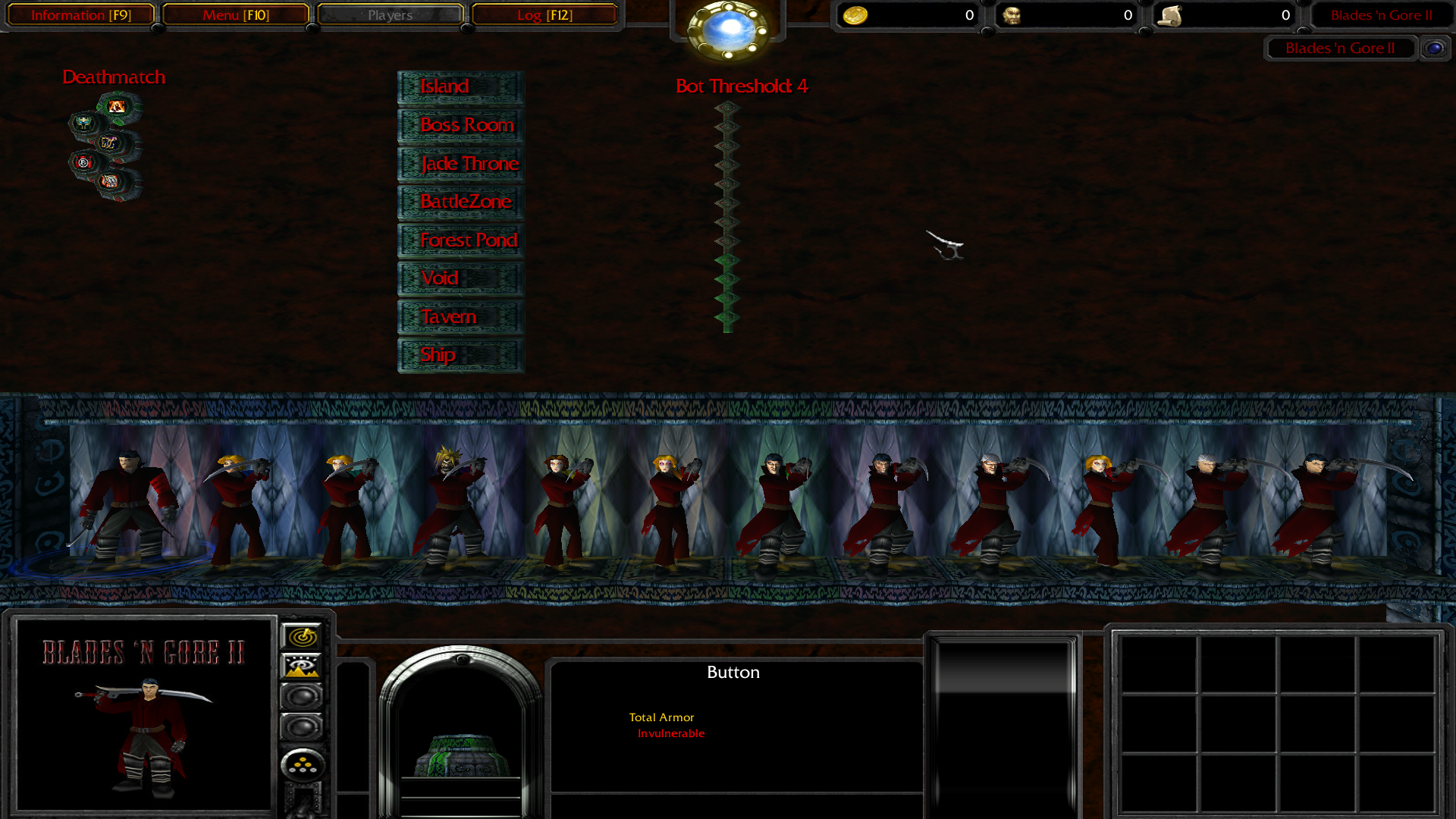
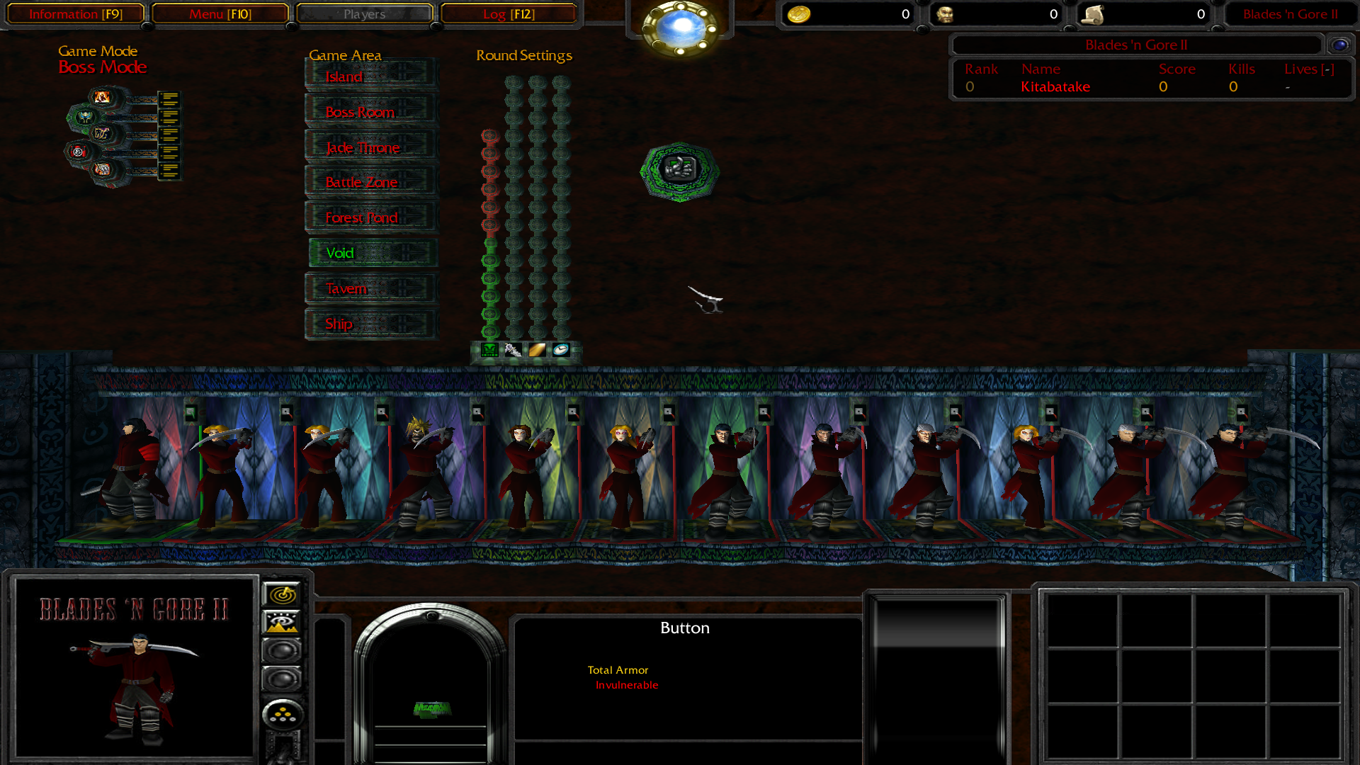
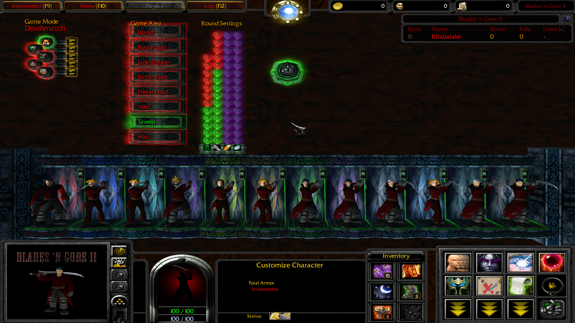
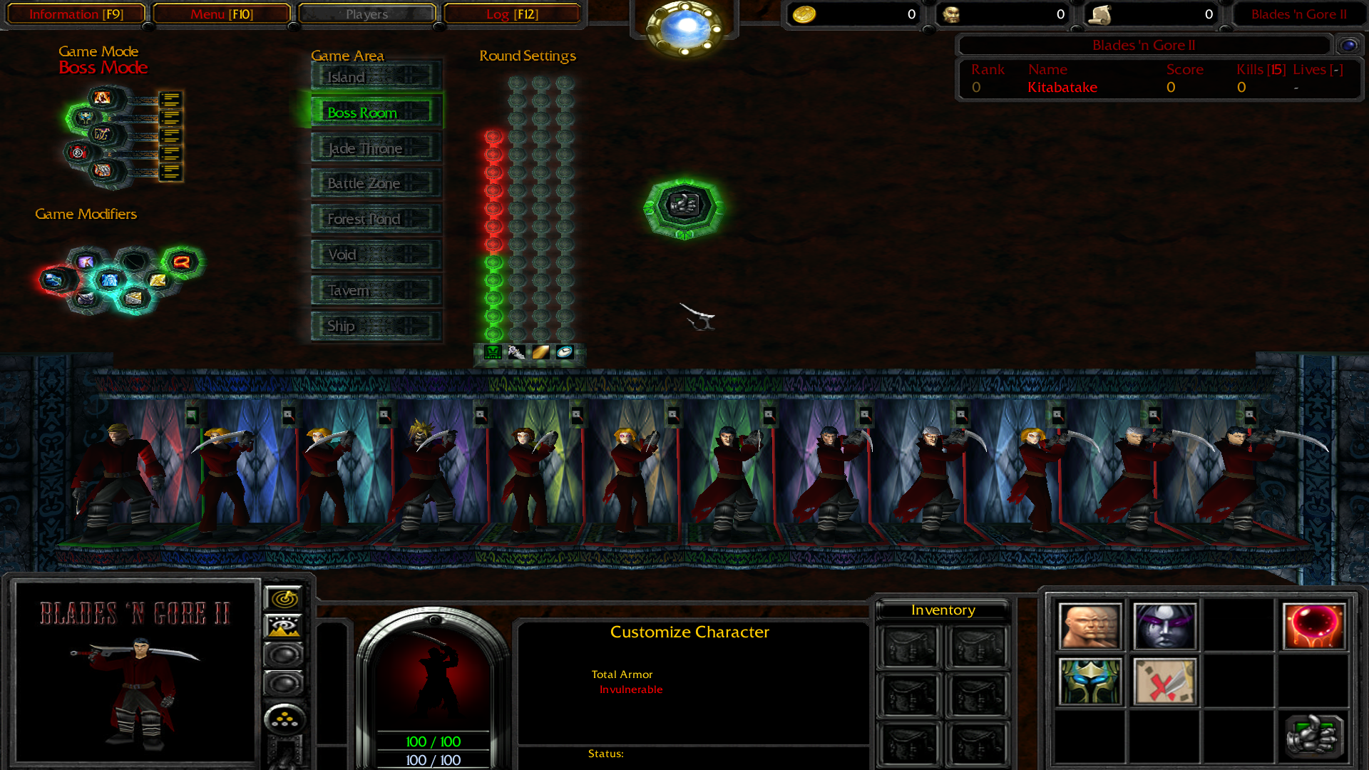
I'm currently working on a fullscreen setting selection system to replace the current clunky spellbook-based one.
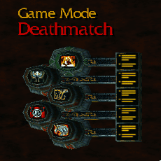
Current progress:

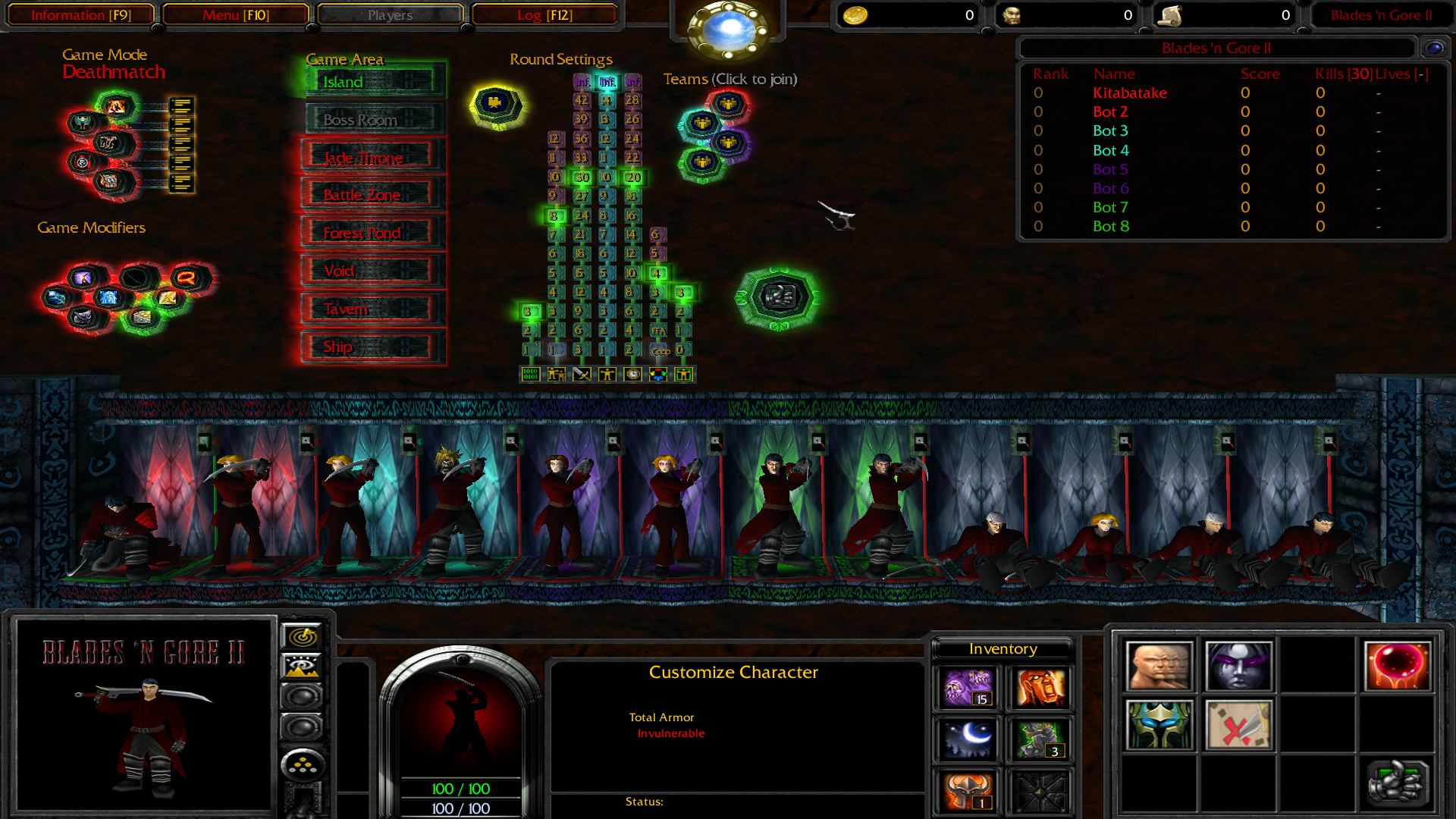
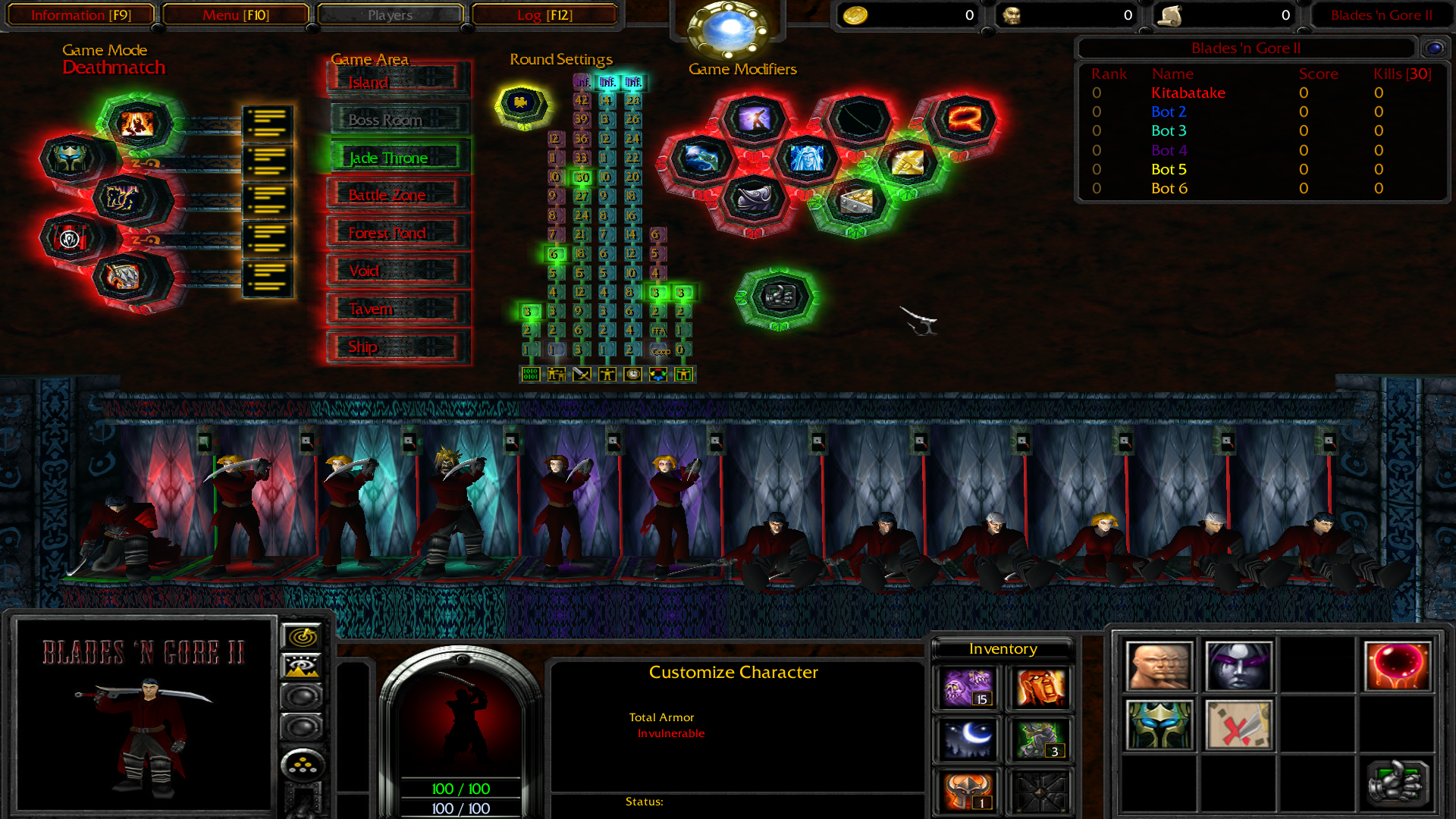
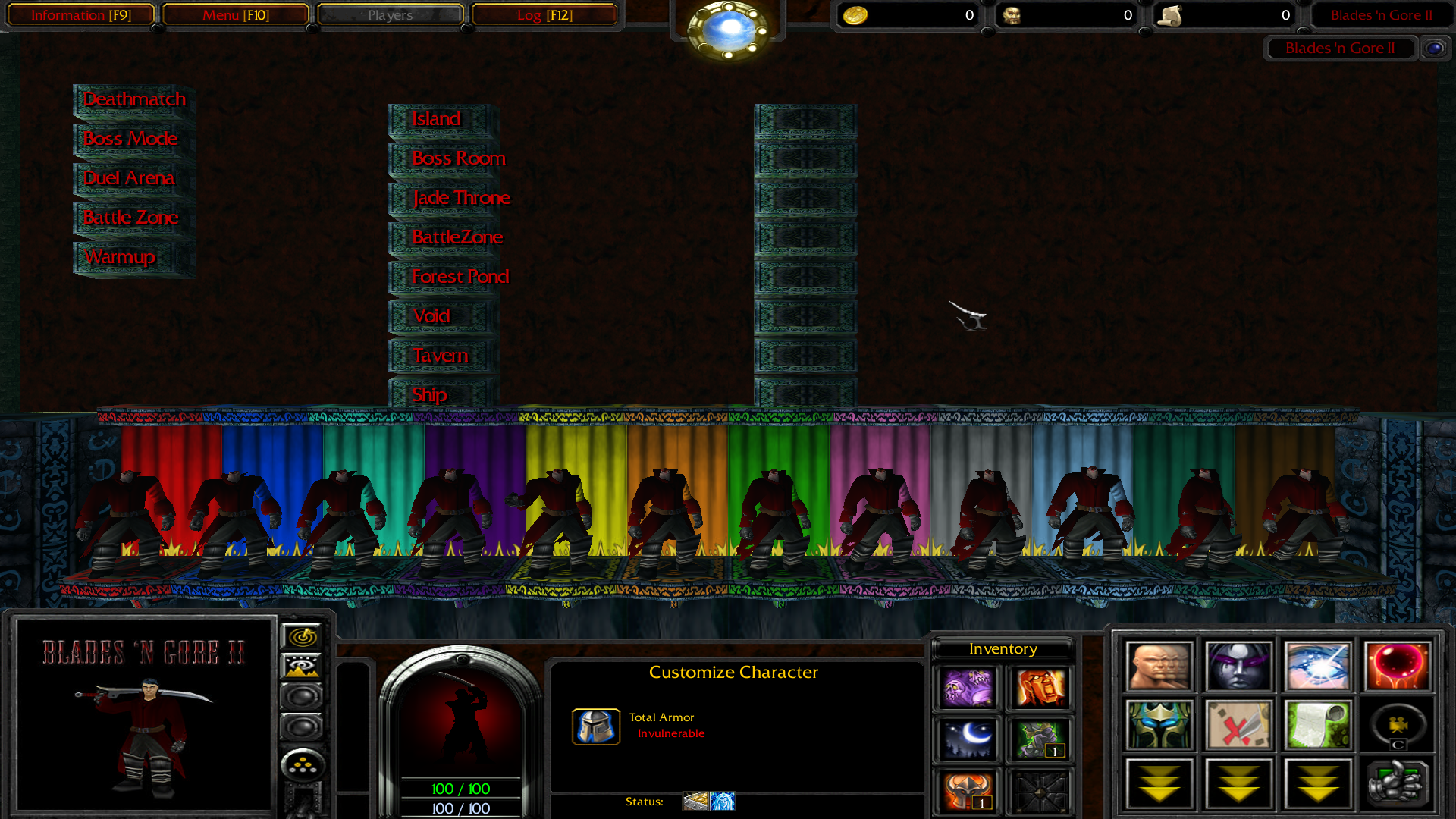
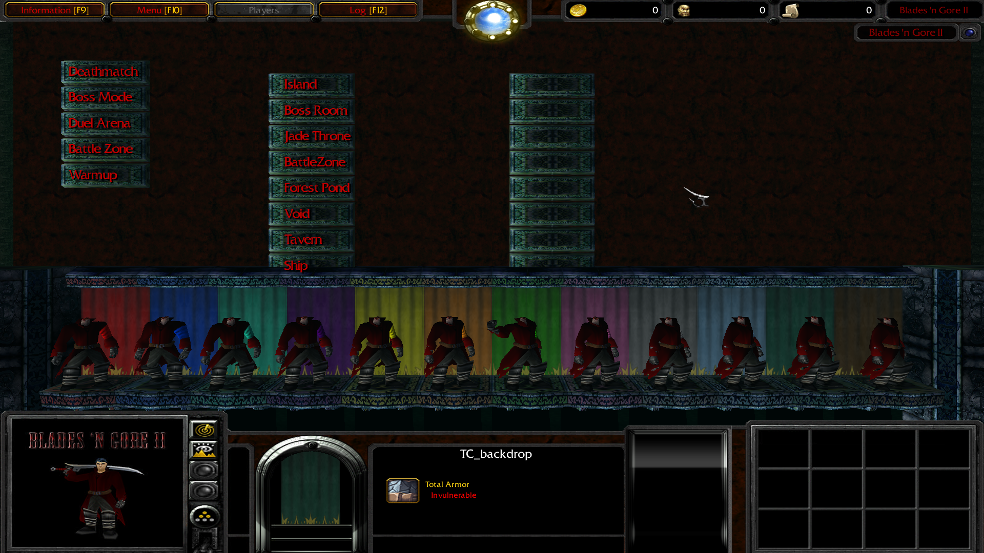
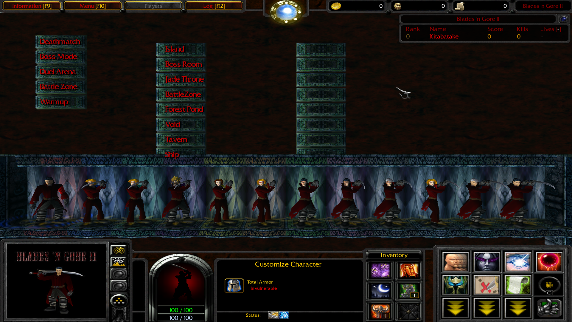
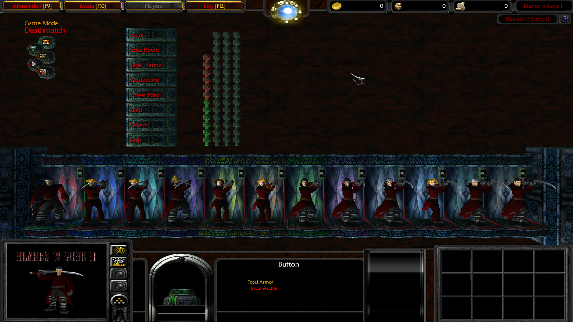
Edit: More progress
 Yes, it's a mess at the moment but you should be able to get the idea.
Note that the whole system is in a very early state; tons of changes will be made.
Also, none of the terrain will be visible once the system is ready.
Got any suggestions/comments/questions regarding the layout and/or elements?
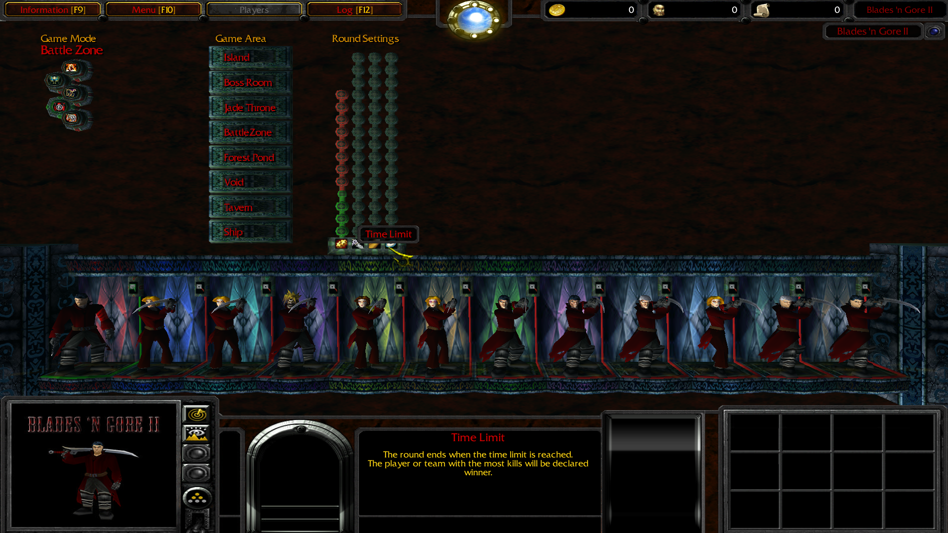
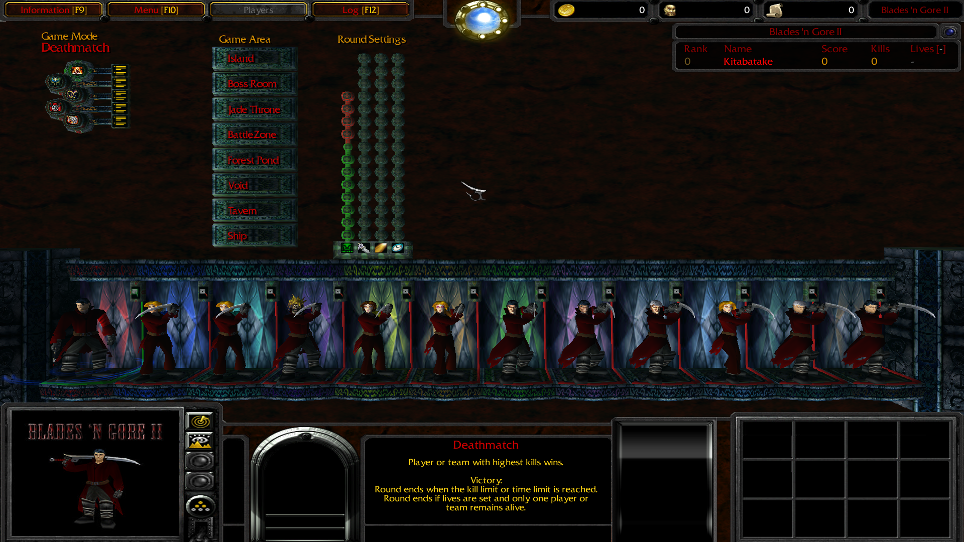
Current progress:
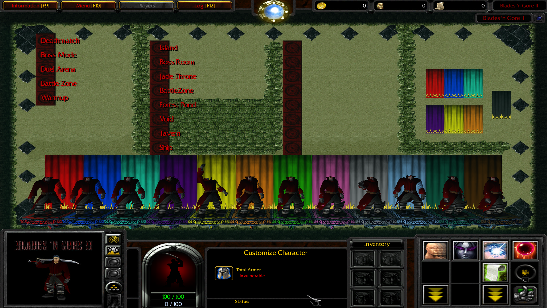
Edit: More progress
|
Note that the whole system is in a very early state; tons of changes will be made.
Also, none of the terrain will be visible once the system is ready.
Got any suggestions/comments/questions regarding the layout and/or elements?
Last edited:


")