• 🏆 Texturing Contest #33 is OPEN! Contestants must re-texture a SD unit model found in-game (Warcraft 3 Classic), recreating the unit into a peaceful NPC version. 🔗Click here to enter!
  • It's time for the first HD Modeling Contest of 2024. Join the theme discussion for Hive's HD Modeling Contest #6! Click here to post your idea!

Texturing Competition #10 - Arcane

Status
Not open for further replies.
Level 34
Joined
May 1, 2008
Messages
3,212
Well, I do think that the previous was kinda bad, and I agree with Hawkwing, those eyes on the face, glowing, are not good without proper partciples... and I lost the ideas what to do next on it (I hope it won't happen on this on :S)

EDIT: Oh yea, and I didn't made a double post, right? I just bumped it, because no one would see if I posted new WIP on the old post... just making the thread alive -,,-
 
Level 34
Joined
May 1, 2008
Messages
3,212
New WIP. I'm still thinking about keeping this cloak that is right now... or should I change it?

...:::NOTE:::...
''Viewer's Fault'' means - that black area on cloak is showed only in Viewer, not ingame or anywhere else
''Model's Fault'' means - that blue thing on her back is because of messed up wrap, back uses wrap from the front part of torso, so it took some part of the cloth too :mad:
 

Attachments

  • wiprc1.jpg
    wiprc1.jpg
    57.9 KB · Views: 311
  • ihasasadhy4.jpg
    ihasasadhy4.jpg
    8.6 KB · Views: 161
Level 34
Joined
May 1, 2008
Messages
3,212
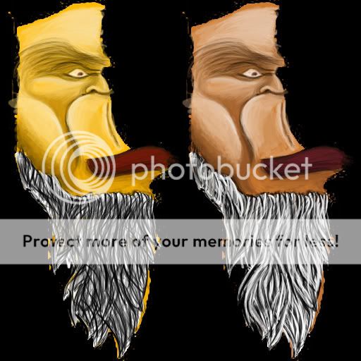
@markone, I know a way how to improve the beard. Start by using some dark gray color (don't use white background for making hair, beard, fur... it's bad) as a background, and to make lines you use some light gray colors, and then lighter, and ligher... until you get white beard, or wanted beard. You don't need dark gray as a background, it can be any color, but too be dark... and so is for the lines you will be makin' on the beard, it's supposed to be the same color as background, but lighter
 
Level 26
Joined
Nov 19, 2007
Messages
1,177
Nearly finished. I also have another version in which pretty much the whole model is plastered with runes. Someone please help me with ideas. The whole model can't be alphaed, and the helmet's pretty horrid. Also, the black bits of the face don't seem to be editable in the portrait.
 

Attachments

  • Revenant.png
    Revenant.png
    360.7 KB · Views: 303
Level 34
Joined
May 1, 2008
Messages
3,212
I am also nearly finished, I just have to fix the stuff that's not good... About your's Ike, it's very good! But there's one thing... one thing that's weird to me. You skin looks like it's made in Dionesiist's style, I don't know... that's just how it reminds me of... I'm not saying that Dio made this!!! I repeat, I'm not saying that Dio made this, I just said it looks familiar to Dio's style, which isn't bad, at all. That's it...

Oh, and about my skin, how should I fix it and improve it?
 

Attachments

  • WIP.JPG
    WIP.JPG
    55.7 KB · Views: 3,630
@FrIkY thx for advice, i already fixed before i read your advice, but i will have it on mind if i need to do it again or some other beard :D

i also changed saturation to match skin color
head.jpg

It's much better. But you can't have that amount of contrast between each strand of hair. Instead of using a black use a dark/medium gray.
 
ike_ike: That looks very nice indeed.

FrIkY: Since the Sorceress model has on odd wrap proportions on the legs, why not draw a knee on the end of the naked leg part.
Otherwise, It looks great. Too bad the model's wrap on the back fudges it up.

markone: The new one looks much better than the old one, and I look forward for future progress.
 

A.R.

Skin Reviewer
Level 25
Joined
Mar 12, 2008
Messages
347
Friky: The problem with her chest area is in the lighting. For a start, the area directly
under and between her breasts shouldn't be the same lightness as above them.
Emphasising the area between the bottom of her ribcage and her stomach area wouldn't
hurt either.
Dusk is right about the contrast, making a clear distinction between the borders and the
cloth colourwise would help immensely. I also think the metal and gem areas seem a little
blurry. If you haven't already, try sharpening the texture and see if that helps. The
cloak-thingy at the back is a bit boring, it could use some kind of design or something,
at least it's not a big ol' smudgeblob like it was before.

So yeah, more contrast and a little more detail and you'll be fine.
 
Level 34
Joined
May 1, 2008
Messages
3,212
Whoa, I didn't know it sucks that much... well, ok I'll try to fix the skin, thanks for the great advice A.R., I appreciate it ^^

EDIT: ok, I made some changes... boob area and that stuff, I hope I fixed it and I sharpened it as A.R. suggested I should
sorceressvh7.png

And use this rar file, to see the work by yourself, better. Inside is the skin and the model, so you can see it by yourself in the Viewer
 

Attachments

  • ArcaneSorceress.rar
    151.4 KB · Views: 85
Level 34
Joined
May 1, 2008
Messages
3,212
I think this is it, my final submission, I think it's all done now and ready to go! :grin:

arcanesorceressst4.png


Here's the skin View attachment Sorceress.blp and here's the model + skin View attachment ArcaneSorceress.rar, don't forget to test it ingame! ^^ (and don't judge it by the screenshot, you should see the skin first and how the skin looks ingame... thanks!)
 
Last edited:
Status
Not open for further replies.
Top