• 🏆 Texturing Contest #33 is OPEN! Contestants must re-texture a SD unit model found in-game (Warcraft 3 Classic), recreating the unit into a peaceful NPC version. 🔗Click here to enter!
  • It's time for the first HD Modeling Contest of 2024. Join the theme discussion for Hive's HD Modeling Contest #6! Click here to post your idea!

Phoenix Trial #2 - Power of Command

Status
Not open for further replies.
  • l0w_kwaliti
    • The move doesn't really like a move icon
    • The cancel one is a bit too thin, maybe make the red thicker? (especially on the right)
    • The skills one looks a bit messy, I can't see where the fingers are
    • The hold position, again, doesn't really look like a hold position icon
    • Maybe add a bit of shading on that arrow in the patrol one
    Other than that they look very nice.​
  • Chaos Overlord - needs more bones, blood, etc. It's not very undead, just very dusty at the moment.
 
Level 13
Joined
Aug 31, 2005
Messages
823
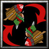
lol Pyrite, thats what I did, except with gobbies.

Edit: If you cant tell what command this is then I've failed as an icon artist
 

Attachments

  • PatrolSize.jpg
    PatrolSize.jpg
    22.3 KB · Views: 156
  • Patrol.jpg
    Patrol.jpg
    39.4 KB · Views: 135
So you have medivial themed things I am guessing? They look nice.

btnstopsz3.png


Here is the hand I have drawn out for my stop... don't know why you want to see it but you do. It is supposed to be an undead hand... thats why it is grey. Now I have no clue what to do with it. Any ideas? Some basic shading on the knuckles and palms...

Make it rotten, sharpen it like nuts, and then at sharpened points, change color
 
lol Pyrite, thats what I did, except with gobbies.

Edit: If you cant tell what command this is then I've failed as an icon artist

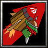
In the resized one it's hard to tell that those are goblins riding the rocket and not green blobs, maybe add more detail there?

As for me, it's the move icon next! Leafy!
 
Level 13
Joined
Aug 31, 2005
Messages
823
Thanks Pyritie. I'll try to sharpen it up. Just finished my move icon. Used the same graphic.

Here is the hand I have drawn out for my stop... don't know why you want to see it but you do. It is supposed to be an undead hand... thats why it is grey. Now I have no clue what to do with it. Any ideas? Some basic shading on the knuckles and palms...

If you make the edges more jagged and color with a decayd style (rough fading) it would look better. Might want to show a bone through the palm or something too, maybe cut off a finger lol.
 

Attachments

  • Move.jpg
    Move.jpg
    39.3 KB · Views: 97
  • MoveSized.jpg
    MoveSized.jpg
    22.2 KB · Views: 159
Level 12
Joined
Feb 1, 2007
Messages
1,092
Thanks for all the great ideas! I am going through it again to make it look undeadish now. I like the bone idea and I am working on it now... pics coming soon.

btnstopjz8.png


EDIT: Here it is now with some more blood, bones ect.. I had funw ith the blood. Lawl I was feeling my own hand trying to fidn where the bones and veins were. Overall, it looks pretty ok now. SOmething is required in the background though, and I forgot to make my hand on a new layer, so I am going to have fun with that.... (sarcasm)

So how does it look now. Too busy you think?
 
btnskillzyb8.png

Early WIP of Skillz, my second icon ever. I think it is cool, except for the hand. Hand was so hard to do... =/. Still needs all its gore and stuff I will work on it soon but how does it look over all?

When I first saw it I thought it was a torch pedestal.

Maybe make the fire float a little above the hand? I think that would hurt a bit...

And l0w_kwaliti, good improvements! :grin:

Yay 500th post! ^_^
 
Level 3
Joined
Apr 1, 2005
Messages
53
Now, I think I never try do draw people by hand in photoshop.
My Attack Icon.
 

Attachments

  • BTNAttackMedievalGore.jpg
    BTNAttackMedievalGore.jpg
    18.7 KB · Views: 269
Level 32
Joined
Oct 23, 2006
Messages
5,291
So Far, So Good

THe WIPs look good so far, gang.

RedBlade & all compeditors: please remember these important technial details.
  • Active and disabled versions of all icons are required.

  • Blizzard icon naming conventions must be followed: BTNAttack*.blp etc.
    • Example: DISBTNHoldPositionBlackDoom.blp
The correct borders for active and disabled icons are critical. For example:

BTNHoldPositionSpell.jpg
Has the proper active border.

PASBTNHoldPositionSpell.jpg
The active border is still partially visible on the disabled icon.


Let's look at a top-flight icon for comparison purposes:

BTNHeroGnollSlicer.blp

DISBTNHeroGnollSlicer.blp

Notice the differences?
  1. No border whatsoever is visible on the disabled version.

  2. The disabled icon has the correct naming convention for its purpose: DISBTN*.blp

Good luck & have fun!
 
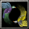
So does the patrol one look better with the color variance?

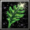
Here's my next one. It was intended to be a "Move" icon, but it turned out being more like a "Stop". I think "Move" should be more of a pointy leaf.

I might add some sparkles here and there, for that added touch.


EDIT: Added sparklies. Now it looks like a skills button >_<

Does it look more like a stop icon with or without the sparklies?
 

Attachments

  • Stop Leaf.jpg
    Stop Leaf.jpg
    266.2 KB · Views: 65
  • Stop Leaf2.jpg
    Stop Leaf2.jpg
    188.7 KB · Views: 98
  • Stop Leaf copy.jpg
    Stop Leaf copy.jpg
    27.4 KB · Views: 210
  • Stop Leaf copy2.jpg
    Stop Leaf copy2.jpg
    25.5 KB · Views: 237

Deleted member 126647

D

Deleted member 126647

Well it would look ridiculous to have the attack one a sword, the move one a sneaker, the stop one a stop sign and then hold position one a bird in a cage right?

I mean part of making them look good is making them look good as a set. At least that's how I would judge my favorites.
 
Level 8
Joined
Sep 13, 2006
Messages
431
And does anyone like the recolored patrol one? :bored:

I rather like it. Interesting idea, with the birds...

I'll have to see if I have time for this competition, but I'll get started on some ideas. Everything is looking pretty good so far, guys; just keep up the good work....


EDIT: Okay, so, ideas (just for bookkeeping purposes so that I can't be accused of copying if someone else uses the ideas before I post the icons)

Theme: Spells/Casting
Attack: Lightning shocky thingy (really vague, I know)
Attack Ground: Arrow pointing to scorched earth, magic seeping from cracks in ground
Stop: Wall of fire with silouette of person behind wall
Hold Position: Boot rooted to ground/boot petrified to ground/guy encased in stone up to neck
Patrol: Two hands channeling magic, little sparkly things surrounding the hands, etc.
Other icon ideas yet to be determined....
 
Last edited:
AAAAH! I can't think of anything for Hold Position, than my lame 3 shields and 3 swords! GRAAAH!

EDIT: I GOT IT! A guy behind a Shield! Although it may look like defend.....

EDIT 2: Maybe 2 arms in a blocking position, the shield stuff looks like defend

EDIT 3: Both ideas are lame, back to the drawing board

EDIT 4: Oh, well, it looks like my old Hold position will have to do the trick, GO SHIELDS AND SWORDS! :grin:
 
Last edited:
Status
Not open for further replies.
Top