Community
Projects
Maps
Tutorials
Gallery
Support Us
Install the app
How to install the app on iOS
Follow along with the video below to see how to install our site as a web app on your home screen.
Note: This feature may not be available in some browsers.
-
Listen to a special audio message from Bill Roper to the Hive Workshop community (Bill is a former Vice President of Blizzard Entertainment, Producer, Designer, Musician, Voice Actor) 🔗Click here to hear his message!
-
Read Evilhog's interview with Gregory Alper, the original composer of the music for WarCraft: Orcs & Humans 🔗Click here to read the full interview.
-
The Hive's 22nd Icon Contest: Creep Abilities is now concluded, time to vote for your favourite set of icons! Click here to vote!
-
✅ The POLL for Hive's Texturing Contest #34 is OPEN! Vote for the TOP 3 SKINS! 🔗Click here to cast your vote!
-
✅ The POLL for Hive's Techtree Contest #20 is OPEN! Vote for the TOP 3 FACTIONS! 🔗Click here to cast your vote!
You are using an out of date browser. It may not display this or other websites correctly.
You should upgrade or use an alternative browser.
You should upgrade or use an alternative browser.
[Role Playing Game] Acheron
- Status
- Not open for further replies.

- Joined
- Mar 29, 2011
- Messages
- 2,601
3.It's because of the water model he use. It's really like that. And I think it's ashes or sulfur, not snow.
I'd also like to say that this water is not very fitting, I mean how can there even be white reflections on it? Those white stripes, there is no sunlight in Underworld. APProject you should use lava model with transparency.

Edit: I found the error in the code, -_- it was the "\". Anyway, it should be fixed. Sorry for any inconveniences. Download again to test it out...
Last edited:
- Joined
- Jun 27, 2008
- Messages
- 2,557


I tried looking for that registry, but I could not find it. Could you be more specific on how to find HKEY_CURRENT_USER?
As for the camera, I think your system of camera rotation and mouse wheel adjustment may provide that experience of exploration around the area.")
Shading is a big problem in WC3, it is never perfect and with defects. Rock spire is like that because the light source is close to it and with direct angle of attack. Jagged connection to the ground can be fixed, but being jaggy looks natural as if it would be in reality, it is shading that makes it a very rough connection. And yeah, it is water plates connection points, it is extremely difficult to make it merge perfectly, it is usually slightly on top of each other and if not, gap appears, but it can be reduced to minimum.
Simply this water plate model is HQ and realistic, that is why I picked it. It does give a feeling of water, when other plates are terrible. This part of the river is but a transition from the Blue - ghostly Marsh to the river of Fire, it would look very bad if it immediately jumped into lava, so I need a smooth transition, so water model must maintain its properties, just to change color beneath it. It may not be very visible, but there is a red water plate model far beneath, it may emerge more when crossing Tartarus, there will be more visuals as this is but a smooth transition.
As for the camera, I think your system of camera rotation and mouse wheel adjustment may provide that experience of exploration around the area.
Shading is a big problem in WC3, it is never perfect and with defects. Rock spire is like that because the light source is close to it and with direct angle of attack. Jagged connection to the ground can be fixed, but being jaggy looks natural as if it would be in reality, it is shading that makes it a very rough connection. And yeah, it is water plates connection points, it is extremely difficult to make it merge perfectly, it is usually slightly on top of each other and if not, gap appears, but it can be reduced to minimum.
Simply this water plate model is HQ and realistic, that is why I picked it. It does give a feeling of water, when other plates are terrible. This part of the river is but a transition from the Blue - ghostly Marsh to the river of Fire, it would look very bad if it immediately jumped into lava, so I need a smooth transition, so water model must maintain its properties, just to change color beneath it. It may not be very visible, but there is a red water plate model far beneath, it may emerge more when crossing Tartarus, there will be more visuals as this is but a smooth transition.
- Joined
- Mar 29, 2011
- Messages
- 2,601
I tried looking for that registry, but I could not find it. Could you be more specific on how to find HKEY_CURRENT_USER?
As for the camera, I think your system of camera rotation and mouse wheel adjustment may provide that experience of exploration around the area.
Shading is a big problem in WC3, it is never perfect and with defects. Rock spire is like that because the light source is close to it and with direct angle of attack. Jagged connection to the ground can be fixed, but being jaggy looks natural as if it would be in reality, it is shading that makes it a very rough connection. And yeah, it is water plates connection points, it is extremely difficult to make it merge perfectly, it is usually slightly on top of each other and if not, gap appears, but it can be reduced to minimum.
Simply this water plate model is HQ and realistic, that is why I picked it. It does give a feeling of water, when other plates are terrible. This part of the river is but a transition from the Blue - ghostly Marsh to the river of Fire, it would look very bad if it immediately jumped into lava, so I need a smooth transition, so water model must maintain its properties, just to change color beneath it. It may not be very visible, but there is a red water plate model far beneath, it may emerge more when crossing Tartarus, there will be more visuals as this is but a smooth transition.
Try downloading it again. But the water has white light reflections, there are no white lights in the area.
Last edited:
Zwiebelchen
Hosted Project GR
- Joined
- Sep 17, 2009
- Messages
- 7,234
I was just joking when asking for a release date. I know that you can not possibly predict whenever something will be finished without blatantly lying before at least 90% of the map is done.@Zwiebelchen
Much left to be done, I am roughly at 30% progress right now, hehe. So I hope to have it done in the end of this year if I am lucky, if not, early next year. You know all about it, human beings are terrible at planning, let alone predicting future.
")
Especially if you are mostly working on your own...
But I like to make up completely unrealistic release dates to keep players on track. ;D
Holy shit!EDIT: Just the beginning of river Phlegethon, river of fire.
I actually like the fact that you did not use Lava. Gives a creepy unique look, with water that is clear and inviting in itself, but illuminated by the red lighting in the area.
Lava is boring and over-used if you ask me. I'd stick with that for the theme of the area. I like that mixed color palette of red and purple on the water.
I always hope that at some point in future, we can do a collaboration on a project. You'll do the terraining, I'll make up the release dates.

- Joined
- Nov 17, 2010
- Messages
- 1,266
I completely agree with Zwiebelchen. The river is masterfully done. I've never seen someone come up with so many unique ideas for their terrains. Inspiration abounds.
- Joined
- Mar 29, 2011
- Messages
- 2,601
Has anyone tested out executable yet? I want to know if it works.
- Joined
- Jun 27, 2008
- Messages
- 2,557
@A Void
It does not have a sun indeed so reflections does not make any sense, but there is a certain light source in this area, because all is not pitch black as it was in the dungeon area, therefore those reflections are not brightly white, but pale dark and in this case - almost red / pink from the light that is emitted from beneath the surface. Probably not logically possible, but let's consider that reflections are created from the light that is streamed from the deeps, because the water is quite bright itself compared to the ground just because of light sources below. But thank you for your input and criticism, it always helps.
Exe remains bugged for me. It would be cool if someone else tried it.
@Zwiebelchen
Yeah, predicting the release is complicated, but it can be determined roughtly by saying which year, hehe. Well this time I am not alone, I do have a companion, Molaf, he helps a lot with the storyline and quest ideas, with his input everything works faster, because I do not need to think a lot about the quests, but to adapt his good ideas to the gameplay. I used to think that teamwork is not for me, but it all depends on the team after all.
Thanks. I agree that this way of stacking 5-6 layers of different doodads to get a completely new look of the water is better than a regular lava. I expect to bring even more visuals when crossing Tartarus, this is but scratching the surface.
Sure, let's get on something in the future, but only if you allow 200 MB map size, hehe.
@Veritas
Thank you very much, I hope to bring even better terrain in the future.
- Joined
- Dec 3, 2011
- Messages
- 366
Has anyone tested out executable yet? I want to know if it works.
Just cant run exe LOL.
- Joined
- Mar 29, 2011
- Messages
- 2,601
Just cant run exe LOL.
Uh what? IT works for ME personally, but I need people to test it out. For Approject it doesn't work for some oblivious reason...
- Joined
- Oct 12, 2011
- Messages
- 3,450


Would be cool if this map is going to be multiplayer.
I played your Iceborn several times already, and here is my thought (hoping you can improve this project from my thought, but it's optional tho):
It's too hard. Let's say, it's impossible to beat the game without reading your walkthrough (which reveals most of secret /items/), and without those secrets, again, it's impossible to beat the game. Even with those secrets it's still damn hard (but I personally love this!). My suggestion is, those secrets should be optional, the game must be fully "beatable" without knowing those secrets, but by knowing those, the game would be easier. The same thing applies to optional quests, optional quests should be optional, but in Iceborn, some optional Quests worth some crucial rewards, without doing the quests you will probably fail in the end, means you "have" to do the quest like it or not.
- Joined
- Jun 27, 2008
- Messages
- 2,557
@btdonald
Have you tried the exe?
@Quilnez
I completely agree with you and that is exactly the main mistake of Iceborn. I had this issue in mind since the start of this project and I will make sure to do things as you just noted. Optional quests will be optional for sure and secrets / puzzles will be skippable, so no more deadends. There will be 3 difficulty levels, so the more difficult level, the more you must complete / reveal in order to succeed, and as for the easiest mode, you may be able to skip up to at leat 50-60%, where in Iceborn you can skip 0%, hehe. This mistake is well taken and you are right, I will try to fix it this time.
- Joined
- Dec 3, 2011
- Messages
- 366
@btdonald
Have you tried the exe?
Yes, in my old computer, the problem came from war3 registry @@
- Joined
- Mar 29, 2011
- Messages
- 2,601
Yes, in my old computer, the problem came from war3 registry @@
what kind of problem, what did it wrote?
- Joined
- Dec 3, 2011
- Messages
- 366
what kind of problem, what did it wrote?
I'll take a picture and give you when I come back home LOL.
I'm re-downloading on my Laptop, wait for what will happen @@
- Joined
- Dec 3, 2011
- Messages
- 366
Here is clip @@
- Joined
- Mar 29, 2011
- Messages
- 2,601
Maybe It can't find your registry keys? Did you install Warcraft 3 normally or a.. pirated installer? There could also be that your registry value writes a path that no longer contains Warcraft 3, if you moved your Warcraft 3 folder somewhere else.
You can fix your Warcraft 3 installation, here. It is a very easy online tool, it generates a new Warcraft 3 registry file based on your selected options.
Once you have done that, launch the .exe again.
You can fix your Warcraft 3 installation, here. It is a very easy online tool, it generates a new Warcraft 3 registry file based on your selected options.
Once you have done that, launch the .exe again.
Zwiebelchen
Hosted Project GR
- Joined
- Sep 17, 2009
- Messages
- 7,234
I was thinking more of something like a co-op style map with a final-fantasy esque battle system. But I guess 200MB isn't an option there either...Sure, let's get on something in the future, but only if you allow 200 MB map size, hehe.
Learn to work with constraints, man! ;P
- Joined
- Mar 29, 2011
- Messages
- 2,601
I was thinking more of something like a co-op style map with a final-fantasy esque battle system. But I guess 200MB isn't an option there either...
Learn to work with constraints, man! ;P
Creativity can never be limited. Multi-player can be achieved via 8 MB limit by-passer.
- Joined
- Jun 27, 2008
- Messages
- 2,557
Well, if I still would be working with constraints, I would have never reached a Director's Cut and I would have quitted WC3 modding and mapping several years ago.
Coding is fun and it is the most important part of the game, but no one ever can rely solely on coding to guarantee a great game, therefore one must use all possible weapons and get the best possible outcome, this includes HQ models, textures, voice acting, music, sound effects and it all of course comes with a cost. Put all of this along side of great coding that you may provide, and you will get truly the best outcome.
But I myself do not follow this completely, if I did, I would use vJass, and now it is just GUI, I guess that's my weak link.
I mean come on, it is 2015 and for some reason 8 MBs still becomes a limit, they should change it.
Zwiebelchen
Hosted Project GR
- Joined
- Sep 17, 2009
- Messages
- 7,234
I learned working with the constraints and I view them as actually beneficial for my creativity. It basicly challenges you to find workarounds and alternate solutions for stuff you simply can not allow for in terms of filesize.Well, if I still would be working with constraints, I would have never reached a Director's Cut and I would have quitted WC3 modding and mapping several years ago.
Coding is fun and it is the most important part of the game, but no one ever can rely solely on coding to guarantee a great game, therefore one must use all possible weapons and get the best possible outcome, this includes HQ models, textures, voice acting, music, sound effects and it all of course comes with a cost. Put all of this along side of great coding that you may provide, and you will get truly the best outcome.
But I myself do not follow this completely, if I did, I would use vJass, and now it is just GUI, I guess that's my weak link.
I mean come on, it is 2015 and for some reason 8 MBs still becomes a limit, they should change it.
Just think of landscaping via doodad-art, for example; Instead of importing an entire model for a bridge, you can build it up manually with basic components. Also, adding more variety to existing creep models through weapon and armor attachments, etc.
Some of the greatest features of Gaias spawned from the limited filesize:
I wanted to be able to exchange body textures for characters, instead of just attachment models; but since textures take such a high amount of space, I actually had to re-wrap all the models so that I can use a low resolution texture without a noticable loss of quality - which resulted in an overall much better looking wrap - and easier skin design aswell.
Ironically, what I am missing the most in my map through the 8MB limit are not even the custom creep models; it is the custom icons. It's amazing how much custom icons contribute to the look and feel of a map.
Maybe we will hear something from the "Blizzard classic game team" soon and they extend the limit...
I feel that 16-20MB would be the "magic number" in which design freedom would truly get an enormous boost, but still maps would be within a reasonable scope.
- Joined
- Oct 12, 2011
- Messages
- 3,450
This. It's really fun to work things around. It usually leads you to some cool tricks you can do in wc3.I learned working with the constraints and I view them as actually beneficial for my creativity. It basicly challenges you to find workarounds and alternate solutions for stuff you simply can not allow for in terms of filesize.
But I'm not against AP either. Great and fresh visual must be your main weapon. We are in 2015 now, Game Industries fight to reach greater graphic and they don't care about their games' sizes. Struggling around the limit is not what they are doing now.
- Joined
- Jun 27, 2008
- Messages
- 2,557
I agree that constraints force one to look more deeply in what you have and come up with more creative solutions, there is no doubt about that. But in the end-result you are still stuck with standard, low quality, edgy, poor texture models for units / doodads, same goes for music and as you mentioned - icons. No matter how creative you will get, you are still stuck with the same level of material for your creation, which is still not good no matter how it force you to be creative.
Almost always (from what I have seen in competinions of terraining for example), no matter how creative you get with poor materials, someone still gets a better end result with even less effort, but using HQ material. People may understand that you worked harder to get it, but it still won't be as good looking as the faster / easier version, but HQ one.
You mentioned building with bits and pieces. Let's say you are building a castle. Your brick is poor quality, low texture, edgy, but you manage to build a really cool castle. Now open import manager and import HQ looking brick and replace the model with the imported one. The result becomes several times better, therefore constraints are not needed to be creative, because you can force yourself to be creative even with the HQ material. You appear in the same situation, but with better material. Look at my example of building the river, I could rely on a HQ water plane alone, it would look good already and probably better than any constrained creation, but I did not rely on that, so I built up to 6 layers of different doodads to get even better result of the river. So I forced creativity as well, but the difference was that I used HQ material instead of LQ.
In the end no matter how free one tries so be, one is still constrained with what one has in the hands at the moment, so I believe striving for creativity with the best materials one has is the best option. I agree with Quilnez.
As for the limitation of maps, 20 MBs would be a vast leap forward and it would open lots of possibilities. Imagine Gaias +12 MBs of freedom considering the level of compression you already achieved in those 8 MBs.
Zwiebelchen
Hosted Project GR
- Joined
- Sep 17, 2009
- Messages
- 7,234
Yeah I totally understand where you're coming from.I agree that constraints force one to look more deeply in what you have and come up with more creative solutions, there is no doubt about that. But in the end-result you are still stuck with standard, low quality, edgy, poor texture models for units / doodads, same goes for music and as you mentioned - icons. No matter how creative you will get, you are still stuck with the same level of material for your creation, which is still not good no matter how it force you to be creative.
Almost always (from what I have seen in competinions of terraining for example), no matter how creative you get with poor materials, someone still gets a better end result with even less effort, but using HQ material. People may understand that you worked harder to get it, but it still won't be as good looking as the faster / easier version, but HQ one.
You mentioned building with bits and pieces. Let's say you are building a castle. Your brick is poor quality, low texture, edgy, but you manage to build a really cool castle. Now open import manager and import HQ looking brick and replace the model with the imported one. The result becomes several times better, therefore constraints are not needed to be creative, because you can force yourself to be creative even with the HQ material. You appear in the same situation, but with better material. Look at my example of building the river, I could rely on a HQ water plane alone, it would look good already and probably better than any constrained creation, but I did not rely on that, so I built up to 6 layers of different doodads to get even better result of the river. So I forced creativity as well, but the difference was that I used HQ material instead of LQ.
In the end no matter how free one tries so be, one is still constrained with what one has in the hands at the moment, so I believe striving for creativity with the best materials one has is the best option. I agree with Quilnez.
As for the limitation of maps, 20 MBs would be a vast leap forward and it would open lots of possibilities. Imagine Gaias +12 MBs of freedom considering the level of compression you already achieved in those 8 MBs.
Obviously, being able to import higher quality textures alone is already a huge benefit (It's a shame that we can't have 1024x1024 ground tile textures, though). In one of the recent projects in Gaias, I wanted to get rid of the lowres B²M house models and replace them completely with the Sword & Stone set, which has been optimized for low filesize (but high texture resolution through tiling)... but considering all the houses on the map, this is a monumental, nigh impossible task.
I wish I could just drop in the higher resolution textures and be done with it, but the file size limit won't really let me.
However, there is a different option: re-wrapping the houses in a modeller into a stronger tiled look. You see, and this is exactly what I was talking about: you'll always find a solution if you keep searching for it...
But yeah; I can't even start to think what would be possible if I suddenly had 12 Megabytes more of space. Custom interface; custom icons, more animations for characters, more of everything....
I really hope Blizzard will show some love to WC3 again soon.
- Joined
- Mar 29, 2011
- Messages
- 2,601
Yeah I totally understand where you're coming from.
Obviously, being able to import higher quality textures alone is already a huge benefit (It's a shame that we can't have 1024x1024 ground tile textures, though). In one of the recent projects in Gaias, I wanted to get rid of the lowres B²M house models and replace them completely with the Sword & Stone set, which has been optimized for low filesize (but high texture resolution through tiling)... but considering all the houses on the map, this is a monumental, nigh impossible task.
I wish I could just drop in the higher resolution textures and be done with it, but the file size limit won't really let me.
However, there is a different option: re-wrapping the houses in a modeller into a stronger tiled look. You see, and this is exactly what I was talking about: you'll always find a solution if you keep searching for it...
But yeah; I can't even start to think what would be possible if I suddenly had 12 Megabytes more of space. Custom interface; custom icons, more animations for characters, more of everything....
I really hope Blizzard will show some love to WC3 again soon.
Well, 8 MB limit was created to limit download bandwidth to the servers and users. If map was 200 MB it would take ages to download via Battle.Net service, it just isn't practical.
There are already several ways of bypassing the limit:
1. 8 MB Map Size Limit Bypasser. But the downside is that the host and joining players must have the same tool.
2. You can use a hosting bot called - GHost, it can start maps beyond 8 MB regardless of the host. GHost is a very popular bot that is used almost in every hosted game in Battle.Net.
3. EntGaming, map hosting limit is 12 MB or higher.
Zwiebelchen
Hosted Project GR
- Joined
- Sep 17, 2009
- Messages
- 7,234
Well, 8 MB limit was created to limit download bandwidth to the servers and users. If map was 200 MB it would take ages to download via Battle.Net service, it just isn't practical.
There are already several ways of bypassing the limit:
1. 8 MB Map Size Limit Bypasser. But the downside is that the host and joining players must have the same tool.
2. You can use a hosting bot called - GHost, it can start maps beyond 8 MB regardless of the host. GHost is a very popular bot that is used almost in every hosted game in Battle.Net.
3. EntGaming, map hosting limit is 12 MB or higher.
I didn't know that GHost can start games beyond the 8MB limit. That might actually be great, as almost all games are hosted via GHost nowadays. The problem would be with LAN games, though. And a lot of people still play games via LAN, so still not really the ideal solution.
- Joined
- Jun 27, 2008
- Messages
- 2,557
And that is why I really dislike constraints, it kills all the fun, it kills the progress, it stops the best possible outcome, and without it, one's outcome will not improve if it won't get to the max. Getting bored of what already is at hand is an amazing thing that force people to more forward I suppose. For that reason I never developed any LAN map.I wish I could just drop in the higher resolution textures and be done with it, but the file size limit won't really let me.
There might be ways to enhance the looks, but it stills bumps into a limitation of how much it can be enhanced. Some models almost can not be really re-wrapped into better, and in the end you might still get stuck with the model itself, that is flat-sided and edgy.
But yeah, there are ways, but most of the time it simply require too much effort to deal with and one hardly can afford that, for example, building HQ terrain where objects are but many small LQ doodads put into one. I know it sounds irrelevant to say such thing, time is subjective, but I simply see no examples of this phenomenon in the map section to support that, it is extremely rare.
Having certain programs to do the job is not ideal indeed, because the majority of players who will download that will have no clue about those, even if you tell them that there is a way, but one must deal with it himself, still a big percentage of players won't get to play, lazyness I suppose. Thay might get scared that something needs to be done before playing. (just a part of players of course)
Thank you very much, that is my current aim, I am seeking for another Cut and I hope to achieve it, one day in the distant future I hope.If i were to vote on the very tough decision on who is the first WC3 mapper to win two director's cut (because all of them are awesome) my vote is yours AProject.
Good luck on Acheron's Affliction!
- Joined
- Jun 27, 2008
- Messages
- 2,557
Hey.
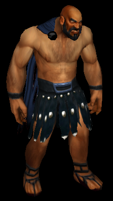
I need your help, guys. What do you think about this model as a base hero model? I decided to remake the model itself into more fitting one. I will also be remaking COMPLETELY armor and weapons, because currently I used WoW armor which is far from Greek. So I am getting some HQ spartan helmets and so on, same goes with weapons. This guy is naked because I will be applying various attachments to head, chest, shoulders, both hands, feet, forearms. So this is a start model. The problem I think is the cape, should it be red? It looks really like a Spartan ripoff, what do you think? Also that hunched back looks odd. Any suggestions? I feel kind of lost, hehe.
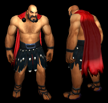
EDIT: I just tried dark blue cape with some holes in it, it looks a bit better.
I need your help, guys. What do you think about this model as a base hero model? I decided to remake the model itself into more fitting one. I will also be remaking COMPLETELY armor and weapons, because currently I used WoW armor which is far from Greek. So I am getting some HQ spartan helmets and so on, same goes with weapons. This guy is naked because I will be applying various attachments to head, chest, shoulders, both hands, feet, forearms. So this is a start model. The problem I think is the cape, should it be red? It looks really like a Spartan ripoff, what do you think? Also that hunched back looks odd. Any suggestions? I feel kind of lost, hehe.
EDIT: I just tried dark blue cape with some holes in it, it looks a bit better.
- Joined
- Aug 1, 2013
- Messages
- 4,658
Cape not replaceable?
If so, remove cape.
Naked model does not have a cape
But that is your call.
Cape could be teamcolored but red seems fine.
Blue could do it as well but yea,
If so, remove cape.
Naked model does not have a cape
But that is your call.
Cape could be teamcolored
but red seems fine.Blue could do it as well but yea,
Zwiebelchen
Hosted Project GR
- Joined
- Sep 17, 2009
- Messages
- 7,234
Don't remove the hunchback! It will make him look like any generic warrior, which would be a shame.
I feel this grants him that 'cynical angry old magnificent bastard' look. Kind of like Bronn from Game of Thrones.
Also, the red cape is cool. But why not make it teamcolored? Then you have the option to change the color based on whatever armor he is wearing.
I feel this grants him that 'cynical angry old magnificent bastard' look. Kind of like Bronn from Game of Thrones.
Also, the red cape is cool. But why not make it teamcolored? Then you have the option to change the color based on whatever armor he is wearing.
- Joined
- Jun 27, 2008
- Messages
- 2,557
Well, cape does give more clothing. And I can not attach the cape or else it won't be animated properly. Also, those greek guys seems to be nearly naked, but with capes.
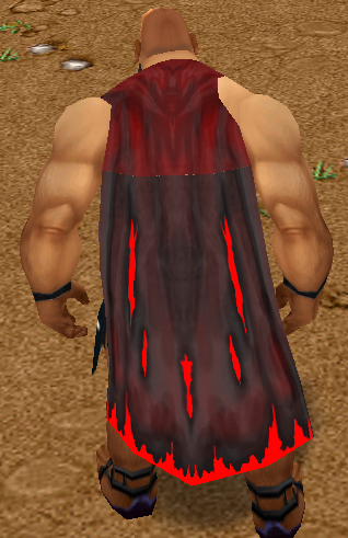
Team colored cape is just great idea, I did not think of that at all. But now I tried coloring it, still a slight problem appeared. I don't know how to fix it, since the cape is not fully textured, it has some alpha layer spots so make it more weared-off, holes and so on, so the color layer overlaps, it looks bad. Any ways to make the layer affect only the cape and not the alpha channel spots?
Also, cape now looks divided into bright and dark parts, it also looks very bad, not sure what to do at this point to solve it.
Zwiebelchen
Hosted Project GR
- Joined
- Sep 17, 2009
- Messages
- 7,234
Actually, it's not that bad. I have a selection of cape models that have a "floating" stand animation, that is kind of a compromise between standing and walking animations in Gaias. I never felt it looks completely out-of-whack. But if you are really picky with the animations, then yes, you might rather want it attached to the character permanently.Well, cape does give more clothing. And I can not attach the cape or else it won't be animated properly.
I don't know what the problem with the bright and dark part is; maybe a problem with the unwrap? I suppose the upper and lower part of the cape are different geosets and one portion of it has different normals. You should definitely merge those geosets just for a cleaner model (also, it will render at a much better quality ingame then, especially when you have lots of omnilights).Team colored cape is just great idea, I did not think of that at all. But now I tried coloring it, still a slight problem appeared. I don't know how to fix it, since the cape is not fully textured, it has some alpha layer spots so make it more weared-off, holes and so on, so the color layer overlaps, it looks bad. Any ways to make the layer affect only the cape and not the alpha channel spots?
Another possibility: the teamcolor texture isn't properly wrapped. Make sure you select "wrap X" and "wrap Y" on the teamcolor texture in Magos to allow tiling of the texture.
About the alpha layer holes: this one is tricky. Basicly, what you can do is to increase the polies of the cape around the holes and remove the transparency. So make the holes part of the geoset, not of the texture.
However, there's a better option, especially if you don't care for filesize:
Use replacable texture ID 31 for the cape and then change the texture ingame via the Warclub ability.
So instead of using teamcolors, you can actually change the cape texture ingame.
Then not only you can change the color of your cape, but also change the length, have capes with symbols or runes, etc.
Note that you can only replace one texture ID at the same time. So if you want to use this approach on something else (like changing the pants or skin color), then you must decide what is more important to have.
But I suggest using it for the cape, because it matters the most on a top-down perspective.
You can also use a fancy combination of team color and interchangable textures:
Use teamcolor for the pants or some armored parts that need no transparency and use interchangable texture for the cape.
--> Two things that can be exchanged on runtime seperately
- Joined
- Aug 1, 2013
- Messages
- 4,658
I have 0.000 experience with texturing or modelling but there is some way to make it alpha.
Just find out where those spots are.
Make the overall cape teamcolored and apply shading on that (if possible)
Otherwise make two layers where the second one is half alpha + shadow so you have one (lower) layer teamcolored and one (upper) layer shadow.
I have no idea why that part at the top is brighter than the part at the bottom.
Zwiebelchen
Hosted Project GR
- Joined
- Sep 17, 2009
- Messages
- 7,234
I think what he means is to import a custom team-color texture... which is not really possible.I have 0.000 experience with texturing or modelling but there is some way to make it alpha.
Just find out where those spots are.
Make the overall cape teamcolored and apply shading on that (if possible)
Otherwise make two layers where the second one is half alpha + shadow so you have one (lower) layer teamcolored and one (upper) layer shadow.
I have no idea why that part at the top is brighter than the part at the bottom.
Take a look at that exchangable texture approach via Warclub! It's amazing!
- Joined
- Mar 29, 2011
- Messages
- 2,601
I have a lot of knowledge in team colored material, the problem here is that the texture lacks any alpha parts. If you would give me the model and the texture I could fix it. The hunched back looks inappropriate, his face looks like former Blizzard voice artist Chris Metzen. 
Zwiebelchen
Hosted Project GR
- Joined
- Sep 17, 2009
- Messages
- 7,234
I'm curious; how are you going to fix that? You can't edit Replacable ID 0 and the intransparency stems from the replacable texture, not from the actual overlay texture.I have a lot of knowledge in team colored material, the problem here is that the texture lacks any alpha parts. If you would give me the model and the texture I could fix it. The hunched back looks inappropriate, his face looks like former Blizzard voice artist Chris Metzen.
- Joined
- Jun 27, 2008
- Messages
- 2,557
Thanks for the help, guys.
Bright and dark problem is the mesh I suppose. Because it is considered as one geoset right now, but those two pieaces of mesh are not completely connected, forcing to drop shadow differently. When there is no team color, it looks all fine though.
I suppose those methods may work, but it just appears to be too much of trouble. Having WarClub ability to change things looks not very comfortable thing to do, and adjusting geoset itself appears to be too much of work for a matter of low importance.
I will stick with dark blue, it fits the waist color and it doesn't poke an eye in the terrain surroundings.
Zwiebelchen
Hosted Project GR
- Joined
- Sep 17, 2009
- Messages
- 7,234
You should definitely try it out; it's actually pretty comfy once you made the required adjustments to the model.I suppose those methods may work, but it just appears to be too much of trouble. Having WarClub ability to change things looks not very comfortable thing to do, and adjusting geoset itself appears to be too much of work for a matter of low importance.
All you have to do in-editor is to import the cape texture seperated from the hero texture, then you can freely import as many different cape designs as you want just by editing the textures.
Here's a tutorial on how to properly set up the model and what to do trigger-wise:
https://www.hiveworkshop.com/forums...how-make-model-change-textures-ingame-222258/
It's much easier than it looks and the results are amazing:

And here's my latest model using teamcolor and body texture swapping:

I use team color for the hair color and texture swapping for the body textures.
- Joined
- Mar 29, 2011
- Messages
- 2,601
I'm curious; how are you going to fix that? You can't edit Replacable ID 0 and the intransparency stems from the replacable texture, not from the actual overlay texture.
Actually, there are multiple ways of doing it. But I would not reveal my methods in any case.
#Zwiebelchen Please hide your images in Hidden tabs.. too large..
Zwiebelchen
Hosted Project GR
- Joined
- Sep 17, 2009
- Messages
- 7,234
Why not? OoActually, there are multiple ways of doing it. But I would not reveal my methods in any case.
Done, sorry.#Zwiebelchen Please hide your images in Hidden tabs.. too large..
- Joined
- Mar 29, 2011
- Messages
- 2,601
Why not? Oo
Done, sorry.
Because I am planning to do a tutorial in the future about this, I don't want anyone else doing it sooner.
- Joined
- Jun 27, 2008
- Messages
- 2,557
Warclub idea looks very useful, but I would use it only for the cape, and after some thinking I see there wouldn't be much of use of colored cape either. It would look weird to see the cape change color during the game once certain gear is put on, or change when gear is put off.
I suppose I will stick with passive colored cape, it would feel more natural.
I suppose I will stick with passive colored cape, it would feel more natural.
Zwiebelchen
Hosted Project GR
- Joined
- Sep 17, 2009
- Messages
- 7,234
You really think someone will "steal" a tutorial?Because I am planning to do a tutorial in the future about this, I don't want anyone else doing it sooner.
Fair enough. Just wanted to mention it because not many people know that you actually can change textures ingame.Warclub idea looks very useful, but I would use it only for the cape, and after some thinking I see there wouldn't be much of use of colored cape either. It would look weird to see the cape change color during the game once certain gear is put on, or change when gear is put off.
I suppose I will stick with passive colored cape, it would feel more natural.
If I had the map space, I'd go apeshit crazy with the interchangable texture thing. But that's just me. I really dig fancy little details or playing dress-up with my characters in general.
- Joined
- Jun 27, 2008
- Messages
- 2,557
That is really cool that you can change these ingame, I did not know that before. I thought players were forced to go through the hassle of unit model morphing. It partly appears morphing can be replaced with this easily.
Oh and looking forward to that tutorial, A_Void.
Here is quite the final basic hero model. Darkened the skin and made the cape dark blue with some holes, looks quite okay I suppose. Henched back could be interpreted in many good ways, but still it doesn't feel very good though.
Another thing I do not like is the WoW style. I begin to hate those over-bulked and fat arms / legs models, it looks just bad (for me).
Zwiebelchen
Hosted Project GR
- Joined
- Sep 17, 2009
- Messages
- 7,234
Yeah. I never morph units because morphing is vulnerable to bugs and impractical, as you have to import the same model multiple times.That is really cool that you can change these ingame, I did not know that before. I thought players were forced to go through the hassle of unit model morphing. It partly appears morphing can be replaced with this easily.
But the interchangable texture thing has some drawbacks you can easily overcome with morphing, so it's definitely not the one-size-fits-all approach:
It requires all textures to use the same UV map. So with all WC3 units having somewhat different wraps, you just can't exchange the texture of a demon hunter with a sorceress, for example.
But it's great if you import custom hero textures anyway. Basicly allows you to use one texture template for all character models and then just swap out as needed.
So basicly: you import one villager model, but can have 5-10 texture variations on the model at the same time. Great for NPCs, especially if combined with team-color!
I wouldn't change that because you need the exagerated features in birdseye perspective. It's the main reason why all the default WC3 models are so bulky ... it improves visibility from the default perspective.Another thing I do not like is the WoW style. I begin to hate those over-bulked and fat arms / legs models, it looks just bad (for me).
When I made changes to many of my character models to make them look more human (increasing the length of legs, making the upper body and arms more slender), I noticed a severe drop in visual feedback... which is why I reverted most of the changes.
There is a reason all female models from WC3 have large breasts and extremely over-the-top attack and walk animations: so that they are better visible from the top view.
- Joined
- Mar 29, 2011
- Messages
- 2,601
That is really cool that you can change these ingame, I did not know that before. I thought players were forced to go through the hassle of unit model morphing. It partly appears morphing can be replaced with this easily.
Oh and looking forward to that tutorial, A_Void.
Here is quite the final basic hero model. Darkened the skin and made the cape dark blue with some holes, looks quite okay I suppose. Henched back could be interpreted in many good ways, but still it doesn't feel very good though.
Another thing I do not like is the WoW style. I begin to hate those over-bulked and fat arms / legs models, it looks just bad (for me).
So now you see how bad the actual models in WoW look like. You should make him more slim, his hands, fingers, head and legs. Then you could make him less hunched because right now he looks like a retired spartan warrior that has a serious injury in his broken back.
- Joined
- Jun 27, 2008
- Messages
- 2,557
The things you learn when constrained.So basicly: you import one villager model, but can have 5-10 texture variations on the model at the same time. Great for NPCs, especially if combined with team-color!
That makes sense.I wouldn't change that because you need the exagerated features in birdseye perspective.
I think Zwiebelchen got his point. It looks all normal from far, of course during cinematics when it is zoomed it may look bulky and hunched though.You should make him more slim
I may post some armor update soon.
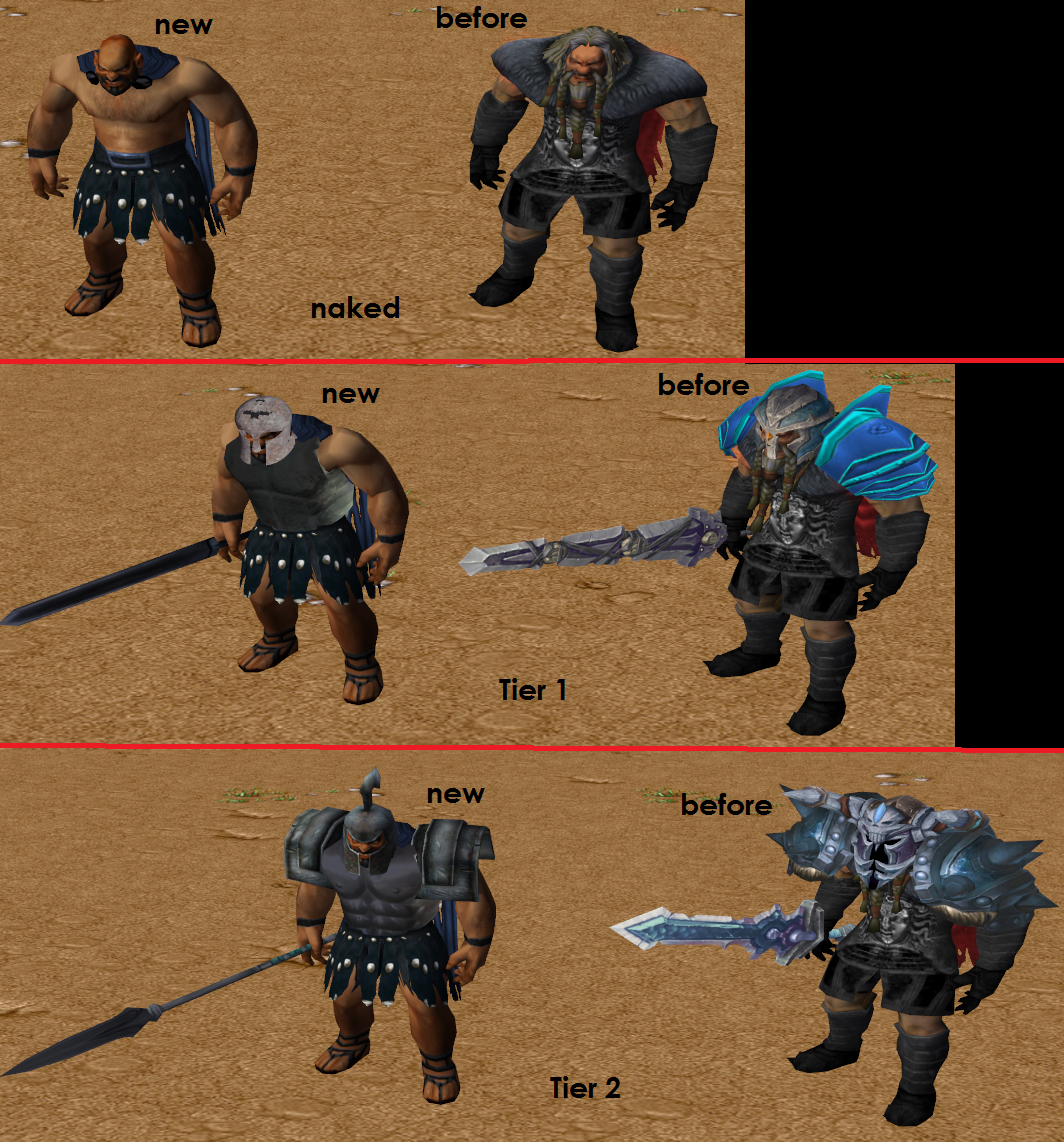
EDIT: So here is the armor update. As I mentioned before, I completely remade the armor and weapons, also new base hero model. This time I aimed for more greek feeling. Here is the comparison of 2 armor tiers. There will be total of 6-7 tiers in game, this is just first and second one. Tiers will get better and better, better stats, abilities, and of course better visuals. Next tiers will include gloves and boots armor and also shields, starting softly before going into something good. In comparison it is clear that WoW gear looks better than the new one, but WoW gear is not any greek, new gear is more theme-based which I like. Tier 1 got some lighting problems though. I am especially exited about next tiers helmets, that includes HQ spartan helmets, helmets with those punk hairs and so on. Final tier may be orientated into Zeus armor, which will be badass, but it will be extremely hard to obtain as it will need a recipe and Hephaistus forge. So here it is, some technical spoilers.
Tier include 3 major pieces (weapon, head, body armor), these items are active when not even carried in the unit inventory, but in another backpack. Game's first major chapter (out of 3 in total) will feature first 2 tiers.
Oh and that cape from bird's view looks gorgeos with these armors.
Zwiebelchen
Hosted Project GR
- Joined
- Sep 17, 2009
- Messages
- 7,234
I'm glad you stepped away from the WoW models. I absolutely detest the horribly oversized and impractical shoulder pieces of WoW. I love the basic greek look you've created. Can't wait to see more of it.
- Joined
- Dec 3, 2011
- Messages
- 366
Tier include 3 major pieces (weapon, head, body armor), these items are active when not even carried in the unit inventory, but in another backpack. Game's first major chapter (out of 3 in total) will feature first 2 tiers.
Oh and that cape from bird's view looks gorgeos with these armors.
Hmmm, character's finger look aren't taking the weapon
 the weapon may be dropped
- Status
- Not open for further replies.
Similar threads
- Replies
- 39
- Views
- 6K