• Listen to a special audio message from Bill Roper to the Hive Workshop community (Bill is a former Vice President of Blizzard Entertainment, Producer, Designer, Musician, Voice Actor) 🔗Click here to hear his message!
  • Read Evilhog's interview with Gregory Alper, the original composer of the music for WarCraft: Orcs & Humans 🔗Click here to read the full interview.

The Picture, take 7!

Welcome to the seventh edition of "The Picture"!

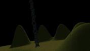
Reference: The Picture #6

DISCLAIMER: All contestants are highly encouraged to post IN-GAME screenshots as their entries. The template has been adapted to A) hide all UI, B) change between camera angles with UP and DOWN arrow keys, and C) hide or show the mouse cursor with 'ESC'. The downside to in-game screenshots is that camera far Z is locked to a hard cap of 10000.

Description:

The goal of this contest is to challenge terrainers to adapt to their situation, you are presented with a template that has certain aspects you cannot change and certain objects you cannot remove, you are locked to a specific camera angle and you have to work around these limitations to create something unique and wonderful of your own. So, without further ado, here's the rules:

The Rules:

  • Contestants must use one of two camera angles for their submissions and cannot alter the camera object in any way. The template will contain two different cameras, you are free to choose either one of them. In-game you can swap between them with the arrow UP and DOWN keys.
  • Contestants cannot alter the elevation (topography) that has already been changed, although so long as the distinctive height variation stays the same, you may make small changes.
  • "Flat" surfaces can be changed.
  • Contestants cannot delete, resize or hide doodads that are already placed in any way, the final submission must contain these objects visibly. The chain in the template can NOT be removed, but it CAN be rotated differently (this includes changing the object editor pitch and roll values), as long as it is in clear view, and the epicenter of the chain remains unmoved.
  • Contestants can change tile-set, fog-setting, time of day, place and tint doodads in any way they want and otherwise add any details they want.
  • Contestants can use custom models and assets in their entries.
  • Contestants can submit HD and SD entries.

Otherwise the contest rules are more or less the same as official terraining contests, what I am especially referencing here is the use of "unofficial" assets: If you use "off-site" assets, please leave a link to them with your submission, and if you're using assets you made or procured yourself, then please make them available to the rest of the contestants. We're here to have fun, learn and grow together, so let's all play fair :)
Link: Arena - Rules And Guide

Judging:

The judging will be performed by the host of each respective round, the winners will be included in a photo-showcase below and the latest winner will have their entry as part of the contest's banner.

Criteria:


AestheticsOverall appearance of the final entry as a whole, e.g. an entry can lack detail and technique but still have an overall nice composition./35

Creativity
How unique and original is the idea? How inventive is the execution? How creatively does it conform to the contest theme?/30

Detail
Measurement and balance of detail in design. Impurities include rough edges, deficiency in execution, and general disorder./35
SimilarityHow close is the final entry to the original template? Is it drastically changed or can you see where it originated from?/10
Total/110

Deadline: End of June, in whatever time zone changes to july the last
 

Attachments

  • FGM - The picture template.w3x
    158.4 KB · Views: 18
  • Camera 1.png
    Camera 1.png
    2.5 MB · Views: 100
  • Camera 2.png
    Camera 2.png
    5.2 MB · Views: 104
Last edited:
Level 37
Joined
Nov 24, 2007
Messages
4,420
Damn boy, them are some real dutchy angles!

And well, ugh.

My old-school lazy-ass terrainer heart really doesn't appreciate this nu-age "ingame" shit you young un's are so obsessed with, but I'll give it a spin.
I mean, this contest is all about "challenging terrainers to adapt to their situations" or something, what an annoying prick who wrote that.

Jokes aside, this looks very interesting! Those unnaturally uniform hills are going to be hell to work around, but I can dig it. I'll for sure throw something together for this one :)

Thank you for hosting this! Much obliged.
In-game is not required, but it is highly encouraged 😉

Yeah I messed around with the angles a bit, consider it an added challenge haha.
 
It has come to my attention that the camera angles are bugged in-editor, and won't display their pitch and roll values correctly. I'll allow contestants who prefer to work in-editor rather than in-game to adjust the camera angles manually so they match that of the in-game camera (as close as they're able to). Any other adjustments are not permitted. I'll add it to the rules in the original post tomorrow.
 
Level 9
Joined
Nov 18, 2014
Messages
81
Damn, this angle looks... hard to deal with.

I might have an idea of what I would want to do... But now, I need to figure out where the hell am I going to find the necessary doodads :grin:
May the model browsing begin !


EDIT: Oh god, now I have to learn how to import tilesets. Damn it brain, couldn't you think about something within classic tileset ? :xxd:
 
Last edited:
Level 37
Joined
Nov 24, 2007
Messages
4,420
Here is my first WIP. Mining operation on space rock seems to be going soomthly.
Still have a lot to do, and not satisfied with some of the doodads I used, but thought it might trigger more people to join in :xxd:

Cool, another sci-fi entry!

It's a nice start, and I'm curious to see how the chain will factor into this scene and not look too out of place.

I would recommend you take care to consider texture quality while working on this ;)

Grabs shovel and gets to work.

Looking forward to seeing your entry!
 
Level 9
Joined
Nov 18, 2014
Messages
81
Cool, another sci-fi entry!

It's a nice start, and I'm curious to see how the chain will factor into this scene and not look too out of place.

I'm trying to find the right models to make the chain supporting some kind of equipment for drilling/mining, which would attached to robot/spaceship above. So far, not found the right match :grin:

I would recommend you take care to consider texture quality while working on this ;)

Well, that's the main point where I'm not satisfied with what I'm using there. But I wanted to make a "sketch" before browsing more for models :xxd:
 
Level 37
Joined
Nov 24, 2007
Messages
4,420
Luckily, we don't seem to have a set deadline yet, right?

Deadline: NA

Correct :)

I'm trying to find the right models to make the chain supporting some kind of equipment for drilling/mining, which would attached to robot/spaceship above. So far, not found the right match :grin:

Interesting!

Well, that's the main point where I'm not satisfied with what I'm using there. But I wanted to make a "sketch" before browsing more for models :xxd:

Ah, makes sense.

Though a little hint: With some clever use of the "glow" and the "terrainglow" models from the UTM with low RGB values, you can really make most textures work by performing some in-editor "photoshopping", diffusing the textures so that their bad quality isn't so apparent.
 
Level 9
Joined
Nov 18, 2014
Messages
81
Though a little hint: With some clever use of the "glow" and the "terrainglow" models from the UTM with low RGB values, you can really make most textures work by performing some in-editor "photoshopping", diffusing the textures so that their bad quality isn't so apparent.
Now, you got me curious. Is there a tutorial out there for that kind of textures hiding/correction ? :cute:
I'll look for it, but you might have the link somewhere, so I thought I would ask.


Also, I can't figure out how to import this cliff/tileset in reforge editor :confused:2
If you have any tip on how to do that, please share them :xxd:
 
Level 37
Joined
Nov 24, 2007
Messages
4,420
Now, you got me curious. Is there a tutorial out there for that kind of textures hiding/correction ? :cute:
I'll look for it, but you might have the link somewhere, so I thought I would ask.

You know, I don't think there is one as far as I know, but some of the techniques used might be covered in this tutorial: Fundamental Principles of Lighting

I did a little shitty mini-tutorial using the felsen rock and the aforementioned glow and terrainglow from the UTM: Minitutorial
It's not super good, but I think it gets the point across. Obviously I would recommend working with lower values and layering them more, but I hope you get the gist.

As for the cliff tile, no idea. Might be that doesn't work for reforged editor, I even tried the old trick of saving, quitting and reopening the editor, didn't work.
 
Level 6
Joined
Apr 13, 2024
Messages
18
After spending some time on this map, it feels like I'm finally moving somewhere. This one is much harder, as I chose to create a city-type terrain which I'm not good at, and it also takes quite a while to go through all available models in UTM (seeing it for the first time :xxd:).

Here's my first WIP with all kinds of stuff randomly scattered around
WIP 1.png
 
Well shoot, I won't make it then.

On vacation and away from my computer this week and busy all week next week.

We'll see if I can squeeze some time in to finish it up somewhat enough for a decent submission.
I'm sure we can postpone the due date a bit if nobody objects, let's see closer to the end of the month.
 
Level 6
Joined
Apr 13, 2024
Messages
18
I also wouldn't mind extra time. Elden Ring DLC release definitely didn't make it easier to work on the map :xxd: . Here's my progress so far:
WIP 5.png

The struggle is real - it's very hard to build fantasy castles/cities with no substantial prior experience, but at least I'm earning said experience in the process :^)
 
Level 6
Joined
Apr 13, 2024
Messages
18
Posting another WIP before the weekend crunch in an attempt to finish this project:

WIP 7.png

Still got to work on details and finish the foreground, but I'm glad that at least it moved in a direction that looks satisfying to me

Also wanted to ask - is it fine to hide terrain hills with big rocks like that (talking about the background walls)? It doesn't seem to break the rules, since nothing about terrain height was changed, but it feels like a grey zone :hohum:
 
Level 9
Joined
Nov 18, 2014
Messages
81
Here is my final entry, not much diff from WIP2, as I didn't get much time, but at least, mouse isn't visible anymore :xxd:

Note to myself: sci-fi is harder, do not go for it when you don't have much time to work on it :grin:
The picture 7 - final entry.png

Not seeing a lot of engagement here. Would the contestants prefer another template? Must be a unison agreement from all those who have submitted WIPs.

It's already past the due date, but if you think you will submit your final entry soon-ish, I don't mind extending.

Not sure changing template now would a make more people come in.
I feel like at this point, we should just close this one and go to the next, hoping more people will join in.
 
Level 6
Joined
Apr 13, 2024
Messages
18
It's already past the due date, but if you think you will submit your final entry soon-ish, I don't mind extending.

Thought the due date included 15th, so I hoped to finish my entry and post it later today (according to UTC +3)

Not seeing a lot of engagement here
Yeah, a little sad to see so few entries, it's partially the reason it took me a while to come back to work 😅
 
Level 6
Joined
Apr 13, 2024
Messages
18
Here's my final entry post:

WIP 8.png

Attaching the map itself as well.

It was quite a journey :grin: I like the end result despite being quite desperate at certain stages of the project. I'm also glad I pushed myself to build an actual "city" and not another natural landscape, it gave more experience than I anticipated.

Thanks to the everyone involved! Looking forward to the next challenge (hope I have enough energy for the next one :xxd:)
 

Attachments

  • The Picture 7 - gloriouspoppy.w3x
    6.2 MB · Views: 13
Level 9
Joined
Nov 18, 2014
Messages
81
Sorry, I kinda forgot about this (entirely my fault :p). I promise I will give you feedback, and select a winner. Hopefully I am able to do it on saturday this upcoming weekend.

Thanks :cute:

I mean, I don't care about the winner thing since there so few of us, but any feedback is always good to take :grin:
 
Level 37
Joined
Nov 24, 2007
Messages
4,420
I would like to voice my deepest apologies for not finishing my entry to this contest, my motivation took a very sudden and negative direction and it made me unable to continue working on this. I am glad to see that although there were few entries, the rest of you made it worthwhile :)

I'll see if I can't muster some energy to at least give some feedback to you lovely contestants.

EDIT: I did some final hasty brush-up and figured I might as well post my entry here (it was mostly finished anyway), I don't expect (or think its fair) to be included in the placement. But hey, if you'll be bothered to say some words about my very late entry in your reviews @FeelsGoodMan, I'd appreciate it ^^ (Map is also attached if anyone want to have a closer look).

1727985129854.png

1727979942993.png
 

Attachments

  • Submair.png
    Submair.png
    2.9 MB · Views: 37
  • FGM - The picture template (1).w3x
    564.2 KB · Views: 5
Last edited:
Level 37
Joined
Nov 24, 2007
Messages
4,420
I honestly did not expect this thread to come back to life :xxd:

Bows to the audience

I appreciate that all three submissions for this were vastly different, and personally I really liked the challenge of this one @FeelsGoodMan, the strange angle and the weird elevation shapes as well as the big dominant chain was really interesting to work around. Maybe in retrospect it might have been a tad too challenging, seeing how few participants this got, but oh well. Here we are.

It was really fun, and I'd really like to thank you a lot for hosting this mate!

@Marchombre

Very interesting approach! Admittedly, like I'm sure you discovered yourself, sci-fi isn't a simple theme to work with for Wc3, seeing as there are so few good sci-fi models out there, though there are a bunch of really good conversions from Sc2 here: Starcraft 2 Conversion Pack

In fact, as a general tip to anyone aspiring to make terrains, the list at the bottom of the Terrain and Level Design Guidelines thread has a lot of really good and helpful doodads that can immensely improve a lot of terrains, especially for SD:

1728218587161.png

(This is a screenshot, please refer to the thread to find the real list(link above))

-

Anyway, digression aside, I really commend the sci-fi approach here :) I'm a bit curious as to whether it's supposed to be inside a space-station or outside, because the overall design seems like it's supposed to be inside, but then there's no windows or anything indicating that it is. And although the chains fit very well color-scheme-wise, they otherwise look quite out of place in such a high-tech environment, sadly. The foreground is quite barren, but somehow you kinda get away with it seeing as this is "space", and honestly, the HD tiles really lend themselves well to sci-fi. I would wish there had been a little more detail though, you could've still kept it barren but done some tile-work and added a few rock formations here and there, just to make it less repetitive and plain empty. I do like the mid-ground area, the sterile look really gives off a cool spacey-vibe, and although there are some stretched textures in the background, it comes together quite nicely. Good job!

@gloriouspoppy

I really like this, and quite honestly, I genuinely really like your style! The way you use vibrant colors and just make them work is honestly kind of inspiring. Part of me wishes you would lean more on custom models, especially for trees, the SD wc3 trees are just really not good for scenic terrains. They were never meant to be seen from the sides, they were designed to be chopped down by measly peasants! :p

Anyway, the white on red contrast is really cool, and the way you positioned the fog to only affect the mid- to background where the lava is was quite nicely pulled off. I'd love to see a snow weather-effect tapered to the foreground, to give it a bit more of a wintery vibe, and the only thing missing to really give off a great cave-effect is a bit of rocks framing the upper corners of the terrain. The chains are really well worked into the design, not too sure about the crystals, but otherwise a great piece.

I hope you both continue working on terrains and will participate in future contests, because you both have great ideas and potential as screnic terrainers :)
 
Level 6
Joined
Apr 13, 2024
Messages
18
Bows to the audience

I appreciate that all three submissions for this were vastly different, and personally I really liked the challenge of this one @FeelsGoodMan, the strange angle and the weird elevation shapes as well as the big dominant chain was really interesting to work around. Maybe in retrospect it might have been a tad too challenging, seeing how few participants this got, but oh well. Here we are.

It was really fun, and I'd really like to thank you a lot for hosting this mate!

@Marchombre

Very interesting approach! Admittedly, like I'm sure you discovered yourself, sci-fi isn't a simple theme to work with for Wc3, seeing as there are so few good sci-fi models out there, though there are a bunch of really good conversions from Sc2 here: Starcraft 2 Conversion Pack

In fact, as a general tip to anyone aspiring to make terrains, the list at the bottom of the Terrain and Level Design Guidelines thread has a lot of really good and helpful doodads that can immensely improve a lot of terrains, especially for SD:

View attachment 490995
(This is a screenshot, please refer to the thread to find the real list(link above))

-

Anyway, digression aside, I really commend the sci-fi approach here :) I'm a bit curious as to whether it's supposed to be inside a space-station or outside, because the overall design seems like it's supposed to be inside, but then there's no windows or anything indicating that it is. And although the chains fit very well color-scheme-wise, they otherwise look quite out of place in such a high-tech environment, sadly. The foreground is quite barren, but somehow you kinda get away with it seeing as this is "space", and honestly, the HD tiles really lend themselves well to sci-fi. I would wish there had been a little more detail though, you could've still kept it barren but done some tile-work and added a few rock formations here and there, just to make it less repetitive and plain empty. I do like the mid-ground area, the sterile look really gives off a cool spacey-vibe, and although there are some stretched textures in the background, it comes together quite nicely. Good job!

@gloriouspoppy

I really like this, and quite honestly, I genuinely really like your style! The way you use vibrant colors and just make them work is honestly kind of inspiring. Part of me wishes you would lean more on custom models, especially for trees, the SD wc3 trees are just really not good for scenic terrains. They were never meant to be seen from the sides, they were designed to be chopped down by measly peasants! :p

Anyway, the white on red contrast is really cool, and the way you positioned the fog to only affect the mid- to background where the lava is was quite nicely pulled off. I'd love to see a snow weather-effect tapered to the foreground, to give it a bit more of a wintery vibe, and the only thing missing to really give off a great cave-effect is a bit of rocks framing the upper corners of the terrain. The chains are really well worked into the design, not too sure about the crystals, but otherwise a great piece.

I hope you both continue working on terrains and will participate in future contests, because you both have great ideas and potential as screnic terrainers :)
Thanks for the review! Appreciate your thoughts :thumbs_up: 
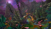
Funnily enough, a couple of your remarks were what concerned me as well when I was finalizing this terrain. Trees were first added just to signify that there will be some sort of forest that I want to expand on later, but that "later" never came as I was running out of time, sadly :xxd: . This is definitely the part that I would want to work on first if I were to come back to this project. When it comes to snowy weather, I actually tinkered with it a little, but I didn't like the standard wc3 snow from this angle, as it was too overwhelming and it drew too much attention from the rest of the terrain, so had to scrap this idea, but I agree that it's kind of asking to add some snowy effect.

Btw, if you or anyone else would be interested, this is what I used as a reference and an inspiration
HOMM Dwarf City 1.jpg HOMM Dwarf City 2.png
God, I love Heroes of Might and Magic :xxd:
 
Level 9
Joined
Nov 18, 2014
Messages
81
@Marchombre

Very interesting approach! Admittedly, like I'm sure you discovered yourself, sci-fi isn't a simple theme to work with for Wc3, seeing as there are so few good sci-fi models out there, though there are a bunch of really good conversions from Sc2 here: Starcraft 2 Conversion Pack

In fact, as a general tip to anyone aspiring to make terrains, the list at the bottom of the Terrain and Level Design Guidelines thread has a lot of really good and helpful doodads that can immensely improve a lot of terrains, especially for SD:

View attachment 490995
(This is a screenshot, please refer to the thread to find the real list(link above))
First, thx for your feedback.

I knew sci-fi was going to be harder, but I didn't realize how much indeed :hohum:
And of course, it was in a period when I didn't have much time to deep dive in how that could be done.

Thx for the ressources, I'll keep them in mind :thumbs_up:

Anyway, digression aside, I really commend the sci-fi approach here :) I'm a bit curious as to whether it's supposed to be inside a space-station or outside, because the overall design seems like it's supposed to be inside, but then there's no windows or anything indicating that it is. And although the chains fit very well color-scheme-wise, they otherwise look quite out of place in such a high-tech environment, sadly. The foreground is quite barren, but somehow you kinda get away with it seeing as this is "space", and honestly, the HD tiles really lend themselves well to sci-fi. I would wish there had been a little more detail though, you could've still kept it barren but done some tile-work and added a few rock formations here and there, just to make it less repetitive and plain empty. I do like the mid-ground area, the sterile look really gives off a cool spacey-vibe, and although there are some stretched textures in the background, it comes together quite nicely. Good job!

It's supposed to be outside, which is why there are only robots working there and ship pulling the chains :xxd:

I tried adding stuff on the fore ground, but found only them to be to much distraction / occupying too much space on the screen due to the weird angle. As you said, I finally decided that that was space after, so it wouldn't be that weird.

Also, sadly I was running out of time, and played way too long with light and shadows trying to cover somewhat the lack of high quality texture in there. At was planning to add a bit more of stuff like cables, electric poles etc but well, finding something that suited my need and implementing it in the scene would have been quite time demanding :cry:

I hope you both continue working on terrains and will participate in future contests, because you both have great ideas and potential as screnic terrainers :)

Well, part of why I wanted this thread to be fully completed is also that we'll be able to move to next one :cute:
So rest assured, I'll look forward future contests :thumbs_up:
 
Ok boys, sorry for the delay, I got held up in traffic. Here are my reviews, hope I wasn't too harsh on you all.

AestheticsOverall appearance of the final entry as a whole, e.g. an entry can lack detail and technique but still have an overall nice composition.20/35

Creativity
How unique and original is the idea? How inventive is the execution? How creatively does it conform to the contest theme?15/30

Detail
Measurement and balance of detail in design. Impurities include rough edges, deficiency in execution, and general disorder.20/35
SimilarityHow close is the final entry to the original template? Is it drastically changed or can you see where it originated from?1/10
Total56/110

Starting off, I'd like to say that at a first glance this is an intriguing piece, but the more I look at it, the more I see its shortcomings. There are two statues, along with two tall pillars with braziers on them, as if they're guarding a path that's supposed to lead to this structure. But there's no path, there are just some randomly placed stone fences blocking the path. You could have done so much more in terms of the "entrance" to your grand structure.

Secondly, the foreground takes up a lot of the actual image, but is mostly just bare snowy hills with vanilla Blizzard trees. This area in my opinion should have been the most detailed, since this is the area that is the closest to the camera, but it seems you have tried making the background the most detailed (more on this later).

Thirdly, the actual platform is quite hard to make out. I can't see exactly what it is. Obscurity is not a problem in itself if it's mysterious, but in this case I feel it detracts more from the piece than what it adds. There are what seems to be tiny pink crystals on it, and some other things there. The platform base is also kinda "thin", and the chains just kinda goes straight through it. In my opinion, it would look at lot better if the platform had a stronger base, and actual attachments for the chains.

The anvil which I assume is supposed to be your center piece, is kinda "just there". It tells me this is a place of blacksmithing, or some kind of mines. There's nothing more to it, it rests on a base, but that's pretty much it. It's also kinda hard to see if it's ON the platform, or behind it. Visually it looks a bit strange.

The background is filled with houses in stone walls, which is kinda cool, and gives off a dwarven vibe. I think the houses are the best part of your piece, since they blend very well with the other concepts you have tried out here. The yellow glow from the windows accentuates the lava, and the contrasting snow very well. One thing about this however is that the sides of the giant wall looks very thin, almost as if it's just a screen, since the pillars are also kinda thin. It would look a bit more "solid" if you closed off the sides instead of just ending the wall with some thin pillars. Almost like this, where the red lines are supposed to be a continuation of brick walls.

The mountain king overseeing the mines/forge adds a mysterious vibe. Is it someone who is returning home? Is it a foreign invader? Anyway, I like it. Adds to the visual storytelling.

So all in all, a good "beginner" piece that has progressed past the very basics, but lacks in overall execution. It's unclear whether these are mines, or a forge, but most importantly is your composition and structurals. You need to work a lot more on general composition, where to apply detail work, and where to have your center piece(s). In addition to this you need to work on your structures, to make them more believable/realistic. Look at some concept art pieces of similar stuff or dwarven structures, and then try to make your structures similar to that.

One thing I'd also like to mention is that it seems the elevation I made in the original map has been flattened, or made invisible with alpha tiles? That's why I scored you a 1/10 in similarity. If I have become blind, and they in fact are there, just let me know, and I'll adjust my score.


AestheticsOverall appearance of the final entry as a whole, e.g. an entry can lack detail and technique but still have an overall nice composition.28/35

Creativity
How unique and original is the idea? How inventive is the execution? How creatively does it conform to the contest theme?20/30

Detail
Measurement and balance of detail in design. Impurities include rough edges, deficiency in execution, and general disorder.15/35
SimilarityHow close is the final entry to the original template? Is it drastically changed or can you see where it originated from?10/10
Total73/110


I love me some space Warcraft III, definitely shows that you're trying for a different vibe than vanilla Warcraft.

Right off the bat I'm gonna go ahead and say that this either looks like an asteroid space station, or a space station on a moon. No matter, it looks like deep space and I'd assume there's no gravity here, which makes the sewer pipe with sewage kinda weird. Color and visibility wise it's also an eyesore, and the piece would be better without it (in my opinion). I get it's supposed to be nuclear waste, but I doubt a nuclear plant disposes of its waste this way.

Let's continue with the ships. There are two giant space ships, one of which is in front of the galaxy, and the other chained to the ground. The one that's chained to the ground is also chained to what seems like a freight container. So I'm not really sure if the chains are there to anchor the ship, or to transport cargo. If it's the latter, then that seems like an extremely impractical way of transporting cargo in space. Since there's no gravity, those containers would be dangling behind that ships engines, burning all the cargo, or potentionally causing hull impact damge from the containers dangling around in chains.

On the ground there are some glass surfaces which I'm not entirely sure what are for, and a robot doing some computer stuff. It looks like the head of the computer robot is sticking up through the glass.

As for the center piece; it's probably the best looking part of this, but it's kinda oddly placed (at least if going by the golden ratio). It should be a bit closer to the center in my opinion.

The premade elevations are completely bare, you should definitely have tried doing something with them instead of just having ground texture.

To summarize, this is an interesting piece, mainly due to the space vibe, but fails in execution. The framing/composition in general is off, and objects should have been placed differently in the picture. There's little detail work, and logical inconsistencies, along with some oddly placed objects (like the sewer pipe). The logical inconsistencies aren't really an issue if you're good at composition and detail work, so please continue working on those. Try to figure out where to place your main center piece first, and then build the "large" structures. After that, fill in with details and smaller doodads. There is a fine line between "too much" and "too little" when it comes to filler doodads, so do try to find the balance between them.


AestheticsOverall appearance of the final entry as a whole, e.g. an entry can lack detail and technique but still have an overall nice composition.25/35

Creativity
How unique and original is the idea? How inventive is the execution? How creatively does it conform to the contest theme?15/30

Detail
Measurement and balance of detail in design. Impurities include rough edges, deficiency in execution, and general disorder.30/35
SimilarityHow close is the final entry to the original template? Is it drastically changed or can you see where it originated from?10/10
Total80/110

Excellent detail work, I must say. The colors of the doodads goes well together, are placed logically, and accentuates each other very well. I can tell that a good deal of thought went into the details.

With that said, that's the best part about this. There isn't a clear center piece at all, and not a lot is going on here. The archway doesn't manage to capture my attention as a center piece, and at first glance just seems like it's a part of the aquatic landscape rather than something leading to the chain. I get underwater vibes from all the aquatic plants and rock formations, but there are no fish or other aquatic animals, making it eerily "still", or "quiet" (almost lifeless I'd say).

The pink night sky makes it kinda uncertain whether or not this is in fact underwater or not. The mushrooms and sky tells me it's not underwater, but rather an alien planet, while the corals tells me it is in fact underwater. Whatever it is, I feel this piece would have benefited greatly from less ambiguity in this specific aspect of it. If I were you, I'd either A) if this is underwater I'd remove the night sky, added more fog to make the background invisible, removed the mushrooms, added more fishes (maybe a huge silhouette of a whale or something in the background), some bubbles, and other aquatic things, or B) if this is an alien planet, maybe some more planets in the sky, removed the corals, and added more trees to make it look less aquatic. Some of the stars in the sky are also overlapping the doodads, making me not entirely sure whether they are stars, or some particles floating about.

All in all a very well crafted landscape, with very good attention to detail, but the center pieces (archway and vine) doesn't succeed in peaking my interest. This may be completely subjective of course, but I think making something "more" around the center pieces would have made this picture great justice. For example adding some smoke coming from the base of the chain, or darkening the entire image and having a light source coming from the base, having creepy fish creatures swim towards it, paving the way to the chain with some kind of glowing roots. Something to make the chain base area and path seem special.
 
Level 6
Joined
Apr 13, 2024
Messages
18
Ok boys, sorry for the delay, I got held up in traffic. Here are my reviews, hope I wasn't too harsh on you all.

AestheticsOverall appearance of the final entry as a whole, e.g. an entry can lack detail and technique but still have an overall nice composition.20/35

Creativity
How unique and original is the idea? How inventive is the execution? How creatively does it conform to the contest theme?15/30

Detail
Measurement and balance of detail in design. Impurities include rough edges, deficiency in execution, and general disorder.20/35
SimilarityHow close is the final entry to the original template? Is it drastically changed or can you see where it originated from?1/10
Total56/110

Starting off, I'd like to say that at a first glance this is an intriguing piece, but the more I look at it, the more I see its shortcomings. There are two statues, along with two tall pillars with braziers on them, as if they're guarding a path that's supposed to lead to this structure. But there's no path, there are just some randomly placed stone fences blocking the path. You could have done so much more in terms of the "entrance" to your grand structure.

Secondly, the foreground takes up a lot of the actual image, but is mostly just bare snowy hills with vanilla Blizzard trees. This area in my opinion should have been the most detailed, since this is the area that is the closest to the camera, but it seems you have tried making the background the most detailed (more on this later).

Thirdly, the actual platform is quite hard to make out. I can't see exactly what it is. Obscurity is not a problem in itself if it's mysterious, but in this case I feel it detracts more from the piece than what it adds. There are what seems to be tiny pink crystals on it, and some other things there. The platform base is also kinda "thin", and the chains just kinda goes straight through it. In my opinion, it would look at lot better if the platform had a stronger base, and actual attachments for the chains.

The anvil which I assume is supposed to be your center piece, is kinda "just there". It tells me this is a place of blacksmithing, or some kind of mines. There's nothing more to it, it rests on a base, but that's pretty much it. It's also kinda hard to see if it's ON the platform, or behind it. Visually it looks a bit strange.

The background is filled with houses in stone walls, which is kinda cool, and gives off a dwarven vibe. I think the houses are the best part of your piece, since they blend very well with the other concepts you have tried out here. The yellow glow from the windows accentuates the lava, and the contrasting snow very well. One thing about this however is that the sides of the giant wall looks very thin, almost as if it's just a screen, since the pillars are also kinda thin. It would look a bit more "solid" if you closed off the sides instead of just ending the wall with some thin pillars. Almost like this, where the red lines are supposed to be a continuation of brick walls.

The mountain king overseeing the mines/forge adds a mysterious vibe. Is it someone who is returning home? Is it a foreign invader? Anyway, I like it. Adds to the visual storytelling.

So all in all, a good "beginner" piece that has progressed past the very basics, but lacks in overall execution. It's unclear whether these are mines, or a forge, but most importantly is your composition and structurals. You need to work a lot more on general composition, where to apply detail work, and where to have your center piece(s). In addition to this you need to work on your structures, to make them more believable/realistic. Look at some concept art pieces of similar stuff or dwarven structures, and then try to make your structures similar to that.

One thing I'd also like to mention is that it seems the elevation I made in the original map has been flattened, or made invisible with alpha tiles? That's why I scored you a 1/10 in similarity. If I have become blind, and they in fact are there, just let me know, and I'll adjust my score.


AestheticsOverall appearance of the final entry as a whole, e.g. an entry can lack detail and technique but still have an overall nice composition.28/35

Creativity
How unique and original is the idea? How inventive is the execution? How creatively does it conform to the contest theme?20/30

Detail
Measurement and balance of detail in design. Impurities include rough edges, deficiency in execution, and general disorder.15/35
SimilarityHow close is the final entry to the original template? Is it drastically changed or can you see where it originated from?10/10
Total73/110


I love me some space Warcraft III, definitely shows that you're trying for a different vibe than vanilla Warcraft.

Right off the bat I'm gonna go ahead and say that this either looks like an asteroid space station, or a space station on a moon. No matter, it looks like deep space and I'd assume there's no gravity here, which makes the sewer pipe with sewage kinda weird. Color and visibility wise it's also an eyesore, and the piece would be better without it (in my opinion). I get it's supposed to be nuclear waste, but I doubt a nuclear plant disposes of its waste this way.

Let's continue with the ships. There are two giant space ships, one of which is in front of the galaxy, and the other chained to the ground. The one that's chained to the ground is also chained to what seems like a freight container. So I'm not really sure if the chains are there to anchor the ship, or to transport cargo. If it's the latter, then that seems like an extremely impractical way of transporting cargo in space. Since there's no gravity, those containers would be dangling behind that ships engines, burning all the cargo, or potentionally causing hull impact damge from the containers dangling around in chains.

On the ground there are some glass surfaces which I'm not entirely sure what are for, and a robot doing some computer stuff. It looks like the head of the computer robot is sticking up through the glass.

As for the center piece; it's probably the best looking part of this, but it's kinda oddly placed (at least if going by the golden ratio). It should be a bit closer to the center in my opinion.

The premade elevations are completely bare, you should definitely have tried doing something with them instead of just having ground texture.

To summarize, this is an interesting piece, mainly due to the space vibe, but fails in execution. The framing/composition in general is off, and objects should have been placed differently in the picture. There's little detail work, and logical inconsistencies, along with some oddly placed objects (like the sewer pipe). The logical inconsistencies aren't really an issue if you're good at composition and detail work, so please continue working on those. Try to figure out where to place your main center piece first, and then build the "large" structures. After that, fill in with details and smaller doodads. There is a fine line between "too much" and "too little" when it comes to filler doodads, so do try to find the balance between them.


AestheticsOverall appearance of the final entry as a whole, e.g. an entry can lack detail and technique but still have an overall nice composition.25/35

Creativity
How unique and original is the idea? How inventive is the execution? How creatively does it conform to the contest theme?15/30

Detail
Measurement and balance of detail in design. Impurities include rough edges, deficiency in execution, and general disorder.30/35
SimilarityHow close is the final entry to the original template? Is it drastically changed or can you see where it originated from?10/10
Total80/110

Excellent detail work, I must say. The colors of the doodads goes well together, are placed logically, and accentuates each other very well. I can tell that a good deal of thought went into the details.

With that said, that's the best part about this. There isn't a clear center piece at all, and not a lot is going on here. The archway doesn't manage to capture my attention as a center piece, and at first glance just seems like it's a part of the aquatic landscape rather than something leading to the chain. I get underwater vibes from all the aquatic plants and rock formations, but there are no fish or other aquatic animals, making it eerily "still", or "quiet" (almost lifeless I'd say).

The pink night sky makes it kinda uncertain whether or not this is in fact underwater or not. The mushrooms and sky tells me it's not underwater, but rather an alien planet, while the corals tells me it is in fact underwater. Whatever it is, I feel this piece would have benefited greatly from less ambiguity in this specific aspect of it. If I were you, I'd either A) if this is underwater I'd remove the night sky, added more fog to make the background invisible, removed the mushrooms, added more fishes (maybe a huge silhouette of a whale or something in the background), some bubbles, and other aquatic things, or B) if this is an alien planet, maybe some more planets in the sky, removed the corals, and added more trees to make it look less aquatic. Some of the stars in the sky are also overlapping the doodads, making me not entirely sure whether they are stars, or some particles floating about.

All in all a very well crafted landscape, with very good attention to detail, but the center pieces (archway and vine) doesn't succeed in peaking my interest. This may be completely subjective of course, but I think making something "more" around the center pieces would have made this picture great justice. For example adding some smoke coming from the base of the chain, or darkening the entire image and having a light source coming from the base, having creepy fish creatures swim towards it, paving the way to the chain with some kind of glowing roots. Something to make the chain base area and path seem special.
Thaks for an honest review! :thumbs_up:

When it comes to the elevation level, none of it was changed (the map I attached to the final entry post can prove it), but it was covered with rocks and walls to the point when the hills that were originally there are not recognizable. I actually was curuius about it, hence why I asked:

Also wanted to ask - is it fine to hide terrain hills with big rocks like that (talking about the background walls)? It doesn't seem to break the rules, since nothing about terrain height was changed, but it feels like a grey zone :hohum:

My confusion was caused by the wording of the following rule:
"Contestants cannot alter the elevation (topography) that has already been changed, although so long as the distinctive height variation stays the same, you may make small changes."

I guess, the conclusion I can draw from this is that it's important that the original height map is visibly preserved on the screenshot (which makes sence, but now I will know for sure :grin:).
 
Thaks for an honest review! :thumbs_up:

When it comes to the elevation level, none of it was changed (the map I attached to the final entry post can prove it), but it was covered with rocks and walls to the point when the hills that were originally there are not recognizable. I actually was curuius about it, hence why I asked:


My confusion was caused by the wording of the following rule:
"Contestants cannot alter the elevation (topography) that has already been changed, although so long as the distinctive height variation stays the same, you may make small changes."

I guess, the conclusion I can draw from this is that it's important that the original height map is visibly preserved on the screenshot (which makes sence, but now I will know for sure :grin:).
Aha sorry I must have missed that question. As for it being allowed or not, idk, since I'm not the one who made the rules (i just copy pasted from a previous contest haha). It does get you a lower score on the similarity scoring tho, since it does kind of remove (or hide) original elements that were in the template.
 
Level 6
Joined
Apr 13, 2024
Messages
18
Aha sorry I must have missed that question. As for it being allowed or not, idk, since I'm not the one who made the rules (i just copy pasted from a previous contest haha). It does get you a lower score on the similarity scoring tho, since it does kind of remove (or hide) original elements that were in the template.
True and fair :thumbs_up: Next time I'll make sure to tag you (or whoever hosts the contest) in case I have questions, since it's understandably hard to follow everyone's messages.
 
Level 9
Joined
Nov 18, 2014
Messages
81
AestheticsOverall appearance of the final entry as a whole, e.g. an entry can lack detail and technique but still have an overall nice composition.28/35

Creativity
How unique and original is the idea? How inventive is the execution? How creatively does it conform to the contest theme?20/30

Detail
Measurement and balance of detail in design. Impurities include rough edges, deficiency in execution, and general disorder.15/35
SimilarityHow close is the final entry to the original template? Is it drastically changed or can you see where it originated from?10/10
Total73/110


I love me some space Warcraft III, definitely shows that you're trying for a different vibe than vanilla Warcraft.

Right off the bat I'm gonna go ahead and say that this either looks like an asteroid space station, or a space station on a moon. No matter, it looks like deep space and I'd assume there's no gravity here, which makes the sewer pipe with sewage kinda weird. Color and visibility wise it's also an eyesore, and the piece would be better without it (in my opinion). I get it's supposed to be nuclear waste, but I doubt a nuclear plant disposes of its waste this way.

Let's continue with the ships. There are two giant space ships, one of which is in front of the galaxy, and the other chained to the ground. The one that's chained to the ground is also chained to what seems like a freight container. So I'm not really sure if the chains are there to anchor the ship, or to transport cargo. If it's the latter, then that seems like an extremely impractical way of transporting cargo in space. Since there's no gravity, those containers would be dangling behind that ships engines, burning all the cargo, or potentionally causing hull impact damge from the containers dangling around in chains.

On the ground there are some glass surfaces which I'm not entirely sure what are for, and a robot doing some computer stuff. It looks like the head of the computer robot is sticking up through the glass.

As for the center piece; it's probably the best looking part of this, but it's kinda oddly placed (at least if going by the golden ratio). It should be a bit closer to the center in my opinion.

The premade elevations are completely bare, you should definitely have tried doing something with them instead of just having ground texture.

To summarize, this is an interesting piece, mainly due to the space vibe, but fails in execution. The framing/composition in general is off, and objects should have been placed differently in the picture. There's little detail work, and logical inconsistencies, along with some oddly placed objects (like the sewer pipe). The logical inconsistencies aren't really an issue if you're good at composition and detail work, so please continue working on those. Try to figure out where to place your main center piece first, and then build the "large" structures. After that, fill in with details and smaller doodads. There is a fine line between "too much" and "too little" when it comes to filler doodads, so do try to find the balance between them.

Thx for the feedback :thumbs_up:


The asteroid space station with mining operation is what I aimed for.

The chains were there to pull the containers into the ship before transporting the cargo elsewhere
I see how that might be confusing tho. :grin:

And I agree the sewer pipe isn't the most adapted thing in the scene, but it's part of a larger model, so I figured I would have to deal with it.
Probably should have hidden it in shadow or behind something :xxd:


And most importantly, I shouldn't have gone for a space theme when I had so little free time, when it took me so much time to browse usable models. It's the main reason why I didn't have time to polish details :cry:
 
The chains were there to pull the containers into the ship before transporting the cargo elsewhere
I see how that might be confusing tho. :grin:
Ah I see. The ship is maybe bit small to house that freight container, at least it looks like that :p Should have had a hatch or something with the chains coming out of it, with the container mid-air as if it's in the middle of being lifted.

Probably should have hidden it in shadow or behind something :xxd:
Definitely could have covered it up with some other doodads.

And most importantly, I shouldn't have gone for a space theme when I had so little free time, when it took me so much time to browse usable models. It's the main reason why I didn't have time to polish details :cry:
There are some really good space themed model packs here on Hive, specifically SCII assets. Take a look at my (failed) contest map, I have compiled lots of futuristic assets from many different sources. Even though the contest is finalized, I challenge you to continue on your terrain piece, using assets from my contest map. Not 100% sure on who to credit for all of them, but if you tell me which ones you want to use, I can try to find out.
 
Last edited:
Level 37
Joined
Nov 24, 2007
Messages
4,420
Ok boys, sorry for the delay, I got held up in traffic.

Ah yes, I saw that queue on my way to work the other day, something about a whale and a bus iirc.

Anyway, thanks for getting around to the reviews @FeelsGoodMan! It feels good to finally have a proper conclusion to this contest... Man. (I had to, there was a gun to my head).

Now, about that review.

Excellent detail work, I must say.

Thank you! I am especially fond of my use of the moon doodad as little pearls dotting the terrain here and there (not to mention the fact that the central tentacle is actually predominantly made entirely out of the dead fish models (cudos to @Mr.Goblin for suggesting this to me <3) :D

1730318923656.png

There isn't a clear center piece at all

You know, that was partly intentional. I did aim for an unorthodox piece with this where the idea was that the beholder slowly unveils the story of the terrain as they view it. I find it a bit interesting that you didn't once comment on the big central eye in the terrain, or the big teeth jutting out from the mountains surrounding the crater, or that you refer to the tentacle as a "vine", all of this was meant to paint the picture of a giant cthulhuesque monster melded with the terrain, but oh well.

The pink night sky makes it kinda uncertain whether or not this is in fact underwater or not.

Not underwater. I tried really hard to dissuade this idea, the corals are for colors, because I wanted the general vibe of the terrain to be colorful and cheery, with a dark and looming undertone, so alien world is the right call.

B) if this is an alien planet, maybe some more planets in the sky, removed the corals, and added more trees to make it look less aquatic. Some of the stars in the sky are also overlapping the doodads, making me not entirely sure whether they are stars, or some particles floating about.

I couldn't find a way of making planets look good, I wanted to keep the corals for the vibrant style and regarding the stars overlapping the background... WHIMSICAL SURREALISM. (Absolutely not just laziness).

All fair points in the summary tho, I am personally very happy with how this turned out, but I'm sure I could have made it better if I hadn't rushed it toward the end. Thanks again for a good job reviewing and hosting this contest, I appreciate it a lot! ^^
 
Thank you! I am especially fond of my use of the moon doodad as little pearls dotting the terrain here and there
Wouldn't have guessed, I thought they were pearls as part of the plants. Nice usage.

(not to mention the fact that the central tentacle is actually predominantly made entirely out of the dead fish models (cudos to @Mr.Goblin for suggesting this to me <3) :D
That's also really cool! I must admit, that I haven't actually opened and inspected these maps, and my judging is based solely on what I saw in the pictures posted. That's why I think I didn't notice the tentacle was made from fish, I thought it was a single model.

big central eye in the terrain
I did in fact see it, but I thought it was a plant or something (thought the pupil was part of the plants hanging down in front of the eye), so didn't comment further on it.

the big teeth jutting out from the mountains surrounding the crater
Yeah should have commented on that, but figured it was a stylistic choice, and a part of the landscape, rather than actual teeth belonging to the alien world kraken.
 
Level 6
Joined
Apr 13, 2024
Messages
18
Felt like joning the review discussion once again, got some thoughts I wanted to share

But there's no path, there are just some randomly placed stone fences blocking the path
Yeah, when creating this, I started to think about how the entrance would look like pretty early on, not going to lie. The actual culprit here was the centerpiece anvil - it was supposed to be the most visible object on the scene and so I had to make an entranse that wouldn't obscure the view on this masterpiece of dwarven engineering :xxd: In the end I failed to come up with anything satisfying and placed that fence in a final attempt to at least cover that gaping hole. And by the way, it's not just a fence - it's a lifting castle gate! I placed 2 small copies of the central chain on top so it looks like the gate is in the middle of lifting/closing. But they turned out so hard to see that I wouldn't blame you for not noticing them 😅

Secondly, the foreground takes up a lot of the actual image, but is mostly just bare snowy hills with vanilla Blizzard trees.
Agreed, and as I said in my reply to Celaquil, it was something I would gladly work on, but I when came back to work it was way too late. Need to make a mental note not to leave such an important part as foreground for the final day :^)

Thirdly, the actual platform is quite hard to make out. I can't see exactly what it is.
Honestly, I'm not too sure either. It was supposed to be a kind of smithing monument at the top that could be also used for practical purposes like crystall processing or w/e at the bottom.

You need to work a lot more on general composition
Again, agreed. I had this concept of a dwarven smithing city inside a mountain from the beginning, but it was kind of obscure and it took me a long time to come up with composition that at least had the vibe I was going for. And this centerpiece also kept getting in the way, since I wanted to use the chains to make them a part of some structure, but making it too big and detailed kept obscuring the view on the city behind, so I dropped some ideas like making it a huge half-opened circular tower that would have a railroad spiraling around its walls and stuff like that. I guess, it would be better to just place some objects at the bottom of the chains to make it look like they were used to suspend sonething in lava pool instead of making this monument. I'll need to look out for such things in advance in the future.

In the end, thanks again FeelsGoodMan for the review and for hosting the contest. It was not an easy one, but I'm glad I took on the challenge :grin:
 
Top