Community
Maps
Tutorials
Gallery
Support Us
Install the app
-
Listen to a special audio message from Bill Roper to the Hive Workshop community (Bill is a former Vice President of Blizzard Entertainment, Producer, Designer, Musician, Voice Actor) 🔗Click here to hear his message!
-
Read Evilhog's interview with Gregory Alper, the original composer of the music for WarCraft: Orcs & Humans 🔗Click here to read the full interview.
-
Create a faction for Warcraft 3 and enter Hive's 19th Techtree Contest: Co-Op Commanders! Click here to enter!
-
Get your art tools and paintbrushes ready and enter Hive's 34th Texturing Contest: Void! Click here to enter!
You are using an out of date browser. It may not display this or other websites correctly.
You should upgrade or use an alternative browser.
You should upgrade or use an alternative browser.
Texturing Competition #7 - Holy/Angelic
- Status
- Not open for further replies.
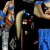
Its a moon warrior..Well... What makes it holy?
Well in wc3 they sometimes talk about a goddess of the moon so i was like moon=godess=holy, you see?
- Joined
- Dec 30, 2007
- Messages
- 1,556
Goddess of The Moon?
Elune?
Elune?
ProbablyGoddess of The Moon?
Elune?
 ...
...- Joined
- Nov 3, 2006
- Messages
- 8,102
Almost done, please tell me what i should improve about it.
the legs are SOO random.
the legs are SOO random.
Explain yourself further ..
- Joined
- Nov 3, 2006
- Messages
- 8,102
Just look at your muscles on the leg, and compare it to those. Different eh?
It ish blizz mistake! Look at original Druid Of The Claw unwrap please :]Just look at your muscles on the leg, and compare it to those. Different eh?
- Joined
- Nov 19, 2007
- Messages
- 1,177
- Joined
- Dec 30, 2007
- Messages
- 1,556
He looks so freaking happy (The Moon Warrior) ^^
A.R.
Skin Reviewer
- Joined
- Mar 12, 2008
- Messages
- 347
- Joined
- Nov 3, 2006
- Messages
- 8,102
No offense but... She looks more like bitch than "holy" xP
Face has an odd for "holy" being as well :/
I am not saying that technique and quality of this skin is low though.
Face has an odd for "holy" being as well :/
I am not saying that technique and quality of this skin is low though.
A.R.
Skin Reviewer
- Joined
- Mar 12, 2008
- Messages
- 347
No offense but... She looks more like bitch than "holy" xP
Face has an odd for "holy" being as well :/
I am not saying that technique and quality of this skin is low though.
alas, theres not much that can be done to de-bitchify the demoness' face. but if you're referring to the details, i've copied the Seraphim pretty closely
- Joined
- Nov 3, 2006
- Messages
- 8,102
Actually, I meant her face, as in, it looks evil. Make it more bland and good-looking rather than detailed and evil-looking 
- Joined
- Dec 30, 2007
- Messages
- 1,556
alas, theres not much that can be done to de-bitchify the demoness' face. but if you're referring to the details, i've copied the Seraphim pretty closely
Her face looks like a "Seraphim Face" from Sacred 1 and 2 and I like that
No offense but... She looks more like bitch than "holy" xP
Face has an odd for "holy" being as well :/
I am not saying that technique and quality of this skin is low though.
IMO, Seraphims are quite "bitchy" but cool and in Sacred they are described as a fallen angel or some strange creature from space, cause they have armors that looks likes the Protoss armors in Starcraft. So I can't say that thay are "holy", but who give a shit. They fit in in this theme anyway ^^
Seraphim Face

You can see how it match with A.R's texture.
- Joined
- Jan 13, 2008
- Messages
- 13
- Joined
- Sep 26, 2004
- Messages
- 1,543
doesn't overlap anything for me.
- Joined
- Nov 3, 2006
- Messages
- 8,102
It depends on the browser. It does overlap on his because it loads full image. Howewer, firefox renders only the part that vB limited it to. IE sucks balls. The guy is talking about THIS:


- Joined
- Sep 2, 2005
- Messages
- 1,029
Actually it was ONLY causing problems for me in Firefox, strangely enough.
Final Submission(S)
Alright. I have two versions here, and whichever people like more will be my final submission. They're the same except one has a color adjustment.
I decided to make the adjustment to match the lighting in the background better, and then decided it might look good overall on the skin. So I have both here.The adjustments looked good in the pic, but just looked pink in game
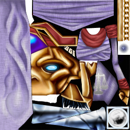
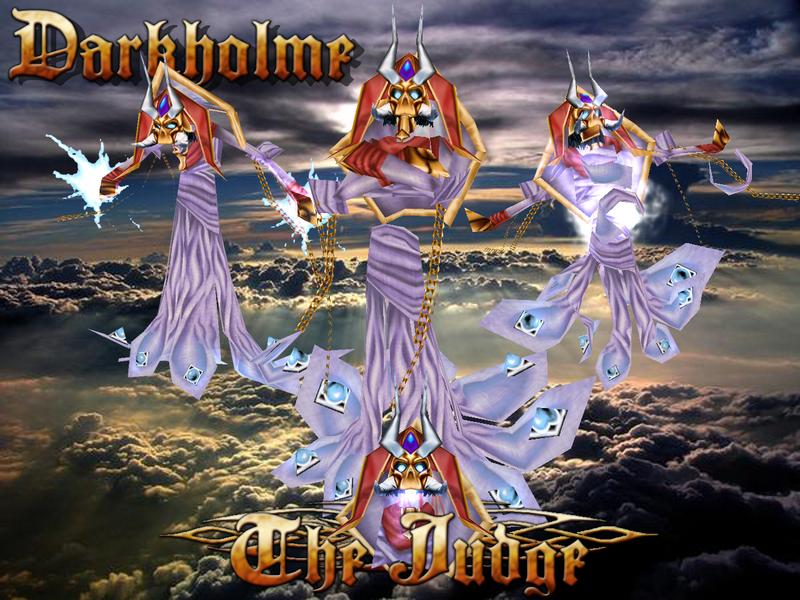
Feel free to try them both in game and tell me which you like better after that too.
If anyone still tries to tell me it still looks like a skeleton and skeletons are "evil", I will tell you you're a wad, and dare you to do better.
And if someone wants the image in my Wallpaper dimensions (that's what I made them at) I can give a png at 1280x960
Woo! 99% freehand. Theres a little boney bit that I never saw used on the model that I left there, I didn't change the eye glow, and the hand is still in the same shape as it was before (dark lines in same places)
Final Submission(S)
I decided to make the adjustment to match the lighting in the background better, and then decided it might look good overall on the skin. So I have both here.
If anyone still tries to tell me it still looks like a skeleton and skeletons are "evil", I will tell you you're a wad, and dare you to do better.
And if someone wants the image in my Wallpaper dimensions (that's what I made them at) I can give a png at 1280x960
Woo! 99% freehand. Theres a little boney bit that I never saw used on the model that I left there, I didn't change the eye glow, and the hand is still in the same shape as it was before (dark lines in same places)
Attachments
Last edited:
- Joined
- Apr 11, 2007
- Messages
- 1,817
- Joined
- Dec 30, 2007
- Messages
- 1,556
Kaitech[SanD], it's "smudgy" right now, add some deep in to the colors (Shadows/Lightnings).
But I like the idea
But I like the idea
- Joined
- Apr 11, 2007
- Messages
- 1,817
I know it's smudgy, I absolutely suck at blending colours without the smudge tool.
Also, I have done that, but I'm skinning in 1024x512, and when I half it to wrap onto the model you can't see it anymore.
I'd prefer to be skinning the way A.R is doing it, but I have no idea how xd
It looks so much better without the un needed crap that's on it...
Also you can go over the lines without screwing the rest up
- Joined
- Dec 30, 2007
- Messages
- 1,556
Kaitech[SanD];577113 said:I know it's smudgy, I absolutely suck at blending colours without the smudge tool.
Me too and I can't help you, even if I wished I could
- Joined
- Mar 18, 2007
- Messages
- 2,247
Kaitech, as of now the blade has no real definition and is just plain color. Try to simulate texture using highlights and stuff. Also, DO NOT use smudge. It's ugly
- Joined
- May 16, 2007
- Messages
- 288
- Joined
- Sep 2, 2005
- Messages
- 1,029
OR! you can use smudge effectively as a given tool in a fine repitoire of tools.
Here Here!
I use smudge constantly. It works, you just need to use it *right*
Paint blocks of color either just with brush or inside a mask.
smudge area between two blocks that should be gradual.
Either smudge *less* on the sharp edges, leave them, or use blur to smooth it out and make it look less pixely, as appropriate.
Smudge works best if you include the middle tone/ a couple middle tones.
No Comments on "The Judge?"
- Joined
- Jul 30, 2007
- Messages
- 888
it looks like all you did to that spellbreaker is just a recolor and some black dots >< im sorry but i dont think that is really free-hand, anyways I just found an artpad lying in my basement, so i might play around with that and try to get something done for this contest.
- Joined
- Jul 30, 2007
- Messages
- 888
- Joined
- Feb 8, 2008
- Messages
- 432
Im in and ill do dreadlord i guess
- Joined
- Apr 11, 2007
- Messages
- 1,817
Kaitech, as of now the blade has no real definition and is just plain color. Try to simulate texture using highlights and stuff. Also, DO NOT use smudge. It's ugly
No, smudge ISN'T ugly, if it was ugly why would it be included in the tool? I find smudge very useful seeing as I can't "Digitally blend colours without smudge". Also, people have their own techniques for skinning that works best for them, and smudge is included in it.
You guys did see when the finish date for this contest is..right?
Yeah, but did you check your calender? Today is March the 25th 01:05(GMT) 2008. The contest finishes in 18 days...
- Joined
- Sep 2, 2005
- Messages
- 1,029
I think someone pushed it back. I remember the original finish being the 31st or something. less than a week away.... I also don't think it was the host who pushed it back (as he's the one who asked if you guys knew the end date).
- Joined
- Oct 7, 2006
- Messages
- 2,077
Oh and sidenote
Darky, you might wanna do more to the Blood Elf helm than just recolor and filter it
And Kai, you needa do some more work on that blade
Looks like plastic right now
P.S. I get to double post cause I'm hosting...rawrawrawr
Darky, you might wanna do more to the Blood Elf helm than just recolor and filter it
And Kai, you needa do some more work on that blade
Looks like plastic right now
P.S. I get to double post cause I'm hosting...rawrawrawr
- Joined
- Jul 30, 2007
- Messages
- 888
Heres the face, I think i like it, dont know yet, will have to see what it looks like with new hair and stuff. Even if it still blows this artpad certainly makes creating faces much faster and easier.
Attachments
- Joined
- Dec 30, 2007
- Messages
- 1,556
On the wrap, Wombat, the eyes looks really strange.
Maybe by "smalling" them down will help.
Maybe by "smalling" them down will help.
- Joined
- Jul 30, 2007
- Messages
- 888
maybe, i still dont know whether im even tryin to finish something for the contest or screw around though, lol
- Status
- Not open for further replies.
Similar threads
- Replies
- 387
- Views
- 42K
- Replies
- 206
- Views
- 25K
- Replies
- 272
- Views
- 27K
- Replies
- 755
- Views
- 54K
D
- Replies
- 405
- Views
- 37K


