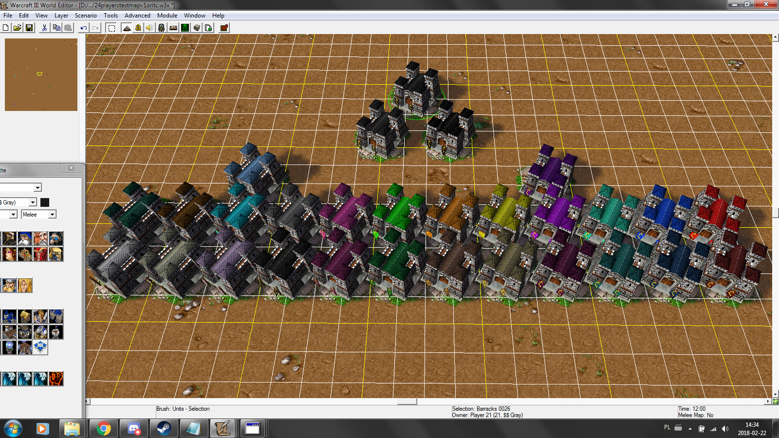
So I've been looking at the new colours after latest 15th March update. Overall I like it. I'm very happy purple and light blue are back!
However, I miss the awesome dark blue from first 1.29 PTR, even though it was very slightly too dark. The new blue is not bad, but it doesn't feel the same.

Also, I'm a bit concerned about some colours being too similar. I'm afraid this would bring confusion, especially in the minimap.
For example, there are two cyans looking very much alike. When looking at both of them side to side, you can tell the difference (well, most of the time); but when you look at them separately, you might get confused and not know which is which (it happened to me in a few games).
Same thing for player 22's white and player 20's pale purple, player 17's pale yellow and player 19's pale lime.
I would suggest to darken a few colours a bit, so the contrast is more obvious. Something like this, maybe:
I don't know if it's relevant, any thoughts?


