• 🏆 Texturing Contest #33 is OPEN! Contestants must re-texture a SD unit model found in-game (Warcraft 3 Classic), recreating the unit into a peaceful NPC version. 🔗Click here to enter!
  • It's time for the first HD Modeling Contest of 2024. Join the theme discussion for Hive's HD Modeling Contest #6! Click here to post your idea!

Icon Mini-contest #1 - SCII icons

Status
Not open for further replies.
Level 45
Joined
Jun 3, 2005
Messages
6,982
sniff sniffs*...Aww.. :(..
Oh well, ill guess ill make some not included in the contest..

EDIT: Okay, well ill just draw for this contest, not that i want to be in it officially.
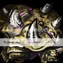
UltraliskArmour.jpg

UltraliskWeapon.jpg

UltraliskIcon.jpg
 
Last edited:
Level 30
Joined
Dec 6, 2007
Messages
2,228
Kimberly's are probably the most interesting ones.
nightmare's portrait is very impressive, the others tend to an average quality, i've seen far better ones from him already but still not bad.
ike's armour icon would need another angle, others are alright.
lelyanra's armour is very hard to define which pieces actually represent what, others are alright.
 
Sorry for keep you waiting. Here are the scores and congrats to everyone who participated.

To those of you who have uploaded their icons in the database and waiting for approval, read some of the points below and i hope you can improve on your icons.

Note from Devine:
Sorry for my harsh ratings, I'm aware of that. Just so you'd know, nobody has really failed, really. I give you all + 15/15 for entering and for having the dedication to complete your work ;)
Congrats to the winners, have fun with the cd keys and to the people who didn't win, better luck next time. Ralle still has some key available for sure :D
If I sound rude and not caring, it's only because I wanted this compo to be judged quickly and so I didn't really have the time to care :p. Nice entries, everyone.


ike_ike: 14/15
4eNNightmare: 13/15
Mr. Goblin: 11/15
lelyanra: 11/15
Palaslayer: 11/15
Kola: 8/15
L_Lawliet: 7/15
Morbid: 6/15
X.e.r.e.X: 5/15
Tails96: 4/15
Equal: 4/15


Morbid: 6/15
  • High templar: The blue parts look pretty bad. The icon is quite grainy. shading is allright, though. The background is pretty odd and blends with the blue parts of the armor. 2/5
  • Psy gloves: The hand is blurry and looks odd. The background and the lightningh is shit. The shading looks bad. 1/5
  • Templar Armor: This one is quite allright. The background is a bit odd. Shading is good. The gems and shoulderguards look good... 3/5

X.e.r.e.X: 5/15
  • Ultralisk: Looks quite bad and cartoonish, the shading is too sudden and too dark too. I don't like that shading too much. The eyes look pretty weird and so do the teeth. Looks like you put too many filters over it... The icon looks too grainy too. It really doesn't look like anything. 0/5
  • Ultralisk claw: It looks a lot like a blade. I like the BG though and I also like the scratches. 3/5
  • Ultralisk Carapace: Looks a bit odd. Shading looks quite random. The horns look quite good though. 2/5

L_Lawliet: 7/15
  • The Hydralisk: Looks good, nice compostition, shading is allright (allthough you could have made the highlight on the left eye a bit stronger) Could use some more contrast between the jaws and the tummy and the tonge and the tummy (especially between the last 2). No BG. 3/5
  • Needle Spine. I have no idea what's happening in the icon. Bad composition, and I mean bad. Look at how many open space you left. The objects are too small to be judged properly, actually. Needs more contrast and maybe add some speed lines or whatever to the background. 1/5
  • Spiked Spine Carapace:Looks cartoonish in a wc3 kind of way. Which is quite good in this case. The horns however look angled wrongly though 3/5.

4eNNightmare: 13/15
  • Tauren Marine: The teeth could use some polishing in terms of contrast. But this icon is pretty awesome. 5/5
  • 88mm Impala Gauss Rifle: The shape is a little odd. The blade looks badly angled in the small version because the other half is cut off. and I'm not very fond of the shading in *some* places. And I don't like the markings, the just look really bad on the icon. The ambient color is really nice though. But the icon could use some polishing in the small version. 3/5
  • Mad Cow shoulders: It looks ratther awesome. The markings look way better because they're bigger and less blurry. The shading is really awesome. 5/5

Kola: 8/15
  • Drone: The whole thing is really oddly shaped. The wings, the face, the ellbows, the claws and the scales. The shading is allright though. 2/5
  • Drone Weapon: The claws need more contrast between the inside and the outside parts of the claws. I also heavily dislike the blood. Which doesn't look like blood at all. 2/5
  • Drone Armor: This looks pretty cool. The shape is a lot better than in the "Drone" Icon. It's less crowded etc. Shading is allright. 4/5

ike_ike: 14/15
  • Reaper: The armor could use some stronger highlights. But let's face it, it still looks good and it's quite awesome. The bg is nice too. 5/5
  • P-iduncare: The whole looks very appealing. Might want to add some stronger highlights. The bg is fine. 5/5
  • Armor: You've been quite minimalistic on the highlights here. It actually looks pretty flat. 4/5 though.

Tails96: 4/15
  • Baneling: Whatever that thing with the green blobs is. This could be a football for all I know. No description or w/E. The whole is very messy and crowdy and the little background there is left screws the rest up Add to this that I have no idea what this is.
  • Carapace: The thing with the spikes. The background looks pretty bad but the spikes are allright. 3/5
  • Shrapnel: I have no reason to assume the rocks are even moving. The background looks bad. The whole looks like a bunch of rocks laying on a green/black piece of paper. 1/5

lelyanra: 11/15
  • Terrain Reaper: looks quite messy. It looks like a iron dude coughing and holding his fist in front of his mouth because that's polite. It's a bit grainy too. 3/5
  • Improved P-45 Scythe Gauss Pistol: This one is a lot better. Nicely shaped and nice shading and highlights. 5/5
  • Reinforced Neosteel Reaper Armor: Yet again very messy. The shading is nice though. 3/5

Equal: 4/15
  • A zerg Plant-Parasite: The icon is too flat, needs stronger highlights and shading. It also needs some texture on the face-thing. Also, your icon has outlines. 2/5
  • Claws: The shape is nice. Only the shading isn't and it also has outlines. 1/5
  • Some blob: I know it's armor but that's only because of "BTNPlanterArmor.blp " It actually lacks shading & highlights in some places like on the leaves and on the pink wires wrapped arround it. 1/5

Mr. Goblin: 11/15
  • The dude: It's quite oddly shaped. I mean... This style works in wc3 but this is a futuristic character. The shape should be flawless, I mean, just look at the big eye... It's not a circle, now is it? It looks quite rough and the armor should look polished as it's futuristic. It looks great though, the contrast is really nice 4/5
  • The shoulderguards: The look quite okay. Nicely shaped and the shading looks okay too. Then again, it's quite rough. 4/5
  • Grenade:This has a really odd shape. It really doesn't look that good. The bg is okay though. 3/5

Palaslayer: 11/15
  • Twilight Archon: Nice icon. A bit crowded on his chest but it still looks good. Nice shading. 5/5
  • Enhanced Psi-Claws: It really doesn't look like they're claws. The combined shading and highlighting looks quite off too. 2/5
  • Fortified Shoulder Plates: The shape is a bit weird... But the shading is nicely done. 4/5


Note from Pyramidhe@d: Stathisdjs's judging has been deemed too vague so i took the liberty of taking over the judging. Keep in mind that i judge normally from design perspective of the icons and took off scores for ineffective icons.
That includes icons that look incomplete, too vague or simple, confusing or cluttered looking icons and so on and so forth. For example, drawing a better shape did not necessarily give a better score compared to a icon with inferior shape but had a more complete and polished look to it.

ike_ike: 14/15
4eNNightmare: 12.5/15
Mr. Goblin: 11/15
lelyanra: 11/15
Kola: 10.5/15
Palaslayer: 9/15
Morbid: 8/15
X.e.r.e.X: 6.5/15
Tails96: 6/15
L_Lawliet: 6/15
Equal: 5/15


Morbid: 8/15
Overall icons fit each other very well. Rather simple shapes and lack of details though but good shading overall and the images are mostly crisp and well defined.
  • High templar: 3/5
  • Psy gloves: 2/5 A bit blurry and looks a bit too simple compared to others.
  • Templar Armor: 3/5

X.e.r.e.X: 6.5/15
The icons don’t really fit together. Different styles and amount of highlights and detailing and etc. Shadings are generally well done. Thing I didn’t like was that the icon didn’t really convey a sense of size. This icon set could well apply to any zerg unit.
  • Ultralisk: 2/15 The shadings are starting to look like black lines.
  • Ultralisk claw: 2.5/5 Has BG but rather simple colours. Good shapes
  • Ultralisk Carapace: 2/5

L_Lawliet: 6/15
Needs a bg. Very bad utilisation of the space given and most are too flat to be considered 3D
  • The Hydralisk: 2/5
  • Needle Spine. 1/5 really bad composition.
  • Spiked Spine Carapace: 3/5 Looks Looks too cartoony. Has details.

4eNNightmare: 12.5/15
Colour scheme of blue and black(on the empty spaces) fits the icons together. However, the fact that you are leaving the BG black bothers me.
  • Tauren Marine: 5/5
  • 88mm Impala Gauss Rifle: 3.5/5 Icon crops on the bottom right and makes it rather unsure what the object is. I really just see the gun and not the blade.
  • Mad Cow shoulders: 4/5 Could do with more shading.

Kola: 10.5/15
The green and brown colour scheme fits the icons well together. Great colours and shading.
  • Drone: 4/5 The shape of the arm bothers me. Looks like a stick figure.
  • Drone Weapon: 2.5/5 shape of the claw is lacking.
  • Drone Armor: 4/5 my thinking is you should have altered this to be your unit icon and think of a different angle to represent an armour.

ike_ike: 14/15
The only thing I gotta pick on is the fact that the armour has no blue in it which broke the colour scheme. Everything is beautifully well done
  • Reaper: 5/5
  • P-iduncare: 5/5
  • Armor: 4/5 The colour thing and a bit flat.

Tails96: 6/15
Good colour scheme, the green BG and the general rough look tying the icons together.
  • Baneling: 2/5 Very crowded hard to see what it is.
  • Carapace: 3/5
  • Shrapnel: 1/5 Rather lacking overall.

lelyanra: 11/15
Good colour choice, the strong red catches the eyes. Good red and dark grey colour scheme.
  • Terrain Reaper: 4.5/5 Bit crowded perhaps.
  • Improved P-45 Scythe Gauss Pistol: 4/5 Lacks BG and leaves a lot of empty space. Especially with the gun being dark grey, this was a bad mistake.
  • Reinforced Neosteel Reaper Armor: 2.5/5 Very messy I have no idea what this was supposed to be. Then I realised there was a head on the top right corner which gets completely cut out because of the border. Another very bad mistake.

Equal: 5/15
The concept is original I would have to admit. But the thick black lines and the simple shadings killed it.
  • A zerg Plant-Parasite: 2/5
  • Claws: 2/5
  • Some blob: 1/5

Mr. Goblin: 11/15
The Grenade brought down the score a lot. It didn’t fit in terms of detail. It was way too simple.
  • Ghost: 5/5
  • The shoulderguards: 4/5 I thought it was a helmet.
  • Grenade:This 2/5 disappointing compared with the other two icons

Palaslayer: 9/15
Overall the icons lack any strong highlights which gave it a really dull look. Fitting colour schemes though.
  • Twilight Archon: 3.5/5 Rather crowded.
  • Enhanced Psi-Claws: 2/5 I didn’t realise it was a hand. The armour is more eye catching than the hand. When you want someone to know it is a hand, you gotta give the focus on the hand.
  • Fortified Shoulder Plates: 3.5/5 Repeated image. Same problem as with kola. Maybe you should have focused on the bust of the archon for the unit and then do a really detailed shoulder armour for the armour icon.


1st Place : ike_ike
2nd Place : 4eNNightmare
3rd Place : lelyanra and Mr.Goblin

Pyritie will have your awards given out as soon as possible.

You never said i had to provide additional info. I gave my ratings on all 3 icons.
 
Status
Not open for further replies.
Top