- Joined
- Mar 22, 2016
- Messages
- 571


- 1st place: 50 reputation points
- 2nd place: 35 reputation points
- 3rd place: 20 reputation points
- Entry: 5 reputation points
- Judge: 5 reputation points
- The Panda
- Naze
Consistency of the icons in the pack | Do the icons compliment each other well? | /10 |
Blizzard style | Is the style similar to standard icons? | /10 |
Concept | How qualitative is the concept, how unexpected and creative is the idea? Originality and uniqueness of icons are judged. How fitting are icons for chosen unit? | /25 |
Technical note | Quality of color, composition, expressiveness, shape, definition, sharpness, clarity, shading, realism, proportions, rendering, details, materials. | /55 |
- Judgement: 75%
- Poll: 25%
Mr. Goblin
Icon Contest #18 - Make him a Hero
Consistency of the icons in the pack Do the icons compliment each other well? 9/10
Blizzard style Is the style similar to standard icons? 7/10
Concept How qualitative is the concept, how unexpected and creative is the idea? Originality and uniqueness of icons are judged. How fitting are icons for chosen unit? 20/25
Technical note Quality of color, composition, expressiveness, shape, definition, sharpness, clarity, shading, realism, proportions, rendering, details, materials. 50/55
Overall: The icons presented match with the unit greatly, without even looking at the unit model i can tell its a shaman or a shaman troll. The 4 icons match together as they have similar traits as in, they all have respected abilities that go with a troll unit or shaman. The icons are well executed and show off what they are meant to do. Some areas could of been better, the frog ability is kinda confusing to me, it would of been cool if a projectile was being thrown at the frog injecting it with poison or something like that. Overall, the icons go with the unit greatly but they don't really go with the warcraft theme too much, some icons seem to have that "new school" feel towards warcraft in my taste. But, they do execute the unit very well and show what the unit is capable of. Great work.
-------------------------------------------------------------------------
Murlocologist
Icon Contest #18 - Make him a Hero
Consistency of the icons in the pack Do the icons compliment each other well? 10/10
Blizzard style Is the style similar to standard icons? 10/10
Concept How qualitative is the concept, how unexpected and creative is the idea? Originality and uniqueness of icons are judged. How fitting are icons for chosen unit? 22/25
Technical note Quality of color, composition, expressiveness, shape, definition, sharpness, clarity, shading, realism, proportions, rendering, details, materials. 50/55
Overall: These icons match together well, the blizzard theme is very well executed here. The colors match well and each icon shows what it does for the unit. The goblin shredder's avatar icon looks kinda weird to me but i guess it is a hunk of metal with blades so i understand why it does look like that. Overall i like all 4 of these icons, the match together well..They are sharp and are very well executed, great job.
-------------------------------------------------------------------------
The Leader
Icon Contest #18 - Make him a Hero
Consistency of the icons in the pack Do the icons compliment each other well? 4/10
Blizzard style Is the style similar to standard icons? 4/10
Concept How qualitative is the concept, how unexpected and creative is the idea? Originality and uniqueness of icons are judged. How fitting are icons for chosen unit? 14/25
Technical note Quality of color, composition, expressiveness, shape, definition, sharpness, clarity, shading, realism, proportions, rendering, details, materials. 18/55
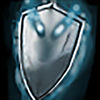
Overall: I love how you presented something too the table here, good work. Overall i do think these need some love and care though, The main avatar icon has a nice base shape but lacks in shading and highlights and maybe some higher contrast in colors. The other icons are a bit confusing to me, i cant really tell whats going on in some of these. The shields shading lacks a bit also, maybe a smoother shading and more highlights could bring it more alive. Some of the colors overall could have more contrast in them, showing off what they are meant to do. I believe that your shading needs to be smoother in alot of areas around your icons, itll make it less blurry and look more cleaner in the outcome. Good job.
-------------------------------------------------------------------------
PrinceYaser
Icon Contest #18 - Make him a Hero
Consistency of the icons in the pack Do the icons compliment each other well? 8/10
Blizzard style Is the style similar to standard icons? 8/10
Concept How qualitative is the concept, how unexpected and creative is the idea? Originality and uniqueness of icons are judged. How fitting are icons for chosen unit? 19/25
Technical note Quality of color, composition, expressiveness, shape, definition, sharpness, clarity, shading, realism, proportions, rendering, details, materials. 38/55
Overall: The colors match together with these 4 icons, they all fit together well but lack in detail and definition. Some of these icons could use some more details and highlights such as the first icon presented. The one that jumps out at me in these 4 is the last icon of the soldier with the wings behind it, i believe that one turned out pretty nice. I feel like icon with the figure being regenerated or something could of been edited with a better shape and effects. It, would be nice if it was a soldier like in the other icon, gaining special powers or something instead of a random figure like that. The sword icon is nice, but since it looks like its being powered by an ability it would be a nice touch to have one side having a goldish tone and the other being the regular sword form, showing off that its gaining power. Overall, nice job.
Icon Contest #18 - Make him a Hero
Consistency of the icons in the pack Do the icons compliment each other well? 9/10
Blizzard style Is the style similar to standard icons? 7/10
Concept How qualitative is the concept, how unexpected and creative is the idea? Originality and uniqueness of icons are judged. How fitting are icons for chosen unit? 20/25
Technical note Quality of color, composition, expressiveness, shape, definition, sharpness, clarity, shading, realism, proportions, rendering, details, materials. 50/55
Overall: The icons presented match with the unit greatly, without even looking at the unit model i can tell its a shaman or a shaman troll. The 4 icons match together as they have similar traits as in, they all have respected abilities that go with a troll unit or shaman. The icons are well executed and show off what they are meant to do. Some areas could of been better, the frog ability is kinda confusing to me, it would of been cool if a projectile was being thrown at the frog injecting it with poison or something like that. Overall, the icons go with the unit greatly but they don't really go with the warcraft theme too much, some icons seem to have that "new school" feel towards warcraft in my taste. But, they do execute the unit very well and show what the unit is capable of. Great work.
-------------------------------------------------------------------------
Murlocologist
Icon Contest #18 - Make him a Hero
Consistency of the icons in the pack Do the icons compliment each other well? 10/10
Blizzard style Is the style similar to standard icons? 10/10
Concept How qualitative is the concept, how unexpected and creative is the idea? Originality and uniqueness of icons are judged. How fitting are icons for chosen unit? 22/25
Technical note Quality of color, composition, expressiveness, shape, definition, sharpness, clarity, shading, realism, proportions, rendering, details, materials. 50/55
Overall: These icons match together well, the blizzard theme is very well executed here. The colors match well and each icon shows what it does for the unit. The goblin shredder's avatar icon looks kinda weird to me but i guess it is a hunk of metal with blades so i understand why it does look like that. Overall i like all 4 of these icons, the match together well..They are sharp and are very well executed, great job.
-------------------------------------------------------------------------
The Leader
Icon Contest #18 - Make him a Hero
Consistency of the icons in the pack Do the icons compliment each other well? 4/10
Blizzard style Is the style similar to standard icons? 4/10
Concept How qualitative is the concept, how unexpected and creative is the idea? Originality and uniqueness of icons are judged. How fitting are icons for chosen unit? 14/25
Technical note Quality of color, composition, expressiveness, shape, definition, sharpness, clarity, shading, realism, proportions, rendering, details, materials. 18/55
Overall: I love how you presented something too the table here, good work. Overall i do think these need some love and care though, The main avatar icon has a nice base shape but lacks in shading and highlights and maybe some higher contrast in colors. The other icons are a bit confusing to me, i cant really tell whats going on in some of these. The shields shading lacks a bit also, maybe a smoother shading and more highlights could bring it more alive. Some of the colors overall could have more contrast in them, showing off what they are meant to do. I believe that your shading needs to be smoother in alot of areas around your icons, itll make it less blurry and look more cleaner in the outcome. Good job.
-------------------------------------------------------------------------
PrinceYaser
Icon Contest #18 - Make him a Hero
Consistency of the icons in the pack Do the icons compliment each other well? 8/10
Blizzard style Is the style similar to standard icons? 8/10
Concept How qualitative is the concept, how unexpected and creative is the idea? Originality and uniqueness of icons are judged. How fitting are icons for chosen unit? 19/25
Technical note Quality of color, composition, expressiveness, shape, definition, sharpness, clarity, shading, realism, proportions, rendering, details, materials. 38/55
Overall: The colors match together with these 4 icons, they all fit together well but lack in detail and definition. Some of these icons could use some more details and highlights such as the first icon presented. The one that jumps out at me in these 4 is the last icon of the soldier with the wings behind it, i believe that one turned out pretty nice. I feel like icon with the figure being regenerated or something could of been edited with a better shape and effects. It, would be nice if it was a soldier like in the other icon, gaining special powers or something instead of a random figure like that. The sword icon is nice, but since it looks like its being powered by an ability it would be a nice touch to have one side having a goldish tone and the other being the regular sword form, showing off that its gaining power. Overall, nice job.
Mr.Goblin: Forest Troll Shadow Priest
Consistency: 9/10
Blizzard Style: 8/10
Concept: 24/25
Technical note: 50/55
Total: 91/100
Awesome icon set. The downparts are the whiteish glows on the Spiritual Rage icon that doesn't fit the rest of the set; the very thin green lines of Poisonous Dart, which doesn't match either the Blizzard style for icons or the rest of the set, since icon visual style tend to deliver scenes that are zoomed in and doesn't have much going on. Other than this, the icon is overall consistent and beautiful: Vodoo Doll and Replenish Staff are particularly a joy to look at.
--------------------------------------------
Murlocologist: Goblin Shredder
Consistency: 9/10
Blizzard Style: 9/10
Concept: 24/25
Technical note: 52/55
Total: 94/100
Another great icon set. One of the downparts is the eventually hard-to-read icons (the first icon, Ignis Ex Machina, is really hard to understand, and the Chainsaw Claw took me a while to grasp there's saw buried behind the leaves and light effects - the metal cane in the middle is much more proeminent and it looks like a "fire shot" ability or something); the other is the very intense saturation on the fiery-lights on the first icons. Kinda puts the Blizzard style off for me, since they seem to go much more conservative about depicting fire and light. Not that I personally don't like a bit of saturated orange fire/light - in fact, I do enjoy it a lot! However it feels a bit too much on that case. Aside these nitpicks, the icons are awesome, cohesive and amazingly executed. They feel like exceptionally good Blizzard icons.
----------------------------------------------
The Leader: Revenant
Consistency: 7/10
Blizzard Style: 5/10
Concept: 24/25
Technical note: 31/55
Total: 67/100
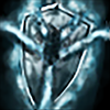
One can see good improvements from your previous icons in these set. They feel rushed (for example, you could've spent a bit more time defining the metal texture of the helmet icon), and some icons feel like they had a bit more love from the author than other icons from the set. Currently the icons are too blurry, which means they are different from the traditional Blizzard style (very defined icons, not blurry, and intense contrasts of light and shadow). Look at your shield icon WIP here, it looks much more defined and Blizzard-styled than the final version here. Try to focus more on this next time. One tip I can give is to try to get thicker lines when drawing: currently the lines that define the surfaces in your icons are too thin! The Undeath icon has some good looking reflections (good work), however it looks like it's a very thin metal helmet, while Blizzard icons generally have very thick metal surfaces. Look at this icon for comparison: Blizzard thick helmet / your thin helmet. About the first mace icon, it needs more light and shadow drawn in a way that makes us viewers understand the 3d volume of the object (use this as an example of good light and shadow for 3d volumes). Anyway, cool concepts, they feel mostly cohesive with each other, with the Undeath icon being by far the best one. Keep drawing!
-----------------------------------------------
Prince Yaser: Chaplain
Consistency: 8/10
Blizzard Style: 8/10
Concept: 24/25
Technical note: 42/55
Total: 82/100
This icon set is a mix of awesome icons and some good potential but a bit lacking icons. The Purification one looks kinda cool, but feels a bit off, specially for straying away from the Blizzard style approach. The revolving golden lines should be thicker, and the main light shaft also should be thicker, not only because of Blizzard style but also because it's a 64x64 image that's gonna be sized down ingame. Examples: Holy Light and Ressurection. Your Divine Clarity icon also suffers too from simple lines and thin contours that feels kinda off, same as the first one - but even more rushed. I like that concept though, it's a shame it felt that way =P On a final note, the last icon (Righteous Blessing) looks great and detailed, but in this case even stepping a bit in the "too-detailed-for-Warcraft-3" zone. Looks gorgeous, nonetheless. As I already said in the thread, your submission would've more benefit from uploading the Extra Material icon in place of, say, Divine Clarity one, IMO. About the sword icon: it looks super. Also it contains thin material floating around, but this time in a very good way: your 1st and 3rd icons wold've beneffited from such a composition - having the middle element thicker or more 3d-solid. Good work!
Consistency: 9/10
Blizzard Style: 8/10
Concept: 24/25
Technical note: 50/55
Total: 91/100
Awesome icon set. The downparts are the whiteish glows on the Spiritual Rage icon that doesn't fit the rest of the set; the very thin green lines of Poisonous Dart, which doesn't match either the Blizzard style for icons or the rest of the set, since icon visual style tend to deliver scenes that are zoomed in and doesn't have much going on. Other than this, the icon is overall consistent and beautiful: Vodoo Doll and Replenish Staff are particularly a joy to look at.
--------------------------------------------
Murlocologist: Goblin Shredder
Consistency: 9/10
Blizzard Style: 9/10
Concept: 24/25
Technical note: 52/55
Total: 94/100
Another great icon set. One of the downparts is the eventually hard-to-read icons (the first icon, Ignis Ex Machina, is really hard to understand, and the Chainsaw Claw took me a while to grasp there's saw buried behind the leaves and light effects - the metal cane in the middle is much more proeminent and it looks like a "fire shot" ability or something); the other is the very intense saturation on the fiery-lights on the first icons. Kinda puts the Blizzard style off for me, since they seem to go much more conservative about depicting fire and light. Not that I personally don't like a bit of saturated orange fire/light - in fact, I do enjoy it a lot! However it feels a bit too much on that case. Aside these nitpicks, the icons are awesome, cohesive and amazingly executed. They feel like exceptionally good Blizzard icons.
----------------------------------------------
The Leader: Revenant
Consistency: 7/10
Blizzard Style: 5/10
Concept: 24/25
Technical note: 31/55
Total: 67/100
One can see good improvements from your previous icons in these set. They feel rushed (for example, you could've spent a bit more time defining the metal texture of the helmet icon), and some icons feel like they had a bit more love from the author than other icons from the set. Currently the icons are too blurry, which means they are different from the traditional Blizzard style (very defined icons, not blurry, and intense contrasts of light and shadow). Look at your shield icon WIP here, it looks much more defined and Blizzard-styled than the final version here. Try to focus more on this next time. One tip I can give is to try to get thicker lines when drawing: currently the lines that define the surfaces in your icons are too thin! The Undeath icon has some good looking reflections (good work), however it looks like it's a very thin metal helmet, while Blizzard icons generally have very thick metal surfaces. Look at this icon for comparison: Blizzard thick helmet / your thin helmet. About the first mace icon, it needs more light and shadow drawn in a way that makes us viewers understand the 3d volume of the object (use this as an example of good light and shadow for 3d volumes). Anyway, cool concepts, they feel mostly cohesive with each other, with the Undeath icon being by far the best one. Keep drawing!
-----------------------------------------------
Prince Yaser: Chaplain
Consistency: 8/10
Blizzard Style: 8/10
Concept: 24/25
Technical note: 42/55
Total: 82/100
This icon set is a mix of awesome icons and some good potential but a bit lacking icons. The Purification one looks kinda cool, but feels a bit off, specially for straying away from the Blizzard style approach. The revolving golden lines should be thicker, and the main light shaft also should be thicker, not only because of Blizzard style but also because it's a 64x64 image that's gonna be sized down ingame. Examples: Holy Light and Ressurection. Your Divine Clarity icon also suffers too from simple lines and thin contours that feels kinda off, same as the first one - but even more rushed. I like that concept though, it's a shame it felt that way =P On a final note, the last icon (Righteous Blessing) looks great and detailed, but in this case even stepping a bit in the "too-detailed-for-Warcraft-3" zone. Looks gorgeous, nonetheless. As I already said in the thread, your submission would've more benefit from uploading the Extra Material icon in place of, say, Divine Clarity one, IMO. About the sword icon: it looks super. Also it contains thin material floating around, but this time in a very good way: your 1st and 3rd icons wold've beneffited from such a composition - having the middle element thicker or more 3d-solid. Good work!
(Judge 1 score/100 + Judge 2 score/100)/2 * 75 + (Poll score/poll votes) * 25
Participant | Entry | Results (judges score + poll score) |
Murlocologist |
(Goblin Shredder)
| 80,225(69,75+10,475) |
Mr. Goblin |
(Forest Troll Shadow Priest)
| 74,85(66,375+8,475) |
PrinceYaser |
(Chaplain)
| 62,975(58,125+4,85) |
The Leader |
(Revenant)


| 41,325(40,125+1,2) |
1st Place
Murlocologist
2nd Place
Mr. Goblin
3rd Place
PrinceYaser
4th Place
The Leader
Icon Contest #18 - Poll
Icon Contest #18 - Make him a Hero


")