• 🏆 Texturing Contest #33 is OPEN! Contestants must re-texture a SD unit model found in-game (Warcraft 3 Classic), recreating the unit into a peaceful NPC version. 🔗Click here to enter!
  • It's time for the first HD Modeling Contest of 2024. Join the theme discussion for Hive's HD Modeling Contest #6! Click here to post your idea!

Texturing Competition #7 - Holy/Angelic

Status
Not open for further replies.
Level 4
Joined
Jul 11, 2007
Messages
108
Blending options. Be more specific. Do you mean you made one piece and then had it copy and spread out ofver the area? or do you mean like, multiple, screen, darken, lighten, overlay.

As for the outline thing, alof of people cover the area with a solid color and then start drawing over the solid color.

Personally I rarely do that. Sometimes I do. It just depends on my mood. I usually just start drawing details on an empty layer over the original, and keep adding details on various layers until I have the original covered.

This time I did both.

I thought i had a blending option on my clothing layer but i don't. Btw the clothing is done in 3 different layers. 1 solid color, 1 with the hairs brushing work and 1 more with a blending option to give it a special feel.
I do it like you, i make layers and draw on them to overlap the original, if thats what you mean. :smile:
 
Level 10
Joined
Jan 5, 2007
Messages
283
Dio and me are using the same model -_-'

Second Texture WiP:
TexWiP2.jpg
 
Level 9
Joined
Jan 1, 2007
Messages
221
I thought i had a blending option on my clothing layer but i don't. Btw the clothing is done in 3 different layers. 1 solid color, 1 with the hairs brushing work and 1 more with a blending option to give it a special feel.
I do it like you, i make layers and draw on them to overlap the original, if thats what you mean. :smile:

kk im way to tired to we what you wrote so all ive read was that us used 3 layers yeh??? my guess is u've but down u base colour yeh?? then uve CnP a fur/hair texture and used overlay or some option like that then on layer 3 u went in for it with the Burn tool?:grin:
 
Level 17
Joined
Sep 2, 2005
Messages
1,029
The face is better but needs some contrast. Nice job though Ezi.

You can always go over the highlights with a bright brush and the darker areas with a dark brush to add some contrast. I think the face should also be a tad bit sharper so you know what it is ingame. But good job, definitely an improvement.

if you mean this:
Click the Arrow
that wasnt ezi, that was me.
 
Level 17
Joined
Sep 2, 2005
Messages
1,029
Here is the new WIP. The face has been completely redone, and some of the cloth has been worked on. Still needs alot of work, but I thought I'd put a WIP up for you guys.
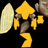
[Edit]: Crap, I doubleposted again. If someone wants to merge this with my last post that would be super (if thats possible)
 

Attachments

  • HeroLichHolyPre.jpg
    HeroLichHolyPre.jpg
    73.7 KB · Views: 237
Level 14
Joined
Aug 25, 2005
Messages
1,133
Ugh, I just cant seem to find any inspiration for this contest, dunno if im in or not. :(

Think of a angel, Dreadlord, Make him in to a fallen angel, still having the good angel look but having the demon still part of him. make his wings in to angels but dark red, Eyes should be black with a white glare coming off of them with a darken light shining off in to his eye brows and upper cheek bone. He should have half of a peasant shirt but only dianglely covering his chest so some of his chest and a arm are uncovered, his pants should but white princess of persah style but with some light blood marks on them and restiched marks, he should have human feat but near the claws give him dark red skin like its taking over slowly, same with his hands the open part of his chest should have a massive scar that goes under the part of the shirt. his face should be mostly human, with a white hair goatee.
 

A.R.

Skin Reviewer
Level 25
Joined
Mar 12, 2008
Messages
347
Update, nearly finished. The cloth still looks messy, the wrap there is no fun :( I'm still debating whether or not to just alpha out the horns/tail... unless anyone has a better idea, in which case let me know :)

EDIT: added an ingame shot
 

Attachments

  • BK4.jpg
    BK4.jpg
    226.2 KB · Views: 260
  • BKwrap4.jpg
    BKwrap4.jpg
    172.9 KB · Views: 255
  • BKIngame.jpg
    BKIngame.jpg
    86 KB · Views: 280
Level 9
Joined
Jan 15, 2008
Messages
235
eh... if i would have tablet skining would be 50% easier. its hard to move what u imagine on screen, much easier with pen.

i see some gr8 works here , really awesome, but that arthas guy looks so evil try give some holy effect on him?:con:


anyway i've done with face, check it. :razz:
 

Attachments

  • wipface.jpg
    wipface.jpg
    56.7 KB · Views: 263

A.R.

Skin Reviewer
Level 25
Joined
Mar 12, 2008
Messages
347
And I suppose you have a tablet, right?

yup, an old-fashioned Wacom one. best thing since sliced bread :D

@ike_ike: yeah, its crappy how you can't alpha the wings on the model - the material simply isn't alpha-able. but ingame you can set the transparency to 0.01% with triggers and it makes the alpha'd parts of the model transparent. it looks wierd on other models, but its fine on the warden.
 
Level 4
Joined
Jul 11, 2007
Messages
108
kk im way to tired to we what you wrote so all ive read was that us used 3 layers yeh??? my guess is u've but down u base colour yeh?? then uve CnP a fur/hair texture and used overlay or some option like that then on layer 3 u went in for it with the Burn tool?:grin:

Oh comon, stop making a fool out of yourself and just face it, i brushed it.
 
Level 9
Joined
Sep 2, 2007
Messages
214
Hey !

Finally i got some time over to tryout the texture competition :grin: after 2 hours of work i came out with this (i know im slow but im new to this xD).

Still loads to do but it's something :wink:
 

Attachments

  • Knight WIP ingame.jpg
    Knight WIP ingame.jpg
    23.3 KB · Views: 302
  • Knight WIP Texture .jpg
    Knight WIP Texture .jpg
    58.3 KB · Views: 422
Level 4
Joined
Jul 11, 2007
Messages
108
Ironic..when you consider that the nature of this competition is angelic and holy.

I agree. They are dark and suck the life force from their enemy's, i dont see whats holy about that, and its a paladin, so neither does he look like an angel.
 
First WIP

Finally found something to do, I feel it almost necessary that I do a skin for the death knight that is actually heavenly, unlike the blood knight :p. So here is first WIP, I need some help with the face, I suck at faces, any advice would be much appreciated.
 

Attachments

  • HeavenRider.JPG
    HeavenRider.JPG
    103.7 KB · Views: 235
  • Heavenly Dragon Horse Rider copy.jpg
    Heavenly Dragon Horse Rider copy.jpg
    112.3 KB · Views: 252
anyway i've done with face, check it. :razz:
The mouth and eyes look like they're not part of the face. And that face is definite dodge/burn.
Oh comon, stop making a fool out of yourself and just face it, i brushed it.
Whether you use a brush or filter, it still looks bad. Freehand moar pl0x.

Finally found something to do, I feel it almost necessary that I do a skin for the death knight that is actually heavenly, unlike the blood knight :p. So here is first WIP, I need some help with the face, I suck at faces, any advice would be much appreciated.

The face looks a little too happy.


I call the dragon skin!
 
Level 9
Joined
Sep 2, 2007
Messages
214
--Final Submission--

After 10 hours of work I'm finally finished with my first hand textured unit :grin:

It's supposed to resemble a Temple Knight.

Hope you like it :cool:
Now im off to finish my Cold one model =)

/MadseN
 

Attachments

  • Crusader Ingame.jpg
    Crusader Ingame.jpg
    43.8 KB · Views: 864
  • Crusader Texture.jpg
    Crusader Texture.jpg
    63.5 KB · Views: 295
  • Crusader.blp
    156.8 KB · Views: 105
  • Crusader Ingame 2.jpg
    Crusader Ingame 2.jpg
    107.3 KB · Views: 247
Last edited:
Level 4
Joined
Jul 11, 2007
Messages
108
Ingame it looks ok, if i freehand it more, result ingame will be exact. Its useless.

And what does pl0x mean?
 
Level 17
Joined
Sep 2, 2005
Messages
1,029
Here's mine. This time with the Unwrap.

What do you think/Give suggestions.

Teamcolor on the bottom of the robe like with the lich (but added more gradually) on the gems on the robe, and on the back of the collar. (On the scale).

And here's the new face in detail too.

And I don't deny it. The red cloth was inspired by the blood knight's sword handle, but I knew SOMETHING needed to go there.

Well Ezikielth, its definitely an improvement. The face still looks blurry though.
 

Attachments

  • HeroLichHolyPre.png
    HeroLichHolyPre.png
    371.4 KB · Views: 202
Level 14
Joined
Jul 11, 2006
Messages
659
I just looks like a lich in white robes. Rather boring. I cant think of any suggestions for it. I just dont see the model being holy regardless of the skin. One thing I would change would be the bones. Bones are UNholy. Oh and that teamcolor balance thing looks out of place on the skin.

All in all I think you need to work more on the concept. What exactly is he supposed to be anyways?
 
Level 17
Joined
Sep 2, 2005
Messages
1,029
I just looks like a lich in white robes. Rather boring. I cant think of any suggestions for it. I just dont see the model being holy regardless of the skin. One thing I would change would be the bones. Bones are UNholy.

What bones? There are no bones on the model... There is a bronze robotic or armored looking face, White sleeves, white robe, no bones around the collar anymore. the only thing I haven't figured out how to make look really "good" is that he still has the horn things on the face.
 
Level 17
Joined
Sep 2, 2005
Messages
1,029
The concept behind it is a Celestial Judge. So "he/she/it" determines the fate of those who arrive in the afterlife type thingy. It should be a little harsher than the pretty fluffy angel.

And I'd like to note it looks less evil than the blood knight...

Ezikielth: The shaded spots, like under the nose, around the mouth, at the top of the eye, around the forehead ridges, have too much of a solid block of color, with the edges a bit blurry, whereas the rest of the face has a bit too little definition. and the wrinkles on the right top of his forehead need more sharpness. Instead of just using the brush, use the polygonal lasso tool. Then color inside the mask you make with the lasso. It's like the tablet for people with a mouse.

Here's the unwrap of the Dranei face I made, so that you can see what I'm talking about. You obviously can't just use it though, because you'll end up disqualifying yourself. So just use it as an example.

If everyone else agrees there's no way to make the lich holy then I'll give up and find another model. But I want some more opinions before I do that...
 

Attachments

  • face.png
    face.png
    55.1 KB · Views: 219
Level 18
Joined
Oct 7, 2006
Messages
2,077
Ezik, post your off topic map issues in another thread, this is not an advertisement thread. All skins are looking good guys
Ezik- you can make him look not like an orc, he doesn't look like one right now
Keep working and make it nice
Dark- personally I like it
You can always start another skin and keep that one on the side. And then submit whichever one you think is better, or what people like more
 
Status
Not open for further replies.
Top