• 🏆 Texturing Contest #33 is OPEN! Contestants must re-texture a SD unit model found in-game (Warcraft 3 Classic), recreating the unit into a peaceful NPC version. 🔗Click here to enter!
  • It's time for the first HD Modeling Contest of 2024. Join the theme discussion for Hive's HD Modeling Contest #6! Click here to post your idea!

Texturing Competition 14 Voting

Which texture is your favorite?

  • Dentothor's Submission?

    Votes: 3 4.1%
  • INF3RNO's Submission?

    Votes: 3 4.1%
  • Xezko's Submission?

    Votes: 11 15.1%
  • Just_Spectating's Submission

    Votes: 21 28.8%
  • Dionesiist's Submission?

    Votes: 10 13.7%
  • 67chrome's Submission?

    Votes: 25 34.2%

  • Total voters
    73
  • Poll closed .
Status
Not open for further replies.
Level 18
Joined
Oct 7, 2006
Messages
2,077
The Hive Workshop

attachment.php

Texturing Competition #14 Voting

Contest Theme: Dionesiist's Model

Each contestant must make a custom skin for this model.

Here are the skins, vote for your favorites!

Dentothor's Submission
60994d1248089325-texturing-competition-14-submission-poster.jpg

Original Post

INF3RNO's Submission
VOID

Xezko's Submission
60281d1247343998-texturing-competition-14-finalsub.png

Original Post

Just_Spectating's Submission
60208d1247261713-texturing-competition-14-final-pic.jpg

Original Post

Dionesiist's Submission
models_7377_screenshot.jpg

Original Post

67chrome's Submission
BannerFelWarden.jpg

Original Post

Props to Dio for the model, and INF3RNO I still have no .blp file for you. It has to be uploaded within 12 hours or you will be disqualified.
 
Last edited:
Level 24
Joined
May 9, 2007
Messages
3,563
Denothor - Too much contrast with the black, and didn't get the chest. <3'ed the weapons.

INF3RNO - Didn't like the team colour, or the weapons but the overall skin had some great unity.

Xezko - Shading on the shoulder pads/under arms seemed strong and the weapons were miss-happen. Well put together, and the texturing on the wings was awesome.

Just_Spectating - Idea and use of wrap was genius, mostly well done. TC is messy, and the swords seem a little rough/flat.

Dionesiist - Feathers seem large, and backs of the legs are ugly. All the leather was wonderful, as was the skin as a whole.

67chrome - The base of the skin is amazingly well done, but the sworls & swirls lose it for me. Also, the TC is random at best.

Overall voted for Just_Spectating, for use of the facial wrap and the whole idea. It was a piece of un-rivaled creativity.
 
Creative my ass. Looks like a Zealot, you agree?
That Greek Warrior thing is amazing. The face is worth a thousand words. Its got Humor, action, Romance, Its brilliant.

let me tell you that we got a blank model and could create ANYTHING with it.

also i already mentioned inspired by zealot..

even the name says zeratul.


:thanks for the vote hawk:
 
Level 38
Joined
Jan 10, 2009
Messages
854
I know in statistics 40 seems to be a magic number, you need at least 40 votes before you can make an accurate judgment on something. So far this is pretty interesting watching how the votes are being cast though, did not expect the voting to look like this. Anyways, good luck everyone :D
 
Level 26
Joined
Nov 19, 2007
Messages
1,177
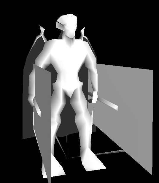
Dentothor: Nyeh. Looks kinda messy. The face is rather jumbled. The weapons look neat from close up, but from personal experience skinny weapons and objects turn out horribly in WC3. I like how you didn't alpha everything out though, and used alpha only to complement the texture (Ahem, INF3RNO)

INF3RNO: It's a freakishly awesome skin, but I think that alpha-ing out the cape and most of the other flat surfaces was kinda lazy. Although given the model and its deliberate alpha capabilities, I suppose it's fine. Anyhow it looks awesome, though the sword's kinda ... stumpy.

Xezko: Looks like a Dio skin :O Looks pretty cool, although I think some bits are a bid streaky. Wings are nice, weapons coulda been a bit more ... weapony.

Just_Spectating: Blargh. It's a really nice skin, although it's hard to tell whether it's because of Samwise's design or your own technique. I think that making a skin based off someone else's concept for a contest is a bit bleh. The weapons coulda been more glowy too, though their shape and size is EPIC. Overall, though, it's pretty coo.The head seems a bit off colour though. And I'm not quite sure why hawk thinks it's original :/

Dionesiist: Wings = bleh. Sword = bleh. Face, armour, body, design = awesome. To think that a face like that could come out of the same model as the faceless/armoured things everyone else has done is awesome.

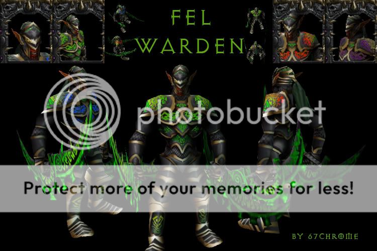
67chrome: Eep. The armour's nice and smoothly shaded and all, but the masses of green don't really appeal to me :/ The helmet he's got is awesome, though.


1 - 1)10
2 - (hr0m3
3 - 1nf3rn0

Golly, that was fun
 
Level 4
Joined
Jul 25, 2009
Messages
95
Can't see Xezko's post. :(
Edit1:I am now able to see it.
Edit1:pS: Voted for 67chrome
 
Level 12
Joined
Dec 16, 2007
Messages
451
I know in statistics 40 seems to be a magic number, you need at least 40 votes before you can make an accurate judgment on something. So far this is pretty interesting watching how the votes are being cast though, did not expect the voting to look like this. Anyways, good luck everyone :D

In my book of Basics of Statistics Analysis, sample of more than 30 elements can be representative :D
 
Level 18
Joined
Aug 13, 2007
Messages
1,584
I think we all like Protoss way too much.

My personal opinion:
1. J_S (marvelously made Zealot)
2. 67chrome (well I really hesitated whether or not he deserves my vote, but I don't like the concept of the Fel Warden. Otherwise the skin is of superior quality)
3. Xezko - well I wish you had made the skin more golden and not so plain yellow.
4. Dionesiist - the face is meh and overall looks like a cross-breed between a diatrima and angel statue. Nevertheless, good execution.
5. Dentothor - I very much like the weapons but the rest I think is what you skinners call messy.
6. INF3RNO - nice constellation-like skin, but making a skin of a stellar creature like Algalon does not allow much detail.
 
Level 26
Joined
Apr 13, 2008
Messages
2,049
mmm very close match between dio's and 67chome's. Yes just_spec's skin was the most creative but... i cant really say it was executed the best. Dio's was certainly lulzy, i love his face (so pompous :p) but I would say that 67chome's had the best shading and overall "texture" in the texture but i really hated the face and concept, the evil red face didnt really go with the warden theme, seeing as the warden is a night elf and only orcs are fel and red, fortunately i think the teamcolor made up for it, which i absolutely love. very well done in that aspect. overall i would say 67 won my vote. great job though to everyone who contributed, awesome and creative. ^^

also dio's had duck feet xD
 
Level 9
Joined
Jan 1, 2007
Messages
221
/sigh ohwell then, hasnt been like that for previous competitions...least none ive been in. ill just wait for the next comp then, didnt have any good idea's for this one really :\
 
Level 24
Joined
Jan 19, 2008
Messages
2,445
I still goes fourth and there is a tie between JE and Chrome. T-T

Jesus, less posts like this "NOOOOOOO IMMA BE 4TH!!! FEEEECK!!! MY ICON AND REPZORZ!!!"
That's like your third post about just whining.

Anyways, I went with Just_Spectating's skin. When I saw the model for the first time I never imagined that someone would make an protoss texture for it.
 
Status
Not open for further replies.
Top