Debode personally requested me to comment, so here goes. I do warn you I might come off a bit harsh. I've tried to give a short, constructive review of all the models previewed in the first post.
Frankly, I thank you for spending your time on this.

It is very much appreciated.
However, I must say our views are rather different. For one, you don't seem to think about how the model will look like in-game, quite different than the view on the Magos screenshots.

Which is fine, really, and entirely my fault, but that means that many of your suggestions don't really count.
Now, lets see...
Peasant
The face is absolutely horrid, his lower lip is three inches broad and only one inch wide. He's got some sickly dark eye holes and his eyebrows are broken - a scar emerging from his eye holes towards the middle of his forehead. He also has a funny nose, but that's character.
Other than that, the clothing looks fine, and so does the bag. The pick seems to be made of obsidian.
Lets see now.
The face will NEVER be noticed in-game, I've provided you with screenshots in the chat that prove my point.

That's how the original Peasant's face looks like as well. The facial texture is made to suit the portrait.
The pickaxe is made of really dark or old iron.

Knight
Quite bright and rough metal on this lad, and more so on the horse. I'd suggest a darker, smoother metal to go with the image of a knight. The metal on the horse looks more like wool than metal, to be perfectly honest. I also think the shield's teamcoloured area needs some more shading.
I somewhat agree on the 'rough' part of your comment about the metal. It does look a little... Wool-ish. I don't think it needs to be darker, though.
I agree about the shield.
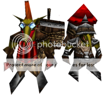
Peon
Pretty sweet, I don't know anything about Orc anatomy, so I'm not qualified to judge that. That only leaves the slightly flat looking shirt (guessing it's teamcoloured) and the glitches in the pike (dark grey lines). Quite decent, actually.
It's mostly just a texture on top of Blizzard's peon, but thanks anyways.
The pickaxe is a minor detail that will NEVER be seen in-game, or no one will pat attention to it, and besides, that's how the original Peon looks like.
Yes, I agree about how the shirt looks flat. Yes, it is TC.
Troll Destroyed
It's a bit hard to judge how it looks due to the angle and huge roof, but that's how it'll look in-game anyway and it looks sweet.
Thanks. <3
Footman
This guy is packed in wool. The leather and gold is also quite bright. Oh, and even the sword looks like wool.
I agree, he looks like he's wearing wool.
The leather looks perfectly fine to me.
The gold could be slightly darker, but hell, that's why it's gold. :X It's meant to be bright and shiny.
Dragon
Looks sweet. I just think the teeth should be less white. I think a pale yellow tone would look better. I think the claws would be cool if they were black. Lastly, I can't make out what the brown mohawk on the head and wings is all about.
Mr.Goblin actually wanted to make the teeth yellow, but it looked more like brown wood than yellow teeth and me and Linaze didn't like that, so we made him change it to a white color instead.
The claws are tiny and are under the dragon. Wont be noticed.
The black mohawk on his head is just part of the Dragon model. It looks nice and adds detail, far better than just having nothing on him. Besides, it looks more original that way.
Dragon Roost
I don't know what dragon eggs supposedly look like, but I think the yellow spots look awkward. Other than that, I think the teeth would be better in a pale yellow tone here as well.
The yellow spots are TC, and the only way we figured out on how to add TC to the eggs. I think they have their own charm, somewhat.
Same goes to the teeth here as what I said on the previous comment.
Elven Ballista
Yes, it's ballista. It looks neat. The gold is a bit vividly coloured and I think the wood could use a larger portion of the UW as it turns out awfully blurry. I don't think strings are made out of that rough ropes, I suggest you eliminate the dark lines indicating a twisted rope, because it looks much thicker and firm that way.
Thanks. The gold looks fine to me, just like on the Footman, so I think that's just your preference here.

The wood is using a huge portion of the UV, and I'm pretty sure the blurriness you see is caused by the angle of the screenshot. The rope is supposed to look tough, as otherwise it would get torn apart as soon as it fired.
Grunt
First thing I noticed is the largely different skin tone. I think the Peon's skintone is more representative for Orcs. Beyond that, his metal plate is really blurry and the eyes seem a bit small. The axe looks kind of weird, and it's incredibly blurry. Otherwise, pretty neat. You should use this style for the metal on the footman and knight as well.
Well, Orcs, just like Humans, have various skin tones.

They're not fixed to a single color. It just adds a little bit of variation.
What metal plate, the shoulderpads? Or his chest?
The eyes wont be seen in-game, seriously now...

What matters is how the portrait looks like. All you'll see in-game is his horned helmet, and even that would barely be noticeable.
The axe does look a bit weird, I admit, but I didn't want to make it high poly. The original axe looks even stranger to me, honestly. :X
Yes, Goblin SHOULD use that style for the rest of the metal, looks much better! You have no idea how much you're right here, I've been thinking about that all the time.

And again, blurriness = angle.
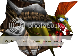
Goose Gryphon Rider
It's a breed of goose and eagle, supersized. I don't know, it looks silly to me. The dwarf is incredibly messy and I'm not sure where his eyes are? They seem to be located under his beard and/or hair. I can't make out what everything else is. The dwarf really needs to be redefined, it's a mess.
Angle. It's all about the angle. It probably doesn't even look like it's flying. It's supposed to look like the WC2 Gryphon, obviously.

Like a white eagle with lion legs covered in feathers.
The dwarf is lowpoly on the Blizzard version as well, simply because he wont be noticed in-game. The portrait looks MUCH better, I assure you.
Human Battleship
This is awesome. Is the blue teamcolour? It wouldn't hurt with some slimmer lines as well, at least on the entirely white parts. The lion head looks really squeezed, though.
The blue around the lion heads is TC, indeed. I have no idea what do you mean by 'slimmer lines', but it's using a Blizzard texture, soo...

The lion heads do look squeezed, but there's nothing I can do about it. Sorry. I already stretched it out fully on the UV.
Human Transport
It's a decent design and all, but I don't understand why the side is open like that. As far as I can tell from the WCII unit list, the boat should be shielded in metal on all four sides. Furthermore, the teamcolour parts lack shading. The tanks(?) with pipes in them are really blurry.
The side open like that because in-game textures and because no need for hi-poly if it looks fine.

The TC gear icon is shading-less, indeed. That is because we used in-game textures. Using a custom texture just for that would be a waste of filesize, but we'll see when we start working on the Alliance again.
Again, seems like a perspective problem to me, about the blurriness. Either way, they look fine in-game.
Ogre
Resembles the WCII Ogre well as far as I can tell, but there's not that much of a change from the WCIII Ogre so I can't really see how this is worth the file space.
Because we're recreating ALL the unit models.

Thus, it can't be an exception.
I agree, though... It could use a unique skin instead of this WC3 one without the tattoos.
Ogre Mage
I much prefer this over the blue Ogre Magi in WCIII. The tribal makrings could use some more shading here and there, though.
I fail to see where they would need shading, please elaborate.
Paladin
The metal is very white, and the armour of the paladin himself is wool like the footman. I like the idea for the shield, but it looks like a leather glove rather than a design on the shield. Make it more metal looking. Why are his eyes burning on the icon?
Skeleton
The skull is marvelous, and I love the armour as well. However, the bones seem to extrude through the armour and that's not looking very nice. His arms and legs are fairly blurry.
The extruding bones are supposed to look like the armor has been broken, I suppose. Either way, that's a part of Cavman's old model and looks fine in-game because the skeleton is so tiny. Looks nice in my eyes, but not from this specific angle.
I don't see the blurriness on his arms and legs. :S Looks like any average WC3 model\texture. We're not striving for extremely hi-res stuff here. More like Blizzard-quality and low filesize.
Troll Axethrower
Sweet. I like the axes a lot. The quality of the skin excedes that of Blizzard's original forest troll and I like the creative use of teamcolour as face paint. I think you could do without the teamcolour on the bracers, the face paint and hair is enough, and rather make some nicely ornamented gauntlets for eye-candy.
I thank you in DonDustin's and Goblin's name.

The face paint is directly from WC2, so are the bracers sadly.
Ornamented gloves wont work. He's a troll, not an English gentleman!

He's supposed to be savage and wild. Thus the loincloth.
Mage
Her face is significantly paler than her neck, and her shoulder bones are too far up. The white cloth doesn't really fit in, in my opinion, perhaps dark brown would fit better. I don't know, I generally just don't like the colour scheme and design on this one. It's a bit of a clash of colours that don't contribute to each other.
I'm really really sorry, but I completely disagree with everything you said.

1) Her face is at the exact same skin color as her neck.
2) I have no idea where you can see the shoulder bones, but if that is true(I don't know anatomy too well

), I guess Mr.Goblin could fix it.
3) The white cloth and the purple clothing are supposed to represent a citizen of a much higher class, a student of arcane magics in Dalaran. She's not supposed to be your common run-out-of-the-mill villager or warrior. She is supposed to be clean and tidy. Dark brown would make look evil, or at least less pure than she is supposed to be.
4) The colors are great in my eyes.

Death Knight
I like the horse, but it's quite blurry, particularly the legs, and the leather armour is too high on contrast. The rider should look more like the icon, in my opinion. Make golden runes along the edges instead of the thick golden trim. The black part of his cape doesn't fit in, really, so I suggest you use teamcolour for all of the cape. The golden runes will provide enough variation.
1) The horse doesn't look blurry from an in-game perspective.
2) The leather armor is Blizzard's work as far as I can tell. I guess Goblin left it there because it didn't look too out of place. Looks fine to me though. In-game, the lightning makes everything look darker and thus better.
3) The golden runes look much better than the trim, indeed. Goblin should really consider changing that. I wanted to tell him that when he was working on it, but I guess I never got the chance.
4) The black part of his robes provides a good contrast to all that damn teamcolor, and the angle is blocking most of it too. :X If everything was teamcolor he'd look pretty damn silly in-game.
Assassin
The pauldrons are huge, and as they seem to be made of metal, incredibly heavy for an assassin. I suggest more emphasis on agile design. Her thighs are fairly buff for a woman. Otherwise, it's quite blurry and there seems to be a glitch with the wrap on the front of the cape. The boots are a bit bright despite the cape and shoulders casting shadows.
The shoulderpads provide a good contrast and make it look unique in-game compared to the regular Assassin model. Besides, in-game she is so tiny, she really NEEDS big, definitive shoulderpads. As for her thighs... I guess that years of constant training and running made her more buffed up than the average girl.

Again, I do not see the blurriness. I guess it's because we're using 256x256 textures as opposed to 512x512, so close ups don't appear extremely sharp and crisp.
All in all, I really want Goblin to look over it and answer you back, as he's the author for most of this.

Thanks for your feedback, it is greatly appreciated!


