Community
Maps
Tutorials
Gallery
Support Us
Install the app
-
Listen to a special audio message from Bill Roper to the Hive Workshop community (Bill is a former Vice President of Blizzard Entertainment, Producer, Designer, Musician, Voice Actor) 🔗Click here to hear his message!
-
Read Evilhog's interview with Gregory Alper, the original composer of the music for WarCraft: Orcs & Humans 🔗Click here to read the full interview.
-
Create a faction for Warcraft 3 and enter Hive's 19th Techtree Contest: Co-Op Commanders! Click here to enter!
-
Create a void inspired texture for Warcraft 3 and enter Hive's 34th Texturing Contest: Void! Click here to enter!
-
The Hive's 21st Texturing Contest: Upgrade is now concluded, time to vote for your favourite set of icons! Click here to vote!
You are using an out of date browser. It may not display this or other websites correctly.
You should upgrade or use an alternative browser.
You should upgrade or use an alternative browser.
Phoenix Trial #7 - Attribute icons
- Status
- Not open for further replies.
- Joined
- Aug 1, 2009
- Messages
- 620
i think i might use luck insted of one of my other attributes
- Joined
- Sep 11, 2009
- Messages
- 1,812
im joining.. dont know what ill do yet.
- Joined
- Jan 27, 2007
- Messages
- 948
- Joined
- Sep 20, 2008
- Messages
- 445
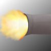
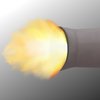
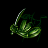
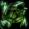
Insanity WIP

Endurance WIP


Endurance WIP

Last edited:
- Joined
- Sep 20, 2008
- Messages
- 445
Because these are, without a doubt, the most boring icons in Warcraft 3.oh sh-! this might not end up well D:
why not keep it simple? why always complicate stuff?
3 Golden icons (or red/green/blue) representing strength/agility/intelligence is that hard?
and if you guys want something unique try replacing the original ones with similar ones like Power/reflex/intuition that wont actually change much but make you look cooland might get you more votes.


Insanity WIP

Endurance WIP

hahahahaha
this are some wicked attributes. looks funny. keep 'em up, crazy ideas and wierd-looking (in a positive way) icons are great.
- Joined
- Jun 2, 2008
- Messages
- 12,887
Insanity WIP

Endurance WIP

I dont really get the endurance one that much :/
- Joined
- Aug 1, 2009
- Messages
- 620

My Luck icon atm.
- Joined
- Sep 20, 2008
- Messages
- 445
The scientist has to endure countless failures (and things blowing up in his face) until he finds a breakthrough in his potionsI dont really get the endurance one that much :/
- Joined
- Sep 11, 2009
- Messages
- 1,812
lool. the insanity one is awesome. he looks VERY crazy.. good job
- Joined
- Jun 2, 2008
- Messages
- 12,887
The scientist has to endure countless failures (and things blowing up in his face) until he finds a breakthrough in his potions
Gotcha
- Joined
- Mar 5, 2008
- Messages
- 3,887
Ohhh.... DAMN IT!!! :/
I wish I could join :*(
Edit:
Maybe I'm joining after all, got some old motherboard and some pc parts from 20th century >
I wish I could join :*(
Edit:
Maybe I'm joining after all, got some old motherboard and some pc parts from 20th century >
Last edited:
- Joined
- Sep 11, 2009
- Messages
- 1,812
My Attributes will be Defense Mastery, Attack Mastery, Magic Mastery. (They are almost like Agi, Str, Int but a bit different)
Defense = Health, Armor, Health Regen.
Attack = Damage, Attack Speed, Movement Speed
Magic = Spell Power, Mana, Mana Regen.
Here is Defense Mastery wip
WIP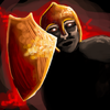
EDIT: edited the next 2 images. these are the final version, well i think lol.
Full size
64x64 (in Real 64x64 Version, its a bit more little so we can see the whole icon cuz if i wouldnt have make this, it would have make the whole icon looks very idiot)
I still dont know what to think about this icon but i tried to give it a wc3 feeling... some comments maybe?
Defense = Health, Armor, Health Regen.
Attack = Damage, Attack Speed, Movement Speed
Magic = Spell Power, Mana, Mana Regen.
Here is Defense Mastery wip
WIP

EDIT: edited the next 2 images. these are the final version, well i think lol.
Full size

64x64
 (in Real 64x64 Version, its a bit more little so we can see the whole icon cuz if i wouldnt have make this, it would have make the whole icon looks very idiot)
 I still dont know what to think about this icon but i tried to give it a wc3 feeling... some comments maybe?
Last edited:
- Joined
- Jun 2, 2008
- Messages
- 12,887
somebody give me feedback/opinion please
They look ok, but arn't you going to put it into an icon perhaps?
- Joined
- Apr 18, 2008
- Messages
- 8,453
Guys... Don't forget to put the "Normal Border" layer under the actual silver border. It's the black outline that makes the icon look good. I suggest using the icon border layer .PSD from the tool section.
Lightskin, a black background would be best.
Lightskin, a black background would be best.
- Joined
- Jan 31, 2009
- Messages
- 1,793
Goodluck to all applicants.
- Joined
- Aug 1, 2009
- Messages
- 620
My Luck - ATM - xD
 ->
->
 ->
->

Well hope you like it


Well hope you like it

- Joined
- May 16, 2007
- Messages
- 7,285
are these supposed to be the 64x64 icons or those smaller ones that BananaHUNT showed us?
- Joined
- Apr 18, 2008
- Messages
- 8,453
Yeah; why no one uses the actual attribute borders?
- Joined
- Mar 5, 2008
- Messages
- 3,887
Yeah; why no one uses the actual attribute borders?
That's what I've been thinking yesterday before i went to bed. And I was hoping no one else would do that xD
Edit:
I guess this will be my STR icon.
Attachments
Last edited:
- Joined
- Jan 30, 2009
- Messages
- 2,273
-> ->
->

Well hope you like it
you really need to tone down that BG...
- Joined
- Mar 5, 2008
- Messages
- 3,887
- Joined
- Mar 18, 2008
- Messages
- 865
It looks retarded
It looks like your making The Human Torch attributes.
Go with Power, Speed, and Energy. Just an idea.
- Joined
- Mar 5, 2008
- Messages
- 3,887
Power icon is done, heh
Maybe I'll take your advice, thanks.
- Joined
- Jun 5, 2008
- Messages
- 2,573
I like that icon Berz.
- Joined
- Mar 5, 2008
- Messages
- 3,887
Thanks, but I'll think of something better 
Anyway why do I have a feeling this is pretty much dead contest? :<
Anyway why do I have a feeling this is pretty much dead contest? :<
- Joined
- Jul 13, 2010
- Messages
- 101
Because It is, Berz...-BerZeKeR- said:Anyway why do I have a feeling this is pretty much dead contest? :<
Also, I am competing and I might not place, for I never did icons before.
Anyway, I'm doing Gunner Attributes and I made an Accuracy type icon.
How do I insert an Image from my folder?
Last edited:
- Joined
- Aug 1, 2009
- Messages
- 620
Will this be better - Dentothor???


- Joined
- Sep 11, 2009
- Messages
- 1,812
Golden-drake, what u should do is not change BG, other was good, but or make a black outline between Bg and Main Object or tone down the Bg <== Make the opacity of the bg at something like 75% instead of 100%
EDIT:
Lets wait a bit more before saying this lol..
EDIT:
Anyway why do I have a feeling this is pretty much dead contest? :<
Because It is, Berz...
Lets wait a bit more before saying this lol..
- Joined
- Aug 2, 2008
- Messages
- 442
bad theme ~= dead contest
- Joined
- Sep 11, 2009
- Messages
- 1,812
Not a bad Theme, But a very hard theme cuz its hard to make 3 Icons for Attributes that fits between and that are not a Muscle Man, A Speedy Man and an Intel Man. (Cuz we already got lots of those icons)
- Joined
- Aug 2, 2008
- Messages
- 442
yeah, it's a bit of a let down after all these months
- Joined
- Aug 16, 2007
- Messages
- 847
Personally I really like the theme, if I had any skill as an icon artist I would definitely join.
- Joined
- May 16, 2007
- Messages
- 7,285
CRAZYRUSSIAN already made the best attribute icons ever (imo)
which makes this contest hard already.
which makes this contest hard already.
- Joined
- Sep 11, 2009
- Messages
- 1,812
- Joined
- Aug 16, 2007
- Messages
- 847
Nice work kola.
I didn't think it could be an orc, until you mentioned that though, kinda thought it was more of armour, which I think you could push a little more if you wanted.
I didn't think it could be an orc, until you mentioned that though, kinda thought it was more of armour, which I think you could push a little more if you wanted.
- Joined
- Sep 11, 2009
- Messages
- 1,812
i dont want to put too many details in it, if i do, it will be lots harder too see what is what and the icon quality will go down in Blp Version.
Edit: Here is my Magic Mastery
Wip
Full Size
64x64
Here is the 3 icons with borders


Im pretty sure i'll Update Attack and Defense...
EDIT: Updated Versions


Edit: Here is my Magic Mastery
Wip

Full Size

64x64

Here is the 3 icons with borders


Im pretty sure i'll Update Attack and Defense...
EDIT: Updated Versions


Attachments
Last edited:
- Joined
- Jul 13, 2010
- Messages
- 101
Orc? Looks more liek a Human in some awesome gear!
- Joined
- Aug 16, 2007
- Messages
- 847
@kola,
Again, awesome work, though for the Magic Mastery, I think you should make the guy a little more prominent. He is kind of tucked into the corner there.
Again, awesome work, though for the Magic Mastery, I think you should make the guy a little more prominent. He is kind of tucked into the corner there.
- Joined
- Apr 18, 2008
- Messages
- 8,453
Kola, the right hand of the dude in Attack Mastery doesn't looks like it's about to land a powerful blow. It looks rather short. I'd suggest changing it a bit.
- Joined
- Jul 27, 2008
- Messages
- 1,702
I am in.
- Status
- Not open for further replies.
Similar threads
- Replies
- 1K
- Views
- 73K


