Community
Maps
Tutorials
Gallery
Support Us
Install the app
-
Listen to a special audio message from Bill Roper to the Hive Workshop community (Bill is a former Vice President of Blizzard Entertainment, Producer, Designer, Musician, Voice Actor) 🔗Click here to hear his message!
-
Read Evilhog's interview with Gregory Alper, the original composer of the music for WarCraft: Orcs & Humans 🔗Click here to read the full interview.
-
Create a faction for Warcraft 3 and enter Hive's 19th Techtree Contest: Co-Op Commanders! Click here to enter!
-
Create a void inspired texture for Warcraft 3 and enter Hive's 34th Texturing Contest: Void! Click here to enter!
-
The Hive's 21st Texturing Contest: Upgrade is now concluded, time to vote for your favourite set of icons! Click here to vote!
You are using an out of date browser. It may not display this or other websites correctly.
You should upgrade or use an alternative browser.
You should upgrade or use an alternative browser.
Mini-Texturing Contest - Halloween
- Status
- Not open for further replies.
- Joined
- Nov 1, 2010
- Messages
- 382


Last edited:
Mr.Goblin
Art & Graphics Design Moderator
- Joined
- May 26, 2008
- Messages
- 4,467


FUUUUUUUUUUUUUUUUUUUUUUUUUUUCKING GENIUS!
- Joined
- Jul 22, 2015
- Messages
- 3,485


Portrait was extremely clever. Well done.
- Joined
- Jun 9, 2008
- Messages
- 16,699

- Joined
- Jul 29, 2008
- Messages
- 9,901


Geeeeeeeeeeeeeeeeeeeeeeeeeeeeeeeeeeeeeeeeez that Portrait is teh bomb.
But I like Garithos better... Maybe if I can rig it right...
But I like Garithos better... Maybe if I can rig it right...
Mr.Goblin
Art & Graphics Design Moderator
- Joined
- May 26, 2008
- Messages
- 4,467
There ya go Kids!  had fun doing these! Struggled with the face warp a lot, but meeh what ever..... I give you, TWO TEXTURES WOAAaaaaah.
I imagine these two tricking kids into the woods and doing .... stuff that aren't cool.

had fun doing these! Struggled with the face warp a lot, but meeh what ever..... I give you, TWO TEXTURES WOAAaaaaah.I imagine these two tricking kids into the woods and doing .... stuff that aren't cool.
Attachments
- Joined
- Jun 9, 2008
- Messages
- 16,699
Omg, they got a 'hang'-over  ( think the pun is obvious why)
( think the pun is obvious why)
- Joined
- Jan 25, 2011
- Messages
- 2,386


Looking great @Bumhunter!
I like Jack more than Willow. I think the technique didn't work right, but it is still cool. Jack completely embraced the theme and I love pumpkins.There ya go Kids!
I imagine these two tricking kids into the woods and doing .... stuff that aren't cool.View attachment 252385
- Joined
- May 7, 2010
- Messages
- 9,278


They will judged even if none will be uploaded to the Skins section. But as Traggey said, it wouldn't hurt to upload them either.upload our skins to hive skin section to be legit?
Whichever option works best for you guys.
Keep up the good work until the very end and prevail :]
Mr.Goblin
Art & Graphics Design Moderator
- Joined
- May 26, 2008
- Messages
- 4,467
Goblin, dude! Those are siick, love it!
Thanks buddy!
wish I had more time to make a more complicated Unit, but hey! Still was fun to do Looking great @Bumhunter!
I like Jack more than Willow. I think the technique didn't work right, but it is still cool. Jack completely embraced the theme and I love pumpkins.
Same, but I felt like this little guy needed a brother, don't know why.... just felt right, so I kinda did Willow as an extra without putting as much love and care into the design. True story... just went for it
EDIT = got a better idea for Willow, I'll edit him outside the challenge. Once I can!
Last edited:
- Joined
- May 7, 2010
- Messages
- 9,278
The mini-contest has ended. I will begin the judging process in the following days.
Thank you all for the wonderful works shown for this one. It was good :]
Thank you all for the wonderful works shown for this one. It was good :]
Mr.Goblin
Art & Graphics Design Moderator
- Joined
- May 26, 2008
- Messages
- 4,467
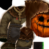
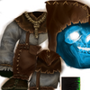
Jack and Willow (Willow)
Jack and Willow (Jack)
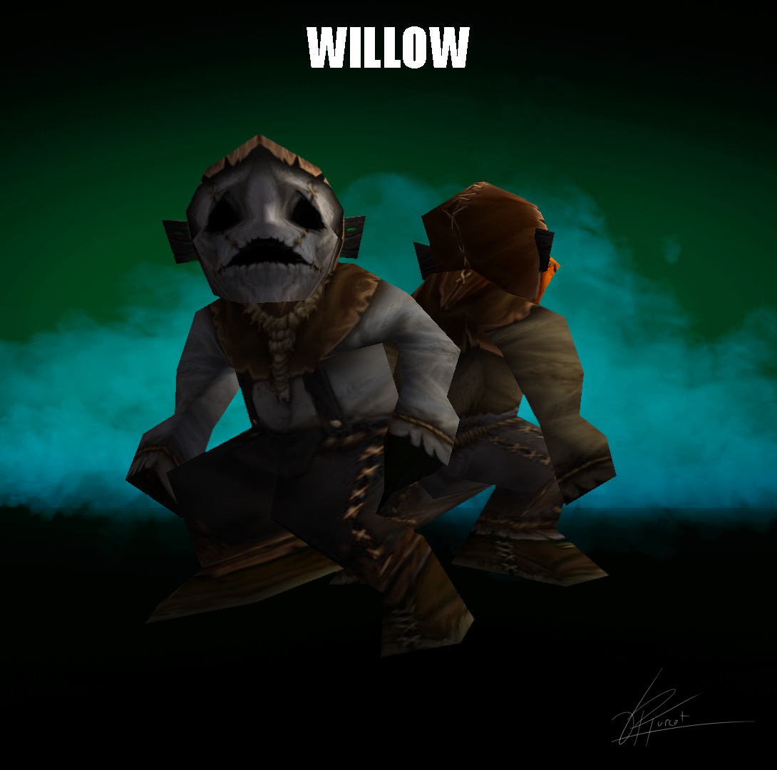
just posted my textures to the texture section... and here's the updated Willow's face based on my new concept-art as informed above. (This version should not be judged on since it was made today, outside of the challenge's timeframe).
Jack and Willow (Jack)
just posted my textures to the texture section... and here's the updated Willow's face based on my new concept-art as informed above. (This version should not be judged on since it was made today, outside of the challenge's timeframe).
- Joined
- Jun 9, 2008
- Messages
- 16,699
@Mr.Goblin that's much more like it :> looks rather haunting
- Joined
- May 7, 2010
- Messages
- 9,278
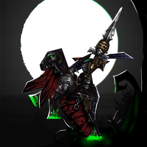
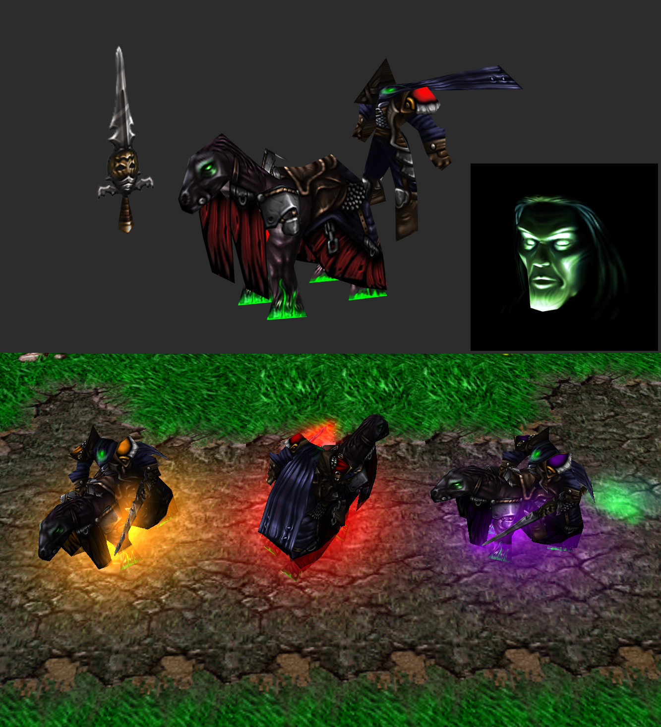
Out of the rabbit's hole comes a lonely sentinel with the...
Just_Spectating
Shading 7/10
Here you've gone for a more realistic and bleached look. The skin looks great but it doesn't quite match up to the in-game norm.
I think that if you would've strengthened the shading and highlights more you would've achieved a more desireable look. Not bad though.
Concept 9/10
I love this. You came up with a unique idea and made it a reality. I quite like the stiches, the suit and the whole concept.
Could've used better contrast to make it pop out. You did well.
Details 8/10
Great work on details. Suit design and complimentary details are gorgeous. 'love them.
24/30
Misha
Shading 6/10
As I previously mentioned throught our messages, the texture lacks quite much in this department.
Your main problem seems to be the transitory shading and higher highlights with streaks of details on top to make them work. Still much to be added here.
It's not bad, not too good either. It is satisfactory for now.
Concept 8/10
'loving it so much. The idea of having a swimming pumpkin mimic all over is great. I think that while you didn't quite mastered your concept, it is still quite good.
Details 7/10
Details are well seen. I think that you could've made them clearer than they currently are. The fins, for example are such the case here. Not bad though.
21/30
Mr.Goblin
Shading 8/10
While both skins are well shaded all over and look otherwordly, they don't fit that well in-game with the rest of the textures by Blizzard.
One more tone like higher saturation and highlighting could've helped to achieve just that. Well done Gob
Concept 10/10
Both get excellent scores in this department. I like the expressions, the tonality, and all the things invested into the idea.
Details 9/10
The work is well done but you could've gone one more step and cleared the details more. They're good but still a bit unclear, especially on the torso and legs.
Great works either way Gob.
27/30
Murlocologist
Shading 8/10
While you fair a little better in this department than people like Misha or Mr.Goblin, you still have awhile to get there.
Higher contrast, stronger shading and highlights to make the skin fit better in-game.
Concept 4/10
I quite like the idea but I feel like it is a bit off-beat from the contest's theme. The hair coud've been altered in a different way.
Details 5/10
You have that problem known as unclarity. The skin is blurred slightly and has a mushy feel. I can see where you where headed with this but you didn't go there. Not yet.
Clarity is the word here. You need much of it to make the texture work your way. The hair is rather weed like which isn't that good.
Still not bad for a first entry.
17/30
Traggey
Shading 9/10
Almost perfect match for the vanilla textures. While I would advice for higher contrast to make it fit more, I fear that that might ruin the looks.
For now, it is good as is.
Concept 10/10
Great way of interpreting the theme. The idea is well conveyed and has the looks for it. The portrait implementation is marvelous.
Details 9/10
A little more and the details would be perfect. Not that they're not but the clarity is a bit blurred.
28/30
The winner receives 20 reputation points while the participants that submitted their finished entries 5 reputation points.
~Results~
Just_Spectating
Shading 7/10
Here you've gone for a more realistic and bleached look. The skin looks great but it doesn't quite match up to the in-game norm.
I think that if you would've strengthened the shading and highlights more you would've achieved a more desireable look. Not bad though.
Concept 9/10
I love this. You came up with a unique idea and made it a reality. I quite like the stiches, the suit and the whole concept.
Could've used better contrast to make it pop out. You did well.
Details 8/10
Great work on details. Suit design and complimentary details are gorgeous. 'love them.
24/30
Misha
Shading 6/10
As I previously mentioned throught our messages, the texture lacks quite much in this department.
Your main problem seems to be the transitory shading and higher highlights with streaks of details on top to make them work. Still much to be added here.
It's not bad, not too good either. It is satisfactory for now.
Concept 8/10
'loving it so much. The idea of having a swimming pumpkin mimic all over is great. I think that while you didn't quite mastered your concept, it is still quite good.
Details 7/10
Details are well seen. I think that you could've made them clearer than they currently are. The fins, for example are such the case here. Not bad though.
21/30
Mr.Goblin
Shading 8/10
While both skins are well shaded all over and look otherwordly, they don't fit that well in-game with the rest of the textures by Blizzard.
One more tone like higher saturation and highlighting could've helped to achieve just that. Well done Gob
Concept 10/10
Both get excellent scores in this department. I like the expressions, the tonality, and all the things invested into the idea.
Details 9/10
The work is well done but you could've gone one more step and cleared the details more. They're good but still a bit unclear, especially on the torso and legs.
Great works either way Gob.
27/30
Murlocologist
Shading 8/10
While you fair a little better in this department than people like Misha or Mr.Goblin, you still have awhile to get there.
Higher contrast, stronger shading and highlights to make the skin fit better in-game.
Concept 4/10
I quite like the idea but I feel like it is a bit off-beat from the contest's theme. The hair coud've been altered in a different way.
Details 5/10
You have that problem known as unclarity. The skin is blurred slightly and has a mushy feel. I can see where you where headed with this but you didn't go there. Not yet.
Clarity is the word here. You need much of it to make the texture work your way. The hair is rather weed like which isn't that good.
Still not bad for a first entry.
17/30
Traggey
Shading 9/10
Almost perfect match for the vanilla textures. While I would advice for higher contrast to make it fit more, I fear that that might ruin the looks.
For now, it is good as is.
Concept 10/10
Great way of interpreting the theme. The idea is well conveyed and has the looks for it. The portrait implementation is marvelous.
Details 9/10
A little more and the details would be perfect. Not that they're not but the clarity is a bit blurred.
28/30
The winner receives 20 reputation points while the participants that submitted their finished entries 5 reputation points.
- Joined
- Jun 9, 2008
- Messages
- 16,699
Misha
Shading 6/10
As I previously mentioned throught our messages, the texture lacks quite much in this department.
Your main problem seems to be the transitory shading and higher highlights with streaks of details on top to make them work. Still much to be added here.
It's not bad, not too good either. It is satisfactory for now.
Concept 8/10
'loving it so much. The idea of having a swimming pumpkin mimic all over is great. I think that while you didn't quite mastered your concept, it is still quite good.
Details 7/10
Details are well seen. I think that you could've made them clearer than they currently are. The fins, for example are such the case here. Not bad though.
21/30
so you see, that's why i leave texturing in more capable hands
it was still fun though- Joined
- Dec 19, 2015
- Messages
- 692
Who won?
Nevermind, Congratulations!
Nevermind, Congratulations!

- Joined
- Jun 9, 2008
- Messages
- 16,699
to the Winner, the spoils =P
Mr.Goblin
Art & Graphics Design Moderator
- Joined
- May 26, 2008
- Messages
- 4,467
Thanks ^^ And well done the rest of you lot! I seriously adore Goblins work here!
You rocked my world too mate. :O thanks and congratz!
- Joined
- May 16, 2007
- Messages
- 7,285


Congrats to Traggey and great skins overall pepl
- Joined
- Mar 22, 2016
- Messages
- 588


- Joined
- Aug 20, 2011
- Messages
- 4,141


Congratulations to all of you, guys!
- Joined
- Jan 31, 2010
- Messages
- 3,552

Gratz y'all
- Status
- Not open for further replies.
Similar threads
- Replies
- 71
- Views
- 10K
- Replies
- 89
- Views
- 18K
- Replies
- 74
- Views
- 21K
- Replies
- 405
- Views
- 39K
- Replies
- 1
- Views
- 1K