- Joined
- Jun 3, 2008
- Messages
- 3,858
Beasts don't eat wood.
Beavers do!
Aight, I'm trying a different approach.

Potential (but highly unlikely) background:

Beasts don't eat wood.


 But somehow in that icon i feel the mace looks a bit small compared to how it is on the model :S Idk why though, just does


 And the glow around the axe looks great like that, but i think u should try to center it if ur gonna make it a passive icon, i guess u might also have to make it just a little bit smaller, or idk, maybe placing it slightly lower and to the right would make it fit just right, i guess we'll see ;P


 But it looks a bit...idk how to put it....old?^^ Could use some more definition, i think it's the glow/shading around it that makes it look old, maybe if u tried to remove that shading and increase the contrast and see where u go from there
. I like how with time you made the unit icon soooo, awesome. I mean it's got contrast (something my icons lack) and good colors. That golden thing on his head looks really good, probably there is something more to be made, there always is about any icon, but I can't see it, it looks great. I wish luck to all with winning this contest. For summon lightning elemental you could just look at different lightning elemental models and find which one u like the bast and base it on that, or you could make him spawn minions which would look like miniature Mephistos just without his horns, if u choose that you should concentrate more on his "foglike" body than the face.
But it looks a bit...idk how to put it....old?^^ Could use some more definition, i think it's the glow/shading around it that makes it look old, maybe if u tried to remove that shading and increase the contrast and see where u go from there
. I like how with time you made the unit icon soooo, awesome. I mean it's got contrast (something my icons lack) and good colors. That golden thing on his head looks really good, probably there is something more to be made, there always is about any icon, but I can't see it, it looks great. I wish luck to all with winning this contest. For summon lightning elemental you could just look at different lightning elemental models and find which one u like the bast and base it on that, or you could make him spawn minions which would look like miniature Mephistos just without his horns, if u choose that you should concentrate more on his "foglike" body than the face.
 (i would call the aura "Fear" or "Frighten" smth like that, allthough hatred is good too hehe) and imo it would be natural for the WC3version to summon elementals


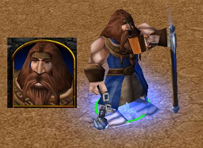
Current state:
Portrait:
Abilities:
Drink Ale
The Dwarf Monk drinks a cup of fresh dwarven ale, restoring an amount of health + mana and giving increased attack speed for an amount of time
Enchanted Axe
The dwarf monk enchants his axe with holy power, increasing his attack damage.
Heavy Strike
The dwarf monk heavily strikes with his mace a target enemy, dealing massive damage and making the unit bleed for a period of time.
Heavy Strike looks amazing! Good job


Third WIP of my Iconset:
Thanks to your suggestions, I improved what I foresaw, and added the sketch of the Hero Icon as well.
I still need to get that ear fixed in the second icon, had no time, sorry.