It's nice work, but it can use some polish. I'll commend you for consistency and effort though, having made a couple of UIs, I know the amount of work that goes into them, so good job on that.
Here are a few things I think would make your UI better:
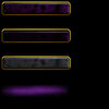
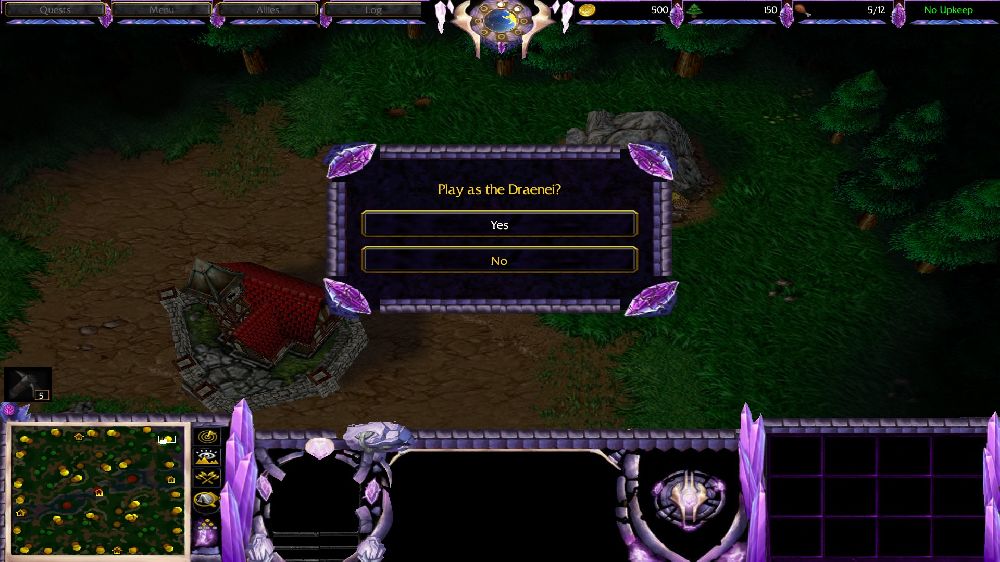
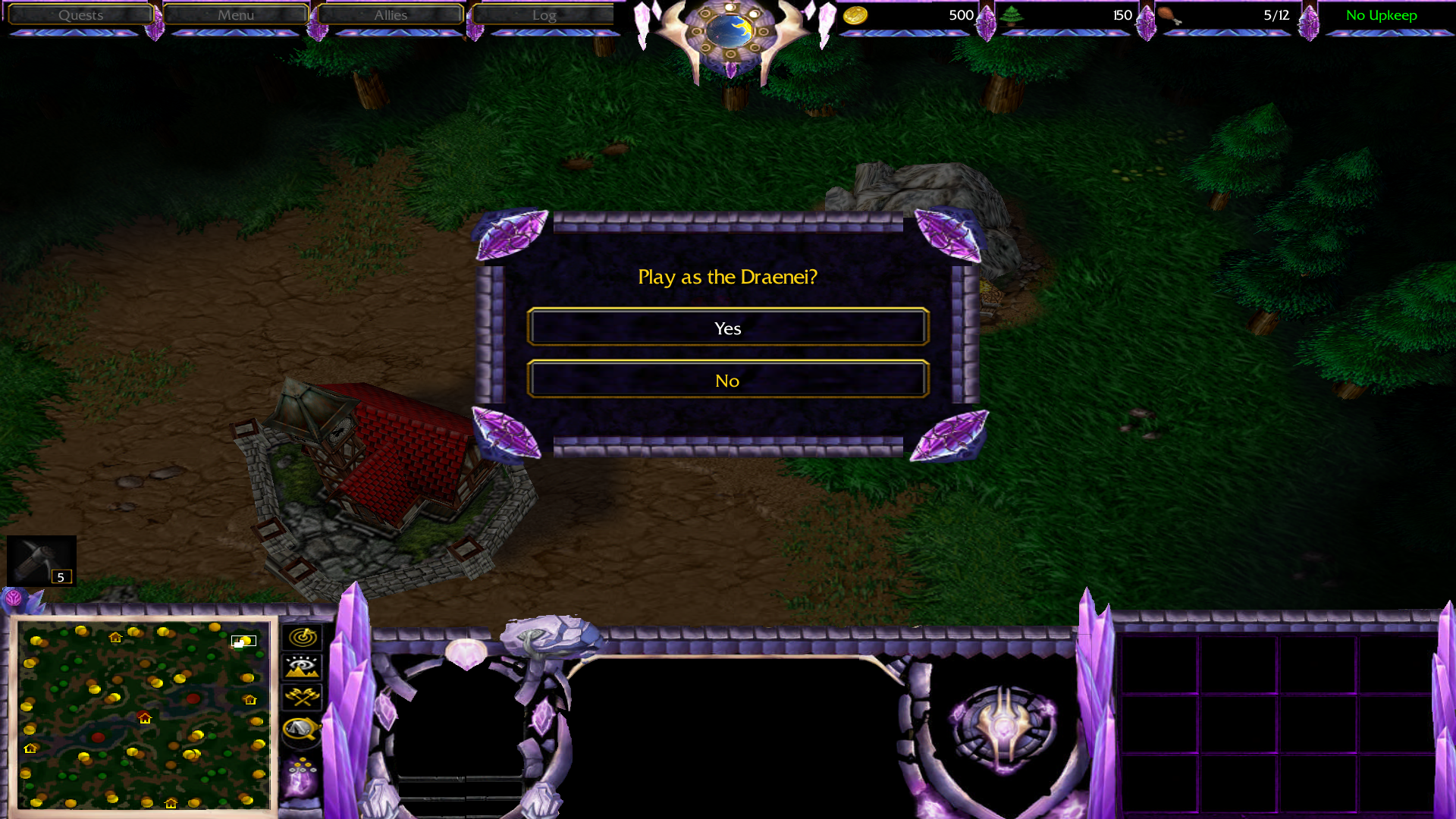
1. remove the gems on the top bar. They may look good when you were designing it, but all it does in-game is be distracting from more important elements (like the resources). If you absolutely want to keep them, I suggest shrinking their size and placing them between button at the bottom of the bar to create some sort of pattern that's subtle and won't be in-your-face whenever you look at the top bar. Also the bar should be one continuous element, not separated into segments with gems b/w them. It's distracting

2. I like the idea of using the draenei logo for the time indicator, but colour-wise, it's not consistent. I suggest using dark-purple, preferably with a metallic texture (altho the texture might not be necessary bc of the size of the image). Alternatively, you could make it blue with a rough-carved crystal texture. If you need inspiration on a time-indicator that doesn't fit the ordinary mould, check out Queenlands UI.
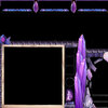
3. the dialogue frame doesn't connect to the gems. Extend them so that there isn't a gap.
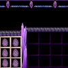
4. While there's nothing wrong with your inventory cover, just having a logo there is a bit... meh

Check out the Blizz UIs (and even some of them on Hive) and you'll get an idea. It could be anything from a different bunch of crystals or maybe a Naaru engraving on dark marble, etc.
5. I love what you did for the portrait window. That said, the minimap has this weird white outline to it? I recommend you remove it.
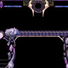
6. Finally, the borders. Idk if you've noticed, but UI borders tend to have perspective to them, so it would be better if you could give it some kind of depth.
Do these (or some) and I guarantee your UI will look better.
Do you have any other elements like spell effect circle and custom cursors in mind?

 Approved

 Dalaran
 Lost Ones
 Scarlet Crusaders
 Dark Iron Clan