- Joined
- Jan 31, 2010
- Messages
- 3,546


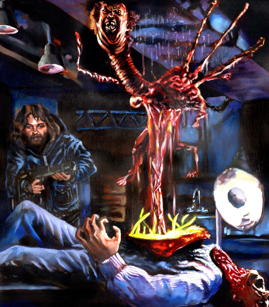
The Thing (1982) © John Carpenter
Twisted Fate
The contestants were to draw/design a concept of a mutated human for a horror game/map, giving it a both obscure and terrifying/gruesome look.

| Contestant: | Submission: |
stein123 | The Man who touched the Angels |
Wisdom | Dezmoz |
Eubz | The Moaning Blackhand |
-Grendel | Corpus Pestilentia |
Naze | Faceless Horrors |
GreeN!X | Experiment 1337 |
PeeKay | Reverse Tetanus Infection |
Devin | General Cladius |
| ZethHolyBlade | Kako Doll |

stein123
THEME | The theme here could be alot better, maybe add some blood in places or maybe bodys laying everywhere. I know its not colored which makes it hard too tell what is what in the photos, i do like the fact that you made it seem like a comic strip. | 9/15% | ||
EXECUTION | The overall concept is very confusing because its not colored in. Also there is 3 individual photos which also confusing me from the theme of it all. I think it would of been better just one photo and add a bunch of stuff towards that one. | 9/20% | ||
CONCEPT | The concept here is lacking, like i said above, it needs to be one photo and added everything together into one colab. Plus he could of added color towards it maybe black and white would be nice but make the blood and gore have colors so it gives that nice touch. Keeps peoples eyes on the photo itself.[c]20/40%[r] REALISM & GORE[c]The character himself is nice, he seems like he can move around and is functional. Also, the body structure is correct and is lovley. | 15/25% [r]TOTAL | 53/100% |
Wisdom
THEME | The overall theme here is good, i like the creature, but you could of added some blood here and there. Maybe add some on his armor and skin or around his feet. I wanna be frightened when i look at these! | 10/15% | ||
EXECUTION | The design here is nice, i like the character it has a nice execution and body mechanics. | 10/20% | ||
CONCEPT | The character itself is good, but like i said before it could have more added towards it. Maybe bodys laying around the feet of him or blood in spots indicating that he is deadly.[c]15/40%[r] REALISM & GORE[c]The realism is nice, but im not really liking the feet at all, they seem like he is floating and not touching the floor. There is some body modifications that need adjusted here. | 15/25% [r]TOTAL | 50/100% |
eubz
THEME | The execution is nice, but i would like too see more detail on the character himself, and maybe more gore and blood! | 9/15% | ||
EXECUTION | I like how you made this seem like a cover of a magazine and such! But, it could use more details towards it like i said. | 10/20% | ||
CONCEPT | I like the concept you went with here, great job. The position of the character is fantastic. It also could use more stuff towards the photo itself.[c]24/40%[r] REALISM & GORE[c]Realism is nice, the character seems like hes being blown away from a explosion or some sort because he has rocks flying away also, i like that. But, he could of added more rocks flying and maybe a better explosion animation. | 14/25% [r]TOTAL | 57/100% |
-Grendel
THEME | The execution here is fantastic the character looks really spooky and makes the theme. | 15/15% | ||
EXECUTION | The character is correct and is very effective in many ways. | 20/20% | ||
CONCEPT | The design itself is very creative because he named off what was on his character, for example he named his characters leg (D) and put it on a chart indicating what D was.. which is very helpful.[c]30/40%[r] REALISM & GORE[c]The realism here is very fantastic overall. The character seems like it can move around and is an actual unit or some sort for a game. | 20/25% [r]TOTAL | 85/100% |
Naze
THEME | You made a scary themed character indeed! i like the concept here, i feel like it could use some more though. | 10/15% | ||
EXECUTION | The overall feel of the character is nice, i can see that it is a virus of some sort eating away at the skin and tissue of the characters head. | 12/20% | ||
CONCEPT | This one was very creative at best but he could of added a bit more towards his drawing, maybe he didn't have enough time. But, he did execute it well.[c]24/40%[r] REALISM & GORE[c]The overall realism here is 100% correct, the tones and colors are amazing, you did a good job in this state. | 23/25% [r]TOTAL | 69/100% |
GreeN!X
THEME | This drawing overall is very disturbing, but thats the whole concept of the contest! I would like too see some color though. | 10/15% | ||
EXECUTION | The execution is well rounded and made the character seem like hes walking and has 6 feet. Also, the body modifications seem too be good, each leg is correct. | 13/20% | ||
CONCEPT | This drawing is very creative indeed, has a random huge eye popping out of the stomach, plus having 6 feet. Like i said, i would like too see some color here.[c]19/40%[r] REALISM & GORE[c]The body seems to be balanced and the legs look like they are resting on the ground. The body structure seems good also, but color and such are an issue here. | 18/25% [r]TOTAL | 60/100% |
PeeKay
THEME | The concept here is fitting, but could use more details towards the actual character, its quite hard too understand the whole theme here. | 9/15% | ||
EXECUTION | Hard too tell what it is without all the other drawings explaining what is happening, without those.. then i would be lost. But, it is very creative nonetheless. | 10/20% | ||
CONCEPT | The design is quite confusing too understand here. I understand the concept of how the muscles are out and the skin wore off, but maybe a bit more details and highlights too understand it more. [c]18/40%[r] REALISM & GORE[c]I like what you did here, it is really cool but just some things you could of added towards this. One, maybe more details and highlights towards the main subject. And two, make the main character subject bigger in one separate photo too see the details and make it easier too recognize what it is. | 17/25% [r]TOTAL | 54/100% |
Devin
THEME | Good job nonetheless, but i understand you added blood and such but it doesn't really fit the theme here. | 5/15% | ||
EXECUTION | You could of added alot more towards this, maybe a mountain range in the background and your characters castle on it. And, maybe add some wings towards the character and just make everything dark possibly. | 5/20% | ||
CONCEPT | I like what you was going for but like i said you need too add more towards this so its not a random character in a white space background.[c]5/40%[r] REALISM & GORE[c]I have no comment here, but needs alot of work. | 5/25% [r]TOTAL | 20/100% |
ZethHolyblade
THEME | Even though it is just one color it has alot of detail which is always nice! good job. | 13/15% | ||
EXECUTION | I like where you put the character and in the background there is shadow figures looking at the creature. The amount of detail makes it see-able and nice. | 16/20% | ||
CONCEPT | This one is very creative and the execution is amazing. There's alot going on with this drawing which makes the peoples eyes on the drawing instead of wandering off of it.[c]30/40%[r] REALISM & GORE[c]I do like how it was just one color but, i would of loved too see this in full color.. But, nonetheless the detail and everything is really nice plus it goes with the theme which is what im looking for, good job. | 20/25% [r]TOTAL | 79/100% |
I did not rate the lore/story because there wasn't any specific section for that and besides the contest was about drawing not writing.
The Real Contestants
THEME:it has what it needs to be thematic. And, how it's presented in a comic book manner, which is not against the rules (since there's no law about that), deserves a 15%.
EXECUTION: the first page is rather comprehensible. The second is just a transformation while the last is pretty fuzzy to the eye. Surely, there is detail in what we can see, though one noncolour (that is black) cannot fully create a desirable overview. Hence, 15%.
CONCEPT: we cannot really speak about much originality in what the transition from mad scientist to monster is concerned. However, the beast has its own way of looking, not the least creative at all. So: 30%.
REALISM & GORE: the gore is not excessive or too much emphasized on but it's there. As far as realism goes, well, you can't really expect that word to fully fit in science-fiction. Let's say some sort of genetic manipulation could lead to a stable creature like that. 25%.
TOTAL: 85%.
Commenting on the story, it has no depth. There are things left unexplained or the writer just expects the readers to know what it's about. We can't speak of the logic behind the "ingredients" required to complete the scientist's plan because we have no real knowledge about them. Lastly, the seraph is just a word here as it has little to do with what humans imagine them to be.
THEME: it does appeal to the main idea. 15%.
EXECUTION: colour helps a lot here. There is little to not understand or that looks awkward to the eye. The image is not blurry but it's not the clearest either. 20%.
CONCEPT: the first thing that comes in mind when seeing this is Resident Evil. We shouldn't call it a ripoff but an inspired piece. 30%.
REALISM & GORE: sadly, the right inferior limb's appearance is wider than the left's. As far as the gore goes, it's subtle. 10%.
TOTAL: 75%.
The story is rather unbelievable even if it was intended to have a scary and ill allure. It's one of those villain or false hero type of comic book or cartoon depictions.
THEME: the way it is is suitable for it's supposed to be. 15%.
EXECUTION: We can understand most of what visually lies therein. That is more than enough. It has a style of its own and the background really helps. It's also filled with dynamism. 20%.
CONCEPT: it pretty much looks like a person afflicted by a terrible disease or fantasy curse. It's the least boring but not mind blowing. 30%.
REALISM & GORE: there is enough carnage to make it viable but the dire problem probably lies within the creature. 25%.
TOTAL: 90%.
As this is supposed to be related to fantasy, we cannot really put science into it. So calling it believable or unbelievable would be useless. However, the story is not genius.
THEME: There is no doubt about it being apt. 15%.
EXECUTION: without any real colour, this image displays a wide variety of details. We can only expect quality from what we see. 20%.
CONCEPT: it's certainly nothing unimagined before but innovation can be seen in the minutiae. 35%.
REALISM & GORE: proportionality is not an option here as long as the creature looks like it's either made from various parts or tries to multiply itself. One of the questions here is: how would the creature be able to move (at least fast as a human being) with so few muscles and bones to sustain its balance in the first place? Another thing is the fact that its organs might just fall forth, or have they been afflicted by fibrosis?20%.
TOTAL: 90%.
What sustains the life of the creature if it disintegrates itself? The Latin description is indeed fascinating though there is no backstory to all of it.
THEME: pretty much captures everything without much blood. 15%.
EXECUTION: the interesting thing about is that even though it has colour the overall hue is similar but there is so much to see. There are shaded parts which further increases the particularity of this artistic display. 20%.
CONCEPT: the "downside" of this is that what we see is only one part of a body, a factor which can't surpass the overall creativity of the artist. 35%.
REALISM & GORE: The carnage is definitely there even with little to no bloodshed. As this is not supposed to be something considered alive, it just works perfectly the way it presents itself. 25%.
TOTAL: 95%.
Story=just random fantasy. The poem would have sounded better if it had more rhymes.
THEME: an ugly monster (pleonasm?) will have its place here. 15%.
EXECUTION: it is comprehensible though it looks quite sketchy. 10%.
CONCEPT: it's nothing new, nothing old. It's some sort of a mythology based creature (when referring to the fact that it's half man/human and half some other thing). 30%.
REALISM & GORE: it's hard to conceive a creature able to breathe with an eye (or what ever is that thing) in its mouth obstructing most if not all of the respiratory tracts. The eye in the belly would not be a problem while the rest of the creature's long body would have enough space to hold vital organs. The tail is rudimentary as it doesn't really have a purpose. 15%.
TOTAL: 70%.
We could mostly just recall sadism from the picture's description.
THEME: yes. 15%.
EXECUTION: although meant to show some details not only pertaining the main idea itself but also a transition and/or description of the process, the overall aspect resembles a sketch. 15%.
CONCEPT: honestly, there's nothing special to behold. It's an anatomical study. The interesting part is that the whole thing looks like a lab log. Visually, it does not bore but it screams for more. 25%.
REALISM & GORE: exteriorized muscles are prone to infection, gangrene, degradation (direct trauma) and whatnot. It's also hard to tell if the experiment has eyes or a functional nose. Moreover, how painful every step or touch would be. 15%.
TOTAL: 70%.
It poses an interesting concept but it's unorthodox medicine.
THEME: somehow. 10%.
EXECUTION: it's not really that much that needs understanding as the details are few. The style could be called minimalistic. 15%.
CONCEPT: there is not much to experience when seeing this but it's colour friendly. It looks like some guy with either brain haemorrhage or haemophilia. 20%.
REALISM & GORE: let's hope the blood does not block sight and/or respiration and/or hearing. 15%.
TOTAL: 60%.
What's interesting in that story is the tragedy of it all.
THEME: definitely. 15%.
EXECUTION: one colour, hard to tell many things but also elaboration. It would have indeed been fascinating if this had been a one shot work. 15%.
CONCEPT: quite original on the long run. It even has a background and a highlight, all done with either the same colour or its absence. 40%.
REALISM & GORE: it doesn't really look to mobile but then again that's not the idea even if it's chained. The unreal thing might be the way living in that condition. 15%.
TOTAL: 85%.
The story might be captivating and have some scientific basis but it doesn't really explain the dangers the experiments might prove to other people (be they humans as we know them now or something else).
The Pretenders
THEME: well, it has a more psychological vibe than a science-fiction or fantasy basis. 10%.
EXECUTION: simple and unelaborated. It might be hard to understand the stuff that's going on in/near the mouth in detail. There is dynamism therein. 10%.
CONCEPT: similar to parasitism (or Alien 1979). It's not that much to describe since the main idea circles around the face. It also looks like a caricature. 25%.
REALISM & GORE: it has a psychological thematic, so, the realism here is hidden in the message the picture sends. Apart from the head and some parts of the body, the rest is deformed. The slaughter is limited to the rage/pain the drawn person exhales. 15%.
TOTAL: 60%.
It has a cartoonish story.
There are more than one version. The latest post was considered for the judging.
THEME: 15%
EXECUTION: a stimulating style though many details are lost in what looks like a blurry cloud/aura that overlaps the creative process. 10%.
CONCEPT: either some sort of Diablo II Baal or some treeman inspiration/hypothesis. It's a confusing construct. 30%.
REALISM & GORE: The carnage is either scarce or hidden in the noncolour. What there can be seen are multiple limbs that may either just hold the creature in place or become a pain to desirably use in its endeavours. The big one in front would surely play a role of a weight protracting the whole body forwards. 10%.
TOTAL: 65%.
Well, there's no useful information for this to comment on.
-----------------------------------------------------------------------------------------------------------------------------
Stein123's "The Man who touch the angels"
THEME Does the artist take advantage of the theme, or is the vision unfitting? 6/15%
The theme is mutated human, the end result no longer resembles a human whatsoever. Concept art is meant to
deliver it's message in one image, creating a comic to assist in selling the idea automatically shows
that the end result is not fitting to the theme.
EXECUTION Does the artist display the design in an effective manner, or is it hard
to tell what is what? Are artistic techniques used effectively to make the
character interesting, or does the style deteriorate the concept? Is the
appearance of the design objectively pleasing, or is it of low quality? 6/20%
The image is completely line, but I must say it does have depth to it even without shading. I can tell what
it is, but I have to use some imagination.
Shading is needed, this is quite incomplete, but it is a good line drawing. Without the shading or colour, there is a lot of
missing information.
CONCEPT Does the design offer a new creative approach, or is it generic and cliché?
Does it have character, or is it just another boring design? Does the design
make sense and fit the description, or is it necessary to read the title to understand? 13/40%
One look at this and what comes to mind is a creature with a medusa body, the underside of a cockroach on
the chest, with a knight helmet head and ghostly epentages. There is no remaining human anatomy, I would have never
guessed that this creature used to be a human nor would I belive the concept attempted to be acheived is a mutated human.
This looks like a prefect transformation of a parasite in a host, maybe you should have made a 'failed' transformation,
which would have left some human anatomy to sell the idea of mutated human.
REALISM & GORE Does the design balance, or are the proportions impractical? Is the anatomy or construction
correct, does it allow the character to move as it should, or is functionality disregarded entirely? 13/25%
This design looks interesting. There is enough detail for me to visualize this creatue moving and attacking.
Although I cannot imagine how it eats or how it sees.
Using the glasses for scale, the proportions are too large, it looks like it weighs 600lbs, but the original human weighs 120lbs.
TOTAL 38/100%
-----------------------------------------------------------------------------------------------------------------------------
Wisdom's "Dezmoz"
THEME Does the artist take advantage of the theme, or is the vision unfitting? 7/15%
The design does resemble a human, but not a mutated human. This creature is too clean and pristine
to be considered mutated. It appears to be a made in a lab specimine for war, gone right, with added armor
plating or some sort of canabalistic cyborg killing machine.
EXECUTION Does the artist display the design in an effective manner, or is it hard
to tell what is what? Are artistic techniques used effectively to make the
character interesting, or does the style deteriorate the concept? Is the
appearance of the design objectively pleasing, or is it of low quality? 13/20%
The painting is good on the left side but lacking on the right side, such as the hand, blurry shoulder and thigh proportions.
Some parts like the big hand has good details, then the feet and shins looks off in comparison. The effort put in each
section of the drawing is inconsistant.
CONCEPT Does the design offer a new creative approach, or is it generic and cliché?
Does it have character, or is it just another boring design? Does the design
make sense and fit the description, or is it necessary to read the title to understand? 0/40%
I cannot say much about the concept becuase it is not your design, you just painted somthing from a game.
Concept Art is about creating your own design, not painting skills. Maybe try to tweak the design, add & remove
details and change the colour scheme.
REALISM & GORE Does the design balance, or are the proportions impractical? Is the anatomy or construction
correct, does it allow the character to move as it should, or is functionality disregarded entirely? 13/25%
This is not a realisitc mutated human at all, it's not natural looking and like I said before it seems like a
modified human made in a lab. That is not the same as a mutation. Also, where are it's kneecaps?
TOTAL 33/100%
-----------------------------------------------------------------------------------------------------------------------------
Eubz's "Moaning Black-hand"
THEME Does the artist take advantage of the theme, or is the vision unfitting? 8/15%
It definately reads as a mutated human, but it needs a better flow of details.
No skin, tree arm, swolen thigh, no toes, neck glued to shoulder, pink innards?
Where are we going with this? What do these details do? Are they just there for the sake of adding details?
EXECUTION Does the artist display the design in an effective manner, or is it hard
to tell what is what? Are artistic techniques used effectively to make the
character interesting, or does the style deteriorate the concept? Is the
appearance of the design objectively pleasing, or is it of low quality? 11/20%
The image is relitively flat. The anatomy is lacking, the creature looks thin, but no ribs are showing.
The creature appearing to missing skin but there are no details of muscle fibers. One protrusion in the tree arm
is missing details. There is detail in the belt and the rocks, which are irrelevent. The belt has a hard highlight, but the light is coming from behind.
The 'veins' are obsurely connected, how does it connect from the torso to the face when it dangling (showing no sign of independent movement).
The title is talking up 10% of the whole canvas, it should not even be there, this is not some horror movie poster.
This peice needs some brushing up and extra polishing and more thought put into the design.
CONCEPT Does the design offer a new creative approach, or is it generic and cliché?
Does it have character, or is it just another boring design? Does the design
make sense and fit the description, or is it necessary to read the title to understand? 16/40%
I've never seen something like this before. The pose of the creature is quite odd, like he is trying to show off his new watch.
I feel that the name focuses on the pose rather than deisgn. So he moans and walks around with his arm sticking out, but whats
up with the weird tree arm? I feel the tree arm looks like the main weapon here. Very odd concept.
REALISM & GORE Does the design balance, or are the proportions impractical? Is the anatomy or construction
correct, does it allow the character to move as it should, or is functionality disregarded entirely? 15/25%
The uneven legs would make this creature walk with a limp, which suits well with the overall peice. The tree arm is quite random,
if the somewhere else on the body also had protruding black horns, then it would flow better. There is no muscle seperation,
the thigh is just one big veiny peice of meat. The abdominal region is blury is is missing muscle details too.
TOTAL 50/100%
-----------------------------------------------------------------------------------------------------------------------------
-Grendel's "Corpus Pestilentia"
THEME Does the artist take advantage of the theme, or is the vision unfitting? 8/15%
Without colour, it is leaves the mind to imagine what the specimine is and I don't feel like I'm looking at
a mutated human. Without any skin tones, or red and pink to establish human flesh, It looks like a partially like a
tree. The added markings also leave me to imagine that it is a demonic creation/summoning, rather than a being that was once human.
Keeping the head reletively human, would have sold the mutated human idea, or even adding one ear or an eyeball. I like the fingers
and feet, but overall it's not very "mutated human".
EXECUTION Does the artist display the design in an effective manner, or is it hard
to tell what is what? Are artistic techniques used effectively to make the
character interesting, or does the style deteriorate the concept? Is the
appearance of the design objectively pleasing, or is it of low quality? 17/20%
The drawing is very well done. The details and shading is great, very well excuted. Although, colour is a very important factor and it is missing.
The dark shading on the left thigh crevas looks quite odd, as it leads up to the hip it shouldn't be so dark, this is why colour is
important to separate values from colour.
CONCEPT Does the design offer a new creative approach, or is it generic and cliché?
Does it have character, or is it just another boring design? Does the design
make sense and fit the description, or is it necessary to read the title to understand? 23/40%
The design is quite simple, but also flows well. The creature looks dry, but mutated beings are usually "gooey"
in a sense. Exposed organs and gaping mouth with no fluids to be found leads me to believe this creature was in
fire or is a desert dwelller, which goes back to my thoughts on demonic creation/summoning.
REALISM & GORE Does the design balance, or are the proportions impractical? Is the anatomy or construction
correct, does it allow the character to move as it should, or is functionality disregarded entirely? 19/25%
With an inside display of the chest and abdominal region, there should be some sort apparant bone structure, but
there is not. Is that the rib cage or over inflated lungs? There should be dangling intestines. This creature has no skin, so how can it have tatoos?
Which again leads me to believe that it is a demonically summoned creature. The extra leg sprouting from the knee
is quite random, maybe have more than one limb sprouting from another area to create the idea of some extra limp causing mutation.
The left hand has only has three fingers, if this was once human, it should have five or at least three mutated fingers
and a normal pinky and ring finger.
TOTAL 67/100%
-----------------------------------------------------------------------------------------------------------------------------
Naze's "Faceless Horrors"
THEME Does the artist take advantage of the theme, or is the vision unfitting? 10/15%
There is definately something mutated with this thing, but it is just a head, the competition is mutated human, not mutated
human head.
EXECUTION Does the artist display the design in an effective manner, or is it hard
to tell what is what? Are artistic techniques used effectively to make the
character interesting, or does the style deteriorate the concept? Is the
appearance of the design objectively pleasing, or is it of low quality? 7/20%
This nicey done, the shading is good and the details are great. Altough it is just a floating head, this is suppose to be
a character design. The hair is sloppaly done, only the outline of the head seem to have hair.
The eyes are missing, where is the pink/red inside the eye socket? The colour pallette is good
but these warts should have puss or blood coming from or around them, having only skin tones in the colour pallette is quite boring.
CONCEPT Does the design offer a new creative approach, or is it generic and cliché?
Does it have character, or is it just another boring design? Does the design
make sense and fit the description, or is it necessary to read the title to understand? 17/40%
The design is too simple, bald old man head, remove eyes and add warts everywhere. Maybe you should have kept one of the
eyes to do somthing creative with it. Everything is here, colour, shadows, highlights, perspective, details, but it doesn't have
a body. If this thing had a body, this would have been much more interesting and a very formidable entry.
REALISM & GORE Does the design balance, or are the proportions impractical? Is the anatomy or construction
correct, does it allow the character to move as it should, or is functionality disregarded entirely? 13/25%
The warts seem to completely destroy every facial feature, there are no eyelids, eyebrows, nostrils or upper lip details.
This would have been fine if there was a body to complement the rest of the painting, but there is not. The chrome dome seems
untouched by the mutation, why is that? It should have some small warts forming somewhere on top of the head.
TOTAL 47/100%
-----------------------------------------------------------------------------------------------------------------------------
GreenN!x's "Experiment 1337"
THEME Does the artist take advantage of the theme, or is the vision unfitting? 7/15%
It is too clean. It doens't seem like it's been mutated, but it seems to be born that way, the extra limbs
don't seem to have burst their way out violently, it just seems like it was there from the start.
The drawing seems very demoney, not radioactive bio-hazard spill.
EXECUTION Does the artist display the design in an effective manner, or is it hard
to tell what is what? Are artistic techniques used effectively to make the
character interesting, or does the style deteriorate the concept? Is the
appearance of the design objectively pleasing, or is it of low quality? 5/20%
With only line and some shading, this is incomplete. The planning taking on this peice is poor as I can notice
the ol' 'put a rock under it trick. Needs another retry.
CONCEPT Does the design offer a new creative approach, or is it generic and cliché?
Does it have character, or is it just another boring design? Does the design
make sense and fit the description, or is it necessary to read the title to understand? 14/40%
The design is too clean and symetrical to be considerd mutated. It is a creative design, but it doens't fit
into the theme. The eyeballs suggest parasite, but the body suggests demon or mad scientist surgery.
REALISM & GORE Does the design balance, or are the proportions impractical? Is the anatomy or construction
correct, does it allow the character to move as it should, or is functionality disregarded entirely? 10/25%
The mouth and eyeball combination works well on the head but not the abdominal region. In the abdominal region, how
can a set of jaws form and a watermelon sized eyeball form there with mutation and fit so well? Maybe if there where other
tiny eyeballs and mouths scattered over the body, it would seem like more a mutated occurance.
What function does the small tail serve? To sho flies from his behind? That wouldn't be possible because even though this
thing has two mouths, it cannot eat, and it cannot eat, it cannot extrete waste. Maybe make it larger to make it serve as a weapon.
The veins scattered all over the body suggests low body fat, but there are no muscle details added.
TOTAL 36/100%
-----------------------------------------------------------------------------------------------------------------------------
PEEKAY's "Reverse Tetanus Infection"
THEME Does the artist take advantage of the theme, or is the vision unfitting? 8/15%
This looks more like a zombie rather than a mutated human or a skeleton with flesh. It doesn't establish to the viewer that it is
a mutated human at first glance.
EXECUTION Does the artist display the design in an effective manner, or is it hard
to tell what is what? Are artistic techniques used effectively to make the
character interesting, or does the style deteriorate the concept? Is the
appearance of the design objectively pleasing, or is it of low quality? 13/20%
The painting is roughly executed, but all the elements are there. There could have been more effort put into detailing
and polishing the final product, rather than putting time into multiple paintings. This looks more like a practise/experimental
peice of work, rahter than a final product.
CONCEPT Does the design offer a new creative approach, or is it generic and cliché?
Does it have character, or is it just another boring design? Does the design
make sense and fit the description, or is it necessary to read the title to understand? 17/40%
The concept is quite bland. It's just a skinless human. There is nothing mutated about it other than the asumed ability for this
creature to live without skin, dangling intestines and over muscular face. This is a human muscle chart with a dynamic pose.
REALISM & GORE Does the design balance, or are the proportions impractical? Is the anatomy or construction
correct, does it allow the character to move as it should, or is functionality disregarded entirely? 17/25%
Like I said previously, this is a human muscle chart. All muscle seem to be there, execpt for the obliques and serratas. The perspective
is odd, I can see the traps, but I also can see the front view of the chest. I if the creature is hunching over, I should not be able to see
much of the chest. Without skin on the face, the eyes should be completely round and expressionless. With abdominal muscles intact,
the intestines should also be intact and not dangling.
TOTAL 55/100%
-----------------------------------------------------------------------------------------------------------------------------
Devin's "General Cladius"
THEME Does the artist take advantage of the theme, or is the vision unfitting? 2/15%
A pale skinned human with silver teeth, bleeding from the eyes and ears with a couple of cuts. I don't think this is fitting
into the catagory of mutated human. There are probably some people who actaully exist that look more mutated than this guy.
EXECUTION Does the artist display the design in an effective manner, or is it hard
to tell what is what? Are artistic techniques used effectively to make the
character interesting, or does the style deteriorate the concept? Is the
appearance of the design objectively pleasing, or is it of low quality? 1/20%
The execution is very poor. A flat side on stance, lack of details and shading, this definately needs more work.
CONCEPT Does the design offer a new creative approach, or is it generic and cliché?
Does it have character, or is it just another boring design? Does the design
make sense and fit the description, or is it necessary to read the title to understand? 4/40%
There is barely any design put into this. Silver teeth, cut, blood in eyes and nose. It seems like a wounded person. Where are
the mutated parts?
REALISM & GORE Does the design balance, or are the proportions impractical? Is the anatomy or construction
correct, does it allow the character to move as it should, or is functionality disregarded entirely? 2/25%
The is no realsim in this drawing at all. The head is not shaped properly and the clothes are made up of three strokes of a brush.
Where is the other half of the body? Where is the detail in the ear? Where are the lips?
TOTAL 9/100%
-----------------------------------------------------------------------------------------------------------------------------
ZethHolyBlade's "Kako Doll"
THEME Does the artist take advantage of the theme, or is the vision unfitting? 7/15%
A man who seems to be splitting apart in shackles, the only mutated part I see is the long tongue
and the wide mouth, the rest appears to be a sevearly wounded human. Gaping wounds, in my book, is not relaletive
to the concept of mutation. The primary read is a zombie.
EXECUTION Does the artist display the design in an effective manner, or is it hard
to tell what is what? Are artistic techniques used effectively to make the
character interesting, or does the style deteriorate the concept? Is the
appearance of the design objectively pleasing, or is it of low quality? 10/20%
The drawing is very messy and all in blue, but it does have it's shading. The drawing seems to be a draft
for a final digital painting, rather than a final product. Some details are lost due to the limitation of using
only pen for every aspect. Colour is an important factor that is missing, if you are going to submit a drawing
done only in blue pen, It should at least be turned black and white.
CONCEPT Does the design offer a new creative approach, or is it generic and cliché?
Does it have character, or is it just another boring design? Does the design
make sense and fit the description, or is it necessary to read the title to understand? 17/40%
Chained up monstosity is a pretty common design. Gaping wounds, long tongue and a wide mouth is a pretty simple
design. If this creature was let loose, what will it do? Run around eating people, biting and clawing is what
the drawing is telling me, and that too is pretty common. The concept of binding the creature down limits
the movement of the creature. When a design has movement limitations, it can be boring. This could have worked
if the creature was not in a comfortable sitting position, having the creature sit is pretty boring, instead it
should be trying to break free in a violent rage, this would add more energy to the drawing.
REALISM & GORE Does the design balance, or are the proportions impractical? Is the anatomy or construction
correct, does it allow the character to move as it should, or is functionality disregarded entirely? 12/25%
The creature is chained up for a reason, that reason is because it kills and eats things and with the arms binded
down, it can only eat if it is fed by somebody else. In the position it is in, it would be difficult for the creature
eat if food was placed infront of it. The shackles on the wrist are too large, the creature could easily slip it's hand
out.
TOTAL 46/100%

Placements:
1) -Grendel (70.02)
2) Naze (55.03)
3) ZethHolyBlade (52.87)
4) Eubz (47.9)
5) PeeKay (43.7)
6) Stein123 (41.06)
7) Wisdom (39.77)
8) GreeNix (38.73)
9) Devin (20.77)
Formula:
(((DEE-BOO's Judging + deepstrasz's Judging + ThePanda's Judging) / 300) * 70) + ((Poll Votes / 31 (Total Poll Votes)) * 30)
Contest | Poll


")


