• 🏆 Texturing Contest #33 is OPEN! Contestants must re-texture a SD unit model found in-game (Warcraft 3 Classic), recreating the unit into a peaceful NPC version. 🔗Click here to enter!
  • It's time for the first HD Modeling Contest of 2024. Join the theme discussion for Hive's HD Modeling Contest #6! Click here to post your idea!

Concept Art Contest #6 - Results

Status
Not open for further replies.

Deleted member 157129

D

Deleted member 157129

the%20hive%20workshop.png


concept%20art.png
contest.png
number.png
6.png


thwcac6p-mjdigitalart-d2zrlx8.png
Tribal Princess
Design a princess of a tribal society. Be creative.
Tribal implies the materials and techniques used by your character has to be consistent with a society that lived before 1000BC, or an equivalent fantasy or alien society. Think hand-crafted tools, weapons and clothes. As you are making a princess, it will also need to be recognisable as a female member of the society with higher esteem than the average member of the society. A princess can have an additional role to being a princess, such as a shaman or a hunter. I will also require your character to be a humanoid or half-humanoid for practical reasons, no tribal princess tigers.

contest%20judging.png


dizzt : 57/100
Too bad you only submitted a WIP, it's hard to do you justice when all I have is an unfinished artwork and a short description.
Theme : 4/10
Verges on something more sci-fi looking than tribal, especially pronounced by the clothing that seems far too sophisticated for a tribeswoman. It is otherwise a fitting idea, though, judging by the description.
Execution : 10/25
By the sheer simplicity of the drawing, the execution is solid in terms of showing the viewer what exactly this is. However, the simplicity and lack of colour takes away from how interesting the design is, and

adding texture to her clothes and skin might've given us a more thorough impression of who she is.
Concept : 18/40
Clearly not your average tribal princess, but unfortunately this is mainly achieved by means of changing the species rather than innovative design. It lacks character, yet again due to the lacking colour and

detail. However, the design is largely self-explanatory and convey the type of character efficiently without the need of a description.
Realism : 25/25
Everything is balanced and appropriately proportioned, nothing in particular to note here.

Mr.Goblin : 77/100
It's my fault for being vague and not telling you directly, but your clothing ended up looking like silk, and overally too sophisticated and intricate for tribal people.
Theme : 5/10
Clearly a character of importance she definitely comes across as a princess. The overal design hold some merit as tribal, but it falters because of the attire - mainly the slightly darker, smoother grey bands that

wrap around the white, more natural cloth.
Execution : 22/25
The final sheet displays the character's different levels of attire detail, helping to describe what is what and how the outfit comes together - as well as to let you know what's under the mask. However, the

design gives little idea of what the character looks liek from behind, apart from the wings seeming to cover everything. From a character modeller perspective, one would probably want to know more about

how the outfit comes together at the back especially considering the wings. Still, it's very well executed and the character is rendered in a lively manner.
Concept : 28/40
The originality of the concept is heavily influenced by the originality of the species itself. Admittedly I've never seen owl people before. However, this is not the primary focus of the contest. As far as character

design goes it's a fairly cliché priestess design, slightly more barbaric in terms of little cloth, and more violent and evil because of the drapes drenched in blood. The clothing itself also carries a hint of elven

design, which ultimately blends into a fairly fresh and interesting design.
Realism : 22/25
There are a few anatomical flaws that hurt the realism of the character. Her thighs are very strong, while her lower legs are more or less regular looking. She's also, in general, quite large compared to her

wings, forcing the question if she could actually fly at all. Still, the most of this looks like a realistic blend of human and owl. Her hands seem a bit impractical as they are all bones - making only the tips claws

would perhaps make more sense.

67chrome : 80/100
I realise your entry isn't entirely finished, but for the sake of fairness I'll judge it as if it were.
Theme : 10/10
This is top notch in terms of theme. It has the stature and attitude of a princess, as well as the primitive appearance of a tribal character.
Execution : 18/25
As far as attire material go, it is easy to tell this is all feathers and flowers. The general look of the final result looks very rough and unfinished, though, and the shading apart from body shape is lacking, giving

no clear indication of how the outfit actually manifests.
Concept : 32/40
Though flowers are largely represented as adornments wore by female characters throughout history, feathers is far less common, let alone an entire outfit consisting thereof. Personally, I'm not sure I'd be

inclined to wear such an outfit out of sheer concern for comfort (call me picky), but this character in particular bears it with grace. The focus on nature and animals give hints of elves, but the overall design

bears no resemblance. In the end she comes across as a shaman, or daughter thereof, and although shamans in history are more applicable as the leader's advisor, a tribe lead by the shaman is not an unlikely

scenario.
Realism 20/25
My main concern here is whether or not it's possible to create such an attire, or rather if it were possible in tribal times, and wear it without it falling apart. Not to mention scratch up your skin quite badly while

moving.

Dionesiist : 94/100
Theme : 10/10
Great way of using the theme to create something new and interesting. However debatable, I feel the princess quality of the character is represented in the abundance of trophies attached to her attire.
Execution : 24/25
Although the level of detail makes it hard for the eye to digest everything at once, it all becomes clear through further inspection. Baring the lack of colour, the design is very well presented and clear. The

additional views are excellent and provide exactly enough information to make out the appearance of the character from any angle.
Concept : 35/40
Tribal through and through, everything from the leather bandages to the tooth necklaces reek of your average tribeswoman. However cliché these materials are, per se, it is that way for a reason - leather and

bone is the only easily accessible material that also suits our purposes perfectly. In this desing, the mentioned materials are used in both the conventional, overused ways as well as in new and interesting ways -

such as the bone bracers.
Realism : 25/25
Nothing particular to note here, everything seems proportioned and anatomically well placed and balanced.
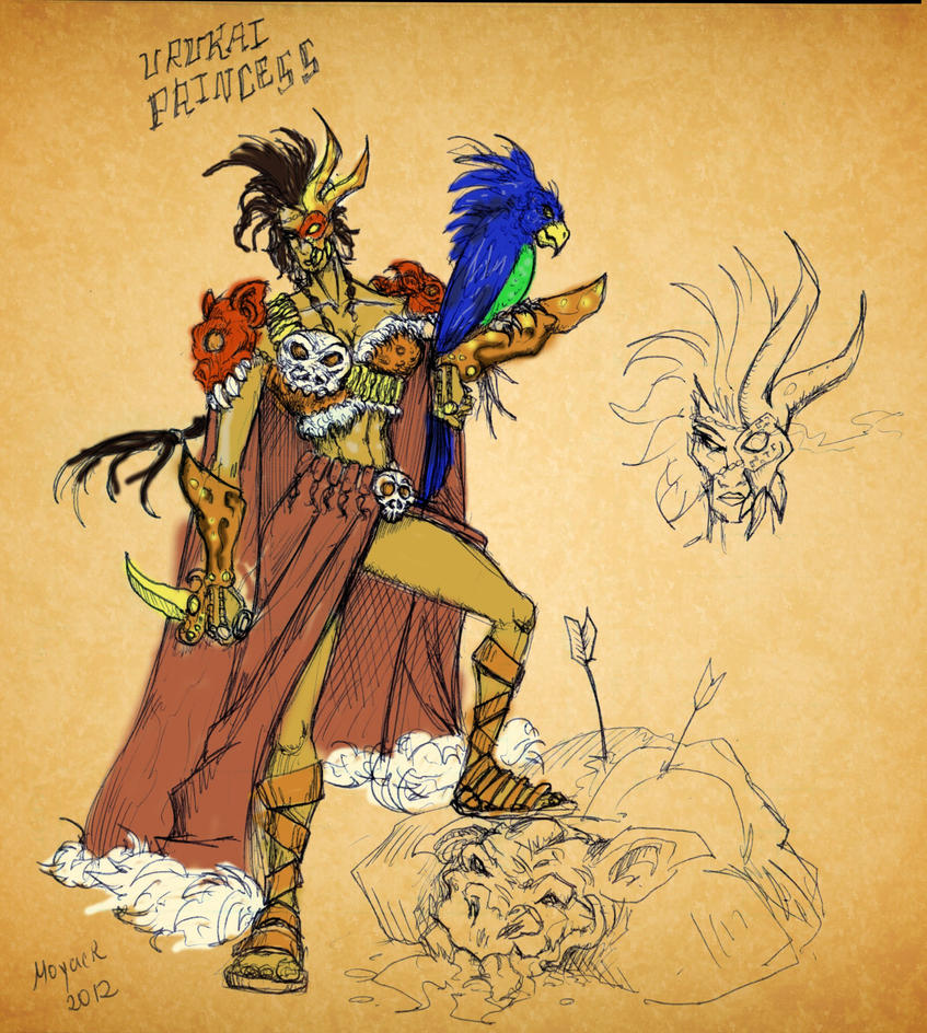
moyackx : 57/100
Theme : 4/10
Parts of the attire seem too advanced for a tribal character - such as the metal eye patch, and chains -, and the character itself seems too much of barbaric hunter of no tribe to be considered a princess.
Execution : 18/25
The character is presented efficiently and most of the design is easily discerned. However, shading is lacking and details seem to have been tossed onto it carelessly creating a clash of both style and colour.
Concept : 25/40
If there was put more emphasis on the princess half of the theme, this could've ended up being a fairly interesting design. It differs from most of the other entries being more of warrior than a spiritual leader.

However, I feel there's too much random going on with the attire taking away from the quality of the concept.
Realism : 10/25
Proportions are off the hook and out the window, with shoulders broader than Arnold Schwarzenegger's and thighs twice the length of her shins. Hands appear to be pork hooves, even though the character

seems to be intended as a human. Her upper arms are too long, as a result of her chest being too large and her hips too small.

ike_ike : 57/100
Theme : 5/10
Bones and feathers? Check. Bare skin? Check. Trophies and otherwise primitive adornments? Check. Character of importance? Absent.
Execution : 17/25
Very clear and defined style conveys the design well, although the design itself is a bit harder to understand. Elements of armour, shading thereof, and skintone seems to be depicted in the exact same colour,

making it hard to tell whether or not her left leg, for instance, is actually visible or it that's a piece of armour. Details are displayed in zoomed in cut-outs, but the absence of additional views should've been

attended to first.
Concept : 25/40
It's as if you tried to make the armour as natural as possible, while still resembling a fantasy warrior somewhat. In that sense it is quite new and refreshing. However there's not much else of interest.
Realism : 10/25
I already punished you for bad execution, thus making it hard to flaw your realism as well because most of the anatomical flaws can be argued to actually be parts of armour rather than her anatomy being off.

However, her right arm is beef as fuck and her hands are tiny little ants in comparrison. Her breasts appear to be hanging out of her armpits, and her shoulders are too broad. Her left cheek bone seems to

extend beyond her nose, and is far below its natural position - is that supposed to be an injury? Her eyes are huge and pop out of her head, but I'll let that pass as style.

PeeKay : 42/100
Theme : 8/10
A ritual warrior slash battle mage suits the theme well. Although the princess element is less represented, it is not entirely absent.
Execution : 14/25
There's a bunch of shiny details and stuff going on, but it is arranged in a manner that makes it ahrd to tell what is what and where one thing ends. Shading is appropriate for the most part, but doesn't help

gauge the depth of the attire nor the materials of it.
Concept : 15/40
A character covered in fur and rubies, with the head a giant best as a hat is not particularly original nor interesting. The dragon adds some invention to it, but sadly not enough.
Realism : 5/25
Your proportions make no sense, her legs are super thin and long, the same applies to her arms. Her shoulders are sickeningly wide (or her right arm is not connected to them). She's got horns coming out of

her armpits. Her torso is almost twice the length it should be and her hips are non-existent. Moreover, she carries a hell of a lot more fur and bone to be able to stand upright, not to mention the huge dragon

casually hanging onto her wooden staff. Her left leg also seem to be breaking off, as it's shaded in a way it appears the underside of the foot is closer to the viewer than her knee.


PeeKay
54/100
Theme
9/10
Follows the theme correctly. The shamanic look is great and it suits the theme, shamans being both tribal as well as a position of a power. The straight confident pose also enhances this.

Execution
5/25
The overall look is rather messy and it isn�t really a good presentation. The fact that your proportions are sloppy does not help this.

Concept
20/40
This is an interesting collection of visuals like the jewels and etc. It is, however, kind of messy, like said above and not really arranged in an interesting manner.

Realism
20/25
I keep telling you. You REALLY do have a problem when it comes to proportions. Your typical human drawing has 7 head high body. Maybe 8 if exaggerated. You have like 10. And how functional is having a dragon the size of a pony use your staff as a perch? Where do those big mammoth tusk attach themselves to. Out from her skin? Where is here actual shoulder eve positioned at? From the looks of it, it looks either she has a shoulder about 7 heads wide or her arm just floats in midair.

Dionesiist
81/100
Theme
9/10
Follows the theme correctly. The drawing conveys a look of tribal or barbaric entity. However does not convey the feelings of a princess.

Execution
20/25
Everything wooks great. Its clean and neat and you have a front and back and side view which is always great.

Concept
30/40
All the visual elements fit cohesively.

Realism
22/25
Proportions and shading works great. Body parts are in a realistic and identifiable proportions.

67chrome
82/100
Theme
9/10
Follows the theme correctly. Nice use of flowers as a theme to represent natural aspect which in turn relates to tribes. Use of staff, maybe representative of power, conveys a feeling of importance. The pose also conveys strength. Perhaps like a priestess. Which works fine in this case, much like PeeKay�s shamanic look.

Execution
18/25
The showing of different angle is both useful and �professional�. It represent your concept well. The only downside is that your whole drawing isnt very polished.

Concept
30/40
Really like the fact this one chose flowers as a motif. It really stands out from the rest and yet fit the theme.

Realism
25/25
Proportions and shading works great. Realistically coloured and shaded and proportioned.

moyackx
65/100
Theme
5/10
I suppose it follows the theme some what correctly. The pose and the composition does convey strong power and confidence which conveys a position of power which suits the princess theme.

Execution
15/25
The representation is pretty nice. Would prefer if more effort was put in to the actual drawing than the background

Concept
30/40
Stands out from the general ones being very combat based. Like some sort of a warlord.

Realism
15/25
Shading is not realisitic but it does its job at conveying shape. The proportions are not realistic but they work because you show all the anatomical parts like the shoulder and etc. The only problem is that the body shape is a male body shape, not a female one. The crucial factor is the broad shoulders that is wider than the hips.

Ike_ike
60/100
Theme
6/10
Follows the theme with the whole feathers and bone white armour/clothing. It is tribal but is not entirely sure whether or not this is really a princess. Doesn�t really show signs of royalty nor power. It would have been better if there was some sort of comparison with a non-princess equivalent.

Execution
15/25
Presentation is nice.

Concept
20/40
The concept is nothing amazing but nothing bad either. Suits the theme.


Realism
19/25
Shading is very minimal which is fine because all the form is defined with strong shapes. The body proportions are rather off. Wide shoulders and rather short torso. And I am not too sure if boobs are positioned like that. Maybe it�s just the shoulders throwing everything off.

Mr.Goblin
62/100
Theme
2/10
Theme was not followed. I see this and all I can think of is Assassin�s Creed and that is a long way from being tribal. The refined beads and silken cloth really IS NOT tribal in any ways. Not even sure if this is a loyalty or not. Really needs a point of reference in order to specify.

Execution
25/25
The Execution is great. You have shown great variety of different visuals.

Concept
10/40
A race of owl people is pretty cool. Except that I don�t really see anything else interesting. Even with the big wing there, I don�t really see anything interesting being done with it. There is also the fact that this whole concept part is very hard to judge because you didn�t follow the theme. There is no theme-to-concept connection.

Realism
25/25
The shading and the rendering of the feather is relatively. The textural quality conveys the correct material.

dizzt
41/100
Theme
1/10
Theme was not followed. When I see this, I see Fifth Element. That is FAR from being tribal. The theme of princess also has not been shown. There is nothing that implies royalty at all.

Execution
7/25
The use of lines are stylish, the flowing lines fits the body shape. However, it is rather empty and it rather approaches sketch than an actual concept art.

Concept
10/40
The concept here is a thin alien woman. The concept does not support the theme. The theme itself isn�t very mind-blowing. There is also the fact that this whole concept part is very hard to judge because you didn�t follow the theme. There is no theme-to-concept connection.

Realism
23/25
Shading is minimalistic but enough to work. The body proportion may be unrealistic but it emphasises the pose so it is great. This applies to the face as well.


((Votes / Total Votes) * (100 * .25) + ((shiiK + Pyramidhe@d)/2) * .75 = Final Score (cut to two decimals)

dizzt: ((10 / 79) * 25) + (((57 + 41) / 2) * .75) = 39.914557
Mr.Goblin: ((23 / 79) * 25) + (((77 + 62) / 2) * .75) = 59.403481
67chrome: ((10 / 79) * 25) + (((80 + 82) / 2) * .75) = 63.914557
Dionesiist: ((4 / 79) * 25) + (((94 + 81) / 2) * .75) = 66.8908228
moyackx: ((7 / 79) * 25) + (((57 + 65) / 2) * .75) = 47.9651899
ike_ike: ((10 / 79) * 25) + (((57 + 60) / 2) * .75) = 47.039557
PeeKay: ((48 / 79) * 25) + (((42 + 54) / 2) * .75) = 51.1898734


Concept%20Art%20Contest%20%236%20-%20Tribal%20Princess%20-%20Results.jpg.png

4th - PeeKay
5th - moyackx
6th - ike_ike
7th - dizzt


Poll | Contest
 
Last edited by a moderator:

Deleted member 157129

D

Deleted member 157129

I must apologise for taking so long to get this done - first we had some trouble finding judges, then I got caught up with too little time to do my part, and then I lost Mr.Goblin's judging and in a last move not to delay this further I went ahead and judged it myself in a rush. Hopefully, the calculations are correct, I am in too much of a hurry to go over them again to check. I'll need somebody to make the winners image, I don't have the necessary tools, resources or time.

Congratulations to the winners!
 
Level 49
Joined
Jan 12, 2010
Messages
1,771
Congrulations to the winners. :)

The contradiction are always intresting, same intresting the poll results with respectable opinions of a judges :)

I have some questions.. First of all - from when even broken proportions plays a role in the part "Realism", that is technique misstakes, and not a idea misstake. I mean the point where a "Realism" means realistic looking, but there i can make a misstake. Well, if we look a "Realism" like a realism of them, where we need to explain that people in tribal society of a 3000 years ago will have very premiveal crafts, and will no have a big artistic sense, so, after that they will use most beautiful and\or more power-showing items in dress of thier leaders. So, i guess from this point my work is inside of a rule. Afterthat we have a special meaning of a technique of a realistic looking, that where i was bored by a proportions criticism when other works somewhere has greater (means more ugly) proportions problem, and somewhere has way too scetch-looking (we speak for technique, nontheless).

About concept part. Read "contest" theme and check, that i clearly asked about the theme of a contest. There is a moment, that a concept art inside of a pointed AGE was pointed bases on a earth story (3000 years ago), so, if we take a theme for a realistic dates and history, then we point and realistic materials and technological level, so, there a concept of a HUMAN, that is being a princess in a HUMAN tribe. That is my concept, lets say "idea". Originality that pointed as a "concept" idea there makes me shocked of a originality of a Dioniisis work (nothing personal, Dionisis). If you judge such contest next time, please, let each percipicator will be judged by same rule, not by a personal for each one person.

Well, and also, i have nothing personal against judges. From Greece. with love. :)
 
Last edited:
there is a "being able to draw in correct proportion but choosing not to draw in correct proportion."

and then there is "NOT being able to draw in proportion thus and being forced to draw in incorrect proportion."

you are the latter, peekay.

i know shiik has no time for this bullshit but if you want, i could really explain the differance between dio's use of proportions and your use of "proportions". even if that means i have to wade through your broken barely understandable english.

woflie1.jpg

That is a resonable proportion. If may not be the exact proportion but the bone structure and the muscle mass is shown in a way that conveys believability. i know there is no such creature and yet i can imagine the way it moves and acts in my head.

1416994-concept.jpg

That is a TERRIBLE proportion.
i cant even begin to tell you how that moves or even exists and its meant to be a humanoid equivalent. your proportions are not as terrible as this but it suffers the same flaw of having no real believable body structure.

First of all - from when even broken proportions plays a role in the part "Realism"
"Since when does broken proportion factor in the "Realism" criteria"
ever since some person didnt put "techniques" criteria among the list of criterias.
that is technique misstakes
correct. but there IS no techniques criteria, is there?
and not a idea misstake.
Proportion is not an idea. we didnt even count it under idea/concept if you read the judgings again. its a vital part that is played, in this context, to create believability and thus REALISM. if your drawing fails to convey believability in the entity you have created, then you have failed.
other works somewhere has greater (means more ugly) proportions problem
please show me these other works where the human body is at least 10-11 heads high and the shoulder 5-6 heads wide or/and with disjointed shoulders, with fist size of her face and skinny little arms carrying a stick with a dead weight equivalent of a large calf.
There is a moment, that a concept art inside of a pointed AGE was pointed bases on a earth story (3000 years ago), so, if we take a theme for a realistic dates and history, then we point and realistic materials and technological level, so, there a concept of a HUMAN, that is being a princess in a HUMAN tribe. That is my concept, lets say "idea".
you just pointed out yourself how typical it would be to do a human princess. well done. just explained yourself how dio scored more in concept.

to explain shiik's judging on concept, since that was the more thorough one.
your character.
skulls on staff. seen it before.
covered with furs of animals. its a given.
dead animal head on head? plenty of those.

Dio's character.
bone safety pins? nope. ive see bone buttons but not bone safety pin like things.
bone and cloth bra thingy with bone string deco? nope.
not a human? its not the best but its something.

more importantly, your visual cues make sense but they are kinda shovelled together in an none-interesting way. where dio's visual cues all mesh very well, having a chosen theme of cloth/string and bones.

therefore, your concept is a mediocre concept while dio is a superior concept.


if you have anything else to complain about, feel free to do so.
 
Level 49
Joined
Jan 12, 2010
Messages
1,771
Well, first of all, let we check other works, and compare.

Nothing personal to the authors, its will be just my try to compare works.

dizzt. Original work, but concept its a little poor, i mean, when you look at it, you feel that something missing.
Overall its fine, but breaks a concept rule about technologies and "tribal crafts"...

Mr Goblin. Good work, sad that not finished. Same here, a princess has silk-looking dress, that is out of contest rule.

Ike. First of all - not tribal, cuz of metallic shoulders. Second - these proportions makes very strange effect, and, surely, they are broken.

67Chrome - overall fine concept again is far from tribal theme, at least cuz this type of sleeves and dress overall comes from way different age.

And, finaly, dio. First of all what you note, when you see this. It's a troll. Well, not a original wc3\wow troll female, but its looks like a little reworked troll. Second - the bandages, that are no reason for. Third - well, these strange fingers are not just looking bad, but changes functionality of a hands, so, this creature will be not realy able to fight with club, that it should dress, according on a concept. Fourth - these things on ears. If you know ears anatomy, you will recognize this misstake. This creature cannot hear anything from front. About anatomy that you told me, Pyra. If overall it looks comsi-comsa fine, situation changes, when you see from close. Right leg of creature comes from other point, than left one. The left one is way too thin, if compare right and left hips. Shoulders are shifted in some strange angle (according on chest pose). Well, now - greater anatomy mistake that Dio made - foots and pose overall. Its just imbalanced, means that this creature is, firstly - unable stay on these legs and walk on these, the creature is unable (in any way) walk as a human, and the only way that the creature with such tail will be able to move - like a animal. Also, with such tail creature should have way too different proportions, cuz tail bones cannot be greater, than a spine bones, that are classic for a humanoid creature on the concept.

So, i will love know what you will tell about this, Pyra.
 
Level 49
Joined
Jan 12, 2010
Messages
1,771
And few words about my work, just a answers to a judge. Mammoth tusks are emptied from inside, so, they has no big weight. They are comes as a same part of equip like a bones on a princess back.
The dragon should have way to big weight for a princess powers, so, when she walk - dragon walks nearly, it don't sits upon a staff. Reason for a dragon same, as for a panther or any else pet. Pony size magic dragon that is fast like a lizard and powerful like a alligator. Sounds deadly, i guess.
About height proportions, that you, Pyra, told me (body size according on a head size) - this one princess has maximum 8-9 it head sizes weight, that, comsi-comsa, possible for a human. No one says that this girl is short like a dwarf.:)
 
Level 45
Joined
Dec 13, 2005
Messages
2,784
Fun, fun, fun.
It's a troll. Well, not a original wc3\wow troll female, but its looks like a little reworked troll.
No tusks, and you're going by the slightly elongated nose. Which, according to WoW, isn't even present in female trolls (rule of sexy, ofc.)
Third - well, these strange fingers are not just looking bad, but changes functionality of a hands, so, this creature will be not realy able to fight with club, that it should dress, according on a concept.
Well, you might think so, but neither one of us has met anyone with fingers like that. Alternatively, if someone with fingers organized like that met us, they'd probably be just as confused. The big banana thumbs were supposed to be really large claws, by the way. In this case, the tip is sanded off.
Fourth - these things on ears. If you know ears anatomy, you will recognize this misstake. This creature cannot hear anything from front.
Yeah, true enough. I'm surprised I didn't see that at the time.
Bla-blah proportions; stability/ legs issues; tail issues
I'm terrible at proportions, it's hard to evaluate how effective a creature design is, honestly, and the tail was supposed to taper.
I'm not writing this as counterarguments or, God forbid, to warrant my winning. I'm just as baffled as you are about the latter.
 
So, i will love know what you will tell about this, Pyra.

ohhhh gooodie

dizzt. Original work, but concept its a little poor, i mean, when you look at it, you feel that something missing.
Overall its fine, but breaks a concept rule about technologies and "tribal crafts"...

something is missing.....what's missing? how does it "break" the concept rule? that statement is as contributory as saying "i dont like red. we should change all the red lights in the world to purple". you are simply making a statement of your opinion without valid reason to back them up, just hoping that keeping it vague would make it stick.

Ike. First of all - not tribal, cuz of metallic shoulders. Second - these proportions makes very strange effect, and, surely, they are broken.
the shoulder armour is....metal? whaaaaaaaaaaaat?
110580d1327986026-concept-art-contest-6-tribal-princess-whepwhepwhep.jpg
so lets start from the bird skull on the necklace here. it is made of bone. clearly. it is a bird skull. skull is a part of your skeletal system. now. is the shoulder pad rendered(ie. coloured and shaded) in the same manner as the bird skull(and therefore is the same material)?

i cant even begin to think how that is even registered in someone's mind as metal. then again, my mind isnt clouded by the fact that i came last.

in regards to the proportion, the drawing style lends itself to some leeway. not saying it is correct. but not saying that is some how critically bad.

67Chrome - overall fine concept again is far from tribal theme, at least cuz this type of sleeves and dress overall comes from way different age.

how booooooooring. if you want to be pedantic about time period and etc, your entry have a sword. sword came into fashion around the bronze age. before that, we had clubs. bronze age, the metal working age, like you seem to be arguing(and i agree) is not tribal.

what i was really looking at is, are all the stuff that the character is wearing possible to be recreated using the tech and the methods of the tribal age. and woven flowers sure sound like a reasonable tech.

And, finaly, dio. First of all what you note, when you see this. It's a troll. Well, not a original wc3\wow troll female, but its looks like a little reworked troll.
and yours is a not-reworked human with just shit loads of fur. i guess that makes it better and more original. i didnt even point out the fact that the head-dress looks exactly like the orc shaman's one. but sure. it's pretty original.

Second - the bandages, that are no reason for.
once again, boooooooooooooooooooooooooooooooooring

having your nails painted serves no functional purpose either. and yet people do it. people dye their hair and yet it has no purpose. you have a huge ass mammoth tusk as a decoration. and it serves no purpose

if you havent noticed, the bandages are not just wrapped, they are woven in to a pattern and hence their purpose is
A. a minor surface protection
B. a decorative visual element

Third - well, these strange fingers are not just looking bad, but changes functionality of a hands, so, this creature will be not realy able to fight with club, that it should dress, according on a concept.
firstly, the hands are part of the concept, that is a part of the look of this race he has chosen to depict
secondly, i dont understand how you would think that these hands would be unable to grasp an object like a club. it has at least 1 opposeable finger and such, it would be able to grab clubs fine.
thirdly, chamleons have hands and feet that are shaped very close/exactly like these and they are able to grasp twigs and what nots without any problem. in fact, they have EVOLVED that way because it makes for better even grasping.

Fourth - these things on ears. If you know ears anatomy, you will recognize this misstake. This creature cannot hear anything from front.
and if you knew anything about ANY anatomy, you would have drawn something a bit more to a reasonable proportion

This creature cannot hear anything from front. About anatomy that you told me, Pyra. If overall it looks comsi-comsa fine, situation changes, when you see from close.
when i see from CLOSE. i dont even NEED to see from close to see that your entry is out of proportion. i can see it just fine from far.

Right leg of creature comes from other point, than left one.
cos...the hip is tilted? it does seem off if i look really really really CLOSE. but if i just look at it normally, without a magnifying glasses, that point is negligible.

The left one is way too thin, if compare right and left hips.
they are viewed from a different angle if you havent noticed. and please dont tell me thighs are perfectly cylinderical and the same thickness from all viewing angles. cos that is just retarded.

Shoulders are shifted in some strange angle (according on chest pose).
i thought it was her left boob just being really pointy. like i said. if i look really really really CLOSE. but if i just look at it normally, without a magnifying glasses, that point is negligible.

Well, now - greater anatomy mistake that Dio made - foots and pose overall. Its just imbalanced, means that this creature is, firstly - unable stay on these legs and walk on these, the creature is unable (in any way) walk as a human, and the only way that the creature with such tail will be able to move - like a animal.
"creature is unable (in any way) walk as a human"
firstly, that point is moot considering the fact that the leg structure is not that of a human.
secondly, i hope you realise that digitigrades are simply walking on your toes. and one can walk while standing on their toes
sendimage.php

thirdly,
he seems to be walking fine. unless there is some finer detail i am missing, that is basically dio's leg structure on a human.

Also, with such tail creature should have way too different proportions, cuz tail bones cannot be greater, than a spine bones, that are classic for a humanoid creature on the concept.
i would like to point out once again, your own proportions leave some what a great something to be desired. but ive said that repeatedly. and once again, if i see REALLY REALLY REALLY closely. i havent heard about this spine to tail ratio thing. then again, neither has few other people. prolly the majority of the people. and yet, dio's proportion looks fine.

also. is this an actual scientific anatomical proof or just a drawing convention?

Mammoth tusks are emptied from inside, so, they has no big weight. They are comes as a same part of equip like a bones on a princess back.
short-handle-axe.jpg

this is laser point relayer for a orbital strike cannon mounted on a satellite. you wouldnt know it because all the parts are inside it. but trust me. its there.

in all seriousness, what do you think would be the first thing that go through a person's mind when they see this mammoth tusk?
A. It is solid and heavy and looks ridiculously cumbersome
or
B. It is completely hollow and light as a feather.

preeeeeeeety sure it is A. and if that is the case, then you have failed once again as a concept art. you are depicting an entity in a misleading way.

there is also the fact that this thing is ridiculously big. there is a point where something is a decortion and you have gone past that point where the decoration has become an hindrance (or a health hazard in your case.) regardless of weight, the object exists physically. how do you expect things to not run in to it while walking or such and such.

The dragon should have way to big weight for a princess powers, so, when she walk - dragon walks nearly, it don't sits upon a staff. Reason for a dragon same, as for a panther or any else pet. Pony size magic dragon that is fast like a lizard and powerful like a alligator. Sounds deadly, i guess.
does anyone else let their ponies or alligators perch like a parrot on their shoulders? i didnt know that was a thing....or even possible.
standing OR walking

does she somehow gain super muscle and bone strength when she stands still?

inb4 "the staff supports all the weight so she doesnt need to be strong"
go out and grab a broom, ducktape a refrigerator on the end of that, and try to balance it upright using your hands.
firstly. it is not going to stay stuck on the broom with a ducktape.
secondly, even if you were able to keep it stuck, it would be impossible to keep it perfectly vertical for any amount of time.

now this is considering that the dragon stays ABSOLUTELY still. and it wont.

if it is landing on and off the staff, then you have to assume that it lands and takes off with some weight and force around it.

unless the dragon's bones are hollow as well....and filled with helium. then i guess it is fine

About height proportions, that you, Pyra, told me (body size according on a head size) - this one princess has maximum 8-9 it head sizes weight, that, comsi-comsa, possible for a human. No one says that this girl is short like a dwarf.:)
if i look really really really really closely and if i wanted to be really really really really certain of the exact proportion of the head i would have redrawn your work as a skeletal figure and measured it with a ruler. but i didnt. i kinda glanced and then roughly measured it with my finger. and it looks like shit out of proportion.

8-9 is not possible for a human unless you have a condition. 7-8 height is reasonable. 8 is, like i said, a stylised proportion for superheroes that people are able to accept because
A. they dont know any better
B. no one is measuring them with a ruler
C. its 9-10. 9? yeah ok. maybe. really depends on how big you perceive her forehead really is. 8? no. it aint no 8.

still doesnt change the fact that her arm either floats in nothing or she has the manliest space marine shoulders.

--------------------------------------------

lastly, how conceited do you have to be to "judge" other fellow contestant's entry? did you really think that pointing out their flaws would somehow lessen your flaws?

are you really that lowly.


MORE IMPORTANTLY

Welcome back and congrats, Dio
 
DAMIT SHIIK! I HAD THE JUDGING SAVED ON A WORD.DOC! D:

oh well, what ever... gratz to everyone.

and here's something for the participants might enjoy reading, because I did gave alot of tips and what not.

Design a princess of a tribal society. Be creative.
Tribal implies the materials and techniques used by your character has to be consistent with a society that lived before 1000BC, or an equivalent fantasy or alien society. Think hand-crafted tools, weapons and clothes. As you are making a princess, it will also need to be recognisable as a female member of the society with higher esteem than the average member of the society. A princess can have an additional role to being a princess, such as a shaman or a hunter. I will also require your character to be a humanoid or half-humanoid for practical reasons, no tribal princess tigers.


Dizzt

Theme: On the first look, I must admit I already got that prestige of a princess. Her stare, her posture, gave A LOT to the character…. But, this is pretty much the only thing that made her look like a princess: simple dress with necklaces? Doesn’t quite tell you she’s a princess (unless the rest of the tribe is naked... which would conclude you are not quite following the theme in itself, because it’s stipulated: Tribal implies the materials and techniques used by your character has to be consistent with a society that lived before 1000BC. Think hand-crafted tools, weapons and clothes. As you are making a princess, it will also need to be recognizable as a female member of the society with higher esteem than the average member of the society.) In fact, next time, you should put more decorations overall. Normally, I would have gave you a lower ranking, but the magic flying stones saved you with the description you provided.

Princess look = 6/10
Tribal look = 5/10
Theme: 11/20
--
Execution: You definitely have an interesting style going on: simplistic but efficient. Sadly, due to the fact your concept is quite simple; I can’t really judge further than that. Normally when doing concept-art you want to explain the different aspect of the cloths it’s wearing: by applying colour and by making the textures. Since you’ve made it only in black in white, I can only judge your texture work to understand the different materials, and truly speaking = you didn’t pull it off. I only understood the materials because of their position and their shape.

Execution: 13/20
--
Concept: …ouch
There are two things you have to consider while making a concept-art: The information and the look.

The look: You’ve made a reaaally simplistic design and that killed you (for the same reasons I explained to you concerning the theme.) Yes, you got yourself some points by making an elfish looking princess and you gain more points with your description. But that’s all, I can clearly tell you didn’t do much concerning the research (by coming up with unique cloth’s designs and decoration’s designs.) when making your concept-art.

The information: What I mean by information is = To help the watcher understand your concept: What kind of material does it wear?(hard or soft?), What short of belief your character has?(do we see a lot of symbolic references to her/his belief?(Crystals, war painting, crest, runes, items it wears, etc.)), In what short of region your character lives in? (does he/she lives in a cold harsh land or in a desert?(is it well covered or not, etc.)What short of surrounding your character lives in?(Does it wear fur?(animals) does it wear foliage?(plants as decorum etc.).

You clearly lack on that aspect.

Look: 4/10
Information: 3/10
Concept = 7/20
--
Realism= Well, you’ve made something logically possible (if elf and magic would exist). But I must admit, you’re the one that made the most boring stance of all the competition… I can almost say you simply Copy Paste one side and redraw it to be perfectly mirrored.

Realism = 18/20

(Personnal note on the overall entry: I must admit, I’ve seen your other artwork and I’m dissappointed. I can clearly tell you’ve rushed your entry. Next time, please take your time, think… think again, then execute. You have the force! :D just learn to use it <3)

=================================================================================
=================================================================================

67chrome
Theme: I must admit I’m not quite sure what to think about it. By the look, we can tell it’s a princess: she’s colorfull, she has a staff, she has the overall prestige of a princess, but there’s a weird thing going on on the general design, it looks more like a Top model wearing some twisted cloth designs made today, then a tribal princess. I guess it’s her pose, and the hair style that does it. But oh well, you respected the theme and by her decoration we can clearly tell she’s a high rank.

Princess look = 8/10
Tribal look = 8/10
Theme: 16/20
--
Execution= I must admit, you’re irregular, you went from detailed and well shaded to sketchy and a spam of colours, same with your shapes. Although the execution is good enough so I can understand the overall design of your cloths and decorum, it gets kinda confusing which part are made of: features? fur? bones, etc.. your description and the colour palette is what made me understood which cloth pieces were made of what short of materials. So you sir, went too easy in your execution, you clearly lacked motivation after you were done with the body and that tells me tooooooo much. (How I Imagine you were while working: Blablablabla I'm having FUN! YEAAAH! ///crash/// I don't want to draw each features :B herp derp... meeh I'll just spam colours and draw a few lines, he'll understand anyway... derp derp)

Execution: 14/20
--
Concept
(read Dizzt judging to understand this following part)
The look = Well, I love the fact you got yourself out of the ‘’fur’’ with your entry, making the dress made with features and bones was a nice twist! Sadly, due to your execution, your great idea got lost into my confusion. But you did manage to bring enough detail into the overall dress and I love that fact. You didn’t simply made 1 layer of cloth, you even came up with a cool staff design and some tattoos. I’m kinda sad you went for a human though, the theme was damn open… and you didn’t took a hold on it.

The information = errm... because it is confusing, your description is pretty much what helped you with it. I can tell by the dress made of phoenix features they are into killing magical creatures, by the staff I can imagine she is a mage, by the decoration I can imagine the overall dress code of her rank, her clothing tell me she lives in a tempered region, her tattoos might insinuate some tribal signification or ranking as well, also the fact that she is really colorful also leads me to imagine an other signification of the belief of her tribe. Nice details overall! (damn confusing, but good nonetheless)

Look = 6/10
Information = 8/10
Concept = 14/20
--
Realism = her proportion seems abit off, her legs seems way to long and her waist is way to short. Also her arms are not even the same length. Concerning her dress, everything seems logical, my only problem is the flowers = how daah fuck do they hold?! (maybe with a less spammy execution I would have understood… yes see what I did thar?)

Realism = 17/20

(Personnal note = by your artwork I understand two things = 1# you've thought of your concept and it shows// 2# you clearly lacked the patience while doing it. This is a contest, I'm slightly disappointed.)
========================================================================
Dionessist
Theme = I don’t really know what to say really, it looks tribal-ish, it has bones and features and what not, you pulled it off well! And THANKS GOD you made something out of the ‘’human box of doom’’. Now: concerning the princess thingy/stuff, I don’t feel she is a princess. She as nifty decoration and war painting but none of this are particularly well made, so we lose the ‘’prestige’’ and high ranking fealing. By the lack of description, I can imagine she’s a shaman?… but again, your concept-art doesn’t tell much itself.

Princess look = 5/10
Tribal look = 10/10
Theme: 15/20
-----------
Execution = Nice style you’ve got thar! It’s constant, sharp and clean and we can clearly see every nifty details you’ve put on. Not much more to say about that. Normally I would have like to have a colour palette at least shown next to your Black and White drawings, but since you’ve made each aspect of her clothing well textured enough and clear enough to understand: I have a good comprehension of the materials, but yeah colour would have been nice :|

Execution = 17/20
----
Concept = (read Dizzt judging to understand this following part)

The look = Clearly interesting! For several reasons: 1# she’s not a human. 2# I like her ‘’short of choral shaped’’ bone formation (it was a nice adon), makes her look a tad fishy, the legs are really cool too! Concerning the look, I must admit you’ve made something a tad to simple for a princes (read the ‘’theme section’’) And due to that I can’t really say it’s a ‘’developed’’ concept-art. Although, with the little you gave her, you did make something different and creative about her look, the bandages, the bones hanging, there’s a few nifty ideas, but I’m a little bit disappointed that such an exotic looking creature, don’t have the same kind of exotic look, to the spicyness you gave me with her look, didn’t quite followed in her clothings.

The Information = well, as described in the ‘’theme’’ I don’t quite feel she’s a princess due to the lack of details or symbols. Although, you lack in that term, but it doesn’t mean you don’t have any symbols. Her bandaged fingers, her bone necklaces, her tattoos, etc does involve interpretation. But overall, not so impressed by the different aspects.

Look = 8/10
Information = 6/10
Concept = 14/20
------
Realism = Not much complain about that, only the neck section looks kinda strange, and legs and arms doesn’t look quite symmetric (even with the forced perspective). Meeh, overall I can say it was well made :D

Realism = 17/20
(Personnal note: I must admit, you’re one of the most creative artist I’ve met concerning armour designs, not saying this is a bad job, but you could have gone MUCH wilder, next competition please respect your creativity ;D)
================================================================================================================================================

Moyackx

Theme= daayum, THAT’S A FREAKING KILLING MACHINE! But who said princess can’t be? :D You respected the theme well, you gave her also many decorations (which I like) the mask, the shoulderpads, a cloak, (it’s overall nicely done!) we can clearly tell she’s a higher rank. Not much to add, I do love the fact your character above most other submissions actually tells a story, by her prestige, her look, her stand,etc…

Tribal = 10/10
Princess = 10/10
Theme = 20/20
-----------------
Execution = this is probably your weakest point. It’s kinda sketchy, the color palette is ‘’kind of boring’’ and doesn’t quite work as a whole. Some parts are colored, some other parts aren’t. Beside, not much work have been put into making the textures of the materials, and since you’ve made a poor choice with your colours we can’t really tell in what materials each components are made off. I’m forced to interpretation, and I guess it’s bones leather and fur, but not sure what is what, I can only guess by the shapes of what you draw…

Execution = 13/20
----------------
Concept = (read Dizzt judging to understand this following part)

Look = Interesting look, but due to the execution we lose a bit of it’s awesomeness. Like said previously: I like what you’ve done… but I’m not quite happy you went for a human. The theme was really open and you could have gone for something much different. I also don’t quite like the fact you only used leather, bones and fur to decorate her; although the look is creative, the material used aren’t. I do like the fact you used these (said boring materials) to make some nice looking decorum: such as her mask, her shoulders, her gloves, they all go together quite well. Sadly, your color choices made her quite irregular… in a bad way. Yellow, orange, red, BOUM WHITE, BOUM BLUE AND GREEN!! I mean even the yellow orange and red don’t seem to be part of the same palette. This irregularity makes her look kinda stupid to be honest… a stupid looking killing machine? Meeh.

Information = just like explained in the ‘’theme’’ section, you’ve made a good job with the overall concept. Bones, teeth, skulls, dagger, hunting hawk thingy? I see a true dangerous hunter! The mask also tells a story by itself! Great overall design, of course I would have like some tattoos here and there, and more bones, but whatever… great job none the less.

Look = 5/10
Information = 8/10
Creative = 13/20
-----
Realism = to be honest, you’re proportions are really off and because I need to judge everyone fairly you’re probably the one that will suffer the most from it. Although you’ve done a nice job at making everything proportionally equal; since she’s a ‘’she’’ and a human ‘’she’’, I can’t quite give you a high rank. She has the body of a 7 feet tall male African runner (not being racist, just observant). If I can suggest something = next competition: use reference pictures, (don’t trace) by simply copying the same kind of stance as the image you’re looking at, you’ll have better proportions because you’ll understand what is off. Yes, it might seem unfare that human princess get lower grades then alien princess, but that is part of the game you’ve got yourself into… you decided to pick a human, you have to follow human proportions. Apart from that, god job with the armor design, you’ve made everything well structured, no flying shoulder-pads or mask, everything is nicely realistically attached together.

Realism= 12/20
(Personnal note= I never seen your previews artworks, but here’s some tips: observe human proportion. If you are out of inspiration or feel your concept is un-original = surf the net and get inspired (this is what I do everyday of my life, and because I have a bank of memories I can create and shape these to create more unique concepts). Work cleaner.( yes I can tell it’s a handmade drawing that have been scanned, but would it have kill you to simply trace over your drawing and to make clean lines instead? No.. )
================================================================================================================================================
Ike-pie-pIke

Theme = She wears a necklace, features, ‘’complex’’ armor with tattoos, I see a princess! I can’t quite pronounce myself on her role though, shaman? Warrior? Both? Can’t quite tell… but at least I can tell she’s a high ranked person. Her look is a tad ambiguous with the ‘’tribal theme’’though… it’s simple, made with weird bones, but the boots and the shoulderpads with designs: seems crafted with metal and it doesn’t seem cheaply made. (and it seems impossible to create them with simple bone.) But because you went all cheapo over the details and such, I can’t tell with what short of material they are made from (beside the mask), so I’ll consider it’s made out of bone with the use of magic and such.

Princess look = 10/10
Tribal look = 7/10 (due to the ambiguity)
Theme = 17/20
-----
Execution = I will be honest, you’re a cheap lazy bastard… (no offence) you show me a cake with a cheery on top, but the cake wasn’t baked and without flavor. Yes, the concept was well thought (the good looking cake), but you gave me a simple line-art(aka: not baked), doing detailed version on the side is usefull (aka: the cheery on tope) but that doesn’t tell me much about what each components are made of: fur? Features? Blue leaves? Bones, metal? (aka, the flavor). But I give it to you, the line art is good, quite simplistic though, but good nonetheless, but yes I already explained myself enough in the ‘’theme’’ section, so you get what I see…

Execution = 16/20
----
Concept = (read Dizzt judging to understand)

Look = looks cool! I admit, I can’t really tell if she’s human or not, but because she has weird proportions and long eyebrows I’ll consider she isn’t… but even though she’s not human, I don’t quite consider this being ‘’creative’’ because she doesn’t look particularly interesting. Concerning the armour = LOVE IT…but, even though you went for the ‘’bone, fur, leather mix’’ you did something truly original with it, but here comes the ‘’but’’: you are irregular, in a bad way. There’s some bones at some place, there is not at some place. at some place there’s carved design, at some other place there’s no carved design, it’s quite confusing… although you kept a continuity with the shapes and the color of the different armor pieces. Humm.. hard to judge really…

Information = Good job on that, the war paintings, the cool looking mask, the necklace, the armour, the shoulderpads, all are cool elements that let us drift into a mystic looking tribe that cherish magic and hunting. Nice job overall! Not much to comment beside the fact it shows you’ve thought of your concept, because your character clearly shows some untold story. I would have love a tad more details, like more carved designs and decorum, cause she does seems abit too naked for a princess.

Look = 7/10
Information = 9/10
Concept = 16/20
------
Realism = Well, since I already explained why she’s not human to my eyes, the only thing left is to comment on the armour itself or the general proportions of this ‘’alien’’. Concerning the armour = For what I can see, she can’t walk properly, it seems impossible to move her feet freely. The shoulder-pad magically floats, it is not attached at all…
Concerning the proportions = one leg is 2 times bigger than the other. WTF is going on with the arms? (elbow part? Herp derp?).

that’s about it.

Realism = 14/20
================================================================================================================================================
Peekay

Theme= I see a QUEEN not a princess! Kidding, you definitely gave me the princess fealing, the stare, the stance, the dragon, the magic rubis, the carved designs.. I see a high ranked mojo that seems like a dictator. Concerning the ‘’tribe’’ theme, you followed it well too, not complaining about that either. I must admit, just like I said for the others, I’m disappointed you went for a human, and for the ‘’fur, bone, leather’’ combination. But it doesn’t affect this part of the judging so.

Princess look = 10/10
Tribe look = 10/10
Theme = 20/20
----
Execution = I don’t know what to think of it, I’ll be honest. Some part you’ve made are really detailed, some part are just a spam of brush, some part seems to be carefully drawn, some part seems like a spam of brush again. It IS a concept-art, but that doesn’t mean you can be THAT incoherent. An other problem that you have is just like I explained with 67chrome entry, is that: since most part are blurry, we can’t really tell what part are made of what.. fur? Leather? What helped you is the shape and the colours you used to paint each part, but that concerning the texture job = it’s laking. But, good job with the shadows!! I’m impress :D

Execution = 16/20
----
Concept= (read Diizt judging to understand)

Look = interesting look! I must say, but you went for a human, and that human wears fur/leather and bones… not quite creative. Although, you did create something quite unique even using these materials, chapeau to you!. Great design, love the necklace, love the belt, love the dragon, love the staff. Great design overall!, my only concern is the colour palette choice and the overall design. Most part of the armor work well together… but, some pearls are rainbow but some pearls aren’t? why?.. why is the belt glowing when the rest isn’t? Why is she wearing warm cloths but not wearing boots? Even though I really like her look, there’s a few ambiguity..

Information = She’s decorated, she has war painting, she has a dragon, etc. Great character that shows a great story. Not much more to add.

Look = 6/10
Information = 10/10
Concept = 16/20
------
Realism = your weakest point…

You choose to make a human? Faire enough, follow human proportions. If I check her shoulder, the arms are unequally apart from the head, and above that she has the shoulders of the great Hulk. Tiny head or a freaking huge neck? Don’t quite know, still not good. That is not my only concerns, all I can think of watching your concept is = she’s going to die with a broken neck, broken back or something. To wear two gigantic mammoth horns on the head is biologically impossible for her neck/bone muscle to follow. To walk around with a dragon (because watching the way the staff is designed it quite points out she’s ment to.) is quite much to ask for 1 arm, when the beast itself is the size of a cow. Blablabla, you get the point… You wanted to make something badass? Well ‘’that short of badass’’ is impossible…

Realism = 10/20

(personnal message = Although I’ve said a few bad comments, I must admit I was highly pleased with your entry, you’ve outdone yourself and that makes me proud!)


Last edited:

Deleted member 157129

D

Deleted member 157129

Sorry, mate, I didn't want to wait until you got back online (these results are already late enough as is).
 
Level 3
Joined
Nov 16, 2009
Messages
66
This is a load of bollocks.
Proportions? Diffrent races/people/etc. have diffrent body proportions.
Realism? What does that have to do with the rating??? Why should anything here be realistic?
Never before have i seen judging this messed up. I would take of my hat if i wore one.
 
Last edited:
Level 4
Joined
Nov 14, 2009
Messages
63
Sorry guys, I have nothing personal against you but the judging is total bullshit excluding Mr.Goblin.
 
This is a load of bollocks.
Proportions? Diffrent races/people/etc. have diffrent body proportions.
Realism? What does that have to do with the rating??? Why should anything here be realistic?
Never before have i seen judging this messed up. I would take of my hat if i wore one.

so lets all draw stick figures.

Sorry guys, I have nothing personal against you but the judging is total bullshit excluding Mr.Goblin.

please. elaborate

enlighten us.
 
  • Like
Reactions: San

Deleted member 157129

D

Deleted member 157129


Theme
Does the artist take advantage of the theme, or is the vision unfitting?/10%

Execution
Does the artist display the design in an effective manner, or is it hard to tell what is what? Are artistic techniques used effectively to make the character interesting, or does the style deteriorate the concept? Is the appearance of the design objectively pleasing, or is it of low quality?/25%

Concept
Does the design offer a new creative approach, or is it generic and cliché? Does it have character, or is it just another boring design? Does the design make sense and fit the description, or is it necessary to read the title to understand?/40%

Realism
Does the design balance, or are the proportions impractical? Is the anatomy or construction correct, does it allow the character to move as it should, or is functionality disregarded entirely?/25%
I'm just going to quote this here because obviously people who are complaining either neglected to read the judging criteria, or they're just butthurt because PeeKay didn't win regardless of his clear lead in the poll.

I'm not going to reply to anyone individually, and I have not read any of the more elaborate posts thoroughly. Frankly, I don't have time nor do I care. We have judges in this contest for a reason, and we have judged by the criteria presented to the contestants and other followers when the contest started. Both Pyramidhe@d and I are educated/being educated in visual art and we're relatively experienced artists (not saying we're any better than any of the participants, but that we are qualified to judge this contest). This is our individual opinion combined, no teamwork or comparing each other's judging to the other. If you cannot respect the opinion of two qualified judges, then you should go somewhere else. This is how we hold contests at THW.
 
Level 4
Joined
Nov 14, 2009
Messages
63
If this is how you hold contests here, then I won't be entering any for sure. Not trying to be cocky nor claiming I am better at judging but the result of your judging proves you are not qualified to judge.
 
Level 4
Joined
Nov 14, 2009
Messages
63
So, what is done wrong at the judging? You still don't elaborate :p

Do you really believe I will? With those attitudes?

"Both Pyramidhe@d and I are educated/being educated in visual art and we're relatively experienced artists"

Cocky much? You are experienced artists so everyone else's opinion is worthless.
 
Level 4
Joined
Nov 14, 2009
Messages
63
I've seen how you've "listened" to Peekay.So no thanks, I'm good. I'm not siding with Peekay or something, hell I don't even think he should have won but he also obviously didn't deserve to come last.
 
I'm giving you a chance to be heard and you keep ignoring it.

Someone will end up coming last in the contest. Position has almost nothing to do with the way the judges have reviewed the submissions. "Listening" to Peekay (although I have no clue what post you are referring to) would most possibly result a subjective review, while judges should be as objective as possible. In case you mean that, I don't see any quality in that potential judging whatsoever.

P.S. I am a fan of Peekay's artwork, but maybe the submission wasn't good enough, compared to the others.
 

Deleted member 157129

D

Deleted member 157129

Do you really believe I will? With those attitudes?

"Both Pyramidhe@d and I are educated/being educated in visual art and we're relatively experienced artists"

Cocky much? You are experienced artists so everyone else's opinion is worthless.

I also said that we're not better than all of the participants, but we are still qualified. Unless you want to hire a professional to judge a contest, this is what we have. The other artists on this site are either too busy, not interested or already participating. Saying there's something wrong with the judging, without even hinting towards what exactly is the fault, leads nowhere.
 
Level 13
Joined
Jan 27, 2009
Messages
361
Amazing concept art everyone. I believe this contest is of the highest quality i've seen yet on hive. Concept art is such a different thing to everyone so it's pretty hard to judge since it is to create an idea, a concept. I think it would be much better if we had a wallpaper art contest or just a 2D art contest. Then you could draw expressions and from different perspectives. Like a contest where you'd draw something that you'd be proud to make a painting off and hang it on the wall. Maybe someones strong point is painting environment? or expressions? or simply just creating a feeling. I think we should have a 2D art contest!
 
i will simply analyse one of your sentences with few other sentences, used as a minor referential evidence to disprove your point of view.

Lets start.
Not trying to be cocky nor claiming I am better at judging but the result of your judging proves you are not qualified to judge.
here you make 2 defined statements.

A: (i am not) better at judging
B: you are not qualified to judge.

...how does that sentence make logical sense.

If statement A is true, that you at not better at judging, how is it possible for B, for you to discern that we are unqualified to judge? If you have lesser knowledge, how are you able to judge upon people that you claim to have more knowledge? a person who has eaten nothing but take away for their whole life cannot critique the views of a professional connoisseurs or food critics. they simply can not.

VICE VERSA

If statement A is false, that you ARE better qualified to judge then statement B then becomes possibly true. You may able to discern that we are unqualified judges. but for what reason do you state statement A?

Now. how do you explain this. it is my view that in fact, both statements are both true AND false at the same time. try to keep up

A: (i am not) better at judging

That may be a statement to be taken at face value, as a statement of your own humilty. So it is true. but in your own mind, you believe yourself to be actually better than the judges. otherwise, why would you have stated statement B? there is absolutely no way. so, it is false. you know it to be false but you state it as true. this sentence merely served as a rhetorical tool, used to humble yourself in front of the audience. so its real nature, whether true or not simply does not matter.

B: you are not qualified to judge.

again, at face value, this statement is true. you indeed discern us to be unqualified, then you must also have belief in your own superiority, your humilty nothing but a farce. You, yourself, present this statement " you are not qualified to judge." as a fact, a true statement to be take at its face value.

still with me?

what you do not realise is that your actions prove this statement to be false or (at the very least un-true)

if you indeed discerned us to be unqualified, then you must have belief in your own superiority. if you are indeed superior, then it must be for a reason. reason such as you have support behind your own argument. and to state these supports in an organised manner will be be a sure way to flaunt your superiority. or at least, prove this idiotic mod who types too much to be the imbecile that he really is by proving him wrong.

but you do not do that. you do not even attempt to do it. you do not even attempt to defend your own view.

what you DO however, is mumble some statements that imply moral superiority

If this is how you hold contests here, then I won't be entering any for sure
Do you really believe I will? With those attitudes?
Cocky much? You are experienced artists so everyone else's opinion is worthless.

nothing that contributes to the topic there. nothing that proves nor disproves statement B.

then you suddenly back out from the conversation with this.

Just pretend I never posted okay? I don't have the will to get into arguments.

why would we pretend that you have never posted? do your posts hold no merit? why do you lack the will? if you lack the will, does that mean you lack the conviction behind your own statements?

why did you state no tangible reasons even while you were badgered down with arguments? surely you must have wanted to lay down some arguments to support yourself. unless you didnt have any.

then if you lacked the conviction and you lacked the reasons, why did you make this statement?

Statement A exists as a mask of humility that you wear to hide your supposed superiority.

Statement B exists because of your supposed superiority that has created statement A. it does not exist because of worthwhile reasons. you have neither reasons NOR conviction. it exists to reinforce the vision of your superiority.

it can be summed that you have simply made a statement in order
1. Be a white knight for the poor
2. Display a position of moral superiority
3. Display a resistance to the supposed system and the oppressors.
so that you may gain some sort of recognition or credit from other users.

in short, your statement is useless in regards to the contest. unless you have better and more worthwhile statements that are not completely groundless, please refrain from posting

------------------------------------

also
If this is how you hold contests here, then I won't be entering any for sure.

no one cares.


Amazing concept art everyone. I believe this contest is of the highest quality i've seen yet on hive. Concept art is such a different thing to everyone so it's pretty hard to judge since it is to create an idea, a concept. I think it would be much better if we had a wallpaper art contest or just a 2D art contest. Then you could draw expressions and from different perspectives. Like a contest where you'd draw something that you'd be proud to make a painting off and hang it on the wall. Maybe someones strong point is painting environment? or expressions? or simply just creating a feeling. I think we should have a 2D art contest!

what you are asking for is an art contest for art sake. which should be considered. would be interesting to see how that turns out
 
Level 49
Joined
Jan 12, 2010
Messages
1,771
2pyra. Quotes.
the shoulder armour is....metal? whaaaaaaaaaaaat?
Well, first. Only few huge animals have bones with correct size, but to make these bones into such shoulder, you need way different technologies, than these, which had an tribe 3000 years ago.
And yes, this is not a bird skull.
you have a huge ass mammoth tusk as a decoration. and it serves no purpose
it's shamanic attributes, with, if you care enough, has some words upon.

sword came into fashion around the bronze age.
First of all, its a bone. Secondly - its not a sword, it goes more like a long dagger.

and yours is a not-reworked human with just shit loads of fur.
Ermmm, i already explained my point. And yeah, i guess that making concept around human is way harder, than around some strange creature from your fantasy.
Way harder.
secondly, i dont understand how you would think that these hands would be unable to grasp an object like a club. it has at least 1 opposeable finger and such, it would be able to grab clubs fine.
finger bones will be broken after few strong hits. Learn something about evolution of bodyparts. So, already -1 to realism at least.
About chameleons - funny point, but chameleon never uses club for fighting. If you don't know what happens with a weapon handle, when you hit something - go, find some metallic or wooden stem and make and powerful hit to the wall. You will feel, that the more than half of a hit power comes to the fingers. Missing little finger will cause that this power will come on lesser square, and just two fingers (remember that one finger is bandaged on the concept).
and if you knew anything about ANY anatomy, you would have drawn something a bit more to a reasonable proportion
Oh lol, one thing is medical anatomy, other thing art proportions. And also, other thing is to paint these. And now put some music on ur PC, just put ur hands in front of your ears. You will hear that sound comes from your back. So, how creature in the wild can stay alive, if it don't know from where comes some hungry animal, from front or from back. You're owned.


they are viewed from a different angle if you havent noticed. and please dont tell me thighs are perfectly cylinderical and the same thickness from all viewing angles. cos that is just retarded.
Left creature's leg is WAY to thin near of groin. Check it.
he seems to be walking fine. unless there is some finer detail i am missing, that is basically dio's leg structure on a human.
Pyra, stop show me that you're out of knowledge about some anatomical specifies. Such tail, firstly, has big bones, from there comes that it has at least 10kg weight (muscles+bones). So, that causes a creature to walk angled in front. So, again, -something to realism and pyra again owned, cuz telling shits.

Maybe for you this anatomy looks fine, and image overall, from my point it looks broken in many points (same like for you this hand on my pic* looks broken).


your own proportions leave some what a great something to be desired
Third time you spell for my work, when we speak for other works, where you don't sayd anything for anatomical\proportion problems, when mine work is destructed by criticism of anatomy. That gives me ground to suspect your neutrality.

is this an actual scientific anatomical
Yeah, it is scientific facts.
You need look from close, people with better knowledge see it from far like great misstake (same that you see the shoulder on my concept).

in all seriousness, what do you think would be the first thing that go through a person's mind when they see this mammoth tusk?
Well, mammoth tusks has no so big weight. Even if they are not empty from inside.

does she somehow gain super muscle and bone strength when she stands still?
well, how i see, you, Pyra, out not only from medical knowledge, but out from logics too. What you think, did the weight from up to down comes to the princess musculature or on the branch? Point for lizard on the branch - we can turn on our fantasy and say that this magical dragon has great vision and from top it look for path etc. etc. ANyway, we said that is magic dragon (and it's shown on the concept that it IS a magic dragon). So, why you don't think that this creature can, fristly, make branch stay still, secondly - give some power to the owner, thirdly - do whatever mystical manipulations with princess, itself and branch to make it like it is currently.

And yeah, pyra, work bellow has way better proportions and less misstakes, surely.

urukai_princess_by_moyack-d4o6a5a.jpg


lastly, how conceited do you have to be to "judge" other fellow contestant's entry? did you really think that pointing out their flaws would somehow lessen your flaws?
I just want a FAIR and NEUTRAL judging, not that i see here from you.

So, according on the same quote that shiik given and all we said here about anatomy of a dio's character we have these:

Does the artist take advantage of the theme, or is the vision unfitting?
Ofc it by fact finely fits the theme excluding bondages that are from different age, so, we have 8-9 from 10 there.

Does the artist display the design in an effective manner, or is it hard to tell what is what? Are artistic techniques used effectively to make the character interesting, or does the style deteriorate the concept? Is the appearance of the design objectively pleasing, or is it of low quality?
Well, sadly the concept is unfinished. Execution is fine for B&W Art Graphic, so, 24/25.
Does the design offer a new creative approach, or is it generic and cliché? Does it have character, or is it just another boring design? Does the design make sense and fit the description, or is it necessary to read the title to understand?
My personal opinion that there is enough of cliche like bondages and overall trolllike looking. From my point i will give more to the dizzt for his concept than for this one. 20/40
Does the design balance, or are the proportions impractical? Is the anatomy or construction correct, does it allow the character to move as it should, or is functionality disregarded entirely?
Creature has BIG problems from this angle and there i'm not able to give something more than 5 from 25. Naturaly BIG problems.


2 Phara
Someone will end up coming last in the contest. Position has almost nothing to do with the way the judges have reviewed the submissions. "Listening" to Peekay (although I have no clue what post you are referring to) would most possibly result a subjective review, while judges should be as objective as possible. In case you mean that, I don't see any quality in that potential judging whatsoever.
Well, we both know that "objective" judging with criteria finaly comes shit like we see here. Other ones big misstakes comes ignored, cliche/boring troll concept takes perfect.
And again i ask for compare concept/design and by other criteria moyacx work.

I also said that we're not better than all of the participants, but we are still qualified. Unless you want to hire a professional to judge a contest, this is what we have. The other artists on this site are either too busy, not interested or already participating. Saying there's something wrong with the judging, without even hinting towards what exactly is the fault, leads nowhere.
Ask CR for much more neutral judging. :)


Finaly, Pyra and Shiik, you said that you are qualified artists and qualified judges. Well, i will take just a moyacx ratings.
For more fun, i post the picture below.Again.
urukai_princess_by_moyack-d4o6a5a.jpg


moyackx : 57/100
Theme : 4/10
Parts of the attire seem too advanced for a tribal character - such as the metal eye patch, and chains -, and the character itself seems too much of barbaric hunter of no tribe to be considered a princess.
Execution : 18/25
The character is presented efficiently and most of the design is easily discerned. However, shading is lacking and details seem to have been tossed onto it carelessly creating a clash of both style and colour.
Concept : 25/40
If there was put more emphasis on the princess half of the theme, this could've ended up being a fairly interesting design. It differs from most of the other entries being more of warrior than a spiritual leader.

However, I feel there's too much random going on with the attire taking away from the quality of the concept.
Realism : 10/25
Proportions are off the hook and out the window, with shoulders broader than Arnold Schwarzenegger's and thighs twice the length of her shins. Hands appear to be pork hooves, even though the character

seems to be intended as a human. Her upper arms are too long, as a result of her chest being too large and her hips too small.


and
moyackx
65/100
Theme
5/10
I suppose it follows the theme some what correctly. The pose and the composition does convey strong power and confidence which conveys a position of power which suits the princess theme.

Execution
15/25
The representation is pretty nice. Would prefer if more effort was put in to the actual drawing than the background

Concept
30/40
Stands out from the general ones being very combat based. Like some sort of a warlord.

Realism
15/25
Shading is not realisitic but it does its job at conveying shape. The proportions are not realistic but they work because you show all the anatomical parts like the shoulder and etc. The only problem is that the body shape is a male body shape, not a female one. The crucial factor is the broad shoulders that is wider than the hips


First of all, we see 5\10 for theme from pyra and 4\10 from shiik. If you once look at the picture, you understand that it is same far from theme, like a hi-tech robot with gauss cannon on shoulder. Theme is surely 1\10, and cannot go higher.

18\25 from shiik and 15\25 from pyra for execution. But what you say when look at a image? Greatly messy execution with huge pack of anatmocial misstakes and crap looking parts, such as a skull on the boob, that is fucking ugly, and surely, not a skull, but, maybe a broken football ball, or something like that.
The right creature's leg comes from lower point, than left, and overall the bottom of body is... mmmm... cracked? broken? what happen with it? The girl is too invalid even for paralympics.
Overall such painting cannot be rated for higher than 5 from 25.

25 Shiik and 30 Pyra from 40 that are open for a concept part. Well, there is more intresting part. This concept needs a lot of work just for, at least, comes organic and naturalistic. There i want to say that parts of a concept, separatedly, will looks fine on different characters, but when they are upon just one character - they not comes inside some effective concept, but comes into trashes, like if she weared balet dress with army-pants, kings cloak, AK in one hand, big golden mega-hammer in other hand, and afterall will be winged with one demon and one angel wings. So, same trash looks this "concept". Nothing personal, moyacx, really, but that is IMO. So, in my rating it comes for max 10 from 40.

About realism. surealy 5 from 25, just cuz this creature even not able stay like that with such broken legs.

And, if we count all ratings i given to this work, it will come 21 from 100, and this will be fair in same case with goblin's concept. And this will be neutral, cuz i'm not intrested in popping up or down this work, and just objectivly judging in same case with other works.


Personaly for pyra about his judging.
You, if you want point that you're enough expirienced in a judging, so, you are. But in fucking subjective personal judging, when you need to judge accroding on all percipications. Look your own judging in icon section. You give same rating to these icons:
icons_15180_btn.jpg
icons_14561_btn.jpg

When one comes max for 30 from 100 and other for 70 from 100 by idea and execution. That is your shit judging. You don't see other works when you judge, and that is unfair. Cuz when you rate something, you SHOULD rate in same case with OTHER WORKS. So, when we have in database CR's godlike icons, most of others comes for 1-2 from 5. That will be fair and respected judging. Same with other works you reject\approve. Oncely you approve a bad made axe that are tonns inside of base and are a load of betters, in other moment you reject some icon that is enough fine to be in base(in comparison ofc).

Again i will say that there is nothing personal to pyra, shiik, moyacx.

With love from Greece.
 
Level 23
Joined
Dec 20, 2009
Messages
1,907
If there is anything proven throughout this whole argument, it is that you are a sore loser, peekay.


(Get over it, your entry wasn't flawless and the judges figured that out, accept it, deal with it, improve on it, but stop bitching and stop pointing with your finger into other peoples direction instead. It won't change the fact that you did not win the contest, it won't change the fact that your entry wasn't flawless and it won't help you improve either, as a human and as an artist. So get over it.)
 
M0rbid puts it very nicely.

Well, first. Only few huge animals have bones with correct size, but to make these bones into such shoulder, you need way different technologies, than these, which had an tribe 3000 years ago.
And yes, this is not a bird skull.

you have a dragon that supposedly transmits power to the character so she could hold it up...and now you are complaining about realisitic bone sizes of real life animals in the real world? when we are clearly doing something that is fantasy related. are you serious?

it's shamanic attributes, with, if you care enough, has some words upon.
how exactly does it serve the shaman ways with its runes? couldnt you have runes on a scarf? couldnt you have it smaller?

First of all, its a bone. Secondly - its not a sword, it goes more like a long dagger.
daggers, bones. my point still stands that they have never made shaped daggers/swords until bronze age.

finger bones will be broken after few strong hits. Learn something about evolution of bodyparts. So, already -1 to realism at least.
About chameleons - funny point, but chameleon never uses club for fighting. If you don't know what happens with a weapon handle, when you hit something - go, find some metallic or wooden stem and make and powerful hit to the wall. You will feel, that the more than half of a hit power comes to the fingers. Missing little finger will cause that this power will come on lesser square, and just two fingers (remember that one finger is bandaged on the concept).
its called impact shock. dont have to idiotically explain everything.

About chameleons - funny point, but chameleon never uses club for fighting.
but they GRAB. branches and twigs. they GRAB. VERY FIRMLY
they are basically structured like that
mechanics_staticsrobotgripper.jpg

looks very grab-y to me. so why is it so hard for that hand to use a club

Missing little finger will cause that this power will come on lesser square, and just two fingers (remember that one finger is bandaged on the concept).
this is starting to sound like as if the human race was tailor engineered to grab clubs...we are able grab clubs because we shaped clubs to be grab-able by our hands, not the other way around.
and all these explanations were done as if the character was human with human attributes. wouldnt you think that this character would have different muscle and bone strength?

this is completely disregarding the fact that the character chooses to use clubs at all. when was it ever mentioned that it will use clubs? why not a sligshot? or a spear? or bow and arrow. or a rock?

and what is with these double standards here. you are allowed to go hay wire with ridiculous proportions and yet you subject others to this overly anal-retentative microscope-wielding scientific medically perfect scrutinisation?

gonna skip a little here cos i really dont have the patience for every single one of these cos they are all about the same.


Pyra, stop show me that you're out of knowledge about some anatomical specifies. Such tail, firstly, has big bones, from there comes that it has at least 10kg weight (muscles+bones). So, that causes a creature to walk angled in front. So, again, -something to realism and pyra again owned, cuz telling shits.

and blah blah blah about few more dozens lines.

here is the problem. going to skip right to the point. dio's problems are technical feasibility problems based upon extremely acute observations with references to medical data. your problems dont require me to have a phd in medicine to figure out. your proportion problems are ridiculously obvious. and we didnt point out these medical incorrections because
A. we dont care
B. None of us are doctors and none of us are technical artists
C. it doesnt matter

what matters is that it persuades the viewer enough to think that a artwork is believeable. that is the criteria behind "Realism". the hand is believeable enough to function. it has opposable digits as well as a real life comparison that works. so it "works" and thats all we care about. the thighs look like it has enough muscle mass to propel the character and there are enough meat on the joint to show that it is probably stable there. the leg structure is a one that we have seen before and seemingly works. so we dont care.

yours on the other hand have a HUGE unbelievable mass of fur and bones piled up not to mention a dragon on top of a rather slim female character. it is not believable. it really isnt.

it really isnt believable that the mammoth tusks are light, considering their size and with people's conception that bones are solid and therefore "heavy" comparatively.
African elephants have large tusks that can reach over 3 m (10 ft) in length and weigh over 90 kg
lets say that means 1m = 30 kg. that doesnt sound light.
you did explain away that it is empty. but the viewer CANNOT see that.
it really is impractical from the sheer size of it as well, like i said.

it looks very unstable that a dragon should perch there and there for it is impractical

of course. you just explained it all away with magic.
magic makes everything fine. doesnt it.

but the viewer doesnt know the dragon gives magic powers. where is the transfer of magic from dragon to character? none. so even your magic isnt even explained.

so you dont explain anything. and it is very hard for the viewer to find this work convincing or even believable.

First of all, we see 5\10 for theme from pyra and 4\10 from shiik. If you once look at the picture, you understand that it is same far from theme, like a hi-tech robot with gauss cannon on shoulder. Theme is surely 1\10, and cannot go higher.

....what gauss cannon? i actually laughed so suddenly, the toast i was eating shot into my nose.

Greatly messy execution
thats the style of the drawing. and the parts i presume you are calling "messy" is cross hatching. and its a technique. and it fits the concept. as i will explain further down

with huge pack of anatmocial misstakes
"The proportions are not realistic but they work because you show all the anatomical parts like the shoulder and etc."
what is your point. i took those points out for realism. why would i take out points for execution? do you not understand the concept of a criteria?

and crap looking parts, such as a skull on the boob, that is fucking ugly, and surely, not a skull, but, maybe a broken football ball, or something like that.
and where does this point actually fit in, in terms of the criterias provided. are you refering to realism again? cos that is where i took out those points from

just cuz this creature even not able stay like that with such broken legs.
once again, statements without explanations. broken legs? to me, they seem to be functioning in the leeway that the style of the drawing provides.

25 Shiik and 30 Pyra from 40 that are open for a concept part. Well, there is more intresting part. This concept needs a lot of work just for, at least, comes organic and naturalistic. There i want to say that parts of a concept, separatedly, will looks fine on different characters, but when they are upon just one character - they not comes inside some effective concept, but comes into trashes, like if she weared balet dress with army-pants, kings cloak, AK in one hand, big golden mega-hammer in other hand, and afterall will be winged with one demon and one angel wings. So, same trash looks this "concept". Nothing personal, moyacx, really, but that is IMO. So, in my rating it comes for max 10 from 40.

my view was that the jumble of different part actually enhances the concept. the concept being that the character is some sort of warrior princess. possibly of a more bandit nature. as a bandit leader, a female elite gladiator or a warlord. mix and match of the attire not only tells a story, a story with lack of stability and peace, represents the non-refined nature of such profession. this idea is further reinforced by the "messy" art style.

the fact that the pieces do not match is actually an integral part of the concept itself, regardless of whether the artist has intended it or not.

And this will be neutral, cuz i'm not intrested in popping up or down this work, and just objectivly judging in same case with other works.
how can you be 100% neutral when you are a rivalling contestant and you are also the least successful contestant. is this whole rant a way to save face on coming last?

that was a rhetorial question. of course it is.


Personaly for pyra about his judging.
You, if you want point that you're enough expirienced in a judging, so, you are. But in fucking subjective personal judging, when you need to judge accroding on all percipications. Look your own judging in icon section. You give same rating to these icons:
icons_15180_btn.jpg
icons_14561_btn.jpg

When one comes max for 30 from 100 and other for 70 from 100 by idea and execution. That is your shit judging. You don't see other works when you judge, and that is unfair. Cuz when you rate something, you SHOULD rate in same case with OTHER WORKS. So, when we have in database CR's godlike icons, most of others comes for 1-2 from 5. That will be fair and respected judging. Same with other works you reject\approve. Oncely you approve a bad made axe that are tonns inside of base and are a load of betters, in other moment you reject some icon that is enough fine to be in base(in comparison ofc).

Again i will say that there is nothing personal to pyra, shiik, moyacx.

With love from Greece.

oh goodie. a feedback on my moderation methods.
So, when we have in database CR's godlike icons, most of others comes for 1-2 from 5.
i have missed the part where you explain why these icons are indeed "godlike". it is one thing to appreciate a person's work and be a fan of a person's work but it is also another thing to idolise them and stay blind to any faults that may exist. blind praise is useless.

it would've been nice if you actually linked the icon page so i could see what i wrote that infuriates you so much. then i realise, i dont really commented on CR's icons. i like to believe that it was an unspoken agreement between us. i dont comment on on his icons because he doesnt usually care for what it says. he tells me he can never edit his icons due to them being not digital so i dont care to comment. its a mutual thing. everyone is fine.

now. back to the actual ratings. I have rated them both as recommended. you know why? because i see no great merit but also no great fault in both of them. neither one stands out as being superior nor inferior. they are both well shaded and well defined. both are vibrantly and interestingly coloured and their composition and proportions utilises the given space well. and both subjects are boring and pre-existing. one is deathwing and one is a guy with a shiny eye. we've all seen both before.

30 from 100 and other for 70 from 100 by idea and execution.
so you are saying that CR's work is at least twice as better than the other icon? now that is a rather bold claim. i mean. i could have said 10% or even 25% better. but 133% better than the other?? that is a very bold claim indeed. i have given my reasons above. where are your reasons? where are your specific critical reasons? i would very very much like to see them. these insights of yours must truly be enlightening.

That is your shit judging
sigh. once again. statement with no grounded supportive evidence. i suppose "30 from 100 and other for 70 from 100 by idea and execution. " counts as a sort of a statistic or at least a numerical data but it is not from a third party so it has 0 validity as an evidence.


really. the point i am trying to part here. honestly speaking, peekay, if you didnt know it was your friend CR's icon, would you have called it godlike?
this really goes for everyone though. not just you.

You, if you want point that you're enough expirienced in a judging, so, you are. But in fucking subjective personal judging, when you need to judge accroding on all percipications.
the word is "objective" judging, not "subjective". subjective means that you were being personal and objective means you were impersonal. and really. i think you are the one being subjective here.

Again i will say that there is nothing personal to pyra, shiik, moyacx.
and yet i dont think this is completely impersonal either. like i always say. i really dont care about personal insults and smear tactics and what nots. you could hurl as many insults as you want. in fact, i thrive on insults and abuses. what does matter is that your insults are without backing. and that itself is the real insulting part. insulting that any of us has to read and contend with what basically are meaningless or non-contributory words.


With love from Greece
no one cares.
 
Level 49
Joined
Jan 12, 2010
Messages
1,771
daggers, bones. my point still stands that they have never made shaped daggers/swords until bronze age.
Well, first of all, learn something for sure, before saying shits, okay? :) The date of 3000 years ago was inside of bronze age, that's first. The second - stone/bone daggers, swords and else crafted edges you can see in any big historical museum, like this one that is on the Red Square in Moscow. But you're sure that shits you're saying is right, without any proofs. Owned #1.
but they GRAB.
And so? I don't sayd that this creature cannot GRAB anything. I said that it will cannot use melee weapon, such as club. Owned #2.
this is starting to sound like as if the human race was tailor engineered to grab clubs...we are able grab clubs because we shaped clubs to be grab-able by our hands, not the other way around.
About some shits. Dude, you're left school when you was 10 years old? Check bodypart's evolution on different types of primates family. The mode of life provokes changes in bodypart. So, adaptation of primates provoke changes inside of thier bone structure of hands, spine, everywhere. So, we grabbed club only cuz we was ABLE to grab a club. Not cuz we MADE club to be grab-able by our hands. Owned #3.
Btw, in same case, let author explain, what happen with the fifth finger that is bandages and comes out of hand?
the hand is believeable enough to function.
For some people that are out of knowledge - maybe.

Tell me please, boy, HOW you can judge "realism" point, if you don't know anything about it?


this is completely disregarding the fact that the character chooses to use clubs at all. when was it ever mentioned that it will use clubs? why not a sligshot? or a spear? or bow and arrow. or a rock?
Open picture again and see the club. As i said before, this creature cannot use melee weapons, cuz it's hand's bones will break after few hits.

it really isnt believable that the mammoth tusks are light, considering their size and with people's conception that bones are solid and therefore "heavy" comparatively.
Stupid point, really. This is not my problem that some kid don't know that mammoth tusks are not so heavy and has not so big weight.
And it's not my problem that you personaly don't know anything about how should look some bodypart. If you change at least something, it will can cause greater technical problems. So, realism IT IS technical part of contest. And there winner has his problem, but you ignore it, cuz you're don't want look for problems in his work. I said about your neutrality.
....what gauss cannon? i actually laughed so suddenly, the toast i was eating shot into my nose.
His picture shows anything, but not a tribal princess. That's the point. So, how it can be 5/10 on theme, if its totaly out of theme?
thats the style of the drawing. and the parts i presume you are calling "messy" is cross hatching. and its a technique. and it fits the concept. as i will explain further down
Lol. This calls "out of painting skills", cuz it's same far from cross hatching, like my work from classic B&W graphics. No one part of a picture has any beautiful and proper looking. Same shit i will make in 10-20 minutes max.
are you refering to realism again?
Not, i refering for presentation. If you cannot show us at least something that will looks like skull - don't make it.
once again, statements without explanations. broken legs? to me, they seem to be functioning in the leeway that the style of the drawing provides.
Ermm, you want me make a show picture with anatomy of moyacx work? Just open photoshop, make lines for spin, chest, pelvis, and put some lines where and what goes. So, plevis bone is shiften somewhere out of where it should be, one leg comes from lower place, than other, and again, shifted away not only down.


Gladiator? Bandit? Tribal? Looolz.

how can you be 100% neutral when you are a rivalling contestant and you are also the least successful contestant.
Well, i judge like i was never percipicated this contest. That is my point, and cuz of that i no compare these work to mine. I compare my judging with your judging, just to show that you don't see A LOT of misstakes in other works and rated somehow different each other work.

they are both well shaded and well defined.
Nice joke. I've lol'd.

Seriusly, you think that there is same quality shading on both of them? :) One is plastic looking shit that made by "finger tool" or some sort of other blurs, the other is well shaded art in a size of 64*64.
so you are saying that CR's work is at least twice as better than the other icon? now that is a rather bold claim. i mean. i could have said 10% or even 25% better. but 133% better than the other?? that is a very bold claim indeed. i have given my reasons above. where are your reasons? where are your specific critical reasons? i would very very much like to see them. these insights of yours must truly be enlightening.
Yeah, seriusly. CR makes his icon in a line of rating 65+, the other work is bellow, cuz we have, firstly, MUCH better dragon icons and, actually, deathwing icons, secondly - icon quality, overall, is low. If CR's icons very well comes to any sort of 2D art execution, so, second will never come in project, better than "DOTA2012MEGA_OMG_OMG_MY_FIRST_PROJECT!!!!!111"
Cuz of that i seriusly belive that CRs icon show us much more better execution. If CR want show metal - he shows metal. If he want show us power - he makes power. The deathwing icon shows a plastic muzzle on a plastic godzilla with blazing eye.
the word is "objective" judging, not "subjective". subjective means that you were being personal and objective means you were impersonal. and really. i think you are the one being subjective here.
I don't need explain, what means subjective and objective.
really. the point i am trying to part here. honestly speaking, peekay, if you didnt know it was your friend CR's icon, would you have called it godlike?
Ermm, first of all, CR its not my "friend", but he's best artist here and i realy love his works. As i said, he doing things that other artists cannot make. But, honestly, if i see some intresting work, i say that in comments. So, its not personal love to a CR, its love to a good execution... But in my personal opinion, icon section is full of unimpressive boring stuff. Somedays coming icons, that you feel it, its great. Impressive, beautiful art. So, in my opinion only icons with some sort of charm comes higher that useful (or usual, that fits better in this string).


icons_11258_btn.jpg
icons_11264_btn.jpg
icons_11170_btn.jpg
icons_11107_btn.jpg
icons_6884_btn.jpg
icons_12300_btn.jpg
icons_12135_btn.jpg
icons_12702_btn.jpg
icons_12095_btn.jpg
icons_12511_btn.jpg

THese are images i found in ten minutes just to show wich i prefer. Surfed some pages of Recommended+ icons and surely can say that i'm stay still in my point that is full of low quality icons. I don't say that most of my icons comes better, im sure that more than a half of my icons are just random near of way better icons. and if CR's stuff comes 65++, my usual would be somewhere between of 40-50 with rare wins like a icons that has same quality as USUAL CR's icons. Hope you got my point.


P.S, hi M0rbid and Mr.Bob. Good to see you, guys. :D
 
Last edited:
Level 31
Joined
Feb 23, 2008
Messages
1,711
~ Quotes: Brought to you by the "Artist" ~

About some shits. Dude, you're left school when you was 10 years old?

Tell me please, boy, HOW you can judge "realism" point, if you don't know anything about it?

But you're sure that shits you're saying is right, without any proofs. Owned #1.

You're owned.

With love from Greece.

----

Observe, as the wild "artist" frolics among the winners, who, by all accounts, did much better than he. The wild "artist" now stalks his prey, hoping to strike by using a well known tactic. The "everyone else's was worse than mine" tactic. Unfortunately, this tactic has not proved as evolutionarily viable as others. Grace, style, and grammatical skill have not been a fully developed, evolutionary, by the "artist" species.

Unfortunately, this species is quickly becoming extinct, due to the complete and utter inability to properly hunt down prey. Watch, as the much more evolved "judge" species protects their young from the "artist" by using a very well known and useful defensive tactic known as "intelligence."

The only thing left for the "artist" species is to turn over on it's back and cry like a small child for 4 days. Among the worst cases, the "artist" species has even been known to spout words such as "boy" and "kid" in rapid succession in an attempt to degrade the much more powerful "judge" species. Unfortunately for the "artist," this makes him a complete and utter idiot.

As you can see, this stray "artist" is on it's last legs. Watch, as it limps around hopelessly until finally retreating before death.

This presentation brought to you by the Hive Geographic and is funded by users like you.
 
Level 12
Joined
Feb 7, 2008
Messages
1,073
After reading the first 2 pages and about half of this 3rd one (before going TL;DR),all I can say is ...what the bloody flying f*ck did I just read?

I mean, hell, just deal with it already, the judging is already done and it more than likely wont be changed.

Oh, and honestly, PeeKay, you are just being a bad loser. Like I said, just deal with it.
In other news - you are also going a little off-topic there with your hating towards Pyra by arguing about his moderating and with the thing about CR, since he (CR*) didn't even participate.

Anyways, gratz for the winners.
(tried not to sound too offensive :l )

EDIT: Because I am too lazy to actually use the quick reply thing, I'll reply to goblins comment below in this one:
Iknorite? This site certainly has some good drama queens.
 
Last edited:
Level 49
Joined
Jan 12, 2010
Messages
1,771
concept-art competition with drama...
Well, not a drama, just a load of fun. :)
Oh, and honestly, PeeKay, you are just being a bad loser.
Okaaaay =(

2Mr. Bob, your avatar says more than any words i can generate there. ^_~

2Others, who want percipicate in that special olympics. I shit bricks here not cuz i'm last, but cuz there are some different rule..
 
Level 15
Joined
Feb 15, 2006
Messages
851
I just don't know why this contest have so many drama. And about the comments about my work, I want to give my gratitude, that proves me that I need to retake the drawing activity, I've lost style and expertize in that activity. Congrats to the winners a I hope you enjoy your life. :)
 
Level 3
Joined
Nov 16, 2009
Messages
66
The funniest part is when people see that the side they oppose was right, but since they joined the other side, they don't want to be wrong, so they just all go against the poor fellow with attempts at weak arguments and diversion. Ever since Mr. Bob's second comment in the third page all i've seen were attempts at diversion mostly by people who saw that they were wrong and don't know how to reply a with a well-argumented response.

Oh, by the way:
Don't you all find it a bit strange that in a way we are judging the judging done in this contest? And whoever replies to that judges the judging done of that judging and so on, until we create something called a discussion. Just a random thought.

After reading the first 2 pages and about half of this 3rd one (before going TL;DR),all I can say is ...what the bloody flying f*ck did I just read?

I mean, hell, just deal with it already, the judging is already done and it more than likely wont be changed.

Oh, and honestly, PeeKay, you are just being a bad loser. Like I said, just deal with it.
In other news - you are also going a little off-topic there with your hating towards Pyra by arguing about his moderating and with the thing about CR, since he (CR*) didn't even participate.

Anyways, gratz for the winners.
(tried not to sound too offensive :l )

EDIT: Because I am too lazy to actually use the quick reply thing, I'll reply to goblins comment below in this one:
Iknorite? This site certainly has some good drama queens.

"Deal with it because it's already done and you can't change it"? You seriously wrote that? So if i kill someone, the family of the person i murdered should just "deal with it" because it's already done and they can't change that? And i can go free? With that attitude we wouldn't have prisons, and all the scum would be free and would keep commiting crimes. Perhaps the comparison is a bit too strong, but it's just so you would get the point.

A few strange examples from some contestants' judging:

---

"Execution
5/25
The overall look is rather messy and it isn�t really a good presentation. The fact that your proportions are sloppy does not help this."

you take away 20 points out of 25 because it looks "rather messy"?

"Concept
20/40
This is an interesting collection of visuals like the jewels and etc. It is, however, kind of messy, like said above and not really arranged in an interesting manner."

And then you take away points on another category, and again, because it's "messy". Don't you think you SHOULDN'T take away points twice for the same thing? I know it's related, but you should then perhaps split it between the two, instead of doubling it?

Overall, that makes up a total of -40 points because it looks "rather messy"(that was the main reason you pointed out). GJ. Whatever you've been drinking, i want to know what it is :D(no offense intended).

---

"Theme
2/10
Theme was not followed. I see this and all I can think of is Assassin�s Creed and that is a long way from being tribal. The refined beads and silken cloth really IS NOT tribal in any ways. Not even sure if this is a loyalty or not. Really needs a point of reference in order to specify."

So now whenever you see something white+red with a hood it will always be assassins creed? And you also take away 8 points just because of the clothes, leaving only 2 for the princess herself?

---

"Theme
1/10
Theme was not followed. When I see this, I see Fifth Element. That is FAR from being tribal. The theme of princess also has not been shown. There is nothing that implies royalty at all."

I'm not sure if you're a troll judge or not. Can't an alien be tribal? Something like ancient draenei? They don't just appear with hi-tech from the start you know. And yet i can understand that part, even though i don't entirely agree with it. What i don't understand is how can't you see royalty.
1. The rings on her neck. There was an African tribe, if i remember correctly, where women put metal rings on their necks, because it was considered that the more rings a woman had on her neck, the more beautiful she was. This princess has quite alot of rings.
2. The posture. Have you ever seen a country-woman or anything but royalty with such posture?
3. The clothes. While they might not represent tribal so much, they are still very neat and clean, the thing that only a priestess or a princess might have, especially in a tribe. And i can't see why a princess of the tribe couldn't have clothes made from something you don't usually find among ancient tribes. Since, well, she IS a princess. If it would be tribal clan-leader or something, then it would be one thing. A princess though is something a bit more sophisticated than a simple jungle-girl or chieftains daughter. The word "princess" usually implies monarchy and middle ages, along with tribal it should mean not as civilized as that, but not monkey-people either.

---

"Execution
15/25
Presentation is nice. "

Explanation is nice. Explanation why you took down 10 points without even giving a real reason i mean. Shows how much time and spirit you put into judging. Your reasons for adding or subtracting points are supposed to help people improve. Did you think it was too simplistic? Or did you think it lacked background? Or...
You see what i mean. I participated only in 1 contest, but the judge gave me a full and clear explanations of everything i did wrong, and since then i became much better at the thing the contest was about.

---

"Concept
30/40
All the visual elements fit cohesively. "

Again, how thorough, it will definitely help the artist improve. And a nice reason why he lost 1/4 of his points for this. There's a ton more like that from this judge.

---

...
Well, i will stop here.
shiiK judged better, he gave longer and clearer explanations of what was good or bad. Also his reasons seemed to be mostly fair, and even though i don't entirely agree with them all, i can see their foundations. The other judge... Well, explanations were too short, some contestants got more attention, while others just got a sentence or two at most, as if he would have liked to ignore them completely.

But perhaps that's just how concept art should be judged?

On the case of Peekay, from everything i read it looks like you gave him low score out of spite rather than anything else. Though it could have also been because you wanted to show how little votes mean and to say "we don't think like the rest of the crowd! Look, we're different!". Talking about proportions, the only messed up thing was the right shoulder. Other things were really great. I can't see the "messy" part you're talking about. And before you start saying i'm subjective, no, i didn't vote for Peekay, i voted for someone else.


I just want you to understand one thing clearly. The only thing i really dislike about this judging is that people don't accept their mistakes. I mean both the judges and some contestants. I understand judging is hard, but if you see you were wrong, just admit it. You don't even have to change it, admitting your mistakes will make the other side feel better, and will also make you a better judge next time.


By the way, about the "stick figures" the second judge mentioned - a stick figure has neither proportions(it's limbs are... Well... Sticks as you might guess while the head has normal size, which creates contrast and terrible proportions), nor realism(no comment needed here), nor body/skin textures, no concept, etc. I don't understand why did you say "we should all just draw stick figures then".
 
Level 12
Joined
Feb 7, 2008
Messages
1,073
"Deal with it because it's already done and you can't change it"? You seriously wrote that? So if i kill someone, the family of the person i murdered should just "deal with it" because it's already done and they can't change that? And i can go free? With that attitude we wouldn't have prisons, and all the scum would be free and would keep commiting crimes. Perhaps the comparison is a bit too strong, but it's just so you would get the point.

Comparing a judging done on a competition to killing a person is way, way different.

But yes, I go with that attitude quite a lot, since what are you to do to something thats already happened? Its not like you can just erase it and do it in a better way, though of course you can try to make things better. But I'd rather not get into deeper details due to having other stuff to do (in other words im giving you the final word here)

Also, this:
Oh, by the way:
Don't you all find it a bit strange that in a way we are judging the judging done in this contest? And whoever replies to that judges the judging done of that judging and so on, until we create something called a discussion. Just a random thought.

Guess i wasnt the only one thinking like that :D

PS: As for the underlined part, I do admit that PeeKay was pretty much doing so and had some valid points in his 'argument', but overall, it was rather ridiculous.
 
ahhhh excellent. an actual structured step by step criticism of judging with actual explanations. now THIS is what i want as feedback regarding the judges. not "judges are shit"

i shall elaborate step by step.

"Execution
5/25
The overall look is rather messy and it isn�t really a good presentation. The fact that your proportions are sloppy does not help this."

you take away 20 points out of 25 because it looks "rather messy"?
this is commented as in terms of polish that the work has been given. i recognise that being messy is a style but even then, the presentation is messy and rather lacking. there is no real attempt at clear colouring and the end presentation is not really informative nor does it look good. the word good is really a subjective term here, in comparison to other works.

and the points that have been given are comparative. i did not take away 20 points but instead i chose only to give 5 in comparison of the amount of polish other people have put in.

i think i have explain this earlier, if something is better than something else, i give it a clear integer score differance. i give either 8 or 9, not 8.5.

when there are multiple, i divide up the score so lets say in this example, the best presentation gets 25 then minus few scores dependent on the flaws or criticism. the next one would then get 20 +/- few points. then the next one gets 15 +/- few points. this ensures a greater variety and range of scores to identify a clearer winner of a certain criteria.

the scores merely indicate where you might rank, not how bad you are.

And then you take away points on another category, and again, because it's "messy". Don't you think you SHOULDN'T take away points twice for the same thing? I know it's related, but you should then perhaps split it between the two, instead of doubling it?
i did indeed do separate it. above, the presentation was messy. on this one, the actual drawing is messy(regardless of style).

the easiest way to describe this is receiving presents. messy presentation means the gift was wrapped with newspaper and with lousy sticky tape but inside, it might be the best gift ever. the gift is the content or the concept. it could work vice versa, the wrapping might be made of gold and diamonds(good presentation) but inside, it turns out to be a $2 snow globe. i took off points for messy once again because the concept was messy. it had bits and pieces that did not look the part together. and hence, messy in terms of visuals. in my other explanation, the messiness was part of the concept but it could have been done in a way that conveys both disarray as well as fitting. another example i could come up with is a very rough but detailed sketch of something.

this picture is a good example.
4537077811_c48ce5d00b.jpg

the drawing style, the way it is presented is messy, looks unfinished and is not formated in any way. however, the concept itself is not messy. it has an overall theme of circular body which brings all the different body parts together and thus a person can recognise all the parts as fitting. and therefore not messy.

So now whenever you see something white+red with a hood it will always be assassins creed? And you also take away 8 points just because of the clothes, leaving only 2 for the princess herself?
the fact that it wears red and white is not the problem. the problem is that these red and white cloth are refined cloth in the first place. silky smooth and shaped cloth that are CLEARLY not tribal in anyways.

the reference to assassin's creed is just a simple timescale reference used to show a pre-existing style that one could identify this drawing with and seeing that it is not tribal in any ways.

i took away 8 points because
* the fact that tribal is really an important point
* the refined nature of the attire makes me wonder the exact nature of the society that this concept exists and it makes me doubt where exactly in the social hierarchy this particular concept exists in. in short, without any comparisons, it is trully hard to believe that this is some sort of a royalty in any sort of ways. and i have stated this.

therefore, it has failed the tribal aspect. which takes away 5. and it barely succeeds on the princess aspect. hence why i took away 8. i was trully considering giving a flat out 0.

I'm not sure if you're a troll judge or not. Can't an alien be tribal? Something like ancient draenei? They don't just appear with hi-tech from the start you know. And yet i can understand that part, even though i don't entirely agree with it. What i don't understand is how can't you see royalty.
1. The rings on her neck. There was an African tribe, if i remember correctly, where women put metal rings on their necks, because it was considered that the more rings a woman had on her neck, the more beautiful she was. This princess has quite alot of rings.
2. The posture. Have you ever seen a country-woman or anything but royalty with such posture?
3. The clothes. While they might not represent tribal so much, they are still very neat and clean, the thing that only a priestess or a princess might have, especially in a tribe. And i can't see why a princess of the tribe couldn't have clothes made from something you don't usually find among ancient tribes. Since, well, she IS a princess. If it would be tribal clan-leader or something, then it would be one thing. A princess though is something a bit more sophisticated than a simple jungle-girl or chieftains daughter. The word "princess" usually implies monarchy and middle ages, along with tribal it should mean not as civilized as that, but not monkey-people either.

troll judge? not at all. i am simply being realistic. if a game company asked you for some sort of alien tribal character, and you gave them this, how well do you think they are going to react? does this design trully reflect the word "tribal" ? it clearly doesnt. it doesnt even hint at it.

and skipping to the mentality of what a client thinks like is the approach i decided to take to score this one. there was no other tangible things to judge upon

"i paid for a tribal princess. did i get a tribal princess?"
no
"i am not paying you for this unrelated work"

and yes. aliens can definitely be tribal. here is an example.
Kroot.jpg

that is an alien. in a sci fi setting, with a gun, fighting space marines. and yet everyone who will see that will recognise the character as being uncivilised or feral. which reflects the lore of the character.

however. in the picture that you are refering to, there is NOTHING that even references anything of a tribal aspect. NOTHING. i cannot begin to emphasis that enough. NOTHING

as for the score, it scored lower than gob because of the ranking scores.

Explanation is nice. Explanation why you took down 10 points without even giving a real reason i mean. Shows how much time and spirit you put into judging. Your reasons for adding or subtracting points are supposed to help people improve. Did you think it was too simplistic? Or did you think it lacked background? Or...
You see what i mean. I participated only in 1 contest, but the judge gave me a full and clear explanations of everything i did wrong, and since then i became much better at the thing the contest was about.

the presentation is nice. it just means it is nice. it isnt mindblowing and it isnt crap. like i explained, actually even before this was mentioned, you are ranked and scored in bulk numbers. you didnt score particularly high so you scored 15 which is roughly the middle. i didnt penalise 10. i simply didnt see anything worth giving those 10 to. there is a differance. if you want to improve, you need to do extra other than whatever you are doing now which i really cant tell what exactly is.

i kind of prefer people to improve on their own accord as well.

Again, how thorough, it will definitely help the artist improve. And a nice reason why he lost 1/4 of his points for this. There's a ton more like that from this judge
like i said. ranked bulk number scores. ive explain this on the contest thread as well.


thanks for posting this detailed feedback and i appreciate it greatly.

one more thing.
Though it could have also been because you wanted to show how little votes mean and to say "we don't think like the rest of the crowd! Look, we're different!".
i actually, almost always, go through great lengths of effort to distance myself to any outcome in regards to the voting. i did not realise that peekay was even coming first let alone how many people voted. i even go as far to try not give feedbacks to artists prior to the final score release let alone feedback during last few weeks of the contest.

and yes. like i said before. i am sorry for the sparcity of the details on the judging. i was simply inspired to talk more on some than the others. and this contest in general were not that inspiring

like i said. thanks for feedback, i will improve my judgings if i happen to judge again for next time.

on another note.

so lets all draw stick figures.
was a sarcastic reply to
Realism? What does that have to do with the rating??? Why should anything here be realistic?
 
Level 3
Joined
Nov 16, 2009
Messages
66
Thanks for giving a detailed reply. I honestly didn't think you would at first. I guess i misjudged you.

As far as i can tell you actually did consider each entry closely before starting to distribute points. Just you didn't point out some of the things which affected the rating when posting your final judgement(now that sounds awkward :D), which made some points seem unfair. I'm sorry i was somewhat rude at some points. I will repeat myself - i misjudged you badly :D

But about the "presentation is nice point". You could have added "but it could have been better. It could have been more detailed." or something like that. It would just make things so much clearer.

About the sci-fi thing. Like i said, i understand it might lack the tribal aspect(since she doesn't look even slightly ruffled or savage, though i still think an oracle or other high-ranking-sophisticated-female member of the tribe might look that way.). But it should have at least earned some points for the royal aspect. At least according to your own explanation that 5 points were for the tribal look, and other 5 for how royal it looked. My previous three points made about royalty still stand unchallanged :D

Besides that, i don't agree with all the points you made, but i understand your reasons for each of them, so i won't argue. Each person would judge a bit differently, but the important thing is that they would try to do it as well as they can. And it seems you did.

About the realism quote - that was not what i meant. What i was trying to say was that a ghost is not realistic(what matter would it have to be made of to be transparent AND lighter than air? How can it see if it's transparent(eyes can't catch light)?, etc.). A wingless flying wyvern is not realistic(It doesn't have wings - so how could it fly? Besides, having a long body like that would most likely be disadvantegeous, etc.). Magic is not realistic. A golem is not realistic. But that doesn't mean they can't be drawn in a way that would make people feel awe for the artist. If everyone drew only realistic things, all you could give for originality would be 1 or 0. The only thing really wrong with Peekays artwork, for example, was the right shoulder. The way you explained messy, well, there were "messier" works that got more points :)

By the way, i actually tried to delete that post with "bollocks" in it just a minute after posting, but for some reason nothing happened :D. Sorry if it sounded offensive. That's actually why i tried to delete it.

I know the most basic programming and a bit more of triggering(thugh not enough to compete with anyone here). My skill in drawing has improved greatly in the past few years, though not yet enough for me to try to enter something like this. The contest in which i participated was Story writing. As you might have noticed, my english isn't too awful(it's not my first language, as you might have also guessed), and i'm actually not too bad when it comes to creating fantasy stuff. Or ideas for it anyway.
 
Level 31
Joined
Sep 11, 2009
Messages
1,812
I think the judging is Really messy.. first of all

there is a "being able to draw in correct proportion but choosing not to draw in correct proportion."

and then there is "NOT being able to draw in proportion thus and being forced to draw in incorrect proportion."

These 2 sentences tell us about the way you judged Execution and Realism.. You Removed points to peekay both in Execution and Realism because of bad proportions, It does make sense. But Realism ISN'T execution... If you make The realism a part of your judging, YOU MUST ''punish'' for cartoonish looking or BD looking (Don't tell me Asterix drawings look realistic, they are well executed, but they aren't Realist).. Giving 19/25 in realism to Ike_Ike just doesn't make sense (No offense btw) I don't remember exactly the entry of Dio, but if i remember well it's not realistic just like Ike_Ike's entry.

My point is : Realism doesn't have it's place in a concept art competition, and if you put it in, AT LEAST judge it right.

And another very very very important thing, A MUST READ : The vote part isn't worth 25% in your Formula.. To make it worth 25%, you should do this Taking example on Peekay score : 48 x 25 / 79 = 15.18
Peekay final score would be 51.18
 

Deleted member 157129

D

Deleted member 157129

Yes, I see now that I've weighted the votes wrong, and I am sorry. However, it does not affect the top three entries so there's nothing to worry about.

dizzt: ((10 / 79) * 25) + (((57 + 41) / 2) * .75) = 39.914557
Mr.Goblin: ((23 / 79) * 25) + (((77 + 62) / 2) * .75) = 59.403481
67chrome: ((10 / 79) * 25) + (((80 + 82) / 2) * .75) = 63.914557
Dionesiist: ((4 / 79) * 25) + (((94 + 81) / 2) * .75) = 66.8908228
moyackx: ((7 / 79) * 25) + (((57 + 65) / 2) * .75) = 47.9651899
ike_ike: ((10 / 79) * 25) + (((57 + 60) / 2) * .75) = 47.039557
PeeKay: ((48 / 79) * 25) + (((42 + 54) / 2) * .75) = 51.1898734

Basically, it shifts PeeKay up to 4th, while the rest of the order is maintained.
 
Level 4
Joined
Jul 19, 2009
Messages
96
Well, my point will be a short misconception on swords, they were not used Europe wide until the Romans popularized them with the gladius and spatha (these taken from the Gauls and Iberians who used similar weapons, but mostly spears and axes or skirmishing weapons), so the bronze age is way off (and if they DID use swords in the bronze age it would make sense because the bronze age was around the times of 3000BC - 2000BC which is perfect for a tribal princess. However roman times make sense too because there were girl shamans in some parts of the world (the Scythians may have had amazon warriors too as well as the britons may have had female shamans). However I still think the judges did there job, just wanted to clear that up, early antiquity and back mainly used spears and axes when it came to melee. Anyways, nice concept art, congrats to winners.
 
Status
Not open for further replies.
Top