Before I post my icons I'd like reflect on them and project my thoughts onto paper

This might be useful for me as I can step back a little, take a fresh look, perhaps get some feedback. I might also inspire other participants in the competition (although providing my competitors with ideas is not very beneficial for me!) and make it easier for the judges to evaluate my works.
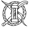
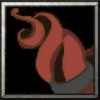
Concept
This is my concept of all 4 tiers with gradual improvement:
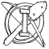
Here I tried to to think through the composition on that small canvas: the main object, its perspective, additional details and an opportunity to improve them.
I tried different positions of the tentacles and decided on dark and light parts, as well as their size (because objects that are too small can get lost). Perspective is also of great importance, because when we perceive Warcraft icons, we are accustomed to the fact that the volume of the picture is also created by
tilting the object, which allows us to fit more visual meaning into a tiny icon:
We'll put the latter under the "warcraft-yness" category.
What I like about my concept is its unusual nature of the object, because we are used to seeing elements of weapons or protection in upgrades associated with lore, but here we see organic matter with a small amount of artificial material. This is a fairly rare combination that can be used both as an upgrade for regular units
and for casters. Besides, we already have a lot of all kinds of weapon and armor upgrades, don't we?
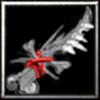
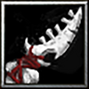
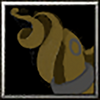
Faceless Power
The unknown force condenses somewhere on the border and its gloomy and suffocating presence begins to be slowly felt...
Why did I choose this object shape? Drawing one, two, three tentacles is just boring, so I decided to twist them properly, creating a rather "dense" core object in the following WIP:
N'Raqi comes in all sorts of colors and shapes, but reddish pink tells me about a certain "immaturity" of the flesh - its youth and formation. Almost all the Faceless Ones we know wear some kind of bracelets, which is some part of their visual culture, so I put on a simpler one. To enhance the design, I drew a bumpy texture and highlighted one (non-luminous) eye. The composition also conveys the idea that one tentacle and one eye equals level 1!
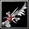
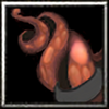
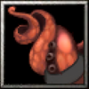
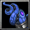
Improved Faceless Power
The shadow around begins to thicken, darkness and a feeling of despair gradually penetrates the uneasy heart...
The second Tier is distinguished by an additional appendage, eye, improved bracer and, of course, alternative color:
Perhaps this is the most signature color of the entire race, the most common: so I decided to use it here, as if in the middle, because more rare upgrades will follow. I added some pearlescent texture to imitate the smooth, stretched surface of the tentacles, highlighted the suction cups (so they wouldn't get lost against the general background) and added "negative" highlight around according to associations with cursed things, the Undead and Void beings:
I chose pinkish-violet color for the backlight to cover 2 spectrums from the Warcraft universe: curse and the Void. Red eyes filled with anger, and a more embossed bracelet with a soft and wavy shape for ease of perception, harmony of form and additional associations.
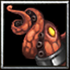
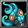
Advanced Faceless Power
Horror begins to spread through the veins, the body is constrained by fear and trembling, and the consciousness gently slips away...
Here I was inspired by the oceanic theme, its color, which goes so well with everything gold, as well as the powerful, familiar orange-red OG T3 highlight:
Having thoroughly scoured the internet, I also found a fair amount of high tier N'Raqi with this color, which has a good effect on the association with the strength, rarity and level of monster - a suitable transition to the next level. The icon also ressembles Mythrax face (sorry, Trolls) but does not contain any spikes or segments and this is not without reason: after all, there are already quite a lot of details on the icon and there is a risk of overloading the image!
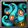
In the end I was left with two color options, with one contrasting better with the highlight:
What to do? I simply took and crossed both, thereby adding a tonal transition between the colors, making the icon look more contrasting and deeper. As you can also see (if you compare it to the final result), I darkened the bracelet, enlarged the eyes, added a more defined outline and removed the gap between the tentacle and the gold plate so that the image merge less.
A third eye (already glowing!), an additional tentacle extension (
without suction cups, so as not to dazzle the eyes) and an improved bracelet - these are the main differences, if you do not take into account the OG highlight. And what is that next to the bracelet?.. It reminds of the mouth of an octopus or a closed eye, both are only to our advantage: this will allow us to create an additional and surprising effect on the next upgrade.
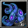
Superior Faceless Power
There is no longer any strength to resist the calling voices; the sound of the tide is heard more and more clearly, and the body begins to gradually lengthen and become flexible like a snake...
And we return to the purple color, but this time deeper, smokier, reminiscent of shadows and darkness itself:
Why this color of highlight? Because it looks unique, goes well with the base color, softly surrounding it, and is a little reminiscent of a flash of lightning and the glowing of dark storm clouds at night (foreshadowing Cthulhu's coming ashore). An additional large eye, now open, takes pride of place with the gold frame of the bracelet:
Well, the rule of an eye multiplied on level is not broken, the luxurious detail is reinforced and enlarged, and eyes gained
pupils (just like those of the Old Gods!) that makes it stand out from the rest. But if you compare T3 and T4 above, you still get a slight feeling that something needs to be added...
Looks good? The tentacles are now decorated with blackened and thickened squid fins, a fitting detail that I was looking for. Teeth, an additional texture or too pointy limbs overload the icon (I can responsibly declare). Here I also closed the gap between the decoration and the bottom left tentacle to pay more attention to the main eye and for additional clarity. Now the entire space of the icon is harmoniously filled: the angular fins have found their place between the curves of the tentacles and are outlined by lightning pretty well.
Concerning the technical side, I tried to follow the artistic style of Blizzard: cartoonishness (with regards to shape and colors), balance between the size of parts and their quantity (thickness of parts, amount of suckers), contrast of light and shadows, sharpness, contouring (closing and opening with the main body of the object), intermediate tone at the close of the object and its highlight, perspective and volume, as well as other minor nuances like slight "noise" and "carelessness". I hope I tried my best to achieve maximum visual integration with the game and its atmosphere.
The main ideas (as has been already mentioned a little in the text) are a focus on the rarity and novelty of the object (tentacles, the Faceless Ones); the visual sequence of tier development (an eye per level, an increase in size and volume, additional outgrowths and their transformation, development of the decoration that changes towards a more "premium" direction); and creativity (a delayed riddle with a demonstration of increasing strength (closed eye - open eye), a unit-caster combo-wombo, a mix of organic and inorganic materials, a variety of colors covering the race based on lore and associations).
Correspondence to the theme may be due to consistency in the change of the core object with rather profound additions around its position and idea.
Thank you for your time and attention!
P.S. As I already wrote at the beginning, my eyes are blurry, and for now I'll take a break before posting this whole thing: maybe I'll come up with something else. Hope you liked the post!


 And thanks for tweaking the rules for "not-very-freehand-artists". Hope for a crowd!


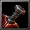
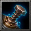


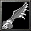
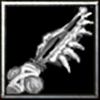
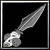


 My eye also sticks to weapons. It feels strange indeed that I also like them more (visually but not ideologically), and my emotions argue with rationality as a dry assessment seems to worsen the result. I think this is so because they show the growth of strength in a more straightforward way and maybe because we see such visual types more often. I might find peace if I finish T4 and polish the tentacles for a cleaner comparison.