Community
Maps
Tutorials
Gallery
Support Us
Install the app
-
Listen to a special audio message from Bill Roper to the Hive Workshop community (Bill is a former Vice President of Blizzard Entertainment, Producer, Designer, Musician, Voice Actor) 🔗Click here to hear his message!
-
Read Evilhog's interview with Gregory Alper, the original composer of the music for WarCraft: Orcs & Humans 🔗Click here to read the full interview.
-
Create a faction for Warcraft 3 and enter Hive's 19th Techtree Contest: Co-Op Commanders! Click here to enter!
-
Create a void inspired texture for Warcraft 3 and enter Hive's 34th Texturing Contest: Void! Click here to enter!
-
The Hive's 21st Texturing Contest: Upgrade is now concluded, time to vote for your favourite set of icons! Click here to vote!
You are using an out of date browser. It may not display this or other websites correctly.
You should upgrade or use an alternative browser.
You should upgrade or use an alternative browser.
🎨Icon Contest #21 - Getting an Upgrade!
- Status
- Not open for further replies.
- Joined
- Jun 2, 2008
- Messages
- 12,843


- Joined
- Jul 28, 2021
- Messages
- 929
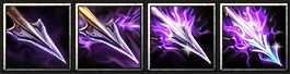
Now, when the weapon T4 is ready, I need to decide on the sets:

I slightly improved the color of the bone weapons by adding a pinch of yellow so that the bones start looking a bit more natural and warmer. For the T4 there I tried a few colors but ended up with ghosty-blue and yellow-lime. Yellow-lime has some associations with the Undead theme (e.g. Skeletal Mage), but also gives a chaotic feel. Ghosty-blue tells me about despair, souless existence, mysery. I'd call such a blade Ghost Blade, Soul Reaper or just Deathly Blade. In my opinion, this color supports the Undead theme better, even though it's not that bright and striking as yellow-lime.
As for the tentacles, I added more contrast, shaded the edges and "protruded" the light parts in the middle, thereby increasing the volume and adding depth, which in turn improved clarity. By definition, the tentacles should be tangled, constantly moving, wriggling, which slightly blurs the overall clarity of their perception, but we cannot let this go too far.
Special thanks to @Vinz (he pushed on me! ), @Kyrbi0, @Deolrin, @RvzerBro and @Wargeras for the feedback!
P.S. Maybe I will also prepare a short presentation on the bone weapon upgrades just to get my thoughts down on paper and make a strategic look around.
I slightly improved the color of the bone weapons by adding a pinch of yellow so that the bones start looking a bit more natural and warmer. For the T4 there I tried a few colors but ended up with ghosty-blue and yellow-lime. Yellow-lime has some associations with the Undead theme (e.g. Skeletal Mage), but also gives a chaotic feel. Ghosty-blue tells me about despair, souless existence, mysery. I'd call such a blade Ghost Blade, Soul Reaper or just Deathly Blade. In my opinion, this color supports the Undead theme better, even though it's not that bright and striking as yellow-lime.
As for the tentacles, I added more contrast, shaded the edges and "protruded" the light parts in the middle, thereby increasing the volume and adding depth, which in turn improved clarity. By definition, the tentacles should be tangled, constantly moving, wriggling, which slightly blurs the overall clarity of their perception, but we cannot let this go too far.
Special thanks to @Vinz (he pushed on me!
), @Kyrbi0, @Deolrin, @RvzerBro and @Wargeras for the feedback!P.S. Maybe I will also prepare a short presentation on the bone weapon upgrades just to get my thoughts down on paper and make a strategic look around.
- Joined
- Jun 2, 2008
- Messages
- 12,843
I understand you wanting feedback on the other set icons you created but since you have already posted your final works please reframe from posting anymore WIP's or other types of icons in this thread as it will make the judge confused at the end whilst judging everything.Now, when the weapon T4 is ready, I need to decide on the sets:
View attachment 533332
I slightly improved the color of the bone weapons by adding a pinch of yellow so that the bones start looking a bit more natural and warmer. For the T4 there I tried a few colors but ended up with ghosty-blue and yellow-lime. Yellow-lime has some associations with the Undead theme (e.g. Skeletal Mage), but also gives a chaotic feel. Ghosty-blue tells me about despair, souless existence, mysery. I'd call such a blade Ghost Blade, Soul Reaper or just Deathly Blade. In my opinion, this color supports the Undead theme better, even though it's not that bright and striking as yellow-lime.
As for the tentacles, I added more contrast, shaded the edges and "protruded" the light parts in the middle, thereby increasing the volume and adding depth, which in turn improved clarity. By definition, the tentacles should be tangled, constantly moving, wriggling, which slightly blurs the overall clarity of their perception, but we cannot let this go too far.
Special thanks to @Vinz (he pushed on me!
P.S. Maybe I will also prepare a short presentation on the bone weapon upgrades just to get my thoughts down on paper and make a strategic look around.
I do enjoy these though. But, again keep any of your other icons you created from the thread please.. Thanks!
You can still comment on the thread though.
- Joined
- Jul 28, 2021
- Messages
- 929
Oh, that presentation was meant to be a prelude for the final works as I put a note that "I could come up with something esle later" because I thought I could showcase/discuss any of my icons here until they are contest-related and not packed into a bundle.I understand you wanting feedback on the other set icons you created but since you have already posted your final works please reframe from posting anymore WIP's or other types of icons in this thread as it will make the judge confused at the end whilst judging everything.
I do enjoy these though. But, again keep any of your other icons you created from the thread please.. Thanks!
You can still comment on the thread though.
Then I apologize that I put the judges in an uncomfortable position and also for my busy posts (at some points I was too excited about the competition
 ).
).Can I ask the staff to kindly allow me to make the final decision on my final entries? I will take this opportunity to post my latest works clearly and concisely without future edits.
- Joined
- Jun 2, 2008
- Messages
- 12,843
Yes if you want to change up your entry you can do so before the end date.Oh, that presentation was meant to be a prelude for the final works as I put a note that "I could come up with something esle later" because I thought I could showcase/discuss any of my icons here until they are contest-related and not packed into a bundle.
Then I apologize that I put the judges in an uncomfortable position and also for my busy posts (at some points I was too excited about the competition
Can I ask the staff to kindly allow me to make the final decision on my final entries? I will take this opportunity to post my latest works clearly and concisely without future edits.
Footman16
Community Manager
- Joined
- Jul 14, 2012
- Messages
- 3,744


Hey there it's no worries! Is the Tentacle tiers your final entry or are you still deciding between which set you want to submit? If so that's A-ok just as long as you let us know which one is intended as the final entryOh, that presentation was meant to be a prelude for the final works as I put a note that "I could come up with something esle later" because I thought I could showcase/discuss any of my icons here until they are contest-related and not packed into a bundle.
Then I apologize that I put the judges in an uncomfortable position and also for my busy posts (at some points I was too excited about the competition
Can I ask the staff to kindly allow me to make the final decision on my final entries? I will take this opportunity to post my latest works clearly and concisely without future edits.
")
- Joined
- Jul 28, 2021
- Messages
- 929
Glad to hear that! I'm still at a crossroads for various reasons, so I'll take some time to decideHey there it's no worries! Is the Tentacle tiers your final entry or are you still deciding between which set you want to submit? If so that's A-ok just as long as you let us know which one is intended as the final entry

Last edited:
- Joined
- May 7, 2016
- Messages
- 2,194


- Joined
- May 7, 2016
- Messages
- 2,194
- Joined
- Jul 28, 2021
- Messages
- 929
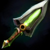
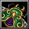
I love the icon, how artistic it is, clean and well drawn, great work! Although I also have the distinct feeling that this icon is pretty HD compared to what we're used to seeing, and feels like you're shrinking a fairly big piece of art from another game with a similar visual setting down to the size of a 64x64 frame. I think I get this feeling also because the icon depicts, composition-wise, a set of armor that includes several armor pieces (a cape, chest plate, shoulder pads) and their details are not as big and visually accentuated in relation to the silhouettes of objects that form the classic gaming style. But let me repeat again, the icon itself is simply excellent.
- Joined
- May 7, 2016
- Messages
- 2,194
Thanks for the compliment!I love the icon, how artistic it is, clean and well drawn, great work! Although I also have the distinct feeling that this icon is pretty HD compared to what we're used to seeing, and feels like you're shrinking a fairly big piece of art from another game with a similar visual setting down to the size of a 64x64 frame. I think I get this feeling also because the icon depicts, composition-wise, a set of armor that includes several armor pieces (a cape, chest plate, shoulder pads) and their details are not as big and visually accentuated in relation to the silhouettes of objects that form the classic gaming style. But let me repeat again, the icon itself is simply excellent.
However, I know I won't ever be able to grasp the blizzard style and apply it to my icons. xD So I'm gonna stick with my own style even if it means losing some points from the blizz style criteria.
- Joined
- Jul 28, 2021
- Messages
- 929
Sure, but on the other hand, the approach to the competition can become very centered around how detailed a certain creation is against an idea that the works should compliment the gameplay in its visual framework and also concept-wise (since icons are an integral part of it). To put it primitively, one can make icons stand out a lot and become a beautiful painting in a frame rather than a suitable, in-built BTN. That's only my opinion, where I just wouldn't trample on visual relevance to Warcraft in favor to eye-candyness and realism and try to maintain a balance instead. Either way, I respect how you feel about your art style and look forward to the next tiers!Thanks for the compliment!
However, I know I won't ever be able to grasp the blizzard style and apply it to my icons. xD So I'm gonna stick with my own style even if it means losing some points from the blizz style criteria.
Last edited:
- Joined
- May 7, 2016
- Messages
- 2,194
I understand where you're going with this, but that's up to the judges and moderators of the contest. My approach has always been technical it's up to them whether to increase the blizz style score or not, it's a contest after all and rules could be modified. It doesn't make a difference to me though, I will always try to make my icons visually appealing.Sure, but on the other hand, the approach to the competition can become very centered around how detailed a certain creation is against an idea that the works should compliment the gameplay in its visual framework and also concept-wise (since icons are an integral part of it). To put it primitively, one can make icons stand out a lot and become a beautiful painting in a frame rather than a suitable, in-built BTN. That's only my opinion, where I just wouldn't trample on visual relevance to Warcraft in favor to eye-candyness and realism and try to maintain a balance instead. Either way, I respect how you feel about your art style and look forward to the next tiers!
Tier 2 by the way:
- Joined
- Jul 28, 2021
- Messages
- 929
Ah, I'm not only about pure points but the overall approach, because inside I'm dying a little that you are not really into putting more game feel with your amazing skills, I wish I could be that goodI understand where you're going with this, but that's up to the judges and moderators of the contest. My approach has always been technical it's up to them whether to increase the blizz style score or not, it's a contest after all and rules could be modified. It doesn't make a difference to me though, I will always try to make my icons visually appealing.
A great second tier, top quality, love the colors!
- Joined
- May 7, 2016
- Messages
- 2,194
- Joined
- Jul 28, 2021
- Messages
- 929
Astonishing armor! How quickly you do thisHere is my final.
View attachment 533815View attachment 533816View attachment 533817View attachment 533818
Good luck everybody!
 By the way, is that something like angelic/paladin faction armor within a concept or you just draw and don't think about it?
Trying to play with darksteel matter to make a more solid variation in comparison to the previous T4:
We'll see how this turns out.
Attachments
Last edited:
- Joined
- Nov 18, 2014
- Messages
- 111
Well, I tried a few things, but I can't find a way to keep things clear. I think this was a bit ambitious 
Last results were:

Going on something much more simpler, at least in theory: upgrade for archers.
I've got the basic shape and color themes. Next step is improving contrast on 3rd and 4th level and differentiate them a bit more in shape (in addition to color and decoration) before the deadline.
But I feel like this will be much more manageable than the previous idea


Last results were:
Going on something much more simpler, at least in theory: upgrade for archers.
I've got the basic shape and color themes. Next step is improving contrast on 3rd and 4th level and differentiate them a bit more in shape (in addition to color and decoration) before the deadline.
But I feel like this will be much more manageable than the previous idea
Attachments
Footman16
Community Manager
- Joined
- Jul 14, 2012
- Messages
- 3,744
I am willing to give an extension if necessary as long as all other contestants are ok with that.
@The_Silent @Vinz @PROXY do you guys need more time?
@Panda @Villagerino Are you guys ok with an extension if necessary?
@The_Silent @Vinz @PROXY do you guys need more time?
@Panda @Villagerino Are you guys ok with an extension if necessary?
- Joined
- Jul 28, 2021
- Messages
- 929
Personally, I'm ok with an extension if guys need more time.I am willing to give an extension if necessary as long as all other contestants are ok with that.
@The_Silent @Vinz @PROXY do you guys need more time?
@Panda @Villagerino Are you guys ok with an extension if necessary?
- Joined
- Feb 4, 2008
- Messages
- 3,516


I'm fine with it, I must admit I planned to do this in the last half of may, and suddenly may was almost over.
- Joined
- May 7, 2016
- Messages
- 2,194
Thanks! Well I've been doing this for 9 years, now every icon takes like 10 minutes of my time. xDAstonishing armor! How quickly you do this
It most certainly is. I was gonna do some night elvish cloak armor but things turned out the angelic way.By the way, is that something like angelic/paladin faction armor within a concept
- Joined
- Jun 2, 2008
- Messages
- 12,843
Thats fine with meI am willing to give an extension if necessary as long as all other contestants are ok with that.
@The_Silent @Vinz @PROXY do you guys need more time?
@Panda @Villagerino Are you guys ok with an extension if necessary?
Footman16
Community Manager
- Joined
- Jul 14, 2012
- Messages
- 3,744
Ok I'll give a 2 week extension then. Remember to put in a second WiP before submission to those of you who haven't yet.
- Joined
- Jun 2, 2008
- Messages
- 12,843
Also, you are aloud to upload your finished icons to the Icon Section, i will review them once judging concludes.Ok I'll give a 2 week extension then. Remember to put in a second WiP before submission to those of you who haven't yet.
- Joined
- Nov 18, 2014
- Messages
- 111
Updating T3:
Previous version felt more like bronze than golden. Fixing it also improved the contrast between the bow and the highlight color.

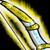
Updating T4:
This upgrade is meant to give a feel of holy/angel bow. Changed the ornament shape, and added a angel feather (which need improvement, but it might be hard considering its size).

Which would make the following set:


Feels coherent and way better visually.
I think I still need something to make T2 & T3 more distinct, will try to work on that next.
Previous version felt more like bronze than golden. Fixing it also improved the contrast between the bow and the highlight color.
Updating T4:
This upgrade is meant to give a feel of holy/angel bow. Changed the ornament shape, and added a angel feather (which need improvement, but it might be hard considering its size).
Which would make the following set:
Feels coherent and way better visually.
I think I still need something to make T2 & T3 more distinct, will try to work on that next.
Last edited:
- Joined
- Nov 18, 2014
- Messages
- 111
Updated T1-T2-T4.
T1: Color change
T2: Shape change
T4: Now a feather and not white leaf


T1 to T3 probably are in their final state.
I feel like T4 comes off a bit distorted due to the golden rings positions/angles so I guess I have more work on that area.
Might find a way to simplify the feather a bit to make it more clear.
T1: Color change
T2: Shape change
T4: Now a feather and not white leaf
T1 to T3 probably are in their final state.
I feel like T4 comes off a bit distorted due to the golden rings positions/angles so I guess I have more work on that area.
Might find a way to simplify the feather a bit to make it more clear.
- Joined
- Jul 28, 2021
- Messages
- 929
Good to see people don't give up and still working on icons after the additonal time is givenUpdated T1-T2-T4.
T1: Color change
T2: Shape change
T4: Now a feather and not white leaf
View attachment 534929View attachment 534930View attachment 534931View attachment 534932
T1 to T3 probably are in their final state.
I feel like T4 comes off a bit distorted due to the golden rings positions/angles so I guess I have more work on that area.
Might find a way to simplify the feather a bit to make it more clear.
 If I were you I'd skip the glow at level 1 (like in vanilla icons): this trick can help better demonstrate the difference in power between level 1 and 2 and make more unique glows (you will have to think less on which glow looks more powerful, as it's harder to decide between 4 than 3).
As for the shape, I think that you can not only add or recolor additional elements on the bows but also change their shape (bows have plenty room for that inside the icon space). This approach can improve the development dynamics of your items.
As for the outline, it is clearly seen, but very solid and monotonous. You can try to make it softer and closer to the color of the main object, especially in areas opposite the light source. This will also allow you to improve the volume of your bows

There's also a few Blizzard icons with feathers, maybe they will help you to find the way to make it look cleaner

There are a few more ways on how to use feathers with bows, maybe these references can inspire you:
Last edited:
- Joined
- Jul 28, 2021
- Messages
- 929
Thanks to the extension, I was able to prepare another set of icons, and this time on the Nerubian theme. It was interesting for me to fantasize about this topic and see what would come of the little that we know about the Nerubians.
Special thanks to the greatest Nerubian
Nerubian Force

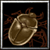
Who are Nerubians - beetles or spiders? Neither one nor the other, but insectoids! And yet, their symbol is a scarab, which I decided to use as the main object for the icon set:


A simple scarab beetle with a shiny bronze tint and modest mandibles, peacefully crawls into the frame of our icon. Its color does not claim a higher tier, all its body parts fit into the space without any problems and are clearly seen in it. And, however, I tried to stylize the shell by protruding its details a little and also to separate the joints with soft outlines, as is usually done in vanilla icon.
Who are Nerubians - beetles or spiders? Neither one nor the other, but insectoids! And yet, their symbol is a scarab, which I decided to use as the main object for the icon set:
A simple scarab beetle with a shiny bronze tint and modest mandibles, peacefully crawls into the frame of our icon. Its color does not claim a higher tier, all its body parts fit into the space without any problems and are clearly seen in it. And, however, I tried to stylize the shell by protruding its details a little and also to separate the joints with soft outlines, as is usually done in vanilla icon.
Improved Nerubian Force
This bug has already acquired wings and is ready to take off, but has not yet decided to do so. Its mandibles have become larger, and the caustic glow around it signals us about danger! Of course, I considered several options but when I made the above combination, I gave up the rest of my attempts:
It is noteworthy that without the glow the greenish scarab with its beautifully shimmering shell looks great, but adding any glow is a big game changer that forces us rethink the image:
To prevent the legs from getting lost against the bright glow, I made them darker. I also had to take care of the wings: as you can see, at first I released them quite a bit, but then I realized that opening the shell more would only benefit the icon. It saved us from unnecessary small objects (for example, a pair of legs at the bottom) and, additionally, we have freed up space to focus more attention on the wings and also used them to cover an unneeded gap in the corner of the icon: win-win!
In the end, I rotated the legs to fill the space inside and added a white bridge to the wings at the edge of the opening parts of the carapace to visually separate adjacent parts better. I also tried to make wings look like a spiderweb that is released from behind to add to the atmosphere.
But what does this beetle symbolize? It symbolizes a fearsome Nerubian soldier, who is ready to rush into battle with incredible agility:
The shell looks clear and simple, but golden details are already visible on it, larger than before. A smooth and even practically colorless carapace doesn't hint at a high rank, but the glow and color tones already tell us that we need to be more careful with this beetle...
Advanced Nerubian Force

This icon symbolizes a high-rank Nerubian creature like a Vizier, Fatespinner, Elder or even a Queen:


These keen and intelligent "dames" wear special patterned decoration and colors, which is what I tried to convey in the icon, but first let's discuss the shapes.


On the icons above I tried to figure out a color scheme along with some other details like mandibles and glowing. I started with opening up a carapase and spreading up the wings to further support the creative idea. Additionally, this allowed us to get a more massive object into the icon, compared to T2, and hide unnecessary limbs. Then I played with the color, glows and highlights:


After a few tries I realized I wanted a more realistic beetle belly and I also made it black, as well as the legs, in order to reduce monotony and improve clarity. However, the beetle looked like an inanimate object and resembled a talisman. Then I decided to add eyes and further increase the volume of the carapase and its patterns:


Another thing! Now the icon actually resembles a royal beetle, whose privilege is to wear expensive, decorated jewelry and bright, noble colors. Its carapace gently reflects the light, while its precious mandibles and rounded shape add luxurious royal femininity.
O course, I created more variations by combining those Vizier-Queen vibes:


First, I got convinced that the gradient looked good, but could be an obstacle during the transition to T4. Secondly, cold glows merge more strongly with the object and perform worse compared to T2. Therefore, I decided to come to a more reliable, albeit simpler, combination of colors and glowing, which nevertheless reflects the lore quite well, even according to a fellow Spiderlordnerd:

This icon symbolizes a high-rank Nerubian creature like a Vizier, Fatespinner, Elder or even a Queen:
These keen and intelligent "dames" wear special patterned decoration and colors, which is what I tried to convey in the icon, but first let's discuss the shapes.
On the icons above I tried to figure out a color scheme along with some other details like mandibles and glowing. I started with opening up a carapase and spreading up the wings to further support the creative idea. Additionally, this allowed us to get a more massive object into the icon, compared to T2, and hide unnecessary limbs. Then I played with the color, glows and highlights:
After a few tries I realized I wanted a more realistic beetle belly and I also made it black, as well as the legs, in order to reduce monotony and improve clarity. However, the beetle looked like an inanimate object and resembled a talisman. Then I decided to add eyes and further increase the volume of the carapase and its patterns:
Another thing! Now the icon actually resembles a royal beetle, whose privilege is to wear expensive, decorated jewelry and bright, noble colors. Its carapace gently reflects the light, while its precious mandibles and rounded shape add luxurious royal femininity.
O course, I created more variations by combining those Vizier-Queen vibes:
First, I got convinced that the gradient looked good, but could be an obstacle during the transition to T4. Secondly, cold glows merge more strongly with the object and perform worse compared to T2. Therefore, I decided to come to a more reliable, albeit simpler, combination of colors and glowing, which nevertheless reflects the lore quite well, even according to a fellow Spider
Superior Nerubian Force

This beetle is distinguished by its size, aggressive color combination and carapace features. His high-level armor is decorated with a gem that gleams in unison with his furious eye. It is already flying to look for its prey or is simply patrolling the nest. By the way, about the nest:

Here are the colors and here is the icon, woven into visual unity. Overall, the icon ressembles a Rhinoceros Beetle and dominant Spiderlords, some of the most powerful creatures of the Nerubian race (though in Warcraft we can observe their forms in full beauty only in the example of the already dead, although not quite dead, powerful and terrible Cryptlord).
There were also a few cool variations, especially pre-glow ones:


As you can see, they contained brighter golden limbs and more colorful combinations. But the glow, as usually, changes the rules:


Immediately there was a need for more contrasting and shaded colors and tints of gold parts, as well as replacing the latter with black ones, like the Queens. Of course, some people will think that individually some combinations look more advantageous than on the final icon, but in the context of the entire icon set, something has to be sacrificed.
That's why I chose a unique and vibrant glow that was bright, thick and jagged enough to bring out the dark colors of this mighty beetle, as deep as its nest:

This beetle is distinguished by its size, aggressive color combination and carapace features. His high-level armor is decorated with a gem that gleams in unison with his furious eye. It is already flying to look for its prey or is simply patrolling the nest. By the way, about the nest:
Here are the colors and here is the icon, woven into visual unity. Overall, the icon ressembles a Rhinoceros Beetle and dominant Spiderlords, some of the most powerful creatures of the Nerubian race (though in Warcraft we can observe their forms in full beauty only in the example of the already dead, although not quite dead, powerful and terrible Cryptlord).
There were also a few cool variations, especially pre-glow ones:
As you can see, they contained brighter golden limbs and more colorful combinations. But the glow, as usually, changes the rules:
Immediately there was a need for more contrasting and shaded colors and tints of gold parts, as well as replacing the latter with black ones, like the Queens. Of course, some people will think that individually some combinations look more advantageous than on the final icon, but in the context of the entire icon set, something has to be sacrificed.
That's why I chose a unique and vibrant glow that was bright, thick and jagged enough to bring out the dark colors of this mighty beetle, as deep as its nest:
The relevance of these icons is due to the rarity of custom material on the theme of the Nerubian race, as well as the expansion of the lore universe in WoW, and that they also reflect the essence of the race.
Color combinations and other details are due to the fact that the player must clearly determine the difference between the icons, because they are to be used by the player one after another, alternately:

The creativity of the icons lies in a fairly obvious and consistent change in the shape of the main object and its transformation (crawling - flying;
a qualitative change in the details like the improvement of patterns and increase in their gloss). The linking of details to the lore is actively used (wings that resemble a spiderweb; carapace patterns; the shape of legs and mandibles). The icons can also have a few upgrade purposes.
The composition of the main object allows it to be viewed in volume, and the perspective gives a certain logic in power change when reading the icons from left to right and backwards:

I sacrificed the individual beauty of the icons for a more transparent upgrade scheme, since the icons are an integral part of the interface rather then showpieces, which is what I reasonably relied on.
The visual uniqueness of the icons may be due to the fact that among the vanilla icons there are few similar forms with highlights and reflections, which required taking into account not only the level of vanilla detail, but also trying to implement the above without practical references.
Color combinations and other details are due to the fact that the player must clearly determine the difference between the icons, because they are to be used by the player one after another, alternately:
The creativity of the icons lies in a fairly obvious and consistent change in the shape of the main object and its transformation (crawling - flying;
a qualitative change in the details like the improvement of patterns and increase in their gloss). The linking of details to the lore is actively used (wings that resemble a spiderweb; carapace patterns; the shape of legs and mandibles). The icons can also have a few upgrade purposes.
The composition of the main object allows it to be viewed in volume, and the perspective gives a certain logic in power change when reading the icons from left to right and backwards:
I sacrificed the individual beauty of the icons for a more transparent upgrade scheme, since the icons are an integral part of the interface rather then showpieces, which is what I reasonably relied on.
The visual uniqueness of the icons may be due to the fact that among the vanilla icons there are few similar forms with highlights and reflections, which required taking into account not only the level of vanilla detail, but also trying to implement the above without practical references.
After having already created this set, I realized that there is no perfect set of icons, at least for this competition topic. You can take a great idea as a basis, develop a creative approach, think through other visual aspects, but in the end you will have to sacrifice something here and there for the sake of a good, "weighty" final result. The whole set of successive upgrades can be a complex concept, a whole story.
I had a creative pleasure taking part in such a competition for the first time. There is very little time left, and I will implement the remaining ideas on this topic separately (thanks God there will be no T4
 ). Once again, special thanks to everyone involved in the organization, as well as the participants.
Last edited:
- Joined
- Jun 2, 2008
- Messages
- 12,843
So this is your actual final then? I like them. They would go very well with the Crypt Lord.View attachment 537114
View attachment 537115 View attachment 537116 View attachment 537134 View attachment 537123
Thanks to the extension, I was able to prepare another set of icons, and this time on the Nerubian theme. It was interesting for me to fantasize about this topic and see what would come of the little that we know about the Nerubians.
Special thanks to the greatest NerubianLordNerd @Draktar for the lore info, to @Vinz and @RvzerBro for the feedback!
P.S. I'm still deciding on my final entries, dear @Footman16Nerubian Force
View attachment 537127
Who are Nerubians - beetles or spiders? Neither one nor the other, but insectoids! And yet, their symbol is a scarab, which I decided to use as the main object for the icon set:
View attachment 537132
View attachment 537135View attachment 537136View attachment 537137
A simple scarab beetle with a shiny bronze tint and modest mandibles, peacefully crawls into the frame of our icon. Its color does not claim a higher tier, all its body parts fit into the space without any problems and are clearly seen in it. And, however, I tried to stylize the shell by protruding its details a little and also to separate the joints with soft outlines, as is usually done in vanilla icon.Improved Nerubian ForceView attachment 537138
This bug has already acquired wings and is ready to take off, but has not yet decided to do so. Its mandibles have become larger, and the caustic glow around it signals us about danger! Of course, I considered several options but when I made the above combination, I gave up the rest of my attempts:
View attachment 537139 View attachment 537140
It is noteworthy that without the glow the greenish scarab with its beautifully shimmering shell looks great, but adding any glow is a big game changer that forces us rethink the image:
View attachment 537141 View attachment 537142
To prevent the legs from getting lost against the bright glow, I made them darker. I also had to take care of the wings: as you can see, at first I released them quite a bit, but then I realized that opening the shell more would only benefit the icon. It saved us from unnecessary small objects (for example, a pair of legs at the bottom) and, additionally, we have freed up space to focus more attention on the wings and also used them to cover an unneeded gap in the corner of the icon: win-win!
In the end, I rotated the legs to fill the space inside and added a white bridge to the wings at the edge of the opening parts of the carapace to visually separate adjacent parts better. I also tried to make wings look like a spiderweb that is released from behind to add to the atmosphere:
View attachment 537445
But what does this beetle symbolize? It symbolizes a fearsome Nerubian soldier, who is ready to rush into battle with incredible agility:
View attachment 537143View attachment 537144
View attachment 537146
The shell looks clear and simple, but golden details are already visible on it, larger than before. A smooth and even practically colorless carapace doesn't hint at a high rank, but the glow and color tones already tell us that we need to be more careful with this beetle...Advanced Nerubian Force
View attachment 537342
This icon symbolizes a high-rank Nerubian creature like a Vizier, Fatespinner, Elder or even a Queen:
View attachment 537343View attachment 537344
These keen and intelligent "dames" wear special patterned decoration and colors, which is what I tried to convey in the icon, but first let's discuss the shapes.
View attachment 537345View attachment 537348View attachment 537351View attachment 537352View attachment 537347
On the icons above I tried to figure out a color scheme along with some other details like mandibles and glowing. I started with opening up a carapase and spreading up the wings to further support the creative idea. Additionally, this allowed us to get a more massive object into the icon, compared to T2, and hide unnecessary limbs. Then I played with the color, glows and highlights:
View attachment 537353View attachment 537354View attachment 537355
After a few tries I realized I wanted a more realistic beetle belly and I also made it black, as well as the legs, in order to reduce monotony and improve clarity. However, the beetle looked like an inanimate object and resembled a talisman. Then I decided to add eyes and further increase the volume of the carapase and its patterns:
View attachment 537356View attachment 537357
Another thing! Now the icon actually resembles a royal beetle, whose privilege is to wear expensive, decorated jewelry and bright, noble colors. Its carapace gently reflects the light, while its precious mandibles and rounded shape add luxurious royal femininity.
O course, I created more variations by combining those Vizier-Queen vibes:
View attachment 537358View attachment 537373View attachment 537360
First, I got convinced that the gradient looked good, but could be an obstacle during the transition to T4. Secondly, cold glows merge more strongly with the object and perform worse compared to T2. Therefore, I decided to come to a more reliable, albeit simpler, combination of colors and glowing, which nevertheless reflects the lore quite well, even according to a fellow Spiderlordnerd:
View attachment 537362Superior Nerubian Force
View attachment 537363
This beetle is distinguished by its size, aggressive color combination and carapace features. His high-level armor is decorated with a gem that gleams in unison with his furious eye. It is already flying to look for its prey or is simply patrolling the nest. By the way, about the nest:
View attachment 537364
Here are the colors and here is the icon, woven into visual unity. Overall, the icon ressembles a Rhinoceros Beetle and dominant Spiderlords, some of the most powerful creatures of the Nerubian race (though in Warcraft we can observe their forms in full beauty only in the example of the already dead, although not quite dead, powerful and terrible Cryptlord).
There were also a few cool variations, especially pre-glow ones:
View attachment 537368View attachment 537366View attachment 537367
As you can see, they contained brighter golden limbs and more colorful combinations. But the glow, as usually, changes the rules:
View attachment 537370View attachment 537371View attachment 537369
Immediately there was a need for more contrasting and shaded colors and tints of gold parts, as well as replacing the latter with black ones, like the Queens. Of course, some people will think that individually some combinations look more advantageous than on the final icon, but in the context of the entire icon set, something has to be sacrificed.
That's why I chose a unique and vibrant glow that was bright, thick and jagged enough to bring out the dark colors of this mighty beetle, as deep as its nest:
View attachment 537372The relevance of these icons is due to the rarity of custom material on the theme of the Nerubian race, as well as the expansion of the lore universe in WoW, and also reflects the essence of the race itself.
Color combinations and other details are due to the fact that the player must clearly determine the difference between the icons, because they are to be used by the player one after another, alternately:
The creativity of the icons lies in a fairly obvious and consistent change in the shape of the main object and its transformation (crawling - flying;
a qualitative change in the details like the improvement of patterns and increase in the luxury of the details until preparation for the transition to the precious stone). The linking of details to the lore is actively used (wings that resemble a spiderweb; carapace patterns; the shape of legs and mandibles). The icons can also have a few upgrade purposes.
The composition of the main object allows it to be viewed in volume, while many details for viewing "from an angle" were not copied but drawn from scratch:
View attachment 537427
I sacrificed the individual beauty of the icons for a more transparent upgrade scheme, since the icons are an integral part of the interface rather then showpieces, which is what I reasonably relied on.
The visual uniqueness of the icons may be due to the fact that among the vanilla icons there are few similar forms with highlights and reflections, which required taking into account not only the level of vanilla detail, but also trying to implement the above without practical references.
After having already created this set, I realized that there is no perfect set of icons, at least for this competition topic. You can take a great idea as a basis, develop a creative approach, think through other visual aspects, but in the end you will have to sacrifice something here and there for the sake of a good, "weighty" final result. The whole set of successive upgrades can be a complex concept, a whole story.
I had a creative pleasure taking part in such a competition for the first time. There is very little time left, and I will implement the remaining ideas on this topic separately (thanks God there will be no T4
- Joined
- Jul 28, 2021
- Messages
- 929
Thanks! But no, still decidingSo this is your actual final then? I like them. They would go very well with the Crypt Lord.
I pinged Footman before the post so that he knows I'm still thinking - Joined
- Nov 18, 2014
- Messages
- 111
I think I'm getting closer to final version with those:
Bow upgrades:


Every icon got a treatment on its outer lines.
Thanks a lot @Villagerino for your feedback. Those lines were bothering me but I couldn't figure why until you pointed it out.
Bow upgrades:
Every icon got a treatment on its outer lines.
Thanks a lot @Villagerino for your feedback. Those lines were bothering me but I couldn't figure why until you pointed it out.
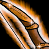
T1 - Long Bow: Reduced the glow
View attachment 534929 ->
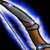
T2 - War Bow: Reverted to previous
View attachment 534930 ->
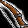
T3 - Eagle Bow: Added eagle feather
View attachment 534931 ->
T4 - Angelic Bow: Modified ring + added angel feathers.
View attachment 534932 ->
View attachment 534929 ->
T2 - War Bow: Reverted to previous
View attachment 534930 ->
T3 - Eagle Bow: Added eagle feather
View attachment 534931 ->
T4 - Angelic Bow: Modified ring + added angel feathers.
View attachment 534932 ->
- Joined
- Jun 2, 2008
- Messages
- 12,843
You have till this Saturday to finish your entry! Nice work.I think I'm getting closer to final version with those:
Bow upgrades:
View attachment 537533View attachment 537534View attachment 537535View attachment 537537
Every icon got a treatment on its outer lines.
Thanks a lot @Villagerino for your feedback. Those lines were bothering me but I couldn't figure why until you pointed it out.
T1 - Long Bow: Reduced the glow
View attachment 534929 -> View attachment 537533
T2 - War Bow: Reverted to previous
View attachment 534930 -> View attachment 537534
T3 - Eagle Bow: Added eagle feather
View attachment 534931 -> View attachment 537535
T4 - Angelic Bow: Modified ring + added angel feathers.
View attachment 534932 -> View attachment 537537
- Joined
- Jul 29, 2008
- Messages
- 9,902


You are unreal, manView attachment 537114
View attachment 537115 View attachment 537116 View attachment 537134 View attachment 537123
Thanks to the extension, I was able to prepare another set of icons, and this time on the Nerubian theme. It was interesting for me to fantasize about this topic and see what would come of the little that we know about the Nerubians.
Special thanks to the greatest NerubianLordNerd @Draktar for the lore info, to @Vinz and @RvzerBro for the feedback!
P.S. I'm still deciding on my final entries, dear @Footman16Nerubian Force
View attachment 537127
Who are Nerubians - beetles or spiders? Neither one nor the other, but insectoids! And yet, their symbol is a scarab, which I decided to use as the main object for the icon set:
View attachment 537132
View attachment 537135View attachment 537136View attachment 537137
A simple scarab beetle with a shiny bronze tint and modest mandibles, peacefully crawls into the frame of our icon. Its color does not claim a higher tier, all its body parts fit into the space without any problems and are clearly seen in it. And, however, I tried to stylize the shell by protruding its details a little and also to separate the joints with soft outlines, as is usually done in vanilla icon.Improved Nerubian ForceView attachment 537138
This bug has already acquired wings and is ready to take off, but has not yet decided to do so. Its mandibles have become larger, and the caustic glow around it signals us about danger! Of course, I considered several options but when I made the above combination, I gave up the rest of my attempts:
View attachment 537139 View attachment 537140
It is noteworthy that without the glow the greenish scarab with its beautifully shimmering shell looks great, but adding any glow is a big game changer that forces us rethink the image:
View attachment 537141 View attachment 537142
To prevent the legs from getting lost against the bright glow, I made them darker. I also had to take care of the wings: as you can see, at first I released them quite a bit, but then I realized that opening the shell more would only benefit the icon. It saved us from unnecessary small objects (for example, a pair of legs at the bottom) and, additionally, we have freed up space to focus more attention on the wings and also used them to cover an unneeded gap in the corner of the icon: win-win!
In the end, I rotated the legs to fill the space inside and added a white bridge to the wings at the edge of the opening parts of the carapace to visually separate adjacent parts better. I also tried to make wings look like a spiderweb that is released from behind to add to the atmosphere:
View attachment 537445
But what does this beetle symbolize? It symbolizes a fearsome Nerubian soldier, who is ready to rush into battle with incredible agility:
View attachment 537143View attachment 537144
View attachment 537146
The shell looks clear and simple, but golden details are already visible on it, larger than before. A smooth and even practically colorless carapace doesn't hint at a high rank, but the glow and color tones already tell us that we need to be more careful with this beetle...Advanced Nerubian Force
View attachment 537342
This icon symbolizes a high-rank Nerubian creature like a Vizier, Fatespinner, Elder or even a Queen:
View attachment 537343View attachment 537344
These keen and intelligent "dames" wear special patterned decoration and colors, which is what I tried to convey in the icon, but first let's discuss the shapes.
View attachment 537345View attachment 537348View attachment 537351View attachment 537352View attachment 537347
On the icons above I tried to figure out a color scheme along with some other details like mandibles and glowing. I started with opening up a carapase and spreading up the wings to further support the creative idea. Additionally, this allowed us to get a more massive object into the icon, compared to T2, and hide unnecessary limbs. Then I played with the color, glows and highlights:
View attachment 537353View attachment 537354View attachment 537355
After a few tries I realized I wanted a more realistic beetle belly and I also made it black, as well as the legs, in order to reduce monotony and improve clarity. However, the beetle looked like an inanimate object and resembled a talisman. Then I decided to add eyes and further increase the volume of the carapase and its patterns:
View attachment 537356View attachment 537357
Another thing! Now the icon actually resembles a royal beetle, whose privilege is to wear expensive, decorated jewelry and bright, noble colors. Its carapace gently reflects the light, while its precious mandibles and rounded shape add luxurious royal femininity.
O course, I created more variations by combining those Vizier-Queen vibes:
View attachment 537358View attachment 537373View attachment 537360
First, I got convinced that the gradient looked good, but could be an obstacle during the transition to T4. Secondly, cold glows merge more strongly with the object and perform worse compared to T2. Therefore, I decided to come to a more reliable, albeit simpler, combination of colors and glowing, which nevertheless reflects the lore quite well, even according to a fellow Spiderlordnerd:
View attachment 537362Superior Nerubian Force
View attachment 537363
This beetle is distinguished by its size, aggressive color combination and carapace features. His high-level armor is decorated with a gem that gleams in unison with his furious eye. It is already flying to look for its prey or is simply patrolling the nest. By the way, about the nest:
View attachment 537364
Here are the colors and here is the icon, woven into visual unity. Overall, the icon ressembles a Rhinoceros Beetle and dominant Spiderlords, some of the most powerful creatures of the Nerubian race (though in Warcraft we can observe their forms in full beauty only in the example of the already dead, although not quite dead, powerful and terrible Cryptlord).
There were also a few cool variations, especially pre-glow ones:
View attachment 537368View attachment 537366View attachment 537367
As you can see, they contained brighter golden limbs and more colorful combinations. But the glow, as usually, changes the rules:
View attachment 537370View attachment 537371View attachment 537369
Immediately there was a need for more contrasting and shaded colors and tints of gold parts, as well as replacing the latter with black ones, like the Queens. Of course, some people will think that individually some combinations look more advantageous than on the final icon, but in the context of the entire icon set, something has to be sacrificed.
That's why I chose a unique and vibrant glow that was bright, thick and jagged enough to bring out the dark colors of this mighty beetle, as deep as its nest:
View attachment 537372The relevance of these icons is due to the rarity of custom material on the theme of the Nerubian race, as well as the expansion of the lore universe in WoW, and that they also reflect the essence of the race.
Color combinations and other details are due to the fact that the player must clearly determine the difference between the icons, because they are to be used by the player one after another, alternately:
The creativity of the icons lies in a fairly obvious and consistent change in the shape of the main object and its transformation (crawling - flying;
a qualitative change in the details like the improvement of patterns and increase in their gloss). The linking of details to the lore is actively used (wings that resemble a spiderweb; carapace patterns; the shape of legs and mandibles). The icons can also have a few upgrade purposes.
The composition of the main object allows it to be viewed in volume, and the perspective gives a certain logic in power change when reading the icons from left to right and backwards:
View attachment 537427
I sacrificed the individual beauty of the icons for a more transparent upgrade scheme, since the icons are an integral part of the interface rather then showpieces, which is what I reasonably relied on.
The visual uniqueness of the icons may be due to the fact that among the vanilla icons there are few similar forms with highlights and reflections, which required taking into account not only the level of vanilla detail, but also trying to implement the above without practical references.
After having already created this set, I realized that there is no perfect set of icons, at least for this competition topic. You can take a great idea as a basis, develop a creative approach, think through other visual aspects, but in the end you will have to sacrifice something here and there for the sake of a good, "weighty" final result. The whole set of successive upgrades can be a complex concept, a whole story.
I had a creative pleasure taking part in such a competition for the first time. There is very little time left, and I will implement the remaining ideas on this topic separately (thanks God there will be no T4
- Joined
- Jul 28, 2021
- Messages
- 929
This is definitely a step forward, improved decorations and closer to game style, good job! Glad my feedback was usefulI think I'm getting closer to final version with those:
Bow upgrades:
View attachment 537533View attachment 537534View attachment 537535View attachment 537537
Every icon got a treatment on its outer lines.
Thanks a lot @Villagerino for your feedback. Those lines were bothering me but I couldn't figure why until you pointed it out.
T1 - Long Bow: Reduced the glow
View attachment 534929 -> View attachment 537533
T2 - War Bow: Reverted to previous
View attachment 534930 -> View attachment 537534
T3 - Eagle Bow: Added eagle feather
View attachment 534931 -> View attachment 537535
T4 - Angelic Bow: Modified ring + added angel feathers.
View attachment 534932 -> View attachment 537537

I thought I was realYou are unreal, man
 Thanks!
Last edited:
- Joined
- Jun 25, 2008
- Messages
- 2,353

Minimum canvas size 256x256 oh god, strike me with lightning
- Joined
- Jun 2, 2008
- Messages
- 12,843
It was suppose to say maximum size instead.Minimum canvas size 256x256 oh god, strike me with lightning
- Joined
- Jun 25, 2008
- Messages
- 2,353
OG Materials (more on soon to come edits -wait 4 weeks-)

1

2

3

4
 Geomancer Base Weapon (pre training)
1
2
3
4
Last edited:
- Joined
- Apr 24, 2012
- Messages
- 9,813


- Joined
- Feb 4, 2008
- Messages
- 3,516
I\m probably out. More urgent irl problems keep popping up. I will see if I can find some time tomorrow, but it is unlikely. 
Last edited:
- Joined
- Jun 2, 2008
- Messages
- 12,843
All good man things happen !I\m probably out. More urgent irl problems keep popping up. I will see if I can find some time tomorrow, but it is unlikely.
- Joined
- Jul 28, 2021
- Messages
- 929
Attachments
Last edited:
- Joined
- Jun 2, 2008
- Messages
- 12,843
The brown one reminds me of a stink bug haha, Good stuff overall. You really got that warcraft style down packed.ICON CONTEST #21
NERUBIAN FORCE
View attachment 537642View attachment 537643View attachment 537644View attachment 537645
Dear staff, @Panda, @Footman16, this is my final.
WIPs:
- Joined
- Jul 28, 2021
- Messages
- 929
Damn, I thought stink bugs are mostly greenThe brown one reminds me of a stink bug haha, Good stuff overall. You really got that warcraft style down packed.
 Thanks, I tried to.
P.S. Please, let me know if I miss anything.
Last edited:
- Joined
- Jun 2, 2008
- Messages
- 12,843
They can be brown were im from, And i dont think you missed anything.Damn, I thought stink bugs are mostly green
P.S. Please, let me know if I miss anything.
- Joined
- Apr 24, 2012
- Messages
- 9,813

- Joined
- Nov 18, 2014
- Messages
- 111
Entry for the Icon Contest #21


For generations, humans have fought. The bow has been, and still is, one their deadliest ally on the battlefield.
The bow has evolved, been improved upon, and been enchanted and still compete to this day with dwarven technology.
For generations, humans have fought. The bow has been, and still is, one their deadliest ally on the battlefield.
The bow has evolved, been improved upon, and been enchanted and still compete to this day with dwarven technology.
Tier 1: The Long Bow

The long bow has been a pivotal point in the human war history. Its range and power make it a deadly weapon capable of wiping an army before it has a chance of getting close.
Tier 2: The War Bow
Stronger and more resilient, the war bow is a better version of the long bow, capable of reaching further with higher destructive power.
Tier 3: The Eagle Bow
Limited by the bow technology, the humans turned to other improvements using magic. After much testing, it has be found that a combinaison of the war bow technology, enchantments and parts of magical beasts would greatly improve the bow performance.
The eagle bow is using feather from magical eagle that give the weapon a greatly superior range and precision.
Tier 4: The Angelic Bow
Developed by the Silver Hand, it is said that this bow is created using angel feathers. Rumors say that the stronger the archer faith is in the Light, the deadlier his weapon will be against its enemy. Many swear that the undead run away whenever they spot an angelic bow on the battlefield, in vain.
While the materials and enchantments are a bit of a mystery and subjects to many rumors, its efficiency has been proven.
Due to the confusing wording in the rules, I have been using a 1024x1024 canvas. It seems is was maximum 256x256 and not minimum tho ? 
Well, I don't think it matters much anyway.


Well, I don't think it matters much anyway.
Last edited:
- Joined
- Jun 2, 2008
- Messages
- 12,843
Im so happy you guys contributed to this as i know we haven't had one in some time and as some users are inactive. So, i appreciate taking the time to make this contest happen!
So after me posting this comment. Ill give some more time but today is the last day for entry's!
So after me posting this comment. Ill give some more time but today is the last day for entry's!
- Status
- Not open for further replies.
Similar threads
- Replies
- 124
- Views
- 21K
- Replies
- 138
- Views
- 22K