Community
Maps
Tutorials
Gallery
Support Us
Install the app
-
Listen to a special audio message from Bill Roper to the Hive Workshop community (Bill is a former Vice President of Blizzard Entertainment, Producer, Designer, Musician, Voice Actor) 🔗Click here to hear his message!
-
Read Evilhog's interview with Gregory Alper, the original composer of the music for WarCraft: Orcs & Humans 🔗Click here to read the full interview.
You are using an out of date browser. It may not display this or other websites correctly.
You should upgrade or use an alternative browser.
You should upgrade or use an alternative browser.
🎨Icon Contest #21 - Getting an Upgrade!
- Joined
- Jun 2, 2008
- Messages
- 11,879


- Joined
- Jul 28, 2021
- Messages
- 858
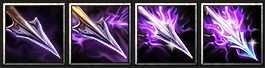
Now, when the weapon T4 is ready, I need to decide on the sets:

I slightly improved the color of the bone weapons by adding a pinch of yellow so that the bones start looking a bit more natural and warmer. For the T4 there I tried a few colors but ended up with ghosty-blue and yellow-lime. Yellow-lime has some associations with the Undead theme (e.g. Skeletal Mage), but also gives a chaotic feel. Ghosty-blue tells me about despair, souless existence, mysery. I'd call such a blade Ghost Blade, Soul Reaper or just Deathly Blade. In my opinion, this color supports the Undead theme better, even though it's not that bright and striking as yellow-lime.
As for the tentacles, I added more contrast, shaded the edges and "protruded" the light parts in the middle, thereby increasing the volume and adding depth, which in turn improved clarity. By definition, the tentacles should be tangled, constantly moving, wriggling, which slightly blurs the overall clarity of their perception, but we cannot let this go too far.
Special thanks to @Vinz (he pushed on me! ), @Kyrbi0, @Deolrin, @RvzerBro and @Wargeras for the feedback!
P.S. Maybe I will also prepare a short presentation on the bone weapon upgrades just to get my thoughts down on paper and make a strategic look around.
I slightly improved the color of the bone weapons by adding a pinch of yellow so that the bones start looking a bit more natural and warmer. For the T4 there I tried a few colors but ended up with ghosty-blue and yellow-lime. Yellow-lime has some associations with the Undead theme (e.g. Skeletal Mage), but also gives a chaotic feel. Ghosty-blue tells me about despair, souless existence, mysery. I'd call such a blade Ghost Blade, Soul Reaper or just Deathly Blade. In my opinion, this color supports the Undead theme better, even though it's not that bright and striking as yellow-lime.
As for the tentacles, I added more contrast, shaded the edges and "protruded" the light parts in the middle, thereby increasing the volume and adding depth, which in turn improved clarity. By definition, the tentacles should be tangled, constantly moving, wriggling, which slightly blurs the overall clarity of their perception, but we cannot let this go too far.
Special thanks to @Vinz (he pushed on me!
), @Kyrbi0, @Deolrin, @RvzerBro and @Wargeras for the feedback!P.S. Maybe I will also prepare a short presentation on the bone weapon upgrades just to get my thoughts down on paper and make a strategic look around.
- Joined
- Jun 2, 2008
- Messages
- 11,879
I understand you wanting feedback on the other set icons you created but since you have already posted your final works please reframe from posting anymore WIP's or other types of icons in this thread as it will make the judge confused at the end whilst judging everything.Now, when the weapon T4 is ready, I need to decide on the sets:
View attachment 533332
I slightly improved the color of the bone weapons by adding a pinch of yellow so that the bones start looking a bit more natural and warmer. For the T4 there I tried a few colors but ended up with ghosty-blue and yellow-lime. Yellow-lime has some associations with the Undead theme (e.g. Skeletal Mage), but also gives a chaotic feel. Ghosty-blue tells me about despair, souless existence, mysery. I'd call such a blade Ghost Blade, Soul Reaper or just Deathly Blade. In my opinion, this color supports the Undead theme better, even though it's not that bright and striking as yellow-lime.
As for the tentacles, I added more contrast, shaded the edges and "protruded" the light parts in the middle, thereby increasing the volume and adding depth, which in turn improved clarity. By definition, the tentacles should be tangled, constantly moving, wriggling, which slightly blurs the overall clarity of their perception, but we cannot let this go too far.
Special thanks to @Vinz (he pushed on me!
P.S. Maybe I will also prepare a short presentation on the bone weapon upgrades just to get my thoughts down on paper and make a strategic look around.
I do enjoy these though. But, again keep any of your other icons you created from the thread please.. Thanks!
You can still comment on the thread though.
- Joined
- Jul 28, 2021
- Messages
- 858
Oh, that presentation was meant to be a prelude for the final works as I put a note that "I could come up with something esle later" because I thought I could showcase/discuss any of my icons here until they are contest-related and not packed into a bundle.I understand you wanting feedback on the other set icons you created but since you have already posted your final works please reframe from posting anymore WIP's or other types of icons in this thread as it will make the judge confused at the end whilst judging everything.
I do enjoy these though. But, again keep any of your other icons you created from the thread please.. Thanks!
You can still comment on the thread though.
Then I apologize that I put the judges in an uncomfortable position and also for my busy posts (at some points I was too excited about the competition
 ).
).Can I ask the staff to kindly allow me to make the final decision on my final entries? I will take this opportunity to post my latest works clearly and concisely without future edits.
- Joined
- Jun 2, 2008
- Messages
- 11,879
Yes if you want to change up your entry you can do so before the end date.Oh, that presentation was meant to be a prelude for the final works as I put a note that "I could come up with something esle later" because I thought I could showcase/discuss any of my icons here until they are contest-related and not packed into a bundle.
Then I apologize that I put the judges in an uncomfortable position and also for my busy posts (at some points I was too excited about the competition
Can I ask the staff to kindly allow me to make the final decision on my final entries? I will take this opportunity to post my latest works clearly and concisely without future edits.
Footman16
Community Manager
- Joined
- Jul 14, 2012
- Messages
- 3,697


Hey there it's no worries! Is the Tentacle tiers your final entry or are you still deciding between which set you want to submit? If so that's A-ok just as long as you let us know which one is intended as the final entryOh, that presentation was meant to be a prelude for the final works as I put a note that "I could come up with something esle later" because I thought I could showcase/discuss any of my icons here until they are contest-related and not packed into a bundle.
Then I apologize that I put the judges in an uncomfortable position and also for my busy posts (at some points I was too excited about the competition
Can I ask the staff to kindly allow me to make the final decision on my final entries? I will take this opportunity to post my latest works clearly and concisely without future edits.
")
- Joined
- Jul 28, 2021
- Messages
- 858
Glad to hear that! I'm still at a crossroads for various reasons, so I'll take some time to decideHey there it's no worries! Is the Tentacle tiers your final entry or are you still deciding between which set you want to submit? If so that's A-ok just as long as you let us know which one is intended as the final entry

Last edited:
- Joined
- May 7, 2016
- Messages
- 2,188


- Joined
- May 7, 2016
- Messages
- 2,188
- Joined
- Jul 28, 2021
- Messages
- 858
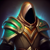
I love the icon, how artistic it is, clean and well drawn, great work! Although I also have the distinct feeling that this icon is pretty HD compared to what we're used to seeing, and feels like you're shrinking a fairly big piece of art from another game with a similar visual setting down to the size of a 64x64 frame. I think I get this feeling also because the icon depicts, composition-wise, a set of armor that includes several armor pieces (a cape, chest plate, shoulder pads) and their details are not as big and visually accentuated in relation to the silhouettes of objects that form the classic gaming style. But let me repeat again, the icon itself is simply excellent.
- Joined
- May 7, 2016
- Messages
- 2,188
Thanks for the compliment!I love the icon, how artistic it is, clean and well drawn, great work! Although I also have the distinct feeling that this icon is pretty HD compared to what we're used to seeing, and feels like you're shrinking a fairly big piece of art from another game with a similar visual setting down to the size of a 64x64 frame. I think I get this feeling also because the icon depicts, composition-wise, a set of armor that includes several armor pieces (a cape, chest plate, shoulder pads) and their details are not as big and visually accentuated in relation to the silhouettes of objects that form the classic gaming style. But let me repeat again, the icon itself is simply excellent.
However, I know I won't ever be able to grasp the blizzard style and apply it to my icons. xD So I'm gonna stick with my own style even if it means losing some points from the blizz style criteria.
- Joined
- Jul 28, 2021
- Messages
- 858
Sure, but on the other hand, the approach to the competition can become very centered around how detailed a certain creation is against an idea that the works should compliment the gameplay in its visual framework and also concept-wise (since icons are an integral part of it). To put it primitively, one can make icons stand out a lot and become a beautiful painting in a frame rather than a suitable, in-built BTN. That's only my opinion, where I just wouldn't trample on visual relevance to Warcraft in favor to eye-candyness and realism and try to maintain a balance instead. Either way, I respect how you feel about your art style and look forward to the next tiers!Thanks for the compliment!
However, I know I won't ever be able to grasp the blizzard style and apply it to my icons. xD So I'm gonna stick with my own style even if it means losing some points from the blizz style criteria.
Last edited:
- Joined
- May 7, 2016
- Messages
- 2,188
I understand where you're going with this, but that's up to the judges and moderators of the contest. My approach has always been technical it's up to them whether to increase the blizz style score or not, it's a contest after all and rules could be modified. It doesn't make a difference to me though, I will always try to make my icons visually appealing.Sure, but on the other hand, the approach to the competition can become very centered around how detailed a certain creation is against an idea that the works should compliment the gameplay in its visual framework and also concept-wise (since icons are an integral part of it). To put it primitively, one can make icons stand out a lot and become a beautiful painting in a frame rather than a suitable, in-built BTN. That's only my opinion, where I just wouldn't trample on visual relevance to Warcraft in favor to eye-candyness and realism and try to maintain a balance instead. Either way, I respect how you feel about your art style and look forward to the next tiers!
Tier 2 by the way:
- Joined
- Jul 28, 2021
- Messages
- 858
Ah, I'm not only about pure points but the overall approach, because inside I'm dying a little that you are not really into putting more game feel with your amazing skills, I wish I could be that goodI understand where you're going with this, but that's up to the judges and moderators of the contest. My approach has always been technical it's up to them whether to increase the blizz style score or not, it's a contest after all and rules could be modified. It doesn't make a difference to me though, I will always try to make my icons visually appealing.
A great second tier, top quality, love the colors!
- Joined
- May 7, 2016
- Messages
- 2,188
- Joined
- Jul 28, 2021
- Messages
- 858
Astonishing armor! How quickly you do thisHere is my final.
View attachment 533815View attachment 533816View attachment 533817View attachment 533818
Good luck everybody!
 By the way, is that something like angelic/paladin faction armor within a concept or you just draw and don't think about it?
Trying to play with darksteel matter to make a more solid variation in comparison to the previous T4:
We'll see how this turns out.
Attachments
Last edited:
- Joined
- Nov 18, 2014
- Messages
- 97
Well, I tried a few things, but I can't find a way to keep things clear. I think this was a bit ambitious 
Last results were:

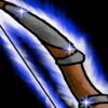
Going on something much more simpler, at least in theory: upgrade for archers.
I've got the basic shape and color themes. Next step is improving contrast on 3rd and 4th level and differentiate them a bit more in shape (in addition to color and decoration) before the deadline.
But I feel like this will be much more manageable than the previous idea


Last results were:
Going on something much more simpler, at least in theory: upgrade for archers.
I've got the basic shape and color themes. Next step is improving contrast on 3rd and 4th level and differentiate them a bit more in shape (in addition to color and decoration) before the deadline.
But I feel like this will be much more manageable than the previous idea
Attachments
Footman16
Community Manager
- Joined
- Jul 14, 2012
- Messages
- 3,697
I am willing to give an extension if necessary as long as all other contestants are ok with that.
@The_Silent @Vinz @PROXY do you guys need more time?
@Panda @Villagerino Are you guys ok with an extension if necessary?
@The_Silent @Vinz @PROXY do you guys need more time?
@Panda @Villagerino Are you guys ok with an extension if necessary?
- Joined
- Jul 28, 2021
- Messages
- 858
Personally, I'm ok with an extension if guys need more time.I am willing to give an extension if necessary as long as all other contestants are ok with that.
@The_Silent @Vinz @PROXY do you guys need more time?
@Panda @Villagerino Are you guys ok with an extension if necessary?
- Joined
- Feb 4, 2008
- Messages
- 3,514


I'm fine with it, I must admit I planned to do this in the last half of may, and suddenly may was almost over.
- Joined
- May 7, 2016
- Messages
- 2,188
Thanks! Well I've been doing this for 9 years, now every icon takes like 10 minutes of my time. xDAstonishing armor! How quickly you do this
It most certainly is. I was gonna do some night elvish cloak armor but things turned out the angelic way.By the way, is that something like angelic/paladin faction armor within a concept
- Joined
- Jun 2, 2008
- Messages
- 11,879
Thats fine with meI am willing to give an extension if necessary as long as all other contestants are ok with that.
@The_Silent @Vinz @PROXY do you guys need more time?
@Panda @Villagerino Are you guys ok with an extension if necessary?
Footman16
Community Manager
- Joined
- Jul 14, 2012
- Messages
- 3,697
Ok I'll give a 2 week extension then. Remember to put in a second WiP before submission to those of you who haven't yet.
- Joined
- Jun 2, 2008
- Messages
- 11,879
Also, you are aloud to upload your finished icons to the Icon Section, i will review them once judging concludes.Ok I'll give a 2 week extension then. Remember to put in a second WiP before submission to those of you who haven't yet.
- Joined
- Nov 18, 2014
- Messages
- 97
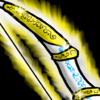
Updating T3:
Previous version felt more like bronze than golden. Fixing it also improved the contrast between the bow and the highlight color.

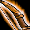
Updating T4:
This upgrade is meant to give a feel of holy/angel bow. Changed the ornament shape, and added a angel feather (which need improvement, but it might be hard considering its size).

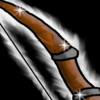
Which would make the following set:


Feels coherent and way better visually.
I think I still need something to make T2 & T3 more distinct, will try to work on that next.
Previous version felt more like bronze than golden. Fixing it also improved the contrast between the bow and the highlight color.
Updating T4:
This upgrade is meant to give a feel of holy/angel bow. Changed the ornament shape, and added a angel feather (which need improvement, but it might be hard considering its size).
Which would make the following set:
Feels coherent and way better visually.
I think I still need something to make T2 & T3 more distinct, will try to work on that next.
Last edited:
Similar threads
- Replies
- 124
- Views
- 20K
- Replies
- 138
- Views
- 21K
- Replies
- 89
- Views
- 30K