• 🏆 Texturing Contest #33 is OPEN! Contestants must re-texture a SD unit model found in-game (Warcraft 3 Classic), recreating the unit into a peaceful NPC version. 🔗Click here to enter!
  • It's time for the first HD Modeling Contest of 2024. Join the theme discussion for Hive's HD Modeling Contest #6! Click here to post your idea!

Texturing Competition #6 - Northrend/Icecrown

Status
Not open for further replies.
Level 21
Joined
Mar 18, 2007
Messages
2,247
Here's a picture of it so far on the model. The fur's still a partial WIP

attachment.php


The unwrap

attachment.php


I tried to make the little tusks kind've "pop off" the texture

Thanks for the suggestions/comments, guys, helped me a lot :D
 

Attachments

  • Satyr3.jpg
    Satyr3.jpg
    184.2 KB · Views: 210
  • SatyrWIPSS1.jpg
    SatyrWIPSS1.jpg
    38.5 KB · Views: 225
Last edited:

TDR

TDR

Level 18
Joined
Sep 26, 2004
Messages
1,543
oh my...no wonder it looks like that. Use way larger man, like 15-30. They blend in better and make you focus on the whole piece instead of detailing small parts individually, like you did. It makes everything more unified. And it's also way faster.

Also, be careful 'cause working on doubled resolution is a tricky thing. On one side, it's good because you can be a little more sloppy for when you shrink the image down, it basically blends stuff a little. But on the other side, you may put in lots of detail that will be lost when you shrink it back. So, as I said, take care.
 
Level 21
Joined
Mar 18, 2007
Messages
2,247
Yeah, I know about that. I was going to scale my magma elemental down to 256x256, but the lava cracks on the arms became crap so I left it at 512x512

I just resized what I had so far just to see what it looks like, it's fine, and nothing that's become blurry you'd be able to notice in-game anyway. I might re-define some stuff after I scale it down, though
 

Deleted member 126647

D

Deleted member 126647

The ice looks good SuPa-, just alpha the fur part on the sides and it'll look great. The parts you did with new brush size look very good in comparison.
 
Level 21
Joined
Mar 18, 2007
Messages
2,247
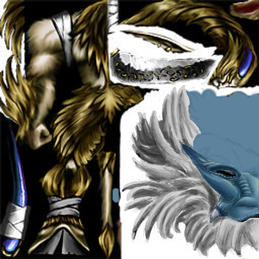
For now I'll just tell you what I did and then maybe add in some pictures later. I made a basic shading of where the lighting would be, and then made a new layer and put in white lines for the different shards. After this I added in shading. To make it a little more shard-like I darkened/lightened some of the pieces more than the ones around them.

Sorry if this isn't a good explanation, but meh, I'm not good at explaining stuff xD

OK, I *think* this is how I did mine

attachment.php

- Basic Shading
attachment.php

- White lines added on different layer, as well as shading to the shards (add shading to the top layer)
attachment.php

- Decrease the opacity of the layer
- Merge visible layers
- Increase contrast
attachment.php

- Decrease saturation
attachment.php

- Add more shading
attachment.php

- (This is optional, and you may not prefer to do it) Make some shards more white to represent luster (picture is a crappy example, I only did it to one little segment :p


I hope this helped you, guys :D Also, I did it pretty quickly, so it's not perfect
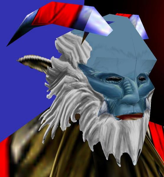
Teh updatez

attachment.php

attachment.php


he's going to have some intricate design on his chest plate

I'll also probably remake the armor, it's looking too unfit
 

Attachments

  • IceTut1.jpg
    IceTut1.jpg
    6.7 KB · Views: 273
  • IceTut3.jpg
    IceTut3.jpg
    8.5 KB · Views: 268
  • IceTut4.jpg
    IceTut4.jpg
    9 KB · Views: 263
  • IceTut5.jpg
    IceTut5.jpg
    8.6 KB · Views: 263
  • IceTut6.jpg
    IceTut6.jpg
    8.5 KB · Views: 277
  • IceTut7.jpg
    IceTut7.jpg
    8.5 KB · Views: 262
  • Satyr6.jpg
    Satyr6.jpg
    182.8 KB · Views: 301
  • SatyrWIPSS4.jpg
    SatyrWIPSS4.jpg
    39.5 KB · Views: 257
Last edited:
Im going to work on skin some more and as I said prolly post next WIP tonight, but one thing I would like to know is if anyone likes my skin at all? Think it has any chance of placing in this competition?

EDIT: Well, I think I am going to scrap this skin idea, its a good idea but I have notice a little flaw in the wrap of blademaster that is REALLY pissing me off, for some reason blizzard thought it would be a good idea to put a little piece of wrap on the pants that makes a stupid triangle on his head if you change alphaing on pants at all, and I really dont want any team color on the pants.

So if I cant think of another idea in the next few days Im probably out of the contest, I dont stand much of a chance of even placing third anyways.
 
Last edited:
Level 34
Joined
Sep 6, 2006
Messages
8,873
Or the acid he took hasn't worn off yet. He's stuck in the 60's.

He also looks like a fisherman with that hat and beard.
 
Level 11
Joined
Aug 4, 2007
Messages
642
@the end the green and yellow is just to show where i will be drawing the runes and armor trimming on it the colours wil be deleted in the end

@matcat 'This work is a pure fiction, any resemblance to a person living or dead is purely coincidental'

@the end I swear i didnt recolour the beard
compare the images
 
Level 14
Joined
Jul 11, 2006
Messages
659
Well good news is that you have alot of potential to learn from your mistakes. A true mistake is a mistake you don't learn from. So don't make your mistakes into true mistakes by not learning from them. Things to learn:

1. It just looks like an amorphous teal blob.
2. Not enough contrast.
3. Colors are hideous.
4. Nothing about the skin makes you think deathknight.
5. Way too blurry.

Keep working on it. Crits may be hard to swallow but they can be quite important.
 
Level 8
Joined
Jun 15, 2006
Messages
332
Well I would love to enter, but i dont have wc3 anymore (lost cd key and new computer) therefore i cannot get the skins from the mpq. If anyone wants to send me the footman skin/and or the mpq file. Do so. Or send me a link where i can get it. It may be that getting the mpq is illegal or something, as i cannot find it, but would giving me just the skin and model so i can see in wc3 viewer?
 
Ok I got a new idea that Im workin on, here is first WIP. I know there are some weird little missing triangles and black lines and shit in the screenshot but for some reason my warcraft 3 viewer does that to everything and I dunno how to fix it.
 

Attachments

  • beetlehead.JPG
    beetlehead.JPG
    155.5 KB · Views: 113
  • HeroCryptLord copy.jpg
    HeroCryptLord copy.jpg
    74.3 KB · Views: 101
Status
Not open for further replies.
Top