frostwhisper
Media Manager
- Joined
- May 25, 2007
- Messages
- 4,265


Contestants were to re-texture an SD unit model found in-game (Warcraft 3 Classic), recreating the unit into its elite counterpart.
 | |
@Moy - Second Place Winner
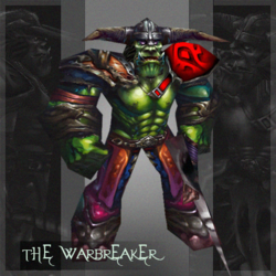
@PrinceYaser - Third Place Winner
| CONTESTANT | WRAP / UN-WRAP | ENTRY |
Vinz |  |
|
Shido |  |
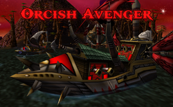
Orcish Avenger ShipEntry for Hive's Texturing Contest #32 "We destroyed so many things on the sea yet when the destroyer itself fallen for our own good, we will avenge them with our spirit to reign over the sea. Eat your heart out, Proudmoore." Version 1.0 Released Tags: Ship, Destroyer, Boat, Orcish, Orc
 www.hiveworkshop.com
|
Footman16 |  |
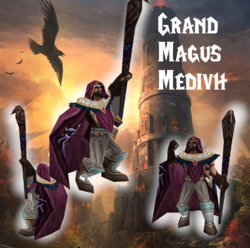
Grand Magus Medivh
www.hiveworkshop.com
|
PrinceYaser |  |
|
Moy |  |
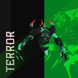
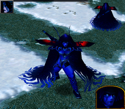
TerrorEntry for 🎨Texturing Contest #32 - Final Form I have seen no texture made for me (I am the Shade), so I made one. A powerful me. A very simple texture, did not put much effort in it, coz y not.
www.hiveworkshop.com
|
Draktar |  |
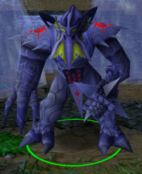
Empire's GuardEntry for Hive's Texturing Contest #32 My first ever contest using a new program I was definitely not fit to use! My entry depicts armored nerubian elite warrior unit. These units patrol the key locations of the empire and slay whoever would dare approach its gates! PS: sorry for the screen...
www.hiveworkshop.com
|
aeman |  |
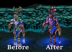
Evolved Faceless OneMy submission for 32# TC essentially this thing is a "what this creature will look like in between of evolving from this to this" so i did this with inspiration from this in game preview
www.hiveworkshop.com
|
Darkfang |  |
Avenging AssassinBased on the OG icon and meant as an upgrade for the regular Assassin/Campaing Warden unit from WC3, and as such, I try to keep the art style as close to the WC3 style while at the same time increasing the general quality. The Avenging Assassins are an exclusive Royal unit in my map, that you...
www.hiveworkshop.com
|
TheZodiarch |  |
Primalist (Keeper of the Grove)Hey! Here is my entry for the Texturing Contest #32 - Final Form Keeper of the Groves final form: Primalist! Turned by the sway and furry of the Primalists, this elven keeper of the green now brings forth savage elemental power. 🪨 The other icons, are just a pair I made to show what they...
www.hiveworkshop.com
|
- 1st place: 750 experience points
- 2nd place: 600 experience points
- 3rd place: 450 experience points
- Entry: 150 experience points
- Judge: 25 experience points per entrant
| Archian | PROXY | Judge average | Poll votes | Poll vote percentage | Result | ||||||||
| Contestant | Entry | Shading | Concept | Detail | Total | Shading | Concept | Detail | Total | ||||
| 35 | 30 | 35 | 100 | 35 | 30 | 35 | 100 | 213 | |||||
| TheZodiarch | Primalist | 35 | 30 | 35 | 1.00 | 31 | 28 | 30 | 0.89 | 0.95 | 29 | 0.31 | 69.04 |
| Moy | Terror | 32 | 28 | 33 | 0.93 | 27 | 22 | 23 | 0.72 | 0.83 | 38 | 0.40 | 65.67 |
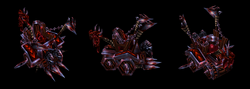
| PrinceYaser | Warbreaker | 30 | 25 | 32 | 0.87 | 23 | 21 | 26 | 0.70 | 0.79 | 36 | 0.38 | 62.42 |
| Draktar | Empire's Guard | 28 | 25 | 20 | 0.73 | 30 | 24 | 30 | 0.84 | 0.79 | 32 | 0.34 | 60.72 |
| Vinz | Corpsegrinder | 30 | 25 | 25 | 0.80 | 23 | 23 | 20 | 0.66 | 0.73 | 36 | 0.38 | 59.12 |
| Footman16 | Grand Magus Medivh | 18 | 28 | 20 | 0.66 | 24 | 20 | 25 | 0.69 | 0.68 | 13 | 0.14 | 46.03 |
| Shido | Orcish Avenger Ship | 20 | 20 | 20 | 0.60 | 30 | 12 | 28 | 0.70 | 0.65 | 12 | 0.13 | 44.11 |
| Darkfang | Avenging Assassin | 28 | 25 | 20 | 0.73 | 18 | 23 | 18 | 0.59 | 0.66 | 9 | 0.10 | 43.43 |
| aeman | Evolved Faceless One | 20 | 20 | 20 | 0.60 | 15 | 18 | 17 | 0.50 | 0.55 | 8 | 0.09 | 36.40 |
Vinz
Interesting choice of model. I think it's a nicely executed texture and the unwrap is smooth. I feel the contrast of the texture makes the details noticeable ingame. Nice attention to details. The shading and highlights are coherent in my view. Wraps nicely on the model. While I don't think it's clear that this is the Meat Wagon's final form, it's a nice new variation of the undead siege engine. I like what you did with gore design. A neat blend of metal and blood. Which is pretty much the core of the Meat Wagon. You handled the wrap nicely. The bloody parts hanging from the top is a nice touch and adds to the core design.
Score:
| Shading | 30/35 |
Concept | 25/30 |
Details | 25/35 |
| Total: | 80/100 |
Shido
It's nice to see a ship texture. We havnet seen many ship textures, so this is a welcome addition to the skins section. Wraps nicely on the model. I feel the color scheme isn't far from the original. You also kept some of the original designs (like the side and the wooden stakes). This adds to the smooth transition from the original to an upgraded version, but it also cost you the chance to be creative with the design yourself.
I think the sails are the most distinctive indication that this is an upgrade. It's hard to notice the hull from the ingame camera. I like the steel part of t the hull though. I think you managed to keep the spirit of Warcraft 3 design in mind.
The choice of model havnet given you that many parts of the unwrap to be creative with. It's mostly straight lines in it's overall design judging from the unwrap. But this is due to the choice of model.
Nice touch with the Orc icon. I feel the shading and highlights are splendid overall. I think the outlines are clear and makes the details more visible from the in game camera. Good contrast.
Score:
| Shading | 20/35 |
Concept | 20/30 |
Details | 20/35 |
| Total: | 60/100 |
Footman16
I like what you did with the cape emblem and the overall color scheme. The purple look adds to the arcane/magical feel of the character. But I feel some of the texture looks a bit blurry in some areas e.g. the cape. Perhaps some more defining highlights & shading could have been added for more distinctive outlines e.g. the cape, hood and pants. Overall I feel the texture could use some more contrast. I think you did a good job on the face. I also like the details on the staff. I feel you could have done something more with the gloves, I feel it's a bit plain. Perhaps the eye of the raven on the staff could also have been more distinctive.
I like what you did with the purple part of the staff.
Overall, I think it's a nice design.
Score:
| Shading | 18/35 |
Concept | 28/30 |
Details | 20/35 |
| Total: | 66/100 |
PrinceYaser
A very vibrant texture with lots of details. I like what you did with the hands. They look more menacing from the ingame camera view. Nice touch. I like that you gave the Orc more armor and attire. A clear upgrade from the original who lacked pants. Also a very neat color scheme of purple, blue and green. I think the attention to details are nice in particular around the belt and body. Your style of painting suits the otherwise horrible wrap. I feel the paint strokes flow with the wrap. I think you've handled the wrap nicely. That being said, the texture also appear a bit undistinctive in some areas of the unwrap. Perhaps even a bit blurry where it's hard to see what's going on e.g. the shoulderpads. I like what you did with the orc logo and alpha channel.
Overall, I feel it's a nicely executed texture and great design.
Score:
| Shading | 30/35 |
Concept | 25/30 |
Details | 32/35 |
| Total: | 87/100 |
Moy
Interesting choice of model. Very smooth and clean texture. Great shading and highlights. I like the contrast the choice of colors gives the texture. Interesting color scheme with dark and neon green lights. Works lovely and keeps the thematic undead and eerie. I love how you turned the Shade into a far more fearful version of itself. Fits the theme nicely. This is indeed an upgraded Shade in it's final form. Too bad the Shade model doesn't have any attack animations. But that's not your fault. I love the attention to details. Great job.
Score:
| Shading | 32/35 |
Concept | 28/30 |
Details | 33/35 |
| Total: | 93/100 |
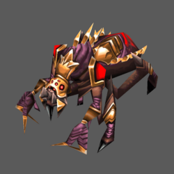
Draktar
The Crypt Fiend is hard to texture. Figuring out the individual parts of the unwrap can be a challenge in itself. But you took on the challenge and managed to pull it off well I think. It wraps nicely on the model. I think the overall shading and highlights are great with a consistent source of lightning, which can be hard when working with a Crypt Fiend unwrap. You added details were it was due. I like the overall color scheme. And I love the nicely executed team color placement. It stands out from the original design leaning towards a more "upgraded" feel, which was the theme of the contest. Nice job.
Score:
| Shading | 28/35 |
Concept | 25/30 |
Details | 20/35 |
| Total: | 73/100 |
aeman
I feel the texture needs more contrast, though. It's rather matte. I like what you did with the face, adding some bright colors for more contrast. Interesting choice of color scheme. But I feel some more diversity in color and exposure could benefit the overall design of this creature. The weapon for instance, I feel you should have gone a different route there. Perhaps another color scheme than the main body.
I like the details on the body, but I feel they could be more emphasized with more shading/highlights/contrast to make them stand out more.
But overall decent shading and highlights. I feel the design fits the theme of the contest. Good job.
Score:
| Shading | 20/35 |
Concept | 20/30 |
Details | 20/35 |
| Total: | 60/100 |
Darkfang
I love the overall color scheme and the design of this piece. Could use more variety in hue and saturation, though. I think it's clear what you had in mind and which unit this was intended to be an upgrade of. Nicely executed design. I feel like you could have made the star design on the cape stand out a bit more, though. I fear those small details are hardly visible. Great shading work.
Score:
| Shading | 28/35 |
Concept | 25/30 |
Details | 20/35 |
| Total: | 73/100 |
TheZodiarch
Excellent texture! I love the attention to details. Great shading and highlights. The contrast is very nice in my opinion. Makes the details visible in game. I feel the design is great and above average. I love what you did with the alpha channel on the horns. Very creative and suits the core design splendidly. I think the overall design matches the contest theme perfectly. It does indeed feel like an upgraded Keeper of the Grove. Excellent job!
Score:
| Shading | 35/35 |
Concept | 30/30 |
Details | 35/35 |
| Total: | 100/100 |
| Corpsegrinder | ||
| Points | Comments | |
| Shading /35: Does the unit fit into the WCIII lighting environment? Is the source of light consistent? Does the unit have a realistic 3D shape enhanced by the shading? Is each individual part shaded according to the material? | 23 | Very strong colors and shading make the whole texture a bit hard to look at. The choice of full on metal (\m/) and the very red-ish hue is very artistic and runs the concept home, but makes it hard to identify actual individual parts of the model. From above, it just looks like a big meat monster. There is no real focus point the eye can use or a real light source recoginezable. |
| Concept /30: Does the design of the unit suit the model it is wrapped on? Has the author come up with creative ways to change parts of the model into something new? Does the unit fit into the style of WCIII? | 23 | Upgrading a meatwagon is a brave choice, and you executed it very well. Going full on meat-grinder mode is a very fun concept. The maw with teeth and the blobs of flesh really are a statement. The strong contrast in terms of shading and the overall redish hues make it hard to actually identify it though and looks a bit out of place in the wc3 environment. |
| Details /35: Does the unit appear blurry and bland in-game? Are the details appropriate and realistically placed? Are the materials in use easily recognized? | 20 | The metal parts are easily identifiable, but especially the wooden parts are complety lost with all the red going on. It was a conscious choice, but perhaps not the best for identifiable detail. As mentioned before, the whole model becoms a red blur. |
| 66/110 | Final Feedback: A really cool concept where you clearly had fun exectuing it. A few smarter decisions when it comes to color diversity and contrast could elevate this texture a lot. Great job nonetheless. | |
| Orcish Avenger Ship | ||
| Points | Comments | |
| Shading /35: Does the unit fit into the WCIII lighting environment? Is the source of light consistent? Does the unit have a realistic 3D shape enhanced by the shading? Is each individual part shaded according to the material? | 30 | The shading is very well done, with consistent light sources and easily recognizable parts. It looks very OG WC III, great job here. |
| Concept /30: Does the design of the unit suit the model it is wrapped on? Has the author come up with creative ways to change parts of the model into something new? Does the unit fit into the style of WCIII? | 12 | The concept is my biggest grieve here, and the one where I had to give the lowest points unfortunately. You basically took every single piece of the original model and just repainted it, making this more of a remaster than an upgrade. The changed sails are a nice idea, but not enough to diversify this texture in any means. |
| Details /35: Does the unit appear blurry and bland in-game? Are the details appropriate and realistically placed? Are the materials in use easily recognized? | 28 | The ship looks great from any perspective and is very true to the wc3 feeling, especially the metal parts are masterfully done, but also the TC parts are on point. |
| 70/100 | Final Feedback: A fantastic texture with a very weak concept. There's so much more that could have been done here: giant metal tusks for the wooden pillars, different designs for the TC masks, a nice figurehead or ram for the front part instead of more of the same metal - you get my drift. | |
| Grand Magus Medivh | ||
| Points | Comments | |
| Shading /35: Does the unit fit into the WCIII lighting environment? Is the source of light consistent? Does the unit have a realistic 3D shape enhanced by the shading? Is each individual part shaded according to the material? | 24 | The shading is well done but something just feels a tiny bit off. On the one hand there is strong contrast at work in his face, but the reddish hues of the shadows in the skin color make it a bit uncanny. Other parts of the texture lack some nice and strong shading like the legs and boots. Still great job though. |
| Concept /30: Does the design of the unit suit the model it is wrapped on? Has the author come up with creative ways to change parts of the model into something new? Does the unit fit into the style of WCIII? | 20 | A very cool concept true to the theme. I just wish there had been more changes to the overall design. Of course the whole point of it is medivh just being upgraded, but there could certainly have been "more" upgradin - the new cloak is a great start but everything else mostly remained the same. |
| Details /35: Does the unit appear blurry and bland in-game? Are the details appropriate and realistically placed? Are the materials in use easily recognized? | 25 | The lack of some real nice dark black tones make the texture stand out a bit ingame and give it a bit of a blurry and washed out look. Besides that, the whole medivh/grand mage vibe has been nailed on point. |
| 69/100 | Final Feedback: A great texture with a few quirks but definetly worthy of the guardian of tirisfal. | |
| Warbreaker | ||
| Points | Comments | |
| Shading /35: Does the unit fit into the WCIII lighting environment? Is the source of light consistent? Does the unit have a realistic 3D shape enhanced by the shading? Is each individual part shaded according to the material? | 23 | The texture has amazing shading from an isolated point of view. The shoulderpad looks especially great. The upper body is really awesome, but the lower body is lacking a bit. It's hard to identify individual parts of his pants and boots, and its hard to understand what is what exactly. |
| Concept /30: Does the design of the unit suit the model it is wrapped on? Has the author come up with creative ways to change parts of the model into something new? Does the unit fit into the style of WCIII? | 21 | It's an upgraded grunt and thus fits the theme greatly. He's even more ripped than before, so he's got that going for him. I'm not really feeling the final form though, it's more like going from Huntress to Naisha than from Grunt to Warlord - but that is nitpicking. |
| Details /35: Does the unit appear blurry and bland in-game? Are the details appropriate and realistically placed? Are the materials in use easily recognized? | 26 | As mentioned in the shading section already, the texture does feel a bit messy and blurry in parts. The upper body is awesome but the legs could very well be 80's dancing pants, especially due to the color choice. That's not necessary a bad thing, I absolutely adore the colors you chose and it makes the texture very vibrant. The face and helmet are exceptionally well done and give off the epic vibes the texture deserves. The wooden handle going through the axe-head seemlessy is my absolute favourite part of the whole thing. |
| 70/100 | Final Feedback: An amazing skin as usual, with a points that could be optimized to give it better readibility and form. | |
| Terror | ||
| Points | Comments | |
| Shading /35: Does the unit fit into the WCIII lighting environment? Is the source of light consistent? Does the unit have a realistic 3D shape enhanced by the shading? Is each individual part shaded according to the material? | 27 | The shading is done phenomenally for the armor and head. The teal ghost parts are what stand outa bit, as they are IMO lacking a bit of shading and definition. I understand where you're coming from with the choice to leave the ghostly energy like it is, but from an ingame perspective it feels a bit off and lacking compared to the armored parts. |
| Concept /30: Does the design of the unit suit the model it is wrapped on? Has the author come up with creative ways to change parts of the model into something new? Does the unit fit into the style of WCIII? | 22 | Choosing the shade was definetly not an easy choice and I highly respect that. Given the models limited choices of adaptibility, you pulled it off very well with upgrading it. It's gone from goofy shadowy figure to hardcore elder ghost straight from the Maw. The "Giger"-esque armor details are just satisfying to look at and the claws coming out from the ghost hands are a nice touch. The low-res dark cloud particles sadly coming with the model do not fit together anymore as great, which brings the overall aesthetic done a bit. |
| Details /35: Does the unit appear blurry and bland in-game? Are the details appropriate and realistically placed? Are the materials in use easily recognized? | 23 | The details are worked out formidabely for the armor/skull parts. Sadly the forced transparency of the model ingame combined with the forced TC material for the eyes - especially in the portrait - diminishes a lot of the stuff. It's the downside of the shade model, but ultimately something you could have perhaps solved in a better way, especially since you chose the model after all. The ghost parts are, as mentioned, seemingly a bit underdeveloped. |
| 72/100 | Final Feedback: An amazing texture with an amazing attention to detail, brought down a bit by the models quirks and issues in WC3 itself. If this wasn't a warcraft 3 contest it would definetly get more points - but it's amazing nonetheless. | |
| Empire's Guard | ||
| Points | Comments | |
| Shading /35: Does the unit fit into the WCIII lighting environment? Is the source of light consistent? Does the unit have a realistic 3D shape enhanced by the shading? Is each individual part shaded according to the material? | 30 | Yummy shading and an artstyle very true to wc3 while giving it the additional love it deserves elevates the whole texture geratly. The TC at the lower back could have used a bit more love and shading but it's a minor detail. |
| Concept /30: Does the design of the unit suit the model it is wrapped on? Has the author come up with creative ways to change parts of the model into something new? Does the unit fit into the style of WCIII? | 24 | It's an armored crypt fiend - one could end it at that. But it is the attention to detail concept wise that makes this awesome. Changes to the original concept were executed with a lot of thought in mind and the color scheme gives it the majestic vibe it wants to convey. |
| Details /35: Does the unit appear blurry and bland in-game? Are the details appropriate and realistically placed? Are the materials in use easily recognized? | 30 | The way the wrap has been handled, especially for the head, is outstanding. The armor looks great and straight out of OG Wc3 and the details put into the texture are very satsifying to look at. The TC looks sick and the readibility is great, all while transforming the model into a new and upgraded version of itself. |
| 84/100 | Final Feedback: | |
| Evolved Faceless One | ||
| Points | Comments | |
| Shading /35: Does the unit fit into the WCIII lighting environment? Is the source of light consistent? Does the unit have a realistic 3D shape enhanced by the shading? Is each individual part shaded according to the material? | 15 | The shading of the model is varying on different body parts, especially when comparing the high contrast upper head and the club with the rest of the texture. There are no real highlights or shadows for the most part and it's hard to identify what parts of the model are supposed to armor, flesh, or skin. |
| Concept /30: Does the design of the unit suit the model it is wrapped on? Has the author come up with creative ways to change parts of the model into something new? Does the unit fit into the style of WCIII? | 18 | The texture sadly does not feel like an evolution, but more just like an armored faceless one. I like the idea of the yellow flayed skin parts and the TC and armor details are sweet, but the model offers so many possibilites to change and upgrade parts of it, as demonstrated here for example: FacelessOne.blp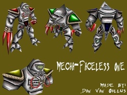
Mecha-Faceless OneDescription: A mechanical/robotic version of the Faceless One and Unbroken creatures. Additional description: This old skin was made for Wc3campaigns Skinning Contest #5. A lot of the skin is freehanded while one part of the original skin was left alone (...almost, did some contrast...
www.hiveworkshop.com
|
| Details /35: Does the unit appear blurry and bland in-game? Are the details appropriate and realistically placed? Are the materials in use easily recognized? | 17 | I really like the TC runes on the shoulerpads and cloaks, and the rocky textures for the club and feet give it a nice crusty feeling. Through the lack of highlights and shadows it all becomes a blur though and the choice of color does not help with it. |
| 50/100 | Final Feedback: A great start for a texture that can be definetly worked and improved on more. The base is there and I'm looking forward for you to elevate this to the next level! | |
| Avenging Assassin | ||
| Points | Comments | |
| Shading /35: Does the unit fit into the WCIII lighting environment? Is the source of light consistent? Does the unit have a realistic 3D shape enhanced by the shading? Is each individual part shaded according to the material? | 18 | I was immensely torn with this texture. I can definetly see that the shading would be very well done, if it wasn't for the dark blue making everything barely recognizable. I get the idea and concept behind it, but simply slapping the blue on top of the texture does it no favors. Even with it simply focusing on the dark blue color scheme, it could have been executed in a smarter way. |
| Concept /30: Does the design of the unit suit the model it is wrapped on? Has the author come up with creative ways to change parts of the model into something new? Does the unit fit into the style of WCIII? | 23 | The concept is great, I'll give you that - if one understands it first of all. During your first WIP's I failed to do that. It really pains me to give this texture such a low rating in it's other sections, because I see that there is a great texture with awesome details, a great moon/shadow/shade concept and a great attention to detail. |
| Details /35: Does the unit appear blurry and bland in-game? Are the details appropriate and realistically placed? Are the materials in use easily recognized? | 18 | As mentioned before, the details are there! I can see them! And they are greatly done. The face looks awesome, the armor and little details on the accesoires as well as the leg tattoos are so great to look at, but sadly it is all lost due to being mostly unidentifiable because the dark blue overshadows everything. The stary cloak is such a great idea but due to the lack of proper highlights on the stars themselves is not transported properly. |
| 59/100 | Final Feedback: You would give my heart a sigh of relief if you redo this texture without the dark blue on top of it - because I can clearly see that there is great stuff hiding beneath it. From a technical and artistic point of view it's a well crafted skin - if it wasn't for that. | |
| Primalist | ||
| Points | Comments | |
| Shading /35: Does the unit fit into the WCIII lighting environment? Is the source of light consistent? Does the unit have a realistic 3D shape enhanced by the shading? Is each individual part shaded according to the material? | 31 | I love the shading. The highlights and shadows are masterfully crafted and vary perfectly based on the material they are on. The stone and crystals look especially cool. I feel certain parts of the wrap could ahve been worked with better, but I know that the KOTG is a pain in the ass to work with. |
| Concept /30: Does the design of the unit suit the model it is wrapped on? Has the author come up with creative ways to change parts of the model into something new? Does the unit fit into the style of WCIII? | 28 | Dragonflight - yay. The primalists serve their elemental masters more than the usual shamans and druids do, thus elevating them to high powers. This keeper has clearly fully comitted to the cause of Iridikron and you can feel it's increased power. The antlers being transformed to flying crystals and the whole texture itself being transformed into something completly new all the while sticking to the contest theme perfectly is an absolute homerun. |
| Details /35: Does the unit appear blurry and bland in-game? Are the details appropriate and realistically placed? Are the materials in use easily recognized? | 30 | The details look amazing and the individual materials are crafted really well. No matter from close up or from a far, one can clearly understand what is what. You can see that there has been a lot of though put into even small things as the right hand claw or the cape drape on the side. |
| 89/100 | Final Feedback: A blessing of a texture that nails the theme of the contest as well as the artistic and technical part. |
Contest | Poll
Assigned staff: @Archian


 and way way more complex fins head but he has to improvise a look that close as possible under the limit of the model and what the texture allow, that's one fish lady was born.


