- Joined
- May 7, 2010
- Messages
- 9,269


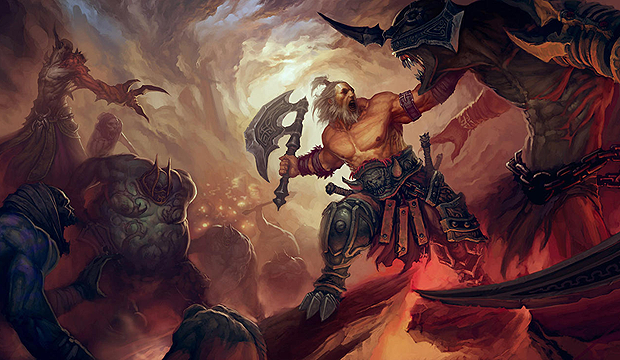
Diablo
Contestants are to create any creature, being or character from the Diablo franchise. Anything from Deckard Cain to Adria is a go.

- First Place: 40 reputation points and your entry on an award icon
- Second Place: 25 reputation points and an award icon
- Third Place: 10 reputation points and an award icon

- Each judge will receive 5 reputation points.

======================================
aeman
Shading = This texture lacks highlights and shadows = making everything look flat.... sadly. I Like the idea of having specular lights reflecting on some parts of the chainmail though! This texture clearly needs more polishing but at least you gave enough visual clues for us to understand it's plate armour! Overall = 15/30
Concept = Crusader? Neat idea to use that unit! Golden rhymes, highlights, having more contrast overall and adding scratch on metal parts, while adding a touch of color would have make this far better! But nice idea none the less. = 20/30
Details = Well, as explained above, this texture would require polishing, everything looks gray and flat, lacks contrast and highlights, etc. The chainmail was a nice idea though to break the overall design, so was the runes on the helmet. = 18/30
Total = 53/90
======================================
Apheraz Lucent
Shading = Great shading overall, we feel the textures, we see the folds in the cape etc. I do feel you went a bit to strong on drawing the shadow on some parts + your golden metal parts could use highlights. = Overal, neat!
") 23/30
23/30Concept = Awhh the good old wizzard!
in terms of creativity, it'S not very surprising to see you pick one of the main classes and apply it to a mage type female unit in warcraft3... :S either way, when it goes down for execution you did have nice design ideas. Love the way the player colours appears on in this texture! Kudos for that, the tiara is neat too! But overall I feel you mostly went and copied the overall look of the Mage character. So = 23/30 = nothing ground breaking in terms of ideas.Details = Like described above, great neat ideas! We feel the textures, the way you displayed the color of the player is very neat too! Your texture is a tad to green though, but so was the mage in diablo 2... so hey, overall = good job! 25/30
71/90
======================================
Blood Raven
Shading = Nice shading, we can easily identify what is plate armour and what's flesh. Particular muscle structure though, but it's warcraft3 so meeh why not?. Your contrast are a tad to strong overall though, your dark areas are reallllly dark and your highlights are reaaaallly bright. You might want to work on that in the futur! = 20/30
Concept = Nice choice of subject!
 Overall though, looking at the original Doomguard texture, you did something quite simplistic for what the texture could hold. would have loved seeing more plates, runes, etc. Great weapon though, really dig it = 23/30
Details = Same comment, you did something quite simplistic. The chainmail is neat though! :O Your muscle structure is weird, but works. Overall = 20/30
Total = 65/90
======================================
Just_Spectating
Shading = overall great execution, part of the shading almost looks like celshading though :O nice volumes though! Your folds in your clothing is nice
= 24/30Concept = GREAT IDEA WOW, dig it! a lot!
= 24/30Details = Great textures overall, neat small details (love the boots!) I do think you could have added more leather here and there though + some parts looks really rushed (blood splat mostly) but overal = it's nice! = 25/30
Total = 73/90
======================================
morbent
Shading = Great execution overall! I really feel the fur and the skin texture! Feels really Diablo 2, like it! 24/30
Concept = OOOOOOOOOOOooooooooooooooooooooooooooooooh that is cool!
Love it! = 24/30Details =I do feel you copy pasted the same texture everywhere though. Making everything look smudge and repetitive overall. You could have added shadows here and there to make things more distinctive and add flow to the fur to simulate the muscles shape etc. 22/30
Total = 70/90
======================================
~Nightmare
Shading = Overall great, feel the folds in the clothing, the wood texture is neat too = great job overall 23/30
Concept = One of the main classes in diablo3 = yeah... easy pick creative wise? + pretty sure you went for the blademaster due to the necklace XD. But hey, love the bandages, the overall look! WOuld I love more leather piece armour though. 22/30
Details = Overall great details, nothing much to say really, beside the fact we feel every textures etc. 24/30
Total = 69/90
======================================
RED BARON
Shading = your shading is inconsistent from a piece of clothing to the other. The boots are super great.... and the robe looks flat D: The book looks flat to, overall = you really need to work more on your contrast. Make your shadows more dark and your highlights brither. But hey at least I can easily identify the type of material. = 21/30
Concept = Awh stay a while and listen!
") = nice choice, nice choice of unit too. Overall = 24/30
= nice choice, nice choice of unit too. Overall = 24/30Details = Just like the shading, feel like the texture is mostly flat. It's Decard cain! Would have love seeing more rag and leather pieces here and there. 20/30
Total = 65/90
======================================
The_Silent
Shading = overall, it's nice. Nice fur texture, I do feel it'S a tad flat though, would have loved seeing more distinctive highlights and shadows on your axe and your fur. = 22/30
Concept = MOOOOOOOO, love it! Nice idea
27/30Details = DUDE overkill with that cow belly part! haha! 23/30
Total = 71/90
======================================
Wisdom
Shading = nice shading! Good job on the highlights and shadows! The hair and fur are nicely rendered
though everything seems to have the same level of highlights which makes everything feels like it's the same material = 22/30Concept = Nice character choice, but pretty obvious warcraft3 pick though. + Feels like you could have done so much more with the bandit mage texture by adding more strats of clothing and leatherbands etc. = 23/30
Details = Nice details here and there, but due to the lack of clothing traps, etc as mentioned in the concept part, feel it lacks a tad of details = 23/30
Total = 68/90
======================================
aeman - Zakkarum Crusader
Shading: 7/30
Concept: 16/40
Details: 8/30
Total: 31/100
The shading is lacking everywhere. You don't seem to have considered the sun as a light source.
On the shoulders, the top of the head, chest plate and, generally, on all the surfaces that the sunlight hits - we should apply highlights.
On surfaces that aren't exposed to the light - we apply shadows.
Some parts of the skin aren't shaded at all. So, they are flat and dull, they lack that realistic 3D appearance.
For example, the armour on his torso, the hair, the tabard's front part, the shield, the main piece of the helm - all these need shading (highlights and shadows).
Here one can see a few shading attempts(on the shoulders, skirt and cross shield's detail), but much more work is required.
The model that you've chosen for reskinning is suitable enough for your subject, but the outcome is not such a good resemblance of the Diablo character.
You could've added more of the crusader's characteristics. Currently, the only thing that reminds us of your Diablo reference is the shield, otherwise nothing indicates that this is a Diablo Crusader.
You could have been more creative, many of the skin's features still remind me of the original skin.
In its' actual state, it looks like a WIP, not as a finished skin. As such, it doesn't look too warcraftish either.
In terms of details, it's rather poorly executed and lacks accuracy.
The shapes are not clearly defined, color variation is poor, and many details are shown with thick black lines, giving it the appearance of an unfinished/unpolished and monotone work.
Team color design is clumsy, the hair lacks details and looks like a blurry gray mass.
We must have metal texture and some cloth texture, unfortunately these can't be seen on your skin.
Cloth and metal are so different textures.
Metal is a hard surface, a very reflective surface, so the contrast should be pretty high(the highlights and the shadows should be very strong). The softer you make the shadows on a metal object, the less shiny it appears. So, when we draw metal, the contrast and reflections are important.
The cloth is a soft surface, it absorbs the light, so there are smooth transitions between highlights and shadows. The contrast should be lower.
To conclude, this skin is lacking, looks unfinished, but i'm sure that with a bit more effort you could raise its quality.
Shading: 24/30
Concept: 33/40
Details: 20/30
Total: 77/100
The shading is quite decent everywhere, but small improvements can be done.
Few examples: some highlights - on the cape shoulder, on the top of the hood(adding some highlights on the bottom part of the cape, right next to the TC);
some shadows - on the pants' sides(green parts only), on the boots' sides and the ankle zone, on the forearms(gloves/bracers) underside, on the staff rod.
The inside of the hood must be darker than the outside; the hair has some strange shading.
Good resemblance of the Diablo 2 sorceress. It wraps nicely to the chosen model.
The Diablo 2 reference has a black skirt instead of green, but this is not such an issue.
All the features of the skin were completely reworked.
You came with an enough creative design for those extra features of the skin, like cape, hood, and boots alike.
Nice reskinning of the body parts and cape, TC also being a nice addition.
The skin is fitting well with the warcraft style.
Enough good definition of all the skin's parts, except the hair, which is weirdly represented.
I'm not so enthusiastic about the golden parts. There are highlights, but not enough shadows to obtain the contrast that a metallic texture requires.
It seems like your base color didn't have sufficient consistency(looks a bit washed out).
You tried to improve this using black outlines, which isn't the best solution, and i do not recommend this method at all.
Applying proper shading is the best solution. I'll give you the cape as example, the right shading makes wonders.
Enough details, a suitable color scheme for the subject that you've chosen.
I love that green, but i would prefer a lil' bit more vibrant color for the gold.
Also, her face looks nice. I find that golden circle on her eyebrow unnecessary (and is barely noticeable on the model).
Though, there are a few things that could benefit from a more interesting design, like the staff pole(it looks crowded with repetitive and symmetrical details, which make it boring), the lower part of the bracers(it looks weird).
A nice wood texture, carved with just a few TC runes or other wood details, would have been more visually appealing than the actual crowded one.
In conclusion, i find this a good and balanced work.
Shading: 23/30
Concept: 34/40
Details: 21/30
Total: 78/100
The highlights and shadows are in the right places, only that they are not so well balanced(with few exceptions).
I'd say that the whole skin looks a bit overcontrasted.
Too strong highlights almost everywhere(except hair, wings and weapon). This is a bit distracting.
His muscles are particularly glowing excessively. The sword, which is metallic, does glow less than his muscles.
You followed your reference very well, the model that you chose was exactly what you needed.
Fully freehand work, every part was changed, nice weapon and body reskin.
The outcome is also very wc3-ish.
Except the fact that it's a bit overcontrasted and the highlights are exaggerated, the skin is executed well enough.
The only complaint is that those exaggerations (on the body parts and golden armour) have changed the purported textures, giving them a lil' bit fake look(your gold texture, for example, has a small amount of shadows and almost no midtones).
There kinda doesn't exist a visual contrast between the two textures, gold and skin.
Those parts need a more balanced contrast, suitable to the textures that they are supposed to be made of.
Other than that, good amount of details, well drawn and matching colors.
Overall, a good looking skin.
Shading: 24/30
Concept: 36/40
Details: 22/30
Total: 82/100
Decent shading.
Maybe a lil' bit more accurate shadows wouldn't hurt(especially on the scalp & neck, forearms, torso), they are too faint and desaturated atm.
Some other minor corrections that can be done: the highlights on his forehead seem a tad too strong; the nose sides and undernose need some more shadows; the upper "lip" is too highlighted compared to the lower one; the chin has no highlights; the belt buckle and the scar/crack on his back could use better shading.
Good shading job on the legs and boots.
You resembled very well the chosen Diablo 2 character. Best model option for this subject.
Creative change of his hair onto scalp and neck part.
All the skin features were changed except some arms (minor)regions.
You have successfully managed to overcome the wrap difficulties in certain areas, resulting in a creative and well made skin, fitting well into the wc3 style.
Good definition, with just few exceptions(the scalp and the neck).
Though, if you'd have experimented more with the lower part of the cloth(more exactly with those folds) the outcome of the corresponding back part could have been better, less out of shape.
Shadows could be smoother(more precisely, the transition from a tonal value to another could be smoother) in some parts of the texture.
That scar on his back is too pinkish(doesn't quite fit with the rest).
His pants wouldn't hurt to be darker, for a good visual contrast with his shirt.
Lots of details and good color variation.
All in all, good job with this skin.
Shading: 17/30
Concept: 18/40
Details: 12/30
Total: 47/100
This model isn't the best choice, kinda difficult wrap. Also, your Diablo character doesn't leave too much room for creativity.
I know you wanted to get this entry to a more advanced status, but for some reason, you didn't work more on it.
Knowing very well your potential, i only rate, without stating my point of view about shading and execution.
For me, this is at a WIP stage. I'll review it(if you want), when it'll reach the stage of a finished work.
Though, (if you intend to finish it) i suggest you to rework his fur(a more accurate/detailed texture, maybe a few worn/shabby areas, here and there, just for variation) and give him a face(the ape-like creature's appearance could be a good source of inspiration).
Shading: 24/30
Concept: 32/40
Details: 26/30
Total: 82/100
In general, good work on the shading.
Though, small improvements could be done: some highlights on the shoulder(cloth); some shading adjustments on the banner; some muscle highlights are a bit too sharp(in certain areas); the underside forearm(bandages) seems a bit too dark; the reflected light on the necklace's balls is too strong and white; scalp, neck and face could use some more shadows(especially around the eyes, for standing out more on the model); his toes(in fact, the feet) seem a bit flat and disproportionate(the little toe is bigger than others); some shadows as well on the reddish belt thingy(hips region) wouldn't hurt; the banner's pole lacks highlights.
But, these are minor things. So, you've done a good shading job.
There isn't a vanilla model more suitable for your Diablo character than this one.
The reskinning was an easy task for you.
You worked all the parts well, resulting in a good Diablo monk replica.
The skin is fitting with wc3 style, but a bit stronger contrast overall would make it even more fitting.
Nice execution, color variation, details - just great.
Yet i have something to say. Some minor observations: the beard and mustache seem to be drawn in a rush, they look kinda stiff and unnatural, straw-like, not hair-like.
You could've done a much better job with the beard as texture, and you could have experimented more with his lips, the clothes' armholes and the pants' folds.
About TC, you missed that the lower part of the pants doesn't have TC, your TC design extends into this area too(causing gaps/holes on the model). Also, the TC could've been more subtle, it's standing out way too much from the rest.
Good clarity and definition.
A very nice skin.
Shading: 11/30
Concept: 23/40
Details: 12/30
Total: 46/100
The skin needs more shading. Almost all the skin parts that you've worked on lack shading(highlights and shadows).
You shaded some parts, like the legs, face, and slightly the body, but ain't enough.
For example, we apply highlights - on the top of the head, shoulders, the outer side of the arms, knees, feet, nose, cheeks, lower lip, chin, etc., and, generally, on the prominent parts that the light hits.
We apply shadows - under arms, body sides, legs' sides, waist zone, under the nose, around the eyes, jaws' sides, etc., and, generally, on the areas that the light doesn't reach.
Also, except each part individually, we shade the skin overall, as a whole, in accordance to the main source of light in wc3(the sun).
Good choice of the model. Almost all the skin parts were changed, but you could have been more creative.
It reminds me enough of the Diablo character.
Regarding the warcraft style, the outcome isn't quite warcraftish, but more shading can solve this.
So you're on the right way, but more improvements need to be done for a satisfactory result.
All the features of the skin could use a better definition by shading.
For example: his face it's kinda dark (mainly coz it lacks highlights); the hair and beard haven't got any shading, and its texture reminds me of straws; the cloak and the front cloth need shading as well. You could have done a better work with those folds, etc.
Regarding the coloring, it's a bit boring, that brownish/beige is too faint and the green hue used doesn't quite fit with the rest.
Also, the details need a more accurate execution, they look flat and vague.
The TC design looks stretched and weird.
I haven't got a clue what the golden thing on his back is.
All in all, it's like you've done half a work, another half remains.
It could become an interesting skin if you put some more effort into it.
Shading: 20/30
Concept: 32/40
Details: 19/30
Total: 71/100
The shading could be improved a tad.
A lil' more highlights here and there(ex.: some areas of the head, shoulders, arms, knees, hoofs, axe handle), some more shadows(horns, stomach/belly/udder, some areas of the legs, underarms).
The axe could use a lil' more contrast to get that specific metallic look.
The shoulder TC stripes are more highlighted on the ends than on the top part.
The legs and arms need some shadows in the parts unexposed to the light, and some highlights on the more prominent parts, etc.
It resembles the Diablo character in a good manner.
The best model choice for this task. The Diablo reference has darker fur, but this is not such major issue.
An easy task(reskinned the tauren into a cow), you couldn't do anything more, considering the character you've chosen.
All the skin parts were reworked.
You managed the TC well, it doesn't steal attention from the rest.
It's matching the warcraft style enough.
Regarding clarity and definition, the execution is satisfactory.
Though the fur as texture could use some more work, atm it looks kinda vague, not like a hairy/fur texture. The hairy/fur texture's characteristics are kinda missing.
Also, you could've done a more accurate work on the axe.
His nose doesn't have a bridge, and its color is a bit unnatural, could be closer to the udder pinkish.
The horns' white could be altered a bit, both for accuracy and variation, and the udder is a bit too bright on the model.
Enough details and color variation.
Overall, it's a good skin.
Shading: 17/30
Concept: 25/40
Details: 17/30
Total: 59/100
The shading needs some improvements(according to the main light source, which is the sun).
For example, the shoulders, the hands, his mustache, knees, the horse's head - they all need proper highlights.
Parts that are less exposed to the light need more shadows(mid body parts, underarms, etc.)
I noticed that his clothes/robe lack shading as a whole, the underarms and the side parts need more shadows.
The pants' shading is weird; horse's mane, neck and tail are randomly shaded; the horse's legs muscles are exaggeratedly highlighted; the staff and the saddle could use a lil' more highlights.
In conclusion, the shading needs some more work.
This model isn't quite fitting with your Diablo character, but i consider that you've done everything you could to resemble it.
All the parts of the skin were reworked, but you could've been a bit more creative.
The outcome isn't so warcraftish.
From the first glance the unbalanced contrast(regarding the skin's parts execution) caught my attention.
The face has too strong contrast and too accentuated details comparative to the rest. Its color (and hands color) is too unnatural.
The robe lacks contrast, looks kinda washed out. The sleeves border color isn't quite fitting with the rest.
You could have used that bluish color on more areas, like in your reference.
Also, the staff could have a more suitable design, that red orb doesn't fit at all, and the team color could be subtler.
The hair textures could use some more work, actually hairs look more like straws.
Enough details, but some are more visible and some are barely visible, like - the chain, the belt and some details on his pants. His robe seems a bit crowded, though.
You're on the right way. With a bit of practice i'm sure that the accuracy of your work will be greatly increased.
Scoring formula: J1+J2/1.9*0.75 + P/Ptot*25
aeman
53+31/190*75 + 3/76*25 = 33,15 + 0,98 = 34,13
Apheraz Lucent
71+77/190*75 + 23/76*25 = 58,42 + 7,56 = 65,98
Blood Raven
65+78/190*75 + 6/76*25 = 56,44 + 1,97 = 58,41
Just_Spectating
73+82/190*75 + 15/76*25 = 61,18 + 4,93 = 66,11
morbent
70+47/190*75 + 5/76*25 = 46,18 + 1,64 = 47,82
~Nightmare
69+82/190*75 + 10/76*25 = 59,60 + 3,28 = 62,88
RED BARON
65+46/190*75 + 5/76*25 = 43,81 + 1,64 = 45,45
The_Silent
71+71/190*75 + 6/76*25 = 56,05 + 1,97 = 58,02
Wisdom
68+59/190*75 + 3/76*25 = 50,13 + 0,98 = 51,11

Contest | Poll
Last edited by a moderator:


 ) Anyone is free to start a theme discussion though, if somebody wants.


 And judging, have been looking forward to reading it. Not that I entirely agree.. meaning that I agree completely with the it, but that I couldn't find a way to actually do it on that skin, given how oddly its warped
  Every single thing I made to stand out would be a problem, as it would repeat somewhere else and stretched.. some parts is a stretched triangle, duplicated..
  Spent quite a bit of time comparing, so yea - I was going for as close a lookalike as I could to the ingame char, and thus didn't give myself much wriggle room for adding extra leather, rags and so forth. Still, could have done more for the none stretched/duplicated parts, such as face and beard - and the very late addition of the loincloth. The odd golden thing is part of the chain, which really should only be on one side, but as it is part of a texture that's duplicated I had to make it a varying size and have two for it to even show somewhat decent- as it was also part of the bag that it only on one side.. well had to attempt something for to connected parts to make some sense.


 )
)