• 🏆 Texturing Contest #33 is OPEN! Contestants must re-texture a SD unit model found in-game (Warcraft 3 Classic), recreating the unit into a peaceful NPC version. 🔗Click here to enter!
  • It's time for the first HD Modeling Contest of 2024. Join the theme discussion for Hive's HD Modeling Contest #6! Click here to post your idea!

Tauer's Models 2.0

Level 39
Joined
Jul 26, 2004
Messages
1,481
Well I hope now people won't complain about him being too slim:/ The face looks better (a lot). Personally I would make the armor texture more rugged. I'm also curious about the hammer. Will you make a custom texture for that too(I hate the Blizz one)?

Alright, I'm trying to make the armor look more battered.
About the hammer, I'm not sure. You're right, Blizzard's hammer doesn't look good, especially not for this model. On the other hand, not sure I have texture space enough to make a hammer. I'll try moving some stuff around, see if I can make room.

we need u to remake ur Kargath Bladefist and Kilrogg Deadeye ~:ogre_haosis:

Hehe, hmmm. Maybe. I'd like to make more important heroes though.

Oh... My... God.

I knew it. I knew you'd be back at some point! :D So so glad to see you returned, Tauer.

In case you didn't know, this is the user formerly known as Warchief_Grom, I'm the guy who originally suggested the Clan Grunt models XP Really missed ya, man! You were probably my favorite modeller back in the day!

Hey man, sure I remember you! Good to see you're still here. Have you checked out my Blackhand model?

Hopefully you'll stick around. I could use your input on my future models :)

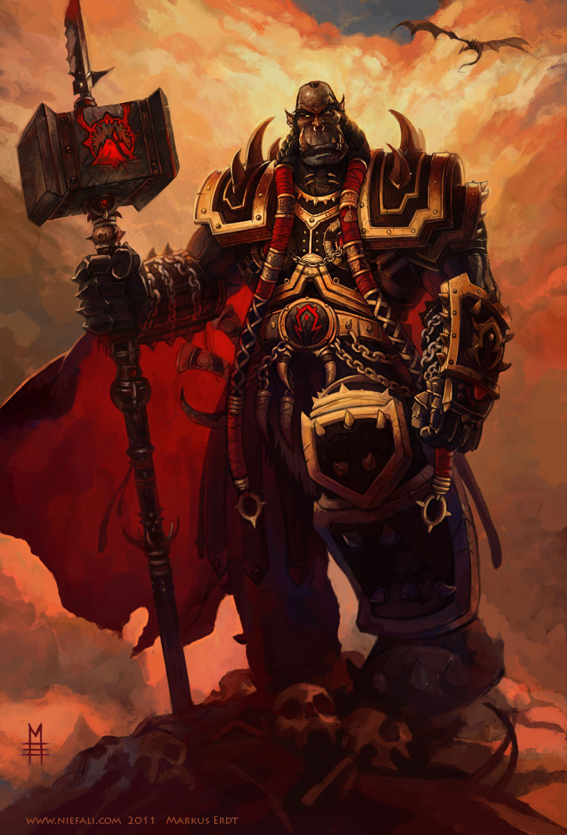
Some more WIP screens. Not much progress, still touching up on the texture. Just trying to get some more shading and detail in there. Can't quite seem to get there though. Still, looks better than the old one.

attachment.php


attachment.php


Feedback is, as always, welcome.
 

Attachments

  • screenshot4.jpg
    screenshot4.jpg
    42.7 KB · Views: 625
  • screenshot3.jpg
    screenshot3.jpg
    43.7 KB · Views: 638
Level 11
Joined
Jan 30, 2010
Messages
548
All models are just damn sexy. Your models are tailor made for wc3 style which is awesome.
Its hard to tell if they are using in-game textures or custom ones.
And new rugged look of Doom hammer is looking much better please continue.
On a side note, which software do you use for animation?
 
Level 39
Joined
Jul 26, 2004
Messages
1,481
All models are just damn sexy. Your models are tailor made for wc3 style which is awesome.
Its hard to tell if they are using in-game textures or custom ones.
And new rugged look of Doom hammer is looking much better please continue.
On a side note, which software do you use for animation?

Thanks :) That's the look I'm going for, glad you like it.
I use 3DS Max 2013 for modelling and animating.

One more WIP, I'm going to bed.

attachment.php


attachment.php


Did some more work on his face. I want it to be just right. Not quite perfect, but it's getting there. Based on this artwork:

Gul%27dan_%27Submits%27_to_Doomhammer.jpg


Doomhammer_Presents_the_Head_of_Blackhand.jpg


Any thoughts?
 

Attachments

  • screenshot5.jpg
    screenshot5.jpg
    53.8 KB · Views: 644
  • screenshot6.jpg
    screenshot6.jpg
    60.6 KB · Views: 661
Level 8
Joined
Aug 13, 2009
Messages
361
Looking excellent, and I have to agree with some former posts, as I am a GIANT Grom Hellscream fanboy (my favorite Warcraft character). A new Grom model, made by you, would be absolutely amazing. Also I should add that you definitely need to do Thrall and perhaps an updated Cho'gall. Of course, if you want to. :p
 
Level 9
Joined
Mar 16, 2008
Messages
316
Hey man, sure I remember you! Good to see you're still here. Have you checked out my Blackhand model?

Hopefully you'll stick around. I could use your input on my future models :)

I have indeed checked out both your Blackhand and Krasus models, and I left little mini-reviews for them on their respective pages! :3

I have no intention of leaving, though I guess I'd have to admit I'm not quite as active as I used to be. Still check the site near-daily, though, and definently will come on more now that I know you're back! I would love to help you out again, and I can't wait to see your future models!

Cheers, and welcome back!
 
Level 9
Joined
Feb 13, 2013
Messages
480
Why not make an alliance hero next maybe Greymane or Perenolde ? Oh yeah blackhand's animations are bad*ss

Edit: back to tpoic you could remove the spikes on your doomhammer model and edit the skin to have the horde insignia on it but other than that it looks pretty good to me.
Edit2: you could also put some leather on him
 
Level 39
Joined
Jul 26, 2004
Messages
1,481
Looking excellent, and I have to agree with some former posts, as I am a GIANT Grom Hellscream fanboy (my favorite Warcraft character). A new Grom model, made by you, would be absolutely amazing. Also I should add that you definitely need to do Thrall and perhaps an updated Cho'gall. Of course, if you want to. :p

Thrall? That's interesting. Never thought of doing him before.
I'll have to think about Grom. If I do make him or Thrall, they'll be pretty low priority I'm afraid.

I have indeed checked out both your Blackhand and Krasus models, and I left little mini-reviews for them on their respective pages! :3

I have no intention of leaving, though I guess I'd have to admit I'm not quite as active as I used to be. Still check the site near-daily, though, and definently will come on more now that I know you're back! I would love to help you out again, and I can't wait to see your future models!

Cheers, and welcome back!

Sounds good! Make sure to visit this thread when you're here, and give me some input ;)

Why not make an alliance hero next maybe Greymane or Perenolde ? Oh yeah blackhand's animations are bad*ss

Edit: back to tpoic you could remove the spikes on your doomhammer model and edit the skin to have the horde insignia on it but other than that it looks pretty good to me.
Edit2: you could also put some leather on him

Hmmm, if I'm to make an Alliance hero, I'd rather make someone like Lothar or Khadgar to be honest. And thanks :)

Ugh.. it's Monday again :(
One picture before I go to school.

Started work on his hammer.
With this one, I had to options; go for the more beautiful version that Thrall uses or go for the rough, battered one from the Doomhammer concept art. I chose option number 2 since I feel that Orgrim is not as extravagant as Thrall. I think rough suits him better.

attachment.php


Still a work in progress. Any thoughts so far?
 

Attachments

  • screenshot7.jpg
    screenshot7.jpg
    46.4 KB · Views: 695
Level 16
Joined
Dec 29, 2008
Messages
1,361
The texture is nice, looks more realistic but imust say the doomhammer is stil a hammer, a normal one, maybe it would be better if it would get a custom model, more detailed.
 
Level 39
Joined
Jul 26, 2004
Messages
1,481
WOW that hammer head looks so HD, fantastic, although in my opinion it looks like its losing its warcraft-y feel because of its High quality but still looks fantastic overall as usual :D

True dat. When you make it with a little too much quality, it loses the Warcraft 3 feel.

I see what you mean, but making it too WC3 like also means that it's ugly :(
Still, it's not done yet. I'll add some more shadows, see if I can't get that Warcraft feel without losing too much quality.
I don't think there's anything wrong with HQ textures, as long as it feels like WC3. Besides, one of the reason I'm spending so much time on the textures is to improve my handpainting skills. Can't really do that if all textures has to look uber low quality, like Blizzard's.

The texture is nice, looks more realistic but imust say the doomhammer is stil a hammer, a normal one, maybe it would be better if it would get a custom model, more detailed.

True.. but that would also mean more polys, and he's already a little high poly. I've been thinking about adding the saw on top. Like in the artwork. What do you think?
 
I see what you mean, but making it too WC3 like also means that it's ugly :(
Still, it's not done yet. I'll add some more shadows, see if I can't get that Warcraft feel without losing too much quality.
I don't think there's anything wrong with HQ textures, as long as it feels like WC3. Besides, one of the reason I'm spending so much time on the textures is to improve my handpainting skills. Can't really do that if all textures has to look uber low quality, like Blizzard's.


True.. but that would also mean more polys, and he's already a little high poly. I've been thinking about adding the saw on top. Like in the artwork. What do you think?
Yes, please continue the good work, ignore for now the WC3 feel, it's ugly as you said. As for the saw on the hammer, well it's up to you, but I think it would either ruin or add a more war-thorn feel to Doomhammer. It could be a worthy experiment btw. As for the textures, well you definitely improve while you make models.
Edit: The hammer turns out quite well, I would also add some wrap on that handle if I were you(it's your choice). I guess you'll add later a Black-rock symbol on the hammer.
 
Level 16
Joined
Dec 29, 2008
Messages
1,361
Well yeah the polycount would go up a bit but lets say making just the hammer head a bit detailed giving it the doomhammer shame would be nice. In my personal feels i dont like the saw blade becouse i'm used to the verison that thrall modificated, but the sawblade was an esential part of the hammer in Ogrims posession, so yeah it would be nice.
 
Level 39
Joined
Jul 26, 2004
Messages
1,481
Yes, please continue the good work, ignore for now the WC3 feel, it's ugly as you said. As for the saw on the hammer, well it's up to you, but I think it would either ruin or add a more war-thorn feel to Doomhammer. It could be a worthy experiment btw. As for the textures, well you definitely improve while you make models.
Edit: The hammer turns out quite well, I would also add some wrap on that handle if I were you(it's your choice). I guess you'll add later a Black-rock symbol on the hammer.

Actually, I'm probably not adding a symbol to the hammer, since all the sides are mirrored. So if I add a symbol it will appear on every side of the hammer, and this would look a bit lame... Plus I kinda like the simple look for it. Makes it look more orcish imo.

Well yeah the polycount would go up a bit but lets say making just the hammer head a bit detailed giving it the doomhammer shame would be nice. In my personal feels i dont like the saw blade becouse i'm used to the verison that thrall modificated, but the sawblade was an esential part of the hammer in Ogrims posession, so yeah it would be nice.

I tried making it a bit more unique, by changing the shape a bit:

attachment.php


attachment.php


Haven't tried adding the blade yet, still thinking about how to best implement it.

About the quality, I guess I can upload a low-res version that looks more WC3-y, I just feel like it's a shame dumbing down quality just because all Blizzards textures look crap. It would help with the filesize though.

I hope you guys don't think I'm being too rejective of your feedback. I really do appreciate it, it's an essential part in growing as a 3D artist. So thanks guys, really :)
 

Attachments

  • screenshot8.jpg
    screenshot8.jpg
    40.6 KB · Views: 444
  • screenshot9.jpg
    screenshot9.jpg
    47.8 KB · Views: 472
I hope you guys don't think I'm being too rejective of your feedback. I really do appreciate it, it's an essential part in growing as a 3D artist. So thanks guys, really :)
I don't, well you surely did made something good out of that hammer, it's war-thorn enough for me. What about that belt, adding something there on that black dot?
 
Level 39
Joined
Jul 26, 2004
Messages
1,481
I don't, well you surely did made something good out of that hammer, it's war-thorn enough for me. What about that belt, adding something there on that black dot?

Yeah, still thinking on that one. I didn't like the look it had before, with the Horde symbol. I might try to remake it. But I'm also thinking of making it teamcolored. Dunno, what do you think?
 
Level 39
Joined
Jul 26, 2004
Messages
1,481
I would either remake it or make a blackrock symbol(maybe it's a dumb idea) to it. Team-colored? that would be nice:wink:

Blackrock symbol is a good idea, but tricky because the symbol is not symmetrical. The belt on the model is mirrored, so the symbol has to be completely symmetrical.
I guess I'll remake the Horde symbol.

Gave the saw blade a try. Now, this is a VERY rough start. Not done at all. I'm not really feeling it yet though. Maybe with some more details, it could look alright.

attachment.php


Thoughts?
 

Attachments

  • screenshot10.jpg
    screenshot10.jpg
    46.9 KB · Views: 486
You could also make the Blackrock symbol like this: just make one side and you're done. It needs to be only a bit recognizable.(your choice)
Btw are those textures bumped a little? As for the saw you can texture it as you said adding details (make it look a bit blunt, you know the backstabber).
----
I'm sorry for the crappy ps sketch:/
I guess it would look something like the pic I showed.
 

Attachments

  • Blackrock mirror.png
    Blackrock mirror.png
    62.2 KB · Views: 182
Level 39
Joined
Jul 26, 2004
Messages
1,481
You could also make the Blackrock symbol like this: just make one side and you're done. It needs to be only a bit recognizable.(your choice)
Btw are those textures bumped a little? As for the saw you can texture it as you said adding details (make it look a bit blunt, you know the backstabber).
----
I'm sorry for the crappy ps sketch:/
I guess it would look something like the pic I showed.

Hmm, good point. I'll try it out. Not too fond of the mirrored Blackrock symbol though.

Tried adding a few details to the blade. Still not too sure. What do you think?

attachment.php


EDIT:

Another pic so you can see it as a whole.

attachment.php
 

Attachments

  • screenshot11.jpg
    screenshot11.jpg
    45 KB · Views: 517
  • screenshot12.jpg
    screenshot12.jpg
    42.5 KB · Views: 442
Level 39
Joined
Jul 26, 2004
Messages
1,481
I think you're almost done with that blade texture (maybe it's just me). Now if you want you could add a little highlight on the blade itself (not the edges), so it can gain a little thickness.
Edit: It looks nicely done:)

Like this? Thanks ;)

Oh and no bumping on the textures, all diffuse.

attachment.php
 

Attachments

  • screenshot13.jpg
    screenshot13.jpg
    53.9 KB · Views: 480
Level 48
Joined
Apr 18, 2008
Messages
8,421
Oh wow. It's great to have you back, Tauer! You're among my favorite modelers for Warcraft III. :)
Now, I know you've already decided against it, but honestly, I really think you should consider changing the eponymous Doomhammer to look slightly more... Epic. It could be as simple as giving it colors similar to his armor, as if they were of the same make, or it could be a complete redesign, maybe more based on the World of Warcraft version. Either way, I think it looks a bit too... Plain, as it is right now. Maybe add more spikes to it, like on the concept, and make the "saw" bigger and longer? Maybe just change the texture so it's more detailed? Right now, it looks a bit plasticy, and I'm not quite sure why.
Also, I definitely think that all of your models need extra teamcolor. You got the Warcraft III feeling just about perfectly, but it all melts away when you don't have teamcolor. It's an important part of the look, as important as anything else, like the cartoonish-ness and extreme shadows and highlights. Without teamcolor, the models look... Empty.
Oh, and as for an epic hero... I may be a little biased, but, to be honest, I've never seen a truly epic Zul'jin model. I've seen plenty of interpertations, but they were all either Axethrower model edits or based on his older-looking World of Warcraft self. I think it would be exciting to see you try and take on him, basing yourself on concepts and your own interpretation. Plus, a troll might prove harder to model because the head is less humanoid in shape, and the animations are all slouched and bent, not to mention very agile.
But Lothar would be interesting, too. I wonder, will you make him mounted? IIRC, he was a Paladin in WC2, which meant a horse. Would be awesome to see him on a horse similar to the WC3 knight's, all stocky and armored up, rather than a tall and lean one like the Archmage's.
 
Level 9
Joined
Mar 16, 2008
Messages
316
I would have to agree with Deolrin here on a few points. The Doomhammer is practically a Horde artifact, even before Thrall put his own touches to it. Make it epic, but not in an extravagant, fancy way. Make it brutal, make it deadly. Orgrim, to me, was almost a plate-wearing warrior-assassin to me. DEFINITELY make the sawblade bigger, and maybe add a few smaller spikes around the blade. In reference to those pictures Deolrin linked, maybe add it in the bulkier parts of the hammer and the studs, maybe bulk up the handle a bit too. A higher filesize would be well worth it, in my opinion.

And yes; Zul'jin would be -AWESOME.-
 
Level 39
Joined
Jul 26, 2004
Messages
1,481
Oh wow. It's great to have you back, Tauer! You're among my favorite modelers for Warcraft III. :)
Now, I know you've already decided against it, but honestly, I really think you should consider changing the eponymous Doomhammer to look slightly more... Epic. It could be as simple as giving it colors similar to his armor, as if they were of the same make, or it could be a complete redesign, maybe more based on the World of Warcraft version. Either way, I think it looks a bit too... Plain, as it is right now. Maybe add more spikes to it, like on the concept, and make the "saw" bigger and longer? Maybe just change the texture so it's more detailed? Right now, it looks a bit plasticy, and I'm not quite sure why.
Also, I definitely think that all of your models need extra teamcolor. You got the Warcraft III feeling just about perfectly, but it all melts away when you don't have teamcolor. It's an important part of the look, as important as anything else, like the cartoonish-ness and extreme shadows and highlights. Without teamcolor, the models look... Empty.
Oh, and as for an epic hero... I may be a little biased, but, to be honest, I've never seen a truly epic Zul'jin model. I've seen plenty of interpertations, but they were all either Axethrower model edits or based on his older-looking World of Warcraft self. I think it would be exciting to see you try and take on him, basing yourself on concepts and your own interpretation. Plus, a troll might prove harder to model because the head is less humanoid in shape, and the animations are all slouched and bent, not to mention very agile.
But Lothar would be interesting, too. I wonder, will you make him mounted? IIRC, he was a Paladin in WC2, which meant a horse. Would be awesome to see him on a horse similar to the WC3 knight's, all stocky and armored up, rather than a tall and lean one like the Archmage's.

I would have to agree with Deolrin here on a few points. The Doomhammer is practically a Horde artifact, even before Thrall put his own touches to it. Make it epic, but not in an extravagant, fancy way. Make it brutal, make it deadly. Orgrim, to me, was almost a plate-wearing warrior-assassin to me. DEFINITELY make the sawblade bigger, and maybe add a few smaller spikes around the blade. In reference to those pictures Deolrin linked, maybe add it in the bulkier parts of the hammer and the studs, maybe bulk up the handle a bit too. A higher filesize would be well worth it, in my opinion.

And yes; Zul'jin would be -AWESOME.-

Alright.. I'll see what I can do to make the weapon a bit more epic, I just don't want to lose the rugged, worn feel of the concept art.
So, blade should be longer.
About team color, I'm not a fan of over using TC like Blizzard. I prefer a few areas with team color to compliment the texture. On Doomhammer, the round thing on his belt will have TC and I'm also think of making TC bracers. Besides, on heroes TC is less important since they have the glow.
About Lothar, if I do make him, I'll make him on foot. A few reasons:
Texture space. If I made him mounted, I'd have use a lot of space just to texture the horse. Could use ingame textures, but afraid it wouldn't fit in with a higher quality texture.
Also cinematic value. I'm not a fan of mounted models, I think they lose a lot of cinematic potential. Who rides a horse all the time anyway? Evil Arthas is a good example, not a fan.

Zul'jin is a really good idea. Would love to make him. I've kinda promised somebody a different model first though. Maybe after. Arrgh, so many heroes to make so little time...

Maybe a Doomhammer like this one? (And I mean the weapon)

orgrim_doomhammer_by_vaejoun-d4h1nrm.jpg

That is indeed a nice picture, could be useful for inspiration for the hammer. Thanks. :)
 
Level 39
Joined
Jul 26, 2004
Messages
1,481
Well those are good ideas. The blackrock sign on his hammer would be nice if you consider it(maybe you'll add a round thing there, not mirrored). Good luck:)
---------------------------------------------------------------
I'm happy to hear about Lothar being on foot (I feel the same about the mounted evil Arthas).

It's a good idea, sadly I'm completely out of texture space. No where to put it :(

A take on a more detailed Doomhammer. Don't really like it though. I think the simple look is better. Any thoughts? I really need some ideas for this one.

attachment.php


attachment.php


EDIT:

Another alternate look:

attachment.php


Looks better than the first imo. Not sure the paint is WC3-y enough though. I guess I could make it team colored, that would be pretty neat.
 

Attachments

  • screenshot14.jpg
    screenshot14.jpg
    45.1 KB · Views: 586
  • screenshot15.jpg
    screenshot15.jpg
    65.8 KB · Views: 637
  • screenshot17.jpg
    screenshot17.jpg
    61.3 KB · Views: 596
Last edited:
Level 39
Joined
Jul 26, 2004
Messages
1,481
I think yes, looks interesting. Team colored would be better imo. I'll let the seniors to give advices:)

Any advice is good advice. I'd like to know what you think ;)

I liked the gold trims though, and the spikes. Not sure if the logo is even recognizable from game camera?

Hmm, was really NOT fond of that look. Even though you're right, the logo will be unrecognizable, the second one looks much more orcish and Doomhammerish. Besides, you would be able to see it in cinematics, sometimes I guess.

Alright guys, I'm afraid I won't be able to work the next couple of days. I'm going travelling for a bit.
Might be for the best. I've been spending way too much time on this. I've been downright obsessive about it LOL. I've been sitting during classes, just looking at the watch, waiting to get home so I could model. I do love it though.
Well, for the next couple of days I'm relaxing in Guilin ;)
I would've liked to finish Doomhammer's texture before I left, but oh well. It'll still be here when I get back.

See you guys Monday or Tuesday! :D

EDIT:

Hehe, all in:

attachment.php


attachment.php


Leather bands? Too much?
 

Attachments

  • screenshot18.jpg
    screenshot18.jpg
    61.4 KB · Views: 462
  • screenshot19.jpg
    screenshot19.jpg
    46.9 KB · Views: 517
Level 4
Joined
Apr 9, 2013
Messages
43
Hmm I don´t know, that sawblade looks bad to me, just sticking out of nowhere, maybe you should do like in the picture I passed, with the blade fixed into the Hammer, not just sticking out of nowhere. Besides it's looking badass!, keep up the good work and nice holidays :).
 
Level 48
Joined
Apr 18, 2008
Messages
8,421
I like it, but maybe make the hammer slightly smaller. It may just be perspective, but it looks, like, five times as big as his head at the moment.
Oh, and perhaps go for golden trimming instead of leather? Might look nicer.

And one more thing, regarding your stance about teamcolor... While I understand why you may not like it, it's still an important part of most every Blizzard model, and a lack of it makes the model stand out in-game and reduces its usefulness. It's a good thing that you are at the very least adding teamcolor in some places, but you must remember - too little teamcolor, or teamcolor in places that are not visible from a top-down view(such as a belt, or bracers, or whatever) is as good as no teamcolor at all. The whole point of teamcolor is that you could glance at an army of 30 units\heroes owned by different players and immediately be able to tell which ones belong to which - that means putting it in places where it's immediately visible from all angles. This often includes capes, shoulderpads and helmets, but sufficiently large portions of the model such as belt buckles, boots, gloves and those shoulderpad-holding plates are also applicable.
If you would hear my advice on your Orgrim model, I believe the belt-buckle and the shoulderpad-holders are the perfect spots for teamcolor(assuming you don't want to ruin the shoulderpads themselves). They are large, they stand out, and they cover a big portion of his chest. It may not be visible from the back, but that is a minor issue, seeing how he is a hero, with hero glow.
 
Last edited:
Level 22
Joined
Sep 7, 2013
Messages
235
Hi,

This model looks very good, i like it!

However it seems that your hammer has wrong proportions: i believe you should make the hammer head smaller and the handle larger, because currently it looks like the handle could break easily under just the weight of the hammer!
I also think you could work a bit more on the junction between handle/hammer and hammer/blade by adding some metallic pieces there.

Regarding teamcolor and Deolrin's comment, i'm not sure the shoulderpads holders that you are proposing will look good. Maybe some teamcolored wraps around his pigtails (like in picture posted by Darkloid) would be less intrusive.
Another solution would be to add a cape, but that's a huge change!
 
Level 39
Joined
Jul 26, 2004
Messages
1,481
Alright guys, I'm back :)
I had a good trip, very beautiful scenery in Guilin. But now I'm back and ready to start work again.

The weapon on the previous model is a bit too big as well. I'd prefer the Doomhammer from that picture up there too, this one is too bald =P

Fair enough, but my number one rule for making these models is to stay as close to the official concept art as possible ;)
This is the one part I won't change no matter the criticism.
If you like the other design better that's okay, but this is the look I'm going for.

Hmm I don´t know, that sawblade looks bad to me, just sticking out of nowhere, maybe you should do like in the picture I passed, with the blade fixed into the Hammer, not just sticking out of nowhere. Besides it's looking badass!, keep up the good work and nice holidays :).

You know, I think I agree with you. I might remove the blade completely. Not sure it looks very good anyway.

I like it, but maybe make the hammer slightly smaller. It may just be perspective, but it looks, like, five times as big as his head at the moment.
Oh, and perhaps go for golden trimming instead of leather? Might look nicer.

And one more thing, regarding your stance about teamcolor... While I understand why you may not like it, it's still an important part of most every Blizzard model, and a lack of it makes the model stand out in-game and reduces its usefulness. It's a good thing that you are at the very least adding teamcolor in some places, but you must remember - too little teamcolor, or teamcolor in places that are not visible from a top-down view(such as a belt, or bracers, or whatever) is as good as no teamcolor at all. The whole point of teamcolor is that you could glance at an army of 30 units\heroes owned by different players and immediately be able to tell which ones belong to which - that means putting it in places where it's immediately visible from all angles. This often includes capes, shoulderpads and helmets, but sufficiently large portions of the model such as belt buckles, boots, gloves and those shoulderpad-holding plates are also applicable.
If you would hear my advice on your Orgrim model, I believe the belt-buckle and the shoulderpad-holders are the perfect spots for teamcolor(assuming you don't want to ruin the shoulderpads themselves). They are large, they stand out, and they cover a big portion of his chest. It may not be visible from the back, but that is a minor issue, seeing how he is a hero, with hero glow.

Don't get me wrong, I do understand your point.. but I really think that the amount of TC Blizzard uses is just ridiculous. I understand that you have to recognize which player the unit belongs to and so on.. but I also think that since this is a hero unit, he has a big ass glow around him that makes it pretty much impossible to NOT be able to see which player he belongs to, TC is a lot less important.
That said, I am working on getting in some team color. I refuse to use the shoulder plates or shoulder plate holders though, as I think that would look really bad.

You might notice I removed a few things from the hammer. I'm still thinking a bit about how to finish it. I can't help but feel that I'm betraying the concept a bit by making it look more "epic" or detailed or whatever. Anyway, pictures:

attachment.php


attachment.php


As you can see, TC on belt buckle, bracers and braids. With the glow, this should be enough. Unless somebody has some ideas on other areas that could have TC, without being too invasive?
I'm considering taking a break from the texture for a bit and moving on to animating. I can always pick up the skin again afterwards.
 

Attachments

  • screenshot20.jpg
    screenshot20.jpg
    50.7 KB · Views: 380
  • screenshot21.jpg
    screenshot21.jpg
    44.6 KB · Views: 397
Don't get me wrong, I do understand your point.. but I really think that the amount of TC Blizzard uses is just ridiculous. I understand that you have to recognize which player the unit belongs to and so on.. but I also think that since this is a hero unit, he has a big ass glow around him that makes it pretty much impossible to NOT be able to see which player he belongs to, TC is a lot less important.
hahaha. Wise words:)
Oh my, now that looks even more appealing to the eye Tauer. Great job :v
Edit:
Oh, and perhaps go for golden trimming instead of leather? Might look nicer.
Here I agree with Deolrin.
Edit: I hope you had a great time on your trip :>
 
Level 39
Joined
Jul 26, 2004
Messages
1,481
Guilin ? ... so u r chinese , right ? :ogre_haosis:

Hehe, actually I'm not. But I've been living in Beijing for the last 3 years, so I feel a little Chinese haha ;)

hahaha. Wise words:)
Oh my, now that looks even more appealing to the eye Tauer. Great job :v
Edit: Here I agree with Deolrin.
Edit: I hope you had a great time on your trip :>

Thank you, I had a wonderful trip ;)
I actually tried out the golden bands before I left.. Can show you a picture:

attachment.php


Not sure though.. What do you think?
 

Attachments

  • screenshot22.jpg
    screenshot22.jpg
    47.3 KB · Views: 412
Level 39
Joined
Jul 26, 2004
Messages
1,481
Looks interesting (Yeah, I'm not sure about it myself, as you said it could be better without the golden trimming).
About the saw Tauer, what happened to it? (doesn't fit his persona?)

I never really liked the look of the saw to be honest.. Anyway, it isn't a requirement for this model I think. It's possible to capture the Doomhammer feel without it.

:goblin_jawdrop:
i lived in beijing , too ~ where r u from ? i mean which nation ?

I'm from Denmark. 你会说中文吗?

I like how it looks. But I think the TC braid things on his hair should be a bit larger, more like Thrall's. Also, something is off about the TC texturing - I'm not sure why, but it looks too "pale" and "light"? I don't really know how to explain it, but it doesn't look like Blizzard's TC.

Alright, made the braid TC a bit larger.
The coloring might have something to do with the NeoDex WC3 renderer. Not sure though. I did some shading, it looks better. It might look more WC3-y when I export though.

Placement of the TC is perfect :D
As for the hammer, personally I'd be fine if you just copied it from Thrall's model :p So anything to make it look closer to that is fine by me.

I was going to use Thrall's hammer, but the low quality of his texture would probably look pretty wrong with the new Doomhammer. Also, I kinda want it to feel unique to Doomhammer, since Thrall made his own modifications to the hammer after getting it.

More pics. I made the braid TC a bit larger, and did some shading on the TC colored areas. Also trying to test it with some different TC colors, see how it looks. I think it's getting there.

attachment.php


attachment.php
 

Attachments

  • screenshot23.jpg
    screenshot23.jpg
    49.2 KB · Views: 352
  • screenshot24.jpg
    screenshot24.jpg
    45.8 KB · Views: 333
Top