
- Joined
- Nov 26, 2006
- Messages
- 11,133


New stuff at end of thread!
Last edited:
Follow along with the video below to see how to install our site as a web app on your home screen.
Note: This feature may not be available in some browsers.


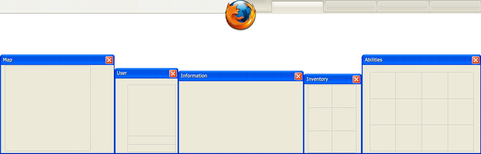
You mean like uploading them here? Or posting the thumbs and clicking on them leads to the full size picture?


That noob has no stones in his necklace! ROFL! Stupid beginner elemental mage! I could pwn him with my ubr h4x
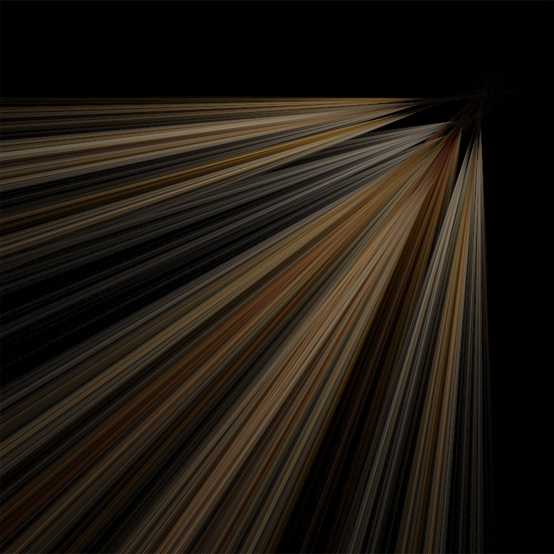
Nice fractal


") Ha, don't get me wrong here dude, but a logo should be very clear and easy to read. Just look at the actual one: two colors standing side by side with 4 little clear pictographs illustrating the main shits of your school. Simple and effective. That's the key to logos man, they must be simple, easy to read and they must transmit their message very clearly.
Ha, don't get me wrong here dude, but a logo should be very clear and easy to read. Just look at the actual one: two colors standing side by side with 4 little clear pictographs illustrating the main shits of your school. Simple and effective. That's the key to logos man, they must be simple, easy to read and they must transmit their message very clearly.


