- Joined
- Oct 23, 2006
- Messages
- 5,291


Phoenix Trial #2
 |
The time has arrived for Hive Workskop judges and voters to determine which arena gladiator has created the most powerful set of command pallete icons.
| THE SUBMISSIONS | |
|
|
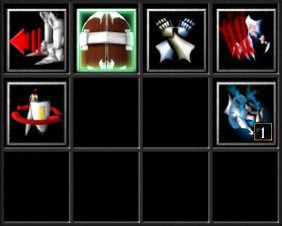
| Gauntlet2021 |
|
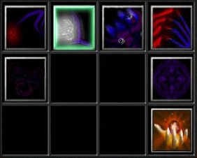
| Pyritie |
|
I have finished mine. Maybe ill make some changes later.
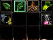
My topic is : Magic
This is the final entry for my Goblin Commander icon set. I hope you all enjoy using it as much as I enjoyed making it.
And so, in order to create the most powerful command buttons of them all, I turned towards the liquid soul of the ancient power itself, to forge these mighty weapons:
Finished...
Theme: Infected (28 Days Later)
I hope they can be of use to someone...
[/td]Okay, well forgot about this until today, so they are a bit rushed. But here they are, I guess. In-game shot within 5 min I hope....
Judges and voters alike should cast their ballots based upon the following criteria:
Rules:
- All icons must adhere to the established icon rules.
- Active and disabled versions of all icons are required.
- No plain screenshots (or shallowly modified) icons are permitted.
- The icons must be made specifically for the contest. No previous works are allowed.
- Blizzard icon naming conventions must be followed: BTNAttack*.blp etc.
- Example: DISBTNHoldPositionBlackDoom.blp
- Works in progress (WIPs) of the icons are encouraged as they keep the contest active.
- The icons must be physically attached to a post when complete. (.blp files only!)
- An in-game screenshot must be included with all submissions.
Judging:
- 50% of the score will determined by a public poll. The rest of the score will be determined by one or more specialized judges.
- Critical judging elements for both voters and specialized judges are:
- Creativity. The icons' originality and uniqueness are vitally important.
- Blizzard feeling. Icons should be executed in such a manner that they can be implemented in a Warcraft map and compliment other Blizzard icons.
- Technical Note. The quality of the icons is the most important thing. They must be detailed yet clear (throwing a lot of elements in a 64x64 image will usually look crowded).
|
The Judging and Voting Process:
|
|
Copy and paste the ballot below to vote in this thread.
BEGIN COPY >===>
[CENTER][B][SIZE="4"]Phoenix Trial #2[/SIZE]
OFFICIAL BALLOT[/B][/CENTER]
[B]I officially cast my ballot for:[/B]
[B]Based on the following considerations:[/B]
Creativity:
Blizzard feeling:
Technical Note:
=================
[B]Comments on other entries:[/B]
<===< END COPY
Last edited:


