• 🏆 Texturing Contest #33 is OPEN! Contestants must re-texture a SD unit model found in-game (Warcraft 3 Classic), recreating the unit into a peaceful NPC version. 🔗Click here to enter!
  • It's time for the first HD Modeling Contest of 2024. Join the theme discussion for Hive's HD Modeling Contest #6! Click here to post your idea!

Mini-Contest: Wc3:WoW Logo Competition {FINISHED}

Status
Not open for further replies.
Level 6
Joined
Jul 29, 2007
Messages
160
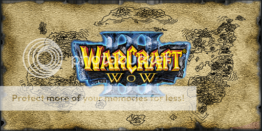
There it is my new one with a white background so it can be put over things, it is able to be scaled down to the size you need to the I I I Bit wont look as bad but I trred with it :thumbs_up::thumbs_up::thumbs_up:

Why do the shadows in "World" go to the center but the III are going off to the left? maybe you should flip the IIIs. And then the shadow of the backround goes off to the top right?

Shouldn't they all go the same way, even if there was more light. Beside if there was more lighting from different areas everything would go off in all the same directions.


Edit:I mean all the shadows in the whole entire logo should go the same way or ways. And same with the III, it should dissapear into the center of it's self like World did and Warcrft did(aspiration points). So, if you leave the World shadow then the backround shadow should be going down.

~Craka_J: Lol
 
Last edited:
Level 3
Joined
Aug 29, 2007
Messages
44
2 Newer ones i created this morning, Red and Blue

WC3Down.jpg


WC3Red.jpg
 
Level 25
Joined
Mar 25, 2004
Messages
4,880
Very nice improvements, that red one looks cool. Looks less messier because the part you filled in with the blue one is all scribbled and easy to notice. Might want to fix it up.

iron_warrior, very nice logo as well. The O looks just about perfect. But the top part of the O in red looks like it's messed up a little. However the rest is great and very original. x5.gearbox has a nice idea with his logo as well. It's beginning to be hard to choose which is best already! This is a very good thing. Keep it up guys, and improve as much as you can.

I have an idea of what four background colors would be good to use for the world part in the WoW logo. It isn't required, but just an idea:
Black,Blue,Green, and Red. Each color represents the colors Blizzard is/will use for their own WoW logos. Blue for the original version, Green for TBC, Black for the new expansion, and Red for... well I know they'll make a red one for sure.

Just an idea for those of you who want to try it out. Not required at all. It's completely optional!
~Craka_J
 
Level 25
Joined
Mar 25, 2004
Messages
4,880
Yeah, you may actually be right. Well I look forward to your logos and improvement, theres very strong competition going on between these three users:
iron_warrior
Angel_Duster
x5.gearbox

I didn't put your names in order of whos winning/losing so don't be disapointed/excited. Just saying that those three individual people are most likely our first, second, and third place winners already so far. But I have faith that we'll have more competitors.
~Craka_J
 
Level 6
Joined
Jul 29, 2007
Messages
160
Here is my latest version
Features:
• Black boarder around all text.
• All shadows of the text go with the Drop shadows.
• Custom Globe from google.
• Custom boarder around globe.
• light green at botom of backround, dark green near top.
• No backround so it can be placed over anything.
• Text originated from Reign Of Chaos.
• Boarder originated from WoW 1.
• Emphasis on the WoW and 3 so it seems more like Wc, not like another WoW game.
• Redid the two Ws because I noticed they were the only letters in perspective so I made them like the rest more 2d ish.
Also, if the III doesnt look as if it fits together someone tell me and I'll try to fix it because whenI look at it something looks wrong.
• Changing the green is just 4 clicks away


I've tried to stay as Warcrafty as possible so I hope that this is what Craka_J is looking for (it's still a WIP)
 

Attachments

  • Logo10a.jpg
    Logo10a.jpg
    88 KB · Views: 1,362
Last edited:
Level 9
Joined
Jun 18, 2004
Messages
565
Ok, this is, more of less, my current logo. I took away the Reflections since they were tough to see at around 50%, and chances are the logo wouldn't be filling the screen.

Craka_J, what do you mean about the "O"? I blended the center of the top a little more, but I didn't fully understand you.
 

Attachments

  • Warcraft3WoWLogo.jpg
    Warcraft3WoWLogo.jpg
    48.9 KB · Views: 405
Level 6
Joined
Jul 29, 2007
Messages
160
Hmm... looks better with a black or blue background rather than a green one. Black border looks nice though!

PS: Why is the "WoW" blurry?
~Craka_J

I just realized why they are from to different logos of Warcraft 3Riegn of chaos the WoW was from a small pic of it... I'll fix that

EDIT: Ok here is the fixed ver.
 

Attachments

  • Logo11A.jpg
    Logo11A.jpg
    87.6 KB · Views: 1,491
Last edited:
Level 6
Joined
Jul 29, 2007
Messages
160
Much better.
The III is kinda blurry too, but I guess it is excusable since it is in the background :\
~Craka_J

I'll fix it anyways since it won't take much time.

EDIT: Bah! I finished but when I added teh drop shadow and tried to save I got a Program Error and it wouldn't let me save it. I guess I'll try to add the shadows after
 
Last edited:
Level 25
Joined
Mar 25, 2004
Messages
4,880
It is a very nice logo indeed, but it is illegal for us to use Blizzard Entertainment's World of Warcraft title in our title/logo. Warcraft is also a trademark, but our mod is created from Warcraft so it should not violate any terms concerning that.
Valid titles that can be used in the logo are the following:
  • WC3:WoW
  • Warcraft III WoW
~Craka_J
 
Level 25
Joined
Mar 25, 2004
Messages
4,880
Whether the TM is there or not, it is still illegal for us to make it our logo because the title "World of Warcraft" is in it. The title is their trademark whether you say it is or isn't. Basicly just taking away the TM on your logo is like saying to a guy who has ice cream that it isn't ice cream because you took away the ice part in the name because you felt like it.
~Craka_J
 
Level 25
Joined
Mar 25, 2004
Messages
4,880
Exactly. I've already done something like this a long, long time ago to a cinematic for Warcraft III called The Tale of Archon and had to learn the hard way lol.
Sorry but rules are rules, and if there is one rule I am going to enforce, it'll be the law.
~Craka_J
w00t my 1000th post!
 
Level 5
Joined
Jun 26, 2007
Messages
63
Yes I know I'm already part of the team, but I'm gonna give it a go:
Logo.png

Faded edges
Logo_Fade.png

Banner Version
banner.png

Faded Banner Version
banner_fade.png


The first one could easily be cropped to a square for a better "icon" style.

Credit goes to Blizzard for the TFT design
I don't know where the background image came from, but I'm assuming it's Blizzard.


Great icons everyone! I can't wait to see who wins!

Congrats on 1k posts Craka'!
 
Level 25
Joined
Mar 25, 2004
Messages
4,880
WC3:WoW members are more than welcome to participate in the mini-contest as well!

Your logo is great, but the WoW part is the only thing that keeps it from perfection! Redo the WoW part in maybe Warcraft font like the other logos and see how it turns out.
~Craka_J
 
Level 25
Joined
Mar 25, 2004
Messages
4,880
Wow, they're all amazingly great and it's so hard to choose which one I like most! Excellent work on replacing the WoW with the actual WoW letters Saitek, and Dragoon.Zombie's logo is great too! I really like Saitek's because of the Frozen Throne background. Since WC3:WoW requires Warcraft III: The Frozen Throne, it fits very well with the mod's logo. I don't know, but so far it looks like if things continue to go the way it's going, there's going to be two first place winners! I may also need help with the judgement from Wolverabid and Bob27 (if Bob27 ends up not entering the contest at all)
Well done ladies and gentlemen (if any ladies, which I doubt very strongly) you've all impressed me and the improvement rate since you all started is phonominal. Good luck!

~Craka_J
 
Level 25
Joined
Mar 25, 2004
Messages
4,880
Nice work DragoonZombie! The font quality is perfect and can't even tell that it was C&P'd.
I want to see more Frozen Throne logos like Saitek's logo!
Perhaps a Warcraft I or Warcraft II styled logo? Worth a try for everything to see how what looks good with what.
~Craka_J
 
Status
Not open for further replies.
Top