- Joined
- Jul 29, 2008
- Messages
- 9,905
This is something I've thought about for... well, ever. But just recently I saw some discussion going on between @SpasMaster & @Scias that really gave me some grounding to get more into it, to dig my teeth in, as it were.
I'm gonna come right out & recognize that this may not only be contentious & potentially divisive, but in fact may be intractable; that is to say, the subject may be so subjective that coming to any real conclusions. But still, I hope for a valuable discussion.
Question for those of you who don't likehappiness to read: What Makes a Blizzard Icon? Are there certain aesthetic qualities we can ascribe to them in general? Do we **know** anything about how they were created, or are we merely educated-guessing/reverse-engineering? What's the best way to determine this to be the case?
Is there an Objective test that could determine the "Blizzard/Warcraft3-fittingness" of an icon, or are we stuck with what is ultimately a completely Subjective task?
Here are the posts:
So, what's, like... The truth of it?
I ask in part because I've spent a while in this business worrying about this exact thing. I'm incredibly picky when it comes to Icons; something about their tiny size but powerful information-density just really strikes me when I see something that looks... 'off'. I'm nowhere near having an artist's eyes, so I can't really say what's up most of the time. However my internal "compare-o-meter' just goes crazy; and honestly I'd say this happens 85-90% of the time I look at new icons. No offense to all you great icon-makers out there (& I won't name any names so as to avoid bias/further offense), but the "Warcraft-style" is, in my opinion, very difficult to emulate.
DISCLAIMER: That has very little to do with the level of artistry present in the icons uploaded to this section. Nearly all of you whom I would not say make "fitting to Warcraft" icons still make icons with an INSANE level of quality. No bones about it, you guys are artists.
Anyway, the problem is, my method of comparison kinda breaks down a bit when I see the above posts' image-dumps. It's actually perfect, it's just the way I would do it, but I look & look & start to just sorta phase out, lose my touch. It's hard to tell, to see if something really doesn't fit, or if it's just my over-developed knowledge of which are in-game & which are not. :<
So, I'd love to get some thoughts. : )
(To clarify, I'm really only talking about icons made to fit into the game; if an artist is drawing special icons for a unique project that doesn't take place in Warcraft 3 at all, then more power to ya; this topic isn't for you)
~~~
@A.R.
@Mad
@Scias
@~Nightmare
@stein123
@-Grendel
@Murlocologist
@Mr.Goblin
@Apheraz Lucent
@Sin'dorei300
@Marcos DAB
@Exarch
@morbent
@M0rbid
@San
@PrinceYaser
@BLazeKraze
@Edge45
I'm gonna come right out & recognize that this may not only be contentious & potentially divisive, but in fact may be intractable; that is to say, the subject may be so subjective that coming to any real conclusions. But still, I hope for a valuable discussion.
Question for those of you who don't like
Is there an Objective test that could determine the "Blizzard/Warcraft3-fittingness" of an icon, or are we stuck with what is ultimately a completely Subjective task?
Here are the posts:
Alright, so I've been observing your recent work and I have some feedback to provide.
Despite the fact that creating icons for custom models that lack icons is very useful and, honestly, is done in the best way that I've seen for awhile, I have some critique.
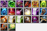
Your icons do have a pretty pixelized look, and therefore, lower quality when standing next to other icons. Unfortunately, even though I like your style and like what you are doing, I (personally) probably wouldn't use most of your icons because of how it would look next to others, in a Tavern for example. I will post a picture showcasing how a Tavern would look if it has some custom icons, some default icons and some of yours:
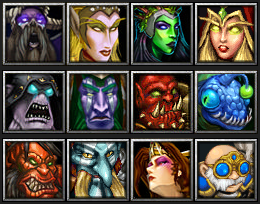
Notice how the pixelized look makes your icons stand out a little bit, as if they belong less in there. Perhaps Gelbin Mekkatorque is the one that suffers least from that issue.
In general, I really like what you are doing and how you are doing it. I just think it requires some improvements quality-wise and then your work would be just perfect to me.
Good luck!
Hey, thanks for the input.
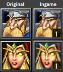
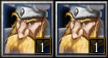
However I have to disagree with a lot that you've stated. I'm not sure though if these icons are displayed this way only on my screen with specific resolution/settings or if this is how they're displayed for everyone, but I've tested every icon I made ingame (not sure if you did the same), it appears the images get blurred, which fixes the issue you're having with the pixely quality.
Here are some example screenshots I took with original heroes to compare:
If this is how the icons display to me due to specific monitor/video settings then I would probably agree, though I'd like to see how they look ingame in proper quality.


Another thing is that your variety of tavern icons even without my icons wouldn't have consistent quality standard, compare the icon of the archer which is probably just a slightly edited screenshot to the extremely high quality icon right beside it. Same goes for druid of the talon whos icon is obviously mirrored (another screenshot).
Glad you like my work, and I hope this is just a matter of you not having time to test the icons ingame, and that they display better ingame for you. I guess if that was the case you'd consider using my icons in your projects?
Edit:
For a better comparison, here's a original Hero to my custom Hero icons comparison file
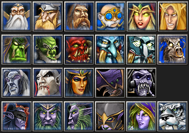
So, what's, like... The truth of it?
I ask in part because I've spent a while in this business worrying about this exact thing. I'm incredibly picky when it comes to Icons; something about their tiny size but powerful information-density just really strikes me when I see something that looks... 'off'. I'm nowhere near having an artist's eyes, so I can't really say what's up most of the time. However my internal "compare-o-meter' just goes crazy; and honestly I'd say this happens 85-90% of the time I look at new icons. No offense to all you great icon-makers out there (& I won't name any names so as to avoid bias/further offense), but the "Warcraft-style" is, in my opinion, very difficult to emulate.
DISCLAIMER: That has very little to do with the level of artistry present in the icons uploaded to this section. Nearly all of you whom I would not say make "fitting to Warcraft" icons still make icons with an INSANE level of quality. No bones about it, you guys are artists.
Anyway, the problem is, my method of comparison kinda breaks down a bit when I see the above posts' image-dumps. It's actually perfect, it's just the way I would do it, but I look & look & start to just sorta phase out, lose my touch. It's hard to tell, to see if something really doesn't fit, or if it's just my over-developed knowledge of which are in-game & which are not. :<
So, I'd love to get some thoughts. : )
(To clarify, I'm really only talking about icons made to fit into the game; if an artist is drawing special icons for a unique project that doesn't take place in Warcraft 3 at all, then more power to ya; this topic isn't for you)
~~~
@A.R.
@Mad
@Scias
@~Nightmare
@stein123
@-Grendel
@Murlocologist
@Mr.Goblin
@Apheraz Lucent
@Sin'dorei300
@Marcos DAB
@Exarch
@morbent
@M0rbid
@San
@PrinceYaser
@BLazeKraze
@Edge45


