• 🏆 Texturing Contest #33 is OPEN! Contestants must re-texture a SD unit model found in-game (Warcraft 3 Classic), recreating the unit into a peaceful NPC version. 🔗Click here to enter!
  • It's time for the first HD Modeling Contest of 2024. Join the theme discussion for Hive's HD Modeling Contest #6! Click here to post your idea!

What Makes a Blizzard Icon?

Status
Not open for further replies.

Kyrbi0

Arena Moderator
Level 45
Joined
Jul 29, 2008
Messages
9,495
This is something I've thought about for... well, ever. But just recently I saw some discussion going on between @SpasMaster & @Scias that really gave me some grounding to get more into it, to dig my teeth in, as it were.

I'm gonna come right out & recognize that this may not only be contentious & potentially divisive, but in fact may be intractable; that is to say, the subject may be so subjective that coming to any real conclusions. But still, I hope for a valuable discussion.

Question for those of you who don't like happiness to read: What Makes a Blizzard Icon? Are there certain aesthetic qualities we can ascribe to them in general? Do we **know** anything about how they were created, or are we merely educated-guessing/reverse-engineering? What's the best way to determine this to be the case?

Is there an Objective test that could determine the "Blizzard/Warcraft3-fittingness" of an icon, or are we stuck with what is ultimately a completely Subjective task?


Here are the posts:
Alright, so I've been observing your recent work and I have some feedback to provide.

Despite the fact that creating icons for custom models that lack icons is very useful and, honestly, is done in the best way that I've seen for awhile, I have some critique.
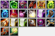
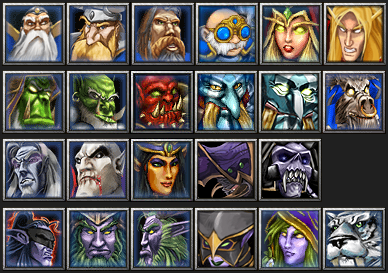
Your icons do have a pretty pixelized look, and therefore, lower quality when standing next to other icons. Unfortunately, even though I like your style and like what you are doing, I (personally) probably wouldn't use most of your icons because of how it would look next to others, in a Tavern for example. I will post a picture showcasing how a Tavern would look if it has some custom icons, some default icons and some of yours:

full


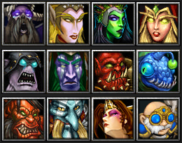
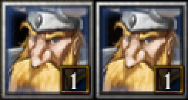
Notice how the pixelized look makes your icons stand out a little bit, as if they belong less in there. Perhaps Gelbin Mekkatorque is the one that suffers least from that issue.
In general, I really like what you are doing and how you are doing it. I just think it requires some improvements quality-wise and then your work would be just perfect to me.

Good luck! :)

Hey, thanks for the input.
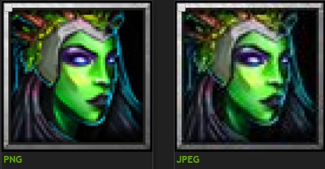
However I have to disagree with a lot that you've stated. I'm not sure though if these icons are displayed this way only on my screen with specific resolution/settings or if this is how they're displayed for everyone, but I've tested every icon I made ingame (not sure if you did the same), it appears the images get blurred, which fixes the issue you're having with the pixely quality.
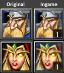
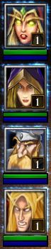
Here are some example screenshots I took with original heroes to compare:
0bc473c7ef143d143f0d08156b919834.png
95309a399f9f24c83527e0dc420fdb4d.png
yA3izn4.png
Jl6UFaw.png
If this is how the icons display to me due to specific monitor/video settings then I would probably agree, though I'd like to see how they look ingame in proper quality.

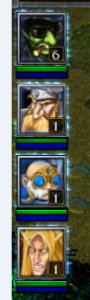
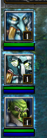
Another thing is that your variety of tavern icons even without my icons wouldn't have consistent quality standard, compare the icon of the archer which is probably just a slightly edited screenshot to the extremely high quality icon right beside it. Same goes for druid of the talon whos icon is obviously mirrored (another screenshot).

Glad you like my work, and I hope this is just a matter of you not having time to test the icons ingame, and that they display better ingame for you. I guess if that was the case you'd consider using my icons in your projects? :D

Edit:
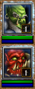
For a better comparison, here's a original Hero to my custom Hero icons comparison file
Ocr3yKR.png

So, what's, like... The truth of it?

I ask in part because I've spent a while in this business worrying about this exact thing. I'm incredibly picky when it comes to Icons; something about their tiny size but powerful information-density just really strikes me when I see something that looks... 'off'. I'm nowhere near having an artist's eyes, so I can't really say what's up most of the time. However my internal "compare-o-meter' just goes crazy; and honestly I'd say this happens 85-90% of the time I look at new icons. No offense to all you great icon-makers out there (& I won't name any names so as to avoid bias/further offense), but the "Warcraft-style" is, in my opinion, very difficult to emulate.

DISCLAIMER: That has very little to do with the level of artistry present in the icons uploaded to this section. Nearly all of you whom I would not say make "fitting to Warcraft" icons still make icons with an INSANE level of quality. No bones about it, you guys are artists.

Anyway, the problem is, my method of comparison kinda breaks down a bit when I see the above posts' image-dumps. It's actually perfect, it's just the way I would do it, but I look & look & start to just sorta phase out, lose my touch. It's hard to tell, to see if something really doesn't fit, or if it's just my over-developed knowledge of which are in-game & which are not. :<

So, I'd love to get some thoughts. : )
(To clarify, I'm really only talking about icons made to fit into the game; if an artist is drawing special icons for a unique project that doesn't take place in Warcraft 3 at all, then more power to ya; this topic isn't for you)

~~~

@A.R.
@Mad
@Scias
@~Nightmare
@stein123
@-Grendel
@Murlocologist
@Mr.Goblin
@Apheraz Lucent
@Sin'dorei300
@Marcos DAB
@Exarch
@morbent
@M0rbid
@San
@PrinceYaser
@BLazeKraze
@Edge45
 
Level 22
Joined
Jan 6, 2017
Messages
307
There's a lot of things involved which makes a design feel authentic when you're updating a game.

First of all obviously it's the style of the icon - of course. You have to study the icons and pick up on specific things the original artist(s) have done which defines their style, which makes it stand out. if you can mimic style you're off on a great start. Process how the artworks are created I think is less important, but if you can get both of these down you should be able to create something significantly more fitting. Restricting your colors is a easy way to help you create things that fit, since if the color palette used is matching with some icons it's more likely to fit with the rest of the icons also. I would suggest experimenting with 255 color indexed images, sometimes I'll index a original icon and then paste my icon into the indexed file to see what it would look like - but generally I just choose colors from original icons and if I make my own it's based off of a originally used color.
These are just methods I use in attempt to match the style, I do not mean to make it look like I believe my icons are a perfect match - I do not think so.

Now this so far sounds really obvious and I didn't even have to write it, but.. When you take a look at Warcraft 3 icons (I just recently saw this page WC3 Icons/Icon List), posted somewhere by Murlocologist, you can see a lot of the original warcraft 3 icons do not match in style. Clearly a lot of the icons are touch ups of screenshots or are just pure screenshots, seems it mostly depends on the importance of the unit/building ingame. Nearly all the neutral units seem to be screenshots. This screenshot thing in comparison to the painted icons of spells and other more important/relevant models has a very noticeable style mismatch.
here's some really obvious stuff:
latest
latest
latest

latest
latest
latest
Frist row being irrelevant units, with screenshot icons and bottom being important ability/upgrade icons with a lot more polished (well actually painted stuff). A thing that gives them similarity is the color palette.

You can see this difference also in the standard to campaign hero comparison icons:
latest
latest
latest
latest
latest

latest
latest
latest
latest
latest
Obviously the more important icons used in classic gameplay are way more polished (I think both are created off of screenshot bases though), the campaign heroes are also polished a little bit but not nearly enough for you to not be able to determine if they're screenshots or not. Certain characters that are significant in campaign such as Arthas are more edited and I personally think the Arthas icon is way better done than the icon of Bloodmage used in classic gameplay (they gotten lazy maybe?:p).

here's some more examples:
latest
latest

latest
latest

latest
latest

latest
latest
So, relevant stuff was polished and irrelevant wasn't. And there's huge mismatch between some icons displayed above due to this. But why do they feel so authentic?

Because they are. These icons are something we're used to, and are released as original content so they are part of the "original" style and we see them as fitting and matching even though there's significant difference in quality and style, if you're to upload your own custom model with just a screenshot for a icon it would most likely stand out as mismatching even though Druid of the Talon as original unit has screenshot for a icon.
I'm not sure if this has to do with me being a kid first time seeing these icons, and having no clue or thought of judging the artworks it just stuck in my head as perfect fitting for Warcraft 3, or what's the reason behind it.

I have to point this icon out in this conversation as an example of a custom icon I found on this website that is the most Warcraft 3 fitting icon I've ever seen, honestly I was even fooled to think this icon was made by blizzard for a hero they scrapped:
108263-4bdb9812f3c04e2170c613be4a049651_tn2.jpg
So props to Sin'dorei300

I'm new around here and didn't do a whole lot of studying/practice, so this is just some of my thoughts I gathered for now. I'm sure there's a lot of more experienced members who would be able to provide significantly better guidelines to create something matching.
 

SpasMaster

Hosted Project: SC
Level 23
Joined
Jan 29, 2010
Messages
1,969
Although this would make for a great discussion, my post on Scias's icon thread was more directed towards the pure 'quality' (honestly I am not sure this is the correct word to use here, cause it could be viewed as "bad" which isn't at all what I am criticizing it about), rather than the style he uses and whether it can be categorized as fitting for 'Blizzard-style' or not.

Even in Scias's response (to which I couldn't respond to until now, due to a busy exam schedule), can be seen what I am describing:
95309a399f9f24c83527e0dc420fdb4d.png


Let's compare the two Shadow Hunters. The original is more well defined, it has more clear edges, it's less pixelized or less... "blurry" so to say.
And this bothers me because (as Scias describes), the original is most likely a slightly edited screenshot, while the one of Scias has some actual art into it.
I would like to have icons like the ones Scias creates basically for all custom models around here which are a merge of a screenshot and art, but I can't help to unsee the more pixelized look and the less "sharp" and "clear" image in the end.

It's best compared to the difference between a JPEG and PNG image. It's not a big difference, but it is there:

JPEGPNG
full
full

And it gets way more visible, the more you zoom in:
full


And it's not related to montior settings, because if there was a problem with the monitor, it would impact my view on any icon, which isn't the case.
And just to make it clear - I am no artist. But I have a good eye for icons and I have literally used hundreds of them through my years of experience in Warcraft 3. My issues that were presented in Scias's thread can be viewed as "nit-picks", cause the icons he makes are by no means "bad". I just started looking for every little thing in any icon over time until now, I can notice the slightest little thing and it can bother me a lot.

But disagreeing about the more pixelized look of the icons is just the same as to disagree with the quality difference between a JPEG and PNG image. It's there - it can't be unseen.
 
Level 22
Joined
Jan 6, 2017
Messages
307
Although this would make for a great discussion, my post on Scias's icon thread was more directed towards the pure 'quality' (honestly I am not sure this is the correct word to use here, cause it could be viewed as "bad" which isn't at all what I am criticizing it about), rather than the style he uses and whether it can be categorized as fitting for 'Blizzard-style' or not.

Even in Scias's response (to which I couldn't respond to until now, due to a busy exam schedule), can be seen what I am describing:
95309a399f9f24c83527e0dc420fdb4d.png


Let's compare the two Shadow Hunters. The original is more well defined, it has more clear edges, it's less pixelized or less... "blurry" so to say.
And this bothers me because (as Scias describes), the original is most likely a slightly edited screenshot, while the one of Scias has some actual art into it.
I would like to have icons like the ones Scias creates basically for all custom models around here which are a merge of a screenshot and art, but I can't help to unsee the more pixelized look and the less "sharp" and "clear" image in the end.

It's best compared to the difference between a JPEG and PNG image. It's not a big difference, but it is there:

JPEGPNG
full
full

And it gets way more visible, the more you zoom in:
full


And it's not related to montior settings, because if there was a problem with the monitor, it would impact my view on any icon, which isn't the case.
And just to make it clear - I am no artist. But I have a good eye for icons and I have literally used hundreds of them through my years of experience in Warcraft 3. My issues that were presented in Scias's thread can be viewed as "nit-picks", cause the icons he makes are by no means "bad". I just started looking for every little thing in any icon over time until now, I can notice the slightest little thing and it can bother me a lot.

But disagreeing about the more pixelized look of the icons is just the same as to disagree with the quality difference between a JPEG and PNG image. It's there - it can't be unseen.

In comparison the Shadow Hunter icon is way sharper and different style than Blademaster which are both part of the original game, difference can be noticed displayed in that same picture. :p

I do agree that there's a issue with my icons some more some less requiring more colors and less obvious pixeling, though this might be issue in my execution more so than in the pixel art method.

However, here's the point I was making about the video/monitor settings and I wasn't sure if those settings have to do with icons displaying this way for me:
UEVuVmh.png
Difference can clearly be seen here between Mountain King's original file (being more pixely as it's most likely 255 color restricted) and ingame which is blurred (for me), this same thing applies to my icons so they're blurred ingame (for me) and in my opinion work way better than original files would. I think this icon of Valeera has the biggest issue with the pixel quality since I kept the color palette a little bit too limited. The difference between original files and ingame files is as obvious as one you're explaining between the PNG and JPEG.
 
Last edited:

Mad

Mad

Level 15
Joined
Feb 17, 2014
Messages
134
The blizzard art style in my opinion is just simply overexaggerated, colorful and has a pretty strong contrast (but never completely black shadows). An extra point would be to avoid too much detail and convey emotion when you're doing character icons.

Scias icons are fine, they just need to be sharper. And to push the blizzard style further would be to have sharper shadows as well. Compare to the hand drawn icons nad you can see that most of the time the shadows are almost blocked in instead of using smooth transitions (Although there are some transitions, look at the demon hunter's cheeks).

Also, don't compare to the screenshotted icons. The style factor are being carried by how good the model and textures look. They might look good because we have grown up with them and we know that they're part of the game.
The reason why they exist is because it would take too much time to have the artists draw all the thousand different icons invidually. The artists was also needed for other tasks while having a deadline for the game's release.


Thats what I think.
 

Dr Super Good

Spell Reviewer
Level 63
Joined
Jan 18, 2005
Messages
27,192
Difference can clearly be seen here between Mountain King's original file (being more pixely as it's most likely 255 color restricted) and ingame which is blurred (for me), this same thing applies to my icons so they're blurred ingame (for me) and in my opinion work way better than original files would. I think this icon of Valeera has the biggest issue with the pixel quality since I kept the color palette a little bit too limited. The difference between original files and ingame files is as obvious as one you're explaining between the PNG and JPEG.
Where are people getting this original file from?

The reason it is blured is pretty obvious. You are not playing in 4:3 ratio so the icon is not even square. Additionally the icon might not even be pixel aligned. Hence you get the bilinear interpolation results of the actual image. Also since it is not 1:1 pixel scale then JPEG artefacts might become more noticeable.

Blizzard BLP with JPEG content always uses 80% quality (20% from best quality). Anything lower than that will look worse. Modern Blizzard games use real time image compression formats, such as S3 Texture Compression.

As far as I am aware I cannot even find the original icons. Even those ported to Heroes of the Storm and StarCraft II are compressed with lossy compression.
 

Kyrbi0

Arena Moderator
Level 45
Joined
Jul 29, 2008
Messages
9,495
Where are people getting this original file from?

The reason it is blured is pretty obvious. You are not playing in 4:3 ratio so the icon is not even square. Additionally the icon might not even be pixel aligned. Hence you get the bilinear interpolation results of the actual image. Also since it is not 1:1 pixel scale then JPEG artefacts might become more noticeable.

Blizzard BLP with JPEG content always uses 80% quality (20% from best quality). Anything lower than that will look worse. Modern Blizzard games use real time image compression formats, such as S3 Texture Compression.

As far as I am aware I cannot even find the original icons. Even those ported to Heroes of the Storm and StarCraft II are compressed with lossy compression.
DSG, glad you could make it. I see you're taking the technical approach (which might be one of the few ways to make any objective definitions).

What? So the stuff in the MPQs, even? Those aren't originals?
 

Dr Super Good

Spell Reviewer
Level 63
Joined
Jan 18, 2005
Messages
27,192
What? So the stuff in the MPQs, even? Those aren't originals?
They are compressed. Blizzard somewhere owns a set of them uncompressed. One can see this with various icons in HotS (not used, but included inside the CASC file structure) where they are the WC3 icons minus the boarders and without the JPEG artefacts but instead with S3TC artefacts (which are visually different, so it was generated from a clean image).

I have attached some examples of such image from Heroes of the Storm.
storm_temp_war3_btn3m3-png.291161
storm_temp_war3_btnnecromancer-png.291162
storm_temp_war3_btnpatrol-png.291163
 

Attachments

  • storm_temp_war3_btn3m3.png
    storm_temp_war3_btn3m3.png
    7.1 KB · Views: 1,049
  • storm_temp_war3_btnnecromancer.png
    storm_temp_war3_btnnecromancer.png
    5.7 KB · Views: 1,048
  • storm_temp_war3_btnpatrol.png
    storm_temp_war3_btnpatrol.png
    3.3 KB · Views: 1,074
Level 22
Joined
Jan 6, 2017
Messages
307
Dr Super Good said:
Where are people getting this original file from?

The reason it is blured is pretty obvious. You are not playing in 4:3 ratio so the icon is not even square. Additionally the icon might not even be pixel aligned. Hence you get the bilinear interpolation results of the actual image. Also since it is not 1:1 pixel scale then JPEG artefacts might become more noticeable.

Blizzard BLP with JPEG content always uses 80% quality (20% from best quality). Anything lower than that will look worse. Modern Blizzard games use real time image compression formats, such as S3 Texture Compression.

As far as I am aware I cannot even find the original icons. Even those ported to Heroes of the Storm and StarCraft II are compressed with lossy compression.

Yeah I figured it had to do with my monitor.

Doesn't everyone use 4:3 ratio monitors nowdays? But yeah the BLP quality also seems to add a lot of colors and doesn't keep the pixel "pureness", I was looking at some of my icons and some pixel clusters that look like they're using 2 colors use 8 or so, but it's not obvious difference as in JPEG.. the 8 colors are all about the same.

I got the "original" icons from here: Warcraft III - Humans -> Buildings
by clicking on each building it pops up a page with icons of the units the building trains in GIF format. There's these pages for every race and you can also find items, abilities and upgrades icons this way too.

Edit:
When I was using these files as reference considering them to be "original" files, I didn't pay attention to the format being .GIF. Since I don't save the file on my PC, I just copy and paste it in my workpage so format didn't matter to me. So yeah, having noticed the format is .GIF these icons are reduced to 256 colors limit of GIF files.. They're not exactly same as original files would be, but they're quite close.

Here's the difference between original Mountain King icon and the GIF color reduced I got from the website (ingame screenshots)
LAN9WZ4.png
 
Last edited:

Dr Super Good

Spell Reviewer
Level 63
Joined
Jan 18, 2005
Messages
27,192
Doesn't everyone use 4:3 ratio monitors nowdays?
No most people use 16:9 displays. Older systems might have a 16:10 display but those have fallen out of fashion. There are also other strange resolutions like 21:9 but those are less common for private use.
by clicking on each building it pops up a page with icons of the units the building trains in GIF format. There's these pages for every race and you can also find items, abilities and upgrades icons this way too.
GIF uses indexed colour so has at most 256 colours. Hence even more lossy than the S3TC versions found in SC2/HotS.

For comparison here it is from HotS.
storm_temp_war3_btnheromountainking-png.291209

I suggest posting the full scale image rather than in game image. In game likely looks more blurry for reasons I have said above, they are being resampled for display.
 

Attachments

  • storm_temp_war3_btnheromountainking.png
    storm_temp_war3_btnheromountainking.png
    6.1 KB · Views: 995
Level 22
Joined
Jan 6, 2017
Messages
307
No most people use 16:9 displays. Older systems might have a 16:10 display but those have fallen out of fashion. There are also other strange resolutions like 21:9 but those are less common for private use.
GIF uses indexed colour so has at most 256 colours. Hence even more lossy than the S3TC versions found in SC2/HotS.

For comparison here it is from HotS.
storm_temp_war3_btnheromountainking-png.291209

I suggest posting the full scale image rather than in game image. In game likely looks more blurry for reasons I have said above, they are being resampled for display.

That HotS file is really interesting to me, it looks possible to achieve with pixel art methods. Like it's made out of clean clusters, the color count is ridiculously high though - 725 colors. Sure a lot of those colors are due to the transparency around the edge of this file, but I think still it has a lot more colors than GIF file yet it doesn't look like it. When you look at it, the eye in HotS file is made out of a cluster using only 1 color and in GIF file it has like 15 colors just for the eye.

Here's the GIF file:
yRyoss4.gif


Edit:
Oh and, I couldn't post a full size of the original since I don't have it, I had to make a ingame screenshot comparison. And I upped the scale to save people from having to zoom in.
 
Last edited:

Kyrbi0

Arena Moderator
Level 45
Joined
Jul 29, 2008
Messages
9,495
~
So this is all very fascinating, but I believe we have digressed somewhat from the primary topic: That is, "Is there a definable "Warcraft-iness" to an icon that can be objectively determined" If so, what is it? If not (i.e. it's mostly/entirely a subjective decision), what are some of the hallmarks of a "Warcraft" icon that makes it more likely to fit well in-game?
 
Level 7
Joined
May 30, 2013
Messages
210
Hello,

After some rather enlightening discussion on the Hive Discord I'll sum my views up here, for posterity's sake. And that you girls (and guys) can take advantage of. :^]

*Units: Pretty well established by SpasMaster (TL;DR: Screenshot base, drawn art from there if important enough).
*Buildings: Basically just screenshots (very similar to units, but more of a half-ass job here for the most part).
*Abilities: Now we're cookin'. Drawn images, but without too much detail. See Examples below.
*Items: Even more simple than Abilities, generally well, bland. See Examples below.

Our discussion's mainly been focused on the latter two because Units have been pretty much established by previous posters in this threads already, and buildings were probably the most lazy job Blizzard's done.
As for abilities and items, opinions diverged. Below is what I think would be the most Blizzard icon for them.

Good Examples:

130725-806dbe7f7567d86306cf982bf2e8337f.png

(BTNVisionWand by ~Nightmare)

91169-0e7e6c8571aec4693b9f04a72c92c5d7.jpg

(BTNWarAxe by NFWar)


Bad Examples:

73915-69283eceff16814c71e7af04fa3bd121.jpg

Too much detail going on.
(BTNInferno by Mr.Goblin)

68707-487ec7d85d5554fc6ca4e30ffc4bbc7a.jpg

Too much detail going on.
(BTNCRNaturepotion by CRAZYRUSSIAN)

119972-3ba9918bb1b1ab78cbeab5d510da5ce1.png

Too many light reflections.
(Death Staff by Traggey)


Also, as an example of what could be done to make an Icon more Blizzard-y:
iconasd.png

(WARNING: 30secs half-ass job)
It's still got a problem with the excessive light reflection on the bottle, but at the very least it's not distracting with all the excessive, unnecessary detail anymore.
 
Level 22
Joined
Jan 6, 2017
Messages
307
Good points overall, here are some of my thoughts:

Item icons kinda vary, depending on their power and depending if they're an ability item or passive bonus.
Usually charged items other than potions have icons that could also suit an ability, some potions with exception are Invulnerability, Invisibility and Restoration (I guess because they're awesome).. By "suit an ability" I mean they have a fancy lightning effect or something in the icon design. Other than potions another exception of charged items is the unit summoning items which mostly have icons of the monsters they summon, Infernal icon is still epic since the units icon itself is epic.
Here's like all(?) the examples grabbed from World Editor since I'm lazy:
SoUtKex.png

(also by accident I forgot to remove Doomguard)
Some other items I'd include with fancy lightning effect icons that have an active ability are: Staff of Teleportation, Staff of Silence, Diamond of Summoning..

While passive buff items like Claws of Attack and such have the no-effect thing going on. Exceptions here are:
  • Talisman of Evasion - I guess because of it being a existing Hero's passive ability.
  • Runed Braces - Being a powerful item.
  • Pendant of Vitality - Idk why it has an epic effect going on.
  • Amulet of Spell Shield - Since it has a passive ability.
  • Cloak of Flames - Passive version of Hero's active ability.
  • Orbs.
  • The really epic artifact items and such have really awesome icons too.
(and more)

So, your item icon doesn't have to be bland and empty just displaying the item itself, but I think if it looks great it should have a great effect in gameplay also. The example of BTNVisionWand can also be used as an item and an ability. I'm also not sure about the necessity of editing the BTNCRNaturepotion since I think it can pass as an item or ability also, if the potion would cast rejuvenation (an active ability) on the hero consuming it, it should work just fine - also I personally don't like the edit because it removes the creative design of the potion with the herbs inside of it.
 
Last edited:
Status
Not open for further replies.
Top