Community
Maps
Tutorials
Gallery
Support Us
Install the app
-
🏆 Texturing Contest #33 is OPEN! Contestants must re-texture a SD unit model found in-game (Warcraft 3 Classic), recreating the unit into a peaceful NPC version. 🔗Click here to enter!
-
It's time for the first HD Modeling Contest of 2024. Join the theme discussion for Hive's HD Modeling Contest #6! Click here to post your idea!
You are using an out of date browser. It may not display this or other websites correctly.
You should upgrade or use an alternative browser.
You should upgrade or use an alternative browser.
The Picture #5
- Status
- Not open for further replies.


- Joined
- Nov 6, 2008
- Messages
- 8,316


Another WIP.
Much better. I hope you can tell yourself. However, you overdid it with the lighting. For instance, there is a lighted bush in front, which is covered purely in blue light, as if you modified its tinting. Remove it, if you can.
I am still having issues with the snow, as it bloats the output way too much, but that's just me I guess.
- Joined
- Feb 28, 2013
- Messages
- 1,897


What he really mean is ...


- Joined
- Nov 6, 2008
- Messages
- 8,316
Way better, even if the misunderstanding generated a much more solid and clear output, I actually meant the Weather - Snow, not the effects.


- Joined
- Nov 11, 2006
- Messages
- 7,518


Great entries so far! Good luck to the contestants.
Lol funny pun (if intended).
Wait... Is the contest .... ogre?
Lol funny pun (if intended).
- Joined
- Aug 28, 2010
- Messages
- 285
Oh, t'was intended indeed  Well - from Thursday till Sunday I'm going to be a tad occupied so I reckon nobody wants to wait for a single person's entry that long even though I could conjure a formidable relevant terrain in a matter of hours for my mind is teeming with ideas waiting to be reaped...
Well - from Thursday till Sunday I'm going to be a tad occupied so I reckon nobody wants to wait for a single person's entry that long even though I could conjure a formidable relevant terrain in a matter of hours for my mind is teeming with ideas waiting to be reaped...- Joined
- Feb 28, 2013
- Messages
- 1,897
Im waiting since yesterday , i think keiji was just busy. Lets just wait
By the way , i noticed some of the entries are not yet done , i think you still have time to submit it now
By the way , i noticed some of the entries are not yet done , i think you still have time to submit it now
- Joined
- Jan 30, 2012
- Messages
- 1,298
i think i'll resign, i don't have anytime to give my entry
sometimes have a vacation is a pain
well good luck to the others
sometimes have a vacation is a pain
well good luck to the others
If anyone feel like posting their finished entries, I'll give you guys a day or two to do so before I start writing up the judging.
Oh and keep your hats on, you can't really go expecting me to post the judgings the very same day the contest ends, I'm no more than a mere human being.
(surprise, surprise!)
Oh and keep your hats on, you can't really go expecting me to post the judgings the very same day the contest ends, I'm no more than a mere human being.
(surprise, surprise!)
Last edited:
- Joined
- Jul 16, 2007
- Messages
- 1,372

I'm no more than a mere human being.
(surprise, surprise!)
Well, that surely explains a lot

- Joined
- Apr 3, 2010
- Messages
- 1,101


Well I had to drop out (Dropped my laptop and broke my HDD)
Looking forward to the other entries though
Looking forward to the other entries though
So, I finally did the judgings. I could probably have done a more in-depth judging for some, or rather, for most. So if you feel your terrain has been unjustly judged in a short fashion, you can try contacting me personally for an exclusive and more in-depth review, do so, though, only if you really intend to listen and improve.
My winner is fladdermasken.
Yadda, yadda, yadda, if I forgot someone out of forgetfulness, then I am sorry. I might have skipped some, though, because I didn't see a good reason to judge them. Thank you all for participating, and may you keep on terraining!
My winner is fladdermasken.
10 – Legendary Terrain: This terrain will come to define this era of terraining.
9 – Extraordinary Terrain: This terrain is perfect.
8 – Awesome Terrain: This terrain might have its flaws, but fuck... I like it..
7 – Nice Terrain: This terrain is pretty, but there are a tad too many flaws for my liking.
6 – Good Terrain: This terrain has heart, but needs some real fixing up.
5 – Alright Terrain: This terrain really needs some fixing up.
4 – Poor Terrain: This terrain is lacking, in all regards.
3 – Bad Terrain: This terrain really just doesn’t look good.
2 – Horrible Terrain: It doesn’t even seem like a fuck has been given.
1 – Uhm... Terrain: Is this even a terrain?
Median:
7/10
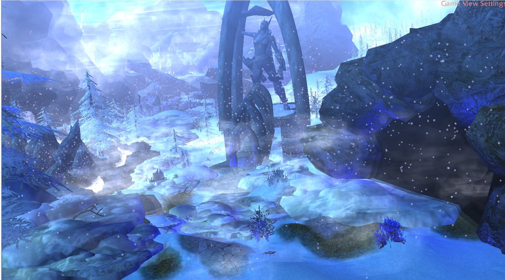
- This turned out surprisingly nice, I like the middle foreground and the left-side background with the kind of ruined city kind of theme. Sky/fog transition could be a tincy wincy bit smoother, but hey, I’m not going to hold that against you. What I AM going to hold against you, however, is some other things. The rocks are far too darkly tinted, and that middle rock in the foreground looks like its hovering. The icy-cliff-thing in the left foreground looks extremely messy and I really don’t like how the horizontal “lines” in the cloud model is showing, back there in the background, 2_P’s cloud model is tricky.
Middle ground looks decent and that statue construct looks decent, overall a rather decent terrain with a tad too many flaws to be exceptional, fixing those, however, may make this terrain really great.
Stare Cat:
3/10
Why-ever you chose those doodads among the set of doodads the map supplied, will forever be beyond my comprehension. This terrain just really doesn’t look good, too many colours, too many poor textures, some weird bubbles in front of the camera and horrible fog/sky transition. And well... Purple boxes.
Fallast:
4/10
You might ask me why I’m rating this higher than the one above? And I don’t blame you for doing so. I give this terrain a 4 because I loved where this terrain was going, I find what little has been done intriguing and I think that if you cared to finish this terrain, Fallast, it might turn out really great.
DoctorP:
5/10
I hate you. No really, I do. This terrain could’ve turned out to be an amazingly nostalgic old-school style terrain, but instead you decided to not finish it, meh.
Brilliant mix of doodads to bring out that classic wc3 feel, I love the cave part and I loved how in your former WIPs you turned the preset doodads into a zeppelin docking station, whatever happened to that idea? Nonetheless, the only thing I’ll hold against you is the awful repetition of rocks in the background, but I reckon that part isn’t “final” anyway.
Please do finish this terrain, I like it.
Elredir:
7.5/10
Love the idea, mate. Though for my part, I think there could be less foreground and more “sky-ground”
No, sincerely, while I love the idea, I don’t really love the overall execution. Personally I find the grass a tad too dominating, the rock textures, especially the bigger formation to the left, really strikes out badly, and I don’t even know what the heck is going on back there in the left corner. I’m not really a big fan of the brightness either, while I noted you saying “it’s intended” well... Intended or not, it still doesn’t look good.
Oh and that BIGASS “dock” doodad just hovering off the left island looks way out of place, not in a surreal kind of cool way, but in a plain wrong way.
Brambleclaw:
3/10
Nice blue effects.
Azurot:
8/10
No matter how much I like this terrain, and no matter how much I don’t find any outstanding flaws, I just can’t help getting over this “unfinished” feel this terrain has. The rocks could’ve had a lighter tint, the snow could’ve been a tad better and the middle left ground looks kind of bare, not to mention the background. But yeah, I’ll give you the “8” regardless.
Meepo-
3/10
Stretched textures, awkward doodads and horrible sky/fog transition, the flames are too intense and the units really don’t look good. This seems more like an attempt at making a cinematic than a terrain.
DivineLight:
3/10
I don’t really understand what’s going on in this terrain, and I furthermore don’t understand what the deal with the skull is, especially considering you’re one of two that did it. Those rocks really doesn’t fit with the night-themed feel you’re making, I don’t even know what’s going on with the sky, is the entire camera perspective supposed to be from inside a cave or something? Anyway, the skull doesn’t look horrible, but just too much sized up that some of the textures start getting stretched and as thus takes away from its beauty.
I might say more, if you want me to, try getting at me some other day.
DSgamer:
4/10
Too unfinished.
Stryderzero:
8/10
I really like this terrain, and I must say, one of your better works.
But stryder, listen and listen closely, if there’s ONE thing you should consider heavily practicing, it’s lighting. I do like the little cosy fire and the lighting you did there, but lighting is so much more than just adding a tiny glow to a little fire-pit. If you’d added some nice glow effect to the moon, changed around the monotonousness of the terrain (Read: added a little more colour) and added another layer of mountains back there on the horizon, if you did all of that. Well, then this terrain might have been a “9”.
Sigalang:
-10/10
DISQUALIFIED
Fladdermasken:
8.5/10
Frankly? General Frankly?! Generally, I’m bloody disappointed. Yeah, I know I’m giving you the highest score, yeah you are the winner of this contest, but that doesn’t mean I won’t harass you, cause I expected better. Doodad placement, lighting, fog/sky transition... All that, superb. Well, most of it anyway. I do not love the arches you used on the house and I think the rivers could be done better, the tiny transition from grass to rock in the bottom right foreground corner looks awkward and those white stalagmites close to the Moria well thing looks weird in combination with it.
I do like the surreal-angled house on the left, though.
7/10
- This turned out surprisingly nice, I like the middle foreground and the left-side background with the kind of ruined city kind of theme. Sky/fog transition could be a tincy wincy bit smoother, but hey, I’m not going to hold that against you. What I AM going to hold against you, however, is some other things. The rocks are far too darkly tinted, and that middle rock in the foreground looks like its hovering. The icy-cliff-thing in the left foreground looks extremely messy and I really don’t like how the horizontal “lines” in the cloud model is showing, back there in the background, 2_P’s cloud model is tricky.
Middle ground looks decent and that statue construct looks decent, overall a rather decent terrain with a tad too many flaws to be exceptional, fixing those, however, may make this terrain really great.
Stare Cat:
3/10
Why-ever you chose those doodads among the set of doodads the map supplied, will forever be beyond my comprehension. This terrain just really doesn’t look good, too many colours, too many poor textures, some weird bubbles in front of the camera and horrible fog/sky transition. And well... Purple boxes.
Fallast:
4/10
You might ask me why I’m rating this higher than the one above? And I don’t blame you for doing so. I give this terrain a 4 because I loved where this terrain was going, I find what little has been done intriguing and I think that if you cared to finish this terrain, Fallast, it might turn out really great.
DoctorP:
5/10
I hate you. No really, I do. This terrain could’ve turned out to be an amazingly nostalgic old-school style terrain, but instead you decided to not finish it, meh.
Brilliant mix of doodads to bring out that classic wc3 feel, I love the cave part and I loved how in your former WIPs you turned the preset doodads into a zeppelin docking station, whatever happened to that idea? Nonetheless, the only thing I’ll hold against you is the awful repetition of rocks in the background, but I reckon that part isn’t “final” anyway.
Please do finish this terrain, I like it.
Elredir:
7.5/10
Love the idea, mate. Though for my part, I think there could be less foreground and more “sky-ground”
No, sincerely, while I love the idea, I don’t really love the overall execution. Personally I find the grass a tad too dominating, the rock textures, especially the bigger formation to the left, really strikes out badly, and I don’t even know what the heck is going on back there in the left corner. I’m not really a big fan of the brightness either, while I noted you saying “it’s intended” well... Intended or not, it still doesn’t look good.
Oh and that BIGASS “dock” doodad just hovering off the left island looks way out of place, not in a surreal kind of cool way, but in a plain wrong way.
Brambleclaw:
3/10
Nice blue effects.
Azurot:
8/10
No matter how much I like this terrain, and no matter how much I don’t find any outstanding flaws, I just can’t help getting over this “unfinished” feel this terrain has. The rocks could’ve had a lighter tint, the snow could’ve been a tad better and the middle left ground looks kind of bare, not to mention the background. But yeah, I’ll give you the “8” regardless.
Meepo-
3/10
Stretched textures, awkward doodads and horrible sky/fog transition, the flames are too intense and the units really don’t look good. This seems more like an attempt at making a cinematic than a terrain.
DivineLight:
3/10
I don’t really understand what’s going on in this terrain, and I furthermore don’t understand what the deal with the skull is, especially considering you’re one of two that did it. Those rocks really doesn’t fit with the night-themed feel you’re making, I don’t even know what’s going on with the sky, is the entire camera perspective supposed to be from inside a cave or something? Anyway, the skull doesn’t look horrible, but just too much sized up that some of the textures start getting stretched and as thus takes away from its beauty.
I might say more, if you want me to, try getting at me some other day.
DSgamer:
4/10
Too unfinished.
Stryderzero:
8/10
I really like this terrain, and I must say, one of your better works.
But stryder, listen and listen closely, if there’s ONE thing you should consider heavily practicing, it’s lighting. I do like the little cosy fire and the lighting you did there, but lighting is so much more than just adding a tiny glow to a little fire-pit. If you’d added some nice glow effect to the moon, changed around the monotonousness of the terrain (Read: added a little more colour) and added another layer of mountains back there on the horizon, if you did all of that. Well, then this terrain might have been a “9”.
Sigalang:
-10/10
DISQUALIFIED
Fladdermasken:
8.5/10
Frankly? General Frankly?! Generally, I’m bloody disappointed. Yeah, I know I’m giving you the highest score, yeah you are the winner of this contest, but that doesn’t mean I won’t harass you, cause I expected better. Doodad placement, lighting, fog/sky transition... All that, superb. Well, most of it anyway. I do not love the arches you used on the house and I think the rivers could be done better, the tiny transition from grass to rock in the bottom right foreground corner looks awkward and those white stalagmites close to the Moria well thing looks weird in combination with it.
I do like the surreal-angled house on the left, though.
Yadda, yadda, yadda, if I forgot someone out of forgetfulness, then I am sorry. I might have skipped some, though, because I didn't see a good reason to judge them. Thank you all for participating, and may you keep on terraining!
It shouldn't be, you should aspire to more!
I didn't know "adding links to the judgings for the pleasure of watchers of a contest"
was part of my non-existent work-description. >.>
However, fuck it. I'll make an effort to do it the next time around.
Next time can we have links in either the OP or this post^?
I'm lazy and it's what you're paid for.
And by paid I mean volunteer your time and effort.
I didn't know "adding links to the judgings for the pleasure of watchers of a contest"
was part of my non-existent work-description. >.>
However, fuck it. I'll make an effort to do it the next time around.
Deleted member 212788
D
Deleted member 212788
Wow totally forgot about this , guess i will finish the terrain later eventually
I hear ya. Totally neglected it. Oh well, there's always next time.
- Joined
- Sep 19, 2011
- Messages
- 829

How did I missed this? Probably for been inactive and busy working on my poroj. Is this still going? Doesn't seem to be closed.
If it still is can I use shadow maps + bump to make my terrain?
If it still is can I use shadow maps + bump to make my terrain?
-----------------
Edit
I'm too late, maybe next time...
Last edited:
The official judgings have been processed, so you can't take part in the actual contest.
(I'll handle the official adding of the winner in the hall of fame at some point...)
However! If you feel like it, or if anyone feels like it, you are completely free to make an entry and
notify me when it's done, then I'll gladly review it, but it wont be counted as part of the contest.
- Might be good practice, though.
fladdermasken
Off-Topic Moderator
- Joined
- Dec 27, 2006
- Messages
- 3,688


Kinda unsatisfying how so many promising entries dropped out. But then again, yay me!..
In my book those flaws don't add up to "bloody disappointed" standards, but I guess the touch-up was a bit sloppy and subpar.Keiji said:Frankly? General Frankly?! Generally, I’m bloody disappointed.
Dang, didn't have your book when I did that review >.>
- I only had my own.
And in that book, it states extraordinary high expectations from you, which is why I was
"bloody disappointed," well... That and you of all people should know how I exaggerate for effect.
<.<
- I only had my own.
And in that book, it states extraordinary high expectations from you, which is why I was
"bloody disappointed," well... That and you of all people should know how I exaggerate for effect.
<.<
- Joined
- Sep 19, 2011
- Messages
- 829
Toby: i'm in BABY! Toby: Wait, Is it Over? Toby: Omg I missed it.
So Here's a idiot that decided to join a late christmas party. Well I'll at least have one more terrain picture in my gallery.
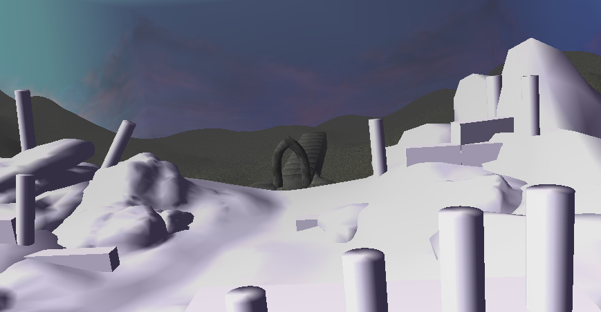
Finally got an idea what I wanted to do, It's just a rough sketch for now but I have a clear image of what I want to make. I'll be using only custom models made by me from scratch in 3ds max. I'll combine all possible techniques I now like shadow mapping, bump, parallax, etc to achieve the best possible visual resorts in warcraft. At the moment I only made the foreground with a simple geometry plan. The theme will be ruins of cours and the geometry will get enhanced details in Zbrush.
I hope you guys will enjoy this as much as I will and maybe I'll try not to miss the second contest.
So Here's a idiot that decided to join a late christmas party. Well I'll at least have one more terrain picture in my gallery.
Finally got an idea what I wanted to do, It's just a rough sketch for now but I have a clear image of what I want to make. I'll be using only custom models made by me from scratch in 3ds max. I'll combine all possible techniques I now like shadow mapping, bump, parallax, etc to achieve the best possible visual resorts in warcraft. At the moment I only made the foreground with a simple geometry plan. The theme will be ruins of cours and the geometry will get enhanced details in Zbrush.
I hope you guys will enjoy this as much as I will and maybe I'll try not to miss the second contest.
- Joined
- Sep 19, 2011
- Messages
- 829
[Bump]
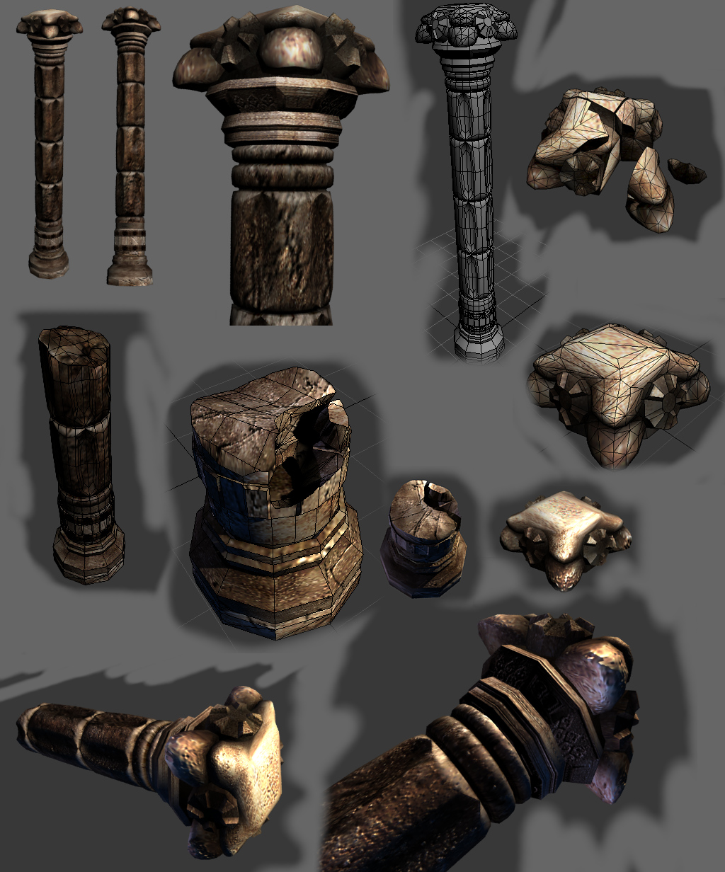
Lately I've been all over the place so I haven't had much time to work on this. This terrain will be special as i will attempt to make all models from scratch which will also be uploaded in a pack. So Here's a update, working on the pillars and I got a major idea how the ruins will look like. The model is very HQ high poly as it is intended for terraining but could also be used in playable games if anyone has this wishes, I would recommend a optimization for it. I'm pretty much disappointed in how this turned out because I can't implement all the details in the model all thanks to the wc3 engine and limits. PS: The down part of the column turned out like crap. So I might include a version with bump that works in wc3.
After I finished all the models I'll probably upload them on the hive so expect a download of this soon enough, Way before I finish the terrain!
Last edited:
- Joined
- Mar 21, 2008
- Messages
- 6,417


Just wow.
Deleted member 212788
D
Deleted member 212788
This terrain is getting on the next Top 10 list, I'm sure of it!
- Joined
- Sep 19, 2011
- Messages
- 829
I hope so, have a feeling that it's going to turn out the way I imagined somehow... might be my masterpiece but it's to soon to start talking big since this is still in brainstorming mode.
- Joined
- Sep 19, 2011
- Messages
- 829
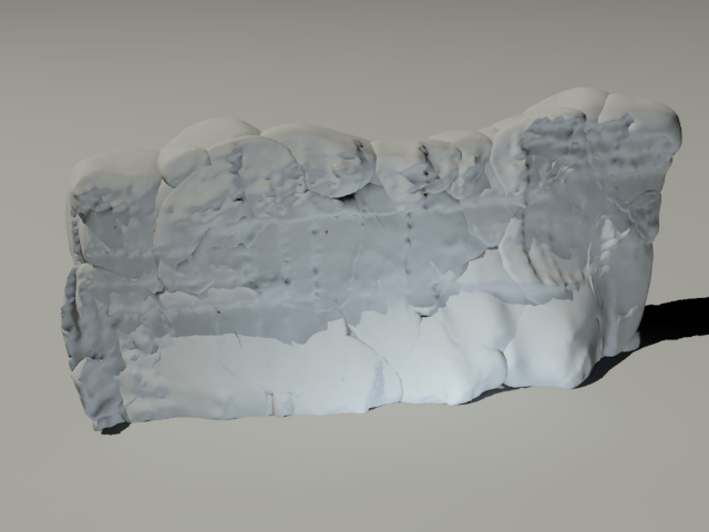
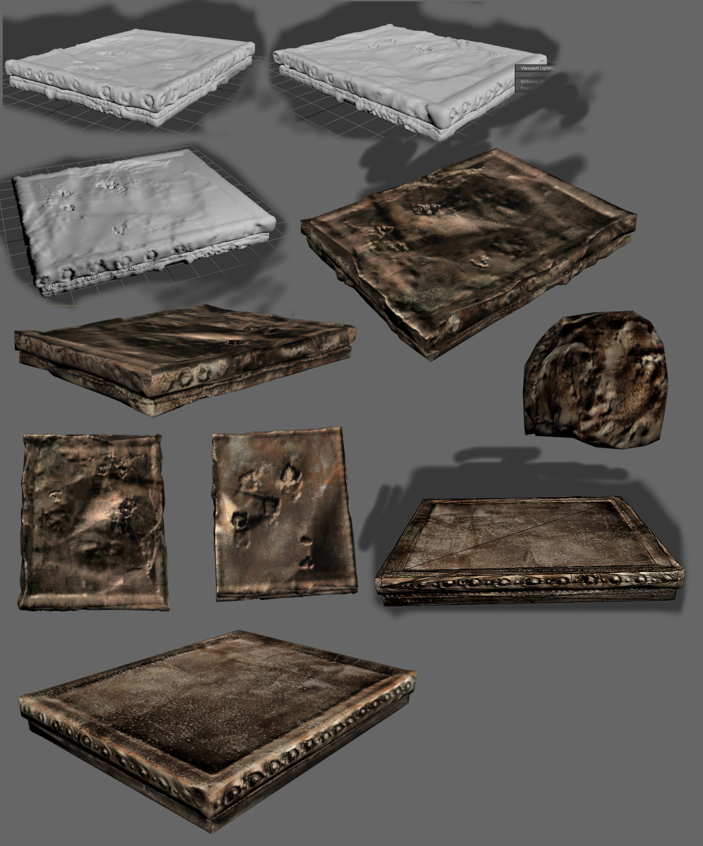
I have been feeling sick the last few days and no matter how much i tried to work on something I just couldn't. So I'll show you a very basic start on the ruined walls. It's fragmented in rayfier and tesaleted with Zbrus so yeah, a lot of poli's for some round stones. Just hope I can at least implement a third of the details in wc3. When I'll recover I'll try to be more inventive with the walls.
- Joined
- Sep 19, 2011
- Messages
- 829
No it's just the high poly models but they will have bump baked in.
Yes I feel the same way but using so all that geometry is going a little overboard because I'll have to make this available for download an as low poly as I can for people who want to add them in playable maps.
The scene is rendered in 3ds max, simple lights (2) with mental ray, that's it.
You should try rayfier for physics and fragmentation if you didn't already I understand that it works with apex clothing, just started using it. Maybe it does not present all those problems we had with Havok.
Edit:
Oh yes, there is also the mental ray ambient occlusion material that ads awesome occlusion on everything. It's a lot easier and faster to use than the daylight system wich takes forever to render but gives you accurate results. The first pic has occlusion material on, I forgot to mention.
- Joined
- Sep 19, 2011
- Messages
- 829
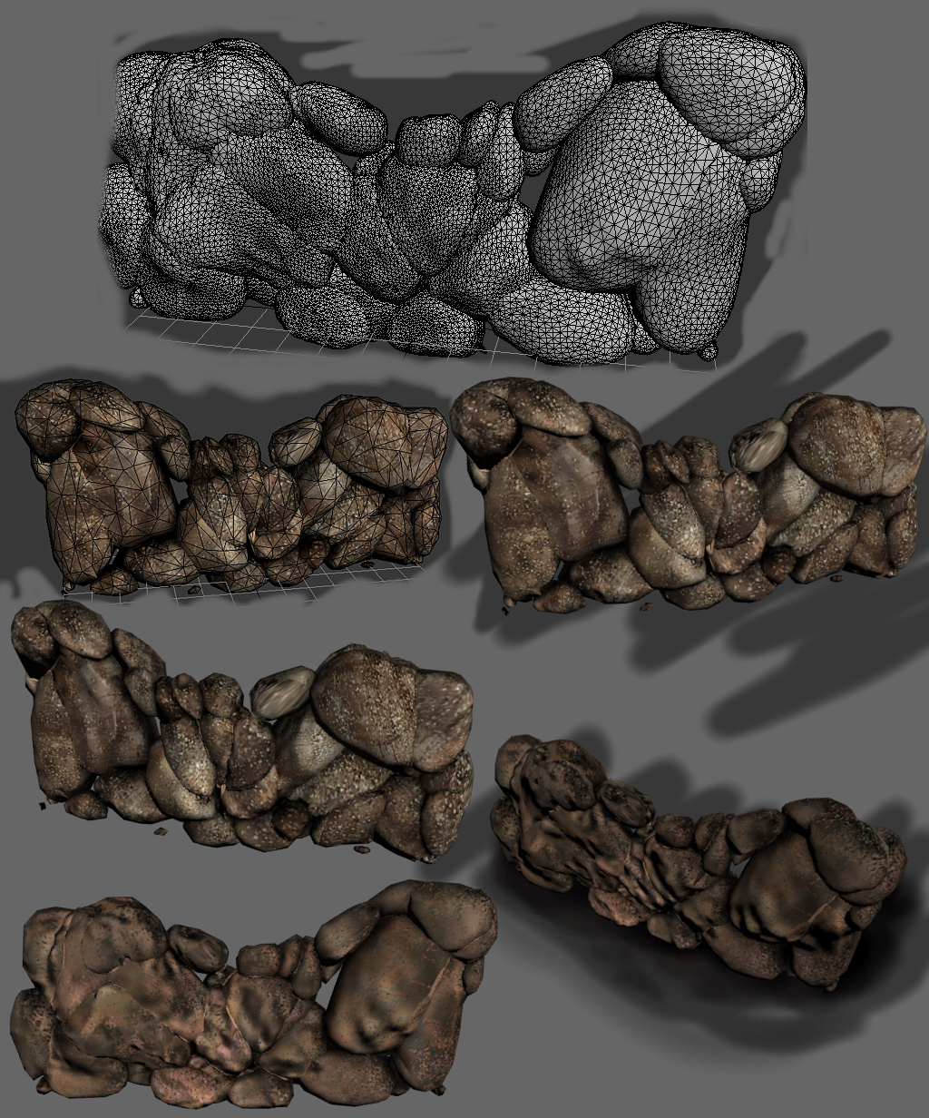
The continuation of the rock walls.
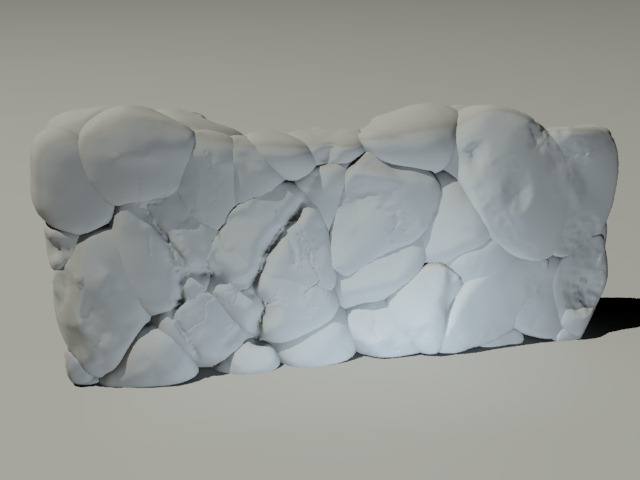
I knew it, the level of detail from the original model isn't even as close as I hoped. After 3 trials I ended up with this disgusting flat low poly wall that doesn't even resemble the original if it weren't for the projection... + crappy texture resolution... I added the original in the pic for you to get a idea how dens the geometry realy is. Unfortunately no game engine can handle that much I think. I am starting to have a feeling that adding normal maps and other tricks in games isn't so much of a big deal since it doesn't do much in the first place (talking about normals, tessellation is another matter) that it mostly goes down to the artist to make it appealing. The model is fine for everyone that wants to use it for whatever but I won't lower myself so much than to use recyclable trash in my masterpiece terrain so I am going to remake it again, of Course I'll make it available for dl. The second model turned out just right on the other hand.
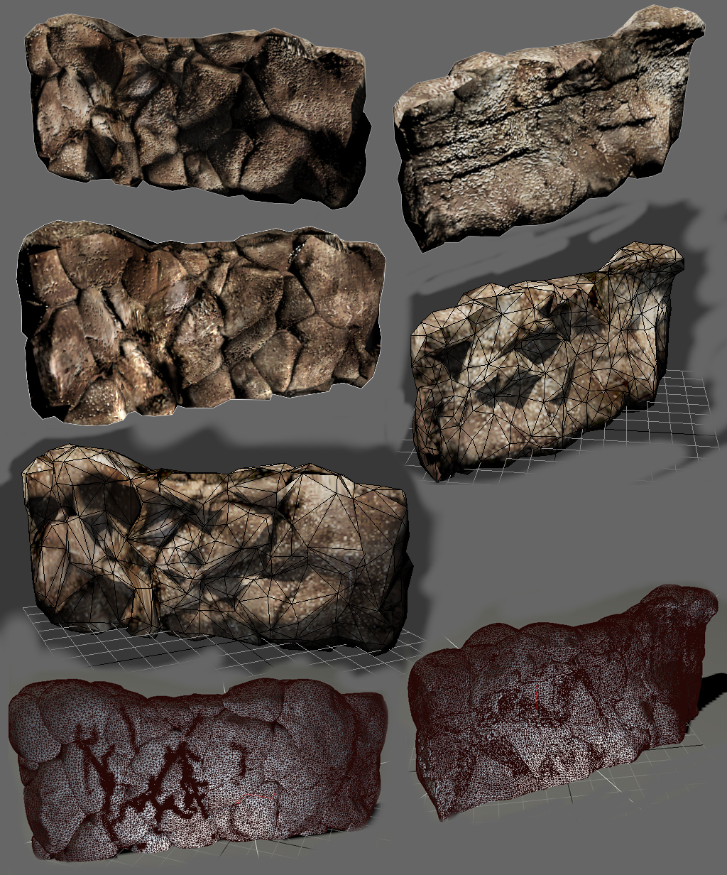
The second Wall model was optimized from the original, also by practising like crazy so many time in wall making I discovered a really neat and efficiently fast way to create and optimize clear cut such geometry. As you might of guessed the model is made out of multiple rocks flattened together. It would be difficult to uv not to mention optimize the inside polygons that are overlapping in a cup of "messy disaster" but after some searches I found some tools that really worked professional on that...
More samples. The models have only diffuse texture with baked ambient occlusion + a little tiny bit of bump. The reason, Il add real bump to them later and see how they look ingame. I know that someone like Keiji might be thinking, so where's the terrain? I'll have to finish all my assets before I even start terraining.
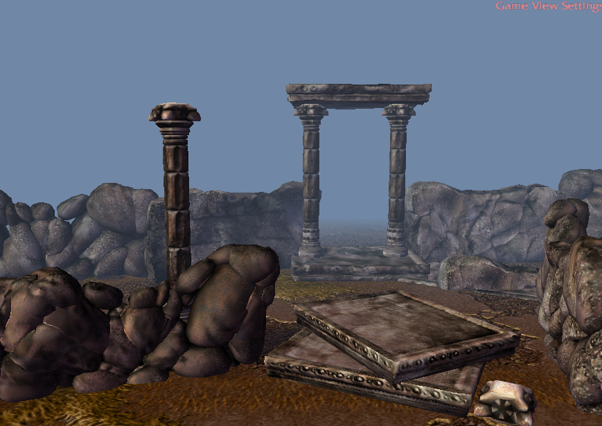
So here are the models in wc3 engine and they look...
I think I'm going to test how they look in Starcraft.
Might add some more models, the reason why I left empty spaces in the pictures, keep watching...
All this modeling from scratch is harder than I thought and I haven't done anything to stylish yet. I'll have to give credits to Talavaj for his workflow on models.
Stay Tuned For More!
I knew it, the level of detail from the original model isn't even as close as I hoped. After 3 trials I ended up with this disgusting flat low poly wall that doesn't even resemble the original if it weren't for the projection... + crappy texture resolution... I added the original in the pic for you to get a idea how dens the geometry realy is. Unfortunately no game engine can handle that much I think. I am starting to have a feeling that adding normal maps and other tricks in games isn't so much of a big deal since it doesn't do much in the first place (talking about normals, tessellation is another matter) that it mostly goes down to the artist to make it appealing. The model is fine for everyone that wants to use it for whatever but I won't lower myself so much than to use recyclable trash in my masterpiece terrain so I am going to remake it again, of Course I'll make it available for dl. The second model turned out just right on the other hand.
The second Wall model was optimized from the original, also by practising like crazy so many time in wall making I discovered a really neat and efficiently fast way to create and optimize clear cut such geometry. As you might of guessed the model is made out of multiple rocks flattened together. It would be difficult to uv not to mention optimize the inside polygons that are overlapping in a cup of "messy disaster" but after some searches I found some tools that really worked professional on that...
More samples. The models have only diffuse texture with baked ambient occlusion + a little tiny bit of bump. The reason, Il add real bump to them later and see how they look ingame. I know that someone like Keiji might be thinking, so where's the terrain? I'll have to finish all my assets before I even start terraining.
So here are the models in wc3 engine and they look...
SHOCKINGLY HIEDEOUS
I think I'm going to test how they look in Starcraft.
Might add some more models, the reason why I left empty spaces in the pictures, keep watching...
All this modeling from scratch is harder than I thought and I haven't done anything to stylish yet. I'll have to give credits to Talavaj for his workflow on models.
Stay Tuned For More!
Deleted member 212788
D
Deleted member 212788
I agree with Talavaj. The Pillars look dendi though the rocks need a bit more texture added to them - such as the ones on the right. Maybe a simple bump map?
- Joined
- Sep 19, 2011
- Messages
- 829
Pffffff..... They do look like potatos! The wall on the left is the same as the wall on the left background and the wall on the right foreground, also the same as all the walls in the second image. The thing is, because of the way I mixed the normals in the diffuse to get this diffuse it turned out half rough half smooth which is apparent in all the models if you notice, some parts are more smooth. It was in the plan for the ruins to be somewhat smooth but not this much, can be easily fixed, I think.
- Joined
- Sep 19, 2011
- Messages
- 829
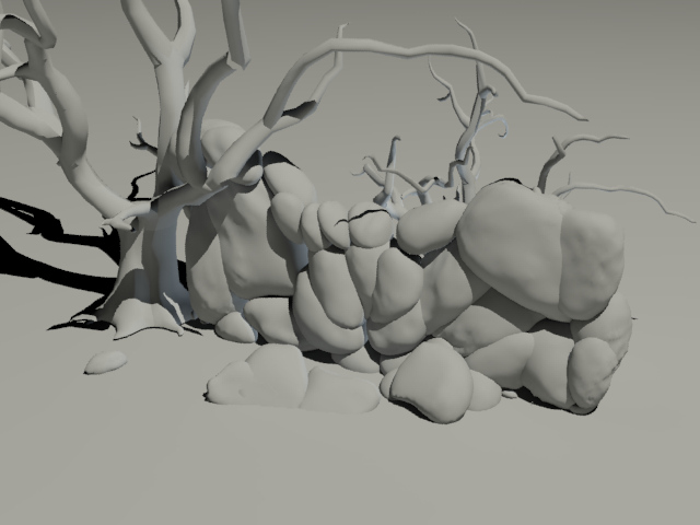
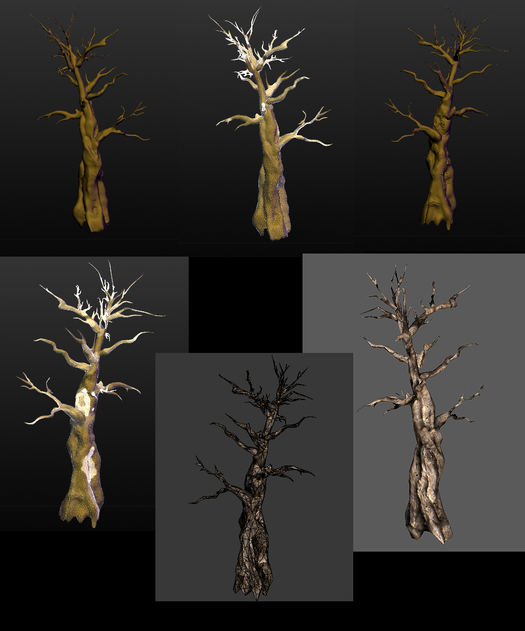
Leaving the potatoes aside I started to work on the trees. My first tree started from a 3ds max tree painted in Sculptris. What you see in the picture is the HQ version but was trying to compress it and add it with the branches ingame, it still is wc3 unfriendly 900 kb and mixing geometri = death. The problem is the number of vertexes, probably I'll have to remake the branches as billboards.
For this ruins pack I'll also try to make my own plants with textures from my back yard.
I'll be leaving you with this unfinished image for now and will come back when I got actual assets and work done.
For this ruins pack I'll also try to make my own plants with textures from my back yard.
I'll be leaving you with this unfinished image for now and will come back when I got actual assets and work done.
Last edited:
- Joined
- Sep 19, 2011
- Messages
- 829
UPDATES

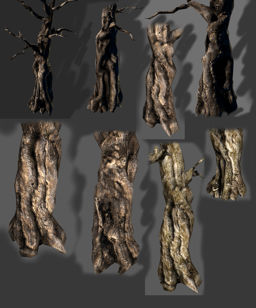
Making the diffuse is trickier than it seems, I screwed up the first time for the tree but I got it right after a few more trials. Because I implemented normals and occlusion in the diffuse I can't use the bump technique, it darkens the model too much. Bump tech seems to work on plain diffuse textures as clean of bumpage as possible. If I get any more wonderful diffuse textures like this I might consider dropping the bump but it works perfectly with shadow maps, a example would be in the picture, the shaded trees. The majority of models from the pics are wc3 shaded with shadow maps, exception the white max shadow studies.
Tree Evolution
How I got to the final result...
Materials - Bump 1, Bump 2, Oclusion 1, Oclusion 2, specular, cavity, height map etc. I render more than several textures and merge them in the diffuse to get as much detail as possible.
More ruines
High poly projections on low poly models, no bumping used, just the complete diffuse how I mentioned above.
Textures
Work on rocks
Working on this pack is definitely fun and I think I'm getting better at making diffuse textures but I'll start working on vegetation and terrain from here. Slowly but shortly the pack is been developed.
If you don't know what Sculptris does, it's a 3d sculpting program like Zbrush I use for making detailed models. Here's an example of how powerful this apparently simple tool is. Using geometry you can sculpt anything from a simple sphere just by touching it.
Last edited:
fladdermasken
Off-Topic Moderator
- Joined
- Dec 27, 2006
- Messages
- 3,688
I really like this and all but maybe you split this from here 2425751 to a new thread.
Also, Keiji,
Also, Keiji,
Award pl0x. :]Award
25 Reputation to the winner, second and third place gets commendations.
- Admin Sponsored -
- Joined
- Sep 19, 2011
- Messages
- 829
Guess I should, wanted to make a terrain for exercise and it seems I went overboard with modeling. My intention was to make a thread for the model pack and one for the terrain, also pasting the finished version here.
Think it's time to ponder a new thread!

Thread moved here --->
http://www.hiveworkshop.com/forums/terrain-board-267/toby-ruined-pack-243463/#post2435649
Think it's time to ponder a new thread!
Thread moved here --->
http://www.hiveworkshop.com/forums/terrain-board-267/toby-ruined-pack-243463/#post2435649
Last edited:
- Status
- Not open for further replies.
Similar threads
- Replies
- 21
- Views
- 2K
- Replies
- 119
- Views
- 51K