- Joined
- Mar 19, 2005
- Messages
- 490
A few words before even beginning:
I am German, hence my CS4 is german aswell…
I do hope its not that big of a problem, as the buttons stay at the same spot in every language and I won’t let out any step without a picture!
Before somebody posts something like “this is not warcraftish”, I have to admit that its not the same style as most other textures in the .mpq. Still these are really effective ways of making textures and with changing some of the used values I guess you’ll be able to replicate the wc3 style with these tutorials aswell!
=================================================
SHADING INTRODUCTION
=================================================
Most newer games provide the support of normal-, bump- and displacement maps, which all are greyscale images.
They all (in slightly different ways) provide more mesh depth, little wrinkels dont need to be modeled, but are
painted onto one of the maps.
The renderer then automatically detects how light or dark a pixel is and detects how the shadow flow needs to be rendered out.
Warcraft 3 doesnt have this feature!
So we need to paint the reflection, the bumpiness, the color and the highlights/shadows manually onto the texture.
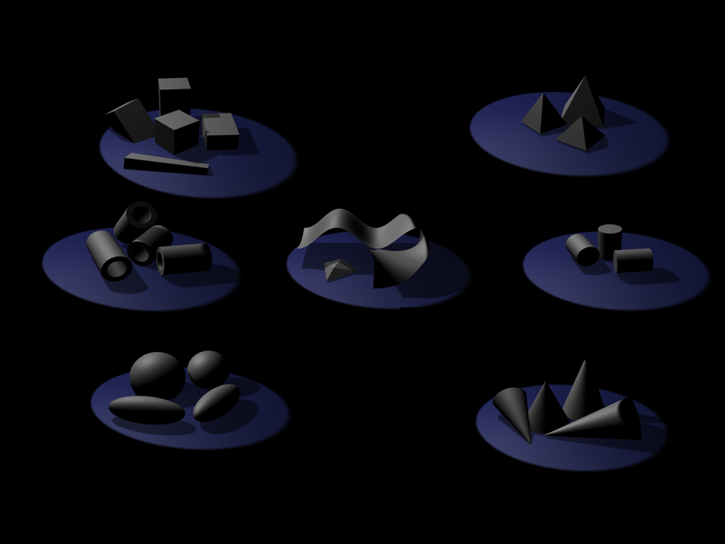
Before going into the details on how to create different effects for different materials I set up a really big image here.
Its all about the shading, see how the different meshes shade differently?
Try to get an eye for that!
(I myself have this as my desktop background, so everytime I boot or shut down my computer I take a look. Funnily i discover some new bit every time )
)
=================================================
LEATHER
=================================================
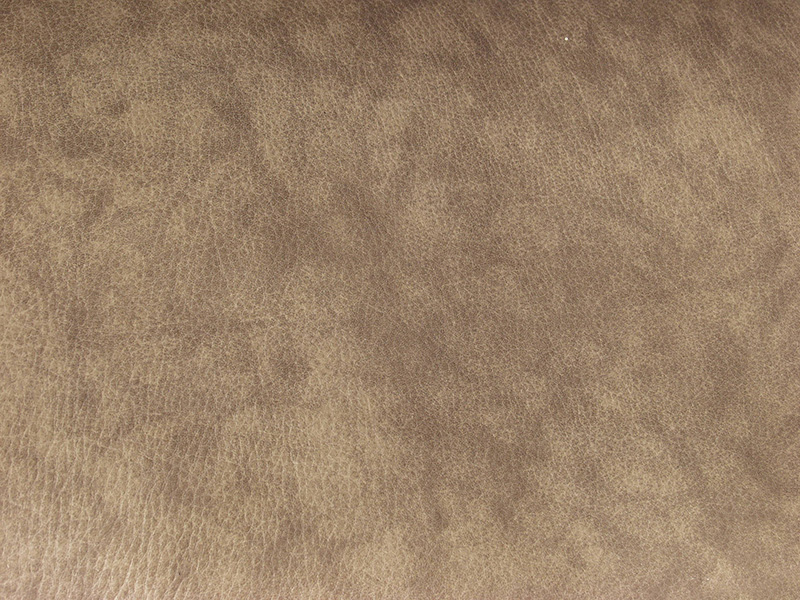
I found this leather texture at www.cgtextures.com and is called “Leather0021_2_S”
It is royalty free, so don’t bother with any copyright issues!
Only thing you need to keep an eye on at this stage:
Don’t take any texture with big scars or anything obvious, as otherwise you will have one and the same obvious thing clustered all over your texture….
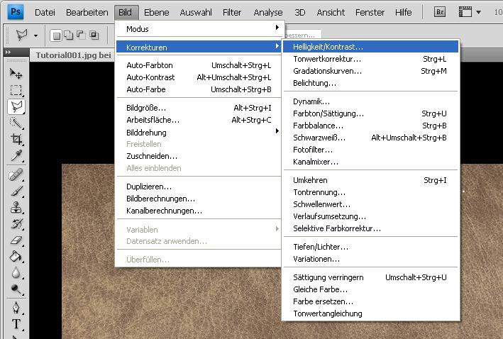
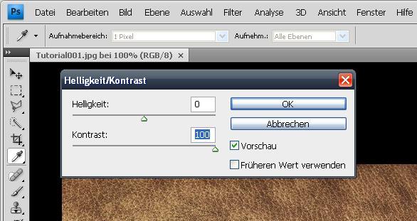
First of all ‘m going to set the conrast to +100%
This will help to make the end texture bumpier…
Select a round area in the middle of the leather. While dragging the circle hold Shift, this way the x- and y- axis will be scaled at the same value
(remember that you can edit it with richtclick -> transform selection)
Don’t get to near to the border pixels, as otherwise we wont have a round brush, but one which is almost round but has an edge on one side

Now rightclick again and click on “refine edge” (I do hope that this is the corresponding english name for the german button)
You can see the numbers I put in in my texture, they may vary, depending on the texturesize you are using…
Just make sure that the selection doesn’t crash with the image border and the texture fades in well radially.
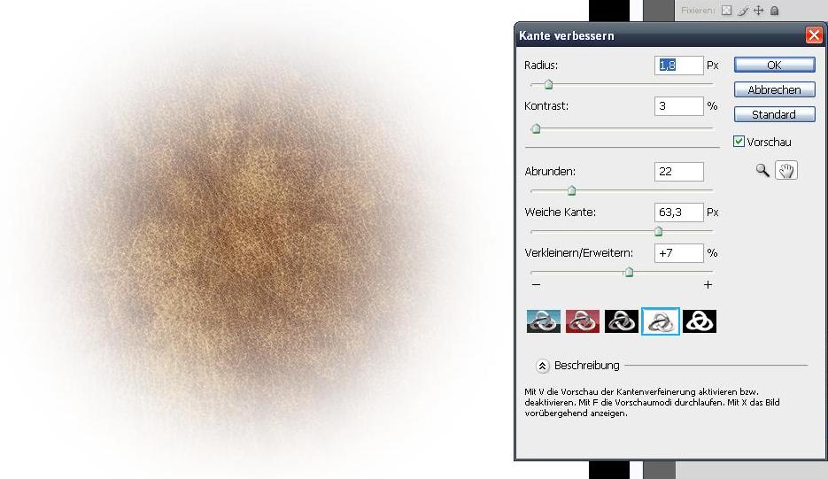
Click the “OK” button and cut out your selection (either with Ctrl + X or Edit -> Cut)
Open up a new document (Ctrl + N) , size 512x512 pixels.
Copy your selection onto the new document
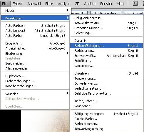
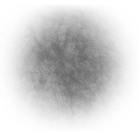
Now we will make it a greyscale, Image -> Corrections -> Color / Saturation (Ctrl + U)
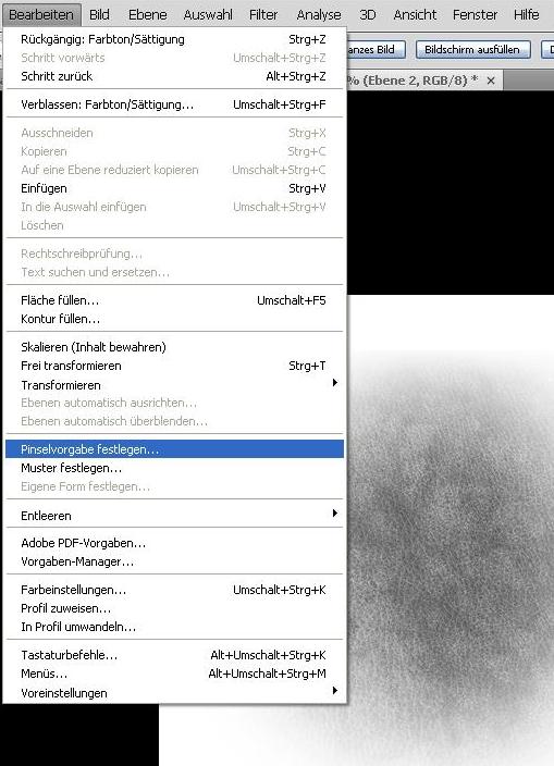
Now click on Edit -> Brush Presetting and you made a custom brush! Congratulations!!
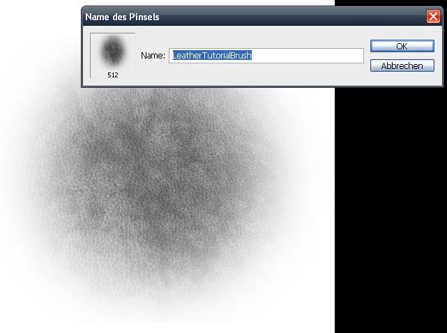
Afterwards invert you picture (Ctrl + I) and set it to a new custom brush…
I tend to name the first one something like “LeatherCustomBrush” and the second one “LeatherCustomBrushInverted”, but you can leave it default as you wish!
Checklist:
What should you have learned by now, what should you have to show until now?
After having worked out all these steps you wont need these anymore for new textures (except the new ones need ot structures and you want to make other leather variations) but overall you have your texture brushes completely set up now.
This is wherer the actual texturing begins:
Set up a color palette, it needs 3 color variations of brown (don’t get to detailed here which color it should be like, we are going to modify that later.)
One example would be:
Highlights: #bca28b
Colorl: #86705c
Shadows: #40372f
A tip on the side:
I recently discovered the Color Fields in the right hand upper part of my viewport.
You can select any color on your canvas or the color picker tool and afterwards click on a free spot of the color field…
Now save the color and it’s the last one in the row of colors.
You can now have any tool activated, but when moving you cursor there it will be converted to the eyedropper tool automatically and you can pick up your color again.
This way you don’t have any annoying image snippets with color variations and don’t need to pick it up with the eyedropper everytime you need the color.
Good, now set up a new document (or outline the parts you want to texture with the polygon cut tool) and fill the whole space with the base color (#86705c).
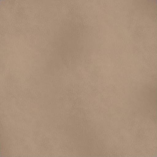
Now set your color to the highlight (#bca28b), a suitable size (I myself tend to use a really large brush, like 512 pixels big) and go over your texture gently. Make the brushes overlay, but not too much, as then the color will be to one sided in these spots.
Afterwards do the same with the shadow color (#40372f) and the inverted brush
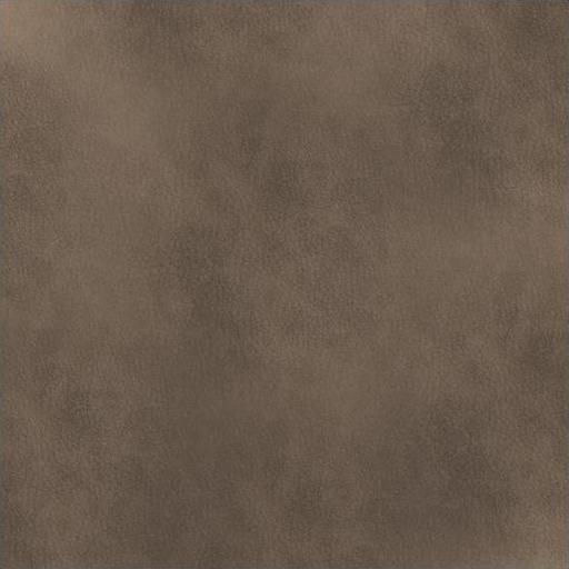
Now yet again, add 100% more contrast (I wont tell you how again, you already did that, remember?)
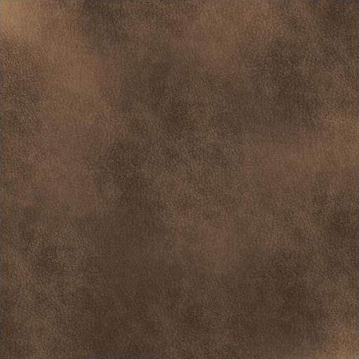
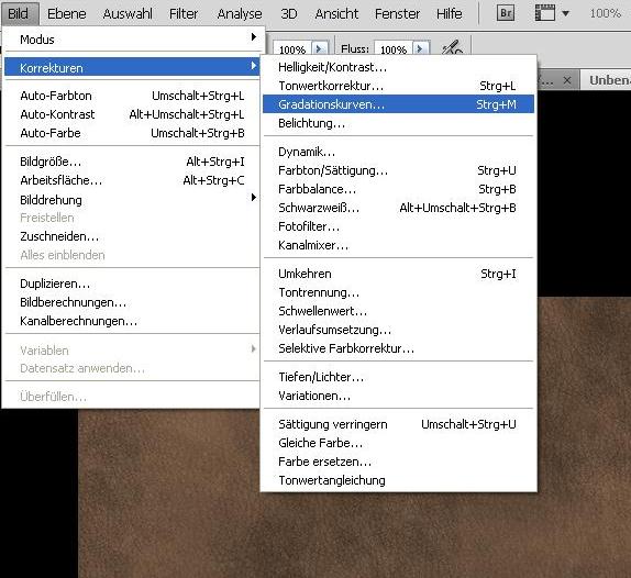
Now change the Gradiation Curve.
You can find it under Image -> Corrections -> Gradiationcurves (Ctrl + M)
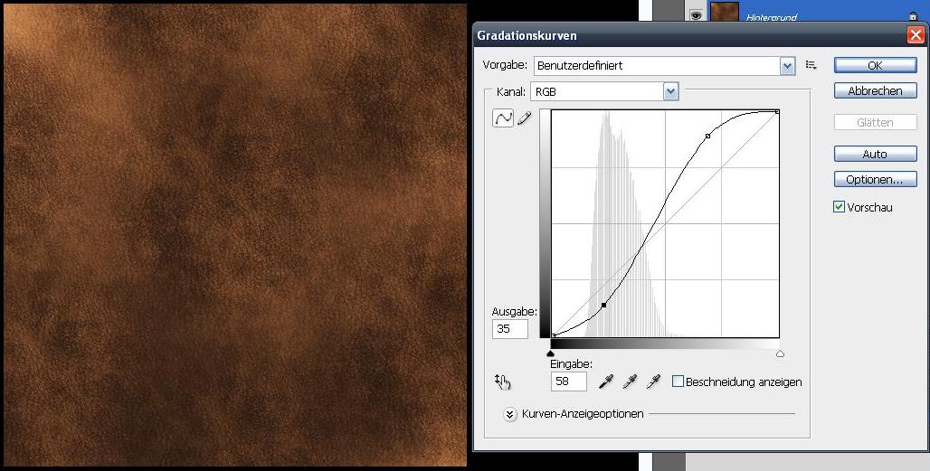
Afterwards add a bit of (enter correct name here plz) -> I searched for 10 minutes for a dictionary, I don’t want to anymore, but you’ll see what I mean in the picture! -_-
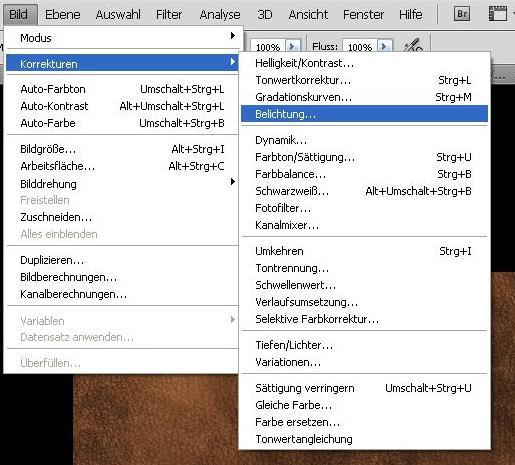
Now add a bit of gamma correction, its value 1 here, but may differ from texture to texture!
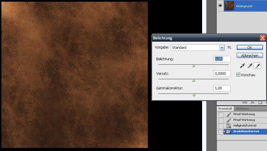
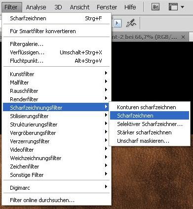
Last but not least add the sharpen filter Filter -> Sharpenfilter -> Sharpen
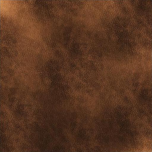
Now everything that is left is the shading.
You may ask yourself how the heck shall I get bright and dark areas in there without destroying the structure of the leather?
Very quick, I don’t want to get too much into detail here:
Add a new layer, paint in your highlights with the bright color and the shadows with the dark one you used before and set the layer blending mode to “copy together”
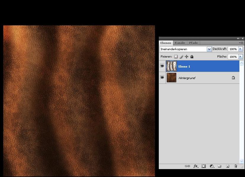
Done!
You now have a leather pattern…
Congrats!!
=================================================
METAL
=================================================
Set up a new working space and fill the canvas with a middle light grey
I chose #919191

Our highlight color will be #d2d2d2 and the darkest color will be 565656.
Set up a custom brush:
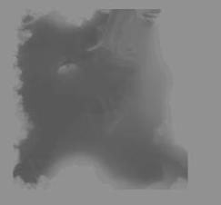
This is the brush's tip. I think it shipped with PS, so you might actually have the same brush in yout list!
It's called Sampled Brush 1
Give it the following settings:
Opacity: 25%
Formsettings:
Size Jitter: 100%
Minimum Size: 50%
Angle Jitter: 100%
Spraying: (I hope thats the coorect term)
Spraying: 150%
Count: 1
Count Jitter: 75%
Other Settings:
Opacity Jitter: 40% (if you have a tablet this is usefull, as you can set it to the pen's pressure)
Flow Jitter: 60%
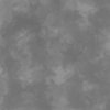
You should get something like this

Now select our dark color and drag the brush once or twice over the whole canvas. (IN "N" or "Z" strokes)

Afterwards do the same with the light color, but paint once or twice more on the canvas!

Now set up a second custom brush:
This time the "Splatter 24 Pixels" one, it should be located somewhere in your brush list aswell.

Apply the following settings
Opacity: 20%
Formsettings:
size Jitter: 100%
Minimum Size: 50%
Angle Jitter: 100%
Spraying:
Spraying: 800%
Anzahl 1
Count Jitter: 75%
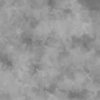
It should look something like this now

Take your light color, set the brush size very large and brush over the canvas again for one or two times!
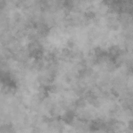
Now we want it to have a lot more shininess, so we gonna set the conrast to +100
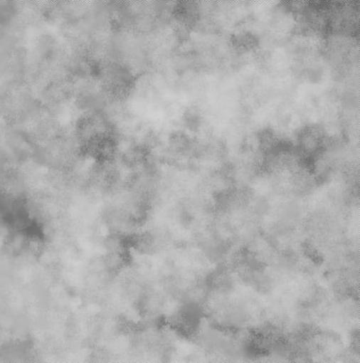
You can now shade as you want!
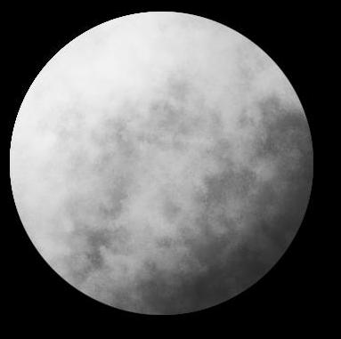
As this is only greyscale you can go with dodge and burn, but whatever suits you best will work!
My texture looks like this:
=================================================
LOINCLOTH
=================================================
First of all you are going to create an own custom brush!
Do so by opening up a new document and filling the background by white.
Now do a few strokes in one direction (so basically parallel lines) and erase the ends to resemble a non square
overall shape
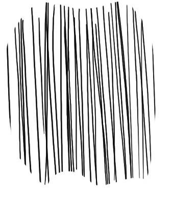
Now take the eraser, make sure your background color in the toolbar is white and erase the upper and lower part of the brush, so that it fades in
Click on Edit -> Add Brush Presetting (or something appropriate)
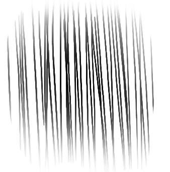
Erase everything again and make the background black.
Select the brush again, turn it 90° in the brush presets window.
Also apply following settings:
Formsettings:
Angle Jitter: 0% (but set the controller to "direction")
Colorsettings:
Color Jitter: 2%
Saturation Jitter: 1%
Hue Jitter: 1%
Other Settings:
Opacity Jitter: 25%
Flow Jitter: 66%
Your brush preview now should look like this (more or less)

Now choose the color you want your loincloth to be.
I'm going with a green here, but you can use whatever you like!
Just be sure that it is a very dark tone and 25% opacity!
Brush vertically a few times...
Dont bother if the black appears between the strokes!
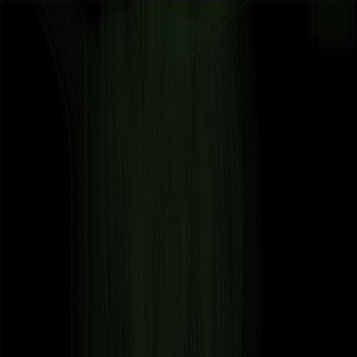
Now take another color, same green, but a bit lighter and go over it horizontally!
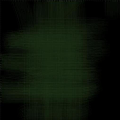
Repeat this (taking a lighter color, changing brush direction) a few times, some 3 or 4 more colors should do
And this is what you should have by now:
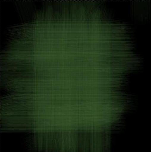
Now again take a very dark tone of your color and set the opacity to 10
Stroke a few times in both directions, doesnt matter in which direction first or how often, just as long as it look okay!
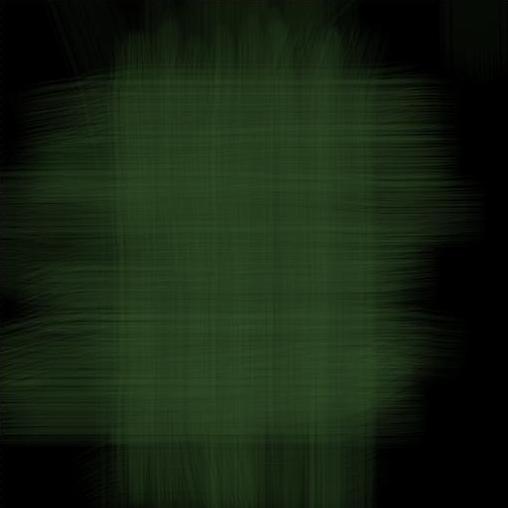
Again, play around with the gradiation curve (CTRL + M)
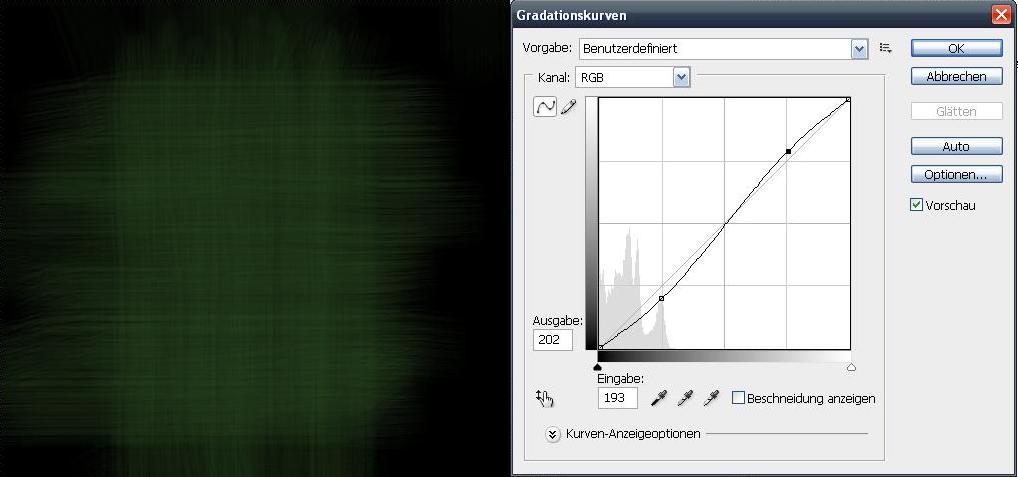
Now add a new layer (CTRL + Shift + Alt + N)
Take a scratchy brush (doesnt matter which one really, it should only suit what you are aiming for)
I chose "Chalk 60 Pixels", which i think came with PS...
Apply these settings:
Formsettings:
Size Jitter: 100%
Angle Jitter: 100%
Roundness Jitter: 100%
Spraying:
Spraying: 250%
Color Settings:
Color Jitter: 10%
saturation Jitter: 1%
Hue Jitter: 2%
Pick up a dark color and now paint over your loin with 100% opacity (but make sure you are working on hte right layer!)
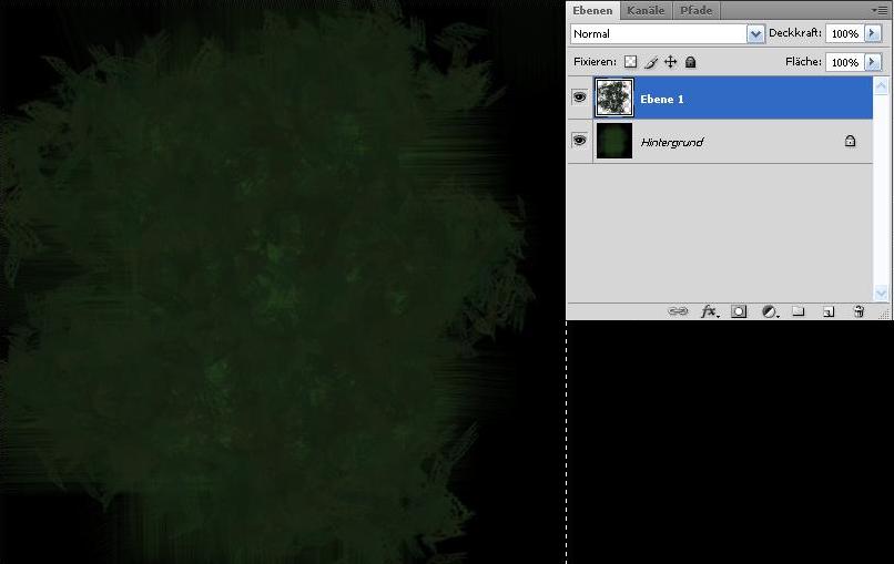
Edit the layer blending and opacity settings as it suits you!
Mine worked out quite well set to "darker color" with 30%
Reduce it to one layer (CTRL + E)
Make your work color black, take your first brush with 10% opacity now and paint a few strokesi n both directions
Clean up the parts you dont need and your texture is done!
The good thing with this method is that you can easily adjust the flow of the loin with your brush strokes...
=================================================
STONE
=================================================
Although I wrote down the names of the brushes I used, I forgot to write down the settings aswell...
I'm sry for that!
But it shouldnt be a big deal...
Just add a few jitters, keep in mind to not jitter the opacity too much, we want to make rock.
And that is chunky, so we need contrast!
the first brush we are using is the "Watercolor Loaded Wet Flat Tip".
It should be in your standard brush list...
NOw make it 20% opacity, black and fill the background a few times with your brush strokes...
Dont get to even here...
After some strokes concentrate on a few areas, leaving the others lighter!
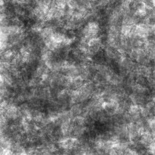
Now do the same with a slightly more opaque brush, I used 40 oOpacity.

Now click on "channels", it is located directly next to your "layer" window.
Add a new alpha channel by clicking on the "add new layer" button, it is highlighted on
the next image
Now again take your brush, set the opacity to 20% and a white color.
Now paint onto your canvas...
Again, this is going to be bumpy, so try to contrast it enough!
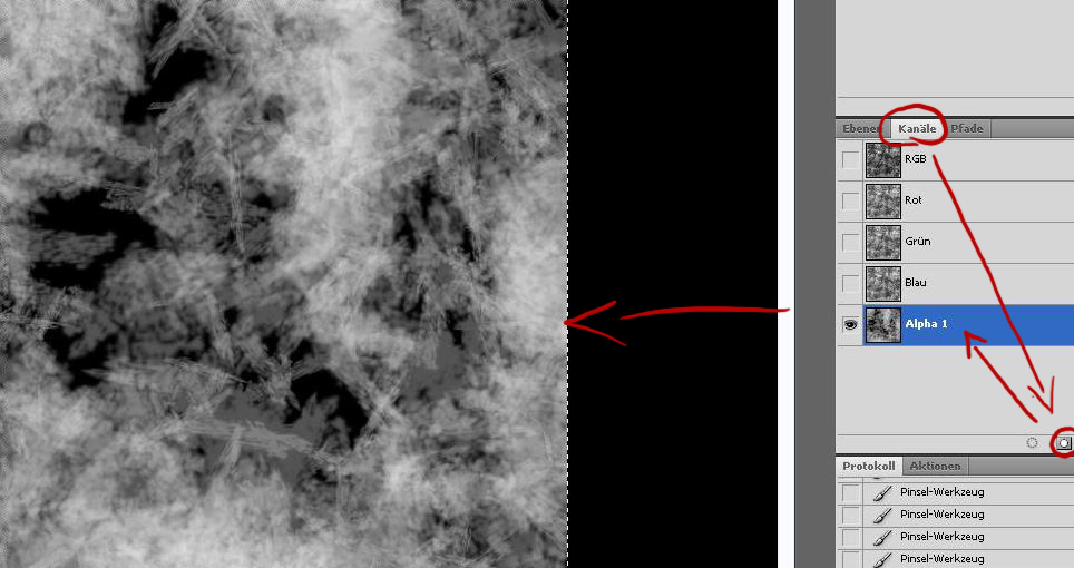
Afterwards select a black color and again go over your already dark areas a few times.

Now back to your layer again!
Click on the backgroundlayer twice...
A message will pop up, just click okay.
You backgroundlayer will be renamed into "Layer0" and wont be a background anymore...
So what...
Just check that the layer name is highlighted with a blue background, so you can be sure to work
on the right layer!
Now hit Filter -> Renderingfilter ->
Lightning Effects (I hope thats the correct term)
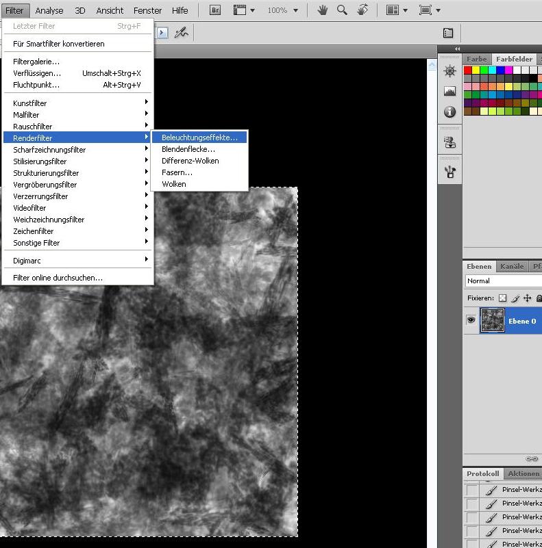
Setting: Standard
Now turn the spotlight 180^, so that the light source comes from the upper left corner.
Drag it as far away from the texture as you can, while leaving the middle point in the middle of it.
Now drag one of the other points (not the one directly on the opposite of the first point)
in the corresponding corner.
You will see that the other one will move appropriate to the one you are dragging!
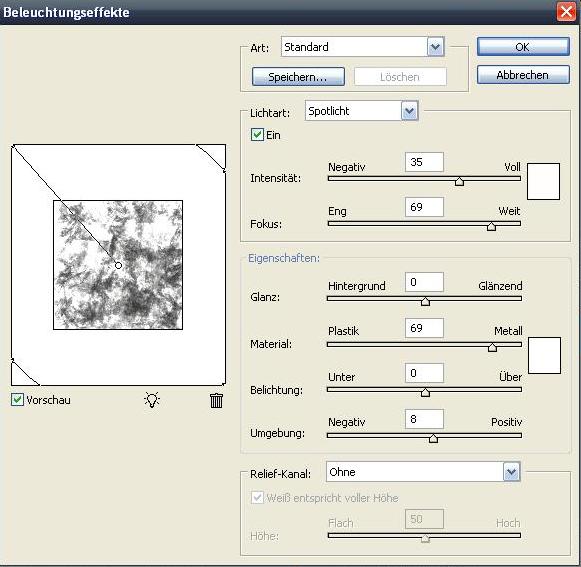
Now apply following settings:
Spotlight
Intensity: 50
Fokus: 100
Properties:
Shininess: -100
Material: 50
Lightning: -30
Environment: 5
Relief Channel: Alpha 1 (thats the one we drew ourselves)
Height: 100 (though this varies strongly, as it depends on the painted alpha map's contrast very much!
(You may need to undo the rendering and tweak the underlaying texture again, in my example the 40% opacity black brush strokes on the left hand side stood out way too much)
So after going back and forth a few times this is what my base texture became:
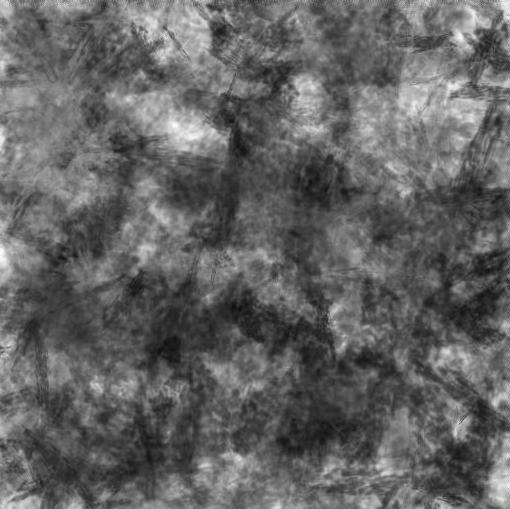
And this is what it became after i rendered it
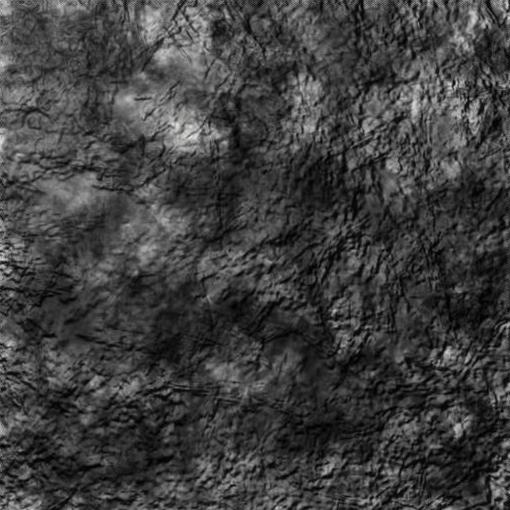
Now you can go into the gradiation curve and tweak the color gradients a bit to make it more uneven.
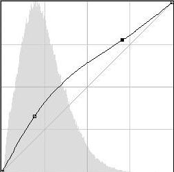
Apply a sharpen filter
Filter -> Sharpen Filter -> sharpen

Done
After a few more clicks thats what i made out of it

=================================================
FUR / HAIR
=================================================
You already know how to set up a custom brush (if not, then look at the loincloth tutorial)
This time we are going to have only 4 lines...
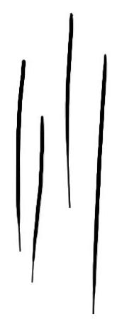
Apply the follwing settings to it:
Brush Form:
Angle: 90°
Spacing: 25%
Formsettings:
Size Jitter: 35% (if you are able set it to "pen pressure"))
Angle Jitter: 2-5% (set the controler to "direction")
Roundness Jitter: 100%
Spraying:
Spraying: 90%
Count: 2
Count Jitter: 100%
Colorsettings:
Color Jitter: 2%
Saturation Jitter: 1%
Hue Jitter: 1%
Other Settings:
Opacity Jitter: 25%
Flow Jitter: 66%
Fill the background with a dark color!
You can even use black...
Set your brush opacity to 100%
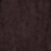
Select the darkest color and brush over the canvas in the direction you want the hair to flow.
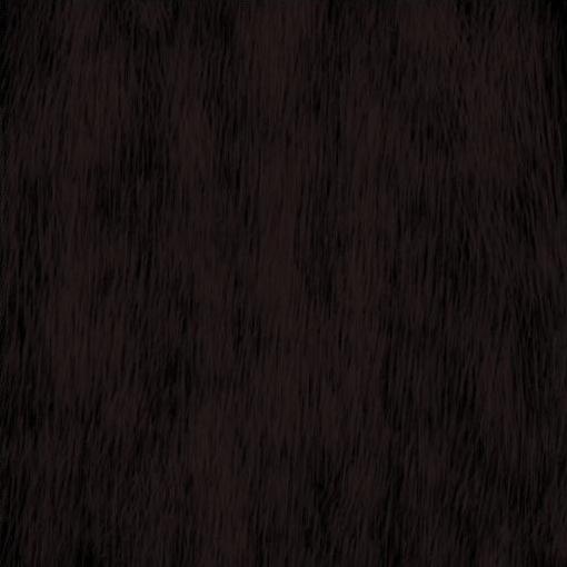
Afterwards take another color (something in between the dark and the middle color) and go over it again.
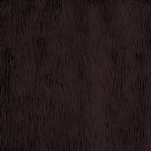
NOw take the middle color, set the brush opacity to 50% and do the same again until you reched the lightest color
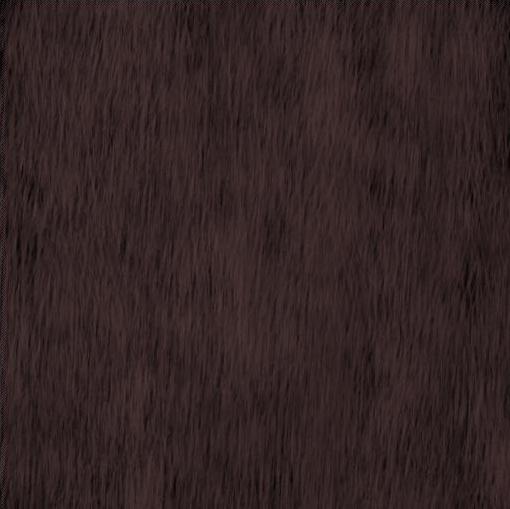
I used the following colors:
Light: 775959
583e3e
Middle: 463131
352424
Dark: 261a1a
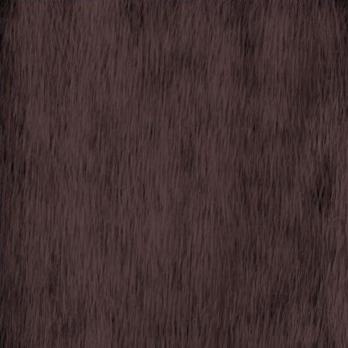
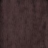
Click on Image -> Corrections -> Gradiation Curve (CTRL + M) and
change the contrast some to make the hairs pop out better!
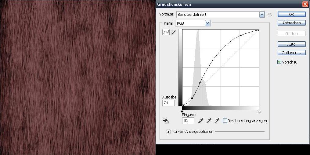
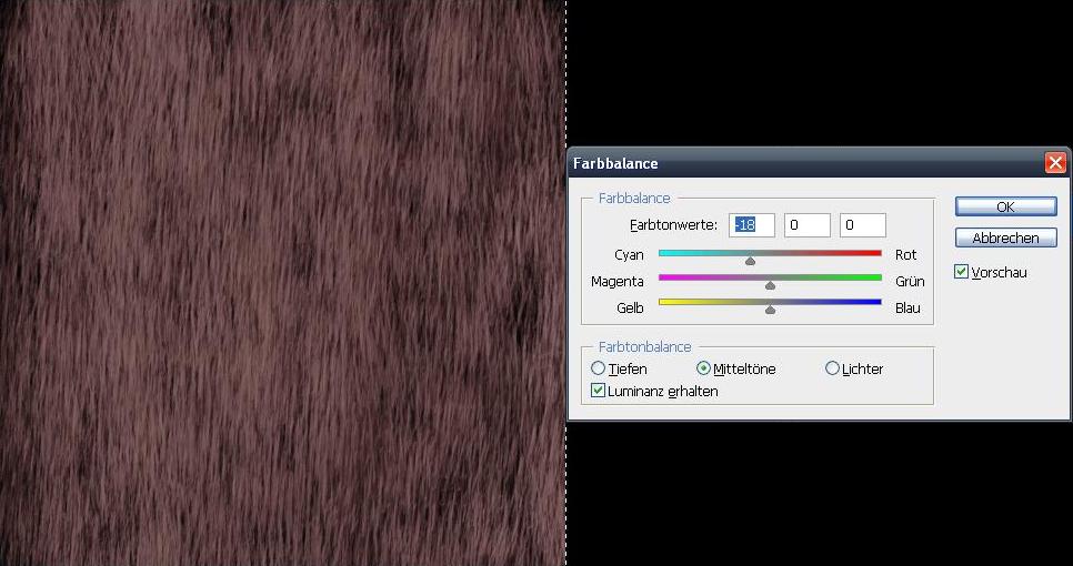
Now my texture became very reddish, which i didnt want it to...
So just hit CTRL + B or Image -> corrections -> Color Balance
and pull the slider away from the red gently until the color is what you want it to be....
Now set up a new brush...
Settings dont bother too much, just take some grundgy brush tip,
set it to spray a bit, set all color jitters to 10%, the opacity to 100% and paint with your middle tone color onto a new layer

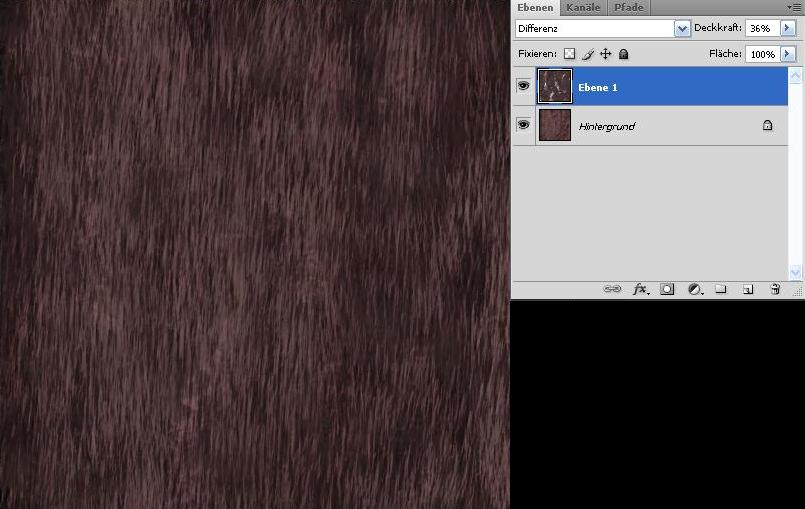
Now change the layer settings..
Its not that important which layer blending mode you choose, but mine became quite nice as "Difference" and 35% opacity..
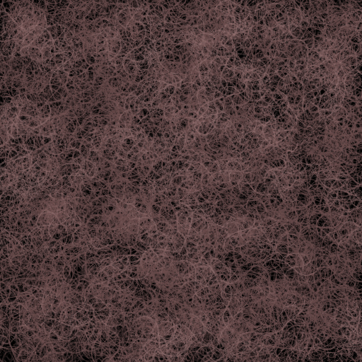
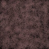
With a different custom brush tip
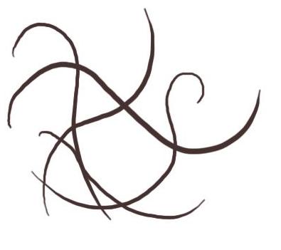
and some other jitter settings you can easily achieve soemthing like this aswell:
I am German, hence my CS4 is german aswell…
I do hope its not that big of a problem, as the buttons stay at the same spot in every language and I won’t let out any step without a picture!
Before somebody posts something like “this is not warcraftish”, I have to admit that its not the same style as most other textures in the .mpq. Still these are really effective ways of making textures and with changing some of the used values I guess you’ll be able to replicate the wc3 style with these tutorials aswell!
=================================================
SHADING INTRODUCTION
=================================================
Most newer games provide the support of normal-, bump- and displacement maps, which all are greyscale images.
They all (in slightly different ways) provide more mesh depth, little wrinkels dont need to be modeled, but are
painted onto one of the maps.
The renderer then automatically detects how light or dark a pixel is and detects how the shadow flow needs to be rendered out.
Warcraft 3 doesnt have this feature!
So we need to paint the reflection, the bumpiness, the color and the highlights/shadows manually onto the texture.
Before going into the details on how to create different effects for different materials I set up a really big image here.
Its all about the shading, see how the different meshes shade differently?
Try to get an eye for that!
(I myself have this as my desktop background, so everytime I boot or shut down my computer I take a look. Funnily i discover some new bit every time
=================================================
LEATHER
=================================================
I found this leather texture at www.cgtextures.com and is called “Leather0021_2_S”
It is royalty free, so don’t bother with any copyright issues!
Only thing you need to keep an eye on at this stage:
Don’t take any texture with big scars or anything obvious, as otherwise you will have one and the same obvious thing clustered all over your texture….
First of all ‘m going to set the conrast to +100%
This will help to make the end texture bumpier…
Select a round area in the middle of the leather. While dragging the circle hold Shift, this way the x- and y- axis will be scaled at the same value
(remember that you can edit it with richtclick -> transform selection)
Don’t get to near to the border pixels, as otherwise we wont have a round brush, but one which is almost round but has an edge on one side
Now rightclick again and click on “refine edge” (I do hope that this is the corresponding english name for the german button)
You can see the numbers I put in in my texture, they may vary, depending on the texturesize you are using…
Just make sure that the selection doesn’t crash with the image border and the texture fades in well radially.
Click the “OK” button and cut out your selection (either with Ctrl + X or Edit -> Cut)
Open up a new document (Ctrl + N) , size 512x512 pixels.
Copy your selection onto the new document
Now we will make it a greyscale, Image -> Corrections -> Color / Saturation (Ctrl + U)
Now click on Edit -> Brush Presetting and you made a custom brush! Congratulations!!
Afterwards invert you picture (Ctrl + I) and set it to a new custom brush…
I tend to name the first one something like “LeatherCustomBrush” and the second one “LeatherCustomBrushInverted”, but you can leave it default as you wish!
Checklist:
What should you have learned by now, what should you have to show until now?
After having worked out all these steps you wont need these anymore for new textures (except the new ones need ot structures and you want to make other leather variations) but overall you have your texture brushes completely set up now.
This is wherer the actual texturing begins:
Set up a color palette, it needs 3 color variations of brown (don’t get to detailed here which color it should be like, we are going to modify that later.)
One example would be:
Highlights: #bca28b
Colorl: #86705c
Shadows: #40372f
A tip on the side:
I recently discovered the Color Fields in the right hand upper part of my viewport.
You can select any color on your canvas or the color picker tool and afterwards click on a free spot of the color field…
Now save the color and it’s the last one in the row of colors.
You can now have any tool activated, but when moving you cursor there it will be converted to the eyedropper tool automatically and you can pick up your color again.
This way you don’t have any annoying image snippets with color variations and don’t need to pick it up with the eyedropper everytime you need the color.
Good, now set up a new document (or outline the parts you want to texture with the polygon cut tool) and fill the whole space with the base color (#86705c).
Now set your color to the highlight (#bca28b), a suitable size (I myself tend to use a really large brush, like 512 pixels big) and go over your texture gently. Make the brushes overlay, but not too much, as then the color will be to one sided in these spots.
Afterwards do the same with the shadow color (#40372f) and the inverted brush
Now yet again, add 100% more contrast (I wont tell you how again, you already did that, remember?)
Now change the Gradiation Curve.
You can find it under Image -> Corrections -> Gradiationcurves (Ctrl + M)
Afterwards add a bit of (enter correct name here plz) -> I searched for 10 minutes for a dictionary, I don’t want to anymore, but you’ll see what I mean in the picture! -_-
Now add a bit of gamma correction, its value 1 here, but may differ from texture to texture!
Last but not least add the sharpen filter Filter -> Sharpenfilter -> Sharpen
Now everything that is left is the shading.
You may ask yourself how the heck shall I get bright and dark areas in there without destroying the structure of the leather?
Very quick, I don’t want to get too much into detail here:
Add a new layer, paint in your highlights with the bright color and the shadows with the dark one you used before and set the layer blending mode to “copy together”
Done!
You now have a leather pattern…
Congrats!!
=================================================
METAL
=================================================
Set up a new working space and fill the canvas with a middle light grey
I chose #919191
Our highlight color will be #d2d2d2 and the darkest color will be 565656.
Set up a custom brush:
This is the brush's tip. I think it shipped with PS, so you might actually have the same brush in yout list!
It's called Sampled Brush 1
Give it the following settings:
Opacity: 25%
Formsettings:
Size Jitter: 100%
Minimum Size: 50%
Angle Jitter: 100%
Spraying: (I hope thats the coorect term)
Spraying: 150%
Count: 1
Count Jitter: 75%
Other Settings:
Opacity Jitter: 40% (if you have a tablet this is usefull, as you can set it to the pen's pressure)
Flow Jitter: 60%
You should get something like this
Now select our dark color and drag the brush once or twice over the whole canvas. (IN "N" or "Z" strokes)
Afterwards do the same with the light color, but paint once or twice more on the canvas!
Now set up a second custom brush:
This time the "Splatter 24 Pixels" one, it should be located somewhere in your brush list aswell.
Apply the following settings
Opacity: 20%
Formsettings:
size Jitter: 100%
Minimum Size: 50%
Angle Jitter: 100%
Spraying:
Spraying: 800%
Anzahl 1
Count Jitter: 75%
It should look something like this now
Take your light color, set the brush size very large and brush over the canvas again for one or two times!
Now we want it to have a lot more shininess, so we gonna set the conrast to +100
You can now shade as you want!
As this is only greyscale you can go with dodge and burn, but whatever suits you best will work!
My texture looks like this:
=================================================
LOINCLOTH
=================================================
First of all you are going to create an own custom brush!
Do so by opening up a new document and filling the background by white.
Now do a few strokes in one direction (so basically parallel lines) and erase the ends to resemble a non square
overall shape
Now take the eraser, make sure your background color in the toolbar is white and erase the upper and lower part of the brush, so that it fades in
Click on Edit -> Add Brush Presetting (or something appropriate)
Erase everything again and make the background black.
Select the brush again, turn it 90° in the brush presets window.
Also apply following settings:
Formsettings:
Angle Jitter: 0% (but set the controller to "direction")
Colorsettings:
Color Jitter: 2%
Saturation Jitter: 1%
Hue Jitter: 1%
Other Settings:
Opacity Jitter: 25%
Flow Jitter: 66%
Your brush preview now should look like this (more or less)
Now choose the color you want your loincloth to be.
I'm going with a green here, but you can use whatever you like!
Just be sure that it is a very dark tone and 25% opacity!
Brush vertically a few times...
Dont bother if the black appears between the strokes!
Now take another color, same green, but a bit lighter and go over it horizontally!
Repeat this (taking a lighter color, changing brush direction) a few times, some 3 or 4 more colors should do
And this is what you should have by now:
Now again take a very dark tone of your color and set the opacity to 10
Stroke a few times in both directions, doesnt matter in which direction first or how often, just as long as it look okay!
Again, play around with the gradiation curve (CTRL + M)
Now add a new layer (CTRL + Shift + Alt + N)
Take a scratchy brush (doesnt matter which one really, it should only suit what you are aiming for)
I chose "Chalk 60 Pixels", which i think came with PS...
Apply these settings:
Formsettings:
Size Jitter: 100%
Angle Jitter: 100%
Roundness Jitter: 100%
Spraying:
Spraying: 250%
Color Settings:
Color Jitter: 10%
saturation Jitter: 1%
Hue Jitter: 2%
Pick up a dark color and now paint over your loin with 100% opacity (but make sure you are working on hte right layer!)
Edit the layer blending and opacity settings as it suits you!
Mine worked out quite well set to "darker color" with 30%
Reduce it to one layer (CTRL + E)
Make your work color black, take your first brush with 10% opacity now and paint a few strokesi n both directions
Clean up the parts you dont need and your texture is done!
The good thing with this method is that you can easily adjust the flow of the loin with your brush strokes...
=================================================
STONE
=================================================
Although I wrote down the names of the brushes I used, I forgot to write down the settings aswell...
I'm sry for that!
But it shouldnt be a big deal...
Just add a few jitters, keep in mind to not jitter the opacity too much, we want to make rock.
And that is chunky, so we need contrast!
the first brush we are using is the "Watercolor Loaded Wet Flat Tip".
It should be in your standard brush list...
NOw make it 20% opacity, black and fill the background a few times with your brush strokes...
Dont get to even here...
After some strokes concentrate on a few areas, leaving the others lighter!
Now do the same with a slightly more opaque brush, I used 40 oOpacity.
Now click on "channels", it is located directly next to your "layer" window.
Add a new alpha channel by clicking on the "add new layer" button, it is highlighted on
the next image
Now again take your brush, set the opacity to 20% and a white color.
Now paint onto your canvas...
Again, this is going to be bumpy, so try to contrast it enough!
Afterwards select a black color and again go over your already dark areas a few times.
Now back to your layer again!
Click on the backgroundlayer twice...
A message will pop up, just click okay.
You backgroundlayer will be renamed into "Layer0" and wont be a background anymore...
So what...
Just check that the layer name is highlighted with a blue background, so you can be sure to work
on the right layer!
Now hit Filter -> Renderingfilter ->
Lightning Effects (I hope thats the correct term)
Setting: Standard
Now turn the spotlight 180^, so that the light source comes from the upper left corner.
Drag it as far away from the texture as you can, while leaving the middle point in the middle of it.
Now drag one of the other points (not the one directly on the opposite of the first point)
in the corresponding corner.
You will see that the other one will move appropriate to the one you are dragging!
Now apply following settings:
Spotlight
Intensity: 50
Fokus: 100
Properties:
Shininess: -100
Material: 50
Lightning: -30
Environment: 5
Relief Channel: Alpha 1 (thats the one we drew ourselves)
Height: 100 (though this varies strongly, as it depends on the painted alpha map's contrast very much!
(You may need to undo the rendering and tweak the underlaying texture again, in my example the 40% opacity black brush strokes on the left hand side stood out way too much)
So after going back and forth a few times this is what my base texture became:
And this is what it became after i rendered it
Now you can go into the gradiation curve and tweak the color gradients a bit to make it more uneven.
Apply a sharpen filter
Filter -> Sharpen Filter -> sharpen
Done
After a few more clicks thats what i made out of it
=================================================
FUR / HAIR
=================================================
You already know how to set up a custom brush (if not, then look at the loincloth tutorial)
This time we are going to have only 4 lines...
Apply the follwing settings to it:
Brush Form:
Angle: 90°
Spacing: 25%
Formsettings:
Size Jitter: 35% (if you are able set it to "pen pressure"))
Angle Jitter: 2-5% (set the controler to "direction")
Roundness Jitter: 100%
Spraying:
Spraying: 90%
Count: 2
Count Jitter: 100%
Colorsettings:
Color Jitter: 2%
Saturation Jitter: 1%
Hue Jitter: 1%
Other Settings:
Opacity Jitter: 25%
Flow Jitter: 66%
Fill the background with a dark color!
You can even use black...
Set your brush opacity to 100%
Select the darkest color and brush over the canvas in the direction you want the hair to flow.
Afterwards take another color (something in between the dark and the middle color) and go over it again.
NOw take the middle color, set the brush opacity to 50% and do the same again until you reched the lightest color
I used the following colors:
Light: 775959
583e3e
Middle: 463131
352424
Dark: 261a1a
Click on Image -> Corrections -> Gradiation Curve (CTRL + M) and
change the contrast some to make the hairs pop out better!
Now my texture became very reddish, which i didnt want it to...
So just hit CTRL + B or Image -> corrections -> Color Balance
and pull the slider away from the red gently until the color is what you want it to be....
Now set up a new brush...
Settings dont bother too much, just take some grundgy brush tip,
set it to spray a bit, set all color jitters to 10%, the opacity to 100% and paint with your middle tone color onto a new layer
Now change the layer settings..
Its not that important which layer blending mode you choose, but mine became quite nice as "Difference" and 35% opacity..
With a different custom brush tip
and some other jitter settings you can easily achieve soemthing like this aswell:
Attachments
-
 Tutorial001.jpg278.4 KB · Views: 1,948
 -
 Tutorial002.JPG71.5 KB · Views: 1,110
 -
 Tutorial003.JPG39 KB · Views: 1,144
 -
 Tutorial004.JPG157.9 KB · Views: 1,100
 -
 Tutorial005.JPG64.1 KB · Views: 1,117
 -
 Tutorial006.JPG48.5 KB · Views: 1,072
 -
 Tutorial007.JPG22 KB · Views: 1,131
 -
 Tutorial008.JPG64.7 KB · Views: 1,062
 -
 Tutorial009.JPG32 KB · Views: 1,036
 -
 Tutorial010.JPG4.9 KB · Views: 1,068
 -
 Tutorial011.JPG13.9 KB · Views: 1,050
 -
 Tutorial012.JPG25.7 KB · Views: 1,086
 -
 Tutorial013.JPG32.8 KB · Views: 1,072
 -
 Tutorial014.JPG57.5 KB · Views: 1,046
 -
 Tutorial015.JPG86 KB · Views: 1,064
 -
 Tutorial016.JPG53.1 KB · Views: 956
 -
 Tutorial017.JPG77.6 KB · Views: 940
 -
 Tutorial018.JPG37.4 KB · Views: 912
 -
 Tutorial019.JPG75.2 KB · Views: 947
 -
 Tutorial020.JPG91.4 KB · Views: 908
 -
 Metal001.JPG5.7 KB · Views: 1,101
 -
 Metal002.JPG3 KB · Views: 934
 -
 Metal003.JPG5.5 KB · Views: 888
 -
 Metal004.JPG11.1 KB · Views: 1,062
 -
 Metal005.JPG14.9 KB · Views: 982
 -
 Metal006.JPG2.6 KB · Views: 932
 -
 Metal007.JPG14.3 KB · Views: 878
 -
 Metal008.JPG18 KB · Views: 988
 -
 Metal009.JPG22.4 KB · Views: 986
 -
 Metal010.JPG10.8 KB · Views: 945
 -
 Gewebe001.JPG24.4 KB · Views: 1,090
 -
 Gewebe002.JPG19.7 KB · Views: 989
 -
 Gewebe003.JPG6.3 KB · Views: 877
 -
 Gewebe004.JPG8.9 KB · Views: 926
 -
 Gewebe005.JPG12.6 KB · Views: 924
 -
 Gewebe006.JPG16.9 KB · Views: 927
 -
 Gewebe007.JPG15.6 KB · Views: 944
 -
 Gewebe008.JPG48.9 KB · Views: 909
 -
 Gewebe009.JPG29.4 KB · Views: 952
 -
 Gewebe010.JPG8.4 KB · Views: 939
 -
 shadingexamples.jpg151.2 KB · Views: 1,091
 -
 Stone001.JPG2.3 KB · Views: 898
 -
 Stone002.JPG40.7 KB · Views: 2,158
 -
 Stone003.JPG42.5 KB · Views: 2,182
 -
 Stone005.JPG184.2 KB · Views: 940
 -
 Stone006.JPG37.9 KB · Views: 883
 -
 Stone007.JPG90.1 KB · Views: 903
 -
 Stone008.JPG48.6 KB · Views: 863
 -
 Stone009.JPG40.5 KB · Views: 1,173
 -
 Stone010.JPG50.9 KB · Views: 879
 -
 Stone011.JPG8 KB · Views: 849
 -
 Fur001.JPG22.5 KB · Views: 845
 -
 Fur002.JPG38.3 KB · Views: 885
 -
 Fur003.JPG39.8 KB · Views: 830
 -
 Fur004.JPG42.4 KB · Views: 878
 -
 Fur005.JPG45.4 KB · Views: 895
 -
 Fur007.JPG94.3 KB · Views: 868
 -
 Fur008.JPG83.9 KB · Views: 874
 -
 Fur009.JPG56.8 KB · Views: 832
 -
 Fur010.JPG69.3 KB · Views: 877
 -
 FurAlternativeBrush.JPG11.8 KB · Views: 829
 -
 FurAlternative.jpg356.2 KB · Views: 880
Last edited:


