Community
Projects
Maps
Tutorials
Gallery
Support Us
Install the app
How to install the app on iOS
Follow along with the video below to see how to install our site as a web app on your home screen.
Note: This feature may not be available in some browsers.
-
Listen to a special audio message from Bill Roper to the Hive Workshop community (Bill is a former Vice President of Blizzard Entertainment, Producer, Designer, Musician, Voice Actor) 🔗Click here to hear his message!
-
Read Evilhog's interview with Gregory Alper, the original composer of the music for WarCraft: Orcs & Humans 🔗Click here to read the full interview.
-
The Hive's 22nd Icon Contest: Creep Abilities is now concluded, time to vote for your favourite set of icons! Click here to vote!
-
✅ The POLL for Hive's Texturing Contest #34 is OPEN! Vote for the TOP 3 SKINS! 🔗Click here to cast your vote!
-
✅ The POLL for Hive's Techtree Contest #20 is OPEN! Vote for the TOP 3 FACTIONS! 🔗Click here to cast your vote!
You are using an out of date browser. It may not display this or other websites correctly.
You should upgrade or use an alternative browser.
You should upgrade or use an alternative browser.
Terraining Contest #7 - Small World
- Status
- Not open for further replies.


- Joined
- Jul 1, 2007
- Messages
- 6,667


~Void~ when does the contest stop its been a while since the clock reached 11.59 (gmt).
It's been over since 11:59 then. Judges can start their shit.
- Joined
- May 16, 2007
- Messages
- 7,272


GL everyone
- Joined
- Jul 1, 2007
- Messages
- 6,667
See, I told you guys interesting themes FTW. Imagine how much less win there would be if the theme was "horror" like people suggested.
- Joined
- Jan 13, 2009
- Messages
- 73
~Void~ couldn't be anymore correct.
A simple theme like horror would have simple scenes with things such as wolves or zombies, etc.
This theme was full of win because people needed to think first before they started their terrains.
And I wish all entrants (including me) good luck.
A simple theme like horror would have simple scenes with things such as wolves or zombies, etc.
This theme was full of win because people needed to think first before they started their terrains.
And I wish all entrants (including me) good luck.
- Joined
- May 16, 2007
- Messages
- 7,272
ThEME: Zombies
- Joined
- Jul 1, 2007
- Messages
- 6,667
How about
Theme: Sunset/rise over a few foresty hills with a road in the foreground going into the background and trees on either side.
xD
Theme: Sunset/rise over a few foresty hills with a road in the foreground going into the background and trees on either side.
xD
- Joined
- May 16, 2007
- Messages
- 7,272
oh you mean the
Who can make the best *picture here* terrain?
Who can make the best *picture here* terrain?


- Joined
- Jan 13, 2009
- Messages
- 73
I'm gonna go play with my pet chicken whilst I'm waiting for the results.
Lol i love playing with my chicken, its so much fun, that's why i believe the winner should get a pet chicken.
btw, is it too late for another WIP. XD I will probably lose this contest, BUT I WILL SOMEDAY RULE THIS WORLD!!!
Lol i love playing with my chicken, its so much fun, that's why i believe the winner should get a pet chicken.
btw, is it too late for another WIP. XD I will probably lose this contest, BUT I WILL SOMEDAY RULE THIS WORLD!!!
Last edited:


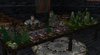
![MaD[Lion].jpg](https://cdn.hiveworkshop.com/data/attachments/44/44167-b76a8465e836fc70a8451f4bce493a88.jpg?hash=t2qEZeg2_H "MaD[Lion].jpg")


- Joined
- Oct 29, 2007
- Messages
- 1,184


How about
Theme: Sunset/rise over a few foresty hills with a road in the foreground going into the background and trees on either side.
xD
That made me Lol. :>
Dr Super Good
Spell Reviewer
- Joined
- Jan 18, 2005
- Messages
- 27,353


Awww, void did not upgrade his to the HD one.
- Joined
- Jul 1, 2007
- Messages
- 6,667
Yeah it would take like 15 minutes to upload. :>
- Joined
- Jan 6, 2008
- Messages
- 2,622
Cobra B, did you take my idea xP.
Dr Super Good
Spell Reviewer
- Joined
- Jan 18, 2005
- Messages
- 27,353
Meh in that case Ill just show you the temporary link to it I made.
Voids entry in HD. . .
Again this is an image of voids entry in HD and is not the image you are rating and the link will eventually expire. Only click on it if you were courious of what I was refering to and this is technically not part of the contest.
I am doing this only cause it would be a waste if people actually wanted to see it.
Also your argument about filesize is illogical, it is only twice the size of your one you submited to be rated and the compression is near unnoticable.
On any modern connection even uncompressed it should take atmost 2 minutes to upload, so I have no clue where you get the 15 minutes from.
That being said I will now state my opinion of some of the entries and wish the best of luck to whever is taking part.
Chaos.
His entry shows impressive use of small models to make whole buildings. However generally it lacks the level of detail to be a good terrain. The buildings are very regular and square, and the gound looks very blury and flat as well as the background. Overall it needed more detail and 3D stuff between the buildings.
CoBrA b
His entry is very impressive. The galexsiey looks ver good and the orb really gives an opinion of it being small. The background should probably hae been further away slightly as it is close enough to notice the low res textures it uses. Overall a very good terrain.
Corexx
Another very impressive entry. It really does look like the castles are the size of toys and wasps are about to attack them. The grass works very well at making it look like the castle is small and not the wasps are big. The archers however on the castles are a bit too unifourm and repetitive. It probably would have looked better with fewer archers or archers and maybe if they were shown doing their attack animation with the odd size varience between them so they are not clones.
Dark Master
Quite good for an overall terrain, however its relevance to the contest is obscure. Only a small part of the picture dealt with a minature world, and most of the image was of a full sized world. A better camera angle which emphisises the minature model world would have been advisable. Also such a tiny screenshot helps no one as you can only really view it properly zooming in and that did not help the fact how the minature world only took up like 5% of the image.
DTurGuR
Certainly a unique entry. The representation of a PSP is prety realistic and very good. However the terrain around the PSP was poor as the terrain textures were low res. It would have been better putting the PSP on a stone table made of lots of parts so the lack of texture res would be less noticable. However you compessed the image too much, so it lost far too much detail and looks quite poor. I was on the vurge of saying that the game image was a texture due to the poor quality of the screenshot.
H-Bomber
The scale is belivable, however it looks highly cluttered. The close up is basicaly a mess and looks rather like a rubish dump terrain with prety generi grass around it and a rabit who is far too small to make the scale believeable. It would have been better making the mill and house bigger in the background and the foreground less cluttered as well as the rabit slightly bigger, so the scale is more clear.
just_spectating
Another one of the better submissions, as it generally looks very good. The books literly do look like minature worlds. You kind of ruined it a bit though by expanding the low resolution textures too much like that of the table and the house wall. Next to that a very well detailed terrain. Also I have no clue why you included a "game view" as part of the terrain, as that is totally out of place.
Keiji
Interesting terrain idea. An overgrown house filled with minature trees. Generally does the impression of scale quite well, however it sufferes a common fault that a lot of the submissions do, the ground texture and stairs use far too low resolution textures and so would have been better off being composted of more piecies.
Mad[Lion]
Also a terrain worthy of being a winner. The idea of a rock hand with cities on it is prety good and the moon in the background really makes it look impressive. Highly detailed and good looking overall. Only major fault was the moon being low poly and so not looking very round at its scale, maybe placing a few moon models beind the front face with different rotation offsets would have hid this my making it appear like it had more sides.
MadsaN
Certainly one of the better entries, 3 rock gients creating 3 floting worlds is executed pretty well. Blending was a problem you suffered from however, as the red rocks on the one island look quite out of place and need some sort of phase in where the normal rocks stop and the red rocks being. Certainly a terrain to be proud of though.
Megafyr
Another gient theme.... Still ok though. The gient looks pretty good and so does the terrain overall. However the fog sort of loses the detail of the background and titan so although good too look at, it lacks much clear visable detail. It would have been better with slightly less dense fog so people could admire the detail put into the ground more as it appears only as shades of grey in the image provided.
Last edited:
- Joined
- May 27, 2007
- Messages
- 1,689


Hmmm I should try at terraining sometime. These contests look interesting.
- Joined
- Jul 1, 2007
- Messages
- 6,667
Wanna judge?
Exaggeration
On any modern connection even uncompressed it should take atmost 2 minutes to upload, so I have no clue where you get the 15 minutes from.
Exaggeration
Dr Super Good
Spell Reviewer
- Joined
- Jan 18, 2005
- Messages
- 27,353
Neithor did I, im doing that all on a 7800 GTS, the same generation as the technology the PS3 uses. Basically that is only 8* AA not even 16* AA and at HD not UHD.
To continue with my opinions on the terrains.
raid1000
Very detailed terrain, nearly no noticable blank or dull patch in it. Looks rather repetitive however as the gears are mostly at the same angle and should infuture be at offset angles so as not to form lines. Also its relevance is obscure, its hard to see that it is meant to be inside the workings of a clock and nothing shows that the clock is meant to be small (could be a huge tower for all that is shown). It really lacked something to make it look like the clock was just a small clock and also that it was clearly a clock (only could notice by looking far into the bright background).
- Joined
- Jul 1, 2007
- Messages
- 6,667
I love H-Bomber's terrain, it reminds me of '06.
- Joined
- Nov 28, 2006
- Messages
- 5,269


Here goes some critique random, helpless opinions:
Chaos: My only real concern is that the same doodad is used for a wall and it gets very repetitive.
CoBrA b: Now that is an original idea! The vortex/galaxy inside the orb is rather colourful. I'd like to see it more centralized around a few different shades.
Corexx: Honestly, your submission doesn't really stand out. It's nice, but the idea isn't very original and there's nothing too special about the castle. What would be cool is if you had a sort of Minas-Tirith styled castle going up the side of a tree. That would be awesome!
Dark Master: What exactly is small about it?
DTurGuR: That is awesome! I don't even know how you did that.I'd like to see more in the foreground on the table though.
H-Bomber: I like the lighting, but it's really nothing special.
just_spectating: That looks very high-def. The thumbnail looks crazy, but when enlarged it looks spectacular. No complaints here except for the window. I wish you'd get rid of it and keep everthing dark.
Keiji: Sorry, but I don't really have anything to say about this. My opinions are pretty neutral.
Mad[Lion]: That's spectacular! It woud be cool to see what it would look like from inside the orb. I wonder if it actually looks like a hand or if the fingers look like giant spires.
MadsaN: The golems could use some work, in my opinion.
Megafyr: The blue almost makes it look underwater.
raid1000: Holy jesus on ice! I love the lighting, I love all of the little walkways and gears and, gah, everything else on this terrain!
Real Impact: Interesting, but, since the magnifying glass is pure-black, it looks very fake. And the lack of a reflection or something on the 'glass' makes it look like it's missing a lens.
Revolve: Mmmkay? Trees and green lava underwater?
~Void~: For some reason it reminds me of Fable! It's great though. By the way, there's a rule against hosts participating you know.
warden13: It's a bit hard to tell what it is at first. It made me laugh a bit after I figured it out though, which didn't take too long.
Ziggen: I actually laughed a bit when I saw this. A little bio-engineered world, eh?
- Joined
- Jul 1, 2007
- Messages
- 6,667
~Void~: For some reason it reminds me of Fable! It's great though. By the way, there's a rule against hosts participating you know.
Thanks, and I'm overriding that rule. Check the OP
- Joined
- Jan 6, 2008
- Messages
- 2,622
its MadseN,
- Joined
- Jul 1, 2007
- Messages
- 6,667
Yes.
- Joined
- Aug 15, 2007
- Messages
- 52

nooo!! someone said i made a moon its not a damn moon!! why cant people see its actually the spherical atmosphere covering this little world inside -.- theres no planet or moons!
And those who wanna see different sides of the hand i aso posted shots earlier ... its on page 26 or something
edit: this is just addinal shot for those who wanna see geometry of hand:
without sky sphere:
And those who wanna see different sides of the hand i aso posted shots earlier ... its on page 26 or something
edit: this is just addinal shot for those who wanna see geometry of hand:
without sky sphere:
Attachments
-
 WC3ScrnShot_070209_233808_05.jpg210.1 KB · Views: 188
 -
 WC3ScrnShot_070209_233751_04.jpg246.3 KB · Views: 201
 -
 WC3ScrnShot_070209_233741_03.jpg219.8 KB · Views: 183
 -
 WC3ScrnShot_070209_233733_02.jpg222.4 KB · Views: 208
 -
 WC3ScrnShot_070209_233719_01.jpg324.7 KB · Views: 199
 -
 WC3ScrnShot_070209_233830_06.jpg283.5 KB · Views: 216
 -
 WC3ScrnShot_070209_233849_07.jpg335.9 KB · Views: 228
- Joined
- May 16, 2007
- Messages
- 7,272
the last two pictures actually look pretty cool.
- Joined
- Jul 1, 2007
- Messages
- 6,667
RGB glows. <3
- Joined
- Jul 1, 2007
- Messages
- 6,667
I (over nine thousand) this contest.
- Joined
- Jul 1, 2007
- Messages
- 6,667
No, it's a meme -.-
- Joined
- Jul 1, 2007
- Messages
- 6,667
That's pretty hard to do xD
- Joined
- Mar 9, 2008
- Messages
- 669
Okay comp works, I almost forgot I volunteered to Judge. What do I do when Im done judging?
- Joined
- Jul 1, 2007
- Messages
- 6,667
Here's Oziris' terrain for those who give a shit. By the way, Oziris, I can't see your posts here, I don't have arena powers.
https://www.hiveworkshop.com/forums...5-terrain-contest-7-small-world-miniature.jpg
https://www.hiveworkshop.com/forums...5-terrain-contest-7-small-world-miniature.jpg
- Joined
- Dec 14, 2005
- Messages
- 10,532


Chaos: Meh. Doodad spam, and I can't say I was a fan of the idea.
CoBrA b: Neat idea, not the best but in my opinion deserving third place.
Corexx: Entertaining, but not one of your better terrains.
Dark Master: Small world?
DTurGuR: My favourite of the submissions, mainly due to its concept.
H-Bomber: Not really sure what this is supposed to be.
Just_Spectating: Fairly neat idea, but a little cluttered.
Keiji: Again, not much of a fan of doodad spam terrains, and not much of a fan of the objects theme either.
MaD[Lion]: My second favourite, as the environment around the hand and the atmosphere/world looked great. The concept wasn't the best, but oh well.
MadseN: I like the islands in the sky angle, but not the titans angle, nor the titans themselves.
Megafyr: Meh, godzilla.
raid1000: Doodad spam as always... your terrains really need to be more interesting.
Real Impact: Rather ugly, and not the best idea.
Revolve: Not sure I see the small world angle, and it's a rather bland shot.
~Void~: Decent concept, but nothing that really jumped out.
warden13: Entertaining, for what it's worth.
Ziggen: A decent terrain which stood out from those such as Void's and such due to the priceless look on that peon's face (sort of like "WTF?").
Poot posting in a terrain thread? : O
he just posted "meh this sux" over 17 times!
- Joined
- Jul 1, 2007
- Messages
- 6,667
Pewt's a harsh critic. Better that way imo.
I dislike critics (except for entertainment purposes). They just complain about stuff, and never provide any information on how to improve.Pewt's a harsh critic. Better that way imo.
- Joined
- Jul 1, 2007
- Messages
- 6,667
I dislike critics (except for entertainment purposes). They just complain about stuff, and never provide any information on how to improve.
I'm sure if you asked them they would tell you.
- Joined
- Jun 16, 2008
- Messages
- 1,936

i rly dont like poot ('s opinion about raid).
- Joined
- Jul 1, 2007
- Messages
- 6,667
I think he's right though. Aside from the atmosphere. I love the atmosphere.
- Status
- Not open for further replies.
Similar threads
- Replies
- 513
- Views
- 51K
- Replies
- 347
- Views
- 37K
- Replies
- 570
- Views
- 54K
- Replies
- 216
- Views
- 29K