• 🏆 Texturing Contest #33 is OPEN! Contestants must re-texture a SD unit model found in-game (Warcraft 3 Classic), recreating the unit into a peaceful NPC version. 🔗Click here to enter!
  • It's time for the first HD Modeling Contest of 2024. Join the theme discussion for Hive's HD Modeling Contest #6! Click here to post your idea!

M0rbids Terrain Showcase

Status
Not open for further replies.
Level 23
Joined
Dec 20, 2009
Messages
1,907
Welcome to my Terrain Showcase, everybody!

This is the place, where I upload some of my terraining screenshots, I'm new to the business so there aren't too many pics at the moment, but I'll update it in the future, I promise:grin:


I hope you enjoy the pics and I would enjoy some tipps, comments and criticism, feel free to post your opinion here. Thanks to everybody!

Link to some playable Terrains by me:
http://www.hiveworkshop.com/forums/...enshots-albian-rpg-m0rbid-158431/#post1470115

Final for the Challenge with Archipelago and WherewolfTherewolf
http://www.hiveworkshop.com/forums/...s-m0rbid-vs-wherewolftherewolf-ruinsfinal.jpg

Submission for [Mini Contest] The Picture
http://www.hiveworkshop.com/forums/...mini-contest-picture-ruinsofavalon-final-.jpg

My first work with the World Editor
http://www.hiveworkshop.com/forums/...267/71656d1261338182-terraininghelp-first.jpg


Attachments:
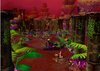
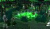
1. Outland Mausoleum: A demons huge grave:wink:
2. Naga Temple: A sacred Temple of the Naga
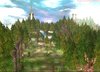
3. Cliffs: A morning foggy look on a tropical island
4. Jungle: Pure Nature:cool:
5. Tundra: The odd landscape, the point, where civilization ends
6. Look at the sunset from the shore of a mountian lake: Inspired by todays winter weather
7. A Trader's Tale: The remained parts of a robbed tradercart


I'd enjoy some feedback and will update this showcase, so check it often if you like it!:thumbs_up:
 

Attachments

  • Temple1.JPG
    Temple1.JPG
    93.6 KB · Views: 363
  • Temple2.JPG
    Temple2.JPG
    104.5 KB · Views: 356
  • Cliffs1.jpg
    Cliffs1.jpg
    427.8 KB · Views: 367
  • Jungle.jpg
    Jungle.jpg
    596 KB · Views: 329
  • Tundra.jpg
    Tundra.jpg
    423 KB · Views: 414
  • Mountains.jpg
    Mountains.jpg
    128.7 KB · Views: 303
  • ATrader'sTale.jpg
    ATrader'sTale.jpg
    108.5 KB · Views: 185
Last edited:
Level 13
Joined
Feb 8, 2009
Messages
1,193
Favorite is the 3rd since those rocks don't go with it but they kinda look good actually so NJ rest of em are meh.
 
Level 25
Joined
Mar 25, 2004
Messages
4,880
Giving constructive criticism on all of your terrains in the correct order:

1. TEMPLE 1
There's two major issues with this terrain. Excessive use of "Blizzard Cliffs" (using the cliff tool is bad! Looks ugly and uncreative.) and very poor tile variation. I see only two tiles used in this terrain, aside from the cliffs. Not good! You should have at least made the bottom of the terrain (below the ramps) have tile variation. It could have looked a lot less plain if you did that. As for an alternative for Blizzard Cliffs, you could search on The Hive Workshop or Wc3Campaigns for scenic/decorative models that could be used to replace the cliffs - it would look much better because it's more creative, more original, and the Blizzard Cliffs just limit you more and take up a lot of space of the terrain.


2. TEMPLE 2
Yet another terrain with two big mistakes. For one, you used Blizzard Cliffs again! But I can tell you were merely just experimenting with the cliffs and doodads that resemble it, so I won't really get into that; but for future reference, please do not use cliffs! Secondly, you can see the sky box glitching in the background, which is never pretty to show off in a screenshot. To fix this, change the rotation or angle of your camera and sometimes zooming in or out can fix the issue. Also, you should have modified the green fog to be slightly darker so it matches the sky box texture better.


3. CLIFFS 1
This one is much better than the previous two terrain screenshots. I like the sky, the choice of custom models for the rocks, trees, and grass, and the tile variation seems fit (although some Grassy Dirt tiles could've been squeezed in where it's very grass). You even didn't use any Blizzard Cliffs and the sky box shows no errors. Great job with all that! However, despite all the good improvements, there's one thing that seems like it can be fixed. The terrain in general feels very vertical. In other words, everything is standing up straight - I'm mainly pointing a finger at the rocks and trees. To fix this, edit the Max and Minimum roll values to (I think) -180.00 and 90.00. I might be wrong with those values, but experiment with your own values if you want! Anyway, once you get it right for your trees and rocks, they should look like they're tilted a bit, depending where you placed them on a hill.


4. JUNGLE
There's some good here, and some bad. The good is that you made a nice jungle atmosphere on the left and right sides of the screenshot, though, it could have been better. For example, hanging jungle foliage would've been a nice touch. But as far as cons go:

The Sky - The clouds are nice, but the sky itself is bad because of its color. Dark/Light blue mixed with white clouds and the greenish brown jungle below it just doesn't mix at all. The sky and clouds you used would fit better in a more icy terrain.

The Doodads - On the right, there's a jungle tree near the sand that is floating above the ground a bit. You should fix that. Also, the grassy doodads are nice but the placement of them is very poor. Some parts need more grass while other parts just feel like it wasn't completely finished being placed. For two good examples, you should've added more grass where the grassy tiles are placed in the background and the grassy doodads near the front of the screenshot seem to be cut-off short.

Background - I see lack of trees on the left, a pointy hill, and not enough doodads really setup to make a nice background.


5. TUNDRA
Yet another mostly good terrain by you. But of course, I must critique the poor parts to help you get better! While the mountains in the background are nice, they still seem a tad low and the far left side of the mountain line looks too low for sure. I suggest you make larger mountains on the left, at least. Then maybe your mountains might not even need much of a raise. Though, raising them anyway would be good. For tiles, I see too much ice and not enough snow! I see two patches of snow - one in the center of the terrain and one on top of a mountain/hill. Adding more snow (maybe around the front of the screenshot where the house is?) would help with the tile variation, in my opinion.


6. MOUNTAINS
Looks nice around the front of the screenshot but as the terrain moves farther out, the quality and skill of the terrain gradually gets worse. The trees in the distance need to be smaller than those up front (for depth). The mountains are low, pointy, too close, and too smooth/lumpy. My advice would be to make taller mountains and push them back further if you can. You should also try adding more to the far left of the screenshot. Trees, rocks, mountains, SOMETHING! Just looks too empty.

Aside from that, you've got pretty nice tile variation and the setup near the front of the terrain is mostly good too.


7. A TRADER'S TALE
Flat and not really that much room to show off your "terrain" skills. That being said, how about some more fog, bushes, grass, slightly more height variation, and you should be fine...
 
Level 23
Joined
Dec 20, 2009
Messages
1,907
WOW, THANK YOU FOR THIS REVIEW!!!
I would like to give you a lot of +rep, but I did it already and will have to wait a little, please remind me later!!

I just want to say something to the last screenshot: you said that it doesn't show my terrain skills. That's sure, but it wasn't the point why I made it, because I did it, because I thought this would be impressive! that's why it is so empty, too!
THis is not ment as something to show how good I can use the world editor, but to expresse some atmosphere!
But again: a huge "thank you!"
 
Level 25
Joined
Mar 25, 2004
Messages
4,880
No problem. I'm glad you liked it and found it useful.

When I said it didn't show your skill, I didn't aim to offend you or assume that you made the terrain just to show off how good you are. I'm sure you did it just for fun, but what I meant was that it didn't look like it was skillfully done or at least it wasn't much of a promotional screenshot - not a lot was shown off. Usually in terrain screenshots, you want to show off more than a small area. But whatever, I was just throwing in my opinion. No need too change up what you already have - that decision is yours.

Keep terraining and improving your terraining skills and hopefully you'll take at least most of my tips into consideration next time you start a new terrain. :smile:
 
Level 25
Joined
Mar 25, 2004
Messages
4,880
There are a lot of ways of doing that. But for starters, showing off larger terrains is definitely a good start. For example, MadseN, one of the best WarCraft III terrainers, usually makes vast terrains. In fact, you should probably study what he does in his terrains. Don't try to recreate what he has already made, but just try to learn from them. Fog, tiles, creativity, hills, etc.
 
Status
Not open for further replies.
Top