• Listen to a special audio message from Bill Roper to the Hive Workshop community (Bill is a former Vice President of Blizzard Entertainment, Producer, Designer, Musician, Voice Actor) 🔗Click here to hear his message!
  • Read Evilhog's interview with Gregory Alper, the original composer of the music for WarCraft: Orcs & Humans 🔗Click here to read the full interview.

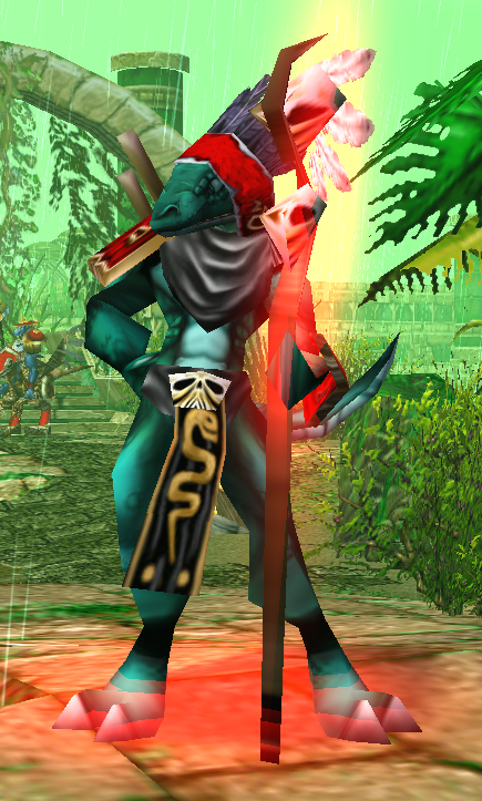
Hero Lizard Witch

A female intelligence hero model for lizardman pack. Animations include spell, attack slam, spell slam and spell throw (she throws an axe).


UPDATE 20.07.18 New texture and minor improvements

UPDATE 20.07.22 Some minor adjustments, new icon, separate hero and unit forms, axe missle model, shiny

Keywords:
lizard, lizardman, humanoid, dinosaur, reptile, sword, witch, wizard, sorcerer, sorcereress, magic, caster
Contents

Lizaed Witch 2 (Icon)

Lizard Missile (Model)

Lizard Witch (Icon)

Lizard Witch Hero (Model)

Lizard Witch Unit (Model)

Reviews
17:36, 16th Nov 2014 Misha: very cool little model, she looks and works nicely ingame. the only thing is that you could have made her little bigger as a model. also the teamglow on her staff could be smaller and billboarded. not needed, but if you...

Moderator

M

Moderator

17:36, 16th Nov 2014
Misha: very cool little model, she looks and works nicely ingame. the only thing is that you could have made her little bigger as a model. also the teamglow on her staff could be smaller and billboarded. not needed, but if you tweak it more, i'll raise the rating
 
dat animation, indeed.

but i'd agree it's too overfeminine for a lizard. I like her spirit at the 'walk' and 'spell'. they do look female, but not 'girly', as the stand anims. I'd recommend going for a 'evil-serpent-like-poisonous-and-treacherous-lady' mood at the stand anims, dunno how would you do that, though. :v

edit: looking at it again, i think the issue is that right know it looks too humanly girly. should look a bit more like a savage beast, but still feminine. well, that's kinda hard to achieve...
 
Last edited:
Level 20
Joined
May 6, 2007
Messages
675
I actually think the overfeminine is good. It gives some personallity to the model. like she is trying way too hard to show that she is a female. Could be that other races simply coundt differentiate, so she got all flanboyand as time passed and now enjoys doing these exaggerated gstures. The other lizardmen just roll with it because she can pop their heads open with magic.
 
Level 47
Joined
Jul 29, 2008
Messages
9,685
Hot Dayung. This is so schweet.

The model itself is, well, to be honest, 'nothing to write home about'. It gets the job done, but you'll notice that Hero models tend to have certain accoutrements and otherwise be just a bit "extra"; extra buff, extra armored, extra-big weapons, extra-personality. This lady is a bit on the slim side when it comes to that stuff.

Where she shines is her animations. Dat Anims! I just love the lady-like poses & attention to detail; lots of interesting little nuances. You are truly quite good at that, and getting better.

I desperately hope I can find a place for them. Would you be alright with me (or a willing slave volunteer modeler) using those animations in another model? I can think of a Troll lady who could use some sass... :p
 
Level 12
Joined
Apr 9, 2013
Messages
762
This must be one of if not my favourite model I've ever gazed my eyes on, it just has it's own personality and it's quite well made and the size is not even that great.
Which makes this model a joy to have.


EDIT:

Not to mention it has a dissipate and a decay animation which is something many people neglect quite too often, well done.
 
Last edited:
Level 12
Joined
Apr 9, 2013
Messages
762
Hmph, I think you made a big mistake, this was one of your best works.
The texture is too bright and undetailed, could be the old one was the same but the colour helped hide that.
Just compare the Icons, first one looks like it could be a character from a Disney animated film the other one could be a screenshot.

What is more unfortunate is that I appear to have lost the older model, you wouldn't by any chance have it backed?
 
Level 38
Joined
Oct 26, 2014
Messages
437
Hmph, I think you made a big mistake, this was one of your best works.
The texture is too bright and undetailed, could be the old one was the same but the colour helped hide that.
Just compare the Icons, first one looks like it could be a character from a Disney animated film the other one could be a screenshot.

What is more unfortunate is that I appear to have lost the older model, you wouldn't by any chance have it backed?

nah I still have it

I agree the new icon is trash, I rushed it too much because I wanted to upload it asap and go to sleep. Also the portrait might use more work

I like the new texture though
 
Top