• 🏆 Texturing Contest #33 is OPEN! Contestants must re-texture a SD unit model found in-game (Warcraft 3 Classic), recreating the unit into a peaceful NPC version. 🔗Click here to enter!
  • It's time for the first HD Modeling Contest of 2024. Join the theme discussion for Hive's HD Modeling Contest #6! Click here to post your idea!

Belgarath's Third Terrain Showcase

Status
Not open for further replies.
Level 21
Joined
Sep 22, 2007
Messages
2,772
As it's no good posting 50 threads with terrains in them, I decided to open my third and hopefully final terrain showcase. It'll contain only what I think are good screen shots. Each one is labeled and numbered.

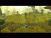
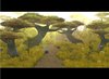
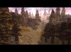
1. The Forest Hills - my first screen shot with actually good lighting.
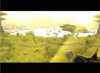
2. The Long Way Home - my second well-lighted shot, of a couple of ships returning home.
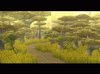
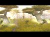
3. The Forest Hills - Small Scale - the path winding through the Forest Hills.
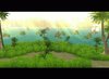
4. The Tropical Island - where the people in The Long Way Home are coming from.
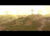
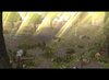
5. The Forest Road - a road winding through an unknown forest.
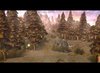
6. The Lost City - a lost city. Gave me a big idea for the challenge terrain.
7. The Ancient Wood - an ancient forest, done for a challenge terrain.
8. The Bushy Road - a road that was based on a forest road in Germany, just memories.
9 & 10. The Fall Path - a road through a forest. 100% playable, uses one custom model.
11. The Path - a path running through the expanse of Real Texture country. Uses RTES models.
 

Attachments

  • The Forest Hills.jpg
    The Forest Hills.jpg
    86.2 KB · Views: 615
  • The Long Way Home.jpg
    The Long Way Home.jpg
    64.2 KB · Views: 575
  • The Fores Hills - Small Scale.jpg
    The Fores Hills - Small Scale.jpg
    78.5 KB · Views: 554
  • The Tropical Island.jpg
    The Tropical Island.jpg
    66.2 KB · Views: 602
  • The Forest Road.jpg
    The Forest Road.jpg
    75.3 KB · Views: 583
  • The Lost City.jpg
    The Lost City.jpg
    76.9 KB · Views: 452
  • The Ancient Wood.jpg
    The Ancient Wood.jpg
    27.4 KB · Views: 406
  • The Bushy Road.jpg
    The Bushy Road.jpg
    44.4 KB · Views: 449
  • Fall Path.jpg
    Fall Path.jpg
    78.5 KB · Views: 417
  • Fall Path No. 2.jpg
    Fall Path No. 2.jpg
    67.1 KB · Views: 427
  • The Path.jpg
    The Path.jpg
    71.5 KB · Views: 336
Last edited:
Level 34
Joined
Sep 6, 2006
Messages
8,873
I thought the same thing as Void. It's all the same thing, with slight variation. It's really good, but everything looks too similar. You need to branch out.
 
Level 36
Joined
Jul 1, 2007
Messages
6,677
The newest one is definitely good, but some pointers.
Fors starters, moonlight isn't purple. ^_^
Also, the leaves on the tree are much different colored from the trunks. Looks unrealistic.
The grass model sucks, and so do the bushes. Change that.
The path just looks like the grass is COMPLETELY gone and there is just dirt. Looks really bad, you should add a thinning out effect, or pebbles, or something to make it looks complete.
Tile variation.
 
Level 21
Joined
Sep 22, 2007
Messages
2,772
Don't see what's wrong with the grass. Dude, are you colour blind? It's bloody blue and who said it's moonlight? Bushes don't suck either. And it's an ancient forest, you dunno what magic's there to keep the grass off the road. As for tile variation, imagine this one without the grass ... not so appealing is it? The rough dirt is crap.
 
Level 34
Joined
Sep 6, 2006
Messages
8,873
You new terrain is a slight step away from the others, but still similar. Try making something totally different. They all use tallish grass, trees, and a path. The background and color variates.
 
Level 36
Joined
Jul 1, 2007
Messages
6,677
Don't see what's wrong with the grass. Dude, are you colour blind? It's bloody blue and who said it's moonlight? Bushes don't suck either. And it's an ancient forest, you dunno what magic's there to keep the grass off the road. As for tile variation, imagine this one without the grass ... not so appealing is it? The rough dirt is crap.

Sounds like laziness to me. You don't need to use whatever tileset you are using, you can use ashenvale or village, too.
 
Level 4
Joined
Feb 22, 2008
Messages
46
They are all ok, but they are missing something. Maybe there's just not anything interesting enough to focus on in the picture, they're all just grass, trees and light. And the blue light on the last one looks ugly, I suggest making it teal or something.
I dunno, don't listen to me. Not like I've done better!
 
Level 34
Joined
Sep 6, 2006
Messages
8,873
Again, too bright, and I'm getting sick of those trees. It would be good if you hadn't posted anything before it, but as is, I dislike it because it's the same stuff.
 
Level 12
Joined
Nov 5, 2007
Messages
730
Looks pretty nice.The others might not like the lack of variations,but you managed to use that to make it look cool.+rep!
 
Level 34
Joined
Sep 6, 2006
Messages
8,873
It has tiles. That's new, ain't it?
You are slowly breaking away for sure, but you haven't yet. Your one for the contest was quite different though.

Edit: Although everyone has a style. All my terrains look similar and so do Voids, and MadseN's, ect. So most of your terrains are going to have a similar feel, you just need to get away from the few doodads that you keep using.
 
Level 4
Joined
Feb 10, 2008
Messages
110
you just need to get away from the few doodads that you keep using.
And the light! It looks good on a couple terrains, but where does it all come from? also it obscures quite a bit of the terrain at times and makes it a bit uninteresting, the one for the contest was a definite improvment.
 
Level 25
Joined
Mar 25, 2004
Messages
4,880
I like the tree variation in the Fall ones. They're all great, except the dark forest terrain looks a little... plain, I guess would be the word I'm looking for. Try adding more trees, rocks, and other things that stand out more besides the grass. Plus, the path isn't very noticable. Not in a good way at least.

~Craka_J
 
Level 36
Joined
Jul 1, 2007
Messages
6,677
Belgarath, you need to work on your lighting. Sunlight doesn't just come down in rays like that ;) And you can see the individual light doodads. Especially in the very last one :\

And the one where the lights go behind the hill, well in my opinion lights should only be right in front of the camera, or if not, used sparingly. But hey, it's up to you, artistic license, right? :D
 
Level 25
Joined
Mar 25, 2004
Messages
4,880
Just looked at your latest batch of terrains. They're not impressive really, but it looks like a very... clean terrain. Reminds me of a golf-course or something. I like it, but there are things about it that I don't like. The elevation under trees is scarce and I'm not a big fan of Ashenvale trees either for Warcraft III. Though, the tile variation was done neatly and blended nicely which is what I think gave the terrain overall a clean look to it.

But like I said, there wasn't much to be impressed by. It is a very basic terrain that happens to look pretty good. What can I say.

Your weakness is in lighting I suppose, as ~Void~ has said, and the placement of your environmental doodads such as Logs is somewhat slightly random. Unfortunately, I cannot explain myself. I rate the terrain a 6/10 since it was neat, but nothing cool.

~Craka_J
 
Status
Not open for further replies.
Top