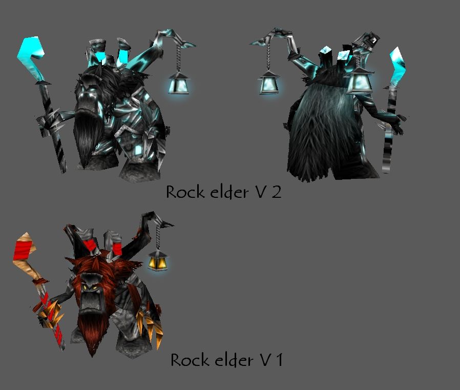
The Rock Elder is known to be one of the wisest and oldest rock golems World wide. His knowledge of the world has it's roots in the oldest of WarCraft's wars, when he was still made of rocks. His old and breakable rocks make him weak in fighting, but his mental strength and intelligence have led a lot of other golems that were summoned by his master to victory. The wizard that summoned him has learned and studied the structure of the night elf Ancient of Lore.
Give credits if used. The hair is supposed to look like me (Ganondorf ^^)
Update 1 (january, 27, 2011):
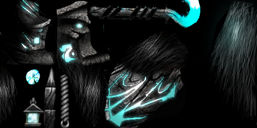
I've updated it. Added some Crystals'n'shit. Feel free to download the old version if you like it better. It's the one in the middle (Picture preview). Here's the
LINK
Update 2 (january, 27, 2011):
Yet another update. I say'd that the updated texture would suck, and I was right. So, I update it again to my original vision. Gonna add some more details.
Update 3 (january, 28, 2011):
...Another update. I like it.
Keywords:
rock, elder, the, warcraft, ancient, of, lore, master, you, still, reading, this?, you, are, awesome, i, must, say.

 Approved
")