-
🏆 Texturing Contest #33 is OPEN! Contestants must re-texture a SD unit model found in-game (Warcraft 3 Classic), recreating the unit into a peaceful NPC version. 🔗Click here to enter!
-
It's time for the first HD Modeling Contest of 2024. Join the theme discussion for Hive's HD Modeling Contest #6! Click here to post your idea!
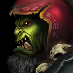
Gul dan

- Author(s)
- Murlocologist
- Size
- 7.73 KB
- Rating
- Downloads
- 395
- Created
- Nov 17, 2016
- Updated
- Nov 24, 2016
- Resources
- 1
- State
 Approved
This bundle is marked as recommended. It works and satisfies the submission rules.

Another orc, Gul dan.
..........................
updated version.
..........................
updated version.


")


