• 🏆 Texturing Contest #33 is OPEN! Contestants must re-texture a SD unit model found in-game (Warcraft 3 Classic), recreating the unit into a peaceful NPC version. 🔗Click here to enter!
  • It's time for the first HD Modeling Contest of 2024. Join the theme discussion for Hive's HD Modeling Contest #6! Click here to post your idea!

Working on Fullscreen systems

Status
Not open for further replies.
Damn mate, you should really make custom icons for game customization...

And you could make a rectangular model which would wrap around selected game mode/map area/etc.

^Actually right. The icons simply doesn't work well enough with each other. It's like thousands of themes altogether.

These icons feel like randomly selected for the interface. It ruins the awesomeness of Game Mode Panel.
Hmm yeah, they are very uninformative at the moment.
I wanted to avoid using custom textures for filesize reasons but I suppose it's the only way to make the buttons clear.

Look at the ability panel for example. Just what!? An undead face, then a revenant, a weird naked man and finally a map. Ehh. Also, the coloring and lightning with these icons is so different it makes me sad.

TLDR: You created an awesome Game Mode Panel but you ruin it by your laziness with adding random Blizzard icons.
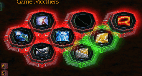
The ability and inventory stuff are all leftovers from the previous system.
I'll fix them at some point, I'm currently focusing on developing a new game mode.

+rep and thanks for the feedback!
 
Level 30
Joined
Nov 29, 2012
Messages
6,637
I do agree its very uninformative but some suggestions, how about when players point the cursor at the icons, a description box explaining that mode appears. Through this, it add some more art into this Fullscreen System you are making and not also that but it also makes your system informative enough for players to get known with.
 
After some experimenting, it appears that it is actually possible to combine item tooltips with working buttons directly.

124756-albums909-picture73050.gif

124756-albums909-picture73049.gif


This should make the buttons clearer now.
Also, if everything goes as planned, I should have version 0.99 uploaded towards the end of this week.
 
Ah great then, Kita. Just a minor suggestion then, I do think it better fits if that you make the icon shape to circle to fit and blend with the Circular button.

Actually, they are nearly circular attachments on the buttons (they are octagonal).
However, since I use in-game icons as textures, they end up looking like squares because I can't really stretch the icon to the full area without making it look stretched or odd.

I guess I could make custom circular icons for all the game modes and modifiers.
It would only result in around +80kb increase in map filesize for all of them.
I'll need to consider this...
 
Status
Not open for further replies.
Top