• Listen to a special audio message from Bill Roper to the Hive Workshop community (Bill is a former Vice President of Blizzard Entertainment, Producer, Designer, Musician, Voice Actor) 🔗Click here to hear his message!
  • Read Evilhog's interview with Gregory Alper, the original composer of the music for WarCraft: Orcs & Humans 🔗Click here to read the full interview.

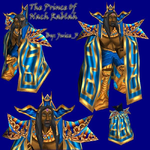
ThePrinceOfNachRablahFinalZ

  • Like
Reactions: deepstrasz
I have'nt submited any skins for a while so i thought it could be time to do it.It's 100% freehand.Updated Skin, Changed cape and some other things. Path: Textures\Hero_BloodElf.blp

Keywords:
Blood Mage, Egyptian, Prince
Contents

ThePrinceOfNachRablahFinalZ (Texture)

Reviews
THE_END: I was so making a skin like this..but abandoned it when I saw your finished product. Awesome stuff

Moderator

M

Moderator

THE_END: I was so making a skin like this..but abandoned it when I saw your finished product. Awesome stuff
 
Level 16
Joined
Jul 19, 2004
Messages
513
I know the bloodmage is overskinned sry for using it.
Here's some icons that goes great with the skin:
http://www.wc3sear.ch/index.php?p=Icons&ID=7250&sid=809c410aecbd55c1b7e08f628cbe8f19

http://www.wc3sear.ch/index.php?p=Icons&ID=7245&sid=809c410aecbd55c1b7e08f628cbe8f19
 
Level 9
Joined
May 10, 2004
Messages
608
hm, i like how you kept it fairly simple, and still adding small details here and there.
Overall id say its a good refreshing reskin of the bloodmage. But the quality of the shading/effects etc. would be around a 3/5 imo (which i would consider quite nice, coming from me)
 
Level 13
Joined
Jul 28, 2004
Messages
1,340
awesome event, its another skin that rises up from the pile of crap.

the changes of the face are somewhat minor, he apparantly have the same texture. you could change his eyebrows so they look like blended with the skin, for a even more realistic effect. he have a curve on his bottom cheek, while its good to definate the face some and add depth, i think you should delete half of the curve, so the darkened part remaining is the one near to the eye.

his shoulder pads are a eye candy, but i'd put some sparklings of white around the very bright areas. i noticed you mainly use burn and dodge, but its very, very important to use your color palette, that also gives a beautiful and realistic side to your work.

seems like this burn n dodge job took long enough, but dont forget to draw sometimes too, thats most likely what will make you stand above the other skinners on this website
 
Level 7
Joined
Jun 30, 2004
Messages
106
Excellente' mon...this is definately one of my favorites if not my favorite. I really enjoy looking at the nice highlights on the cape. I might use this one in my campaign...one question did u add some transparency anywhere on this skin because i may have multiple blood mage skins and if i do ill have to put this one under a seperate model.
 
Level 15
Joined
Aug 13, 2004
Messages
406
The face is not very good and is could really use some more detail considering the large file format. The gold on the shoulders and on the cape is well done, however the gold boots are too orange and a bit slopy although the concept is solid.
The chest is pretty poor, although I can forgive that considering how poor the wrapping is on that part but I suggest so sort of cloth or armor instead of trying to portray muscles.
The hands look silly and kinda take away from some of the better areas of the skin. They could definitely afford some more detail.

Overall a good skin although not DC worth in my opinion.
Could probably be reduced to 256x256 without a major loss in quality.
 
Level 12
Joined
Aug 10, 2004
Messages
1,141
From regular point of view its fine but it looks like this model has a hefty rack lol

also the eyes are a bit cracked out

Otherwise great model
IU especially love the bright colors
 
Top