Footman16
Community Manager
- Joined
- Jul 14, 2012
- Messages
- 3,744
Contestants were to re-texture a SD unit model found in-game (Warcraft 3 Classic), recreating the unit into a peaceful NPC version.
| CONTESTANT | WRAP/UNWRAP | ENTRY |
Bleeq |
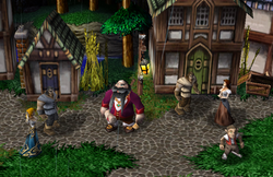
Town MayorThis is my entry for Texturing Contest #33, Peaceful NPCs. He could also pass as some other type of aristocrat or official I guess. In hindsight, I think I was a bit influenced by the Napoleon moving coming out. The Archmage voice goes well with him (just ignore the horse naying lol). I could...
| |
Shido |
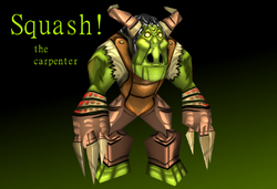
Squash The CarpenterEntry for Hive's Texturing Contest #33 (not 32 lol, footman quit ctrl+c;ctrl+p then) My return was not so expected but at least I can cook up new stuff. Version 1.0 Released. Tag: Orc, Sasquatch, Woodmaster, craftsman, journeyman, squatch
| |
| demongrel |
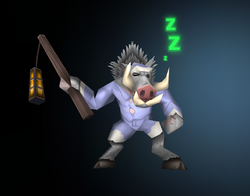
Sleepy QuillboarHere's my entry for the Texturing Contest #33: Peaceful NPC This poor quillboar has gotten lost on its way to Razorfen! Will you help this sleepy piggy back to its blanket?
| |
| Vinz |
| |
| PrinceYaser |
|
- 1st place: 750 experience points
- 2nd place: 600 experience points
- 3rd place: 450 experience points
- Entry: 150 experience points
- Judge: 25 experience points per entrant
Bleeq:
Shading: 10
Concept: 20
Details: 10
Total: 40/100
Shido:
Shading: 25
Concept: 20
Details: 25
Total: 70/100
demongrel:
Shading: 20
Concept: 20
Details: 20
Total: 60/100
Vinz:
Shading: 30
Concept: 30
Details: 25
Total: 85/100
PrinceYaser:
Shading: 30
Concept: 40
Details: 30
Total: 100/100
Shading: 10
Concept: 20
Details: 10
Total: 40/100
Shido:
Shading: 25
Concept: 20
Details: 25
Total: 70/100
demongrel:
Shading: 20
Concept: 20
Details: 20
Total: 60/100
Vinz:
Shading: 30
Concept: 30
Details: 25
Total: 85/100
PrinceYaser:
Shading: 30
Concept: 40
Details: 30
Total: 100/100
Bleeq – Town Mayor
Shading – The shading has been done to a good degree, the folds of his gown and sleeves has been done really well and appropriate colours and shades have been chosen. The lighting source comes from above which is necessary for Wc3 style lighting. The only I see is a lack of overall “macro” shading the shading could also serve to be stronger maybe some deeper blacks. The highlights seem fine though. 20
Concept – The concept is very cool, you’ve transformed the Tuskarr warrior into a Human, burly mayor of the village. The transformation is total and fits the theme perfectly. Maybe not the most unique as a town mayor seems like quite an obvious choice for an idea for a peaceful NPC but nonetheless a very appropriate choice. 35
Details – This is an area where there is a lot of good and bad. The wrinkles and detailing on the head and face are excellent, very Warcraft-y and evokes the look perfectly with the wrinkle folds into the eyes etc, the hair has also been done really well in it’s own style. The necklace and scroll are also good and have been drawn very well. However, the coat, trousers, socks, shoes, hands etc are all quite poor in comparison. They’re quite “blobby” and could definitely use more detailing and definition to achieve the appropriate texture’d look. The shading on them is fine but they need to look more like the material they are supposed to be. 14
69
Shido – Squash The Carpenter
Shading – The shading here is a bit of a dichotomy between some really amazing and perfect areas of shading on his coat, skin etc and then other areas where there is a distinct lack such as his legs and hair. The deep black cartoon-y outlines are also really good at making the texture “pop” and stand out which is good however I do think overall there could be some more darker shading in the lower areas and a slightly stronger highlighting on areas closer to the top of the skin. 21
Concept – We have a Sasquatch/Orc hybrid who has given up being a creep for being a Carpenter? A very unique idea which is good, so props there, however I’m not sure how well the “carpenter” idea comes across since his outfit could really apply to almost anything and maybe even a warrior with the leather and furs. It is unique and I do like the idea but I’m not sure how strongly the unit evokes “peaceful”. 24
Details – Similar to the shading we have some good and we have some areas for improvement, the skin on the arms and face is really good, really well done there especially with the small scratches and marks and discolouration not just going for green but adding some brown hues too is really good. His jacket has also been done really well and I like how it looks. The Hair, trousers, fur and hands however could definitely use some more fine detailing, right now they’re very “vague” and I’m not sure they convey the look or at least its hard to tell. The hair and fur as well could definitely use just some more lines and details to really convey the material although this applies to the hair more than the fur since the fur at least has a distinct shape to follow. 12
57
demongrel – Sleepy Quillboar
Shading - Similar to other entries we have some good shading here and I have been especially impressed with some of the “shaping” shading we have seen elsewhere and here the shirt has those nice subtle folds in it that sells the soft, look of nightwear to it, the hair and fur has shading and there’s even some macros shading in places. However, the shading is not nearly enough in my opinion and there are lots of areas where more and especially more distinct shading could be added particularly the flesh in between the buttons, underneath the collars and just overall there needs to be more. The macro shading is also absent and there needs to be stronger highlights at the top of the texture for the light source. 15
Concept – I really like this, it’s a very cool take on the unit turning the normally violent quillboar into just a sleepy little dude, very fitting especially with the creep sleep effect. It’s unique as well in terms of how it’s been transformed. It is still a Quillboar so the transformation isn’t complete in that regard but the concept is cool and I do like it and it fits the brief even if it is mostly a clothing change for our Quillboar. 28
Details – There are some great little details here, the snout as it transitions into the flesh has been done really well, the fur detailing has been done well, the shirt that looks like it’s bursting is also a nice touch with the small buttons. His lantern as well is really good with the faintest candle visible through the hazy orange glow, the lantern and the face are definitely two of the standout areas here. The areas that I think could use the same love and care are the handle and the rest of the mane they look quite dull and lacking in comparison, I also think there could maybe be a wee bit more detailing on the shirt and the buttons could use some love in spite of their inclusion, the tusks aren’t bad either but I think could use some more work with the grain running along the ivory. 10
53
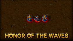
Vinz – Honour of the Waves
Shading – The shading here is really top notch, from the way the gold reflects like a metal to the metallic shine of the clothes, there’s good use of dark shadows and highlights on the bottom skirt section and overall there is a good mix of macro and more detailed shading as well as the neat eye to detail of adding the shadow of the hat over his face. The way the light also peaks at the top of his hat is also a very cool feature. It’s very stylised. If I had one complaint its that maybe the shine has been used too mich, from the gloves to the chest to the hat to the skirt, it’s everywhere but this is a minor nitpick. The shading on the belt also feels off with the pattern of the three light highlights between the dark, it doesn’t really add a shape nor does it make sense for the curve of the belt round the body in my opinion. The shading and highlighting on the bottle is also really good and definitely caught my eye. I also noticed the nice thick highlight edge on the nose of the panda which is a very Warcraft-y style of highlight. 27
Concept – I feel bad when it comes to this criteria because it is such a nice texture overall however in terms of the brief there isn’t much that satisfies. It’s not very unique in the sense that the blue panda is still a blue panda. It could just as easily be an upgraded skin for the original Element of Storms Panda model rather than a conversion or alternative appearance and so would have been better suited for the Upgrade Texture Contest. He’s an Admiral, which I suppose if he’s a trade fleet admiral, could be peaceful enough but sadly that part of the brief also isn’t shouting out to me and I could see him just as much a military Admiral as any other kind. He has no overt weapons, and just a water bottle so whilst not overtly armed or “militaristic” I still think this is definitely a weak point. 15
Details – In terms of detailing we have some beautiful areas, the golden trim is executed perfectly with the ornate design across the chest, belt, skirt and hat, it simply looks wonderful and I am in awe at it. The skirt also looks great with the nice folds in it and the other parts of the texture have also had some nice attention paid to them. The face has the small wee whisker dots and the eye looks phenomenal down to the wee curl on his patch of eye fur. Where the texture suffers, however, is in the overall material look, we do have an attempt at a kind of fur texture on the inside of the chest armour, but other than that everything is very smooth and very shiny, whilst the head itself is just smudged, I do appreciate the subtle attempt at suggesting fur with the 3 drawn areas but I think more could be done to sell to me that it is fur, the cloth bits and the hat, the arms and the chest are all a little too similar in my opinion so I would’ve like some more detail variation there. Don’t get me wrong the texture is still wonderfully done but I think it just lacks that Je ne se qois when it comes to detailing in some areas or at least in regards to material as a lot of the “detail” is conveyed through the shading. 22
64
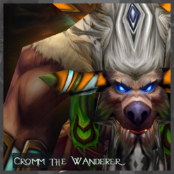
PrinceYaser – Cromm The Wanderer
Shading - Wow, this texture definitely reminds me of some of the higher quality textures you would see in World of Warcraft, we’ve got a good mix of light and dark and the shading has been used to great effect to show the shape of features from the head to the arms and even hands. He looks phenomenal in terms of shading and highlights, the glow from the lamp has also been used really well as a light source and the colour blend has been used to excellent effect across the entire skin. If I had one nitpick I think the lighting and shading is a little off since the shoulders should be lighter than the lower parts of the arms or at least that contrast could be a little stronger and I think a stronger lighting contrast on the legs could help them to stand out a little more as they get lost when looking at the model top down, however these are nitpicks of the highest order. 29
Concept – This is a difficult one, on the one hand his weapon has been suitably converted into a helpful lantern, Tauren are notoriously pacifistic by nature (Grimtotem excepted) however I’m still not sure how “peaceful” he looks in concept and I feel like he could just as easily be a combatant as a non-combatant. I also wonder whether he is a Tauren or a Furbolg just from looking at the head/face portion since he could fit both. Overall it does fit the brief but I’m not sure how unique or transformative the overall idea is in regards to this contest. 25
Details – Boy, where to start, the eyes are blue and glow, the armour is intricate and details, he has grass trousers, leather belt and a massive wood and brass metal totem with a beautiful colour palette choice across the whole texture for contrast but with none of it clashing, the subtle blue colouring of the lantern is also a nice choice and then the hair with the gemstone in it is also another added feature which is difficult to pull off with the wrap of the Tauren Chieftain. What’s meant to be fur looks like fur, what’s meant to be skin looks like skin. This is a cacophony of attention to detail that just screams at you to be noticed and looked over. I’m not sure there’s much more that could be added in terms of detail here. 30
84
Final Thoughts
This has been an interesting contest to judge and we’ve had a great field of entries. What sticks out to me with all of them was the overall quality of shading across all entries, every single person showed off good quality shading and highlighting work and whilst some could have expanded it and perhaps applied that quality more consistently across the whole texture the quality was there in every, single contestant.
In terms of the points total the fact that concept is 40 compared to the 30 of the other areas definitely does weight the results towards those who are able to fit the brief in unique and inventive ways. In some ways I think making the total out of 100 whilst easy from a mathematical point of view does make quantitative judgement a little difficult, what is the different between 21 and 22? Or between 11 and 12? At that point I think it strays a little outside of the objective towards a vaguer and looser sense of judgement. So, in future I would prefer each category’s maximum total perhaps be out of ten or 15 at max.
I’ve got to say though I have been impressed overall with all the entries, even those who haven’t won a medal this time around I see the potential and with some more time and practice every single entrant has the potential to be a winner in future contests. It may have taken us a while to see this contest through but we got there in the end and I have also learned some of the nuances of being the staff member running a contest, maybe next time I will stick to being an entrant too!
FinalScore = (40*Reached_Votes/POSSIBLE_VOTES) + (60*Average_Judge_Score/POSSIBLE_SCORE)
Assigned Staff: @Footman16
Previous Contest | Contest | Poll


 . But hey congratz everyone and remind yourself do not put your lamp horizontally. My ancestors will find you if you do so.


