- Joined
- Apr 24, 2012
- Messages
- 9,842


Contestants must dive into the depths of the infernal realms, and return with two effects, tokens to their inner darkness. By demons be driven!
- 1st place: 40 reputation points.
- 2nd place: 25 reputation points.
- 3rd place: 10 reputation points.
- Entry: 5 reputation points.
- Judge: 5 reputation points.
The three winners will receive an award icon representing the winning entry.
- Judgement: 70%
- Poll: 30%
Antinous
Demonic Adornment
Aesthetics – The model looks so nice. It simple yet fitting to what it wants to represent. The color scheme is good and could’ve used more colors and be improved. Also, you could use a more detailed texture on the wings’ fiery detail. Still, I do think this is a great effect for buffs. Good job on this one! 23/25
Animations – Birth animation is kinda lacking. The way the wings appear instantly and the way the skull just hovered out of nowhere did not satisfy my standards. You could have used some particles and glow to the birth in a way that it doesn’t overwhelm the model. Death animation could be improved by giving it a decaying look after it fell to the ground. 10/15
Creativity – Nothing really new with the sfx. Its just bones with fire and is seemingly used in other sfx. Still it is enough such that it doesn’t overwhelm the sfx with too much feature and detail. Its clean and it is good to use to what it is designed for. 15/20
Integration – its clean and works well in game. 15/15
Theme – the effects reeks of demonic theme. I mean it’s bones, horn and fire. 14/15
Hell Cursed
Aesthetics – This has a lot of potential if executed properly. I imagine the vfx to be inky and demonic themed. The overall model is lacking. This could’ve added more poly and the cross and chain and added more to its color scheme. The animated chain texture could have been replaced with a shadow look. The runes are a good addition but with the lackluster chains, the overall aesthetic is kinda meh. Here’s an example of how I imagine it to look like. 15/25
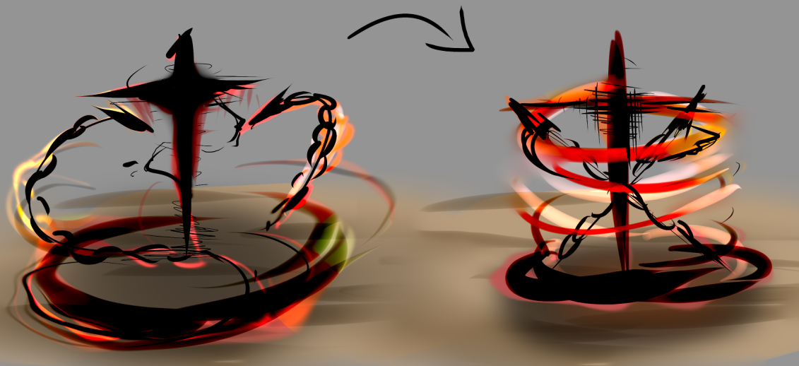
Animations – The animations are as lacking as its model and overall aesthetics. Could have used more movements and it would be an awesome binding sfx. Birth and death animation aren’t smooth enough for my standards 8/15
Creativity – I really like the creativity on this one. The execution may not be good enough but the way this was imagine was really interesting. A bit more detail and this could’ve been one the great sfx out there. 19/20
Integration – Simple, clean and it works in game. 15/15
Theme – fits the theme cos of the addition of runes, might be used for shadow spells. 14/15
JetFangInferno
Desecrate
Aesthetics – It has too much in it that it make the overall aesthetics messy and made the purpose of the sfx kinda chaotic. Color scheme isn’t that bad but the red rotating rune’s color could have been improved. Also, instead of having one “soul” moving upwards, you could have added desecrated smoke effects on the ground and added a more soul-taking to its environment. 15/25
Animations – The animations are kinda average since it is basically a mix-up of warcraft 3’s basic animation. Tho I still do consider it smooth enough for the its aesthetic. 10/15
Creativity – not really creative. It’s a mix of the death of undead building structure, ground texture and runes with shockwave particles. Nothing really new introduced. 13/20
Integration – works well in game and not messy enough to cause obstruction of game view. 15/15
Theme – kinda shadow-demonic type. Fits the theme well. 14/15
Annihilate
Aesthetics – I like the overall design of this one. Small details like black desecrating particles on a white background and tail particles going upwards really amplify the impact of the vfx. The small glowing particles one the buildup also brought a smoother look instead of just black smokes. And the soul are just satisfying to look at. Still, it’s a bit messy due to the overuse of rune and ground textures. 22/25
Animations – it only has one animation as a whole and was executed good enough. 12/15
Creativity – I found the way this was executed to be creative. The mix of soul-desecrating theme with a flamestrike-style of build up was neat. 17/20
Integration - works well in game and not messy enough to cause obstruction of game view. Sounds also fit well 15/15
Theme – also a shadow-demonic type. Fits the theme well. 14/15
Mythic
Fountain of Souls
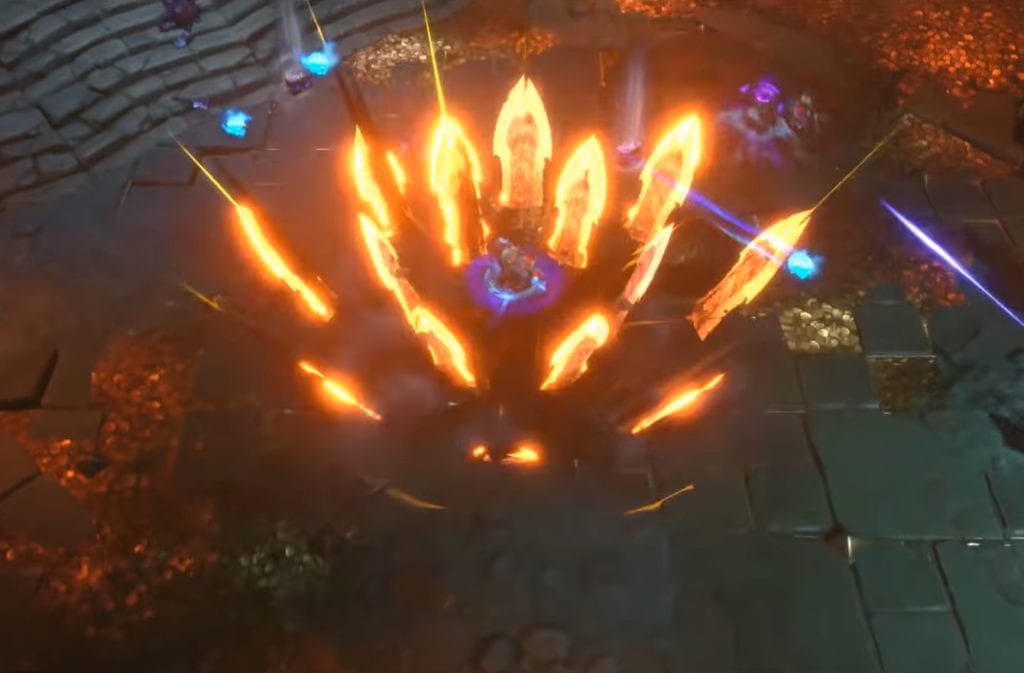
Aesthetics – This thing is an eyecandy. I love the effect produced with animated textures and a rotating model. I do believe, however, that it would look much better if there are more of that detail(soul thingy in the middle) than just one to add a randomness and more natural fire feel on it and also I do find that “laser” on the middle as a mess that doesn’t help in what the creator wants to do with the effect. The color scheme is also nice. The purpose of the model isn’t really clear. I imagine it as an effect for the tranquil ability, tho because of the heavy details in its center, it does not look like quite it fits for that ability. This effect is probably better for a doodad instead. Like for a power plant (apex legends’ drill site laser). 23/25
Animations – Since the model’s purpose aren’t clear, I cant say if the few animations are lackluster or not. But I’d say its good enough since it smoothly transitions from birth to death. 12/15
Creativity – This effects creativity lies in its detail. I really like that animated rotating soul thingy. I also like how you experimented with what to add with the effects, like the laser thing and the ambient particles, however I suggest to look for references to have a better idea in what to add and what to not add. 18/20
Integration - works well in game and not messy enough to cause obstruction of game view. Sounds also fit well 15/15
Theme – kinda lacking on its demonic side since fire does not necessarily reeks of demonic theme 13/15
Kingdom Come
Aesthetics – The effect looked kinda messy. There is a sword falling, unnecessary spikes that would look much better if it’s just crater on impact, and a bunch of overused particles. Also the placement of rubbles and rocks at its death seemed really out of place. Color scheme is nice if you ignore the sword detail. Overall, the main problem of this effect is that the details introduced does not really go well with each other, producing a messy result. I suggest adding motion blur, decrease the duration of the particles, replace spikes with cracks and crater which would appear instantly and die in a smooth way. 15/25
Animations – Please don’t add a slow-moving movement on a sword after it landed, it really seemed wrong, also proper timing on the rubble effect as stated earlier. Also please don’t add a slow movement on the spikes. Proper reference for the movement would be War’s Blade Geyser from darksiders. 10/15
Creativity – I like how you experimented with what to add with a sword fall effect. Even though it did not turn out as a satisfying effect, it is original and that should be given credit. 17/20
Integration - works well in game and kinda messy if scaled larger and might cause obstruction of game view. Sounds fit well 13/15
Theme – Sword reeks of demonic theme, together with the spikes and fire. 14/15
xYours Trulyx
Gatekeeper's Pact
Aesthetics – Too much stuff has been added to this effect causing a messy aesthetic. Color scheme is kinda nice. The archimonde head effect feels so off. The way it just floats reminded me of the screaming meme. It will look a lot better if it has a better fading effect with it being animated. 15/25
Animations – It only has a birth animation which is pretty mediocre. The way the red/fiery winds appear and the way it spins just does not appeal to me. It would be better if you have added different rotation speed to each of the winds. Also adding a spin, even a small amount, to every element of the effect would give it a more natural animation. 10/15
Creativity – the overall aesthetic may not be as nice as expected but the way you added features than just sticking with what the warcraft 3 effect looks like is very creative. It wasn’t just executed really well. 18/20
Integration – Slightly messy and might cause obstruction of game view. Sounds fit well 13/15
Theme – With the archimonde head, and the fiery color scheme, this effect fits well with the theme. 14/15
Infernal Bulwark
Aesthetics – Everything from birth to stand looks fantastic! Death effect kinda brings it down tho since some kind of static cloud texture appears as it dies which is really bad looking. Try not to add a motion to static images since they will look unnatural and will look like a bad edit in a video (imagine like moving photos in a meme video). The color scheme is fantastic! The gradient from dark ground to fiery glow looks really nice. The particles used in it are just fantastic. Everything is so vibrant. A bit more polish to this effect and this would be perfect. 23/25
Animations – The birth and stand animation looks really nice. The way the birth animation transitions to the stand looks fantastic. The fire winds fit really well with the effect especially in the birth animation (it looks so clean). As said earlier, the particle’s animation is bad on the death animation. Scattered, small particles of the same kind looks bad on a fire vfx since it makes the fire looks like weird snowflakes. 13/15
Creativity – It felt that it has the same creativity as the gatekeeper pact ability. The way you put those fire winds in the effect is pretty neat. The way it just comes to the user during the birth animation was really fantastic! And the way you put a glow the spikes and transitioning it the stand animation was really clean. 18/20
Integration - works well in game and not messy enough to cause obstruction of game view. Sounds also fit well 15/15
Theme – Spikes and fire. Really fits the theme. 14/15
Demonic Adornment
Aesthetics – The model looks so nice. It simple yet fitting to what it wants to represent. The color scheme is good and could’ve used more colors and be improved. Also, you could use a more detailed texture on the wings’ fiery detail. Still, I do think this is a great effect for buffs. Good job on this one! 23/25
Animations – Birth animation is kinda lacking. The way the wings appear instantly and the way the skull just hovered out of nowhere did not satisfy my standards. You could have used some particles and glow to the birth in a way that it doesn’t overwhelm the model. Death animation could be improved by giving it a decaying look after it fell to the ground. 10/15
Creativity – Nothing really new with the sfx. Its just bones with fire and is seemingly used in other sfx. Still it is enough such that it doesn’t overwhelm the sfx with too much feature and detail. Its clean and it is good to use to what it is designed for. 15/20
Integration – its clean and works well in game. 15/15
Theme – the effects reeks of demonic theme. I mean it’s bones, horn and fire. 14/15
Hell Cursed
Aesthetics – This has a lot of potential if executed properly. I imagine the vfx to be inky and demonic themed. The overall model is lacking. This could’ve added more poly and the cross and chain and added more to its color scheme. The animated chain texture could have been replaced with a shadow look. The runes are a good addition but with the lackluster chains, the overall aesthetic is kinda meh. Here’s an example of how I imagine it to look like. 15/25
Animations – The animations are as lacking as its model and overall aesthetics. Could have used more movements and it would be an awesome binding sfx. Birth and death animation aren’t smooth enough for my standards 8/15
Creativity – I really like the creativity on this one. The execution may not be good enough but the way this was imagine was really interesting. A bit more detail and this could’ve been one the great sfx out there. 19/20
Integration – Simple, clean and it works in game. 15/15
Theme – fits the theme cos of the addition of runes, might be used for shadow spells. 14/15
JetFangInferno
Desecrate
Aesthetics – It has too much in it that it make the overall aesthetics messy and made the purpose of the sfx kinda chaotic. Color scheme isn’t that bad but the red rotating rune’s color could have been improved. Also, instead of having one “soul” moving upwards, you could have added desecrated smoke effects on the ground and added a more soul-taking to its environment. 15/25
Animations – The animations are kinda average since it is basically a mix-up of warcraft 3’s basic animation. Tho I still do consider it smooth enough for the its aesthetic. 10/15
Creativity – not really creative. It’s a mix of the death of undead building structure, ground texture and runes with shockwave particles. Nothing really new introduced. 13/20
Integration – works well in game and not messy enough to cause obstruction of game view. 15/15
Theme – kinda shadow-demonic type. Fits the theme well. 14/15
Annihilate
Aesthetics – I like the overall design of this one. Small details like black desecrating particles on a white background and tail particles going upwards really amplify the impact of the vfx. The small glowing particles one the buildup also brought a smoother look instead of just black smokes. And the soul are just satisfying to look at. Still, it’s a bit messy due to the overuse of rune and ground textures. 22/25
Animations – it only has one animation as a whole and was executed good enough. 12/15
Creativity – I found the way this was executed to be creative. The mix of soul-desecrating theme with a flamestrike-style of build up was neat. 17/20
Integration - works well in game and not messy enough to cause obstruction of game view. Sounds also fit well 15/15
Theme – also a shadow-demonic type. Fits the theme well. 14/15
Mythic
Fountain of Souls
Aesthetics – This thing is an eyecandy. I love the effect produced with animated textures and a rotating model. I do believe, however, that it would look much better if there are more of that detail(soul thingy in the middle) than just one to add a randomness and more natural fire feel on it and also I do find that “laser” on the middle as a mess that doesn’t help in what the creator wants to do with the effect. The color scheme is also nice. The purpose of the model isn’t really clear. I imagine it as an effect for the tranquil ability, tho because of the heavy details in its center, it does not look like quite it fits for that ability. This effect is probably better for a doodad instead. Like for a power plant (apex legends’ drill site laser). 23/25
Animations – Since the model’s purpose aren’t clear, I cant say if the few animations are lackluster or not. But I’d say its good enough since it smoothly transitions from birth to death. 12/15
Creativity – This effects creativity lies in its detail. I really like that animated rotating soul thingy. I also like how you experimented with what to add with the effects, like the laser thing and the ambient particles, however I suggest to look for references to have a better idea in what to add and what to not add. 18/20
Integration - works well in game and not messy enough to cause obstruction of game view. Sounds also fit well 15/15
Theme – kinda lacking on its demonic side since fire does not necessarily reeks of demonic theme 13/15
Kingdom Come
Aesthetics – The effect looked kinda messy. There is a sword falling, unnecessary spikes that would look much better if it’s just crater on impact, and a bunch of overused particles. Also the placement of rubbles and rocks at its death seemed really out of place. Color scheme is nice if you ignore the sword detail. Overall, the main problem of this effect is that the details introduced does not really go well with each other, producing a messy result. I suggest adding motion blur, decrease the duration of the particles, replace spikes with cracks and crater which would appear instantly and die in a smooth way. 15/25
Animations – Please don’t add a slow-moving movement on a sword after it landed, it really seemed wrong, also proper timing on the rubble effect as stated earlier. Also please don’t add a slow movement on the spikes. Proper reference for the movement would be War’s Blade Geyser from darksiders. 10/15
Creativity – I like how you experimented with what to add with a sword fall effect. Even though it did not turn out as a satisfying effect, it is original and that should be given credit. 17/20
Integration - works well in game and kinda messy if scaled larger and might cause obstruction of game view. Sounds fit well 13/15
Theme – Sword reeks of demonic theme, together with the spikes and fire. 14/15
xYours Trulyx
Gatekeeper's Pact
Aesthetics – Too much stuff has been added to this effect causing a messy aesthetic. Color scheme is kinda nice. The archimonde head effect feels so off. The way it just floats reminded me of the screaming meme. It will look a lot better if it has a better fading effect with it being animated. 15/25
Animations – It only has a birth animation which is pretty mediocre. The way the red/fiery winds appear and the way it spins just does not appeal to me. It would be better if you have added different rotation speed to each of the winds. Also adding a spin, even a small amount, to every element of the effect would give it a more natural animation. 10/15
Creativity – the overall aesthetic may not be as nice as expected but the way you added features than just sticking with what the warcraft 3 effect looks like is very creative. It wasn’t just executed really well. 18/20
Integration – Slightly messy and might cause obstruction of game view. Sounds fit well 13/15
Theme – With the archimonde head, and the fiery color scheme, this effect fits well with the theme. 14/15
Infernal Bulwark
Aesthetics – Everything from birth to stand looks fantastic! Death effect kinda brings it down tho since some kind of static cloud texture appears as it dies which is really bad looking. Try not to add a motion to static images since they will look unnatural and will look like a bad edit in a video (imagine like moving photos in a meme video). The color scheme is fantastic! The gradient from dark ground to fiery glow looks really nice. The particles used in it are just fantastic. Everything is so vibrant. A bit more polish to this effect and this would be perfect. 23/25
Animations – The birth and stand animation looks really nice. The way the birth animation transitions to the stand looks fantastic. The fire winds fit really well with the effect especially in the birth animation (it looks so clean). As said earlier, the particle’s animation is bad on the death animation. Scattered, small particles of the same kind looks bad on a fire vfx since it makes the fire looks like weird snowflakes. 13/15
Creativity – It felt that it has the same creativity as the gatekeeper pact ability. The way you put those fire winds in the effect is pretty neat. The way it just comes to the user during the birth animation was really fantastic! And the way you put a glow the spikes and transitioning it the stand animation was really clean. 18/20
Integration - works well in game and not messy enough to cause obstruction of game view. Sounds also fit well 15/15
Theme – Spikes and fire. Really fits the theme. 14/15
Contest | Poll


