• Listen to a special audio message from Bill Roper to the Hive Workshop community (Bill is a former Vice President of Blizzard Entertainment, Producer, Designer, Musician, Voice Actor) 🔗Click here to hear his message!
  • Read Evilhog's interview with Gregory Alper, the original composer of the music for WarCraft: Orcs & Humans 🔗Click here to read the full interview.

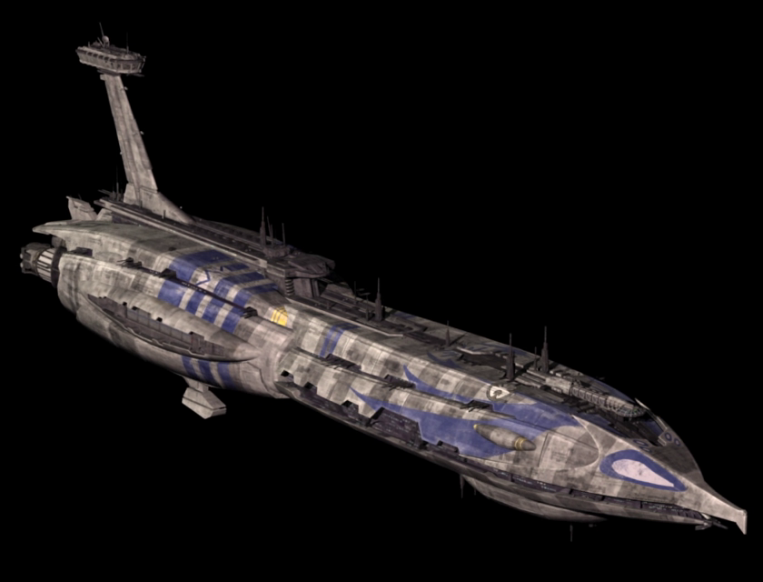
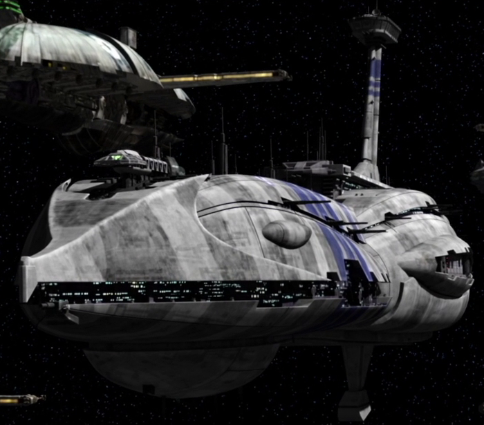
Providence Class Destroyer

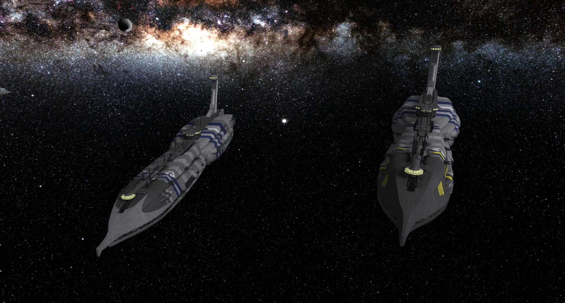
The Providence-class Carrier/Destroyer was the main capital ship of the separatists during the galactic civil war. Its large hangar bay can hold a considerable complement of droid starfighters and bombers.

I worked a bit harder on the death animation for this one - it will break apart, and explode in two separate pieces. It has a bunch of attachment points aswell as a ton of particles. Windows, engines and hangar shields glow in the dark. Seriously, i'm really proud of how this turned out. As usual, a high res version of the texture will be found below.

Keywords:
Starship, destroyer, dreadnaught, star wars, droid, cis, grievous, separatist, cruiser, space
Contents

Providence Class Destroyer (Model)

Reviews
09:04, 20th Oct 2014 Misha: very well done :)
@Hayate: i figured since it is in space, you know.... it will move when it's, well, moving, no need for it to bob up and down.

Rear view:

attachment.php


A patrol lurking outside Coruscant

attachment.php


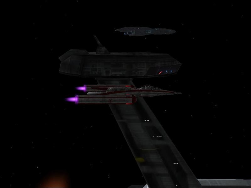
A separatist destroyer, locked in battle with a republic Venator-class

attachment.php


As promised, you will find a high res version of the texture attached below.
 

Attachments

  • ScreenShot213.png
    ScreenShot213.png
    362.6 KB · Views: 15,768
  • ProvidenceBattle.jpg
    ProvidenceBattle.jpg
    86.2 KB · Views: 14,811
  • Providence2.jpg
    Providence2.jpg
    61.1 KB · Views: 9,509
  • Providence_HighRes.blp
    175.1 KB · Views: 361

Deleted member 237964

D

Deleted member 237964

Woah! it's awesome model.Quality is amazing. 5/5
 
ok, attempt number 2 -- hive crashed lost my review second try (sry if this is a double post)

I played empire at War and the mod republic at war. so here comes my review

Pros:

I like the mesh shape, I think putting the windowed vertexes behind the outer metal vertexes was really ingenious.
I like how the team color looks, those blue stripes DAM SNAZY
I like how the hangar has shields, I also like how the shields turn off during death. I like the death animation in general because you added that metal junk at the separation point which was a nice touch -- the flames are well placed too, I would have added more flames my self but im a particle addict
I like the windows, there small and fuzzy when this models made too tiny but what ever they are still awesome

cons:

I think the green windows on the Con. tower are too big, they are like over 8 times the size of the yellow windows, which is odd because I thought that in revenge of the sith when grievous obi wan and sky walker are duking it out in the con. tower it was made of lots of tiny green windows. I think you could make the con towers green windows 2 perhaps even 3 times smaller. you could just keep the size of the con tower the same and just use a few more vertexes to make a higher number of green windows for the same area.

the green windows on the lower most frontal con. tower are suffering the same issue, they seem kinda big compared to the tiny awesome little yellow lights all around it.

the attack animation is where I go uhguhguhghughuguhuguhuhghughuguhg all over the place with my foaming mouth foam that spews everywhere

a better attack-1-2-3 could have been 2 or 3 lights in that same area, the front, getting the same red flashes but out of sync, with just one red flash right in the center, i mean even the clone ship had attack-1 and 2 green laser turrets to explain where the green laser projectiles come from, this single red blinky light is giving me cancer THIS IS A SPACE SHIP. even just 2 different red light spots would be enough.

a cool addition though would be a spell first and spell second (like the tinker) where the ship has lots of lights appear on either side, just like your red flash there, only over 10 or 15 of them all over the place.

this models pretty neat I give it a 8.5/10 I feel its lacking in some areas (attacks? spells? a hyper spacing birth? a hyper spacing morph?) but its very well made and highly detailed in areas that matter such as the mesh and the death animation.
 
A fair review. I knew the moment i made that attack animation, that "Kellym0 is going to have something to say about this", ha-ha. It is a bit bland and hardly even visible from afar, but to me the options are not that great either. I could replace it with a particle burst, then at least it would have some motion. I also thought about adding a small pointy black "lance" under the bridge, so that it could look like a cannon from which the laser is coming.

The barrage thing is another matter, apart from the sides, there are not so many places i'd imagine a laser coming from, and you'd just end up with a bunch of flashing lights. As a spell animation, i'd question how usable it would be - overall it would just look like grievous is having a disco on the ship while laser beams are flying from complete other areas. Perhaps a charged beam from the front would be a better option in this case. I'm not sure why i did not add warp animations, perhaps because i did not add them on the venator. They could be useful and i might add them later.

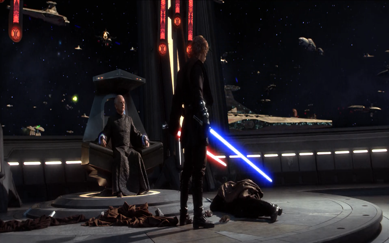
Finaly, as for the windows of the observation deck, i have to disagree. One reason for their size is that it is really hard to work with this resolution. Also, if they were any smaller, they would not be visible from afar. Another reason is, they were simply that big. Hell, it's an observation deck! Here is a picture from the movie, it is hard to see, but it kinda shows the scale:

Dooku'sEnd.png


As for the bridge, it consists of several levels, sharing the same window. You can kinda see it in my references:

ScreenShot_17.png

8609182jha.jpg

Invincible2-TCWs2BR3.png

CountDookusProvidenceclass-SL.png
 
Level 3
Joined
Sep 28, 2014
Messages
27
Nice work - actually am looking forward your job on the Munificent frigate and the other destroyer-type ship, the CIS used during the Clone Wars.
 
I uploaded both to Sc2 master as "Star Wars Assets by Fingolfin"

it has both the Providence Class Destoryer and the Venator-class Star Destroyer

going to put the Providence Class Destoryer on Hive in a few minutes
 

Attachments

  • The_Fleets_Battle.PNG
    The_Fleets_Battle.PNG
    736.5 KB · Views: 650
  • Providence_Class_Destoryer.png
    Providence_Class_Destoryer.png
    479.2 KB · Views: 615
  • Venator-Class_Star_Destoryer.png
    Venator-Class_Star_Destoryer.png
    399.3 KB · Views: 659
I can see from here that you have not done it right. You have used the same material for the teamcolored parts as for those with the alpha parts. That means you have teamcolor in the hangar and the slots where the lights should be. The model uses four materials:

*One for the transparent parts, i.e. most parts of the model.
*One for the teamcolor parts, it has one submaterial with blend filter (the texture) and one solid (teamcolor). This is used on a couple of small pieces which were detached from the rest of the mesh - the parts with the stripes and the CIS symbol.
*One with additive filter, for the shield and the glow models for the green windows
*One with both an additive sub-material, and a blend one. The blend is the bottom layer. This is for the windows (the blend makes them render better at long distances).

Also there are materials for the shockwave and the engine glows. The glows have vertex coloring to make them appear yellow.
 
Ok let me see what I can do to fix it

Edit: Just so you know I did the original convertion but for some reason it was glitchy in starcraft 2 map editor so I had to ask for some help to figure the glitchy for both the venator and this one on sc2mapster. they were able to figure it out but there had to be attachments add to it in 3ds max otherwise when the ship is attacking in starcraft 2 it looks like it shooting from under the engines. so I don't know what happened with the team color because when Appling the textures and putting the team color on the model it might have added more team color not sure. Its been a month since I worked with 3ds max when I had to save money to get a new computer so I may have gotten a little rusty on it.

So forgive me if this is frustrating you...I continue to see what can be done to fix it, hopefully I can figure it out.
 
Last edited by a moderator:
''A fair review. I knew the moment i made that attack animation, that "Kellym0 is going to have something to say about this" '

that made me chuckle
im making a mur'loc with over 150 animations that comes in 4-5 colors and has the upgrade tags first through fourth like the towers so yea =D I think animations are pretty important =) and I love to see good ones. and not so good ones make me a saaad.... panda.

''The barrage thing is another matter, apart from the sides, there are not so many places i'd imagine a laser coming from''

Im just referencing the ability ''broad side'' which these ships used in republic at war (the game I think you're emulating here), where all over the frontal length of the ship's sides, they just spam red lasers like crazy. kinda like this lego picture:

http://images.mocpages.com/user_images/4101/12400162642_SPLASH.jpg

but in this scene here:

http://img2.wikia.nocookie.net/__cb20130218025946/starwars/images/3/34/Separatistdeckgun.png

http://img2.wikia.nocookie.net/__cb20130211071132/starwars/images/b/bf/Naval_style.png

''Finaly, as for the windows of the observation deck, i have to disagree. One reason for their size is that it is really hard to work with this resolution.''

say no more, I know that feel

''As for the bridge, it consists of several levels, sharing the same window. You can kinda see it in my references'':

yea you're right I missed that.

other then extra animations this models basically perfect 9/10

edit: il comment on that lucrehulk-class battleship tommrow/ when ever your done -- not going to lie its going to be more harsh =(( [but for the better :D ]

preemptive judging of unfinished work (based on ur screeny) -- I think the lucrehulk-class battleship is not round enough, not enough polys in the arms:

http://img3.wikia.nocookie.net/__cb20061207164044/starwars/images/d/db/TFBattleshipE3Promo.jpg

not enough windows on the out side middle rim I dont think.

http://img4.wikia.nocookie.net/__cb20130508025901/starwars/images/d/d0/TFbattleshipPantora-SoI.png

insides of your ships rim looks literally perfect its the outer rim sides i am having issues with. its a hard ship to render for wc3 so il wait til its done til I say any thing mean about it. but yes more yellow windows lots more. at least as many as your other ships if not more so but most certainly not less

here is a picture of what I think:

http://www.hiveworkshop.com/forums/members/183403-albums6929-picture90658.html#picturecomment74341
 
Last edited:
So, you think i should have double rows of lights on the outside of the ring? I made it this way to make sure they would be visible. The lucrehulk IS a bit larger than the providence, so perhaps i could take some liberties with the lighting. As for the torus not being round enough - that is really not something i can do anything about at this point. I made it this way to keep the polycount down, and i think it looks good.

I think you will enjoy the death animation - i actually took the trouble to model most of the hangar interior, so when the ring breaks apart, it will reveal the entire cross-section of the ship and you will be able to peer into the hangar! A bit excessive some would say, but i thought it would be neat. As for the windows on the core, i thought it would look empty without them, and on other references i have seen it have windows (although maybe not at the centre like that, but that was the only place where it looked good). I will use particles for the attack animation this time, so wohoo for that. The lasers will come out of the front "edges" of the ring.
 
Top