• 🏆 Texturing Contest #33 is OPEN! Contestants must re-texture a SD unit model found in-game (Warcraft 3 Classic), recreating the unit into a peaceful NPC version. 🔗Click here to enter!
  • It's time for the first HD Modeling Contest of 2024. Join the theme discussion for Hive's HD Modeling Contest #6! Click here to post your idea!

Paintovers and C&C! Submit your WIPs here!

Level 16
Joined
Jan 21, 2011
Messages
999
-=PAINT OVERS and C&C=-

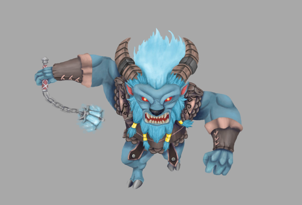
Hello fellow artist! This thread was created to help you and the other fellow hivers who would like to pursuit their epic quest at becoming master drawers!

Submit your new project here, TheKurt009 and Mr.Goblin will gladly give you professional feedbacks and do paintovers to help you out improve your drawings, help you out with your struggles and perhaps teach you a few things along the way!.


If you want some criticisms and tips to make your piece better, Upload your file here! Allow us and other artist to give their feedbacks!

On board the improvement train!
 
Last edited:
Level 50
Joined
Mar 22, 2016
Messages
588
I made it in gimp for a dwarf icon. I switch between around 5 brushes, usually not working in grayscale (it looks awful whenever I do), working with 2-3 layers. I got a lot of problems with colour switching and getting colour ''flow''. I'm often too lazy to add things like backlight or secondary lighsources as I do icons in one go. In this one something just isn't working out well.
dwarf.png
 
Level 16
Joined
Jan 21, 2011
Messages
999
I made it in gimp for a dwarf icon. I switch between around 5 brushes, usually not working in grayscale (it looks awful whenever I do), working with 2-3 layers. I got a lot of problems with colour switching and getting colour ''flow''. I'm often too lazy to add things like backlight or secondary lighsources as I do icons in one go. In this one something just isn't working out well.
dwarf.png
Hello there Murcologist! for starters i would like to say i like your artstyle!

quick paintover initiated, 3, 2, 1, GO!

dwarf.png

  • but i would still suggest practicing in grayscale for depth purposes.
  • Your piece has a warm tone, so in order to balance it i added a cool backlight for it.
  • I also added another Light source to help with the depth and to bring out other parts of the drawings that are otherwise too hidden.
  • I have also fixed his right eye a little bit since it looked a little too confusing as to where his eyebrow bones and eyelids should be.
  • Also added some Cool Soft shadows to help with depth and adjusted the color because the original's shadow looked dirty, as in not blending well with the skin. :)
  • I left how the eyes should have been because it is interesting, He conveys a certain edge in how he looks. And in touching those, i might as well make my own icon.
  • dwarf.png In making icons, you need to zoom it out for readability. But i think you know that already, seeing as you make tons of icons :) but i left it here for other future icon makers :)
this isn't supposed to be a replacement but only an idea, i left out much details like the rugged hairs and the little bit of detail in the right eyebrow. hope it helps you in your future icons :D
 
Last edited:
Level 28
Joined
Nov 12, 2007
Messages
2,340
Hello there Murcologist! for starters i would like to say i like your artstyle!

quick paintover initiated, 3, 2, 1, GO!

View attachment 254812
  • but i would still suggest practicing in grayscale for depth purposes.
  • Your piece has a warm tone, so in order to balance it i added a cool backlight for it.
  • I also added another Light source to help with the depth and to bring out other parts of the drawings that are otherwise too hidden.
  • I have also fixed his right eye a little bit since it looked a little too confusing as to where his eyebrow bones and eyelids should be.
  • Also added some Cool Soft shadows to help with depth and adjusted the color because the original's shadow looked dirty, as in not blending well with the skin. :)
  • I left how the eyes should have been because it is interesting, He conveys a certain edge in how he looks. And in touching those, i might as well make my own icon.
  • View attachment 254812 In making icons, you need to zoom it out for readability. But i think you know that already, seeing as you make tons of icons :) but i left it here for other future icon makers :)
this isn't supposed to be a replacement but only an idea, i left out much details like the rugged hairs and the little bit of detail in the right eyebrow. hope it helps you in your future icons :D

That's awesome. I like how you added depth and made it interesting with other light sources. I, however, would have left the skin and hairs with the rough texture they previously had - maybe such detail would be lost after the picture is resized to icon-size, but maybe it'll give an interesting touch and look a bit less clean.
 
Level 16
Joined
Jan 21, 2011
Messages
999
That's awesome. I like how you added depth and made it interesting with other light sources. I, however, would have left the skin and hairs with the rough texture they previously had - maybe such detail would be lost after the picture is resized to icon-size, but maybe it'll give an interesting touch and look a bit less clean.
well yes i agree haha, like i said, the sketch isn't a complete replacement but rather to show what would give a piece its initiative push before it enters the detail factory. I try to maintain and preserve those but some will be inevitably get lost.
 
Level 15
Joined
Dec 21, 2013
Messages
910
O great masters! Please send me your light!

I trying to following Neoartcore coloring. I really like his saturated colour. But, like all of my art, I have no idea how to finish it. Please tell me what to do.
And it always turned blurry. I kinda scared using hard full opacity brush because the color cant blend well (I think my app is suck but afaik its the best for iphone). And, choosing color directly is ultimately hard for me, so i just put and mix some color.
edit: took another 30 minutes trying to get rid the blur, not much changed
 

Attachments

  • image.jpg
    image.jpg
    93.3 KB · Views: 310
Last edited:
O great masters! Please send me your light!

I trying to following Neoartcore coloring. I really like his saturated colour. But, like all of my art, I have no idea how to finish it. Please tell me what to do.
And it always turned blurry. I kinda scared using hard full opacity brush because the color cant blend well (I think my app is suck but afaik its the best for iphone). And, choosing color directly is ultimately hard for me, so i just put and mix some color.
edit: took another 30 minutes trying to get rid the blur, not much changed
paintove2r.jpg


Hey there! First thing, Dude... wow, you're really getting better and FASsssssst!

Now, let me be clear, I know you have your own manga looking style and I really can't help you out with your stylistic porportions because my background is mostly in fine art and industrial art.

From what I can see there's a few things you did right!
1 = You have great volume,
2 = You seem to respect where the highlights are compared to the shadows,
3 = You drew a very organic flow in your hair... kudos!
4 = your texture work is great! We can even feel the subsurface scaterring on some places! :D
5 = you picked a really really really hard angle to make a portrait, I myself avoid doing portrait with such angles. Kudos for challenging yourself!

Here's what you could fix. (The colours matches those made in my paintover)
1 = Your overal anatomy is to be rework. Please... pretty please, use references LOTS of them in the futur. (x10 with portraits)
A trick that would help you out is to break down people's face by simple shapes. Triangles, squares, circles, etc.

19e4b705e6dc54614933039ea21fd174.jpg
exemple. By doing so you'll learn faster the overal structure and flow of the face.
2 = Hair flow. A easy and accurate way to design and draw hair is to learn the point of tension, where the hair starts and folds. In my drawings you can see there's two main starting point, I expended from there. (with this in mind, google some awesome haircuts, you'll soon find there's patterns in how hair grows and flows around the skull).
3 = Light source. = Make sure you know where you're light is coming from, some highlights and shadows didn't make much sense. Identify with an arrow you various light source! Ambiant light, point light, linear light. and pretty please, once again = check a lot of references! :D

That's it mate! Great job none the less!
 
Level 16
Joined
Jan 21, 2011
Messages
999
awesome job covering most of it! :D guess i'll cover some technical stuff for him ^_^
I trying to following Neoartcore coloring. I really like his saturated colour. But, like all of my art, I have no idea how to finish it. Please tell me what to do.
And it always turned blurry. I kinda scared using hard full opacity brush because the color cant blend well (I think my app is suck but afaik its the best for iphone). And, choosing color directly is ultimately hard for me, so i just put and mix some color.
edit: took another 30 minutes trying to get rid the blur, not much changed

the reason why it doesnt work is because an iphone doesnt have pressure sensitivity, which makes it hard for you to blend colors well. But the tip to making it work is eyedrops, lots and lots of eyedrops ^_^
ScreenShot_20161213182803.png


Here i used MSPaint which has no pressure sensitivity. I used very hard opacity brushes and brushed them together. Then you get the little blended pixelated colors to eyedrop. Brush them on the middle, get the mixed pixelated color again and brush them.
See, blending colors are tedious without pressure opacity and may take you longer hours of work, despite some apps making it better for you. So you might as well try other artstyles to compensate.

i strictly recommend you use a Wacom graphic tablet when drawing as it has the fundamentals you will need. Oh and Photoshop too ^_^

i don't really draw in iphones and i commend you for doing great work on it!
 
Level 15
Joined
Dec 21, 2013
Messages
910
Thank you Master Goblin!
Thank you Mastah Kurt!
Idk what should I say now (will be edited before 2017)
 
Last edited:
Level 27
Joined
Jul 6, 2008
Messages
11,324
Even though I'm massively disappointed C&C doesn't stand for Command & Conquer, this is a fantastic thread! Thanks Kurt & Mr Goblin!
J6BDeJB.png
If what it was mostly a quick test on how efficient would painting over quick 3D geometry be like, so far I feel like I lack both practice and speed, so I can't really be good at it >_>
 

Deleted member 212788

D

Deleted member 212788

Thank heavens for twitter else I would've likely missed this thread!

Will probably post some works later as I have to finish a comic by friday.
 
Level 28
Joined
Nov 12, 2007
Messages
2,340
Thank heavens for twitter else I would've likely missed this thread!

Well look at that, and some were reluctant about twitter doing its job (me included, hehe).

If what it was mostly a quick test on how efficient would painting over quick 3D geometry be like, so far I feel like I lack both practice and speed, so I can't really be good at it >_>

Oh, but it looks nice! Needs a little refining for an icon, but that's the easy part. And about you "lacking practice and speed, so you can't really be good at it", don't be so pessimistic about it - it is just a matter of training.
 

Kyrbi0

Arena Moderator
Level 44
Joined
Jul 29, 2008
Messages
9,487
What a cool thread. I, however, am disappointed that "paintover" doesn't mean "drawing over screenshots to make icons"; I thought that would be simply the most awexome thing to have a Request thread for.

Still, this is a good cause, and already seems to be kicking off with a bang.

Murlocologist, LOVE that Dwarf... And Kurt, you managed to improve it, somehow. Or at least Warcraft-ify it. Kudos.

Mr.Goblin, I think you need to be a little bit more positive & encouraging. You're really being a Debbie Downer here, as usual.

:D
 
Level 16
Joined
Jan 21, 2011
Messages
999
Even though I'm massively disappointed C&C doesn't stand for Command & Conquer, this is a fantastic thread! Thanks Kurt & Mr Goblin!
J6BDeJB.png
If what it was mostly a quick test on how efficient would painting over quick 3D geometry be like, so far I feel like I lack both practice and speed, so I can't really be good at it >_>

Hello! back with the paintover haha. First, i couldn't really say mine is better, probably made it a lot worse i think :/ I don't have much knowledge on what makes something look like it belongs to starcraft universe or scifi in general which, i'm still practicing to get the hang of things.

disclaimer: my own opinions aren't meant to be taken as rule XD

now, with your piece, i couldn't really say anything besides the first syringe that i removed because it looks like gravity isn't working there, but i accidentally removed the tablets lol. The piece felt it needed some "light works" to make it stand out as an icon and make it more readable in black background so i added glowing liquids for the blank bottles and the syringe. Like i said, i'm not well versed in scifi so in my blank mind i thought maybe glowing liquids might put some depth on the piece, otherwise, a directional light pointing towards some of the objects.

i liked how you made it that even when i zoom it out to icon size it's still readable as a medicine icon ^_^ great job on that! :D
you also used 3D references then painted over it which i really like! just keep on doing it and you'll get the hang of it! :D

also want to note for everyone: please describe specifically what needed to be worked on, you might like a part of your piece to be as is. My paintovers are only my opinions and aren't needed to be taken as absolute :) you can still however request a paintover in general, but if you want something specific, please state it lol ^_^
 

Attachments

  • J6BDeJB.png
    J6BDeJB.png
    538.6 KB · Views: 310
Last edited:
Level 16
Joined
Jan 21, 2011
Messages
999
I would want to be more patient. But how?
patience is a virtue my friend ^_^ it is a valuable quality of a person

if you keep doing something, you get faster at it. If you keep drawing "while" striving for improvement, you'll get better at it.
passion also helps because it makes you love what you do. If you don't love what you're doing, you just get easily more frustrated and would make you quit.
i can't simply make you be more "patient" in drawing if you don't like what you do :)
 

Screamernail

S

Screamernail

patience is a virtue my friend ^_^ it is a valuable quality of a person

if you keep doing something, you get faster at it. If you keep drawing "while" striving for improvement, you'll get better at it.
passion also helps because it makes you love what you do. If you don't love what you're doing, you just get easily more frustrated and would make you quit.
i can't simply make you be more "patient" in drawing if you don't like what you do :)

Ok thanks.

Oh and can i post a image here and let some of you "Improve" it? Just for fun.
 

Screamernail

S

Screamernail

that's what this thread is all about ^_^ but i do hope you learn from it and not just
"draw this for me" okay? :)

Actually i got nothing. Can you do one Xillu picture? I can let you chose one from my album.
 
Level 16
Joined
Jan 21, 2011
Messages
999
Seems a pretty interesting thread.
thanks :) hope you come to visit and help other artists or when you needed a mercenary to help :)

Actually i got nothing. Can you do one Xillu picture? I can let you chose one from my album.
sorry :) but my purpose is to help artists and would be artists in this thread, which is to provide helpful feedback and give some pointers :)
although unless you have a "work in progress art" that you'd post here which i'd always be willing to help.

right now judging from your drawings, all i can say is
you need to study your fundamentals, like
-anatomy and perspective.
-values and depth
-light
-color theory

study those :D if you want i can recommend you some books of what most artists use :)
 

Screamernail

S

Screamernail

thanks :) hope you come to visit and help other artists or when you needed a mercenary to help :)


sorry :) but my purpose is to help artists and would be artists in this thread, which is to provide helpful feedback and give some pointers :)
although unless you have a "work in progress art" that you'd post here which i'd always be willing to help.

right now judging from your drawings, all i can say is
you need to study your fundamentals, like
-anatomy and perspective.
-values and depth
-light
-color theory

study those :D if you want i can recommend you some books of what most artists use :)

I'm a simple artist and i want to be one. I guess the only thing i need to practice is poses.
 
Level 24
Joined
May 15, 2013
Messages
3,782
My turn for "demands"

I actually put this on hold, but I'll use this chance (since some guy, particularly above this post, is *coughing*).
Initial sketch,
h1-jpg.252529

Where I got so far,
h4-jpg.253082

What troubles me here is that its scales, aswell as its body that I tried whirling around, and also its spines, I have a hard time surfacing that part. The light is from the moon(I'll add the light colors later) coming from the top left side.
I got a little frustrated from missing points and can't seem to move on until I find it.
Also, depth is actually last every time I work, adding more confusing things to my plans.
 
Level 16
Joined
Jan 21, 2011
Messages
999
Speaking of which. I was trying to draw this:
Mona_Lisa_(copy,_Hermitage).jpg


and I ended up with this:
View attachment 255308
Can you draw this for me?


...

*cough*

from scratch??? i'll try??? lol you're taking advantage of the system XD

My turn for "demands"

I actually put this on hold, but I'll use this chance (since some guy, particularly above this post, is *coughing*).
Initial sketch,
h1-jpg.252529

Where I got so far,
h4-jpg.253082

What troubles me here is that its scales, aswell as its body that I tried whirling around, and also its spines, I have a hard time surfacing that part. The light is from the moon(I'll add the light colors later) coming from the top left side.
I got a little frustrated from missing points and can't seem to move on until I find it.
Also, depth is actually last every time I work, adding more confusing things to my plans.
Yo! i'm reaaally liking how you shaded this! looked like a plaster sculpt or 3D! you used burn and dodge tools??? ^_^
H4.png

first of all, the reason it becomes confusing to you is because you're putting depth at the end of your workflow.
my workflow goes as follows:

-sketch
-flat colors
-depth (these two can be interchangeable)
-coffee
-procrastinate
-lights
-rendering
-post processing

first i added some orange shadows to the yellow body, moved the underbelly to the left and fixed the unnatural bend because it looked like a bump. didn't fixed the hair because i personally liked it as it is, but could use some color works ^_^
i added cool colors because it is night time, and because the moonlight is its primary lightsource, it is behind the viewer, unless it serves as a backlight then it should be visible.
i haven't added atmosphere perspective since it was sort of confusing how long the dragon should be, and that it's still incomplete yet. also sort of Desaturated the colors a little because like the depth, the colors seem to have the same saturation value. For the scales, i never drew the scales but opted for a sort of fur-like texture (personal preference)
personally for me still, i forgot to settle the colors and unify it and in turn it looked like it's not in the background so i hope you learn from my mistake XD

all in all i'm very impressed with the dragon and had fun with the paintover.
Hope to see the final result! ^_^
 
Last edited:
Level 24
Joined
May 15, 2013
Messages
3,782
Well done :D, it looks really cool, if I was able to upload the psd file (which is frckin above 400MB), you would have more freedom on editing it than it being a Wip. Thanks alot :D

hmm, I ought to try your workflow, but It might be hard for me since I'm more into layer ordering, and that I would go with the centre of attention and render it first, must be why I get to lose the depth.

Edit: also, I use various brush opacity to shadow and lighten the surfaces, added with shadow layering and different layer types for the color. I actually learned that dodge and burn tools are too heavy and you get less control on its opacity.
 
Level 16
Joined
Jan 21, 2011
Messages
999
Well done :D, it looks really cool, if I was able to upload the psd file (which is frckin above 400MB), you would have more freedom on editing it than it being a Wip. Thanks alot :D

hmm, I ought to try your workflow, but It might be hard for me since I'm more into layer ordering, and that I would go with the centre of attention and render it first, must be why I get to lose the depth.

Edit: also, I use various brush opacity to shadow and lighten the surfaces, added with shadow layering and different layer types for the color. I actually learned that dodge and burn tools are too heavy and you get less control on its opacity.
400MB?!?!?!?! how big is that!??!?!
i never reached above 100mb :eek: nah don't worry about the psd because i tend to work with two to three layers anyway. New layers> merge down > Repeat. So i frequently draw on flattened images. although sometimes i reach 10 when there are so many technicalities involved.
i agree about dodge and burn, i never used those ^_^ i just thought because i recall you used those in your previous works and i was like "he used those? whoah"
the workflow i use is the artists' standard, i frequently see those in gif processes. Also avoid the procrastination part lol

Awesome, If only I could draw as good as these arts-

Keep it up, guys. :D

thaanks! :D just upload a drawing here for some help ^_^
 

Roland

R

Roland

I need help to get this buddy vectorized or make this guy better. Please?

Here's my Old Post via my portfolio.

I started this a week a ago and I was looking for a guy or girl who can draw a better illustration of this guy and make him more Vectorized.
f7c300edc156418c803238c430ce4962.png
 

Roland

R

Roland

!!!
That's pretty rad. I dont do designs though but i could help. Haven't drawn anything for a week so i could give this a shot.

I dont have much knowledge in design principles aside from basic ones. I mostly dabble in concept art
Okay.. Okay Thanks tho but enough of the Fancy Reactions, I need every progress shot's you've done before finishing it and I'll give you a green light to rasterize the Image.
 
Level 16
Joined
Jan 21, 2011
Messages
999
Okay.. Okay Thanks tho but enough of the Fancy Reactions, I need every progress shot's you've done before finishing it and I'll give you a green light to rasterize the Image.
Im not an artist for hire :/ i help people with their wips on my own terms and how i see them to make it better.

It's one thing to give valuable feedback to someone, but it's another thing to request a fully fledged artwork.
 

Roland

R

Roland

Nah I don't really wanted it to be actually improved, You can rework my logo in your own imagination @TheKurt009 I just want to see it rad and I'll print it soon so I'll photograph it with my Parachute cord weaves
 
Level 16
Joined
Jan 21, 2011
Messages
999
hey :) glad i just checked this while on break. did a 10 minute fix for this
main thing i noticed that needed fixing was the anatomy of the troll. I didn't know if they're supposed to be double jointed or do their forearms bend like that but i had to resort to the normal human anatomy. The torso needed to be fixed as well :)

i love the effort you put on the raptor :) i don't think there are any major fixes that needed to be pointed out. Except the left leg which only needed some minor fix :) i left that out though.

Another tip i think i could give is when adding highlights, don't just drag the color slider up but instead drag them diagonally and also the hue bar too
to add some color variance.
another thing i did is add another color dodge layer and brushed on the metallic parts to give them that metallic feel, so the materials won't look the same :))

i made the shadows more bluish to contrast the warm highlights which is just a personal taste :)
oh and the more saturated feel was also a personal taste :)

oh and also please avoid using absolute black or white,
for the absolute white, those are just reserved for direct spotlights
however, this tip can still be bended as some still look very well even when done so

hayate.jpg
 
Top