- Joined
- Apr 18, 2008
- Messages
- 8,453


Wizards
Contestants were to create a unit or a hero whose main form of combat is magical in nature. The model needs to clearly show that the unit or hero in question is a mage or wizard of some kind or another - this includes traditional wizards, warlocks, witches, illusionists, necromancers, psychics and spellblades, as long as it is obvious that the character primarily or heavily utilizes magic in combat.

| Contestant | Submission Name |
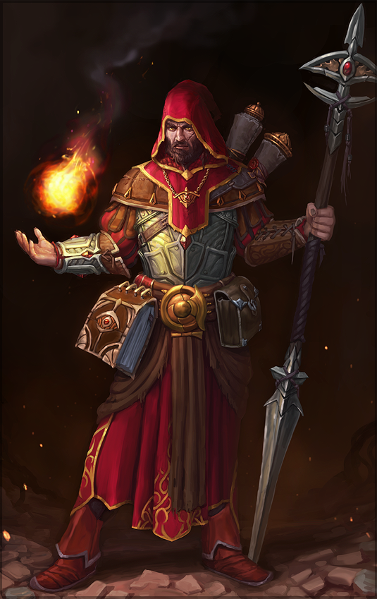
Direfury | Gnome Arcanist |
-Grendel | Holder of Entropy |
Freddyk | Toad Rider |
Gluma | Lizardman High Priest |
Hayate | Night Elf Lunar Mage |
MatiS | ArchAngel |
PROXY | Eredar Annihilator |
Pvt.Toma | Dunk Master |

DisclaimerThe criteria: I'm using the classic criteria system we would use, with two small differences.
- A small adjustment at the weight of creativity and mesh - both are worth 10 points.
- Whenever a model is absent of some aspect, but didn't need it anyways, I remove, or reduce that criterion's point value and recalculate the score.
For instance: model has 10/10 mesh, 10/10 skin, 10/10 animation, 5/5 mechanics, 10/10 creativity and 0/5 effects, but those weren't even needed. Then, I'll divide the total of points per 45 instead of 50. Ends up a fraction, but doesn't discount unjustly from those cases.
Mesh: 8/10
It's well done, with good proportions, considering the guy is a gnome. The high polycount has to do with having 2 alternate forms, but it is true that the amount of polies you've put on the guy's hands and fingers is way too much. One thing that bothers me is that the head of the guy looks like a sphere primitive. You don't see geometry primitives in-game. They look bad.
Animations: 10/10
Nice custom animations. Great variety and quality.
Skin: 5/10
The wrap isn't badly executed, but I think it's too dead in its color scheme and texture definition in comparison to other wc3 models (even if you used in-game textures). Maybe having used more intensely folded fabric/leather and maybe a rope, a pouch, something more would break the dead spirit of the model and give it more definition. If all parts of the skin were as lively as the boots, for instance, it would look better. Nice animated textures at the elementals though.
Mechanics: 5/5
Works fine in-game.
Effects: 4/5
Although the effects come nicely in many animations sometimes it's too much. Basically too big and too numerous, to an extent it goes further from what is expected for a wc3 model.
Creativity: 8/10
That your concept is original, I have no doubt. That's already more than most entries were able to achieve. I wonder, though, how consistent is it, as I don't see much connection between the gnome's nature to its elementals. The dead tones, few features at the main state and at the same time the high complexity of the idea makes up a model that lacks spirit.
Overall rating: 40/50
Mesh: 10/10
The mesh is beautifully done, from proportions to the polygon distribution. It is true that the level of detail of the mesh is far too high for wc3, but that shouldn't be such a big worry, since it looks alright in wc3 atmosphere, and the polygons are balanced.
Animations: 7/10
The imported anims look good. But it's too easy to recognize the Blood Mage in it.
Skin: 10/10
Great work here. The wrap was very careful and the textures fit each other.
Mechanics: 5/5
Works fine in-game.
Effects: 5/5
The effects are really great.
Creativity: 7/10
I don't understand what you mean by 'Holder of Entropy' - somehow the guardian of chaos - and at the same time it looks like a generic evil undead wizard. But the execution features a lot of creative effort. It just lacked a more interesting idea to begin with.
Overall rating: 44/50
Mesh: 10/10
There's nothing wrong with the mesh, fair amount of polies, good-looking and warcraftish.
Animations: 10/10
The animations are really nicely done. You have a great understanding of motion, which is seen at the walk animations (normal and channel). The walk fast could've been better, but doesn't lower the general pattern considerably. They even fooled me for being completely custom animations (Thanks to Deolrin to notify me the Kodo Beast reference). Those are the situations in which not-totally-custom animations deserve high ratings, when they are used unexpectedly, feature some tinkering and manage to be their own thing.
Skin: 7/10
Although each of the parts of the model are well-wrapped with good texture choices, both together end up not so nicely. The slightly different tones do not stand out one from another enough, and they are both saturated. (If the frog, or the rider, was black, or gray, the combination would be better)
Mechanics: 5/5
Works nicely in-game.
Effects: 5/5
Particles are placed correctly, in a good measure. And the frog spitting corpses looks pretty cool.
Creativity: 10/10
It has a strong sense of being an unique character. The 4-armed male naga was pretty creative, and the choice of mount is lovely. Has no lore behind it, but the model already shows itself as a creative piece.
Overall rating: 47/50
Mesh: 10/10
If it is high-poly or anything, it's due to the number of elements it features, because the mesh execution is correct.
Animations: 10/10
Nicely executed anims. It's a complex model to animate and you pulled it off nicely.
Skin: 7/10
Although the wrap is well-made, there are too many different tones in conflict. Considering the skin only, ends up looking like a random geomerge.
Mechanics: 5/5
Works well in-game.
Effects: 4/5
Good effects. The ribbons at the staff look pretty cool. But those glows coming out of it go way too far.
Creativity: 5/10
Although the quality of the model is great, concept-wise it just seems too much. You should have cut some aspects of the idea to have something more consistent. I can't see the whole thing as a 'Wizard', more as a Lizardman War Beast. Seems like you kept adding more and more elements as much as you could. The main lizard was already enough to make up one hell of a model. Maybe with its mount too. But the wizard lost the main role at some point.
Overall rating: 41/50
Mesh: 6/10
Well-executed mesh, but it carries too much detail and leaves too little for the texture to define. That isn't the way wc3 models are typically done, and is bad in the cost-benefit of modelling. For instance, you use many polies to wrap the texture freely, but then looking at the portrait the face anatomy is all wrong because all details are pieces of colored mesh. Another issue that displaces it from the warcraftish-ness is its proportions (In wc3 models tend to have a bit thickened limbs, bigger head, etc). Ends up that it resembles those anime models we see around.
Animations: 8/10
Good variety of custom animations. But sometimes they look more like Runescape anims than WC3. The movement part is mostly correct, but they could be smoother.
Skin: 4/10
Using campaign texture might seem a good idea, because they're high-res, they have engravings, and whatnot. But it isn't. Most of them hardly fit the in-game atmosphere. You figured it out yourself, and added pieces of mesh everywhere to make it have more definition and contours (Since those textures are generally too plain). But the result of this is that it has too many seams. There are many parts with plain-colored mesh, too. That looks especially bad in-game. The seam between the hair and the face is a good example of how bad plain-colored mesh seams look. You would do better finding a texture that has countours at its edges, or a texture that has both the hair and the face at the same time. Also, the texture of his skin isn't according with the 'Night Elf' concept, it looks like a regular elf with a more grayish skin.
Mechanics: 5/5
Works well in-game. Has all features necessary. (A tiny detail is renaming the 'Head' bone to 'bone_head', so it can be used in cinematics)
Effects: 4/5
That circle white-blueish particle is of great measure, in its idea, quantity, size, opacity, frequency, etc. There could be more effects than that at some anims, but it's alright as it is.
Creativity: 1/10
A night elf mage that doesn't actually look like a night elf due to technical issues. And its magic is inspired on the... moon. That's the very first and most ordinary thing anyone would expect, and the execution doesn't introduce any groundbreaking idea. It surely lacks some creativity effort.
Overall rating: 28/50
Mesh: 5/10
No big issues about poly distribution or poly count, but there are some serious anatomy faults here. Elbows, shoulders, wrists, they aren't at the correct position/rotation, and the result is quite disturbing for some reason. And the wings aren't as big as expected for an 'Archangel'
Animations: 4/10
You tried to do custom anims, and they aren't totally bad, but far below the wc3 standard. They don't look natural, since they are too linear and simplistic. Lacks a sense of physics in some. And some just look a bit too weird. Death for instance, apparently it doesn't die, just 'goes away'. And in some anims looks like her hands and feet are tied.
Skin: 2/10
What it lacks is texture. The skin at the moment is about color only, except in some parts. You should draw folded cloth, details, and such, so it has some definition. Looks incomplete in-game.
Mechanics: 3/5
Has most features necessary to work, but its animations look a bit off, so it doesn't exactly 'work well' in-game.
Effects: 3/5
The portrait animations, while completely crazy, don't even appear in-game. They could be deleted, would save particle count. Some others are adequate.
Creativity: 0/10
Well... your model doesn't show us much wizard-ness, but rather its angelic-ness. The fact it looks too bland makes it lack a lot in the conceptual aspect too. It is completely devoid of unique characteristics that would say something interesting about it.
Overall rating: 17/50
Mesh: 7/10
The mesh is of great quality, and the polies are well-used, but it ended up a bit too much. I'd complain about the anatomy, as well. She's too skinny! And limb segments shouldn't maintain the same section, they should broaden and then become narrower. This way you keep them from looking like sticks.
Animations: 8/10
Nice imported anims. Apparently you tweaked them, since even if they come from the Archimonde model they look feminine enough for your model. (except for Stand and Stand - 2)
Skin: 10/10
The skin is very good-looking. The color scheme is consistent and we hardly see unpleasant seams.
Mechanics: 5/5
Works well in-game.
Effects: 2/5
Would have added to the model having a couple more effects. And that fire particles at the bracers should have been set to fixed to their position, so they don't stay clustered randomly in the map as it walks or moves.
Creativity: 8/10
It isn't a completely out of the box idea, since it's basically an Eredar as wizard, but female. But the execution features a lot of creative aspects from the mesh to the texture.
Overall rating: 40/50
Mesh: 7/10
Although he's too skinny, there isn't much wrong stuff with its mesh. Those giant hands are decently executed. I would expect a few less polies for the complexity present in the model, though.
Animations: 8/10
Except the fact he isn't touching the floor properly, and even if it was intentional it looks like an animation mistake, the custom anims are pretty well-executed, and very creative. Walk looks a bit too much like the anime style, though.
Skin: 5/10
This model's weakest aspect is the skin. The texture looks mostly blurry and rushed. The interesting part is the fading hands, nice job on that.
Mechanics: 3/5
Even if it has all features necessary to work, the fact it is floating above the ground takes its toll on the model mechanics. To fix it, it's necessary to set the unit to flying and change the height in WE, what isn't appropriate since it is a walking unit.
Effects: 4/5
Looks decent regarding effects. That ball particle isn't so appealing, but there are some nice touches, for example in the attack anim and dissipate.
Creativity: 6/10
This is a very original model. Those hands coming out of nowhere chaining the little guy, not something we see around. I wonder though, how pertinent it is to the wc3 environment, and to the contest's theme. A basketball move as reference moves it away from both at the same time.
Overall rating: 33/50
Mesh: 9/10
Nice, simple, and well-wrapped, it doesn't deform and looks very good in animations. Physical form and silhouette is well defined.
Texture/UW: 8/10
Texture might a little blurry ingame, but still gives off a good feel. Wrap is very well made and looks rather good in the texture animations, but perhaps not as much in the water-form.
Animations: 8/10
they are nice, smooth-flowing, but might feel a little too slow and not as exaggerated as war3 ones, one would argue with that opinion, but it does not really reduce the model's overall score.
Creativity: 10/10
it is unique for warcraft, and it also reminds me of one similar creature that had that same cool appeal. (also of Orko a bit ) It also fits in well.
Mechanics: 3/5
well.. since I took the model that was linked in the poll thread, i can say that it's missing attachment points and footprints, and i'm not sure if that was added later.. the rest of geoset animations is good.
Effects: 3/5
they are simple, work well and are good.. but they aren't really flashy.
Total: 41
Nice, simple, and well-wrapped, it doesn't deform and looks very good in animations. Physical form and silhouette is well defined.
Texture/UW: 8/10
Texture might a little blurry ingame, but still gives off a good feel. Wrap is very well made and looks rather good in the texture animations, but perhaps not as much in the water-form.
Animations: 8/10
they are nice, smooth-flowing, but might feel a little too slow and not as exaggerated as war3 ones, one would argue with that opinion, but it does not really reduce the model's overall score.
Creativity: 10/10
it is unique for warcraft, and it also reminds me of one similar creature that had that same cool appeal. (also of Orko a bit
) It also fits in well. Mechanics: 3/5
well.. since I took the model that was linked in the poll thread, i can say that it's missing attachment points and footprints, and i'm not sure if that was added later.. the rest of geoset animations is good.
Effects: 3/5
they are simple, work well and are good.. but they aren't really flashy.
Total: 41
Mesh: 9/10
Ah, the 'Totally not Skeletor' :b Mesh is really well made and polished.
Texture/UW: 9/10
it looks very crispy ingame with barely any easily noticable seams. very good job at it, although i'm lill 'o.o' at how wide his nose-hole is. (mainly on portrait)
Animations: 8/10
Nothing too special, it's the reworked bloodmage animation, but it has nice fluidity to it.
Creativity: 10/10
while it is a skeleton that is wielding magic, the amount of work on it clearly shows. it is a really intimidating warlock, despite looking weak
Mechanics: 5/5
This model has all the bells and whistles that a good model needs, from the bloodmage base, as well as very matching sounds for many animations.
Effects: 5/5
equipped with both permanent and occasional effects, it creates a very good and sinister aura about it, completing the model.
Total: 46
Mesh: 9/10
Really nice, i've got no complaints. it feels little too slender for war3 though..
Texture/UW: 8/10
well.. while the rider is really nicely (and tricky) wrapped, the frog itself doesn't really have the same feel, it is lacking the highlights and shadows, and the top of its head is not wrapped that well.. then again, that might just be texture limitation..
Animations: 8/10
Anims are nice, but portions of them don't fit that well, like the non-hopping movement of the frog. and rider's animations are kinda mellow.. but still, they're nice.
Creativity: 10/10
.. is through the roof :b not only this is a four-armed alien, riding a gigantic frog, but this is also a unit, instead of a hero. I like it very much.
Mechanics: 5/5
all attachment points and sound event objects are there, rounding it up.
Effects: 3/5
not really that many.. i wish there were more.
Total: 43
Mesh: 7/10
Meshes are nicely put together, but sometimes kind-of connected loosely. there is not much clipping, but in overall, it looks a little bit too busy.
Texture/UW: 6/10
Wrapping here is not the best as it could be, some parts of the model display line-stretches on the ends, slight wars of the texture, or mirror-like wrinkles. and while the eye-candy of 3 custom textures is nice, it just adds to the 'too busy' feel of the model.
Animations: 9/10
I like how the animations are accenting the individual lizard's behavior, personality, or bad luck there is also no visible clipping.
Creativity: 7/10
well.. it's a four-lizard-wizard it's nice, but knowing you, it's a bit much
Mechanics: 5/5
Attachment points and sounds are there, so that is good.
Effects: 3/5
there are not too many, but they feel alright.
Total: 37
Meshes are nicely put together, but sometimes kind-of connected loosely. there is not much clipping, but in overall, it looks a little bit too busy.
Texture/UW: 6/10
Wrapping here is not the best as it could be, some parts of the model display line-stretches on the ends, slight wars of the texture, or mirror-like wrinkles. and while the eye-candy of 3 custom textures is nice, it just adds to the 'too busy' feel of the model.
Animations: 9/10
I like how the animations are accenting the individual lizard's behavior, personality, or bad luck
there is also no visible clipping.Creativity: 7/10
well.. it's a four-lizard-wizard
it's nice, but knowing you, it's a bit much Mechanics: 5/5
Attachment points and sounds are there, so that is good.
Effects: 3/5
there are not too many, but they feel alright.
Total: 37
Mesh: 8/10
let's see, the figure is very slender but nice. meshes are well put together and don't clip. I like it.
Texture/UW: 8/10
Wrapping is really good on some pieces, but pretty odd on the other pieces, like the hands and arms, or on the staff.. I really like the face and the geoset animation tint.
Animations: 8/10
They flow really good on some occasions, while they're pretty.. constricted on the other. wonder if you could've made them lill better if you had more time .u.
Creativity: 7/10
Moon and the night elves have been always connected, so that is not as creative as it could be, but, being an arcane, Quel'dorei-like wizard, gives it a few extra points.
Mechanics: 5/5
Nothing to complain about :3
Effects: 3/5
Not really much..
Total: 39
Mesh: 7/10
Simple, but lill too slender.
Texture/UW: 6/10
texture is lill lacking on highlights and shadows on the girl, and a lot on the wings. it is also of a bit lower quality.
Animations: 7/10
well.. her arms pass through her on the death anim..? they feel too constricted sometimes, but they have some fluidity.
Creativity: 6/10
a divine lady that ain't bad.. but you could have done much more to it..
Mechanics: 3/5
the model doesn't not show the weapon attachment, has no death sound and the overhead attachment is performing lill funky when moving.
Effects: 3/5
good, but little monotone.. not to mention that the dissipating one lasts too long..
Total: 32
Simple, but lill too slender.
Texture/UW: 6/10
texture is lill lacking on highlights and shadows on the girl, and a lot on the wings. it is also of a bit lower quality.
Animations: 7/10
well.. her arms pass through her on the death anim..?
they feel too constricted sometimes, but they have some fluidity.Creativity: 6/10
a divine lady that ain't bad.. but you could have done much more to it..
Mechanics: 3/5
the model doesn't not show the weapon attachment, has no death sound and the overhead attachment is performing lill funky when moving.
Effects: 3/5
good, but little monotone.. not to mention that the dissipating one lasts too long..
Total: 32
Mesh: 9/10
very nice, nicely put together, but pretty slender.
Texture/UW: 10/10
A spending wrapping and great usage of textures.
Animations: 7/10
well.. not so special, eredar goodness, nice and fluid.
Creativity: 9/10
Not as much as the specie and animation, but very much in her attire and weapon. it makes her a very unique eredar lady.
Mechanics: 4/5
she has all the attachment points, but they're not adjusted that well. all other things are good.
Effects: 3/5
a bit too few
Total: 42
Mesh: 8/10
Very.. very minimalistic, and definitely not war3-shaped. Very slender.
Texture/UW: 7/10
very loosely wrapped, especially on that poncho and pants, also I'm not sure what those balls are supposed to be wrapped as. oO
Animations: 9/10
very, very smooth and quick, i like it.
Creativity: 7/10
even though, to me, it's very stange, war3-wise. this is a very unique model. and that is cool.
Mechanics: 4/5
all required attachment points and sound event objects are there.
Effects: 4/5
plenty, but simple and nice.
Total: 39

Placements:
1) Freddyk (60.9)
2) -Grendel (59.59)
3) PROXY (57.3)
4) Direfury (53.16)
5) Hayate (50.57)
6) Gluma (50.25)
7) Pvt.Toma (48.58)
8) MatiS (35.67)
Formula:
(Judging + Votes) -->
(((Misha + HappyCockroach + General Frank) / 150) * 60) + ((Votes / 58) * 40)
Contest | Poll
Last edited:
")


 Given the quality of these entries I would count everyone to be a winner.
  I really enjoyed the riders, so seeing as one of them one is nice. Still I also kinda liked the over the top nature of Gluma's.