- Joined
- Nov 17, 2010
- Messages
- 1,266
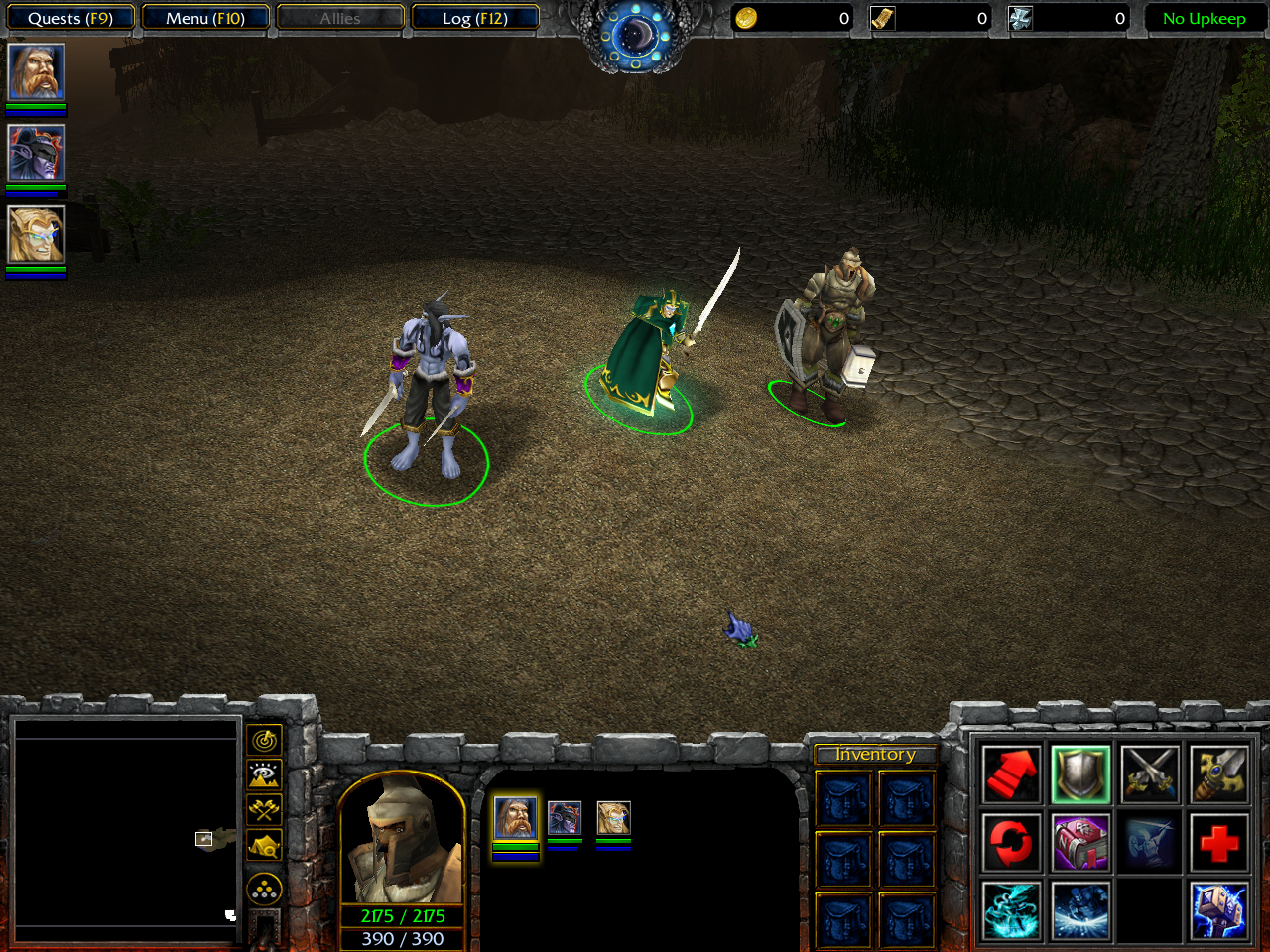
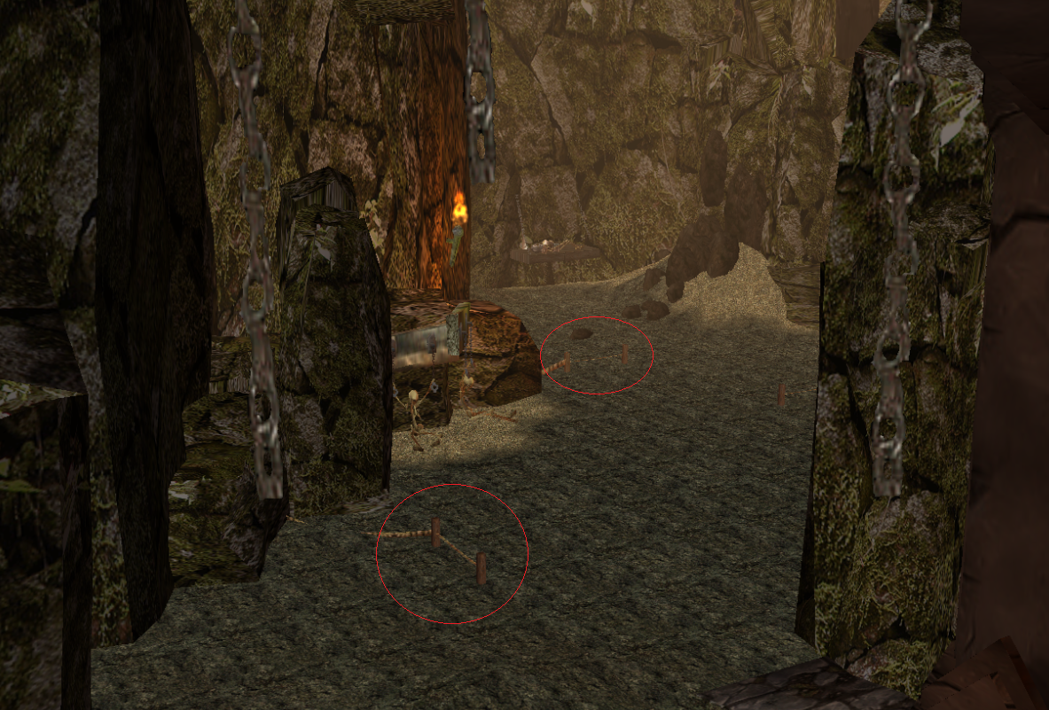
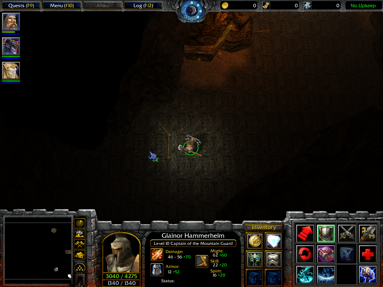
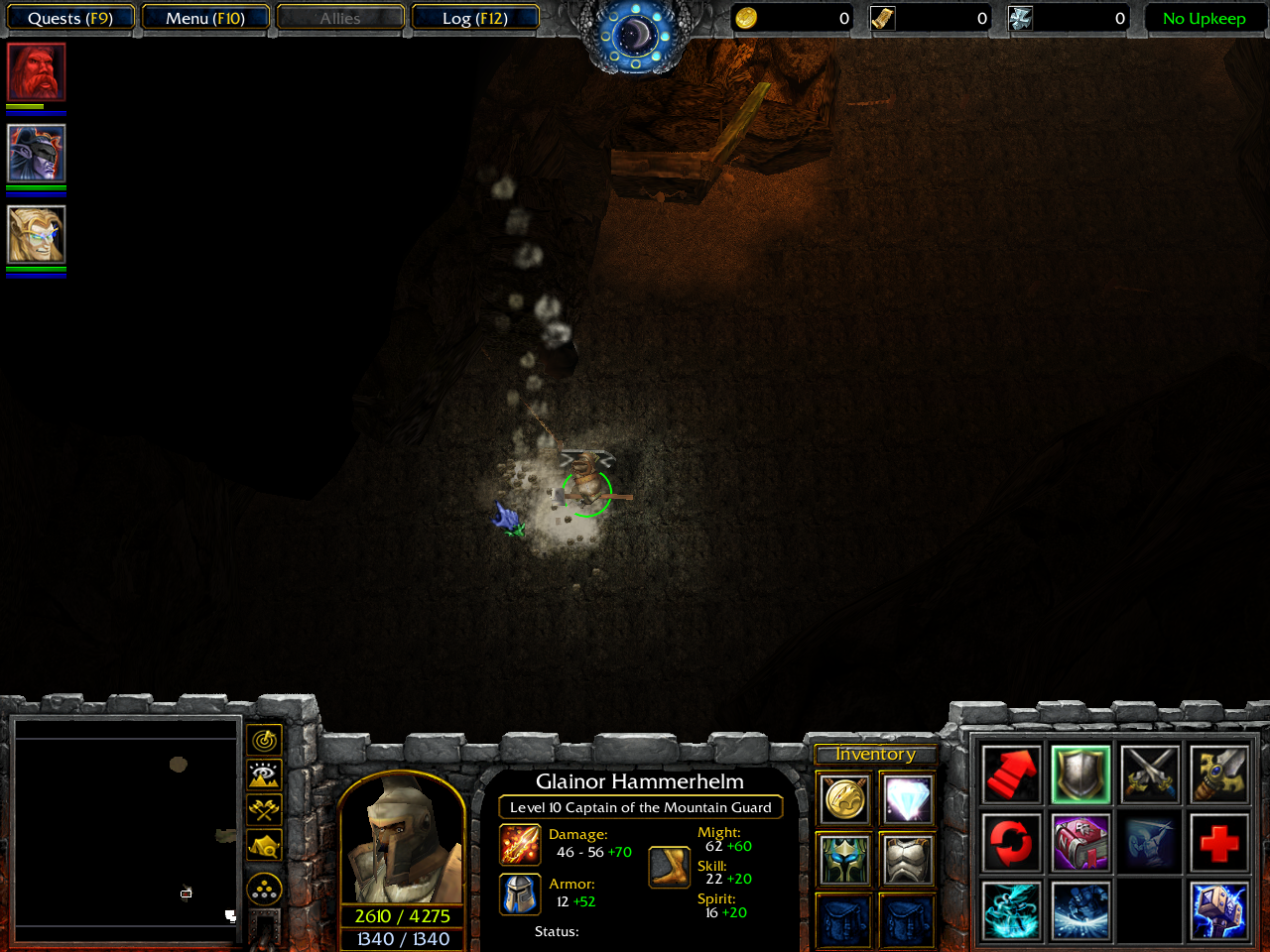
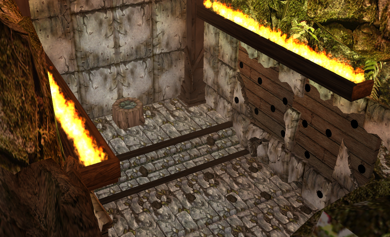
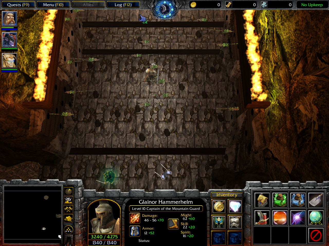
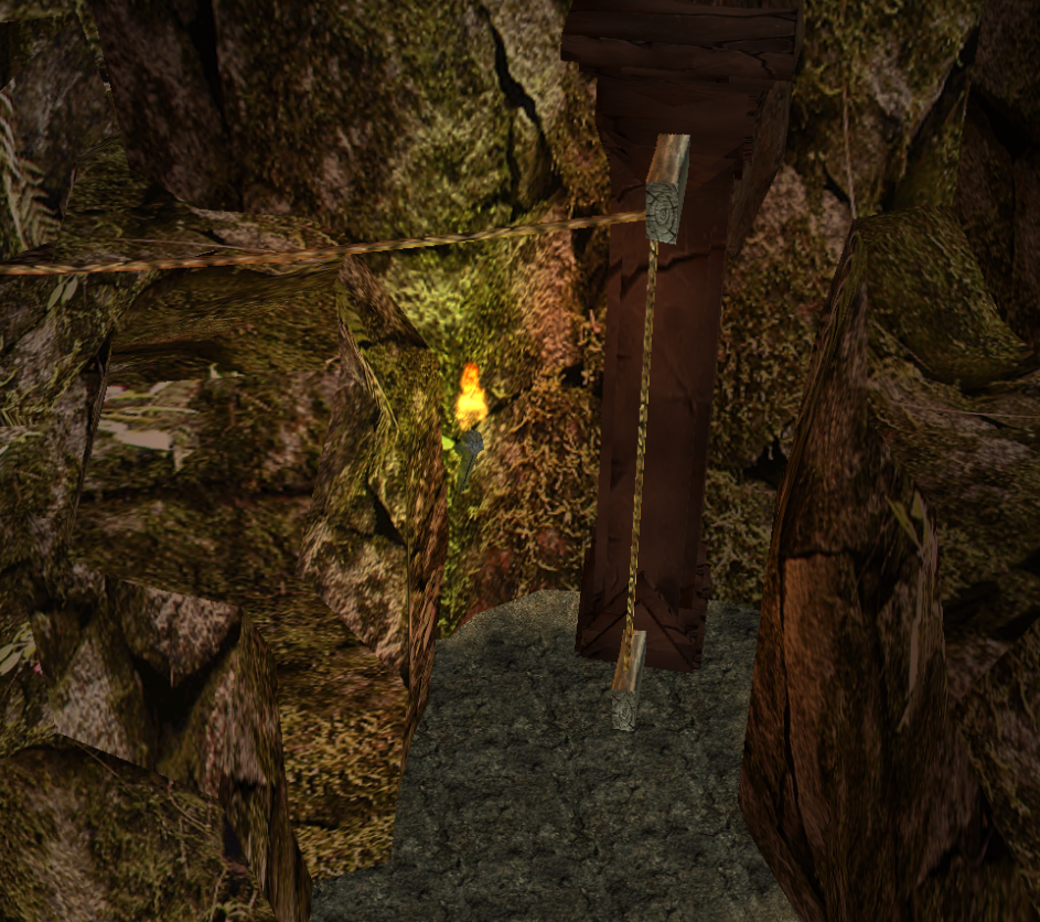
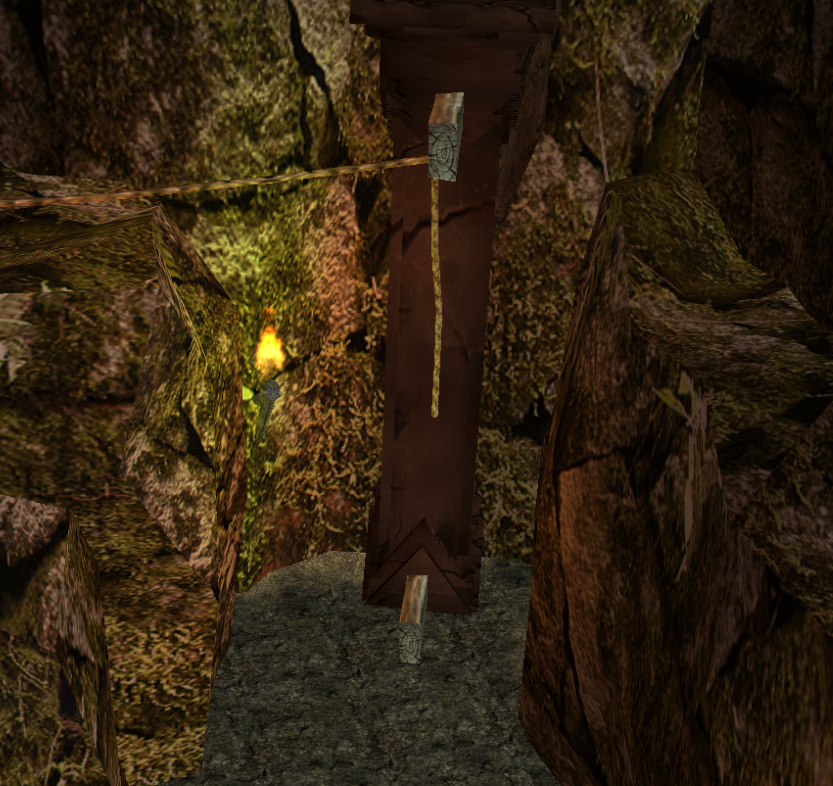
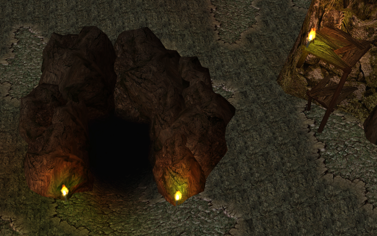
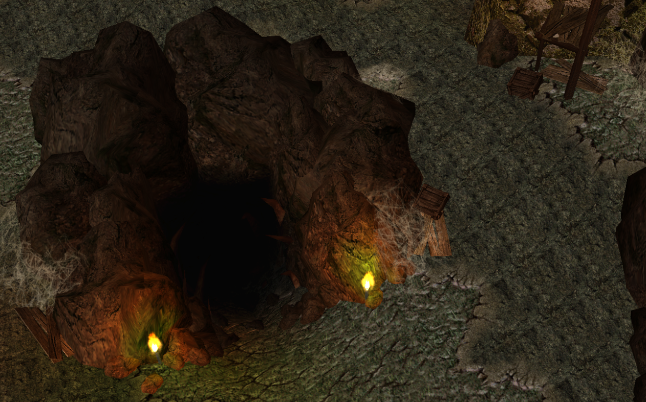
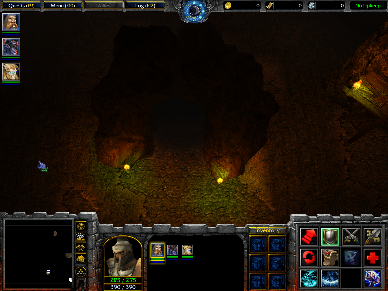
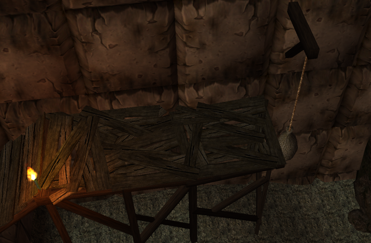
Nice interior screenshots. Some criticism for those screenshot.
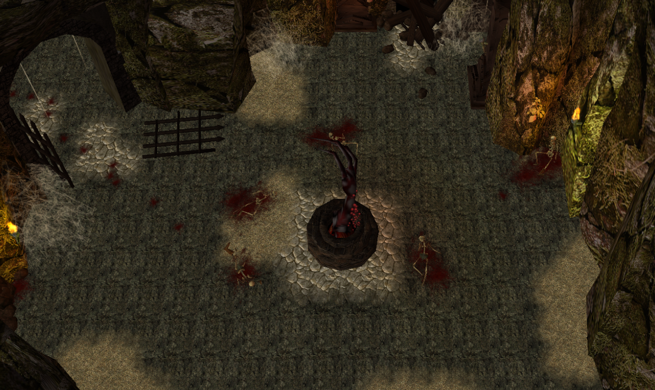
First: Looks good and clean but it could use some more details in the sides and in the middle. Place some more doodads in the sides such as barrels, crates and etc. For the middle, try placing something that catches attention like a statue, an unusual but pleasant to look at structure. It could also use some doodads hanged in the wall such as what you did in the second screenshot.
Second: Looks great and definitely better than the first one. Nothing much to suggest but you could place some doors between each sections.
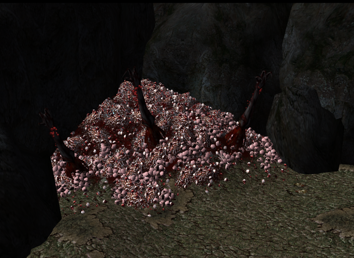
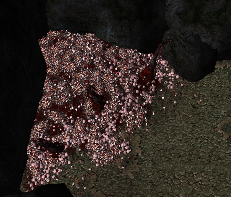
Others: Looks really great and quite detailed and I liked those cracks in your 7th screenshot. I have a feeling that some parts of your map leads you to this houses through the cracks which an increase discovery in your map by a number. The last screenshot looks epic and I like that statue, where did you got that anyway? Link please?
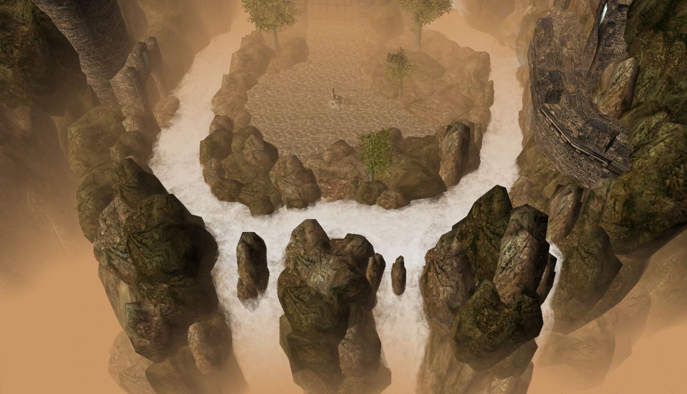
For the Calienth, all of them looks great but for the 3rd screenshot, you could smoothen that edge near the house so it would look smoother and better.
Overall, good luck!
Thanks for the feedback Hell Master
I agree that the first one seems a little empty, I'm not quite done with it yet, I'll definitely add some stuff to the walls.
That statue was actually made out of 4 different doodads. I removed the head, shield, and sword from the statue model with Magos. Then I added a shield hammer and helmet. I really like how it turned out because it looks like a completely new model and the doodads make it look like a higher quality than it actually is.
@Heinvers: Thanks for the support!
EDIT: I added a new poll for a question I am having please let me know what you think!
Last edited:

