- Joined
- May 18, 2018
- Messages
- 484


Contestants were to create a multi-layered Boss Fight Arena for 1 player, with at least 2 levels. The levels can be different floors, dimensions, other rooms and so on, as long as the Boss Fight Arena has 2 levels.
- 1st place: 750 experience points
- 2nd place: 600 experience points
- 3rd place: 450 experience points
- Entry: 150 experience points
- Judge: 50 experience points per entrant
| Contestant | Entry |
| @FeelsGoodMan | Heaven and Hell |
| @Achille | Crucible of Flame |
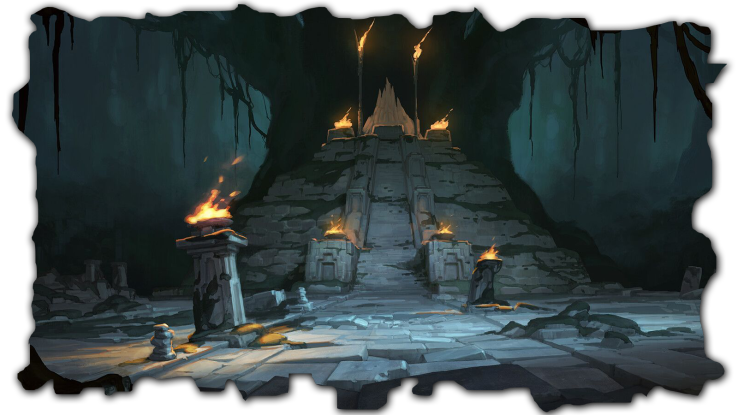
| @Riki | Winterheart Temple |
| @00110000 | The Megaraut |
| Aesthetics | Overall appearance of the final entry as a whole, e.g. an entry can lack detail and technique but still have an overall nice composition. | /35 |
| Creativity | How unique and original is the idea? How inventive is the execution? How creatively does it conform to the contest theme? | /30 |
| Layout | How well are the arena layouts? Are they logical with little to no visual obstructions? Is it easy to move around? Is it a good place to fight a boss? | /35 |
| /100 |
- Judgement: 70%
- Poll: 30%
I expected much more in terms of "Creativity" from you guys, as the theme is quite playing, but I don't see much. So, sorry if I'm too harsh on that.
| Aesthetics | The use of alpha tile, fog and clouds is done professionally. It's standard and does the job quite well. The whole visuals somehow remind me of Iceborn. One would probably do a nice comparison, as the arenas are as well balanced. :] There's a lil' bit of inconsistency regarding the combination of doodads in the Heaven arena, but it doesn't stand out too much. I would add a bit of color variation and use a bit more of eye-candy stuff in both of the arenas, as they look a little faded. Overall, it's standard and well balanced. Not too much to nitpick at. Well done. | /30 |
| Creativity | Fair enough. Nothing special though. I like the teleport gate system though, I've seen it in another map of yours as well. | /11 |
| Layout | Simple & effective. However, if one would create a boss fight with this map, I don't feel like there's much for him to explore around. There is not much to be inspired with. Just two very well balanced fighting arenas. I found some small collisions as well. For instance, the a collision where the Heaven gate's extra parts come out of stones beneath while opening. Quite standard anyway, especially the Hell arena. Pathing is done very well. | /28 |
| /69 |
| Aesthetics | Unfortunately, most of the map is bland, which would be the starting area. It's too bland and probably too long. Some of the doodads are stretched out and repetitive, making them visually unpleasant and boring, especially the rocks. Repetition has always been a good rule of terraining, but it should not be done in a way that looks boring and rough. You have to pay more attention to your placement of doodads, and put them together with care, versatility & variety. Although, a plus point is that the map looks alive, that's a good thing. In conclusion, always try focusing a bit more on the visuals representation, choose your doodads wisely, play around with tile variation, etc... | /21 |
| Creativity | Well, the most creative map among the entries, kudos to that. I can observe some huge potential of creating some gooddie boss fight here. The whole areas inspire people, giving them ideas. Well done. | /20 |
| Layout | Simple, standard. Some areas are bland, sadly. Found some visual collisions/obstructions as well. However, the whole layout is pretty inspiring and properly executes the definition of 'Level Design & Boss Fight'. This map would be easily a winner, if there was more attention to visuals representation. | /27 |
| /68 |
| Aesthetics | A very classic design. You decided to go for old school type of terraining, safe and fine. As for the whole composition, although I'm not a fan of those generic cliffs, I cannot ever complain a single thing about combination of doodads here... it's just classy, simple and the models go well together. The moving ice is a nice touch. Well done with the tile variation. | /24 |
| Creativity | I can see some flavours here and there, but same as the others, I expected more. | /13 |
| Layout | Classic, old school and safe. It just looks quite standard, I can definitely see potential ways of good usage here. Well done. | /26 |
| /63 |
| Aesthetics | Another classic design. I'm indeed a fan of dead atmospheres, but I must try not to be devoured by it and give extra points based on my own preferences lol Jokes aside, it's unfinished sadly, which would reduce the score. The concept is good and it's a lively map though, because of the sweet SFX doodads here and there, I like that. You could play around much more with the map, regarding composition. It's way too bland, could use a bit of flavour. | /18 |
| Creativity | This one's different, but it's not so creative regarding designing a boss fight. You could play around way more with the map. Next time mate. :] | /10 |
| Layout | The concept is OK, but it feels unfit and unfinished for a boss fight arena. If the theme was something like 'Assault Defense', I would definitely rank this map higher, but this is a 'Level Design' contest. | /20 |
| /48 |
| Aesthetics | The left side of the map has a lot of little details that make it interesting to venture through. You included a lot of color in an otherwise dark atmosphere. That only applies to the walkways, as the cliffs are just raised terrain without any interesting features. I would suggest adding more pipes, vents, etc. The chains in the air would look nice if they stayed on screen, but it might be better to remove them since they disappear at certain camera positions. The sludge rivers suffer the same issue, although it sounds like they were meant to be a triggered event. There's not much going on for the right side of the map. The area around the giant cauldron looks interesting with the bones, but there are no other doodads in the surrounding area. | /12 |
| Creativity | The combination of greens and purples paired with all of the skulls gives a strong necromancy vibe, and that obviously makes this a perfect fit for an undead boss. The flowing, nauseous liquid as an environmental hazard is a nice touch, as are the obvious spawn gates for creeps and footswitch activations. It seems like you had a lot of great ideas for this as a playable map, but you burnt out on it or couldn't decide on how to continue the pace for the terrain. | /14 |
| Layout | The layout of this terrain looks messy at first. The pathing doesn't seem to funnel the player to where they need to go. After reading your intended design for the left side of the map, it does make sense and actually seems like an interesting concept. It just seems like a lot of the terrain was unfinished, especially on the right side of the map. There is far too much open space with nothing breaking up the monotony of flat terrain. You included extra triggering that should not be in a terrain map. It seems like you lost motivation halfway through, so it's hard to understand what you were specifically trying to go for with a lot of the terrain. | /11 |
| /37 |
| Aesthetics | The cross arena in the upper left of the mana looks nice with the center beam and surrounding glow doodads. I would like to have seen more effects like that further down the map as well. The flowing lavafalls look great, but the splashing particles look out of place for a liquid flowing so slowly. The lava rivers don't look as good, at least not on the flat terrain sides. They could have much more decoration around them such as bones, metal fences, alternate stone types, etc. And in the upper left area, the use of wooden bridges is odd for being so close to extreme heat. The ruined stone you used around the lion statues might be a better fit for a bridge, if not Moria doodads. The bridge at the bottom of the map is a great concept, but I feel like it doesn't blend well with the surrounding area. Using more of that stone in the rest of the environment, or using more variety in the walkable area of the bridge would make it look more like it belongs there. At first glance, this terrain is aesthetically great. But the more I looked through it, the more I found little things that were off-putting about the environment or lack of decoration. I feel like this terrain just needed a little extra time and love to really shine. | /22 |
| Creativity | Flame is in the name, and it definitely feels like a hot and suffocating landscape to traverse. This would be a great map to have any type of fire-based enemies, demons, or even dark iron dwarves. But is a fiery hellscape creative and unique? Not particularly. The fact that it's versatile in what it can be used for is what makes it stand out to me. Your ideas revolving around the bridge can lead to interesting combat techniques as well. | /22 |
| Layout | There are many areas that feel too contrained and narrow for a full-on boss fight, especially if minions were to be included. While bottlenecks give a sense of either urgency or opportunity, I don't feel like there were enough open areas to balance it out. I did read what you said about using the bridge pillars as cover, but that type of terrain detail is only great in concept for very specific types of combat systems. Unfortunately, pathing is extremely messy. There is a pathing blocker missing below the bridge at the top of the map. Large portions of pathing blockers are missing to the right of the large bridge. Chunks of pathing blockers are also missing along the left of the map. While pathing would likely be altered and fixed in the creation of a playable map from this terrain, one of the rules and conditions is that "pathing must be 100% done" for this contest. | /15 |
| /59 |
| Aesthetics | The first boss area looks great. The crystals are a nice way to encompass the area the player is will be fighting in. I feel like you could have added more doodads leading up to it, like maybe some ice or webbing, corpses or equipment of fallen heroes to denote danger, etc. The same applies to all of the other areas where there's just black brick or black square tiles. The ice tile in the ice chunk area is nice to look at, but the brightness gives an extreme contrast to everything else being shadowed around it. It seems like an issue with the model's texture probably having too strong of an additive layer. The ice chunks the player can walk across clip through unit feet in certain areas. The devices in the final area look too different from each other. The middle seems elven, the corners looks undead in origin, and the one at the top is a generic mage-looking portal. Even though they have similar concepts, they just don't look like they fit together. Overall, the aesthetics are adequete for standard unit models. The bare areas just need more decoration and detail to keep the player interested, even when there's a lack of activity going on. Also, some white or light blue terrain fog might add more of a chilly or mystical feeling to everything. | /24 |
| Creativity | Ice, spiders, throne rooms, and... ancient technology? It's an interesting mix, but it feels a little disjointed or too busy in its themes. Maybe something fun can be done with the crystal devices, but nothing stands out as super creative or too dull. I feel like if you really honed in on a specific theme other than icy, you could pull off much more creative touches to the terrain. However, I do like the different stages in cold environments as you progress. | /20 |
| Layout | The starting zone is my favorite layout of all of the map entries. It's clear where everything is supposed to happen, and it feels like proper progression toward a boss fight. Continuing through the corridors and out into the ice chunk area, the walkable space seems very confined for looking so large and open. I was expecting units to be able to walk to at least one more of the land masses. Either way, it corrals the player to where they need to go. The final area feels detached from the rest of the level in more than just positioning, but it seems to serve its purpose for what you intended it for and how the player will interact with the devices. I would just move the corner devices further out into their own little alcoves so the combat area is more defined. | /30 |
| /74 |
| Aesthetics | The red water doodads seem slightly too small, so you can see gaps between them in areas where water is more exposed. Double-clicking the doodads and setting X:99.58 and Y:99.97 made them seamless for me. Units clip through the scattered bones and organs in the hellscape area. The bones are almost unnoticeable, but unit feet can completely disappear in the organs. I would suggest moving them slightly lower, or raise them up and give them pathing. It's a similar situation at the tops of each of the stairs in the hell zone, but it seems the model itself would need to be altered to fix that. It's a minor detail that may be overlooked by most, but it could help with immersion. The chains going through the air are done incredibly well. And as someone who knows how annoying it is to keep doodads from disappearing at certain camera positions, you did a great job with this throughout the entirety of the terrain, even with the use of so many large doodads. Overall, this terrain is very enjoyable to look at. Like your other projects, you could fool people into thinking this is HD Reforged graphics with the imported models and how well they're used together. That may be more of a con for people who like using classic style models, but I'm scoring based on the cohesiveness and presentation of the terrain. | /30 |
| Creativity | While the contrast between Heaven and Hell is not an original idea on its own, the way it's conveyed here is unique enough. The statues in the heavenscape are large and looming, and you weren't afraid to use the almost sinister brown colors and tendrils in what is typically thought of as a brighter and cheerier environment. All of this contributes to this version of heaven being a fitting battleground against a boss. You definitely went for a bone theme for the hellscape. Again, I like that you include a lot of light colors in what is typically thought of as a dark and fiery environment. The pulsating organs truly make it feel hellish and unsettling, and I feel like that makes it more of a fitting Hell than the stereotypical fire and torture. | /24 |
| Layout | This is a very polished map, and there are no evident pathing errors. There's plenty of space for large combat sequences without feeling too empty. The idea of separating areas by a portal flows with the idea of having heaven and hell being distinctly different dimensions. I would have liked to have seen some conjoining corridors of some kind where creeps could be utilized or a break between boss rooms, such as the teleporter to Hell leading to a smaller, separate room before reaching the final area. Other than each zone being a bit too expansive to keep track of, the layout works very well for boss fights. | /28 |
| /82 |
Contest | Poll


