- Joined
- Nov 12, 2007
- Messages
- 2,338


• ICON CHALLENGE •
| 
| 
|
|
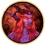
Maxwell
|
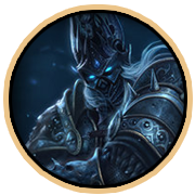
PrinceYaser
|
• JUDGING •
|
Provided by @~Nightmare 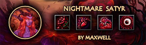
Consistency of the icons in the pack 8/10 Very consistent, although the horn seems to be off from the set as it doesn't have as much contrast like from the other icons. Blizzard Style 7/10 Almost there. Though I would like to see less outlines which is really exaggerated on the Scarlet Bloom icon. Contrast seems to be a little intense on Scarlet Bloom, Seed of Corruption and Nightmare (loved that name XD). Blizzard has vibrant colors for the effects and if the contrast is intense a back light/glow is added. Theme and Creativity 18/25 
The death blossom icon remind me of this one, would love if you had made a different approach tho. The horn stand out from the rest of your icons and I think that is the best icon of your set. Technical Quality 45/55 I would mostly avoid too much contrast (and consistency too) and too much red. Combining purple and red would do a really great effect like what you did with the Seed of Corruption icon the only thing that is left is a good complimenting backlight. The smoke on the horn seems to be plastic-y. The nightmare icon was painted really well. Great job on these tho. TOTAL: 78/100 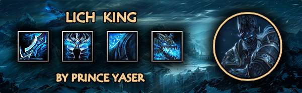
Consistency of the icons in the pack 8/10 Very consistent in colors, almost consistent on the style. The Frostmourne having a very sharp style while the helmet with a very smooth and clean style. Blizzard Style 9/10 Fitting ingame except the Frostmourne being less-fitting because of the style. Theme and Creativity 15/25 Good thing that you've made your last icon a different one from the rest because I thought it was going to be another part of the equipment (like a gauntlet or boots or whatever). It was really sad that you didn't create at least one icon that would highly impact the whole set. Would love too if you the helmet is on the different angle because it always reminds me of that icon that you've used as the reference which is kinda heavy. Technical Quality 45/55 The Frostmourne's anatomy seems off and has a different style from the rest of the set. The cloak at first sight seems to be undefined as it is really hard to know what it is at first sight. The dragon seems to be a nice touch. Good job on these! TOTAL: 77/100 |
• WINNER •
|
Maxwell |
|
Calculation
|
|
Final Score = (PollVotes/TotalVotes)*75 + (JudgeScore/100)*25 |


 .
.

