• 🏆 Texturing Contest #33 is OPEN! Contestants must re-texture a SD unit model found in-game (Warcraft 3 Classic), recreating the unit into a peaceful NPC version. 🔗Click here to enter!

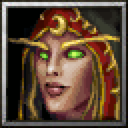
BTNSalandria

Haven't made a icon in awhile but felt inspired by Stefan.K's recent model of Salandria

I'm not sure if I like the icon without the hair showing, but considering her hair shows on portrait ingame I felt like it would be more fitting.
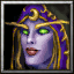
Also decided to make an alternative version with purple lips, again not matching the portrait perfectly but I prefered the color palette without the red lips.

Progress Gif:
jFOuoHu.gif


256x256 image:
3gDCZSx.png

r8XcLk7.png

Edit:

Removed some hair bits since I felt it doesn't fit the model well enough, might remove hair entirely if people suggest.

Edit2:

Oops I actually made her a nightelf at first, she's bloodelf now haha.

Edit3:

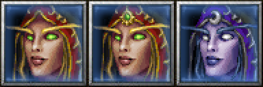
Updated according to suggestions from members & reviewer, the fixes applied are following:
Straightened her right eyebrow.
Removed Lunar Eblem from Bloodelf version.
Added alternate Bloodelf icon with a Green Gem replacing the Lunar Eblem.
Further recolored & changed up Nightelf version of the icon and uploaded it as another alternative icon resource.

Larger preview version of the updated files:
ahqzyRx.png
Contents

BTNHeroNightElfSalandria (Icon)

BTNHeroSalandria (Icon)

BTNHeroSalandriaAlternate (Icon)

BTNNightElfSalandria (Icon)

BTNSalandria (Icon)

BTNSalandriaAlternate (Icon)

Reviews
Level 22
Joined
Jan 6, 2017
Messages
310
You could just reduce the size, it will allow the neck to show
I don't like the idea of reducing the size for multiple reasons.
I feel like the head will be too small if I do, also if I just simply reduce the size with a tool it'll make the image blury which will reduce the quality and also as a pixel artist I like to see the pixel clusters and AA I've done. I don't think the icon would benefit too much from squeezing in few extra pixels of neck, I have a bigger concern with the bangs of her hair if they're making too much of a disconnection between the model and the icon (issue is the ingame model's portrait has the bangs but the model itself doesn't).

Which program are you using? there are ways to reduce sizes by hand that allow you to preserve a good looking picture/icon.
 
Level 22
Joined
Jan 6, 2017
Messages
310
It might, try using Paint.Net
Oh damn btw I made big mistake, she's supposed to be blood elf lolol, fixed it.

Ok I made a smaller version of the icon, here is the original file:
P2kIku7.png


and here's how it looks like ingame, comparison to Dark Ranger and the current icon

gTYXpCD.png


I feel like the current icon being more close-up matches more with the Dark Ranger, and the majority of the original Warcraft 3 heroes icons.
 
Level 22
Joined
Jan 6, 2017
Messages
310
Please fix her left eyebrow. It is too wavy for elf and overall looks weird.
Awaiting Update

Feel free to move this icon to Substandard, as I don't care to put more time into converting the files to BLP and re-uploading them than it would take to do this "fix" on the icon.. I'm really busy and value my time more than to waste it like that.
 
  • Like
Reactions: San
Level 22
Joined
Feb 19, 2015
Messages
891
I am not interested in putting Icons to the Substandart section. This is a good quality Icon, I just suggested to fix two little things that will make it even better. If you dont have time, you dont have to make the changes right now. Theres no time limit for an icon to sit in awaiting update.
 
I am not interested in putting Icons to the Substandart section. This is a good quality Icon, I just suggested to fix two little things that will make it even better. If you dont have time, you dont have to make the changes right now. Theres no time limit for an icon to sit in awaiting update.
Man icons usually are put to awaiting update for issues which make problems for the icon making it not approvable, do you think this does have really such an issue(s)? Hm.. what do you mean it's too wavy? Elves have really wavy eyebrows, observe this icon by Sin, one of the greatest icons I have ever seen:

107237-2faf3439ac1180f94e65651ce6a3ee91_tn2.jpg
- Both eyerbrows are even more wavy than this icon.

Well, just my thoughts. The discussion is not my concern.
 
Level 22
Joined
Jan 6, 2017
Messages
310
I wasn't referring to you. I was referring to the strange tone of voice I picked up from Scias.

It did upset me that after spending 2 hours (for which I could have done many other things) making a icon for the community, and updating it multiple times afterwards.. a moderator would pick on literally 2 pixels of a eyebrow (which I intended to be that way), and decide that for some reason these 2 pixels are enough of a problem for this entire icon not to be approved. The moderators should have more respect for the artists, and consider suggesting opinion-based corrections, rather than requiring as necessary for a icon to be approved.

I would definitely not have reacted this way if I didn't see fair share of this kind of awful reviewing on the icons here, even as I joined the forum there was some drama about the icon section and my own work because it was made by pixel art. I would expect moderators to have little more respect for artists work on here since we're doing this for free, out of our own free will - I say this because the majority of issues they bring up are not artistic flaws but personal opinions they have yet somehow they don't suggest the change but demand it.

Besides, do you guys not notice that the other moderator/reviewer for some reason ignores all my work, doesn't comment nor review it, and I barely even spoke with him - all I did was respectfully show him my process files he required of me. How could I not be bothered with this kind of unprofessional behavior?


----

KILLICIDE said:
What program are you using to do this?
I use Button Manager (Icon Wizard tool), it's not about lenght of the process to convert the files and uploading them (4 icons), but I was bringing up the issue that it does take more work and time to convert & udate the icon than it does to "fix" the issue that made it unapprovable - which makes absolutely no sense to me.
 
Level 22
Joined
Jan 6, 2017
Messages
310
@Scias, if you are not satisfied with review you can always ask for another 2D Art Reviewer and contact Stuff.

The other reviewer ignores my work, and taking this to Staff is again more work and time taken from me than it's worth, I really don't care if this icon is in Substandard or not, so toss it in there since I'm not updating it and it doesn't fit in your criteria.
 

San

San

Level 32
Joined
Sep 23, 2012
Messages
1,307
It did upset me that after spending 2 hours (for which I could have done many other things) making a icon for the community, and updating it multiple times afterwards.. a moderator would pick on literally 2 pixels of a eyebrow (which I intended to be that way), and decide that for some reason these 2 pixels are enough of a problem for this entire icon not to be approved. The moderators should have more respect for the artists, and consider suggesting opinion-based corrections, rather than requiring as necessary for a icon to be approved.

I would definitely not have reacted this way if I didn't see fair share of this kind of awful reviewing on the icons here, even as I joined the forum there was some drama about the icon section and my own work because it was made by pixel art. I would expect moderators to have little more respect for artists work on here since we're doing this for free, out of our own free will - I say this because the majority of issues they bring up are not artistic flaws but personal opinions they have yet somehow they don't suggest the change but demand it.

This nailed the situation we're having in icon section since the past few months, it gets even worse after the absence of Murloc.
To all the new and in the future reviewer, if you truly wants to help the community and be a good man, instead of the contact-the-staff card or "i dont need two cents from people:pwink:" attitude, I wholeheartedly suggest you to digest and understand what Scias have pointed out.
 
Level 22
Joined
Feb 19, 2015
Messages
891
As I said before:
This is a good quality Icon, I just suggested to fix two little things that will make it even better.

It's not a question will this Icon be approved or not. It is a good Icon. I just gave some time to Scias to remove thing with eye & eyebrow that, yes, in my opinion, will make icon even better. Since @Scias said that he is not going to do it, I will just set Icon to Approved.
 
Level 22
Joined
Jan 6, 2017
Messages
310
As I said before:


It's not a question will this Icon be approved or not. It is a good Icon. I just gave some time to Scias to remove thing with eye & eyebrow that, yes, in my opinion, will make icon even better. Since @Scias said that he is not going to do it, I will just set Icon to Approved.

There's a difference between suggesting and putting work to pending update, pending update means I'm required to do the update in order for the icon to fit your criteria or the standards of the website, while by suggesting you'd let me know your thoughts and allow me to decide if I want to make the change or not.
 

Ralle

Owner
Level 77
Joined
Oct 6, 2004
Messages
10,096
@Maxwell is still a new reviewer and I tutored him in how to use the tools for moderation. This is my fault.

I can see where you are coming from. I suppose awaiting update should only be used if the resource would otherwise end up as restricted/substandard if feedback is not applied. A curvy brow is not enough reason for that.

I guess in the future we'd do the following:
- Awaiting update is used if the resource is about to be put into substandard/restricted because of quality issues that the author can fix.
- Approved is used if the quality is good even though the mod/reviewer has feedback to further improve it.

Does that resonate with everybody?
 
Level 22
Joined
Jan 6, 2017
Messages
310
@Maxwell is still a new reviewer and I tutored him in how to use the tools for moderation. This is my fault.

I can see where you are coming from. I suppose awaiting update should only be used if the resource would otherwise end up as restricted/substandard if feedback is not applied. A curvy brow is not enough reason for that.

I guess in the future we'd do the following:
- Awaiting update is used if the resource is about to be put into substandard/restricted because of quality issues that the author can fix.
- Approved is used if the quality is good even though the mod/reviewer has feedback to further improve it.

Does that resonate with everybody?

I guess I misunderstood how the moderation is done on here, which is what caused the issue for me. Since for me this "new method" made more sense and I assumed it is how it already goes, I didn't know I could simply refuse to make an update and the icon would be moved from Pending Update to Approved.. But anyhow, thanks for clarifying the system, making this change and stepping in, I appreciate it and I think a lot of other artists will also.
 
Level 37
Joined
Jul 22, 2015
Messages
3,485
It seems this all stemmed from the fact that you thought this icon was not approvable simply because an eyebrow. This is a fault on our end, for not being explicit enough. The eyebrow was just a suggestion, and you are free to reject the suggestion because it is your art, and it is up to your interpration on how something should look. In the case that the icon is already in an approvable state, it will just be moved to the approved section.

However, I must point out the fact that you flaunt about how you draw icons "for free, out of [your] own free will," yet it seems that you forget that the Reviewers & Moderators do the same exact thing. If you expect us to act professional, then I ask you do the same by knowing how to respond in a respectable manner. With this in mind, Maxwell wanted to help improve your icon; was lashing out at him the appropriate response? Sorry for going back to this, but I just really hate it when people have this idea that everyone on the Staff needs to respect the users like you're all above us. We're all the same, and if you expect me to be professional, I expect the same from everyone else.
 

Shar Dundred

Community Moderator
Level 72
Joined
May 6, 2009
Messages
5,858
Hold your horses, @KILLCIDE, you are acting as if this was all Scias' fault when it wasn't.

Maxwell has made a mistake, which is understandable since he is new in this business, and therefore
Scias was not very happy about it. Given late events in the Icon Section and its moderation, I would
say that his level of annoyance was higher than it would have been otherwise.

This minor eyebrow thing (which a non-artist like myself didn't really see, btw) is by all means NO
reason to prevent APPROVAL.

This section was and still is in dire needs of better, improved moderation.
Shutting down everyone who voices disappointment with approval criteria is the WRONG WAY to improve.
 
Level 22
Joined
Jan 6, 2017
Messages
310
It seems this all stemmed from the fact that you thought this icon was not approvable simply because an eyebrow. This is a fault on our end, for not being explicit enough. The eyebrow was just a suggestion, and you are free to reject the suggestion because it is your art, and it is up to your interpration on how something should look. In the case that the icon is already in an approvable state, it will just be moved to the approved section.

However, I must point out the fact that you flaunt about how you draw icons "for free, out of [your] own free will," yet it seems that you forget that the Reviewers & Moderators do the same exact thing. If you expect us to act professional, then I ask you do the same by knowing how to respond in a respectable manner. With this in mind, Maxwell wanted to help improve your icon; was lashing out at him the appropriate response? Sorry for going back to this, but I just really hate it when people have this idea that everyone on the Staff needs to respect the users like you're all above us. We're all the same, and if you expect me to be professional, I expect the same from everyone else.

Yeah I misunderstood the system, since I thought "Pending Update" means that it is necessary for me to make the Update that a moderator required from me. I didn't know I could reject making the change, the issue the reviewer pointed out wasn't a big or difficult fix for me but it was just that being "forced" to make such a simple change just to get the icon approved felt like he was just abusing his powers over me. And I felt that this kind of way of reviewing and approving things is extremely disrespectful and makes a bad environment for contributors, where you're forced to make changes based on reviewers personal opinion.. So you see where my stress about the whole thing is coming from. And aren't there some icons that have been stuck in "Pending Update" even though the creators have pointed out that they won't make the update? I'm pretty sure I also seen contributors forced into making changes that weren't necessary just so their icon would be approved (such as add a light source here or there)..

The reason I brought drawing the icons for free up is because if I'm making them just to contribute to a community I don't feel like one person can have the say in how my icon is supposed to look or to be changed - of course you can suggest, but you cannot demand the change, which is the whole point I was trying to make. I also don't see how creating resources can be compared to reviewing them, reviewing and giving a critique is a lot simpler task and requires less effort (I give critiques every once in awhile even though I'm not a reviewer).. But anyhow, I did feel disrespected so I retaliated in a disrespectful manner, there shouldn't be a surprise there.

Either way, the method so far was confusing with the Pending Update process, and I believe Ralle's new method should make things a lot more clear now and create less drama and issues in the community.
 
Level 37
Joined
Jul 22, 2015
Messages
3,485
@Shar Dundred It seems you misunderstood my whole post. My intention was not to point fingers at Scias. If you read my post, the first thing I admitted was the fault being ours; specifically, it was our fault for not being explicit, so I'm not sure how you could have missed that. The end of my post was me voicing my opinion on how much it annoys for me users to think Staff members need to act professional and nice all the time, when users can just scream and cry to get our attention. I want to have good debates about ways to improve the site, and lashing out at each other is not the way to start that, which is why I asked Scias to not lash out. I never blamed him for anything. I'm hoping you did not feel the same way @Scias, but judging from your recent post, you seemed to understand the point I was trying to get at.

And aren't there some icons that have been stuck in "Pending Update" even though the creators have pointed out that they won't make the update?
There probably are. Unfortunately, I can admit to a few cases where I would completely forget about a submission, and it would take a notification from another user or the submitter themself to remind me to go back to it. With this in mind, people can just poke at us for submissions that are long overdue.
 
Level 22
Joined
Jan 6, 2017
Messages
310
@Shar Dundred It seems you misunderstood my whole post. My intention was not to point fingers at Scias. If you read my post, the first thing I admitted was the fault being ours; specifically, it was our fault for not being explicit, so I'm not sure how you could have missed that. The end of my post was me voicing my opinion on how much it annoys for me users to think Staff members need to act professional and nice all the time, when users can just scream and cry to get our attention. I want to have good debates about ways to improve the site, and lashing out at each other is not the way to start that, which is why I asked Scias to not lash out. I never blamed him for anything. I'm hoping you did not feel the same way @Scias, but judging from your recent post, you seemed to understand the point I was trying to get at.


There probably are. Unfortunately, I can admit to a few cases where I would completely forget about a submission, and it would take a notification from another user or the submitter themself to remind me to go back to it. With this in mind, people can just poke at us for submissions that are long overdue.

There wasn't much I disagreed with in your last post apart from me flaunting about working for free.

But I do agree with @Shar Dundred 's point about the situation of the moderation and reviewing on this website, I do not believe you guys are blind to what's going on and what the community is having issues with. I personally had very little issues with the staff, so me lashing out and starting this discussion had more to do with helping improve this website than to do with a personal issue I had.
 
Level 20
Joined
Feb 23, 2014
Messages
1,264
Damn, this escalated needlessly :)

Personally, I think this whole situation is nothing more than a minor misunderstanding as I don't believe that either @Maxwell or @Scias actually meant any harm.

Mistakes were made, personal frustrations have been vented and since this isn't really the best place to discuss moderation, I politely ask that we all just move on and talk about the icon itself.

---

And on that topic, I somewhat agree that the right eyebrow could be smoothed out a bit.

Also, the corresponding model doesn't have any lunar symbols on the cape/forehead, so I think it would be nice to have a version of the icon without it :) Especially considering that lorewise, the Blood Elves aren't really worshipping the moon - if anything, they are all about the sun and thus a Blood Elf with a lunar emblem kinda bugs me :)

But then again, these are just minor details and generally the icon is very nice, so a 5/5 rating is most definetely justified.
 
Level 22
Joined
Jan 6, 2017
Messages
310
Damn, this escalated needlessly :)

Personally, I think this whole situation is nothing more than a minor misunderstanding as I don't believe that either @Maxwell or @Scias actually meant any harm.

Mistakes were made, personal frustrations have been vented and since this isn't really the best place to discuss moderation, I politely ask that we all just move on and talk about the icon itself.

---

And on that topic, I somewhat agree that the right eyebrow could be smoothed out a bit.

Also, the corresponding model doesn't have any lunar symbols on the cape/forehead, so I think it would be nice to have a version of the icon without it :) Especially considering that lorewise, the Blood Elves aren't really worshipping the moon - if anything, they are all about the sun and thus a Blood Elf with a lunar emblem kinda bugs me :)

But then again, these are just minor details and generally the icon is very nice, so a 5/5 rating is most definetely justified.

I hate to point it out also but I feel like there's a double standard and inconsistent moderation which lead me to the whole misunderstanding of the system.

---

And on topic, I made the eyebrow in that way to show the effect of perspective (with the shadow), and the extra pixels of base color I put in there to make her eyebrow look like some hair bits on her eyebrow pop out of the strict straight form in attempt to make it look more natural..
Here are the two pixels that create the problem:
87HedP3.png

If that was shaded, the eyebrow would be straight and fine.

The issue about the lunar symbol on her forehead is that I originally pixeled the icon as a nightelf, I did point out to the creator of the model that the skin looks weird, and since I was basing it on the screenshot I took I went with the purple colors of the skin it had, and adjusted them.. Got carried away working with purple skin and thought I was working on a night elf character.. Which is why I added the moon detail since I felt like the icon doesn't necessarily have to 100% match the model, and only after uploading the piece I realized that it's supposed to be a bloodelf and then I had to make correct that mistake (btw this is also why there's nightelf alternative version). I totally overlooked that detail, thanks for pointing it out.


Anyhow, now that I know I'm not being forced into making these changes, and it is my own choice, I will go ahead and make the adjustments you guys suggested.
 
Top